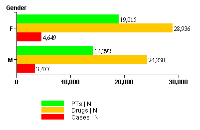
In an aggregate bar graph, the row variable of the report appears on the y-axis. Each numeric column variable in the report appears on the x-axis. A key appears below the graph describing each bar.
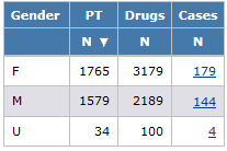
For example, a report includes counts of PTs, drugs, and cases for each gender:
Depending on the display options that you specify, the graph might look like this: