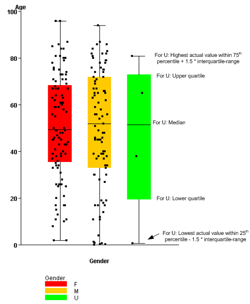
A box plot (also known as a box-and-whisker plot) is the plotting of data points against horizontal and vertical axes to show the distribution of a continuous variable. In a box plot:
The interquartile range, which is the difference between the upper quartile and the lower quartile, is a measure of the spread of the distribution. The relative distances of the upper and lower quartiles from the median describe the shape of the distribution of data.
In the box plot:
Note: Points in a box plot are jittered (displayed at small random offsets from the center line). This ensures that if two records have the same value, a point is likely to be displayed for each of them.
Several box plots might be shown in a single graph if you select a secondary variable. If so, a key appears below the box plot to relate the individual box plots to the values of the secondary variable.
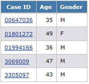
For example, a report shows age and gender for each case ID:
Depending on the display options that you specify, the graph might look like this: