Oracle® Healthcare Foundation
Sample Dashboards User's Guide
Release 7.1.1
E80487-02
April 2017
This document contains details on sample dashboards for Oracle Healthcare Foundation (OHF) 7.1.1. It consists of a comprehensive set of examples for Clinical, Financial, and Value Based Care domains that are created using Self-Service Analytics (SSA). It is distributed as free content and is not maintained or supported by Oracle as a licensed product.
1 Overview
The Self-Service Analytics sample dashboards runs on Oracle Business Intelligence (OBIEE) and can be used to visualize data in Healthcare Common Data Mart (HCD).
You can deploy the sample dashboards catalog file (ohfssa_sample) in the OBIEE server. For details on deployment instructions, see Oracle Healthcare Foundation Sample Dashboards Deployment Guide.
You can also customize or extend these sample dashboards and reports as per your downstream application use cases.
2 Sample Dashboards
The following are the sample dashboards and pages:
| Dashboard | Pages |
|---|---|
|
OHF Self Service Analytics - Value Based Care (Sample) Dashboard |
|
|
OHF Self Service Analytics - Derived Measures Browser (Sample) Dashboard |
Allows you to browse derived measures, such as: HCAHPS, HIQR/HQQR, PQRS, or CQM. |
|
OHF Self Service Analytics - Patient Browser (Sample) Dashboard |
Create, save, or retrieve queries for a cohort of patients by: demographics, diagnosis, procedure, drug, DRG, service line, etc. |
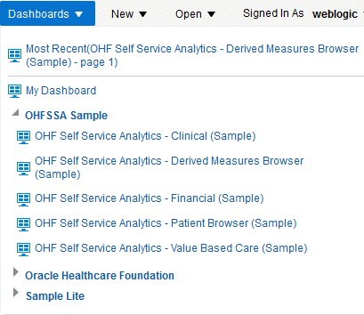
Figure 1 shows the list of dashboards available in this sample. You can access these from the Dashboard menu in OBIEE.
The reports in these dashboards work for the Hospital enterprise. You can filter some reports by organization.
2.1 OHF Self Service Analytics - Value Based Care (Sample) Dashboard
2.1.1 Member Analysis
The Member Analysis page uses Member Month Eligibility and Medical Claim. Figure 2 shows an illustration of member analysis.
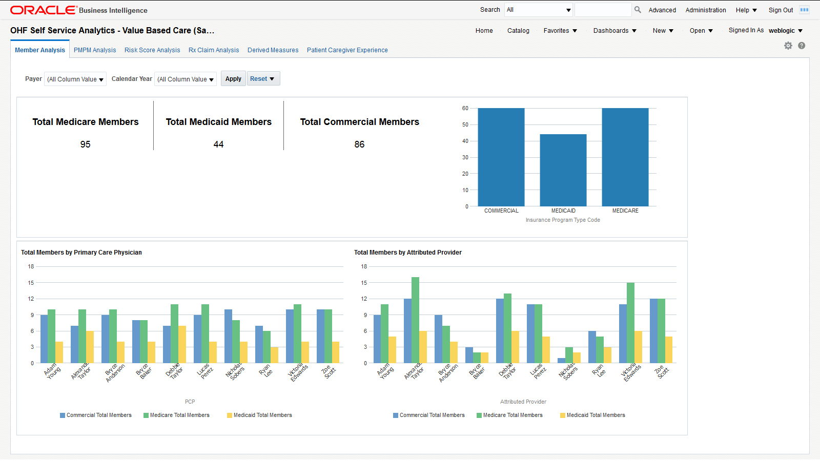
You can use the filters at the top of the page to focus on specific payers and calendar years. This page has the following reports:
-
Total medicare, medicaid, and commercial members. This report shows the organization's exposure to different insurers based on the number of patients they cover.
-
Total Members by Primary Care Physician. This report shows each primary care physician's exposure to different insurers based on the number of patients they cover.
-
Total Members by Attributed Provider. This report shows each attributed provider's exposure to different insurers based on the number of patients they cover.
2.1.2 PMPM Analysis
The PMPM Analysis page uses Member Month Eligibility, Medical Claim, and Rx Claim. Figure 3 shows an illustration of PMPM analysis.
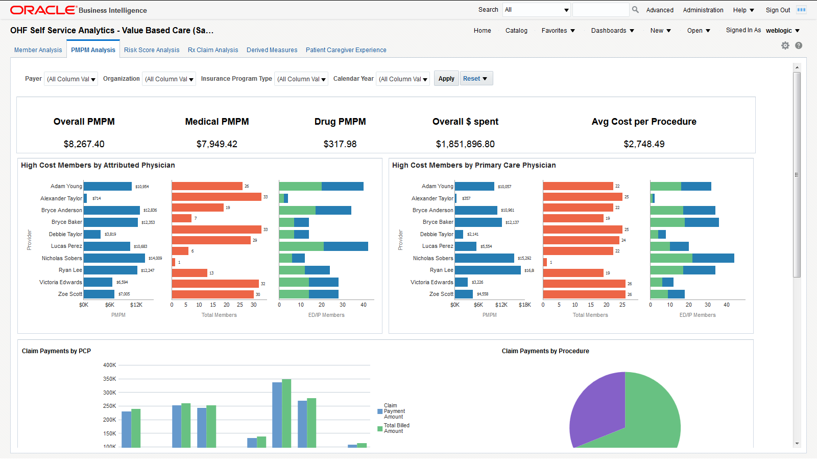
You can use the filters at the top of the page to focus on specific payers, organizations, insurance program types, and calendar years. This page has the following reports.
-
PMPM overall, medical and drug cost in dollars, overall dollars spent, and average cost per procedure. This report allows you to see the average monthly costs per member and their distribution between medical and drug PMPM costs. It also allows you to evaluate your total costs and the cost of a typical procedure.
-
High Cost Members by Attributed Physician. This report helps you understand the PMPM costs that attributed physicians generate through the average monthly cost per member and the total number of members assigned. The distribution between emergency and inpatient members also helps to understand the associated costs.
-
High Cost Members by Primary Care Physician. This report helps you understand the costs that primary care physicians generate through the average monthly cost per member and the total number of members assigned. The distribution between emergency and inpatient members also helps to understand the associated costs.
-
Claim payments by member - A tabular report that lists all members and their claim payments. This report allows you to drill down to the payments claimed for each member.
-
Claim payments by procedure - A graphical representation of the weight each procedure has in the overall payments claimed. This report helps you visualize the procedures that generate the largest claims.
-
Claim payments by care setting - Graphical representation of the claim payment amounts for each case setting. This report helps you visualize the care settings that generate the largest claims.
-
Claim payments by PCP - Graphical representation of the claimed payment amounts and billed amounts by primary care physician. This report allows you to compare the overall payments claimed by primary care physicians and to check how they are covered by the billed amounts.
-
Cost by Payer Network - Lists the total billed amount for each payer network. This report allows you to evaluate the exposure to each payer network, based on the amounts billed.
2.1.3 Risk Score Analysis
The Risk Score Analysis page uses Member Risk Score. Figure 4 shows an illustration of risk score analysis.
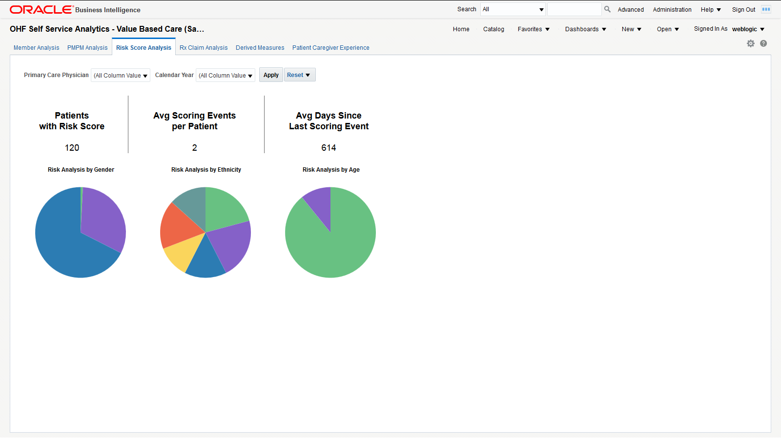
You can use the filters at the top of the page to focus on specific primary care physicians and calendar years. This page has the following reports.
-
Total number of patients with risk score, average scoring events per patient and average days since last scoring event. This report helps you understand the scoring activity volume based on the number of patients it is performed on, the number of scoring events per patient and their frequency.
-
Risk analysis by gender, ethnicity, and age band. Correlate this report with the total numbers of patients in each category to understand which genders, ethnic groups and age bands are more exposed to risks.
2.1.4 Rx Claim Analysis
The Rx Claim Analysis page uses Prescription Claim. Figure 5 shows an illustration of Rx claim analysis.
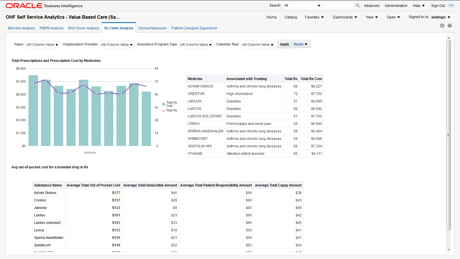
You can use the filters at the top of the page to focus on specific payers, organization providers, insurance program types, and calendar years. This page has the following reports.
-
Prescription count and cost analysis - This report helps you understand how often different medicines are prescribed and the costs that these prescriptions generate.
-
Out of pocket costs report shows the average out of pocket cost that patients pay for a given set of medicines along with the breakdown of the total cost by total copay, deductible, and patient responsibility amounts.
2.1.5 Derived Measures
The Derived Measures page uses quality measurements based on the Accountable Care Organization (ACO) standards. You can customize this page to be used for any quality measure. Figure 6 shows an illustration of the ACO quality measures page.
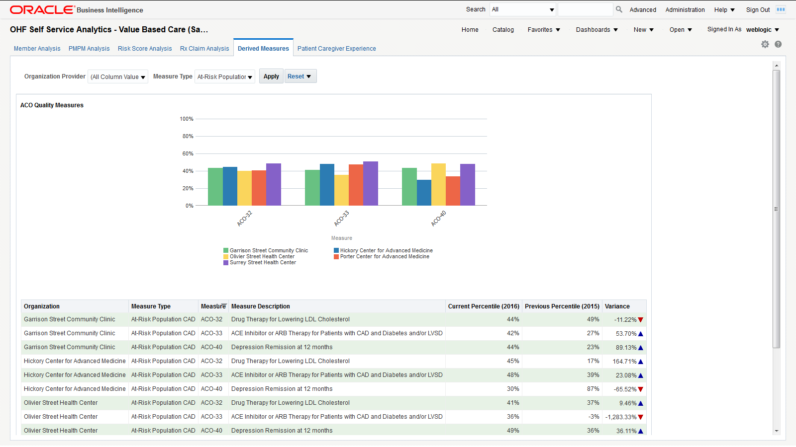
You can use the filters at the top of the page to focus on specific organization providers and measure types. This page has the following report:
-
ACO Quality Measures - Graphical representation of the percentile rating for the selected organization providers for specific measure types. This report allows you to compare how organization providers compare to each other on different measures. The detailed tabular report below the chart also includes the percentile variance from the previous year to the current year, providing insight into the progress of an organization over different ACO quality measures.
Note:
The derived measure model supports drill-down to a patient, member, individual and organization service provider, encounter, internal organization, medical claim, and Rx claim from the quality measure results.2.1.6 Patient Caregiver Experience
The Patient Caregiver Experience page uses survey response from the patient survey. Figure 7 shows an illustration of the patient caregiver experience page.
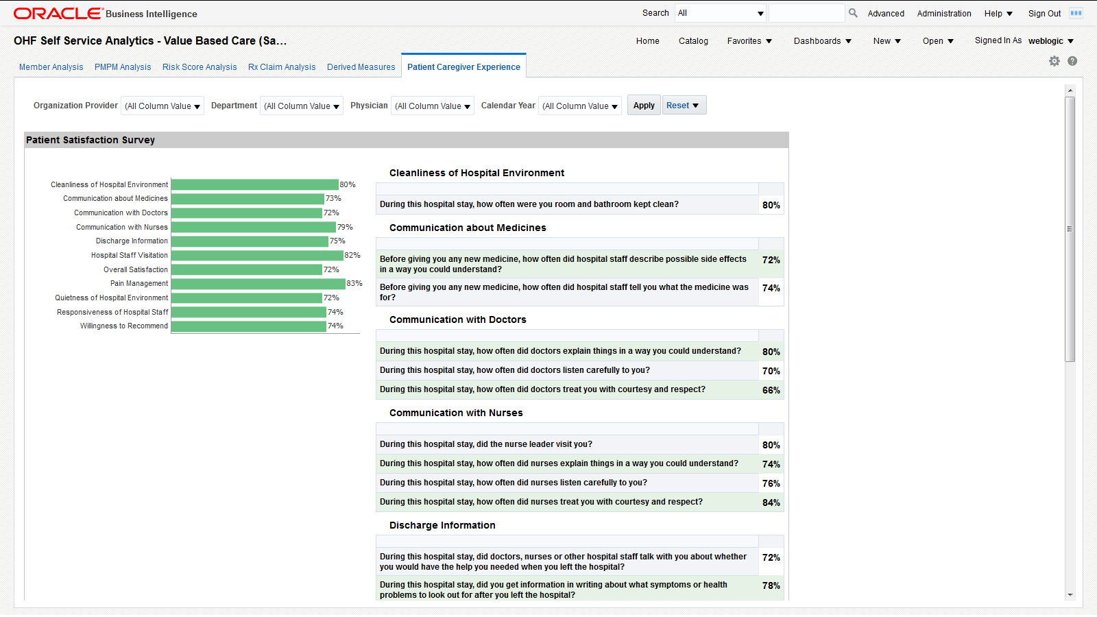
You can use the filters at the top of the page to focus on specific organization providers, departments, physicians, and calendar years. This page has the following reports:
-
Patient Satisfaction Survey - Shows patients' surveys during their encounters with the caregiver. It displays the performance score for each area. For example, "During the hospital stay, how often doctors explained in a way that the patient could understand?" has a score of 80%, which means 80% of patients agreed that the doctors explained clearly.
-
Survey Category - Shows the survey response results rolled up to the categories, such as cleanliness of hospital environment, communication about medicines, and communication with doctors, nurses.
Note:
The survey model in HCD supports drill-down to a patient, member, individual service provider, encounter, or internal organization from the survey responses.2.2 OHF Self Service Analytics - Derived Measures Browser (Sample) Dashboard
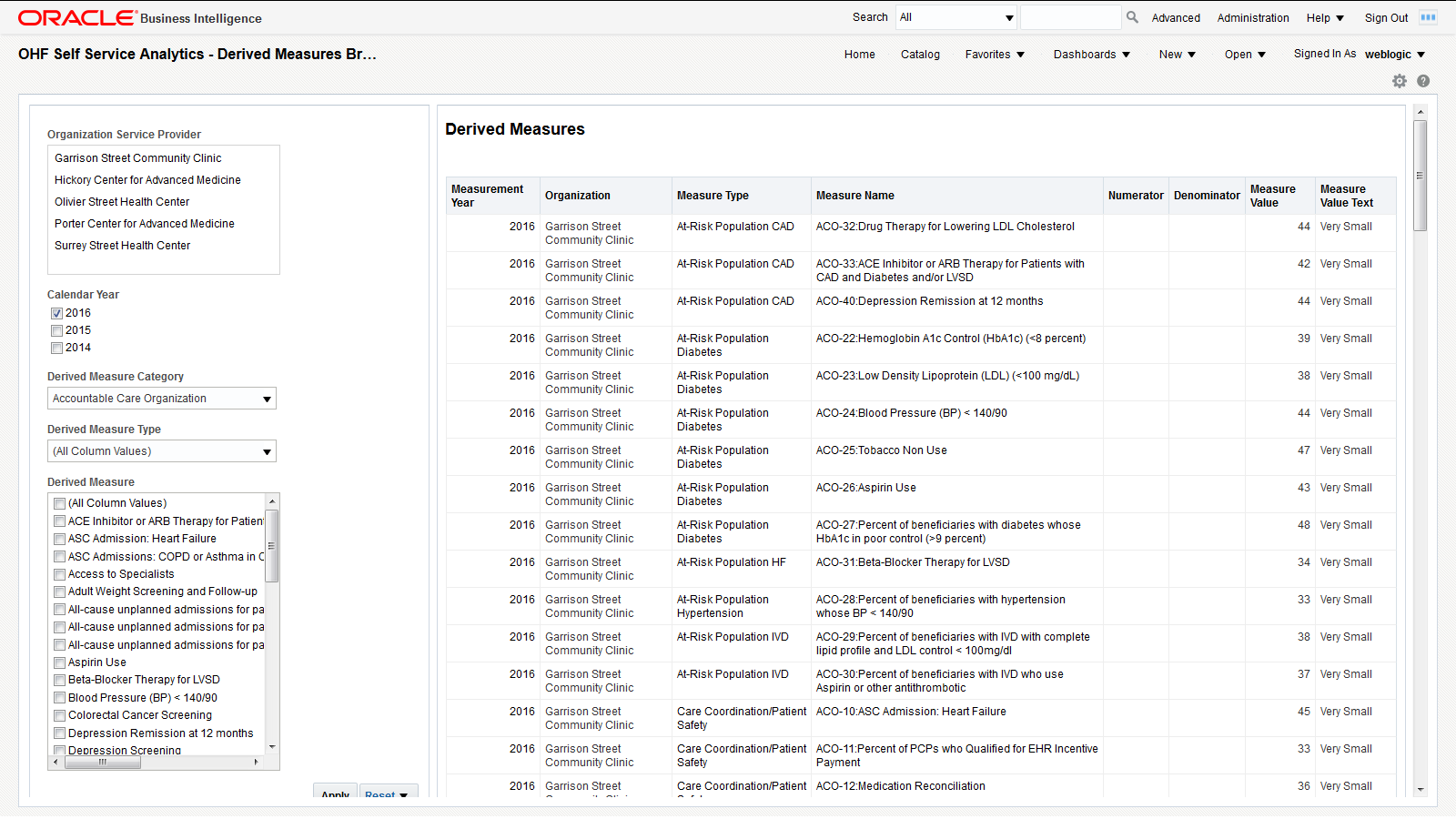
The Derived Measures Browser allows you to browse derived measures, such as: HCAHPS, HIQR/HQQR, PQRS, or CQM. Use the panel on the left to select your filtering criteria and click Apply to display the results in the table on the right. Also see Derived Measures for measure comparisons between organizations and progress tracking.
2.3 OHF Self Service Analytics - Patient Browser (Sample) Dashboard
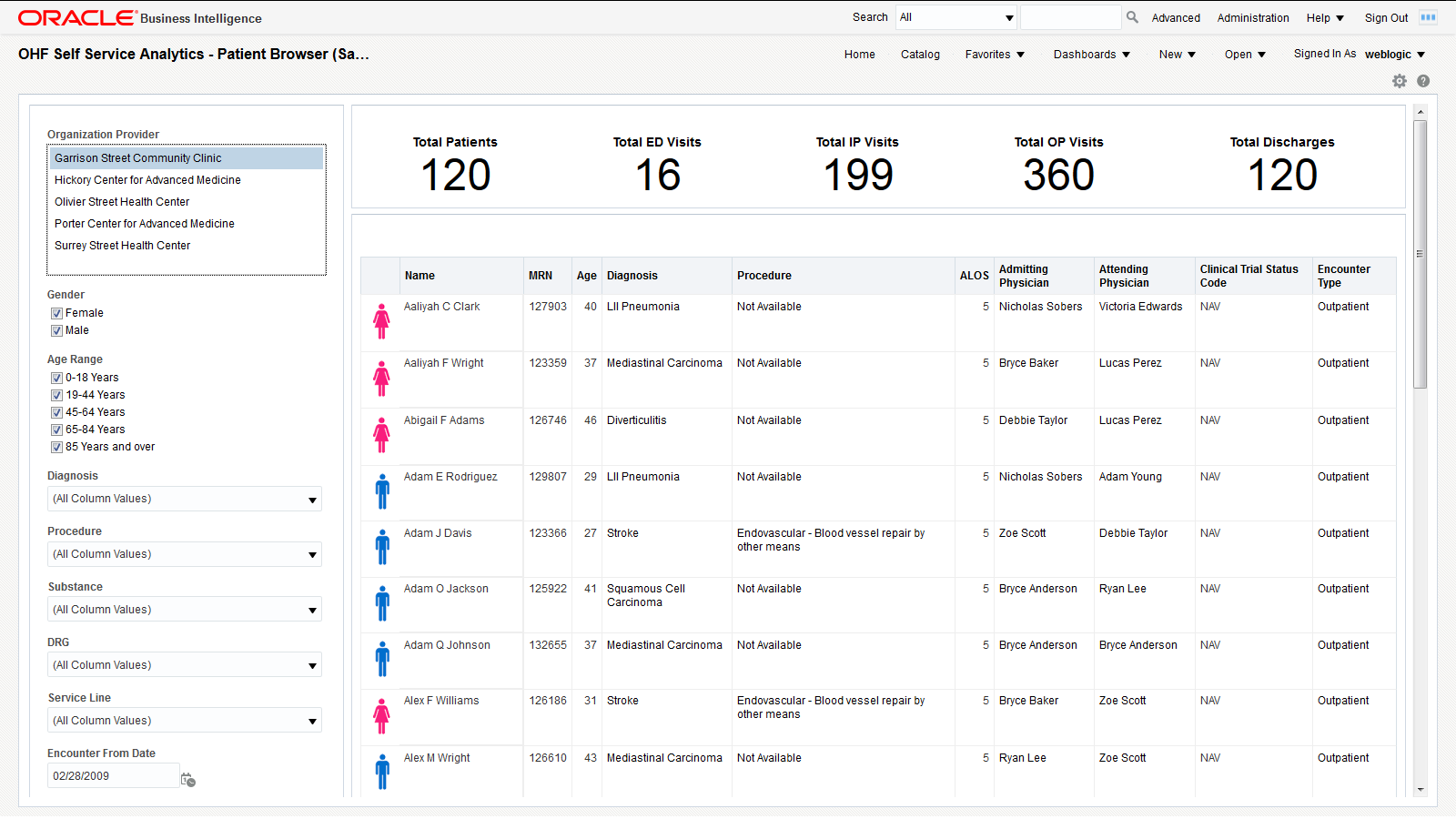
The Patient Browser allows you to create, save, or retrieve queries for a cohort of patients by: demographics, diagnosis, procedure, drug, DRG, service line, etc. Use the panel on the left to select your filtering criteria and click Apply to display the results in the table on the right. A summary count for your results is displayed at the top of the page for the number of patients, visits, and discharges.
2.4 OHF Self Service Analytics - Clinical (Sample) Dashboard
2.4.1 Summary
Figure 10 shows the Summary page.
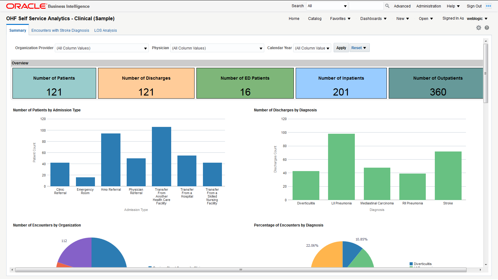
You can use the filters at the top of the page to focus on preferred organization providers, physicians, or calendar years. The page has the following reports:
-
Overview - An overview of counts in a Hospital enterprise including number of the patients, discharges, emergency department patients, inpatients, and outpatients. This helps you to compare the inflow and outflow of patients, and to allocate resources based on the distribution of patient care efforts between emergency, ambulatory and inpatient services.
-
Number of patients or encounters by admission type. This report allows you to see the inflow of patients that go through different admission types (referral, transfer, emergency, etc.) and to adjust your admission operations accordingly.
-
Number of discharges by diagnosis - Modify this report to show the number of discharges for a specific diagnosis of interest. You can correlate this report with the Top 10 Diagnoses report and see if they are proportional. If the number of discharges for a specific diagnosis is trailing, it may indicate a long-term tendency for cases with that specific diagnosis to accumulate in the organization. You may want to investigate such situations and address them.
-
Number of encounters by organization. This report allows you to see the workload distribution between your organizations and plan your staffing, budgeting, and resource allocations accordingly.
-
% of encounters by diagnosis - Modify this report to show the % of encounters for a specific diagnosis of interest. You can use this report to estimate the mix of specialists that you need, based on the workloads that the various types of treatments require.
-
Number of encounters by inpatient and outpatient. The balance between the inpatient and outpatient services you provide may help your organization adjust its focus either on clinics or hospitals.
-
Number of encounters by top 10 diagnosis - Modify this report to show the number of encounters for a specific diagnosis of interest. You can use this report to see which treatments that you provide are the most labor intensive.
-
Number of discharges by year and month on a time series. You can correlate this report with the number of encounters by year-end and see if there are any seasonal slow-downs in treatment delivery.
-
Number of encounters by year and month on a time series. You can use this report to see the long-term trends and seasonal spikes in workload.
-
Number of discharges by ethnicity - Shows a comparative analysis of number of discharges over two years by ethnicity. Modify this report to show the number of discharges for specific years of interest. You can correlate this report with the number of encounters by ethnicity to see if there is a systematic tendency to discharge members of certain ethnic groups after fewer investigations than the baseline.
-
Number of encounters by ethnicity - Shows a comparative analysis of the number of encounters over two years by ethnicity. Modify this report to show the number of encounters for specific years of interest. You can correlate this report with the number of discharges by ethnicity to see if there is a systematic tendency to discharge members of certain ethnic groups after fewer investigations than the baseline.
-
Patient encounter analysis by gender - Shows the workload distribution between male and female patients. You can use this report to plan gender-specific healthcare measures.
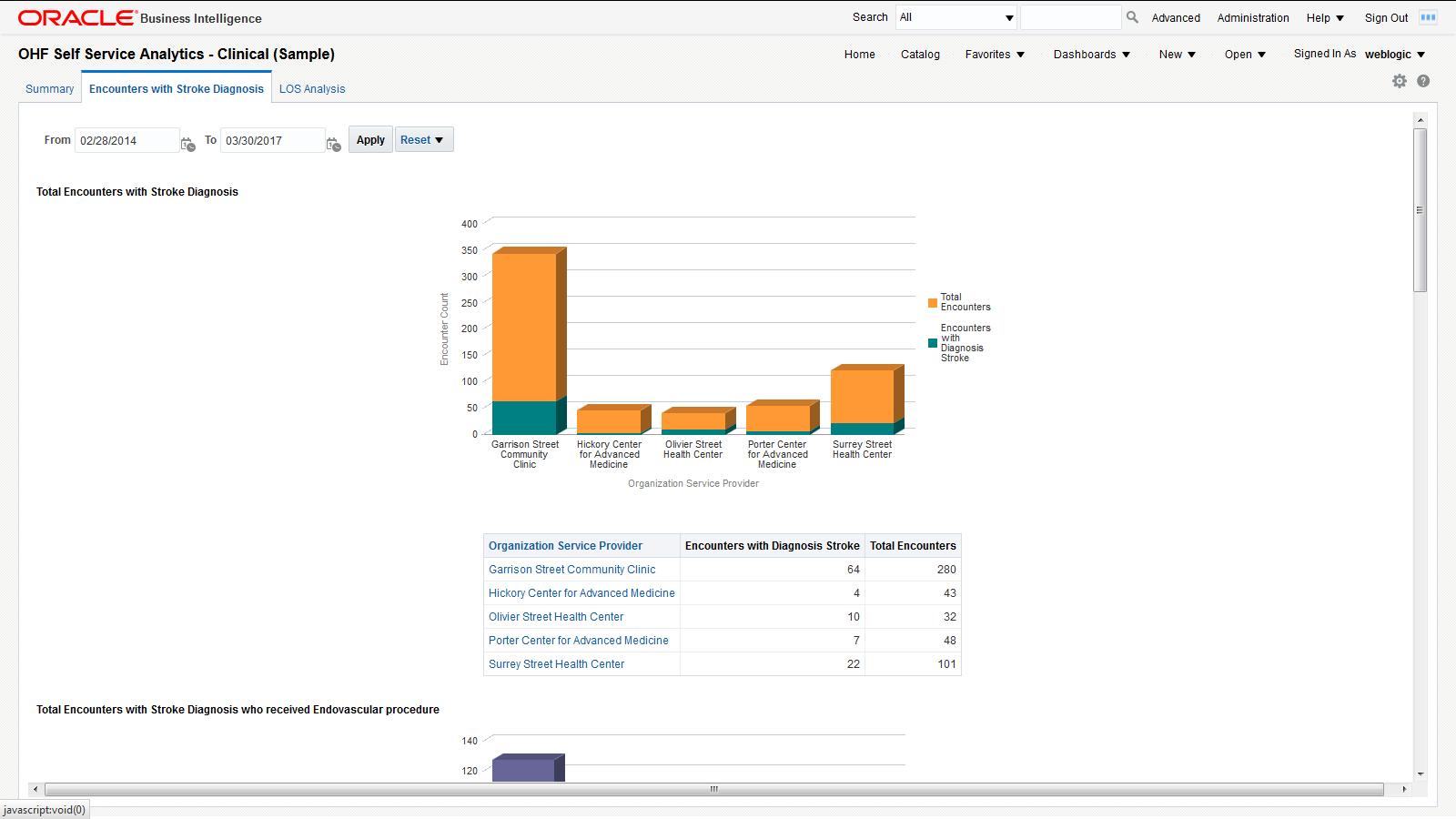
2.4.2 Encounters with Stroke Diagnosis
The Encounters with Stroke Diagnosis page shows a holistic view of the number of encounters in a Healthcare organization for different dimensions such as diagnosis, procedure, and time. It uses the Stroke diagnosis and Endovascular procedure. You can modify the page to use any diagnosis and procedures based on your use case.
You can use the filters at the top of the page to focus on specific time periods. This page has the following reports:
-
Number of encounters with Stroke diagnosis for the chosen time period - Shows the total number of encounters with stroke diagnosis in an organization against the total number of encounters as a whole in an organization. This lets you compare and contrast the volume of encounters in your organizations for a specific diagnosis.
-
Number of encounters with Stroke diagnosis and Endovascular procedure for the chosen time period - Shows the number of encounters with stroke diagnosis and the patients who received endovascular procedure treatment. This lets you evaluate the frequency of endovascular procedures performed on patients who suffered a stroke.
-
Number of encounters with Stroke and Endovascular procedure over a period of time. This report lets you see long-term trends and seasonal spikes for endovascular procedures performed on patients who suffered a stroke.
-
List of Patients Admitted with Stroke Diagnosis who received Endovascular Procedure for Treatment - Tabular report showing the list of patients with Stroke diagnosis who have received endovascular procedure for the chosen time period. This report allows you to drill down to the specifics of each encounter attended by individual patients.
-
Organizations - Encounters and Diagnosis - Tabular report showing monthly encounters for each diagnosis per organization.
2.4.3 LOS Analysis
Figure 12 shows an illustration of the Length of Stay (LOS) Analysis page:
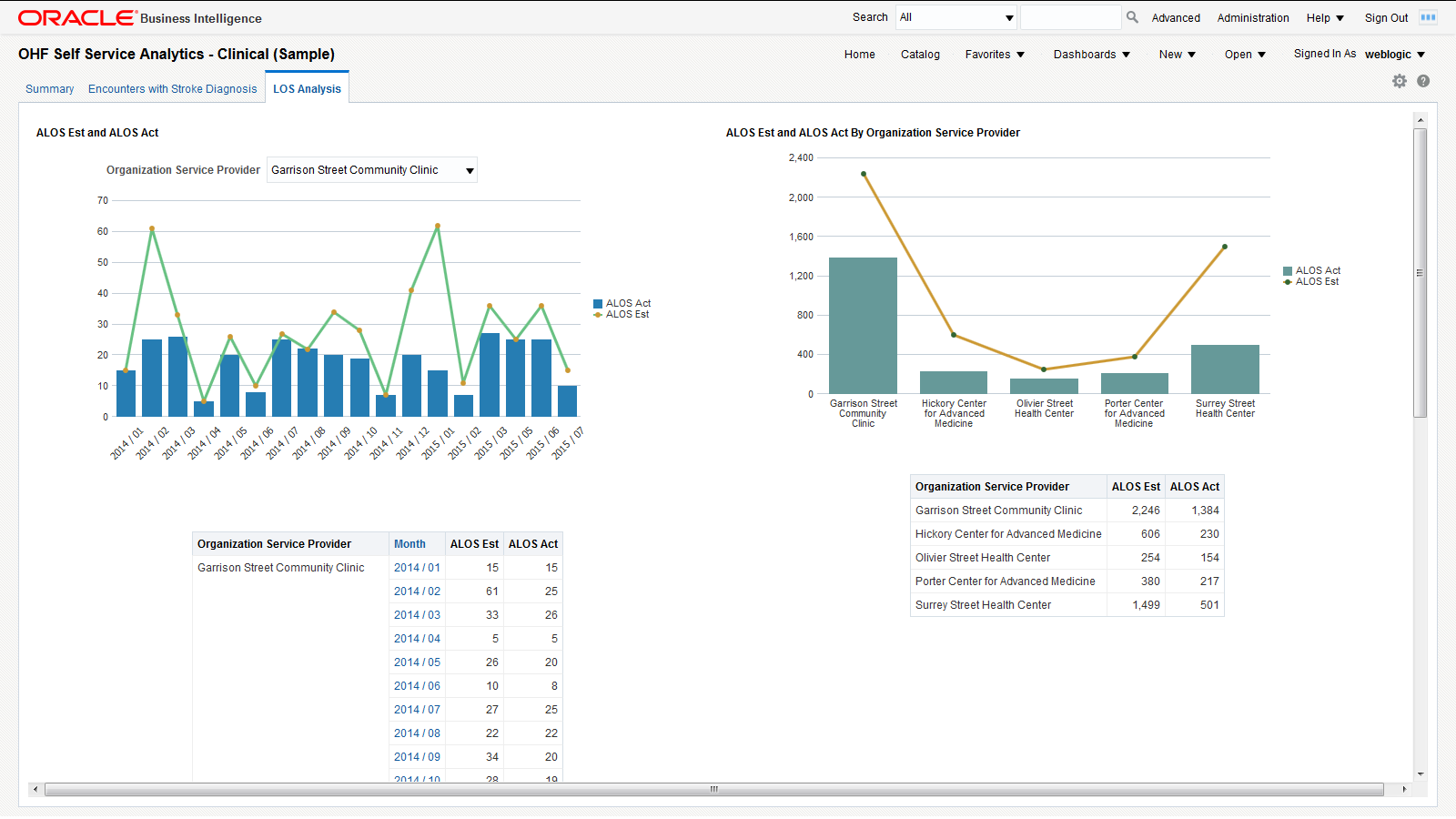
This page has the following reports:
-
Estimated ALOS versus Actual ALOS by time - Comparative analysis report that shows the average estimated LOS and average actual LOS over a period of time filtered by organization service provider. You can use this report to analyze and address issues with your LOS forecasting methodology for an organization service provider.
-
Estimated ALOS versus Actual ALOS by organization - Comparative analysis report that shows the estimated LOS and actual LOS by organization service provider. This report provides insight into the LOS forecasting gaps from each organization service provider.
-
Estimated ALOS versus Actual ALOS by Diagnosis - Comparative analysis report that shows the average estimated LOS and average actual LOS by diagnosis. You can use this report to analyze and address any issues with your LOS forecasting methodology for individual diagnoses.
2.5 OHF Self Service Analytics - Financial (Sample) Dashboard
2.5.1 Reimbursement Analysis
The Reimbursement Analysis page covers the reimbursement amounts for the patient accounts. Figure 13 shows an illustration of reimbursement analysis.
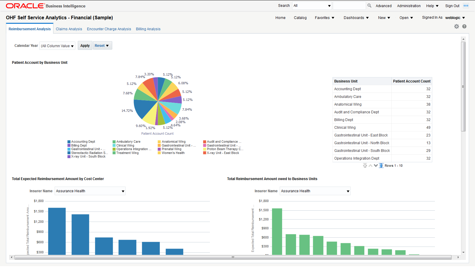
You can use the filter at the top of the page to focus on specific calendar years. This page has the following reports:
-
Number of patient accounts by business unit. This report helps you understand the distribution of patient accounts across business units and it helps in resource planning to manage patient accounts effectively.
-
Total expected reimbursement amount by cost center, filtered by insurer. This report indicates the degree to which each insurer impacts the income of different cost centers.
-
Total reimbursement amount owed to business units, filtered by insurer. This report indicates the degree to which each insurer impacts the income of different business units.
-
A tabular report with patient, patient account, and reimbursement amount details. This report allows you to track the details of all the reimbursements that apply to each patient.
2.5.2 Claims Analysis
The Claims Analysis page is for claim submission. Figure 14 shows an illustration of claims analysis.
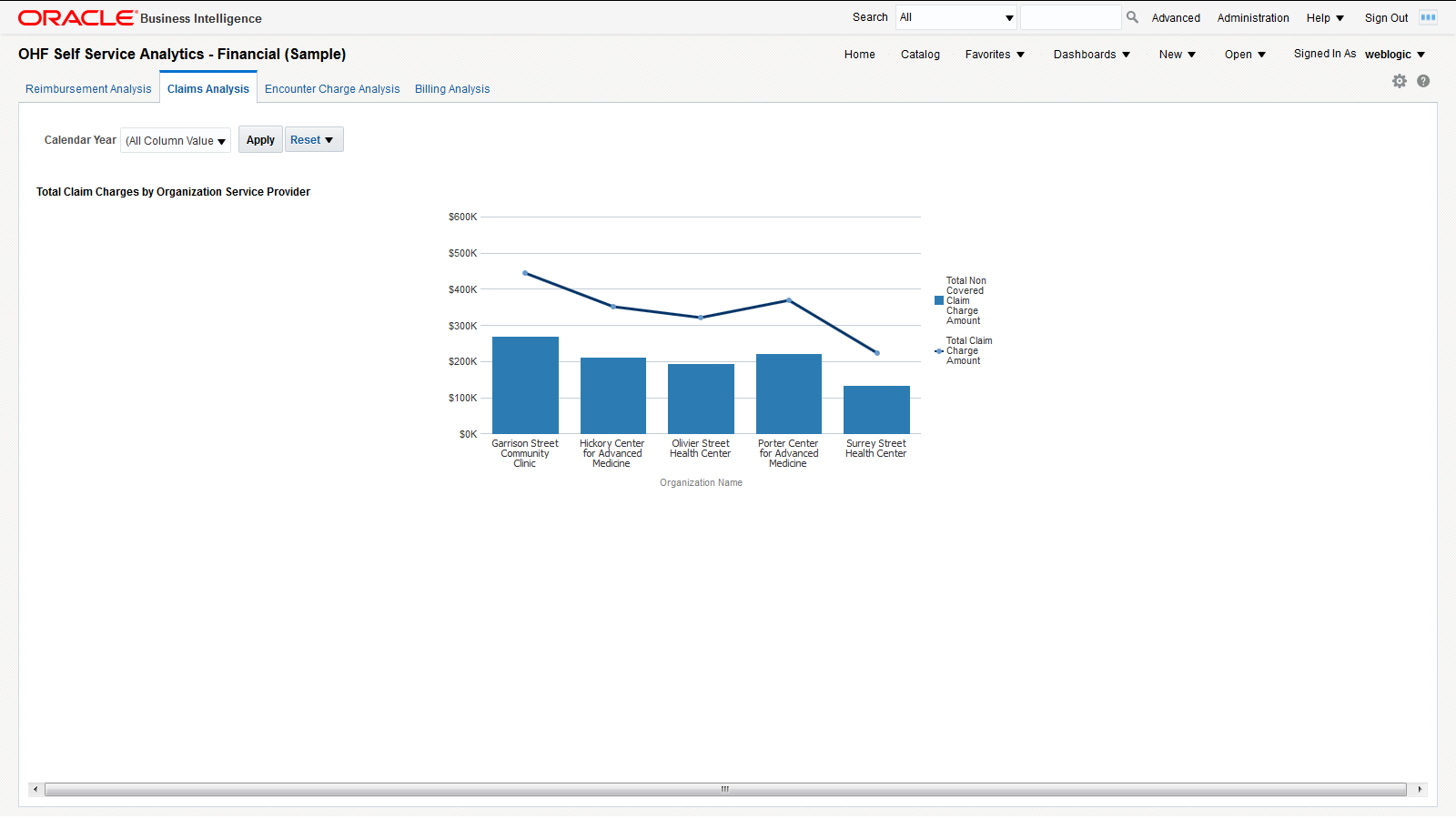
You can use the filter at the top of the page to focus on specific calendar years. This page has the following report:
-
Total claim charge amount versus total non-covered claim charge amount. This report allows you to see the extent to which the charges claimed by each organization service provider are covered by insurers and to evaluate the risk of overdue or delinquent payments.
2.5.3 Encounter Charge Analysis
Figure 15 shows an illustration of encounter charge analysis.
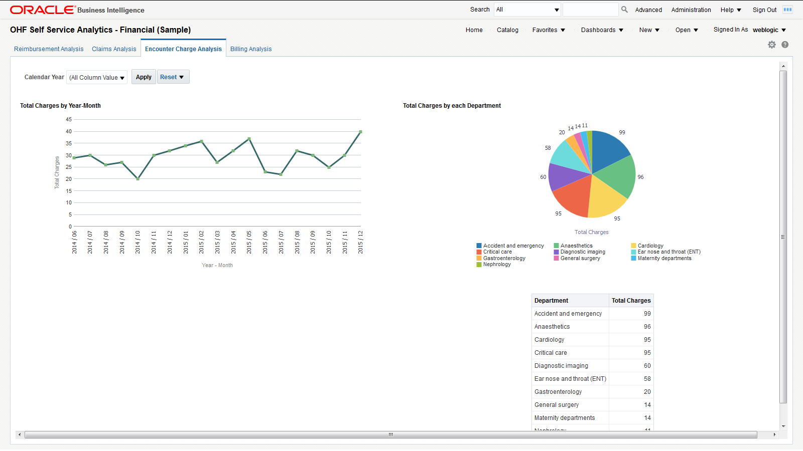
You can use the filter at the top of the page to focus on specific calendar years. This page has the following reports:
-
Total charges over time. This report helps you understand the trend in organization spending for patient services over a chosen period of time.
-
Total charges by department. This report helps you understand the charging distribution between departments.
2.5.4 Billing Analysis
The Billing Analysis page displays comparative billing information for your organizations and detailed bills for individual patients. Figure 16 shows an illustration of billing analysis.
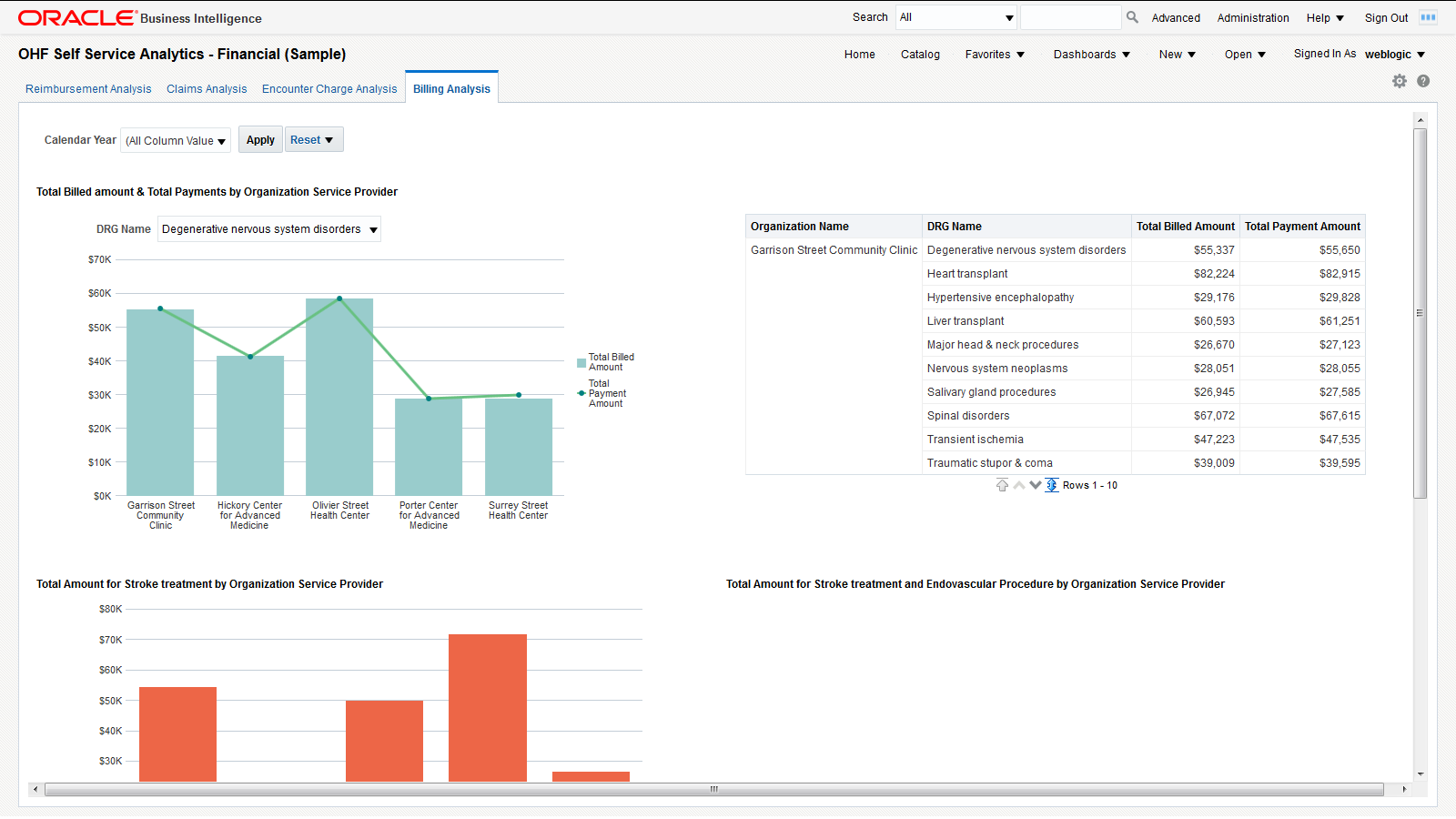
You can use the filter at the top of the page to focus on specific calendar years. This page has the following reports:
-
Total billed amount versus total payment by organization and DRG - Graphical report and a tabular report showing the total billed amount and the total payment by organization filtered by DRG. This report helps you identify costs and payments for patient services specific to each organization based on diagnosis-related groups.
-
Total billed amount for stroke treatment by organization service provider - You can modify this report to use any diagnosis or procedure. This report helps you compare the costs that organization service providers spend on stroke treatments.
-
Total billed amount for stroke and endovascular procedure treatment by organization service provider. This report helps you compare the costs that organization service providers spend on stroke treatments and endovascular procedures.
-
Patient bill details - Tabular report showing the patient bill details for a selected patient account. This report allows you to drill-down to the detailed billing information of individual patients.
3 Documentation Accessibility
For information about Oracle's commitment to accessibility, visit the Oracle Accessibility Program website at http://www.oracle.com/pls/topic/lookup?ctx=acc&id=docacc.
Oracle customers that have purchased support have access to electronic support through My Oracle Support. For information, visit http://www.oracle.com/pls/topic/lookup?ctx=acc&id=info or visit http://www.oracle.com/pls/topic/lookup?ctx=acc&id=trs if you are hearing impaired.
Oracle Healthcare Foundation Sample Dashboards User's Guide, Release 7.1.1
E80487-02
Copyright © 2016, 2017, Oracle and/or its affiliates. All rights reserved.
This software and related documentation are provided under a license agreement containing restrictions on use and disclosure and are protected by intellectual property laws. Except as expressly permitted in your license agreement or allowed by law, you may not use, copy, reproduce, translate, broadcast, modify, license, transmit, distribute, exhibit, perform, publish, or display any part, in any form, or by any means. Reverse engineering, disassembly, or decompilation of this software, unless required by law for interoperability, is prohibited.
The information contained herein is subject to change without notice and is not warranted to be error-free. If you find any errors, please report them to us in writing.
If this is software or related documentation that is delivered to the U.S. Government or anyone licensing it on behalf of the U.S. Government, then the following notice is applicable:
U.S. GOVERNMENT END USERS: Oracle programs, including any operating system, integrated software, any programs installed on the hardware, and/or documentation, delivered to U.S. Government end users are "commercial computer software" pursuant to the applicable Federal Acquisition Regulation and agency-specific supplemental regulations. As such, use, duplication, disclosure, modification, and adaptation of the programs, including any operating system, integrated software, any programs installed on the hardware, and/or documentation, shall be subject to license terms and license restrictions applicable to the programs. No other rights are granted to the U.S. Government.
This software or hardware is developed for general use in a variety of information management applications. It is not developed or intended for use in any inherently dangerous applications, including applications that may create a risk of personal injury. If you use this software or hardware in dangerous applications, then you shall be responsible to take all appropriate fail-safe, backup, redundancy, and other measures to ensure its safe use. Oracle Corporation and its affiliates disclaim any liability for any damages caused by use of this software or hardware in dangerous applications.
Oracle and Java are registered trademarks of Oracle and/or its affiliates. Other names may be trademarks of their respective owners.
Intel and Intel Xeon are trademarks or registered trademarks of Intel Corporation. All SPARC trademarks are used under license and are trademarks or registered trademarks of SPARC International, Inc. AMD, Opteron, the AMD logo, and the AMD Opteron logo are trademarks or registered trademarks of Advanced Micro Devices. UNIX is a registered trademark of The Open Group.
This software or hardware and documentation may provide access to or information about content, products, and services from third parties. Oracle Corporation and its affiliates are not responsible for and expressly disclaim all warranties of any kind with respect to third-party content, products, and services unless otherwise set forth in an applicable agreement between you and Oracle. Oracle Corporation and its affiliates will not be responsible for any loss, costs, or damages incurred due to your access to or use of third-party content, products, or services, except as set forth in an applicable agreement between you and Oracle.