Visualize Data Using Charts and Controls
Use the Visualize panel of Oracle Log Analytics to present search data in a form that helps you better understand and analyze.
Topics:
To export your log search results, see Export Logs.
Familiarize Yourself with Log Explorer
To access Log Explorer, open the navigation menu and click Observability & Management. Under Log Analytics, click Log Explorer.

-
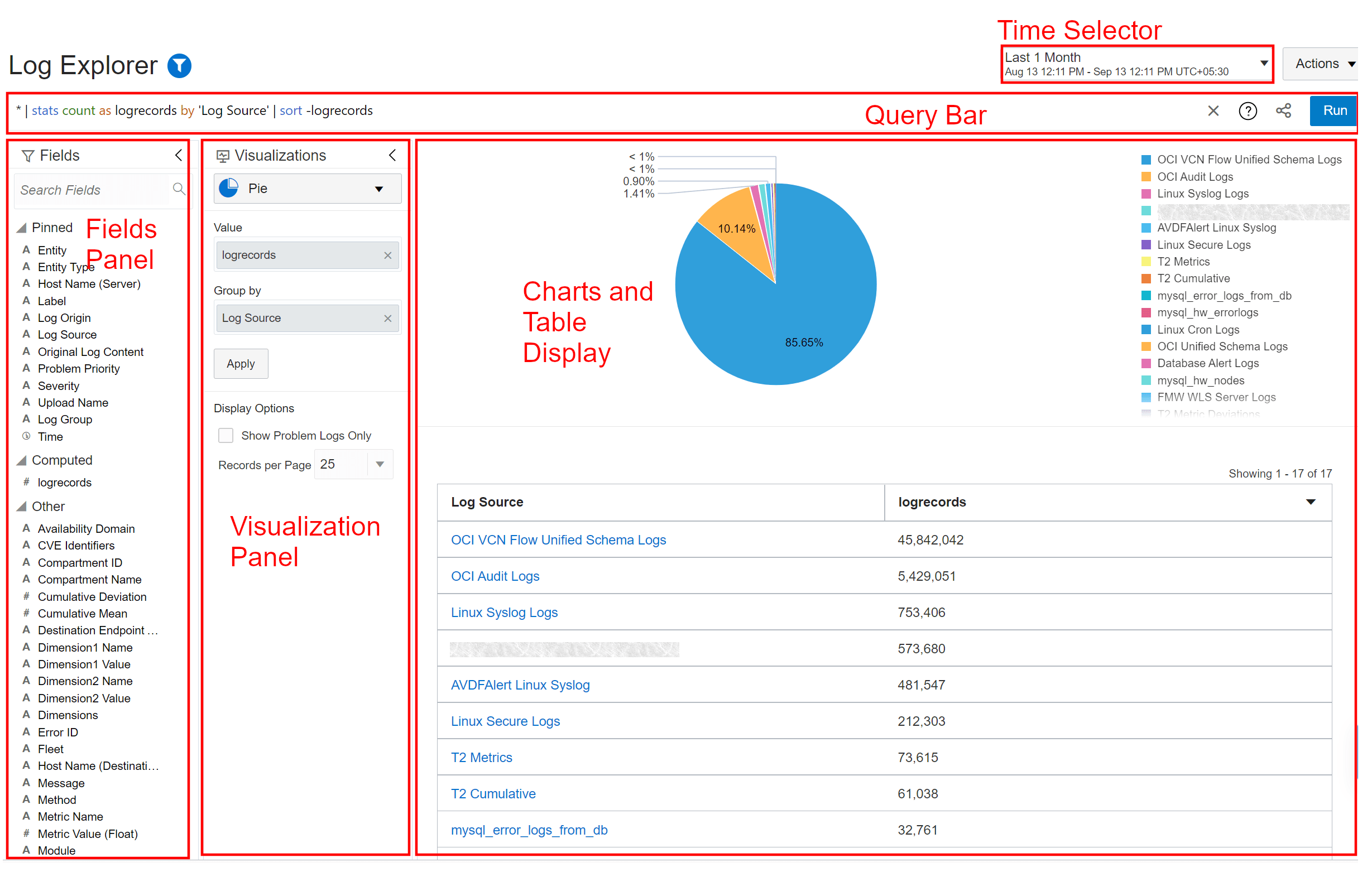
Fields: You can filter the logs using the fields in the log messages. The fields are put into buckets Pinned, Computed, and Other based on your usage. Use the arrow button in the top of the panel to contract the panel for user interface space management. To know more about how you can filter logs using fields, see Filter Logs by Pinned Attributes and Fields.
-
Visualizations: Use this panel to select the type of visualization that best matches your requirement. Use the arrow button in the top of the panel to contract the panel for user interface space management. See Select the Visualization Type.
Additionally, you can select from the options available in the panel to modify your view of the charts and table.
-
Charts and Table: The visualization that you select in the previous panel is displayed here. For tips on optimizing the view, see Customize the Visualization and Important Tips for Working with Log Explorer and Visualizations.
-
Query Bar: Build your custom query to filter the logs and drill down to specific log records. See Query Search.
Click the help icon
 in the query bar to use the Query Help Wizard and quickly learn to
write queries and for a vast set of example queries for advanced analysis.
See Use Query Help Wizard.
-
Time Selector: Use the time selector to select the time range in which the logs were collected. Use the arrow buttons to shift the time left or right. Your current selection of time determines the amount of time shifted. For example, if your current selection is
Last 60 mins, then the amount of time shifted is 60 minutes. If you are usingLast 24 hours, then the amount of time shifted is 24 hours.
Use the Scope Filter ![]() in the top left corner of Log Explorer to set the global context for the
resources like log group compartment, region, and entities. This context is
maintained when you switch between Dashboards and Log Explorer.
in the top left corner of Log Explorer to set the global context for the
resources like log group compartment, region, and entities. This context is
maintained when you switch between Dashboards and Log Explorer.
Customize the Visualization
Consider a situation where you’ve performed a search operation on your log data either by using the Search field or by using the target or field attributes. Now, you want to visualize the search results in a specific format for analysis.
In this section, you’ll refer to the search results, and use the Visualize panel of Oracle Log Analytics to represent the search data in the required format.
Drag the Fields and Visualizations palettes to increase or decrease their size for better visualization with the charts.
To visualize the search results generated for analyzing the log data over the last 30 days:
-
Open the navigation menu and click Observability & Management. Under Log Analytics, click Log Explorer.
-
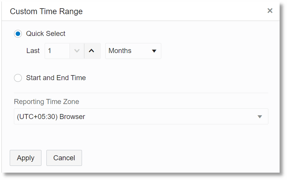
Select the time range Last 1 month.

-
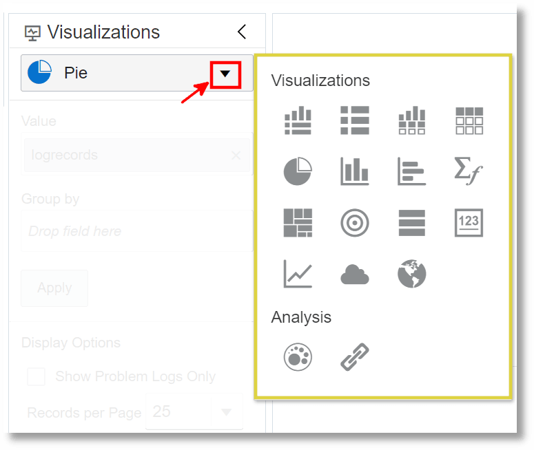
In the Visualizations panel, click the visualization options.

-
Select any simple visualization such as Table With Histogram (
 ).
).
The data is represented in the form of a table with histogram.

Important Tips for Working with Log Explorer and Visualizations
For Log Explorer:
-
To copy your current context in the Log Explorer like query, time range, scope filter, options, and the choice of visualization, click the Actions menu in the right top corner, and select Copy query URL. Alternatively, click the Copy query URL icon
 in the query bar. You can use this URL to open the Log Explorer in
a different browser or tab with all your preferences such as time range,
scope filter settings, and search query. For more information about the URL
parameters, see Log Explorer URL Parameters.
-
To return to your previous view, click the browser back button.
-
If you run a query that needs to fetch data for a long duration, such as the last 7 days or the last 1 month, then Oracle Log Analytics may take some time to display the entire result set in the selected visualization. In this case, Oracle Log Analytics keeps updating the visualization until the query has finished running.
For Visualizations:
-
Click Show Log Scale to view the smaller values that aren’t otherwise visible on the chart. The option is made available when Oracle Log Analytics detects there are small set of logs that are not visible in the current visualization. It's a useful option to highlight small values.
-
When the data collection is in progress, the display on the chart might be incomplete. There’s a drop-off in the visualization for the incoming data. This can be observed on any of the charts of Oracle Log Analytics that involve real-time display of incoming data.
-
In the Records table in the visualizations like Records with Histogram, Records, Table with Histogram, and Table, you can add extended field definition or label to a log source inline. Typically, extended field definition and label are added to the source while creating it or by editing the source. However, now you can create them inline when you are analyzing your logs in the Log Explorer. First, identify the field in the log record that can be used to create the extended field definition or label. Next, you can add the extended field definition or label in one of the two ways:
-
Click the Actions icon
 in the row which corresponds to the log record that has the
field. Click Add extended field definition or Add
label. The corresponding dialog box opens.
In the Add extended field definition dialog box, Original Log Content is selected as the Base Field. Define the Extract expression for the extended field definition. For more information about using extended field definition in a source, see Use Extended Fields in Sources.
In the Add label dialog box, Original Log Content is selected as the Input Field. Provide the values for other parameters to define the label. For more information about those parameters, see Create a Label.
-
Expand the row which corresponds to the log record that has the field. Click on the field and select Add extended field definition or Add label. The corresponding dialog box opens.
In the Add extended field definition dialog box, the field that you clicked on earlier is selected as the Base Field. Complete the form for extracting the extended field definition.
Similarly, in the Add label dialog box, the field that you clicked on earlier is selected as the Input Field. Specify the output value for the label.
Note that while adding the extended field definition, if the field that you clicked on earlier is not a base parser field, then the field Original Log Content is selected. Similarly, while adding the label, if the field is not a base parser field or an extended field definition, then the field Original Log Content is selected. Base parser fields are those fields which are identified and mapped to their values in the example log content while creating a parser. See Create a Parser.
-
-
To view the error details in the Records table in the visualizations like Records with Histogram, Records, Table with Histogram, and Table, first edit the query to display the log records with
Error IDinformation as follows and run the query:'Error ID' != null | timestats count as logrecords by 'Log Source'The
Error IDis now displayed in the table under the Original Log Content column. Hover your cursor over theError IDto view more details about the error. -
For a flatter view of the log records in the Records table in the visualizations like Records with Histogram and Records, click No Wrap. Otherwise, the records table content is wrapped to fit in your screen.
-
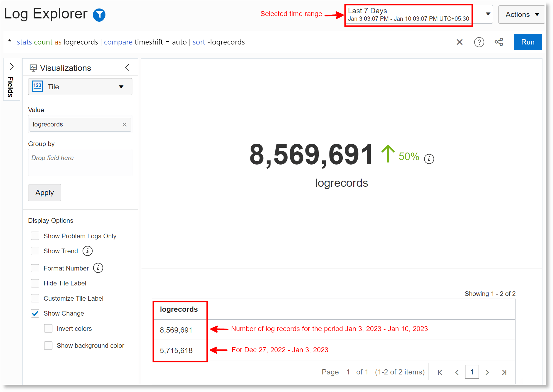
In the Tile visualization, you can compare the search results across multiple time frames. From the display options, select Show Change. Based on your selection of the time range in the time selector, the results are generated for the current time range and the previous one of the same size. For example, if your selection of the time range is Last 60 minutes, then the comparison shows the change of the value between Last 60 to 120 minutes and Last 60 minutes. For the details of the
comparecommand, and an example of the timeshift operation, see compare.In the following example, the current time range selected is Last 7 Days:

Accessibility Tips
- Working with Tables
In tables that support the Select All option, if you want to check the Select All check box using the keyboard, then press F2.
- Maps
To scroll the map using the keyboard, use the arrow keys.
- Query Syntax Highlighting
By default, the query syntax is highlighted in the query bar using colors. If you want to switch to using Black and White colors for queries, then click the Search Help
 icon in the query bar, click Syntax Highlighting, and click
Black & White.
- Word Cloud
In Word Cloud visualization, to use a keyboard for selecting the words, use CTRL+arrow keys. If you are on the largest word, then use CTRL+down to switch to other words.
- Histogram
In any histogram, to use a keyboard to scroll across the histogram points, use CTRL+right/left arrow keys. Also, use CTRL+up/down arrow keys to scroll up and down each series while in the chart.