15 Creating a Calendar Application
This chapter describes how to use the ADF Faces calendar component to create a calendar application.
This chapter includes the following sections:
15.1 Introduction to Creating a Calendar Application
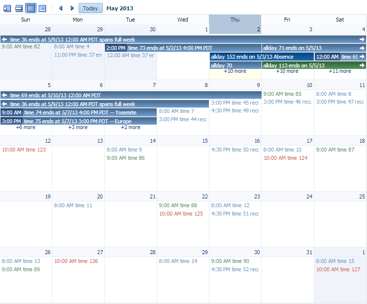
ADF Faces includes a calendar component that displays activities in daily, weekly, monthly, or list views for a given provider or providers (a provider is the owner of an activity).
Note:
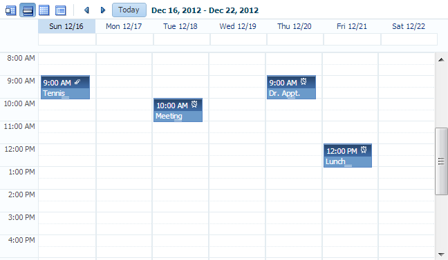
Printing is possible in the printable page mode for all types of views and the scrollbars will be dropped in the printed file.Figure 15-1 shows an ADF Faces calendar in weekly view mode with some sample activities.
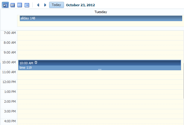
You can configure the calendar so that it only displays a subset of those views. For example, you may not want your calendar to use the month and list views. You can configure it so that only the day and week views are available, as shown in Figure 15-2. Because only day and week views are available, those are the only buttons displayed in the toolbar.
By default, the calendar displays dates and times based on the locale set in the trinidad-config.xml file (see Section A.6, "Configuration in trinidad-config.xml"). If a locale is not specified in that file, then it is based on the locale sent by the browser. For example, in the United States, by default, the start day of the week is Sunday, and 2 p.m. is shown as 2:00 PM. In France, the default start day is Monday, and 2 p.m. is shown as 14:00. The time zone for the calendar is also based on the setting in trinidad-config.xml. You can override the default when you configure the calendar. For more information, see Section 15.3, "Configuring the Calendar Component."
The calendar uses the CalendarModel class to display the activities for a given time period. You must create your own implementation of the model class for your calendar. If your application uses the Fusion technology stack, then you can create ADF Business Components over your data source that represents the activities, and the model will be created for you. You can then declaratively create the calendar, and it will automatically be bound to that model. For more information, see the "Using the ADF Faces Calendar Component" section of the Oracle Fusion Middleware Fusion Developer's Guide for Oracle Application Development Framework.
If your application does not use the Fusion technology stack, then you create your own implementation of the CalendarModel class and the associated CalendarActivity and CalendarProvider classes. The classes are abstract classes with abstract methods. You must provide the functionality behind the methods, suitable for your implementation of the calendar. For more information, see Section 15.2, "Creating the Calendar."
The calendar includes a toolbar with built-in functionality that allows a user to change the view (between daily, weekly, monthly, or list), go to the previous or next day, week, or month, and return to today. The toolbar is fully customizable. You can choose which buttons and text to display, and you can also add buttons or other components. For more information, see Section 15.5, "Customizing the Toolbar."
Tip:
When these toolbar buttons are used, attribute values on the calendar are changed. You can configure these values to be persisted so that they remain for the user during the duration of the session. For more information, see Chapter 34, "Allowing User Customization on JSF Pages."You can also configure your application so that the values will be persisted and used each time the user logs into the system. For this persistence to take place, your application must use the Fusion technology stack. For more information, see the "Allowing User Customizations at Runtime" chapter of the Oracle Fusion Middleware Fusion Developer's Guide for Oracle Application Development Framework.
The calendar component displays activities based on those activities and the provider returned by the CalendarModel class. By default, the calendar component is read-only. That is, it can display only those activities that are returned. You can add functionality within supported facets of the calendar so that users can edit, create, and delete activities. When certain events are invoked, popup components placed in these corresponding facets are opened, which can allow the user to act on activities or the calendar.
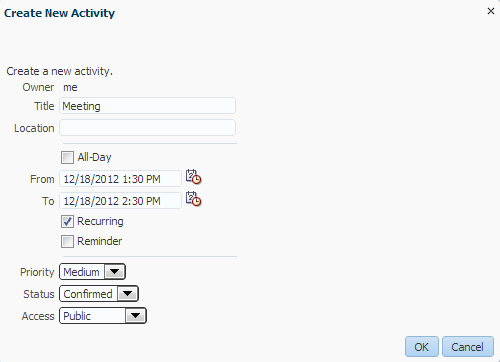
For example, when a user clicks on an activity in the calendar, the CalendarActivityEvent is invoked and the popup component in the ActivityDetail facet is opened. You might use a dialog component that contains a form where users can view and edit the activity, as shown in Figure 15-3.
For more information about implementing additional functionality using events, facets, and popup components, see Section 15.4, "Adding Functionality Using Popup Components."
The calendar component supports the ADF Faces drag and drop architectural feature. Users can drag activities to different areas of the calendar, executing either a copy or a move operation, and can also drag handles on the activity to change the duration of the activity. For more information about adding drag and drop functionality, see Section 35.7, "Adding Drag and Drop Functionality to a Calendar."
By default, the calendar displays activities using a blue color ramp. A color ramp is a set of colors in a color family and is used to represent the different states of activities. In the default calendar, for a short-duration activity shown in the daily view, the time of an activity is shown with a dark blue background, while the title of the activity is shown with a light blue background, as shown in Figure 15-1. You can customize how the activities are displayed by changing the color ramp.
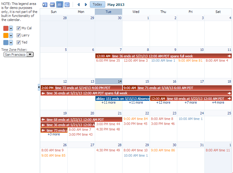
Each activity is associated with a provider, that is, an owner. If you implement your calendar so that it can display activities from more than one provider, you can also style those activities so that each provider's activity shows in a different color, as shown in Figure 15-4.
15.2 Creating the Calendar
Before you can add a calendar component to a page, you must implement the logic required by the calendar in Java classes that extend ADF Faces calendar abstract classes. For an ADF Faces application, create the classes as managed beans. After you create the classes, you can add the calendar to a page.
Note:
If your application uses the Fusion technology stack, implement the calendar classes using ADF Business Components. This will allow you to declaratively create and bind your calendar component. For more information, see the "Using the ADF Faces Calendar Component" section of the Oracle Fusion Middleware Fusion Developer's Guide for Oracle Application Development Framework.Before you implement your logic, it helps to have an understanding of the CalendarModel and CalendarActivity classes, as described in the following section.
15.2.1 Calendar Classes
The calendar component must be bound to an implementation of the CalendarModel class. The CalendarModel class contains the data for the calendar. This class is responsible for returning a collection of calendar activities, given the following set of parameters:
-
Provider ID: The owner of the activities. For example, you may implement the
CalendarModelclass such that the calendar can return just the activities associated with the owner currently in session, or it can also return other owners' activities. -
Time range: The expanse of time for which all activities that begin within that time should be returned. A date range for a calendar is inclusive for the start time and exclusive for the end time (also known as half-open), meaning that it will return all activities that intersect that range, including those that start before the start time, but end after the start time (and before the end time).
A calendar activity represents an object on the calendar, and usually spans a certain period of time. The CalendarActivity class is an abstract class whose methods you can implement to return information about the specific activities.
Activities can be recurring, have associated reminders, and be of a specific time type (for example, hour or minute). Activities can also have start and end dates, a location, a title, and a tag.
The CalendarProvider class represents the owner of an activity. A provider can be either enabled or disabled for a calendar.
15.2.2 How to Create a Calendar
Create your own implementations of the CalendarModel and CalendarActivity classes and implement the abstract methods to provide the logic.
To create the calendar model classes:
-
Create a managed bean that will hold logic for the calendar. This bean must:
-
Extend the
oracle.adf.view.rich.model.CalendarModelclass. -
Implement the abstract methods.
For more information about the
CalendarModelclass, see the ADF Faces Javadoc. -
Implement any other needed functionality for the calendar. For example, you might add logic that sets the time zone, as in the
oracle.adfdemo.view.calendar.rich.model.DemoCalendarBeanmanaged bean in the ADF Faces demo application (for more information about the demo application, see Section 1.4, "ADF Faces Demonstration Application").
For more information about creating managed beans, see Section 2.6, "Creating and Using Managed Beans."
-
-
Create a managed bean that will hold logic for the activities. This bean must:
-
Extend the
oracle.adf.view.rich.model.CalendarActivityclass. -
Implement the abstract methods.
-
Implement any other required functionality for the calendar. As an example, see the
oracle.adfdemo.view.calendar.rich.model.DemoCalendarActivitymanaged bean in the ADF Faces demo application.Tip:
If you want to style individual instances of an activity (for example, if you want each provider's activities to be displayed in a different color), then thegetTagsmethod must return a string that represents the activity instance. For more information, see Section 15.6.1, "How to Style Activities."
-
-
Create a managed bean that will hold information and logic for providers.
-
Extend the
oracle.adf.view.rich.model.CalendarProviderclass. -
Implement the abstract methods.
-
Implement any other required functionality for the provider.
-
To create the calendar component:
-
In the Component Palette, from the Common Components section, drag a Calendar and drop it onto a JSF page.
Tip:
Thecalendarcomponent can be stretched by any parent component that can stretch its children. If the calendar is a child component to a component that cannot be stretched, it will use a default width and height, which cannot be stretched by the user at runtime. However, you can override the default width and height using inline style attributes. For more information about the default height and width, see Section 15.3, "Configuring the Calendar Component." For more information about stretching components, see Section 8.2.1, "Geometry Management and Component Stretching." -
Expand the Calendar Data section of the Property Inspector, and enter an EL expression for Value that resolves to the managed bean that extends the
CalendarModelclass.
15.3 Configuring the Calendar Component
Configure the many display attributes for the calendar, for example, the day that a week starts, and the time displayed at the beginning of a day.
15.3.1 How to Configure the Calendar Component
You configure the calendar using the Property Inspector.
-
In the Property Inspector, view the attributes for the calendar. Use the Help button to display the complete tag documentation for the
calendarcomponent. -
With the
calendarcomponent selected, expand the Common section of the Property Inspector, and set the following:-
AvailableViews: Select the available views. The value can be one of or a combination of the following:
-
month -
week -
day -
list -
all
If you want to enter more than one value, enter the values with a space between. For example, if you want the calendar to use day and week views, you would enter the following:
day week
Note:
Ifallis entered, then all views are available, regardless if one is left out of the list.The corresponding buttons will automatically be displayed in the toolbar, in the order they appear in the list.
Note:
In order to handle an overflow of tasks for a given day in themonthview, if you entermonthand do not also enterall, then you must also enterday. -
-
View: Select the view (either
day,list,month, orweek) that should be the default when the calendar is displayed. Users change this value when they click the corresponding button in the calendar's toolbar. -
StartDayOfWeek: Enter the day of the week that should be shown as the starting day, at the very left in the monthly or weekly view. When not set, the default is based on the user's locale. Valid values are:
-
sun -
mon -
tue -
wed -
thu -
fri -
sat
-
-
StartHour: Enter a number that represents the hour (in 24 hour format, with 0 being midnight) that should be displayed at the top of the day and week view. While the calendar (when in
dayorweekview) starts the day at 12:01 a.m., the calendar will automatically scroll to thestartHourvalue, so that it is displayed at the top of the view. The user can always scroll above that time to view activities that start before thestartHourvalue. -
ListType: Select how you want the
listview to display activities. Valid values are:-
day: Shows activities only for the active day. -
dayCount: Shows a number of days including the active day and after, based on the value of thelistCountattribute. -
month: Shows all the activities for the month to which the active day belongs. -
week: Shows all the activities for the week to which the active day belongs.
-
-
ListCount: Enter the number of days' activities to display (used only when the
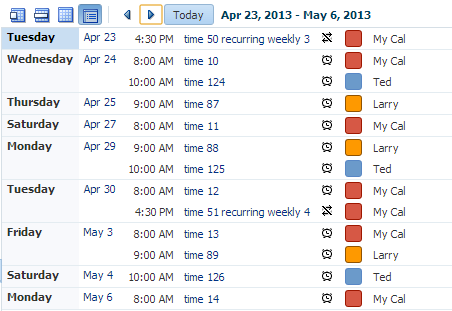
listTypeattribute is set todayCount).Figure 15-5 shows a calendar in list view with the
listTypeset todayCountand thelistCountvalue set to14.
-
-
Expand the Calendar Data section of the Property Inspector, and set the following:
-
ActiveDay: Set the day used to determine the date range that is displayed in the calendar. By default, the active day is today's date for the user. Do not change this if you want today's date to be the default active day when the calendar is first opened.
Note that when the user selects another day, this becomes the value for the
activeDayattribute. For example, when the user first accesses the calendar, the current date is the active day. The user can select another day to be the active day by clicking on the day link in the month view. The active day also changes when the user selects a different month or year. -
TimeZone: Set the time zone for the calendar. If not set, the value is taken from
AdfFacesContext. The valid value is ajava.util.TimeZoneobject.
-
-
Expand the Appearance section of the Property Inspector and set the following:
-
AllDayActivityOrder: Control the display of all-day activities by specifying a list of strings that correspond to tags on the activities. Activities will be grouped by tags and display in the order specified by
allDayActivityOrder. Activities without any tags, or whose tags are not listed in allDayActivityOrder, will display together in a default group.Within each group, the calendar displays rows with the most activities first. For example, if
allDayActivityOrder = "holiday absence", then all-day activities will be displayed in this order:-
Activities with the
holidaytag -
Activities with the
absencetag -
Activities with no tags
-
-
HourZoom: Set the zoom factor for time cells to be displayed in the calendar. The zoom factor applies to the height of the hour in
dayorweekview. Valid values are auto or a non-zero positive number (including fractions). By default, the value is1.A value greater than
1will scale up the calendar by the specified factor. For example, a value of2will scale up the calendar by 200%. A value of0.5will scale down the calendar by 50%. When set toautothe calendar will scale by an optimal factor for best viewing, ensuring that tightly scheduled non-overlapping activities will not display overlapping each other for lack of vertical space. -
TimeSlotsPerHour: Set the number of time slots to display per hour in day or week view. Time slots are minor divisions per hour, indicated by a dotted line splitting the hour into shorter intervals. For example, the value
4will render four time slots per hour, measuring 15 minutes each. Valid values are auto or a non-zero positive whole number. By default, the value is auto.When set to auto the calendar will use the skin property
-tr-time-slots-per-hour. For example,af|calendar {-tr-time-slots-per-hour: 4}will render a minor division (dotted line) at 15-minute intervals.
-
-
If you want the user to be able to drag and resize the calendar regions, expand the Other section of the Property Inspector and set the
splitterCollapsedandsplitterPositionattributes. The splitter separates the all-day and timed activities areas in the day and week views of the calendar (it has no effect in month and list views). By default splitterCollapsed isfalse, which means that both the all-day and timed activities areas are displayed. When the splitter is collapsed (splitterCollapsed =true), the all-day activities area is hidden and the timed activities area stretches to fill all available vertical space. ThesplitterPositionattribute specifies the initial height in pixels of the all-day activities area; the timed activities area gets the remaining space. Valid values areautoor a non-zero positive whole number. By default, the value isauto. For more information, see the tag documentation for thecalendarcomponent. -
If you want the user to be able to drag a handle on an existing activity to expand or collapse the time period of the activity, then implement a handler for
CalendarActivityDurationChangeListener. This handler should include functionality that changes the end time of the activity. If you want the user to be able to move the activity (and, therefore, change the start time as well as the end time), then implement drag and drop functionality. For more information, see Section 35.7, "Adding Drag and Drop Functionality to a Calendar."
You can now add the following functionality:
-
Create, edit, and delete activities using popup components. For more information, see Section 15.4, "Adding Functionality Using Popup Components."
-
Move activities around on the calendar. For more information, see Section 35.7, "Adding Drag and Drop Functionality to a Calendar."
-
Change or add to the toolbar buttons in the toolbar. For more information, see Section 15.5, "Customizing the Toolbar."
-
Change the appearance of the calendar and events. For more information, see Section 15.6, "Styling the Calendar."
15.3.2 What Happens at Runtime: Calendar Events and PPR
The calendar has two events that are used in conjunction with facets to provide a way to easily implement additional functionality needed in a calendar, such as editing or adding activities. These two events are CalendarActivityEvent (invoked when an action occurs on an activity) and CalendarEvent (invoked when an action occurs on the calendar itself). For more information about using these events to provide additional functionality, see Section 15.4, "Adding Functionality Using Popup Components."
The calendar also supports events that are fired when certain changes occur. The CalendarActivityDurationChangeEvent is fired when the user changes the duration of an activity by dragging the box that displays the activity. The CalendarDisplayChangeEvent is fired when the value of a display attribute changes. For example, if a user changes the view attribute from day to month, the calendar is rerendered automatically because the calendar component becomes a partial page rendering (PPR) target, triggering an immediate refresh
15.4 Adding Functionality Using Popup Components
When a user acts upon an activity, a CalendarActivityEvent is fired. This event causes the popup component contained in a facet to be displayed, based on the user's action. For example, if the user right-clicks an activity, the CalendarActivityEvent causes the popup component in the activityContextMenu to be displayed. The event is also delivered to the server, where a configured listener can act upon the event. You create the popup components for the facets (or if you do not want to use a popup component, implement the server-side listener). It is in these popup components and facets where you can implement functionality that will enable users to create, delete, and edit activities, as well as to configure their instances of the calendar.
Table 15-1 shows the different user actions that invoke events, the event that is invoked, and the associated facet that will display its contents when the event is invoked. The table also shows the component you must use within the popup component. You create the popup and the associated component within the facet, along with any functionality implemented in the handler for the associated listener. If you do not insert a popup component into any of the facets in the table, then the associated event will be delivered to the server, where you can act on it accordingly by implementing handlers for the events.
Table 15-1 Calendar Faces Events and Associated Facets
| User Action | Event | Associated Facet | Component to Use in Popup |
|---|---|---|---|
|
Right-click an activity. |
|
|
|
|
Select an activity and press the Delete key. |
|
|
|
|
Click or double-click an activity, or select an activity and press the Enter key. |
|
|
|
|
Hover over an activity. |
|
|
|
|
Right-click the calendar (not an activity or the toolbar). |
|
|
|
|
Click or double-click any free space in the calendar (not an activity). |
|
|
|
15.4.1 How to Add Functionality Using Popup Components
To add functionality, create the popups and associated components in the associated facets.
To add functionality using popup components:
-
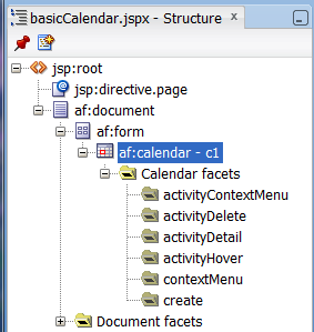
In the Structure window, expand the af:calendar component node so that the calendar facets are displayed, as shown in Figure 15-6.
-
Based on Table 15-1, create popup components in the facets that correspond to the user actions for which you want to provide functionality. For example, if you want users to be able to delete an activity by clicking it and pressing the Delete key, you add a popup dialog to the
activityDeletefacet.To add a popup component, right-click the facet in the Structure window and choose Insert inside
facetName> Popup.For more information about creating popup components, see Chapter 13, "Using Popup Dialogs, Menus, and Windows."
Example 15-1 shows the JSF code for a dialog popup component used in the
activityDeletefacet.Example 15-1 JSF Code for an Activity Delete Dialog
<f:facet name="activityDelete">
  <af:popup id="delete" contentDelivery="lazyUncached">
    <!-- don't render if the activity is null -->
    <af:dialog dialogListener="#{calendarBean.deleteListener}"
               affirmativeTextAndAccessKey="Yes" cancelTextAndAccessKey="No"
               rendered="#{calendarBean.currActivity != null}">
      <af:outputText value="NOTE: This popup is for demo purposes only,
                  it is not part of the built in functionality of the calendar."/>
      <af:spacer height="20"/>
      <af:outputText value="Are you sure you want to delete this activity?"/>
      <af:panelFormLayout>
        <af:inputText label="Title" value="#{calendarBean.currActivity.title}"
                       readOnly="true"/>
        <af:inputDate label="From" value="#{calendarBean.currActivity.from}"
                      readOnly="true">
          <af:convertDateTime type="date" dateStyle="short"
                              timeZone="#{calendarBean.timeZone}"
                           pattern="#{calendarBean.currActivity.dateTimeFormat}"/>
        </af:inputDate>
        <af:inputDate label="To" value="#{calendarBean.currActivity.to}"
                      readOnly="true">
          <af:convertDateTime type="date" dateStyle="short"
                              timeZone="#{calendarBean.timeZone}"
                           pattern="#{calendarBean.currActivity.dateTimeFormat}"/>
        </af:inputDate>
        <af:inputText label="Location" readOnly="true"
                      rendered="#{calendarBean.currActivity.location != null}"
                      value="#{calendarBean.currActivity.location}"/>
      </af:panelFormLayout>
    </af:dialog>
  </af:popup>
</f:facet>
Figure 15-7 shows how the dialog is displayed when a user clicks an activity and presses the Delete key.
-
Implement any needed logic for the
calendarActivityListener. For example, if you are implementing a dialog for theactivityDeleteFacet, then implement logic in thecalendarActivityListenerthat can save-off the current activity so that when you implement the logic in the dialog listener (in the next step), you will know which activity to delete. Example 15-2 shows thecalendarActivityListenerfor thecalendar.jspxpage in the ADF Faces demo application.Example 15-2 calendarActivityListener Handler
public void activityListener(CalendarActivityEvent ae) { CalendarActivity activity = ae.getCalendarActivity(); if (activity == null) { // no activity with that id is found in the model System.out.println("No activity with event " + ae.toString()); setCurrActivity(null); return; } System.out.println("providerId is " + activity.getProviderId()); System.out.println("activityId is " + activity.getId()); setCurrActivity(new DemoCalendarActivityBean((DemoCalendarActivity)activity, getTimeZone())) -
Implement the logic for the popup component in the handler for the popup event. For example, for the delete dialog, implement a handler for the
dialogListenerthat actually deletes the activity when the dialog is dismissed. For more information about creating dialogs and other popup components, see Chapter 13, "Using Popup Dialogs, Menus, and Windows."
15.5 Customizing the Toolbar
By default, the toolbar in the calendar enables the user to change the view between day, week, month, and list, go to the next or previous item in the view, or go to the present day. The toolbar also displays a text description of the current view. For example, in the day view, it displays the active date, as shown in Figure 15-8.
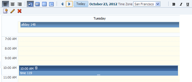
Figure 15-9 shows a toolbar that has been customized. It has added toolbar buttons, including buttons that are right-aligned on the top toolbar, and buttons in a second toolbar.
15.5.1 How to Customize the Toolbar
Place the toolbar and toolbar buttons you want to add in custom facets that you create. Then, reference the facet (or facets) from an attribute on the toolbar, along with keywords that determine how or where the contained items should be displayed.
-
In the JSF page of the Component Palette, from the Core panel, drag and drop a Facet for each section of the toolbar you want to add. For example, to add the custom buttons shown in Figure 15-9, you would add four
facettags. Ensure that each facet has a unique name for the page.Tip:
To ensure that there will be no conflicts with future releases of ADF Faces, start all your facet names withcustomToolbar. For example, the section of the toolbar that contains the alignment buttons shown in Figure 15-9 are in thecustomToolbarAlignfacet. -
In the ADF Faces page of the Component Palette, from the Common Components panel, drag and drop a Toolbar to each facet and add toolbar buttons and configure the buttons and toolbar as needed. For more information about toolbars and toolbar buttons, see Section 14.3, "Using Toolbars."
-
In the Property Inspector, from the dropdown menu next to the
toolboxLayoutattribute, choose Edit. -
In the Edit Property: ToolboxLayout dialog set the value for this attribute. It should be a list of the custom facet names, in the order in which you want the contents in the custom facets to appear. In addition to those facets, you can also include all, or portions of the default toolbar, using the following keywords:
-
all: Displays all the toolbar buttons and text in the default toolbar -
dates: Displays only the previous, next, and today buttons -
range: Displays only the string showing the current date range -
views: Displays only the buttons that allows the user to change the view
Note:
If you use theallkeyword, then thedates,range, andviewskeywords are ignored.For example, if you created two facets named
customToolbar1andcustomToolbar2, and you wanted the complete default toolbar to appear in between your custom toolbars, the value of thetoolboxLayoutattribute would be the following list items:-
customToolbar1 -
all -
customToolbar2
You can also determine the layout of the toolbars using the following keywords:
-
newline: Places the toolbar in the next named facet (or the next keyword from the list in thetoolboxLayoutattribute) on a new line. For example, if you wanted the toolbar in thecustomToolbar2facet to appear on a new line, the list would be:-
customToolbar1 -
all -
newline -
customToolbar2
If instead, you did not want to use all of the default toolbar, but only the views and dates sections, and you wanted those to each appear on a new line, the list would be:
-
customToolbar1 -
customToolbar2 -
newline -
views -
newline -
dates
-
-
stretch: Adds a spacer component that stretches to fill up all available space so that the next named facet (or next keyword from the default toolbar) is displayed as right-aligned in the toolbar. Example 15-3 shows the value of thetoolboxLayoutattribute for the toolbar displayed in Figure 15-9, along with the toolbar placed in thecustomToolbarAlignfacet. Note that the toolbar buttons displayed in thecustomToolbarBoldfacet are right-aligned in the toolbar because the keywordstretchis named before the facet.
Example 15-3 Value for Custom Toolbar
<af:calendar binding="#{editor.component}" id="calendar1" value="#{calendarBean.calendarModel}" timeZone="#{calendarBean.timeZone}" toolboxLayout="customToolbarAlign all customToolbarTZ stretch customToolbarBold newline customToolbarCreate" . . . <f:facet name="customToolbarAlign"> <af:toolbar> <af:commandToolbarButton id="alignLeft" shortDesc="align left" icon="/images/alignleft16.png" type="radio" selected="true"/> <af:commandToolbarButton id="alignCenter" shortDesc="align center" icon="/images/aligncenter16.png" type="radio" selected="false"/> <af:commandToolbarButton id="alignRight" shortDesc="align right" icon="/images/alignright16.png" type="radio" selected="false"/> </af:toolbar> </f:facet> . . . </af:calendar> -
15.6 Styling the Calendar
Like other ADF Faces components, the calendar component can be styled as described in Chapter 20, "Customizing the Appearance Using Styles and Skins." However, along with standard styling procedures, the calendar component has specific attributes that make styling instances of a calendar easier. These attributes are:
-
activityStyles: Allows you to individually style each activity instance. For example, you may want to show activities belonging to different providers in different colors. -
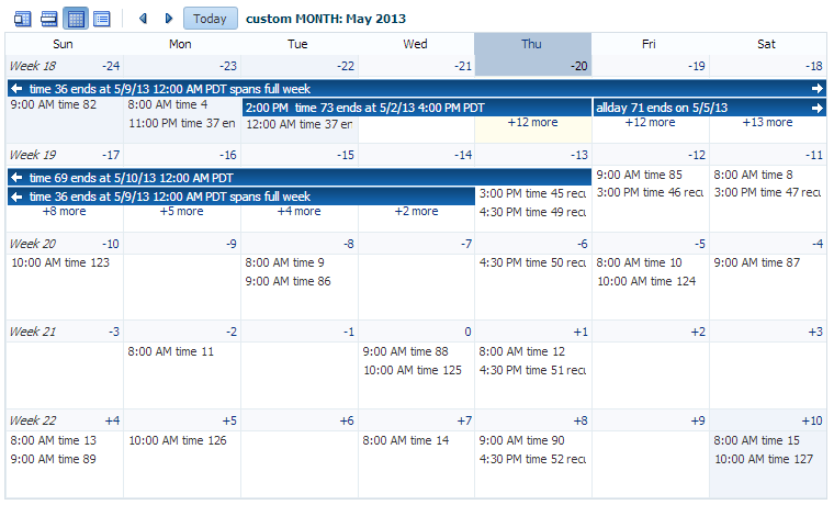
dateCustomizer: Allows you to display strings other than the calendar date for the day in the month view. For example, you may want to display countdown or countup type numbers, as shown in Figure 15-10. This attribute also allows you to add strings to the blank portion of the header for a day, for example to show the total number of hours worked per day. You can also use this attribute to color code certain days, such as holidays. For more information, see Section 15.6.3, "How to Customize Dates."
15.6.1 How to Style Activities
The activityStyles attribute uses InstanceStyles objects to style specific instances of an activity. The InstanceStyles class is a way to provide per-instance inline styles based on skinning keys.
The most common usage of the activityStyles attribute is to display activities belonging to a specific provider using a specific color. For example, the calendar shown in Figure 15-11 shows activities belonging to three different providers. The user can change the color used to represent a provider's activities in the left panel. The activityStyles attribute is used to determine the color displayed for each activity, based on the provider with which it is associated.
Note that instead of using a single color, a range of a color is used in the calendar. This is called a color ramp. A color ramp is a set of colors in a color family and is used to represent the different states of activities. For example, Ted's activities use the blue color ramp. Activities whose time span is within one day are displayed in medium blue text. Activities that span across multiple days are shown in a medium blue box with white text. Darker blue is the background for the start time, while lighter blue is the background for the title. These different blues are all part of the blue color ramp.
The CalendarActivityRamp class is a subclass of InstanceStyles, and can take a representative color (for example, the red chosen for "Me" activities) and return the correct color ramp to be used to display each activity in the calendar.
The activityStyles attribute must be bound to a map object. The map key is the set returned from the getTags method on an activity. The map value is an InstanceStyles object, most likely an instance of CalendarActivityRamp. This InstanceStyles object will take in skinning keys, and for each activity, styles will be returned.
-
In your
CalendarActivityclass, have thegetTagsmethod return a string set that will be used by theactivityStylesattribute to map the returned string to a specific style. For example, to use the different color ramps for the different providers shown in Figure 15-11, you must return a string for each provider. In this case, an activity belonging to the current user might returnMe, an activity belonging to L.E. might returnLE, and an activity belonging to T.F. might returnTF. For more information about implementing theCalendarActivityclass, see Section 15.2.2, "How to Create a Calendar." -
Create a map whose key is the string returned from the
getTagsmethod, and whose value is anInstanceStylesobject (for example, aCalendarActivityRampinstance).For example, to use the different color ramps shown in Figure 15-11, you would create a map using the values shown in Table 15-2.
Table 15-2 Map for activityStyles Attribute
Key (String Set) Value (InstanceStyles Object) {"Me"}CalendarActivityRamp.getActivityRamp (CalendarActivityRamp.RampKey.RED){"LE"}CalendarActivityRamp.getActivityRamp (CalendarActivityRamp.RampKey.ORANGE){"TF"}CalendarActivityRamp.getActivityRamp (CalendarActivityRamp.RampKey.BLUE) -
In the Structure window, select the calendar component, and in the Property Inspector, bind the
activityStylesattribute to the map.
15.6.2 What Happens at Runtime: Activity Styling
During calendar rendering for each activity, the renderer calls the CalendarActivity.getTags method to get a string set. The string set is then passed to the map bound to the activityStyles attribute, and an InstanceStyles object is returned (which may be a CalendarActivityRamp).
Using the example:
-
If the string set
{"Me"}is passed in, the redCalendarActivityRampis returned. -
If the string set
{"LE"}is passed in, the orangeCalendarActivityRampis returned. -
If the string set
{"TF"}is passed in, the blueCalendarActivityRampis returned.
15.6.3 How to Customize Dates
If you want to display something other than the date number string in the day header of the monthly view, you can bind the dateCustomizer attribute to an implementation of a DateCustomizer class that determines what should be displayed for the date. You can use the dateCustomizer attribute to add strings to the blank portion of the header for a day, for example to show the total number of hours worked per day.
To color code dates, implement a new method named getInlineStyle in the DateCustomizer class. The getInlineStyle method returns inline CSS styles, which can be applied to the style attribute for the section of the calendar specified by a key. You can use getInlineStyle to set the background color on a date in the month grid. For accessibility, the information provided by the color coding must also be available to a screen reader. You can expose this information using the dateHeaderStamp facet to specify components that will be displayed in the header section of a date cell. For example, if the date is color coded because it is a holiday, you can specify an af:image with the shortDesc set to the holiday name, as well as programmatically specify which date it should display for, and the image will be displayed in the header for that date. For more information about the DateCustomizer class, refer to the ADF Faces Javadoc. For information about the dateHeaderStamp facet, see the tag documentation for the calendar component.
-
Create a subclass of the
oracle.adf.view.rich.util.DateCustomizerclass. This subclass determines what to display using the following skinning keys.Keys passed to the
DateCustomizer.formatmethod:-
af|calendar::day-header-row: In day view, customize the day of the week in the header. For example, replace "Thursday" with "Thu". -
af|calendar::day-header-row-misc: In day view, customize the text beneath the day of the week in the header. For example, display "New Year's Day" on Jan 1. -
af|calendar::list-day-of-month-link: In list view, customize the text for the day of the month link. For example, replace "Jan 1" with "New Year's Day". -
af|calendar::list-day-of-week-column: In list view, customize the day of the week in the left list column. For example, replace "Thursday" with "Thu". -
af|calendar::list-day-of-week-column-misc: In list view, customize the text that appears beneath the day of the week in the left list column. For example, display "New Year's Day" on Jan 1. -
af|calendar::month-grid-cell-header-day-link: In month view, customize the date link labels in the cell header. For example, replace "5" with "-34". -
af|calendar::month-grid-cell-header-misc: In month view, add miscellaneous text to the empty area of the cell header. For example, on Jan 1, add the text "New Year's Day". -
af|calendar::week-header-day-link: In week view, customize the date link for each date in the header. For example, replace "Sun 1/1" with "New Year's Day". -
af|calendar::week-header-cell-misc: In week view, customize the text that appears beneath the date in the header. For example, display "New Year's Day" on Jan 1. -
af|calendar::toolbar-display-range:day: In day view, or in list view whenlistType = day, customize the date string on the toolbar. -
af|calendar::toolbar-display-range:month: In month view, or in list view whenlistType = month, customize the date string on the toolbar.
Keys passed to the
DateCustomizer.formatRangemethod:-
af|calendar::toolbar-display-range:week: In week view, or in list view whenlistType = week, customize the date range string on the toolbar. -
af|calendar::toolbar-display-range:list: In list view, or in list view whenlistType = dayCount, customize the date range string on the toolbar.
Keys passed to the
DateCustomizer.getInlineStylemethod:-
af|calendar::list-row: In list view, apply a CSS style to the current activity row. -
af|calendar::month-grid-cell: In month view, apply a CSS style for the specified date.
-
-
In a managed bean, create an instance of the
DateCustomizerclass. For example:private DateCustomizer _dateCustomizer = new DemoDateCustomizer();
-
In the calendar component, bind the
dateCustomizerattribute to theDateCustomizerinstance created in the managed bean.
Example 15-4 shows an example of the DemoDateCustomizer class that displays the week number in the first day of the week, and instead of the day of the month, a countdown number to a specific date, as shown in Figure 15-10. Example 15-5 shows an example of the DemoDateCustomizer class that displays color coded holidays, and Example 15-6 shows an example that displays color coded holidays using the dateHeaderStamp facet as it is used on the dateCustomizerCalendar.jspx page of the File Explorer application.
Example 15-4 Date Customizer Displaying Countdown Numbers
public class MyDateCustomizer extends DateCustomizer
{
  public String format(Date date, String key, Locale locale, TimeZone tz)
  {

    if ("af|calendar::month-grid-cell-header-misc".equals(key))
    {

     // return appropriate string

    }
    else if ("af|calendar::month-grid-cell-header-day-link".equals(key))
    {

      // return appropriate string
    }

  return null;

  }

}
Example 15-5 Date Customizer Displaying Color Coded Holidays
public class MyDateCustomizer extends DateCustomizer
{
public String getInlineStyle(Date date, String key, Locale locale, TimeZone tz)
  {
    if ("af|calendar::day-all-day-activity-area".equals (key) ||
        "af|calendar::day-timed-activity-area".equals (key) ||
        "af|calendar::week-all-day-activity-area".equals (key) ||
        "af|calendar::week-timed-activity-area".equals (key) ||
        "af|calendar::month-grid-cell".equals(key) ||
        "af|calendar::list-row".equals(key))

    {
      Calendar curCal = Calendar.getInstance (tz, locale);
      curCal.setTime (date);

      if (_getUSHoliday (curCal) != null)
        return "background-color: #fafaeb;";
    }

  return null;

  }

}
Example 15-6 Date Customizer Displaying Color Coded Holidays with dateHeaderStamp
<af:calendar  id="cal"  ..>
  <f:facet name="dateHeaderStamp">
    <af:image rendered="#{calendarBean.dateCustomizer.USHoliday}"
              source="/images/holidayStar_16X16.png"
              shortDesc="#{calendarBean.dateCustomizer.dateHeaderDesc}"
    ../>
  </f:facet>
</af:calendar>
