10 Using Tables, Trees, and Other Collection-Based Components
This chapter describes how to display structured data in components that can iterate through collections of data and then display each row in the collection, using the ADF Faces table, tree, treeTable, listView, and carousel components. If your application uses the Fusion technology stack, then you can use data controls to create these components. For more information see the "Creating ADF Databound Tables," "Displaying Master-Detail Data," and "Creating More Complex Pages" chapters of the Oracle Fusion Middleware Fusion Developer's Guide for Oracle Application Development Framework.
This chapter includes the following sections:
-
Section 10.1, "Introduction to Using Collection-Based Components"
-
Section 10.7, "Displaying Table Menus, Toolbars, and Status Bars"
-
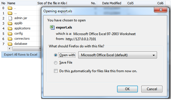
Section 10.11, "Exporting Data from Table, Tree, or Tree Table"
-
Section 10.12, "Accessing Selected Values on the Client from Collection-Based Components"
10.1 Introduction to Using Collection-Based Components
ADF Faces provides components that you can use to iterate through and display collections of structured data. Instead of containing a child component for each record to be displayed, and then binding these components to the individual records, these components are bound to a complete collection, and they then repeatedly render one component (for example an outputText component), by stamping the value for each record.
For example, say a table contains two child column components. Each column displays a single attribute value for the row using an output component, and there are four records to be displayed. Instead of binding four sets of two output components to display the data, the table itself is bound to the collection of all four records and simply stamps one set of the output components four times. As each row is stamped, the data for the current row is copied into the var attribute on the table, from which the output component can retrieve the correct values for the row. For more information about how stamping works, especially with client components, see Section 10.1.5, "Accessing Client Collection Components."
Example 10-1 shows the JSF code for a table whose value for the var attribute is row. Each outputText component in a column displays the data for the row because its value is bound to a specific property on the variable.
Example 10-1 JSF Code for a Table Uses the var Attribute to Access Values
<af:table var="row" value="#{myBean.allEmployees}">
  <af:column>
    <af:outputText value="#{row.firstname}"/>
  </af:column>
  <af:column>
    af:outputText value="#{row.lastname}"/>
  </af:column>
</af:table>
Collection components use a CollectionModel class to access the data in the underlying collection. This class extends the JSF DataModel class, but is based on row keys instead of indexes to support underlying data changes. It also supports more advanced functionality, such as sorting.
You may also use other model classes, such as java.util.List, array, and javax.faces.model.DataModel. If you use one of these other classes, the collection component automatically converts the instance into a CollectionModel class, but without any additional functionality. For more information about the CollectionModel class, see the MyFaces Trinidad javadoc at http://myfaces.apache.org/trinidad/trinidad-1_2/trinidad-api/apidocs/index.html">>http://myfaces.apache.org/trinidad/trinidad-1_2/trinidad-api/apidocs/index.html.
Note:
If your application uses the Fusion technology stack, then you can use data controls to create collection components and the collection model will be created for you. For more information see the "Creating ADF Databound Tables," "Displaying Master-Detail Data," and "Creating More Complex Pages" chapters of the Oracle Fusion Middleware Fusion Developer's Guide for Oracle Application Development Framework.The table component displays simple tabular data. Each row in the table displays one object in a collection, for example one row in a database. The column component displays the value of attributes for each of the objects.
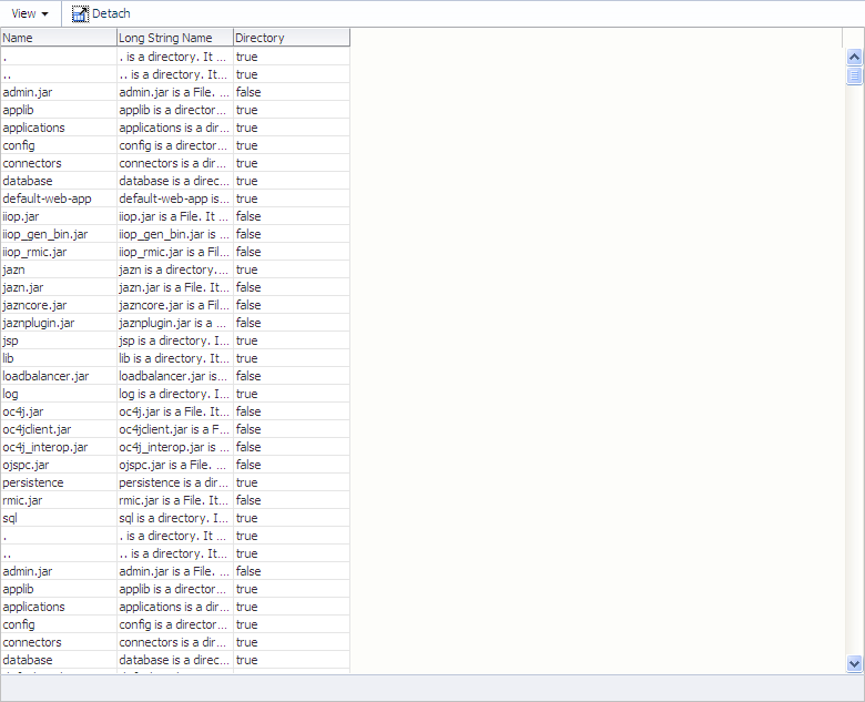
For example, as shown in Figure 10-1, the Table tab in the File Explorer application uses a table to display the contents of the selected directory. The table value attribute is bound to the contentTable property of the tableContentView managed bean in the File Explorer demo.
The table component provides a range of features for end users, such as sorting columns, and selecting one or more rows and then executing an application defined action on the selected rows. They also provide a range of presentation features, such as showing grid lines and banding, row and column headers, column headers spanning groups of columns, and values wrapping within cells. Many of these features are available on all the collection components.
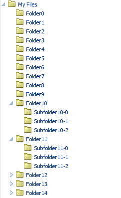
Hierarchical data (that is data that has parent/child relationships), such as the directory in the File Explorer application, can be displayed as expandable trees using the tree component. Items are displayed as nodes that mirror the parent/child structure of the data. Each top-level node can be expanded to display any child nodes, which in turn can also be expanded to display any of their child nodes. Each expanded node can then be collapsed to hide child nodes. Figure 10-2 shows the file directory in the File Explorer application, which is displayed using a tree component.
Hierarchical data can also be displayed using tree table components. The tree table also displays parent/child nodes that are expandable and collapsible, but in a tabular format, which allows the page to display attribute values for the nodes as columns of data. For example, along with displaying a directory's contents using a table component, the File Explorer application has another tab that uses the tree table component to display the contents, as shown in Figure 10-3.
Like the tree component, the tree table component can show the parent/child relationship between items. And like the table component, the tree table component can also show any attribute values for those items in a column.
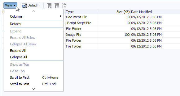
You can add a toolbar and a status bar to tables, trees, and tree tables by surrounding them with the panelCollection component. The top panel contains a standard menu bar as well as a toolbar that holds menu-type components such as menus and menu options, toolbars and toolbar buttons, and status bars. Some buttons and menus are added by default. For example, when you surround a table, tree, or tree table with a panelCollection component, a toolbar that contains the View menu is added. This menu contains menu items that are specific to the table, tree, or tree table component.
Figure 10-4 shows the tree table from the File Explorer application with the toolbar, menus, and toolbar buttons created using the panelCollection component.
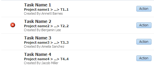
The listView component allows you to display structured data in a list format. Unlike a table, it does not have columns. The components that display the actual data are contained in a single child listItem component. Figure 10-5 shows a listView component that contains one child listItem component. The listItem component contains a mix of layout components, output components and button components.
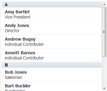
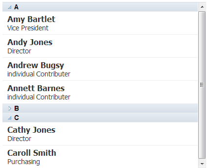
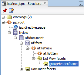
The listView component can also display hierarchical data. When a component that is bound to the parent data is placed in the groupHeaderStamp facet, that data is displayed in a header. Figure 10-6 shows how the alphabet letters, which are the parent data, are displayed in headers, while the child personnel data is displayed in rows below the parent.
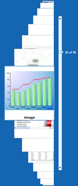
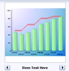
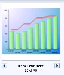
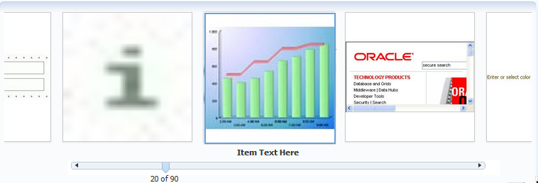
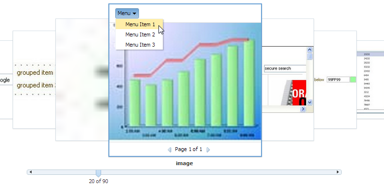
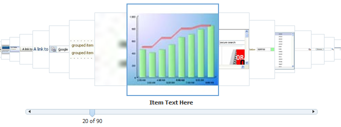
The carousel component displays a collection of images in a revolving carousel, as shown in Figure 10-7. Users can change the image at the front either by using the slider at the bottom or by clicking one of the auxiliary images to bring that specific image to the front.
10.1.1 Content Delivery
The collection components are virtualized, meaning not all the rows that are there for the component on the server are delivered to and displayed on the client. You configure a collection-based component to fetch a certain number of rows at a time from your data source. The data can be delivered to the component immediately upon rendering, when it is available, or lazily fetched after the shell of the component has been rendered (by default, the components fetch data when it is available).
With immediate delivery, the data is fetched during the initial request. With lazy delivery, when a page contains one or more collection components, the page initially goes through the standard lifecycle. However, instead of fetching the data during that initial request, a special separate partial page rendering (PPR) request is run, and the number of rows set as the value of the fetch size for the component is then returned. Because the page has just been rendered, only the Render Response phase executes for the components, allowing the corresponding data to be fetched and displayed. When a user's actions cause a subsequent data fetch (for example scrolling in a table for another set of rows), another PPR request is executed.
When content delivery is configured to be delivered when it is available, the framework checks for data availability during the initial request, and if it is available, it sends the data to the component. If it is not available, the data is loaded during the separate PPR request, as it is with lazy delivery.
Performance Tip:
Lazy delivery should be used when a data fetch is expected to be an expensive (slow) operation, for example, slow, high-latency database connection, or fetching data from slow non-database data sources like web services. Lazy delivery should also be used when the page contains a number of components other than a collection-based component. Doing so allows the initial page layout and other components to be rendered first before the data is available.Immediate delivery should be used if the collection-based component is the only context on the page, or if the component is not expected to return a large set of data. In this case, response time will be faster than using lazy delivery (or in some cases, simply perceived as faster), as the second request will not go to the server, providing a faster user response time and better server CPU utilizations. Note however that only the number of rows configured to be the fetch block will be initially returned. As with lazy delivery, when a user's actions cause a subsequent data fetch, the next set of rows are delivered.
When available delivery provides the additional flexibility of using immediate when data is available during initial rendering or falling back on lazy when data is not initially available.
The number of rows that are displayed on the client are just enough to fill the page as it is displayed in the browser. More rows are fetched as the user scrolls the component vertically (or if configured to page instead of scroll, when the user navigates to another set of rows). The fetchSize attribute determines the number of rows requested from the client to the server on each attempt to fill the component. For a table, the default value is 25. So if the height of the table is small, the fetch size of 25 is sufficient to fill the component. However, if the height of the component is large, there might be multiple requests for the data from the server. Therefore, the fetchSize attribute should be set to a higher number. For example, if the height of the table is 600 pixels and the height of each row is 18 pixels, you will need at least 45 rows to fill the table. With a fetchSize of 25, the table has to execute two requests to the server to fill the table. For this example, you would set the fetch size to 50.
However, if you set the fetch size too high, it will impact both server and client. The server will fetch more rows from the data source than needed and this will increase time and memory usage. On the client side, it will take longer to process those rows and attach them to the component.
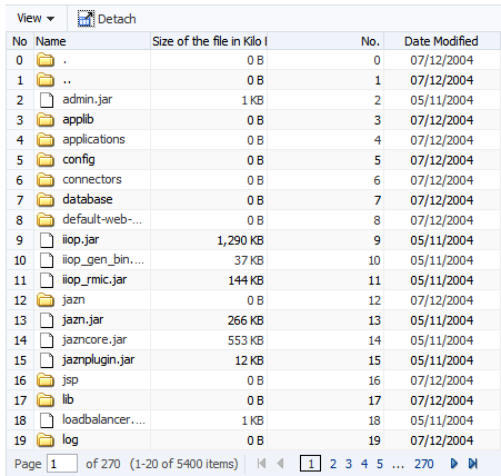
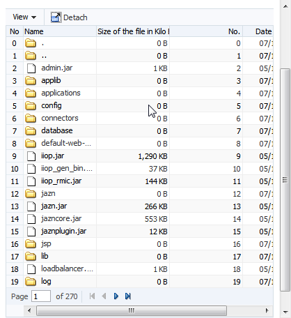
By default, on a desktop device, tables render a scroll bar that allows the users to scroll through the rows of data. You can use the scrollPolicy attribute to change that behavior. If you set it to page, the table will be paginated, so that it displays a footer that allows the user to jump to specific pages of rows, as shown in Figure 10-8.
When the viewport is too narrow to display the complete footer, the table displays a compact footer that shows only the page currently displayed and the navigation buttons, as shown in Figure 10-9.
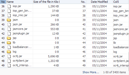
Alternatively, you can set scrollPolicy to loadMore. This setting creates a Show More link and a row counter at the bottom of the table, as shown in Figure 10-10. Clicking the link fetches additional records.
Note:
By default, on tablet devices, tables are rendered to display the table as paginated and therefore do not display a scroll bar. If instead, you want to enable scroll bars so the table automatically loads the next set of rows when the user scrolls to the bottom of the table, you can set thescrollPolicy attribute to scroll. This option on tablets results in a behavior called implicit high-water mark scrolling and closely resembles the way virtualized touch scrolling (scrolling in both horizontal and vertical directions) behaves on tablet devices. Regular virtualized scrolling which results from setting scrollPolicy to scroll on a desktop machine is not implemented on tablets due to performance problems with virtualized scrolling of table data on tablets. You can, however, customize the caching behavior of implicit high-water mark scrolling by specifying the number of rows to cache to minimize database roundtrips by setting a value for the maxClientRows attribute.As with a table configured to scroll, the number of rows on a page is determined by the fetchSize attribute.
Note:
You can hide the scroll bar using the-tr-overflow-style: autohiding-scrollbar skinning property. For example:
af|table {
  -tr-overflow-style: autohiding-scrollbar
}
For more information about skins, see Chapter 20, "Customizing the Appearance Using Styles and Skins."
You can configure the set of data that will be initially displayed using the displayRow attribute. By default, the first record in the data source is displayed in the top row or node and the subsequent records are displayed in the following rows or nodes. You can also configure the component to first display the last record in the source instead. In this case, the last record is displayed in the bottom row or node of the component, and the user can scroll up to view the preceding records. Additionally, you can configure the component to display the selected row. This can be useful if the user is navigating to the component, and based on some parameter, a particular row will be programmatically selected. When configured to display the selected row, that row will be displayed at the top of the table and the user can scroll up or down to view other rows.
10.1.2 Row Selection
You can configure selection to be either for no rows, for a single row, or for multiple rows using the rowSelection attribute (the carousel component does not allow multiple selection). This setting allows you to execute logic against the selected rows. For example, you may want users to be able to select a row in a table or a node in a tree, and then to click a command button that navigates to another page where the data for the selected row is displayed and the user can edit it.
Note:
If you configure your component to allow multiple selection, users can select one row and then press the shift key to select another row, and all the rows in between will be selected. This selection will be retained even if the selection is across multiple data fetch blocks. Similarly, you can use the Ctrl key to select rows that are not next to each other.For example, if you configure your table to fetch only 25 rows at a time, but the user selects 100 rows, the framework is able to keep track of the selection.
When the selected row (or node) of a component changes, the component triggers a selection event. This event reports which rows were just deselected and which rows were just selected. While the components handle selection declaratively, if you want to perform some logic on the selected rows, you need to implement code that can access those rows and then perform the logic. You can do this in a selection listener method on a managed bean. For more information, see Section 10.2.8, "What You May Need to Know About Performing an Action on Selected Rows in Tables."
Performance Tip:
Users can navigate through the table using a mouse and the scrollbar, or using the up and down arrow keyboard keys. By default, a selection event is immediately fired when the user clicks a row. If the user is navigating through the rows using the arrow keys, this means that a selection event will be fired for each row, as the user navigates.If you expect users to navigate through the table using the keys, you can set the delaySelectionEvent attribute to true, so that there is a 300 millisecond delay before the selection event is fired. If the user navigates to another row within the 300 milliseconds, the selection event is canceled.
10.1.3 Editing Data in Tables, Trees, and Tree Tables
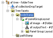
You can choose the component used to display the actual data in a table, tree, or tree table. For example, you may want the data to be read-only, and therefore you might use an outputText component to display the data. Conversely, if you want the data to be able to be edited, you might use an inputText component, or if choosing from a list, one of the SelectOne components. All of these components are placed as children to the column component (in the case of a table and tree table) or within the nodeStamp facet (for a tree).
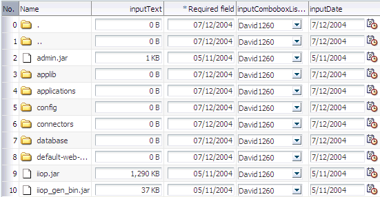
When you decide to use components whose value can be edited to display your data, you have the option of having the table, tree, or tree table either display all rows as available for editing at once, or display all but the currently active row as read-only using the editingMode attribute. For example, Figure 10-11 shows a table whose rows can all be edited. The page renders using the components that were added to the page (for example, inputText, inputDate, and inputComboBoxListOfValues components).
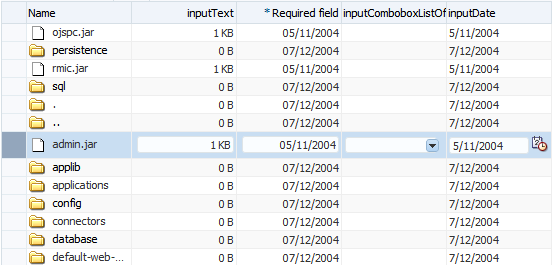
Figure 10-12 shows the same table (that is, it uses inputText, inputDate, and inputComboBoxListOfValues components to display the data), but configured so that only the active row displays the editable components. Users can then click on another row to make it editable (only one row is editable at a time). Note that outputText components are used to display the data in the noneditable rows, even though the same input components as in Figure 10-11 were used to build the page. The only row that actually renders those components is the active row.
The currently active row is determined by the activeRowKey attribute on the table. By default, the value of this attribute is the first visible row of the table. When the table (or tree or tree table) is refreshed, that component scrolls to bring the active row into view, if it is not already visible. When the user clicks on a row to edit its contents, that row becomes the active row.
When you allow only a single row (or node) to be edited, the table (or tree or tree table) performs PPR when the user moves from one row (or node) to the next, thereby submitting the data (and validating that data) one row at a time. When you allow all rows to be edited, data is submitted whenever there is an event that causes PPR to typically occur, for example scrolling beyond the currently displayed rows or nodes.
Note:
You should not use more than one editable component in a column.Not all editable components make sense to be displayed in a click-to-edit mode. For example, those that display multiple lines of HTML input elements may not be good candidates. These components include:
-
SelectManyCheckbox -
SelectManyListBox -
SelectOneListBox -
SelectOneRadio -
SelectManyShuttle
Performance Tip:
For increased performance during both rendering and postback, you should configure your table to allow editing only to a single row.When you elect to allow only a single row to be edited at a time, the page will be displayed more quickly, as output components tend to generate less HTML than input components. Additionally, client components are not created for the read-only rows. Because the table (or tree, or tree table) performs PPR as the user moves from one row to the next, only that row's data is submitted, resulting in better performance than a table that allows all cells to be edited, which submits all the data for all the rows in the table at the same time. Allowing only a singe row to be edited also provides more intuitive validation, because only a single row's data is submitted for validation, and therefore only errors for that row are displayed.
10.1.4 Using Popup Dialogs in Tables, Trees, and Tree Tables
You can configure your table, tree, or tree table so that popup dialogs will be displayed based on a user's actions. For example, you can configure a popup dialog to display some data from the selected row when the user hovers the mouse over a cell or node. You can also create popup context menus for when a user right-clicks a row in a table or tree table, or a node in a tree. Additionally, for tables and tree tables, you can create a context menu for when a user right-clicks anywhere within the table, but not on a specific row.
Tables, trees, and tree tables all contain the contextMenu facet. You place your popup context menu within this facet, and the associated menu will be displayed when the user right-clicks a row. When the context menu is being fetched on the server, the components automatically establish the currency to the row for which the context menu is being displayed. Establishing currency means that the current row in the model for the table now points to the row for which the context menu is being displayed. In order for this to happen, the popup component containing the menu must have its contentDelivery attribute set to lazyUncached so that the menu is fetched every time it is displayed.
Tip:
If you want the context menu to dynamically display content based on the selected row, set the popup content delivery tolazyUncached and add a setPropertyListener tag to a method on a managed bean that can get the current row and then display data based on the current row:
<af:tree value="#{fs.treeModel}"
         contextMenuSelect="false" var="node" ..>
  <f:facet name="contextMenu">
    <af:popup id="myPopup" contentDelivery="lazyUncached">
      <af:setPropertyListener from="#{fs.treeModel.rowData}"
               to="#{dynamicContextMenuTable.currentTreeRowData}"
               type="popupFetch" />
      <af:menu>
       <af:menu text="Node Info (Dynamic)">
         <af:commandMenuItem actionListener=
           "#{dynamicContextMenuTable.alertTreeRowData}"
           text=
     "Name - #{dynamicContextMenuTable.currentTreeRowData.name}" />
         <af:commandMenuItem actionListener=
           "#{dynamicContextMenuTable.alertTreeRowData}"
           text=
     "Path - #{dynamicContextMenuTable.currentTreeRowData.path}" />
         <af:commandMenuItem actionListener=
           "#{dynamicContextMenuTable.alertTreeRowData}"
           text="Date -
     #{dynamicContextMenuTable.currentTreeRowData.lastModified}" />
       </af:menu>
    </af:menu>
  </af:popup>
  </f:facet>
...
</af:tree>
The code on the backing bean might look something like this:
public class DynamicContextMenuTableBean
{
  ...
  public void setCurrentTreeRowData(Map currentTreeRowData)
  {
    _currentTreeRowData = currentTreeRowData;
  }

  public Map getCurrentTreeRowData()
  {
    return _currentTreeRowData;
  }

  private Map _currentTreeRowData;
}
Tables and tree tables contain the bodyContextMenu facet. You can add a popup that contains a menu to this facet, and it will be displayed whenever a user clicks on the table, but not within a specific row.
For more information about creating context menus, see Section 13.2, "Declaratively Creating Popup Elements."
10.1.5 Accessing Client Collection Components
With ADF Faces, the contents of the collection-based component are rendered on the server. There may be cases when the client needs to access that content on the server, including:
-
Client-side application logic may need to read the row-specific component state. For example, in response to row selection changes, the application may want to update the disabled or visible state of other components in the page (usually menu items or toolbar buttons). This logic may be dependent on row-specific metadata sent to the client using a stamped
inputHiddencomponent. In order to enable this, the application must be able to retrieve row-specific attribute values from stamped components. -
Client-side application logic may need to modify row-specific component state. For example, clicking a stamped command link in a table row may update the state of other components in the same row.
-
The peer may need access to a component instance to implement event handling behavior (for more information about peers, see Section 3.1, "Introduction to Using ADF Faces Architecture"). For example, in order to deliver a client-side action event in response to a mouse click, the
AdfDhtmlCommandLinkPeerclass needs a reference to the component instance which will serve as the event source. The component also holds on to relevant state, including client listeners as well as attributes that control event delivery behavior, such asdisabledorpartialSubmit.
Because there is no client-side support for EL in the rich client framework, nor is there support for sending entire table models to the client, the client-side code cannot rely on component stamping to access the value. Instead of reusing the same component instance on each row, a new JavaScript client component is created on each row (assuming any component must be created at all for any of the rows).
Therefore, to access row-specific data on the client, you need to use the stamped component itself to access the value. To do this without a client-side data model, you use a client-side selection change listener. For detailed instructions, see Section 10.12, "Accessing Selected Values on the Client from Collection-Based Components."
10.1.6 Geometry Management for Table, Tree, and Tree Table Components
By default, when tables, trees, and tree tables are placed in a component that stretches its children (for example, a panelCollection component inside a panelStretchLayout component), the table, tree, or tree table will stretch to fill the existing space. However, in order for the columns to stretch to fit the table, you must specify a specific column to stretch to fill up any unused space, using the columnStretching attribute. Otherwise, the table will only stretch vertically to fit as many rows as possible. It will not stretch the columns, as shown in Figure 10-13.
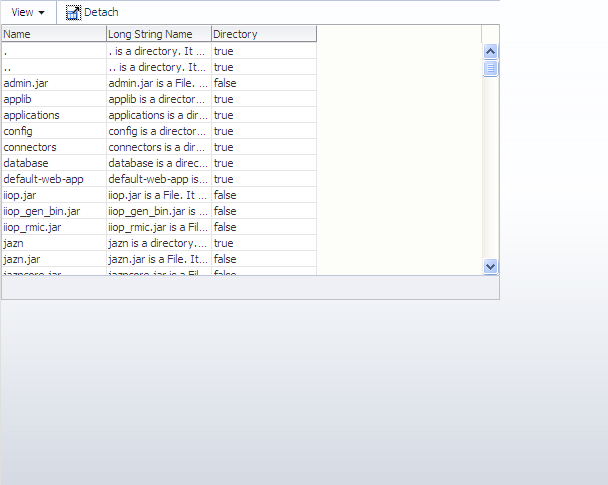
When placed in a component that does not stretch its children (for example, in a panelCollection component inside a panelGroupLayout component set to vertical), by default, a table width is set to 300px, as shown in Figure 10-14.
When you place a table in a component that does not stretch its children, you can control the height of the table so that is never more than a specified number of rows, using the autoHeightRows attribute. When you set this attribute to a positive integer, the table height will be determined by the number of rows set. If that number is higher than the fetchSize attribute, then only the number of rows in the fetchSize attribute will be returned. You can set autoHeightRows to -1 (the default), to turn off auto-sizing.
Auto-sizing can be helpful in cases where you want to use the same table both in components that stretch their children and those that don't. For example, say you have a table that has 6 columns and can potentially display 12 rows. When you use it in a component that stretches its children, you want the table to stretch to fill the available space. If you want to use that table in a component that doesn't stretch its children, you want to be able to "fix" the height of the table. However, if you set a height on the table, then that table will not stretch when placed in the other component. To solve this issue, you can set the autoHeightRows attribute, which will be ignored when in a component that stretches, and will be honored in one that does not.
Note:
The default value for theautoHeightRows attribute is handled by the DEFAULT_DIMENSIONS web.xml parameter. If you always want table components to be stretched when the parent can stretch, and to be the size of the fetchSize attribute when it cannot, set the DEFAULT_DIMENSIONS parameter instead of the autoHeightRows attribute. Set the autoHeightRows attribute when you want to override the global setting.
By default, DEFAULT_DIMENSIONS is set so that the value of autoHeightRows is -1 (the table will not stretch). For more information, see Section A.2.3.25, "Geometry Management for Layout and Table Components."
10.2 Displaying Data in Tables
The table component uses other components to actually display the data. The immediate children of a table component must be column components. Each visible column component is displayed as a separate column in the table. Column components contain components used to display content, images, or provide further functionality. For more information about the features available with the column component, see Section 10.2.1, "Columns and Column Data."
The child components of each column display the data for each row in that column. The column does not create child components per row; instead, the table uses stamping to render each row. Each child is stamped once per row, repeatedly for all the rows. As each row is stamped, the data for the current row is copied into a property that can be addressed using an EL expression. You specify the name to use for this property using the var property on the table. Once the table has completed rendering, this property is removed or reverted back to its previous value.
Because of this stamping behavior, some components may not work inside the column. Most components will work without problems, for example any input and output components. If you need to use multiple components inside a cell, you can wrap them inside a panelGroupLayout component. Components that themselves support stamping are not supported, such as tables within a table. For information about using components whose values are determined dynamically at runtime, see Section 10.2.9, "What You May Need to Know About Dynamically Determining Values for Selection Components in Tables."
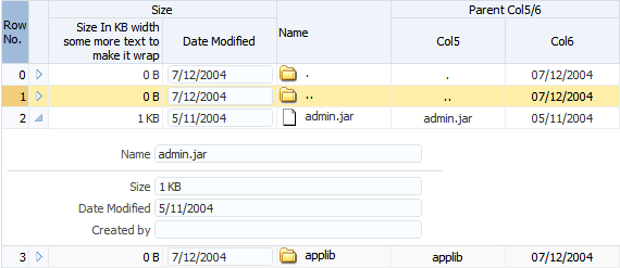
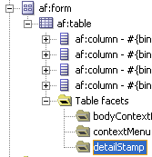
You can use the detailStamp facet in a table to include data that can be optionally displayed or hidden. When you add a component to this facet, the table displays an additional column with an expand and collapse icon for each row. When the user clicks the icon to expand, the component added to the facet is displayed, as shown in Figure 10-15.
When the user clicks on the expanded icon to collapse it, the component is hidden, as shown in Figure 10-16.
For more information about using the detailStamp facet, see Section 10.3, "Adding Hidden Capabilities to a Table."
10.2.1 Columns and Column Data
Columns contain the components used to display the data. As stated previously, only one child component is needed for each item to be displayed; the values are stamped as the table renders. Columns can be sorted, and you can configure whether or not the sorting is case-sensitive (by default, it is case-sensitive).
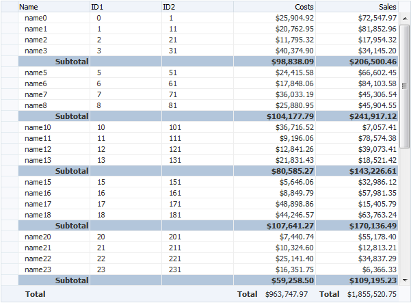
Columns can also contain a filtering element. Users can enter a value into the filter and the returned data set will match the value entered in the filter. You can set the filter to be either case-sensitive or case-insensitive. If the table is configured to allow it, users can also reorder columns. Columns have both header and footer facets. The header facet can be used instead of using the header text attribute of the column, allowing you to use a component that can be styled. The footer facet is displayed at the bottom of the column. For example, Figure 10-17 uses footer facets to display the total at the bottom of two columns. If the number of rows returned is more than can be displayed, the footer facet is still displayed; the user can scroll to the bottom row.
10.2.2 Formatting Tables
A table component offers many formatting and visual aids to the user. You can enable these features and specify how they can be displayed. These features include:
-
Row selection: By default, at runtime, users cannot select rows. If you want users to be able to select rows in order to perform some action on them somewhere else on the page, or on another page, then enable row selection for the table by setting the
rowSelectionattribute. You can configure the table to allow either a single row or multiple rows to be selected. For information about how to then programatically perform some action on the selected rows, see Section 10.2.8, "What You May Need to Know About Performing an Action on Selected Rows in Tables." -
Scrolling/Pagination: By default, on desktop devices, tables render a scroll bar that allows the user to scroll through all rows. On tablet devices, instead of a scroll bar, the table is paginated and displays a footer that allows the user to jump to specific pages of rows. You can change the default by setting the
scrollPolicyattribute.Note:
You can hide the scroll bar using the-tr-overflow-style: autohiding-scrollbarskinning property. For example:af|table { -tr-overflow-style: autohiding-scrollbar }For more information about skins, see Chapter 20, "Customizing the Appearance Using Styles and Skins."
-
Table height: You can set the table height to be absolute (for example, 300 pixels), or you can determine the height of the table based on the number of rows you wish to display at a time by setting the
autoHeightRowsattribute. For more information, see Section 10.1.6, "Geometry Management for Table, Tree, and Tree Table Components."Note:
When table is placed in a layout-managing container, such as apanelSplittercomponent, it will be sized by the container and theautoHeightRowsis not honored. -
Grid lines: By default, an ADF table component draws both horizontal and vertical grid lines. These may be independently turned off using the
horizontalGridVisibleandverticalGridVisibleattributes. -
Banding: Groups of rows or columns are displayed with alternating background colors using the
columnBandingIntervalattribute. This helps to differentiate between adjacent groups of rows or columns. By default, banding is turned off. -
Column groups: Columns in a table can be grouped into column groups, by nesting column components. Each group can have its own column group heading, linking all the columns together.
-
Editable cells: When you elect to use input text components to display data in a table, you can configure the table so that all cells can be edited, or so that the user must explicitly click in the cell in order to edit it. For more information, see Section 10.1.3, "Editing Data in Tables, Trees, and Tree Tables."
Performance Tip:
When you choose to have cells be available for editing only when the user clicks on them, the table will initially load faster. This may be desirable if you expect the table to display large amounts of data. -
Column stretching: If the widths of the columns do not together fill the whole table, you can set the
columnStretchingattribute to determine whether or not to stretch columns to fill up the space, and if so, which columns should stretch. You can set the minimum width for columns, so that when there are many columns in a table and you enable stretching, columns will not be made smaller than the set minimum width. You can also set a width percentage for each column you want to stretch to determine the amount of space that column should take up when stretched.Note:
If the total sum of the columns' minimum widths equals more than the viewable space in the viewport, the table will expand outside the viewport and a scrollbar will appear to allow access outside the viewport.Performance Tip:
Column stretching is turned off by default. Turning on this feature may have a performance impact on the client rendering time when used for complex tables (that is, tables with a large amount of data, or with nested columns, and so on).Note:
Columns configured to be row headers or configured to be frozen will not be stretched because doing so could easily leave the user unable to access the scrollable body of the table. -
Column selection: You can choose to allow users to be able to select columns of data. As with row selection, you can configure the table to allow single or multiple column selection. You can also use the
columnSelectionListenerto respond to theColumnSelectionEventthat is invoked when a new column is selected by the user. This event reports which columns were just deselected and which columns were just selected. -
Column reordering: Users can reorder the columns at runtime by simply dragging and dropping the column headers. By default, column reordering is allowed, and is handled by a menu item in the
panelCollectioncomponent. For more information, see Section 10.7, "Displaying Table Menus, Toolbars, and Status Bars." -
Column freezing: You can configure the table so that columns can be frozen and so will not scroll out of view. Columns can be frozen on either the left or right side of the table. This is controlled by the
freezeDirectionattribute on the table. You choose the column to start the freeze using thefrozenattribute on the column.Performance Tip:
Use of row column freezing increases the complexity of tables and can have a negative performance impact.
10.2.3 Formatting Columns
Each column component also offers many formatting and visual aids to the user. You can enable these features and specify how they can be displayed. These features include:
-
Column sorting: Columns can be configured so that the user can sort the contents by a given column, either in ascending or descending order using the
sortableattribute. A special indicator on a column header lets the user know that the column can be sorted. When the user clicks on the icon to sort a previously unsorted column, the column's content is sorted in ascending order. Subsequent clicks on the same header sort the content in the reverse order.By default, sorting is case-sensitive. That is, abc would be sorted before ABC. You can configure the column so that instead, abc would be sorted the same as ABC, using the
sortStrengthattribute.In order for the table to be able to sort, the underlying data model must also support sorting. For more information, see Section 10.2.7, "What You May Need to Know About Programmatically Enabling Sorting for Table Columns."
-
Content alignment: You can align the content within the column to either the start, end, left, right, or center using the
alignattribute.Tip:
Usestartandendinstead ofleftandrightif your application supports multiple reading directions. -
Column width: The width of a column can be specified as an absolute value in pixels using the
widthattribute. If you configure a column to allow stretching, then you can also set the width as a percentage. -
Column spanning: You can configure a column to span across other columns using the
colSpanattribute. Normally however, you use an EL expression as the value for the span, to enable only a certain cell in the column to actually span. -
Line wrapping: You can define whether or not the content in a column can wrap over lines, using the
noWrapattribute. By default, content will not wrap. -
Row headers: You can define the left-most column to be a row header using the
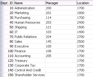
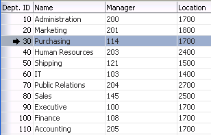
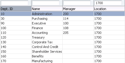
rowHeaderattribute. When you do so, the left-most column is rendered with the same look as the column headers, and will not scroll off the page. Figure 10-18 shows how a table showing departments appears if the first column is configured to be a row header.If you elect to use a row header column and you configure your table to allow row selection, the row header column displays a selection arrow when a users hovers over the row, as shown in Figure 10-19.
For tables that allow multiple selection, users can mouse down and then drag on the row header to select a contiguous blocks of rows. The table will also autoscroll vertically as the user drags up or down.
Performance Tip:
Use of row headers increases the complexity of tables and can have a negative performance impact.Tip:
While the user can change the way the table displays at runtime (for example the user can reorder columns or change column widths), those values will not be retained once the user leaves the page unless you configure your application to allow user customization. For information, see Chapter 34, "Allowing User Customization on JSF Pages."10.2.4 How to Display a Table on a Page
You use the Create an ADF Faces Table dialog to add a table to a JSF page. You also use this dialog to add column components for each column you need for the table. You can also bind the table to the underlying model or bean using EL expressions.
Note:
If your application uses the Fusion technology stack, then you can use data controls to create tables and the binding will be done for you. For more information see the "Creating ADF Databound Tables" chapter of the Oracle Fusion Middleware Fusion Developer's Guide for Oracle Application Development Framework.Once you complete the dialog, and the table and columns are added to the page, you can use the Property Inspector to configure additional attributes of the table or columns, and add listeners to respond to table events. You must have an implementation of the CollectionModel class to which your table will be bound.
-
Create a Java class that extends the
org.apache.myfaces.trinidad.model.CollectionModelclass.Collection components use a
CollectionModelclass to access the data in the underlying collection. This class extends the JSFDataModelclass, but is based on row keys instead of indexes to support underlying data changes. It also supports more advanced functionality, such as sorting.You may also use other model classes, such as
java.util.List,array, andjavax.faces.model.DataModel. If you use one of these other classes, the collection component automatically converts the instance into aCollectionModelclass, but without any additional functionality. For more information about theCollectionModelclass, see the MyFaces Trinidad javadoc athttp://myfaces.apache.org/trinidad/trinidad-1_2/trinidad-api/apidocs/index.html">>http://myfaces.apache.org/trinidad/trinidad-1_2/trinidad-api/apidocs/index.html. -
In the Component Palette, from the Common Components panel, drag and drop a Table to open the Create ADF Faces Table dialog.
Use the dialog to bind the table to any existing model you have. When you bind the table to a valid model, the dialog automatically shows the columns that will be created. You can then use the dialog to edit the values for the columns'
headerandvalueattributes, and choose the type of component that will be used to display the data. Alternatively, you can manually configure columns and bind at a later date. For more information about using the dialog, press F1 or click Help. -
In the Property Inspector, expand the Common section. If you have already bound your table to a model, the value attribute should be set. You can use this section to set the following table-specific attributes:
-
RowSelection: Set a value to make the rows selectable. Valid values are:
none,single, andmultiple, andmultipleNoSelectAll.Note:
Users can select all rows and all columns in a table by clicking the column header for the row header if therowSelectionattribute is set tomultipleand that table also contains a row header. If you do not want users to be able to select all columns and rows, then setrowSelectiontomultipleNoSelectAll.For information about how to then programatically perform some action on the selected rows, see Section 10.2.8, "What You May Need to Know About Performing an Action on Selected Rows in Tables."
-
ColumnSelection: Set a value to make the columns selectable. Valid values are:
none,single, andmultiple.
-
-
Expand the Columns section. If you previously bound your table using the Create ADF Faces Table dialog, then these settings should be complete. You can use this section to change the binding for the table, to change the variable name used to access data for each row, and to change the display label and components used for each column.
Tip:
If you want to use a component other than those listed, select any component in the Property Inspector, and then manually change it:-
In the Structure window, right-click the component created by the dialog.
-
Choose Convert from the context menu.
-
Select the desired component from the list. You can then use the Property Inspector to configure the new component.
Tip:
If you want more than one component to be displayed in a column, add the other component manually and then wrap them both in apanelGroupLayoutcomponent. To do so:-
In the Structure window, right-click the first component and choose Insert before or Insert after. Select the component to insert.
-
By default the components will be displayed vertically. To have multiple components displayed next to each other in one column, press the shift key and select both components in the Structure window. Right-click the selection and choose Surround With.
-
Select
panelGroupLayout.
-
-
Expand the Appearance section. You use this section to set the appearance of the table, by setting the following table-specific attributes:
-
Width: Specify the width of the table. You can specify the width as either a percentage or as a number of pixels. The default setting is 300 pixels. If you configure the table to stretch columns (using the
columnStretchingattribute), you must set the width to percentages.Tip:
If the table is a child to a component that stretches its children, then this width setting will be overridden and the table will automatically stretch to fit its container. For more information about how components stretch, see Section 8.2.1, "Geometry Management and Component Stretching." -
ColumnStretching: If the widths of the columns do not together fill the whole table, you can set this attribute to determine whether or not to stretch columns to fill up the space, and if so, which columns should stretch.
Note:
If the table is placed inside a component that can stretch its children, only the table will stretch automatically. You must manually configure column stretching if you want the columns to stretch to fill the table.Note:
Columns configured to be row headers or configured to be frozen will not be stretched because doing so could easily leave the user unable to access the scrollable body of the table.Performance Tip:
Column stretching is turned off by default. Turning on this feature may have a performance impact on the client rendering time for complex tables.You can set column stretching to one of the following values:
-
blank: If you want to have an empty blank column automatically inserted and have it stretch (so the row background colors will span the entire width of the table). -
A specifically named column: Any column currently in the table can be selected to be the column to stretch.
-
last: If you want the last column to stretch to fill up any unused space inside of the window. -
none: The default option where nothing will be stretched. Use this for optimal performance. -
multiple: All columns that have a percentage value set for theirwidthattribute will be stretched to that percent, once other columns have been rendered to their (non-stretched) width. The percentage values will be weighted with the total. For example, if you set the width attribute on three columns to 50%, each column will get 1/3 of the remaining space after all other columns have been rendered.
Tip:
While the user can change the values of the column width at runtime, those values will not be retained once the user leaves the page unless you configure your application to use change persistence. For information about enabling and using change persistence, see Chapter 34, "Allowing User Customization on JSF Pages." -
-
HorizontalGridVisible: Specify whether or not the horizontal grid lines are to be drawn.
-
VerticalGridVisible: Specify whether or not the vertical grid lines are to be drawn.
-
RowBandingInterval: Specify how many consecutive rows form a row group for the purposes of color banding. By default, this is set to 0, which displays all rows with the same background color. Set this to 1 if you want to alternate colors.
-
ColumnBandingInterval: Specify the interval between which the column banding occurs. This value controls the display of the column banding in the table. For example,
columnBandingInterval=1 would display alternately banded columns in the table. -
FilterVisible: You can add a filter to the table so that it displays only those rows that match the entered filter criteria. If you configure the table to allow filtering, you can set the filter to be case-insensitive or case-sensitive. For more information, see Section 10.4, "Enabling Filtering in Tables."
-
ScrollPolicy: By default, on desktop devices, tables render a scroll bar that allows the user to scroll through all rows. On tablet devices, instead of a scroll bar, tables are rendered to display the table as paginated.
Set the value to
autoto keep this default behavior. Set the value topageto have the table always display the rows as sets of pages, with a navigation to those pages in the footer. For tablet devices, set the value toscrollto have the table always render a scroll bar and scroll with implicit high-water mark scrolling; this setting is particularly useful to address performance problems with virtualized scrolling of table data on tablets. You can specify the number of rows to cache to minimize database roundtrips when the user scrolls back by setting a value for themaxClientRowsattribute.Note:
For desktop devices, in order to explicitly set a table to display as paginated (configured as the default for tablet devices), you must set thescrollPolicyattribute topage, theautoHeightRowsattribute to0. If these conditions are not met, the table will display with a scroll bar (whether it is a child to a stretched or a flowing component). For more information about flowing container components, see Section 8.2.4, "Tips for Using Geometry-Managed Components." -
Text attributes: You can define text strings that will determine the text displayed when no rows can be displayed, as well as a table summary and description for accessibility purposes.
-
-
Expand the Behavior section. You use this section to configure the behavior of the table by setting the following table-specific attributes:
-
DisableColumnReordering: By default, columns can be reordered at runtime using a menu option contained by default in the
panelCollectioncomponent. You can change this so that users will not be able to change the order of columns. (ThepanelCollectioncomponent provides default menus and toolbar buttons for tables, trees, and tree tables. For more information, see Section 10.7, "Displaying Table Menus, Toolbars, and Status Bars".)Note:
While the user can change the order of columns, those values will not be retained once the user leaves the page unless you configure your application to allow user customization. For information, see Chapter 34, "Allowing User Customization on JSF Pages." -
FetchSize: Set the size of the block that should be returned with each data fetch. The default is 25.
Tip:
You should determine the value of thefetchSizeattribute by taking the height of the table and dividing it by the height of each row to determine how many rows will be needed to fill the table. If thefetchSizeattribute is set too low, it will require multiple trips to the server to fill the table. If it is set too high, the server will need to fetch more rows from the data source than needed, thereby increasing time and memory usage. On the client side, it will take longer to process those rows and attach them to the component. For more information, see Section 10.1.1, "Content Delivery." -
ContentDelivery: Specify when the data should be delivered. When the
contentDeliveryattribute is set toimmediate, data is fetched at the same time the component is rendered. If thecontentDeliveryattribute is set tolazy, data will be fetched and delivered to the client during a subsequent request. If the attribute is set towhenAvailable(the default), the renderer checks if the data is available. If it is, the content is delivered immediately. If it is not, then lazy delivery is used. For more information, see Section 10.1.1, "Content Delivery." -
AutoHeightRows: Specify the number of rows to initially display in the table. When the returned number of rows exceeds this value, a scrollbar is displayed. If you want your table to size to be the same as the
fetchSize, set it to0. If you want the table to stretch to fill its parent container that is configured to stretch children, set it to-1(for more information about stretching the table, see Section 10.1.6, "Geometry Management for Table, Tree, and Tree Table Components"). Otherwise set it to a specific number that is lower than the current setting forfetchSize.Note:
Note the following about setting theautoHeightRowsattribute:-
Specifying height on the
inlineStyleattribute will have no effect and will be overridden by the value ofAutoHeightRows. -
Specifying a
min-heightormax-heighton theinlineStyleattribute is not recommended and is incompatible with theautoHeightRowsattribute. -
When the component is placed in a layout-managing container, such as
panelSplitter, it will be sized by the container (no auto-sizing will occur).
Note:
The default value for theautoHeightRowsattribute is handled by theDEFAULT_DIMENSIONSweb.xml parameter. If you always want table components to be stretched when the parent can stretch, and to be the size of thefetchSizeattribute when it cannot, set the DEFAULT_DIMENSIONS parameter toauto, instead of setting theautoHeightRowsattribute.When you set the DEFAULT_DIMENSIONS parameter to
autoand place the table in a parent that does not stretch its children, and there is no override value for theautoHeightRowsattribute, then the table will take its width from theAFStretchWidthstyle class, which by default, will stretch the width of the table to accommodate it's child column components.Set the
autoHeightRowsattribute when you want to override the global setting.By default, DEFAULT_DIMENSIONS is set so that the value of
autoHeightRowsis-1(the table will not stretch). For more information, see Section A.2.3.25, "Geometry Management for Layout and Table Components." -
-
DisplayRow: Specify the row to be displayed in the table during the initial display. The possible values are
firstto display the first row at the top of the table,lastto display the last row at the bottom of the table (users will need to scroll up to view preceding rows) andselectedto display the first selected row in the table.Note:
The total number of rows from the table model must be known in order for this attribute to work successfully. -
DisplayRowKey: Specify the row key to display in the table during initial display. This attribute should be set programmatically rather than declaratively because the value may not be strings. Specifying this attribute will override the
displayRowattribute.Note:
The total number of rows must be known from the table model in order for this attribute to work successfully. -
EditingMode: Specify whether for any editable components, you want all the rows to be editable (
editAll), or you want the user to click a row to make it editable (clickToEdit). For more information, see Section 10.1.3, "Editing Data in Tables, Trees, and Tree Tables."Tip:
If you chooseclickToEdit, then only the active row can be edited. This row is determined by theactiveRowKeyattribute. By default, when the table is first rendered, the active row is the first visible row. When a user clicks another row, then that row becomes the active row. You can change this behavior by setting a different value for theactiveRowKeyattribute, located in the Other section. -
ContextMenuSelect: Specify whether or not the row is selected when you right-click to open a context menu. When set to
true, the row is selected. For more information about context menus, see Chapter 13, "Using Popup Dialogs, Menus, and Windows." -
FilterModel: Use in conjunction with
filterVisible. For more information, see Section 10.4, "Enabling Filtering in Tables." -
Various listeners: Bind listeners to methods that will execute when the table invokes the corresponding event (the
columnSelectionListeneris located in the Other section). For more information, see Chapter 5, "Handling Events."
-
-
Expand the Other section, and set the following:
-
ActiveRowKey: If you choose
clickToEdit, then only the active row can be edited. This row is determined by theactiveRowKeyattribute. By default, when the table is first rendered, the active row is the first visible row. When a user clicks another row, then that row becomes the active row. You can change this behavior by setting a different value for theactiveRowKeyattribute. -
ColumnResizing: Specify whether or not you want the end user to be able to resize a column's width at runtime. When set to disabled, the widths of the columns will be set once the page is rendered, and the user will not be able to change those widths.
Tip:
While the user can change the values of the column width at runtime, those width values will not be retained once the user leaves the page unless you configure your application to use change persistence. For information about enabling and using change persistence, see Chapter 34, "Allowing User Customization on JSF Pages." -
FreezeDirection: If you want columns to be able to be frozen, specify whether they should be frozen from the start of the table (the left side in a LTR locale) or the end of the table (the right side in a LTR locale). You must configure the column to start to the freeze using that column's
frozenattribute.For example, say you want the first three columns to be frozen. On the table, you would set
freezeDirectiontostart, and on the third column, you would setfrozentotrue.If you want the last four columns to be frozen, you would set
freezeDirectiontoend, and on the fourth from last column, you would setfrozentotrue -
SelectionEventDelay: Set to
trueif you expect users to navigate through the table using the up and down arrow keys.Users can navigate through the table using a mouse and the scrollbar, or using the up and down arrow keys. By default, a selection event is immediately fired when the user clicks a row. If the user is navigating through the rows using the arrow keys, this means that a selection event will be fired for each row, as the user navigates.
If you expect users to navigate through the table using the keys, you can set the
delaySelectionEventattribute totrue, so that there is a 300 millisecond delay before the selection event is fired. If the user navigates to another row within the 300 milliseconds, the selection event is canceled.
-
-
In the Structure window, select a column. In the Property Inspector, expand the Common section, and set the following column-specific attributes:
-
HeaderText: Specify text to be displayed in the header of the column. This is a convenience that generates output equivalent to adding a header facet containing an
outputTextcomponent. If you want to use a component other thanoutputText, you should use the column'sheaderfacet instead (for more information, see Step 13). When theheaderfacet is added, any value for theheaderTextattribute will not be rendered in a column header. -
Align: Specify the alignment for this column.
start,end, andcenterare used for left-justified, right-justified, and center-justified respectively in left-to-right display. The valuesleftorrightcan be used when left-justified or right-justified cells are needed, irrespective of the left-to-right or right-to-left display. The default value isnull, which implies that it is skin-dependent and may vary for the row header column versus the data in the column. For more information about skins, see Chapter 20, "Customizing the Appearance Using Styles and Skins." -
Sortable: Specify whether or not the column can be sorted. A column that can be sorted has a header that when clicked, sorts the table by that column's property. Note that in order for a column to be sortable, the
sortableattribute must be set totrueand the underlying model must support sorting by this column's property. For more information, see Section 10.2.7, "What You May Need to Know About Programmatically Enabling Sorting for Table Columns."Note:
When column selection is enabled, clicking on a column header selects the column instead of sorting the column. In this case, columns can be sorted by clicking the ascending/descending sort indicator. -
SortStrength: Specify the level of difference to be considered significant when sorting. Choose from one of the following:
-
Primary: The sorting considers only the letter itself. Case and any accents are ignored:abc,ÁBC,ábc, andABCwill be sorted asabc,ÁBC,ábc, ABC(the order in which they appear). Use this for case-insensitive sorting. -
Secondary: The sorting considers the letter and then any accent. Case is ignored:
abc,ÁBC,ábc, andABCwill be sorted asabc,ABC,ÁBC,ábc. In locales that do not have accents, this will result in a case-insensitive search. -
Tertiary: The sorting will consider the letter, then the accent, and then the case:
abc,ÁBC,ábc, andABCwill be sorted asabc,ABC,ábc,ÁBC. In locales that do not have accents, this will result in a case-sensitive search. -
Identical: The letters, accents, cases, and any other differences (such as words with punctuation) will be considered:abc,ab-c,ÁBC,ábc, andABCwill be sorted asabc,ABC,ábc,ÁBC,ab-c. This is the default.
-
-
Filterable: Specify whether or not the column can be filtered. A column that can be filtered has a filter field on the top of the column header. Note that in order for a column to be filterable, this attribute must be set to
trueand thefilterModelattribute must be set on the table. Only leaf columns can be filtered and the filter component is displayed only if the column header is present. This column'ssortPropertyattribute must be used as a key for thefilterPropertyattribute in thefilterModelclass.Note:
For a column with filtering turned on (filterable=true), you can specify the input component to be used as the filter criteria input field. To do so, add a filter facet to the column and add the input component. For more information, see Section 10.4, "Enabling Filtering in Tables."
-
-
Expand the Appearance section. Use this section to set the appearance of the column, using the following column-specific attributes:
-
DisplayIndex: Specify the display order index of the column. Columns can be rearranged and they are displayed in the table based on the
displayIndexattribute. Columns without adisplayIndexattribute value are displayed at the end, in the order in which they appear in the data source. ThedisplayIndexattribute is honored only for top-level columns, because it is not possible to rearrange a child column outside of the parent column. -
Width: Specify the width of the column.
-
MinimumWidth: Specify the minimum number of pixels for the column width. When a user attempts to resize the column, this minimum width will be enforced. Also, when a column is flexible, it will never be stretched to be a size smaller than this minimum width. If a pixel width is defined and if the minimum width is larger, the minimum width will become the smaller of the two values. By default, the minimum width is 10 pixels.
-
ShowRequired: Specify whether or not an asterisk should be displayed in the column header if data is required for the corresponding attribute.
-
HeaderNoWrap and NoWrap: Specify whether or not you want content to wrap in the header and in the column.
-
RowHeader: Set to
trueif you want this column to be a row header for the table.Performance Tip:
Use of row headers increases the complexity of tables and can have a negative performance impact.
-
-
Expand the Behavior section. Use this section to configure the behavior of the columns, using the following column-specific attributes:
-
SortProperty: Specify the property that is to be displayed by this column. This is the property that the framework might use to sort the column's data.
-
Frozen: Specify whether the column is frozen; that is they can't be scrolled off the page. In the table, columns up to the frozen column are locked with the header, and not scrolled with the rest of the columns. The frozen attribute is honored only on the top-level column, because it is not possible to freeze a child column by itself without its parent being frozen.
Performance Tip:
Use of frozen columns increases the complexity of tables and can have a negative performance impact. -
Selected: When set to
true, the column will be selected on initial rendering.
-
-
Expand the Other section and set ColSpan if you want this column to span over subsequent columns. You can set it to the number of columns you want it to span, or you can set it to ALL to span to the end of the table. If you don't want the whole column to span, you can use an EL expression that resolves to a cell or cells.
Example 10-2 shows how you might set colSpan in a tree table component where you want only the parent node to span across all columns.
Example 10-2 Set colSpan to Span Parent Node to End of Table
<af:column id="c1" sortable="true" sortProperty="Dname"
           colSpan="#{testBean.container ? 'ALL' : '1'}"
           headerText="DepartmentName">
  <af:outputText value="#{node.Dname}" id="ot2"/>
</af:column>
Example 10-3 shows the corresponding managed bean code.
-
To add a column to an existing table, in the Structure window, right-click the table and from the context menu choose Insert Inside Table > Column.
-
To add facets to the table, right-click the table and from the context menu, choose Facets - Table and choose the type of facet you want to add. You can then add a component directly to the facet.
Tip:
Facets can have only one direct child. If you want the facet to display more than one component, first insert a group component (such aspanelGroupLayout) and then insert the multiple components as children to the group component. -
To add facets to a column, right-click the column and from the context menu, choose Facets - Column and choose the type of facet you want to add. You can then add a component directly to the facet.
Tip:
Facets can have only one direct child. If you want the facet to display more than one component, first insert a group component (such aspanelGroupLayout) and then insert the multiple components as children to the group component. -
Add components as children to the columns to display your data.
The component's value should be bound to the variable value set on the table's
varattribute and the attribute to be displayed. For example, the table in the File Explorer application usesfileas the value for thevarattribute, and the first column displays the name of the file for each row. Therefore, the value of the output component used to display the directory name is#{file.name}.Tip:
If an input component is the direct child of a column, be sure its width is set to a width that is appropriate for the width of the column. If the width is set too large for its parent column, the browser may extend its text input cursor too wide and cover adjacent columns. For example, if aninputTextcomponent has its size set to 80 pixels and its parent column size is set to 20 pixels, the table may have an input cursor that covers the clickable areas of it neighbor columns.To allow the input component to be automatically sized when it is not the direct child of a column, set
contentStyle="width:auto".
10.2.5 What Happens When You Add a Table to a Page
When you use JDeveloper to add a table onto a page, JDeveloper creates a table with a column for each attribute. If you bind the table to a model, the columns will reflect the attributes in the model. If you are not yet binding to model, JDeveloper will create the columns using the default values. You can change the default values (add/delete columns, change column headings, and so on) during in the table creation dialog or later using the Property Inspector.
Example 10-4 shows abbreviated page code for the table in the File Explorer application.
Example 10-4 ADF Faces Table in the File Explorer Application
<af:table id="folderTable" var="file"
          value="#{explorer.contentViewManager.
                                    tableContentView.contentModel}"
           binding="#{explorer.contentViewManager.
                                    tableContentView.contentTable}"
           emptyText="#{explorerBundle['global.no_row']}"
           rowselection="multiple"
           contextMenuId=":context1" contentDelivery="immediate"
           columnStretching="last"
           selectionListener="#{explorer.contentViewManager.
                              tableContentView.tableFileItem}"
           summary="table data">
  <af:column width="180" sortable="true" sortStrength="identical"
             sortProperty="name"
             headerText="" align="start">
    <f:facet name="header">
      <af:outputText value="#{explorerBundle['contents.name']}"/>
    </f:facet>
    <af:panelGroupLayout>
      <af:image source="#{file.icon}"
                inlineStyle="margin-right:3px; vertical-align:middle;"
                shortDesc="file icon"/>
      <af:outputText value="#{file.name}" noWrap="true"/>
    </af:panelGroupLayout>
  </af:column>
  <af:column width="70" sortable="true" sortStrength="identical"
             sortProperty="property.size">
    <f:facet name="header">
      <af:outputText value="#{explorerBundle['contents.size']}"/>
    </f:facet>
    <af:outputText value="#{file.property.size}" noWrap="true"/>
  </af:column>
...
  <af:column width="100">
    <f:facet name="header">
      <af:outputText value="#{explorerBundle['global.properties']}"/>
    </f:facet>
    <af:commandLink text="#{explorerBundle['global.properties']}"
                    partialSubmit="true"
                    action="#{explorer.launchProperties}"
                    returnListener="#{explorer.returnFromProperties}"
                    windowWidth="300" windowHeight="300"
                    useWindow="true"></af:commandLink>
  </af:column>
</af:table>
10.2.6 What Happens at Runtime: Data Delivery
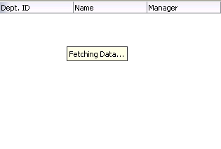
When a page is requested that contains a table, and the content delivery is set to lazy, the page initially goes through the standard lifecycle. However, instead of fetching the data during that request, a special separate PPR request is run. Because the page has just rendered, only the Render Response phase executes, and the corresponding data is fetched and displayed. If the user's actions cause a subsequent data fetch (for example scrolling in a table), another PPR request is executed. Figure 10-20 shows a page containing a table during the second PPR request.
When the user clicks a sortable column header, the table component generates a SortEvent event. This event has a getSortCriteria property, which returns the criteria by which the table must be sorted, along with the sort strength. The table responds to this event by calling the setSortCriteria() method on the underlying CollectionModel instance, and calls any registered SortListener instances.
10.2.7 What You May Need to Know About Programmatically Enabling Sorting for Table Columns
Sorting can be enabled for a table column only if the underlying model supports sorting. If the model is a CollectionModel instance, it must implement the following methods:
-
public boolean isSortable(StringpropertyName) -
public List getSortCriteria() -
public void setSortCriteria(Listcriteria)
The criteria in the second and third methods is a list where each item in the list is an instance of org.apache.myfaces.trinidad.model.SortCriterion, which supports sort strength.
For more information, see the MyFaces Trinidad website at http://myfaces.apache.org/trinidad/index.html">>http://myfaces.apache.org/trinidad/index.html.
If the model is not a CollectionModel instance, the table component wraps that model into an org.apache.myfaces.trinidad.model.SortableModel instance and converts the model to a CollectionModel instance that is sortable (SortableModel is a concrete class that extends CollectionModel and implements sorting functionality). In this case, the table will examine the actual data to determine which properties are sortable. Any column that has data that implements java.lang.Comparable will be sortable. This automatic support for sorting by the table is not as efficient as sorting directly into a CollectionModel instance but is sufficient for small data sets. Note that tables with a converted model allow sorting for only one column and therefore multi-column table sorting (normally done by supplying multiple sort criteria) is not supported on the converted model.
Note:
When the underlying table model is not aCollectionModel instance and multi-column sorting is desired, consider using the table inside a panelCollection component. The panel user interface allows the user to sort using multiple sort criteria even though automatic sorting provided by the table with a converted model does not support it. For details about the panelCollection component, see Section 10.7.1, "How to Add a panelCollection with a Table, Tree, or Tree Table.".10.2.8 What You May Need to Know About Performing an Action on Selected Rows in Tables
A collection-based component can allow users to select one or more rows and perform some actions on those rows (the carousel component does not support multiple selection).
When the selection state of a component changes, the component triggers selection events. A selectionEvent event reports which rows were just deselected and which rows were just selected.
To listen for selection events on a component, you can register a listener on the component either using the selectionListener attribute or by adding a listener to the component using the addselectionListener() method. The listener can then access the selected rows and perform some actions on them.
The current selection, that is the selected row or rows, are the RowKeySet object, which you obtain by calling the getSelectedRowKeys() method for the component. To change a selection programmatically, you can do either of the following:
-
Add
rowKeyobjects to, or removerowKeyobjects from, theRowKeySetobject. -
Make a particular row current by calling the
setRowIndex()or thesetRowKey()method on the component. You can then either add that row to the selection, or remove it from the selection, by calling theadd()orremove()method on theRowKeySetobject.
Example 10-5 shows a portion of a table in which a user can select some rows then click the Delete button to delete those rows. Note that the actions listener is bound to the performDelete method on the mybean managed bean.
<af:table binding="#{mybean.table}" rowselection="multiple" ...>
  ...
</af:table>
<af:commandButton text="Delete" actionListener="#{mybean.performDelete}"/>
Example 10-6 shows an actions method, performDelete, which iterates through all the selected rows and calls the markForDeletion method on each one.
Example 10-6 Using the rowKey Object
public void performDelete(ActionEvent action)
{
  UIXTable table = getTable();
  Iterator selection = table.getSelectedRowKeys().iterator();
  Object oldKey = table.getRowKey();
  while(selection.hasNext())
  {
    Object rowKey = selection.next();
    table.setRowKey(rowKey);
    MyRowImpl row = (MyRowImpl) table.getRowData();
    //custom method exposed on an implementation of Row interface.
    row.markForDeletion();
  }
  // restore the old key:
  table.setRowKey(oldKey);
}

// Binding methods for access to the table.
public void setTable(UIXTable table) { _table = table; }
public UIXTable getTable() { return _table; }
private UIXTable _table;
10.2.9 What You May Need to Know About Dynamically Determining Values for Selection Components in Tables
There may be a case when you want to use a selectOne component in a table, but you need each row to display different choices in a component. Therefore, you need to dynamically determine the list of items at runtime.
While you may think you should use a forEach component to stamp out the individual items, this will not work because forEach does not work with the CollectionModel instance. It also cannot be bound to EL expressions that use component-managed EL variables, as those used in the table. The forEach component performs its functions in the JSF tag execution step while the table performs in the following component encoding step. Therefore, the forEach component will execute before the table is ready and will not perform its iteration function.
In the case of a selectOne component, the direct child must be the items component. While you could bind the items component directly to the row variable (for example, <f:items value="#{row.Items}"/>, doing so would not allow any changes to the underlying model.
Instead, you should create a managed bean that creates a list of items, as shown in Example 10-7.
Example 10-7 Managed Bean Returns a List of Items
public List<SelectItem> getItems()
{
   // Grab the list of items
   FacesContext context = FacesContext.getCurrentInstance();
   Object rowItemObj =  context.getApplication().evaluateExpressionGet(
      context, "#{row.items}", Object.class);
   if (rowItemObj == null)
     return null;
    // Convert the model objects into items
   List<SomeModelObject> list =  (List<SomeModelObject>) rowItemObj;
   List<SelectItem> items = new ArrayList<SelectItem>(list.size());
   for (SomeModelObject entry : list)
   {
     items.add(new SelectItem(entry.getValue(), entry.getLabel());public
    }
    // Return the items
    return items;
}
You can then access the list from the one component on the page, as shown in Example 10-8.
10.2.10 What You May Need to Know About Using the Iterator Tag
When you do not want to use a table, but still need the same stamping capabilities, you can use the iterator tag. For example, say you want to display a list of periodic table elements, and for each element, you want to display the name, atomic number, symbol, and group. You can use the iterator tag as shown in Example 10-9.
Example 10-9 Using the Iterator Tag
<af:iterator var="row" first="3" rows="3" varStatus="stat"
             value="#{periodicTable.tableData}" >
  <af:outputText value="#{stat.count}.Index:#{stat.index} of
                                   #{stat.model.rowCount}"/>
  <af:inputText label="Element Name" value="#{row.name}"/>
  <af:inputText label="Atomic Number" value="#{row.number}"/>
  <af:inputText label="Symbol" value="#{row.symbol}"/>
  <af:inputText label="Group" value="#{row.group}"/>
</af:iterator>
Each child is stamped as many times as necessary. Iteration starts at the index specified by the first attribute for as many indexes specified by the row attribute. If the row attribute is set to 0, then the iteration continues until there are no more elements in the underlying data.
10.3 Adding Hidden Capabilities to a Table
You can use the detailStamp facet in a table to include data that can be displayed or hidden. When you add a component to this facet, the table displays an additional column with a toggle icon. When the user clicks the icon, the component added to the facet is shown. When the user clicks on the toggle icon again, the component is hidden. Figure 10-21 shows the additional column that is displayed when content is added to the detailStamp facet.
Note:
When a table that uses thedetailStamp facet is rendered in Screen Reader mode, the contents of the facet appear in a popup window. For more information about accessibility, see Chapter 22, "Developing Accessible ADF Faces Pages."Figure 10-22 shows the same table, but with the detailStamp facet expanded for the first row.
Note:
If you set the table to allow columns to freeze, the freeze will not work when you display thedetailStamp facet. That is, a user cannot freeze a column while the details are being displayed.10.3.1 How to Use the detailStamp Facet
To use the detailStamp facet, you insert a component that is bound to the data to be displayed or hidden into the facet.
-
In the Component Palette, drag the components you want to appear in the facet to the detailStamp facet folder. Figure 10-23 shows the detailStamp facet folder in the Structure window.
Tip:
If the facet folder does not appear in the Structure window, right-click the table and choose Facets - Table > Detail Stamp. -
If the attribute to be displayed is specific to a current record, replace the JSF code (which simply binds the component to the attribute), so that it uses the table's variable to display the data for the current record.
Example 10-10 shows abbreviated code used to display the
detailStampfacet shown in Figure 10-22, which shows details about the selected row.Example 10-10 Code for detailStamp Facet
<af:table rowSelection="multiple" var="test1"
          value="#{tableTestData}"
  <f:facet name="detailStamp">
    <af:panelFormLayout rows="4" labelWidth="33%" fieldWidth="67%"
                        inlineStyle="width:400px">
    <af:inputText label="Name" value="#{test1.name}"/>
      <af:group>
        <af:inputText label="Size" value="#{test1.size}"/>
        <af:inputText label="Date Modified" value="#{test1.inputDate}"/>
        <af:inputText label="Created by"/>
      </af:group>
    </af:panelFormLayout>
  </f:facet>
</af:table>
Note:
If your application uses the Fusion technology stack, then you can drag attributes from a data control and drop them into thedetailStamp facet. You don't need to modify the code.10.3.2 What Happens at Runtime: Disclosing Row Data
When the user hides or shows the details of a row, the table generates a rowDisclosureEvent event. The event tells the table to toggle the details (that is, either expand or collapse).
The rowDisclosureEvent event has an associated listener. You can bind the rowDisclosureListener attribute on the table to a method on a managed bean. This method will then be invoked in response to the rowDisclosureEvent event to execute any needed post-processing.
10.4 Enabling Filtering in Tables
You can add a filter to a table that can be used so that the table displays only rows whose values match the filter. When enabled and set to visible, a search criteria input field displays above each filterable column.
For example, the table in Figure 10-24 has been filtered to display only rows in which the Location value is 1700.
Filtered table searches are based on Query-by-Example and use the QBE text or date input field formats. The input validators are turned off to allow for entering characters for operators such as > and < to modify the search criteria. For example, you can enter >1500 as the search criteria for a number column. Wildcard characters may also be supported. Searches can be either case-sensitive or case-insensitive. If a column does not support QBE, the search criteria input field will not render for that column.
The filtering feature uses a model for filtering data into the table. The table's filterModel attribute must be bound to an instance of the FilterableQueryDescriptor class.
Note:
If your application uses the Fusion technology stack, then you can use data controls to create tables and filtering will be created for you. For more information see the "Creating ADF Databound Tables" chapter of the Oracle Fusion Middleware Web User Interface Developer's Guide for Oracle Application Development FrameworkIn Example 10-11, the table filterVisible attribute is set to true to enable the filter input fields. For each column to be filtered, you must set the sortProperty attribute to the associated column in the filterModel instance and the filterable attribute set to true.
Example 10-11 Table Component with Filtering Enabled
<af:table value="#{myBean.products}" var="row"
               ...
          filterVisible="true"
               ...
          rowselection="single">
               ...
  <af:column sortProperty="ProductID" filterable="true" sortable="true"
    <af:outputText value="#{row.ProductID}">
               ...
  </af:column>
  <af:column sortProperty="Name" filterable="true" sortable="true"
    <af:outputText value="#{row.Name}"/>
               ...
  </af:column>
  <af:column sortProperty="warehouse" filterable="true" sortable="true"
    <af:outputText value="#{row.warehouse}"/>
               ...
  </af:column>
</af:table>
10.4.1 How to Add Filtering to a Table
To add filtering to a table, first create a class that can provide the filtering functionality. You then bind the table to that class, and configure the table and columns to use filtering. The table that will use filtering must either have a value for its headerText attribute, or it must contain a component in the header facet of the column that is to be filtered. This allows the filter component to be displayed. Additionally, the column must be configured to be sortable, because the filterModel class uses the sortProperty attribute.
-
Create a Java class that is a subclass of the
FilterableQueryDescriptorclass.The
ConjunctionCriterionobject returned from thegetFilterConjunctionCriterionmethod must not benull. For more information about this class, see theADF Faces Javadoc. -
Create a table, as described in Section 10.2, "Displaying Data in Tables."
-
Select the table in the Structure window and set the following attributes in the Property Inspector:
-
FilterVisible: Set to
trueto display the filter criteria input field above searchable column. -
FilterModel: Bind to an instance of the
FilterableQueryDescriptorclass created in Step 1.
Tip:
If you want to use a component other than aninputTextcomponent for your filter (for example, aninputDatecomponent), then instead of settingfilterVisibletotrue, you can add the needed component to thefilterfacet. To do so:-
In the Structure window, right-click the column to be filtered and choose Insert inside af:column > JSF Core > Filter facet.
-
From the Component Palette, drag and drop a component into the facet.
-
Set the value of the component to the corresponding attribute within the
FilterableQueryDescriptorclass created in Step 1. Note that the value must take into account the variable used for the row, for example:#{af:inputDate label="Select Date" id="name" value="row.filterCriteria.date"}
-
-
In the Structure window, select a column in the table and in the Property Inspector, and set the following for each column in the table:
-
Filterable: Set to
true. -
FilterFeatures: Set to
caseSensitiveorcaseInsensitive. If not specified, the case sensitivity is determined by the model.
-
10.5 Displaying Data in Trees
The ADF Faces tree component displays hierarchical data, such as organization charts or hierarchical directory structures. In data of these types, there may be a series of top-level nodes, and each element in the structure may expand to contain other elements. For example, in an organization chart, any number of employees in the hierarchy may have any number of direct reports. The tree component can be used to show that hierarchy, where the direct reports appear as children to the node for the employee.
The tree component supports multiple root elements. It displays the data in a form that represents the structure, with each element indented to the appropriate level to indicate its level in the hierarchy. Users can expand and collapse portions of the hierarchy. Figure 10-25 shows a tree used to display directories in the File Explorer application.
The ADF Faces tree component uses a model to access the data in the underlying hierarchy. The specific model class is oracle.adf.view.rich.model.TreeModel, which extends CollectionModel, described in Section 10.2, "Displaying Data in Tables."
You must create your own tree model to support your tree. The tree model is a collection of rows. It has an isContainer() method that returns true if the current row contains child rows. To access the children of the current row, you call the enterContainer() method. Calling this method results in the TreeModel instance changing to become a collection of the child rows. To revert back up to the parent collection, you call the exitContainer() method.
You may find the oracle.adf.view.rich.model.ChildPropertyTreeModel class useful when constructing a TreeModel class, as shown in Example 10-12.
Example 10-12 Constructing a TreeModel
List<TreeNode> root = new ArrayList<TreeNode>();
for(int i = 0; i < firstLevelSize; i++)
{
  List<TreeNode> level1 = new ArrayList<TreeNode>();
  for(int j = 0; j < i; j++)
  {
    List<TreeNode> level2 = new ArrayList<TreeNode>();
    for(int k=0; k<j; k++)
    {
      TreeNode z = new TreeNode(null, _nodeVal(i,j,k));
      level2.add(z);
    }
    TreeNode c = new TreeNode(level2, _nodeVal(i,j));
    level1.add(c);
  }
  TreeNode n = new TreeNode(level1, _nodeVal(i));
  root.add(n);
}
ChildPropertyTreeModel model = new ChildPropertyTreeModel(root, "children");
private String _nodeVal(Integer... args)
{
  StringBuilder s = new StringBuilder();
  for(Integer i : args)
    s.append(i);
  return s.toString();
}
Note:
If your application uses the Fusion technology stack, then you can use data controls to create trees and the model will be created for you. For more information see the "Displaying Master-Detail Data" chapter of the Oracle Fusion Middleware Web User Interface Developer's Guide for Oracle Application Development FrameworkYou can manipulate the tree similar to the way you can manipulate a table. You can do the following:
-
To make a node current, call the
setRowIndex()method on the tree with the appropriate index into the list. Alternatively, call thesetRowKey()method with the appropriaterowKeyobject. -
To access a particular node, first make that node current, and then call the
getRowData()method on the tree. -
To access rows for expanded or collapsed nodes, call
getAddedSetandgetRemovedSetmethods on theRowDisclosureEvent. For more information, see Section 10.5.4, "What You May Need to Know About Programmatically Expanding and Collapsing Nodes." -
To manipulate the node's child collection, call the
enterContainer()method before calling thesetRowIndex()andsetRowKey()methods. Then call theexitContainer()method to return to the parent node. -
To point to a
rowKeyfor a node inside the tree (at any level) use thefocusRowKeyattribute. ThefocusRowKeyattribute is set when the user right-clicks on a node and selects the Show as top context menu item (or the Show as top toolbar button in thepanelCollectioncomponent).When the
focusRowKeyattribute is set, the tree renders the node pointed to by thefocusRowKeyattribute as the root node in the Tree and displays a Hierarchical Selector icon next to the root node. Clicking the Hierarchical Selector icon displays a Hierarchical Selector dialog which shows the path to thefocusRowKeyobject from the root node of the tree. How this displays depends on the components placed in thepathStampfacet.
As with tables, trees use stamping to display content for the individual nodes. Trees contain a nodeStamp facet, which is a holder for the component used to display the data for each node. Each node is rendered (stamped) once, repeatedly for all nodes. As each node is stamped, the data for the current node is copied into a property that can be addressed using an EL expression. Specify the name to use for this property using the var property on the tree. Once the tree has completed rendering, this property is removed or reverted back to its previous value.
Because of this stamping behavior, only certain types of components are supported as children inside an ADF Faces tree. All components that have no behavior are supported, as are most components that implement the ValueHolder or ActionSource interfaces.
In Example 10-13, the data for each element is referenced using the variable node, which identifies the data to be displayed in the tree. The nodeStamp facet displays the data for each element by getting further properties from the node variable:
Example 10-13 Displaying Data in a Tree
<af:tree var="node">
  <f:facet name="nodeStamp">
    <af:outputText value="#{node.firstname}"/>
  </f:facet>
</af:tree>
Trees also contain a pathStamp facet. This facet determines how the content of the Hierarchical Selector dialog is rendered, just like the nodeStamp facet determines how the content of the tree is rendered. The component inside the pathStamp facet can be a combination of simple outputText, image, and outputFormatted tags and cannot not be any input component (that is, any EditableValueHolder component) because no user input is allowed in the Hierarchical Selector popup. If this facet is not provided, then the Hierarchical Selector icon is not rendered.
For example, including an image and an outputText component in the pathStamp facet causes the tree to render an image and an outputText component for each node level in the Hierarchical Selector dialog. Use the same EL expression to access the value. For example, if you want to show the first name for each node in the path in an outputText component, the EL expression would be <af:outputText value="#{node.firstname}"/>.
Tip:
ThepathStamp facet is also used to determine how default toolbar buttons provided by the panelCollection component will behave. If you want to use the buttons, add a component bound to a node value. For more information about using the panelCollection component, see Section 10.7, "Displaying Table Menus, Toolbars, and Status Bars."10.5.1 How to Display Data in Trees
To create a tree, you add a tree component to your page and configure the display and behavior properties.
-
Create a Java class that extends the
org.apache.myfaces.trinidad.model.TreeModelclass, as shown in Example 10-12. -
In the Component Palette, from the Common Components panel, drag and drop a Tree to open the Insert Tree dialog. Configure the tree as needed. Click Help or press F1 for help in using the dialog.
-
In the Property Inspector, expand the Data section and set the following attributes:
-
Value: Specify an EL expression for the object to which you want the tree to be bound. This must be an instance of
org.apache.myfaces.trinidad.model.TreeModelas created in Step 1. -
Var: Specify a variable name to represent each node.
-
VarStatus: Optionally enter a variable that can be used to determine the state of the component. During the Render Response phase, the tree iterates over the model rows and renders each node. For any given node, the
varStatusattribute provides the following information:-
model: A reference to theCollectionModelinstance -
index: The current row index -
rowKey: The unique key for the current node
-
-
-
Expand the Appearance section and set the following attributes:
-
DisplayRow: Specify the node to display in the tree during the initial display. The possible values are
firstto display the first node,lastto display the last node, andselectedto display the first selected node in the tree. The default isfirst. -
DisplayRowKey: Specify the row key to display in the tree during the initial display. This attribute should be set only programatically. Specifying this attribute will override the
displayRowattribute. -
Summary: Optionally enter a summary of the data displayed by the tree.
-
-
Expand the Behavior section and set the following attributes:
-
InitiallyExpanded: Set to
trueif you want all nodes expanded when the component first renders. -
EditingMode: Specify whether for any editable components used to display data in the tree, you want all the nodes to be editable (
editAll), or you want the user to click a node to make it editable (clickToEdit). For more information, see Section 10.1.3, "Editing Data in Tables, Trees, and Tree Tables." -
ContextMenuSelect: Determines whether or not the node is selected when you right-click to open a context menu. When set to
true, the node is selected. For more information about context menus, see Chapter 13, "Using Popup Dialogs, Menus, and Windows." -
RowSelection: Set a value to make the nodes selectable. Valid values are:
none,single, ormultiple. For information about how to then programatically perform some action on the selected nodes, see Section 10.5.5, "What You May Need to Know About Programmatically Selecting Nodes." -
ContentDelivery: Specify when the data should be delivered. When the
contentDeliveryattribute is set toimmediate, data is fetched at the same time the component is rendered. If thecontentDeliveryattribute is set tolazy, data will be fetched and delivered to the client during a subsequent request. If the attribute is set towhenAvailable(the default), the renderer checks if the data is available. If it is, the content is delivered immediately. If it is not, then lazy delivery is used. For more information, see Section 10.1.1, "Content Delivery." -
FetchSize: Specify the number of rows in the data fetch block. For more information, see Section 10.1.1, "Content Delivery."
-
SelectionListener: Optionally enter an EL expression for a listener that handles selection events. For more information, see Section 10.5.5, "What You May Need to Know About Programmatically Selecting Nodes."
-
FocusListener: Optionally enter an EL expression for a listener that handles focus events.
-
RowDisclosureListener: Optionally enter an EL expression for a listener method that handles node disclosure events.
-
-
Expand the Advanced section and set the following attributes:
-
FocusRowKey: Optionally enter the node that is to be the initially focused node.
-
DisclosedRowKeys: Optionally enter an EL expression to a method on a backing bean that handles node disclosure. For more information, see Section 10.5.4, "What You May Need to Know About Programmatically Expanding and Collapsing Nodes."
-
SelectedRowKeys: Optionally enter the keys for the nodes that should be initially selected. For more information, see Section 10.5.5, "What You May Need to Know About Programmatically Selecting Nodes."
-
-
If you want your tree to size its height automatically, expand the Other section and set AutoHeightRows to the maximum number of nodes to display before a scroll bar is displayed. The default value is -1 (no automatic sizing for any number of number). You can set the value to 0 to have the value be the same as the
fetchSizevalue.Note:
Note the following about setting theautoHeightRowsattribute:-
Specifying height on the
inlineStyleattribute will have no effect and will be overridden by the value ofAutoHeightRows. -
Specifying a
min-heightormax-heighton theinlineStyleattribute is not recommended and is incompatible with theautoHeightRowsattribute. -
When the component is placed in a layout-managing container, such as
panelSplitter, it will be sized by the container (no auto-sizing will occur). For more information, see Section 10.1.6, "Geometry Management for Table, Tree, and Tree Table Components."
-
-
To add components to display data in the tree, drag the desired component from the Component Palette to the nodeStamp facet. Figure 10-26 shows the nodeStamp facet for the tree used to display directories in the File Explorer application.
The component's value should be bound to the variable value set on the tree's
varattribute and the attribute to be displayed. For example, the tree in the File Explorer application usesfolderas the value for thevarattribute, and displays the name of the directory for each node. Therefore, the value of the output component used to display the directory name is#{folder.name}.Tip:
Facets can accept only one child component. Therefore, if you want to use more than one component per node, place the components in a group component that can be the facet's direct child, as shown in Figure 10-26.
10.5.2 What Happens When You Add a Tree to a Page
When you add a tree to a page, JDeveloper adds a nodeStamp facet to stamp out the nodes of the tree. Example 10-14 shows the abbreviated code for the tree in the File Explorer application that displays the directory structure.
Example 10-14 ADF Faces Tree Code in a JSF Page
<af:tree id="folderTree"
         var="folder"
         binding="#{explorer.navigatorManager.foldersNavigator
                                             .foldersTreeComponent}"
         value="#{explorer.navigatorManager.foldersNavigator.
                                              foldersTreeModel}"
         disclosedRowKeys="#{explorer.navigatorManager.foldersNavigator.
                                              foldersTreeDisclosedRowKeys}"
         rowSelection="single"
         contextMenuId=":context2"
         selectionListener="#{explorer.navigatorManager.foldersNavigator.
                                              showSelectedFolderContent}">
  <f:facet name="nodeStamp">
    <af:panelGroupLayout>
      <af:image id="folderNodeStampImg" source="#{folder.icon}"
                inlineStyle="vertical-align:middle; margin-right:3px;
                             shortDesc="folder icon"/>
      <af:outputText id="folderNodeStampText" value="#{folder.name}"/>
    </af:panelGroupLayout>
  </f:facet>
</af:tree>
10.5.3 What Happens at Runtime: Tree Component Events
The tree is displayed in a format with nodes indented to indicate their levels in the hierarchy. The user can click nodes to expand them to show children nodes. The user can click expanded nodes to collapse them. When a user clicks one of these icons, the component generates a RowDisclosureEvent event. You can register a custom rowDisclosureListener method to handle any processing in response to the event. For more information, see Section 10.5.4, "What You May Need to Know About Programmatically Expanding and Collapsing Nodes."
When a user selects or deselects a node, the tree component invokes a selectionEvent event. You can register custom selectionListener instances, which can do post-processing on the tree component based on the selected nodes. For more information, see Section 10.5.5, "What You May Need to Know About Programmatically Selecting Nodes."
10.5.4 What You May Need to Know About Programmatically Expanding and Collapsing Nodes
The RowDisclosureEvent event has two RowKeySet objects: the RemovedSet object for all the collapsed nodes and the AddedSet object for all the expanded nodes. The component expands the subtrees under all nodes in the added set and collapses the subtrees under all nodes in the removed set.
Your custom rowDisclosureListener method can do post-processing, on the tree component, as shown in Example 10-15.
Example 10-15 Tree Table Component with rowDisclosureListener
<af:treeTable id="folderTree" var="directory" value="#{fs.treeModel}"
     binding="#{editor.component}" rowselection="multiple"
     columnselection="multiple" focusRowKey="#{fs.defaultFocusRowKey}"
     selectionListener="#{fs.Table}"
     contextMenuId="treeTableMenu"
     rowDisclosureListener="#{fs.handleRowDisclosure}">
The backing bean method that handles row disclosure events is shown in Example 10-16. The example illustrates expansion of a tree node. For the contraction of a tree node, you would use getRemovedSet.
Example 10-16 Backing Bean Method for RowDisclosureEvent
public void handleRowDisclosure(RowDisclosureEvent rowDisclosureEvent)
  throws Exception {
    Object rowKey = null;
    Object rowData = null;
    RichTree tree = (RichTree) rowDisclosureEvent.getSource();
    RowKeySet rks = rowDisclosureEvent.getAddedSet();

    if (rks != null) {
        int setSize = rks.size();
        if (setSize > 1) {
            throw new Exception("Unexpected multiple row disclosure
                                 added row sets found.");
        }

        if (setSize == 0) {
           // nothing in getAddedSet indicates this is a node
           // contraction, not expansion. If interested only in handling
           // node expansion at this point, return.
           return;
        }

        rowKey = rks.iterator().next();
        tree.setRowKey(rowKey);
        rowData = tree.getRowData();

        // Do whatever is necessary for accessing tree node from
        // rowData, by casting it to an appropriate data structure
        // for example, a Java map or Java bean, and so forth.
   }
}
Trees and tree tables use an instance of the oracle.adf.view.rich.model.RowKeySet class to keep track of which nodes are expanded. This instance is stored as the disclosedRowKeys attribute on the component. You can use this instance to control the expand or collapse state of an node in the hierarchy programatically, as shown in Example 10-17. Any node contained by the RowKeySet instance is expanded, and all other nodes are collapsed. The addAll() method adds all elements to the set, and the and removeAll() method removes all the nodes from the set.
Example 10-17 Tree Component with disclosedRowKeys Attribute
<af:tree var="node"
         inlineStyle="width:90%; height:300px"
         id="displayRowTable"
         varStatus="vs"
         rowselection="single"
         disclosedRowKeys="#{treeTableTestData.disclosedRowKeys}"
         value="#{treeTableTestData.treeModel}">
The backing bean method that handles the disclosed row keys is shown in Example 10-18.
Example 10-18 Backing Bean Method for Handling Row Keys
public RowKeySet getDisclosedRowKeys()
{
  if (disclosedRowKeys == null)
  {
    // Create the PathSet that we will use to store the initial
    // expansion state for the tree
      RowKeySet treeState = new RowKeySetTreeImpl();
      // RowKeySet requires access to the TreeModel for currency.
      TreeModel model = getTreeModel();
      treeState.setCollectionModel(model);
      // Make the model point at the root node
      int oldIndex = model.getRowIndex();
      model.setRowKey(null);
      for(int i = 1; i<=19; ++i)
      {
        model.setRowIndex(i);
        treeState.setContained(true);
      }
      model.setRowIndex(oldIndex);
      disclosedRowKeys = treeState;
  }
  return disclosedRowKeys;
}
10.5.5 What You May Need to Know About Programmatically Selecting Nodes
The tree and tree table components allow nodes to be selected, either a single node only, or multiple nodes. If the component allows multiple selections, users can select multiple nodes using Control+click and Shift+click operations.
When a user selects or deselects a node, the tree component fires a selectionEvent event. This event has two RowKeySet objects: the RemovedSet object for all the deselected nodes and the AddedSet object for all the selected nodes.
Tree and tree table components keep track of which nodes are selected using an instance of the class oracle.adf.view.rich.model.RowKeySet. This instance is stored as the selectedRowKeys attribute on the component. You can use this instance to control the selection state of a node in the hierarchy programatically. Any node contained by the RowKeySet instance is deemed selected, and all other nodes are not selected. The addAll() method adds all nodes to the set, and the and removeAll() method removes all the nodes from the set. Tree and tree table node selection works in the same way as table row selection. You can refer to sample code for table row selection in Section 10.2.8, "What You May Need to Know About Performing an Action on Selected Rows in Tables."
10.6 Displaying Data in Tree Tables
The ADF Faces tree table component displays hierarchical data in the form of a table. The display is more elaborate than the display of a tree component, because the tree table component can display columns of data for each tree node in the hierarchy. The component includes mechanisms for focusing on subtrees within the main tree, as well as expanding and collapsing nodes in the hierarchy. Figure 10-27 shows the tree table used in the File Explorer application. Like the tree component, the tree table can display the hierarchical relationship between the files in the collection. And like the table component, it can also display attribute values for each file.
The immediate children of a tree table component must be column components, in the same way as for table components. Unlike the table, the tree table component has a nodeStamp facet which holds the column that contains the primary identifier of an node in the hierarchy. The treeTable component supports the same stamping behavior as the Tree component (for details, see Section 10.5, "Displaying Data in Trees").
For example, in the File Explorer application (as shown in Figure 10-27), the primary identifier is the file name. This column is what is contained in the nodeStamp facet. The other columns, such as Type and Size, display attribute values on the primary identifier, and these columns are the direct children of the tree table component. This tree table uses node as the value of the variable that will be used to stamp out the data for each node in the nodeStamp facet column and each component in the child columns. Example 10-19 shows abbreviated code for the tree table in the File Explorer application.
Example 10-19 Stamping Rows in a TreeTable
<af:treeTable id="folderTreeTable" var="file"
              value="#{explorer.contentViewManager.treeTableContentView.
                                                   contentModel}"
              binding="#{explorer.contentViewManager.treeTableContentView.
                                                   contentTreeTable}"
              emptyText="#{explorerBundle['global.no_row']}"
              columnStretching="last"
              rowSelection="single"
              selectionListener="#{explorer.contentViewManager.
                                   treeTableContentView.treeTableSelectFileItem}"
              summary="treeTable data">
  <f:facet name="nodeStamp">
    <af:column headerText="#{explorerBundle['contents.name']}"
               width="200" sortable="true" sortProperty="name">
      <af:panelGroupLayout>
        <af:image source="#{file.icon}"
                  shortDesc="#{file.name}"
                  inlineStyle="margin-right:3px; vertical-align:middle;"/>
        <af:outputText id="nameStamp" value="#{file.name}"/>
      </af:panelGroupLayout>
    </af:column>
  </f:facet>
  <f:facet name="pathStamp">
    <af:panelGroupLayout>
      <af:image source="#{file.icon}"
                shortDesc="#{file.name}"
                inlineStyle="margin-right:3px; vertical-align:middle;"/>
      <af:outputText value="#{file.name}"/>
    </af:panelGroupLayout>
  </f:facet>
  <af:column headerText="#{explorerBundle['contents.type']}">
    <af:outputText id="typeStamp" value="#{file.type}"/>
  </af:column>
  <af:column headerText="#{explorerBundle['contents.size']}">
    <af:outputText id="sizeStamp" value="#{file.property.size}"/>
  </af:column>
  <af:column headerText="#{explorerBundle['contents.lastmodified']}"
             width="140">
    <af:outputText id="modifiedStamp"
                   value="#{file.property.lastModified}"/>
  </af:column>
</af:treeTable>
The tree table component supports many of the same attributes as both tables and trees. For more information about these attributes see Section 10.2, "Displaying Data in Tables" and Section 10.5, "Displaying Data in Trees."
10.6.1 How to Display Data in a Tree Table
You use the Insert Tree Table wizard to create a tree table. Once the wizard is complete, you can use the Property Inspector to configure additional attributes on the tree table.
To add a tree table to a page:
-
In the Component Palette, from the Common Components panel, drag and drop a Tree Table onto the page to open the Insert Tree Table wizard. Configure the table by completing the wizard. If you need help, press F1 or click Help.
-
Use the Property Inspector to configure any other attributes.
Tip:
The attributes of the tree table are the same as those on the table and tree components. Refer to Section 10.2.4, "How to Display a Table on a Page," and Section 10.5.1, "How to Display Data in Trees" for help in configuring the attributes.
10.7 Displaying Table Menus, Toolbars, and Status Bars
You can use the panelCollection component to add menus, toolbars, and status bars to tables, trees, and tree tables. To use the panelCollection component, you add the table, tree, or tree table component as a direct child of the panelCollection component. The panelCollection component provides default menus and toolbar buttons.
Figure 10-28 shows the panelCollection component with the tree table component in the File Explorer application. The toolbar contains a menu that provides actions that can be performed on the tree table (such as expanding and collapsing nodes), a button that allows users to detach the tree table, and buttons that allow users to change the rows displayed in the tree table. You can configure the toolbar to not display certain toolbar items. For example, you can turn off the buttons that allow the user to detach the tree or table. For more information about menus, toolbars, and toolbar buttons, see Chapter 14, "Using Menus, Toolbars, and Toolboxes."
Among other facets, the panelCollection component contains a menu facet to hold menu components, a toolbar facet for toolbar components, a secondaryToolbar facet for another set of toolbar components, and a statusbar facet for status items.
The default top-level menu and toolbar items vary depending on the component used as the child of the panelCollection component:
-
Table and tree: Default top-level menu is View.
-
Table and tree table with selectable columns: Default top-level menu items are View and Format.
-
Table and tree table: Default toolbar menu is Detach.
-
Table and tree table with selectable columns: Default top-level toolbar items are Freeze, Detach, and Wrap
-
Tree and tree table (when the
pathStampfacet is used): The toolbar buttons Go Up, Go To Top, and Show as Top also appear.
Example 10-20 shows how the panelCollection component contains menus and toolbars.
Example 10-20 The panelCollection Component with Table, Menus, and Toolbars
<af:panelCollection
    binding="#{editor.component}">
  <f:facet name="viewMenu">
    <af:group>
      <af:commandMenuItem text="View Item 1..."/>
      <af:commandMenuItem text="View Item 2.."/>
      <af:commandMenuItem text="View Item 3..." disabled="true"/>
      <af:commandMenuItem text="View Item 4"/>
    </af:group>
  </f:facet>

  <f:facet name="menus">
    <af:menu text="Actions">
      <af:commandMenuItem text="Add..." />
      <af:commandMenuItem text="Create.." />
      <af:commandMenuItem text="Update..." disabled="true"/>
      <af:commandMenuItem text="Copy"/>
      <af:commandMenuItem text="Delete"/>
      <af:commandMenuItem text="Remove" accelerator="control A"/>
      <af:commandMenuItem text="Preferences"/>
    </af:menu>
  </f:facet>
  <f:facet name="toolbar">
    <af:toolbar>
      <af:commandToolbarButton shortDesc="Create" icon="/new_ena.png">
      </af:commandToolbarButton>
      <af:commandToolbarButton shortDesc="Update" icon="/update_ena.png">
      </af:commandToolbarButton>
      <af:commandToolbarButton shortDesc="Delete" icon="/delete_ena.png">
      </af:commandToolbarButton>
    </af:toolbar>
  </f:facet>
  <f:facet name="secondaryToolbar">
  </f:facet>
  <f:facet name="statusbar">
    <af:toolbar>
      <af:outputText id="statusText" ... value="Custom Statusbar Message"/>
    </af:toolbar>
  </f:facet>
  <af:table rowselection="multiple" columnselection="multiple"
                        ...
  <af:column
                        ...
  </af:column>
Tip:
You can make menus detachable in thepanelCollection component. For more information, see Section 14.2, "Using Menus in a Menu Bar." Consider using detached menus when you expect users to do any of the following:
-
Execute similar commands repeatedly on a page.
-
Execute similar commands on different rows of data in a large table, tree table, or tree.
-
View data in long and wide tables or tree tables, and trees. Users can choose which columns or branches to hide or display with a single click.
-
Format data in long or wide tables, tree tables, or trees.
10.7.1 How to Add a panelCollection with a Table, Tree, or Tree Table
You add a panelCollection component and then add the table, tree, or tree table inside the panelCollection component. You can then add and modify the menus and toolbars for it.
To create a panelCollection component with an aggregate display component:
-
In the Component Palette, from the Layout panel, drag and drop a Panel Collection onto the page. Add the table, tree, or tree table as a child to that component.
Alternatively, if the table, tree, or tree table already exists on the page, you can right-click the component and choose Surround With. Then select Panel Collection to wrap the component with the
panelCollectioncomponent. -
Optionally, customize the
panelCollectiontoolbar by turning off specific toolbar and menu items. To do so, select thepanelCollectioncomponent in the Structure window. In the Property Inspector, set thefeaturesOffattribute. Table 10-1 shows the valid values and the corresponding effect on the toolbar.Table 10-1 Valid Values for the featuresOff Attribute
Value Will not display... statusBarstatus bar
viewMenuView menu
formatMenuFormat menu
columnsMenuItemColumns menu item in the View menu
columnsMenuItem:colIdFor example:
columnsMenuItem:col1, col2Columns with matching IDs in the Columns menu
For example, the value to the left would not display the columns whose IDs are
col1andcol2freezeMenuItemFreeze menu item in the View menu
detachMenuItemDetach menu item in the View menu
sortMenuItemSort menu item in the View menu
reorderColumnsMenuItemReorder Columns menu item in the View menu
resizeColumnsMenuItemResize Columns menu item in the Format menu
wrapMenuItemWrap menu item in the Format menu
showAsTopMenuItemShow As Top menu item in the tree's View menu
scrollToFirstMenuItemScroll To First menu item in the tree's View menu
scrollToLastMenuItemScroll To Last menu item in the tree's View menu
freezeToolbarItemFreeze toolbar item
detachToolbarItemDetach toolbar item
wrapToolbarItemWrap toolbar item
showAsTopToolbarItemShow As Top toolbar item
wrapWrap menu and toolbar items
freezeFreeze menu and toolbar items
detachDetach menu and toolbar items
-
Add your custom menus and toolbars to the component:
-
Menus: Add a
menucomponent inside themenufacet. -
Toolbars: Add a
toolbarcomponent inside thetoolbarorsecondaryToolbarfacet. -
Status items: Add items inside the
statusbarfacet. -
View menu: Add
commandMenuItemcomponents to theviewMenufacet. For multiple items, use thegroupcomponent as a container for the manycommandMenuItemcomponents.
From the Component Palette, drag and drop the component into the facet. For example, drop Menu into the
menufacet, then drop Menu Items into the same facet to build a menu list. For more instructions about menus and toolbars, see Chapter 14, "Using Menus, Toolbars, and Toolboxes." -
10.8 Displaying a Collection in a List
Instead of using a table with multiple columns, you can use the listView and listItem components to display structured data in a simple table-like format that contains just one column. Figure 10-29 shows a listView component that contains one listItem component used to display an error icon, task information, and an action button, for each row.
As shown in Figure 10-30, instead of using columns to group the data to be displayed, a mix of layout components and other components, held by one listItem component, display the actual the data. In this example, the listItem component contains one large panelGroupLayout component set to display its children horizontally. The children are three other panelGroupLayout components used to group their children as columns might in a table. These panelGroupLayout components are also set to display their children horizontally. The second of these layout components contains one panelGroupLayout component set to display its child components (in this case three outputText components) vertically.
Example 10-21 shows the corresponding code.
Example 10-21 The listView Component
<af:listView id="listView" binding="#{editor.component}"
                           var="item" varStatus="vs" partialTriggers="::pprLV"
                           value="#{demolistView.taskModel}"
                           selection="multiple">
  <af:listItem id="lvi">
    <af:showPopupBehavior popupId="::ctxtMenu"
                          triggerType="contextMenu"/>
    <af:panelGroupLayout id="panelGroupLayout1"
                         layout="horizontal"
                         styleClass="AFStretchWidth">
      <af:panelGroupLayout id="panelGroupLayout2"
                           layout="horizontal"
                           inlineStyle="margin-left:20px; width:45px"
                           halign="center" valign="middle">
        <af:image rendered="#{vs.index %6 ==1}"
                  source="/images/error.png" id="i1"
                  shortDesc="Error at Line #{vs.index + 1}"/>
      </af:panelGroupLayout>
      <af:panelGroupLayout id="panelGroupLayout3" layout="horizontal"
                           inlineStyle="width:100%">
        <af:panelGroupLayout id="panelGroupLayout5"
                             layout="vertical"
                             inlineStyle="min-width:300px">
          <af:outputText id="outputText1" value="#{item.taskName}"
                         styleClass="taskName"/>
          <af:outputText id="outputText2"
                         value="#{item.projectDesc}"
                         styleClass="taskProjectDesc"/>
          <af:outputText id="outputText3" value="#{item.created}"
                         styleClass="taskCreated"/>
        </af:panelGroupLayout>
      </af:panelGroupLayout>
      <af:panelGroupLayout id="panelGroupLayout4"
                           layout="horizontal" halign="end"
                           valign="middle"
                           inlineStyle="margin-right:20px">
        <af:commandButton id="cb1" text="Action"
                      shortDesc="Click To Invoke Action for Item #{vs.index + 1}">
          <af:showPopupBehavior popupId="::popupDialog"
                               alignId="cb1" align="afterStart"/>
        </af:commandButton>
      </af:panelGroupLayout>
    </af:panelGroupLayout>
  </af:listItem>
</af:listView>
You bind the listView component to the collection. The component then repeatedly renders one listItem component by stamping the value for each item. As each item is stamped, the data for the current row is copied into a property that can be addressed by an EL expression that uses the listView component's var attribute. Once the list has completed rendering, this property is removed or reverted back to its previous value.
In this example, the listView value is bound to the demolistView.taskModel object. The properties on this object can be accessed using the var property, which is set to item. For example, in order to display the task name, the outputText component value is set to item.taskName.
The listView component can also display a limited, two-level hierarchy. To display a hierarchy, the listView needs to be bound to a TreeModel instead of a CollectionModel. The TreeModel can contain one root level and one child level (for more information about the TreeModel class, see Section 10.5, "Displaying Data in Trees").
As with trees, the listView uses stamping to display content for the individual nodes, and a facet (named the groupHeaderStamp facet) that acts as a holder for the component used to display the parent data for the nodes. However, since the listView only allows two levels, the groupHeaderStamp facet contains the component used to display only the root level.
Figure 10-31 shows a listView component displaying a simple hierarchy that has letters of the alphabet as the root, and employee objects as the leaf nodes.
The components used to display the employee object are placed in a listItem component, while the components used to display the letter of the alphabet are placed in a listItem component inside the groupHeaderStamp facet, as shown in Example 10-22.
Example 10-22 The groupHeaderStamp Facet in a listView Component
<af:listView id="listView" binding="#{editor.component}"
             var="item" varStatus="vs" groupDisclosurePolicy="noDisclosure"
             value="#{demolistView.ABTreeModel}">
  <af:listItem id="listItem1">
    <af:panelGroupLayout id="pgl3" layout="vertical">
      <af:outputText id="ot2" value="#{item.ename}" styleClass="ABName"/>
      <af:outputText id="ot3" value="#{item.job}" styleClass="ABJob"/>
    </af:panelGroupLayout>
  </af:listItem>
  <f:facet name="groupHeaderStamp">
    <af:listItem id="listItem2" styleClass="ABHeader">
      <af:outputText id="ot1" value="#{item.alphabetHeading}"/>
    </af:listItem>
  </f:facet>
</af:listView>
When you display a hierarchy in a listView component, you can configure it so that the headers can disclose or hide its child components, as shown in Figure 10-32.
By default, the listView component is configured to display all children. You can change this using the groupDisclosurePolicy attribute.
When a user collapses or expands a group, a RowDisclosureEvent is fired. You can use the groupDisclosureListener to programmatically expand and collapse nodes. For more information, see Section 10.5.4, "What You May Need to Know About Programmatically Expanding and Collapsing Nodes."
When a user selects or deselects a row or a node, a SelectionEvent is fired. You can use the selectionListener to programmatically respond to the event. For more information, see Section 10.2.8, "What You May Need to Know About Performing an Action on Selected Rows in Tables."
10.8.1 How to Display a Collection in a List
You use a listView component bound to a CollectionModel instance and one listItem component to create the list. If you want to display a simple parent-child hearers, you place a second listItem component in the groupHeaderStamp facet. You then add layout components and other text components to display the actual data.
To display a collection in a list:
-
Create a Java class for the model to which the list will be bound. If you want the list to display groups with headers, the model must extend the
org.apache.myfaces.trinidad.model.TreeModelclass. If not, it should extend theorg.apache.myfaces.trinidad.model.CollectionModelclass.Tip:
You may also use other model classes, such asjava.util.List,array, and javax.faces.model.DataModel. If you use one of these other classes, thelistViewcomponent automatically converts the instance into aCollectionModelclass, but without any additional functionality. For more information about theCollectionModelclass, see the MyFaces Trinidad Javadoc athttp://myfaces.apache.org/trinidad/trinidad-1_2/trinidad-api/apidocs/index.html">>http://myfaces.apache.org/trinidad/trinidad-1_2/trinidad-api/apidocs/index.html. -
In the Component Palette, from the Common Components panel, drag and drop a List View on to the page.
-
In the Property Inspector, expand the Other section and set the following:
-
Value: Specify an EL expression to bind the list to the mode created in Step 1.
-
Var: Specify a variable name to represent each node.
-
First: Specify a row to set as the first row to display in the list.
-
FetchSize: Set the size of the block that should be returned with each data fetch. The default is 25.
Tip:
You should determine the value of thefetchSizeattribute by taking the height of the list and dividing it by the height of each row to determine how many rows will be needed to fill the list. If thefetchSizeattribute is set too low, it will require multiple trips to the server to fill the list. If it is set too high, the server will need to fetch more rows from the data source than needed, thereby increasing time and memory usage. On the client side, it will take longer to process those rows and attach them to the component. For more information, see Section 10.1.1, "Content Delivery." -
Rows: Specific the number of rows to display in the range of rows. By default this is 25 (the same value as the
fetchSizeattribute). Set it to0to display all rows. -
SelectedRowKeys: Optionally enter the keys for the nodes that should be initially selected. For more information, see Section 10.5.5, "What You May Need to Know About Programmatically Selecting Nodes."
-
Selection: Set a value to make the rows selectable (this is the
rowSelectionattribute). Valid values are: none, single, and multiple. For information about how to then programatically perform some action on the selected rows, see Section 10.2.8, "What You May Need to Know About Performing an Action on Selected Rows in Tables."
-
-
Drag and drop a List Item as a child to the
listViewcomponent. -
Drag and drop layout and other components into the
listViewcomponent, to create your desired configuration. See Figure 10-30 and Example 10-21 for an example. -
If you want the
listViewcomponent to display a simple hierarchy, drag and drop a List Item into thegroupHeaderStampfacet. Figure 10-33 shows thegroupHeaderStampfacet in the Structure window. -
Drag and drop an Output Text into the
listItemcomponent to display your header text, and configure theoutputTextcomponent as needed.
10.9 Displaying Images in a Carousel
You can display images in a revolving carousel, as shown in Figure 10-34. Users can change the image at the front either by using the slider at the bottom or by clicking one of the auxiliary images to bring that specific image to the front.
By default, the carousel is displayed horizontally. The objects within the horizontal orientation of the carousel are vertically aligned to the middle and the carousel itself is horizontally aligned to the center of its container.
You can configure the carousel so that it can be displayed vertically, as you might want for a reference card file. By default, the objects within the vertical orientation of the carousel are horizontally aligned to the center and the carousel itself is vertically aligned to the middle, as shown in Figure 10-35. You can change the alignments using the carousel's alignment attributes.
Best Practice:
Generally the carousel should be placed in a parent component that stretches its children (such as apanelSplitter or panelStretchLayout). If you do not place the carousel in a component that stretches its children, your carousel will display at the default dimension of 500px wide and 300px tall. You can change these dimensions.The carousel component can display in circular mode, as in Figure 10-34, or you can configure it so that it displays only the current image, as shown in Figure 10-36
You can also configure the controls used to browse through the images. You can display a slider that has next and previous arrows and that spans more than one image (as shown in Figure 10-34), you can display only next and previous buttons, (as shown in Figure 10-36), or you can display next and previous buttons, along with the slide counter, (as shown in Figure 10-37).
By default, when the carousel is configured to display in the circular mode, when you hover over an auxiliary item (that is, and item that is not the current item at the center), the item is outlined to show that it can be selected (note that this outline will only appear if your application is using the Skyros or Fusion FX v1.2 and above skins). You can configure the carousel so that instead, the item pops out and displays at full size, as shown in Figure 10-38.
When set to the circular mode, you can also configure the space between images, and you can also configure the size of the auxiliary images. By default, the space between images is set to 0.45 times the size of the preceding image, resulting in the images overlapping each other, and the auxiliary image size is set to 0.8, so that each image is 0.8 times the size of the preceding image, as shown in Figure 10-34. You can change these settings to alter how the carousel appears. For example, if you wanted the carousel to appear more like a filmstrip, you might set the space between the images to be 1.1, and the size of the auxiliary items to be 1, so that they are all the same size, as shown in Figure 10-39.
A child carouselItem component displays the objects in the carousel, along with a title for the object. You bind the carousel component to the collection. The component then repeatedly renders one carouselItem component by stamping the value for each item. As each item is stamped, the data for the current item is copied into a property that can be addressed by an EL expression that uses the carousel component's var attribute. Once the carousel has completed rendering, this property is removed or reverted back to its previous value. Carousels contain a nodeStamp facet, which is both a holder for the carouselItem component used to display the text and short description for each item, and the parent component to the image displayed for each item.
For example, the carouselItem JSF page in the ADF Faces demo shown in Figure 10-34 contains a carousel component that displays an image of each of the ADF Faces components. The demoCarouselItem (CarouselBean.java) managed bean contains a list of each of these components. The value attribute of the carousel component is bound to the items property on that bean, which represents that list. The carousel component's var attribute is used to hold the value for each item to display, and is used by both the carouselItem component and the image component to retrieve the correct values for each item. Example 10-23 shows the JSF page code for the carousel. For more information about stamping behavior in a carousel, see Section 10.5, "Displaying Data in Trees."
Example 10-23 Carousel Component JSF Page Code
<af:carousel id="carousel" binding="#{editor.component}"
             var="item"
             value="#{demoCarousel.items}"
             carouselSpinListener="#{demoCarousel.handleCarouselSpin}">
  <f:facet name="nodeStamp">
    <af:carouselItem id="crslItem" text="#{item.title}" shortDesc="#{item.title}">
      <af:image id="img" source="#{item.url}" shortDesc="#{item.title}"/>
    </af:carouselItem>
  </f:facet>
</af:carousel>
A carouselItem component stretches its sole child component. If you place a single image component inside of the carouselItem, the image stretches to fit within the square allocated for the item (as the user spins the carousel, these dimensions shrink or grow).
Best Practice:
Theimage component does not provide any geometry management controls for altering how it behaves when stretched. You should use images that have equal width and height dimensions in order for the image to retain its proper aspect ratio when it is being stretched.The carousel component uses a CollectionModel class to access the data in the underlying collection. This class extends the JSF DataModel class and adds on support for row keys. In the DataModel class, rows are identified entirely by index. However, to avoid issues if the underlying data changes, the CollectionModel class is based on row keys instead of indexes.
You may also use other model classes, such as java.util.List, array, and javax.faces.model.DataModel. If you use one of these other classes, the carousel component automatically converts the instance into a CollectionModel class, but without any additional functionality. For more information about the CollectionModel class, see the MyFaces Trinidad javadoc at http://myfaces.apache.org/trinidad/trinidad-1_2/trinidad-api/apidocs/index.html">>http://myfaces.apache.org/trinidad/trinidad-1_2/trinidad-api/apidocs/index.html.
Note:
If your application uses the Fusion technology stack, you can create ADF Business Components over your data source that represent the items, and the model will be created for you. You can then declaratively create the carousel, and it will automatically be bound to that model. For more information, see the "Using the ADF Faces Carousel Component" section of the Oracle Fusion Middleware Fusion Developer's Guide for Oracle Application Development Framework.The carousel components are virtualized, meaning that not all the items available to the component on the server are delivered to, and displayed on, the client. You configure the carousel to fetch a certain number of rows at a time from your data source. The data can be delivered to the component either immediately upon rendering, or lazily fetched after the shell of the component has been rendered. By default, the carousel lazily fetches data for the initial request. When a page contains one or more of these components, the page initially goes through the standard lifecycle. However, instead of the carousel fetching the data during that initial request, a special separate partial page rendering (PPR) request is run on the component, and the number of items set as the value of the fetch size for the carousel is then returned. Because the page has just been rendered, only the Render Response phase executes for the carousel, allowing the corresponding data to be fetched and displayed. When a user does something to cause a subsequent data fetch (for example, spinning the carousel for another set of images), another PPR request is executed.
Performance Tip:
You should use lazy delivery when the page contains a number of components other than a carousel. Using lazy delivery allows the initial page layout and other components to be rendered first before the data is available.Use immediate delivery if the carousel is the only context on the page, or if the carousel is not expected to return a large set of items. In this case, response time will be faster than with lazy delivery (or in some cases, simply perceived as faster), as the second request will not go to the server, providing a faster user response time and better server CPU utilizations. Note, however, that only the number of items configured to be the fetch block will be initially returned. As with lazy delivery, when a user's actions cause a subsequent data fetch, the next set of items is delivered.
A slider control allows users to navigate through the collection. Normally, the thumb on the slider displays the current object number out of the total number of objects, for example 6 of 20. When the total number of objects is too high to calculate, the thumb on the slider will show only the current object number. For example, say a carousel is used for a company's employee directory. By default, the directory might show faces for every employee, but it may not know without an expensive database call that there are exactly 94,409 employees in the system that day.
You can use other components in conjunction with the carousel. For example, you can add a toolbar or menu bar, and to that, add buttons or menu items that allow users to perform actions on the current object.
10.9.1 How to Create a Carousel
To create a carousel, you must first create the data model that contains the images to display. You then bind a carousel component to that model and insert a carouselItem component into the nodeStamp facet of the carousel. Lastly, you insert an image component (or other components that contain an image component) as a child to the carouselItem component.
-
Create the data model that will provide the collection of images to display. The data model can be a
List,Array,DataModel, orCollectionModel. If the collection is anything other than aCollectionModel, the framework will automatically convert it to aCollectionModel. For more information about theCollectionModelclass, see the MyFaces Trinidad Javadoc athttp://myfaces.apache.org/trinidad/trinidad-1_2/trinidad-api/apidocs/index.html">>http://myfaces.apache.org/trinidad/trinidad-1_2/trinidad-api/apidocs/index.html.The data model should provide the following information for each of the images to be displayed in the carousel:
-
URL to the images
-
Title, which will be displayed below the image in the carousel
-
Short description used for text displayed when the user mouses over the image
For examples, see the
CarouselBean.javaand theCarouselMediaBean.javaclasses in the ADF Faces demo application. -
-
In the Component Palette, from the Common Components panel, drag and drop a Carousel onto the page.
-
In the Property Inspector, expand the Common section, and set the following:
-
Orientation: By default, the carousel displays horizontally. Select
verticalif you want it to display vertically, as shown in Figure 10-35. If you set it tohorizontal, you must configure how the items line up using thehalignattribute. If you set it tovertical, set how the items line up using thevalignattribute. -
Halign: Specify how you want items in a vertical carousel to display. Valid values are:
-
Center: Aligns the items so that they have the same centerpoint. This is the default.
-
End: Aligns the items so that the right edges line up (when the browser is displaying a left-to-right language).
-
Start: Aligns the items so that the left edges line up (when the browser is displaying a left-to-right language).
-
-
Valign: Specify how you want items in a horizontal carousel to display. Valid values are:
-
Bottom: Aligns the items so that the bottom edges line up.
-
Middle: Aligns the items so that they have the same middle point. This is the default.
-
Top: Aligns the items so that the top edges line up.
-
-
Value: Bind the carousel to the model.
-
-
Expand the Data section and set the following:
-
Var: Enter a variable that will be used in EL to access the individual item data.
-
VarStatus: Enter a variable that will be used in EL to access the status of the carousel. Common properties of
varStatusinclude:-
model: Returns theCollectionModelfor the component. -
index: Returns the zero-based item index.
-
-
-
Expand the Appearance section and set EmptyText to the text that should display if no items are returned. If using a resource bundle, use the dropdown menu to choose Select Text Resource.
-
Expand the Behavior section, and set the following:
-
FetchSize: Set the size of the block that should be returned with each data fetch.
-
ContentDelivery: Specify when the data should be delivered. When the
contentDeliveryattribute is set toimmediate, items are fetched at the same time the carousel is rendered. If thecontentDeliveryattribute is set tolazy, items will be fetched and delivered to the client during a subsequent request. -
CarouselSpinListener: Bind to a handler method that handles the spinning of the carousel when you need logic to be executed when the carousel spin is executed. Example 10-24 shows the handler method on the
CarouselBeanwhich redraws the detail panel when the spin happens.Example 10-24 Handler for the CarouselSpinEvent
  public void handleCarouselSpin(CarouselSpinEvent event)
  {
    RichCarousel carousel = (RichCarousel)event.getComponent();
    carousel.setRowKey(event.getNewItemKey());
    ImageInfo itemData = (ImageInfo)carousel.getRowData();
    _currentImageInfo = itemData;

    // Redraw the detail panel so that we can update the selected details.
    RequestContext rc = RequestContext.getCurrentInstance();
    rc.addPartialTarget(_detailPanel);
  }
-
-
Expand the Advanced section and set CurrentItemKey. Specify which item is showing when the carousel is initially rendered. The value should be (or evaluate to) the item's primary key in the
CollectionModel: -
Expand the Other section, and set the following:
-
AuxiliaryOffset: Set to a number to determine how much an image will be offset from the preceding image. The default is
0.45. -
AuxiliaryPopOut: Set to
hoverto cause an auxiliary image to render full-size when the user hovers over it. The default isoff. -
AuxiliaryScale: Set to a number to determine what size each image should be in comparison to the image before it. A setting of
1means all images would be the same size. A setting of less than1causes each image to be incrementally smaller, greater than1and they will be larger. By default, the setting is0.8,which means each image is 80% smaller than the preceding image. -
ControlArea: Specify the controls used to browse through the carousel images. Valid values are:
-
full: The slider is larger than the current image, and displays next and previous buttons.
-
small: The slider is the size of the current image, and displays next and previous buttons.
-
compact: Only the next and previous buttons are displayed.
-
none: The slider and controls are not displayed.
-
-
DisplayItems: Select circular to have the carousel display multiple images. Select oneByOne to have the carousel display one image at a time.
-
-
From the Component Palette, drag a Carousel Item to the
nodeStampfacet of theCarouselcomponent.Bind the
CarouselItemcomponent's attributes to the properties in the data model using the variable value set on the carousel'svarattribute. For example, the carousel in Example 10-23 usesitemas the value for thevarattribute. So the value of thecarouselItem'stextattribute would beitem.title(given thattitleis the property used to access the text used for the carousel items on the data model). -
Drag an image from the Component Palette and drop it as a child to the
carouselItem.Bind the
imagecomponent's attributes to the properties in the data model using the variable value set on the carousel'svarattribute. For example, the carousel in Example 10-23 usesitemas the value for thevarattribute. So the value of theimage'ssourceattribute would beitem.url(given thaturlis the property used to access the image).You can surround the image component with other components if you want more functionality. For example, Figure 10-40 shows a carousel whose images are surrounded by a
panelGroupLayoutcomponent and that also uses aclientListenerto call a JavaScript function to show a menu and a navigation bar.Example 10-25 shows the corresponding page code.
Example 10-25 A More Complex Layout for a Carousel
<af:carouselItem id="mainItem" text="#{item.title}" shortDesc="#{item.title}">
  <af:panelGroupLayout id="itemPgl" layout="vertical">
    <af:image id="mainImg" source="#{item.url}" shortDesc="#{item.title}"
                           styleClass="MyImage">
      <af:clientListener method="handleItemOver" type="mouseOver"/>
      <af:clientListener method="handleItemDown" type="mouseDown"/>
      <af:showPopupBehavior triggerType="contextMenu" popupId="::itemCtx"/>
    </af:image>
  <af:panelGroupLayout id="overHead" styleClass="MyOverlayHeader"
                       layout="vertical" clientComponent="true">
    <af:menuBar id="menuBar">
      <af:menu id="menu" text="Menu">
        <af:commandMenuItem id="menuItem1" text="Menu Item 1"/>
        <af:commandMenuItem id="menuItem2" text="Menu Item 2"/>
        <af:commandMenuItem id="menuItem3" text="Menu Item 3"/>
      </af:menu>
    </af:menuBar>
  </af:panelGroupLayout>
  <af:panelGroupLayout id="overFoot" styleClass="MyOverlayFooter"
                       layout="vertical" clientComponent="true"
                       halign="center">
    <af:panelGroupLayout id="footHorz" layout="horizontal">
      <f:facet name="separator">
        <af:spacer id="footSp" width="8"/>
      </f:facet>
      <af:commandImageLink . . .
                          />
      <af:outputText id="pageInfo" value="Page 1 of 1"/>
      <af:commandImageLink . . .
                         />
      </af:panelGroupLayout>
    </af:panelGroupLayout>
  </af:panelGroupLayout>
</af:carouselItem>
Performance Tip:
The simpler the structure for the carousel is, the faster it will perform.
10.9.2 What You May Need to Know About the Carousel Component and Different Browsers
In some browsers, the visual decoration of the carousel's items will be richer. For example, Safari and Google Chrome display subtle shadows around the carousel's items, and the noncurrent items have a brightness overlay to help make clear that the auxiliary items are not the current item, as shown in Figure 10-41.
Figure 10-42 shows the same component in Internet Explorer.
10.10 Passing a Row as a Value
There may be a case where you need to pass an entire row from a collection as a value. To do this, you pass the variable used in the table to represent the row, or used in the tree to represent a node, and pass it as a value to a property in the pageFlow scope. Another page can then access that value from the scope. The setPropertyListener tag allows you to do this (for more information about the setPropertyListener tag, including procedures for using it, see Section 4.7, "Passing Values Between Pages").
For example, suppose you have a master page with a single-selection table showing employees, and you want users to be able to select a row and then click a command button to navigate to a new page to edit the data for that row, as shown in Example 10-26. The EL variable name emp is used to represent one row (employee) in the table. The action attribute value of the commandButton component is a static string outcome showEmpDetail, which allows the user to navigate to the Employee Detail page. The setPropertyListener tag takes the from value (the variable emp), and stores it with the to value.
Example 10-26 Using SetPropertyListener and PageFlowScope
<af:table value="#{myManagedBean.allEmployees}" var="emp"
          rowSelection="single">
  <af:column headerText="Name">
    <af:outputText value="#{emp.name}"/>
  </af:column>
  <af:column headerText="Department Number">
    <af:outputText value="#{emp.deptno}"/>
  </af:column>
  <af:column headertext="Select">
    <af:commandButton text="Show more details" action="showEmpDetail">
      <af:setPropertyListener from="#{emp}"
                              to="#{pageFlowScope.empDetail}"
                              type="action"/>
    </af:commandButton>
  </af:column>
</af:table>
When the user clicks the command button on an employee row, the listener executes, and the value of #{emp} is retrieved, which corresponds to the current row (employee) in the table. The retrieved row object is stored as the empDetail property of pageFlowScope with the #{pageFlowScope.empDetail} EL expression. Then the action event executes with the static outcome, and the user is navigated to a detail page. On the detail page, the outputText components get their value from pageFlowScope.empDetail objects, as shown in Example 10-27.
Example 10-27 Retrieving PageFlowScope Objects
<h:panelGrid columns="2">
  <af:outputText value="Firstname:"/>
  <af:inputText value="#{pageFlowScope.empDetail.name}"/>
  <af:outputText value="Email:"/>
  <af:inputText value="#{pageFlowScope.empDetail.email}"/>
  <af:outputText value="Hiredate:"/>
  <af:inputText value="#{pageFlowScope.empDetail.hiredate}"/>
  <af:outputText value="Salary:"/>
  <af:inputText value="#{pageFlowScope.empDetail.salary}"/>
</h:panelGrid>
10.11 Exporting Data from Table, Tree, or Tree Table
You can export the data from a table, tree, or tree table, or from the table region of the data visualization project, scheduling, or resource utilization Gantt chart to a Microsoft Excel spreadsheet or to a comma-separated values (CSV) file. To allow users to export a table, you create an action source, such as a button or command link that will be used to invoke the export, and add an exportCollectionActionListener component and associate it with the data you wish to export. You can configure the exportCollectionActionListener so that all the rows of the source table or tree will be exported, or so that only the rows selected by the user will be exported.
Tip:
You can also export data from a DVT pivot table. For more information, see Section 27.9, "Exporting from a Pivot Table."For example, Figure 10-43 shows the table from the ADF Faces demo application that includes buttons that allow users to export the data to an Excel spreadsheet or as a CSV file.
When the user clicks a button, the listener processes the exporting of all the rows to a spreadsheet or CSV. As shown in Figure 10-43, you can also configure the exportCollectionActionListener component so that only the rows the user selects are exported.
Only the following can be exported:
-
Value of value holder components (such as
inputandoutputcomponents). -
Value of
selectItemcomponents used inselelctOneChoiceandselectOneListboxcomponents (the value ofselectItemcomponents in other selection components are not exported). -
Value of the
textattribute of a command component. -
Value of the
shortDescattribute onimageandiconcomponents.
If you do not want the value of the shortDesc attribute on image and icon components to be exported (for example, if a cell contains an image), you can use the predefined skipObjectComponent filter method. This method will run before the exportCollectionActionListener, and will keep any Object components from being exported. You can also create your own custom filter method to apply any needed logic before the exportCollectionActionListener runs.
Depending on the browser, and the configuration of the listener, the browser will either open a dialog, allowing the user to either open or save the file as shown in Figure 10-44, or the file will be displayed in the browser. For example, if the user is viewing the page in Microsoft Internet Explorer, and no file name has been specified on the exportCollectionActionListener component, the file is displayed in the browser. In Mozilla Firefox, the dialog opens.
If the user chooses to save the file, it can later be opened in Excel, as shown in Figure 10-45. If the user chooses to open the file, what happens depends on the browser. For example, if the user is viewing the page in Microsoft Internet Explorer, the spreadsheet opens in the browser window. If the user is viewing the page in Mozilla Firefox, the spreadsheet opens in Excel.
Note:
You may receive a warning from Excel stating that the file is in a different format than specified by the file extension. This warning can be safely ignored.10.11.1 How to Export Table, Tree, or Tree Table Data to an External Format
You create a command component, such as a button, link, or menu item, and add the exportCollectionActionListener inside this component. Then you associate the data collection you want to export by setting the exportCollectionActionListener component's exportedId attribute to the ID of the collection component whose data you wish to export.
You should already have a table, tree, or tree table on your page. If you do not, follow the instructions in this chapter to create a table, tree, or tree table. For example, to add a table, see Section 10.2, "Displaying Data in Tables."
Tip:
If you want users to be able to select rows to export, then configure your table to allow selection. For more information, see Section 10.2.2, "Formatting Tables."To export collection data to an external format:
-
In the Component Palette, from the Common Components panel, drag and drop a command component, such as a button, to your page.
Tip:
If you want your table, tree, or tree table to have a toolbar that will hold command components, you can wrap the collection component in apanelCollectioncomponent. This component adds toolbar functionality. For more information, see Section 10.7, "Displaying Table Menus, Toolbars, and Status Bars."You may want to change the default label of the command component to a meaningful name such as Export to Excel.
-
In the Component Palette, from the Operations panel, drag an Export Collection Action Listener as a child to the command component.
-
In the Insert Export Collection Action Listener dialog, set the following:
-
ExportedId: Specify the ID of the table, tree, or tree table to be exported. Either enter it manually or use the dropdown menu to choose Edit. Use the Edit Property dialog to select the component.
-
Type: Set to
excelHTMLto export to an Microsoft Excel spreadsheet. Set toCSVto export to a comma-separated values file.
-
-
With the
exportCollectionActionListenercomponent still selected, in the Property Inspector, set the following:-
Filename: Specify the proposed file name for the exported content. When this attribute is set, a "Save File" dialog will typically be displayed, though this is ultimately up to the browser. If the attribute is not set, the content will typically be displayed inline, in the browser, if possible.
-
Title: Specify the title of the exported document. Whether or not the title is displayed and how exactly it is displayed depends on the spreadsheet application.
-
ExportedRows: Specify if you want to export all rows in the table, or only rows selected by the user. If your table uses the
detailStampfacet, you can elect to either export that data or not (for more information about thedetailStampfacet, see Section 10.3, "Adding Hidden Capabilities to a Table"). Set to one of the following:-
all: All rows will be automatically selected and exported. -
selected: Only the rows the user has selected will be exported. -
allWithoutDetails: All rows, except the data in thedetailStampfacet, will be selected and exported. -
selectedWithoutDetails: Only the rows the user has selected will be exported, except for the data in thedetailStampfacet.
-
-
RowLimit: Enter a number that represents the maximum number of rows that can be exported. Enter
-1if there should be no limit. -
Charset: By default, UTF-8 is used. You can specify a different character set if needed.
-
FilterName: Enter
skipObjectComponent, if you want a built-in method to run that will skip anyObjectcomponent from being processed. -
FilterMethod: Enter an EL expression that evaluates to a method that will be invoked before the
ExportCollectionActionListenerthat will handle any needed override logic.
-
Example 10-28 shows the code for a table and its exportCollectionActionListener component. Note that the exportedId value is set to the table id value.
Example 10-28 Using the exportCollectionActionListener to Export a Table
<af:table contextMenuId="thePopup" selectionListener="#{fs.Table}"
          rowselection="multiple" columnselection="multiple"
          columnBandingInterval="1"
          binding="#{editor.component}" var="test1" value="#{tableTestData}"
          id="table" summary="table data">
  <af:column>
  . . .
  </af:column>
</af:table>
<af:commandButton text="Export To Excel" immediate="true">
  <af:exportCollectionActionListener type="excelHTML" exportedId="table"
                               filename="export.xls" title="ADF Faces Export"/>
10.11.2 What Happens at Runtime: How Row Selection Affects the Exported Data
Exported data is exported in index order, not selected key order. This means that if you allow selected rows to be exported, and the user selects rows (in this order) 8, 4, and 2, then the rows will be exported and displayed in Excel in the order 2, 4, 8.
10.12 Accessing Selected Values on the Client from Collection-Based Components
Since there is no client-side support for EL in the rich client framework, nor is there support for sending entire collection models to the client, if you need to access values on the client using JavaScript, the client-side code cannot rely on component stamping to access the value. Instead of reusing the same component instance on each row, a new JavaScript component is created on each row (assuming any component needs to be created at all for any of the rows), using the fully resolved EL expressions.
Therefore, to access row-specific data on the client, you need to use the stamped component itself to access the value. To do this without a client-side data model, you use a client-side selection change listener.
10.12.1 How to Access Values from a Selection in Stamped Components.
To access values on the client from a collection-based component, you first need to make sure the component has a client representation. Then you need to register a selection change listener on the client and then have that listener handle determining the selected row, finding the associated stamped component for that row, use the stamped component to determine the row-specific name, and finally interact with the selected data as needed.
To access selected values from stamped components:
-
In the Structure window for your page, select the component associated with the stamped row. For example, in Example 10-29 the table uses an
outputTextcomponent to display the stamped rows.Example 10-29 Table Component Uses an outputText Component for Stamped Rows
<af:table var="row" value="#{data}" rowSelection="single">
  <af:column headerText="Name">
    <af:outputText value="#{row.name}"/>
  </af:column>
</af:table>
Set the following on the component:
-
Expand the Common section of the Property Inspector and if one is not already defined, set a unique ID for the component using the
Idattribute. -
Expand the Advanced section and set ClientComponent to
True.
-
-
In the Component Palette, from the Operations panel, drag and drop a Client Listener as a child to the table.
-
In the Insert Client Listener dialog, enter a function name in the Method field (you will implement this function in the next step), and select
selectionfrom the Type dropdown.If for example, you entered mySelectedRow as the function, JDeveloper would enter the code shown in bold in Example 10-30.
Example 10-30 Using a clientListener to Register a Selection
<af:table var="row" value="#{data}" rowSelection="single">
  <af:clientListener type="selection" method="mySelectedRow"/>
  ...
</af:table>
This code causes the
mySelectedRowfunction to be called any time the selection changes. -
In your JavaScript library, implement the function entered in the last step. This function should do the following:
-
Figure out what row was selected. To do this, use the event object that is passed into the listener. In the case of selection events, the event object is of type
AdfSelectionEvent. This type provides access to the newly selected row keys via thegetAddedSet()method, which returns a POJSO (plain old JavaScript object) that contains properties for each selected row key. Once you have access to this object, you can iterate over the row keys using a "for in" loop. For example, the code in Example 10-31 extracts the first row key (which in this case, is the only row key). -
Find the stamped component associated with the selected row. The client-side component API
AdfUIComponentexposes afindComponent()method that takes the ID of the component to find and returns theAdfUIComponentinstance. When using stamped components, you need to find a component not just by its ID, but by the row key as well. In order to support this, theAdfUITableclass provides an overloaded method offindComponent(), which takes both an ID as well as a row key.In the case of selection events, the component is the source of the event. So you can get the table from the source of the event and then use the table to find the instance using the ID and row key. Example 10-32 shows this, where
nameStampis the ID of the table.Example 10-32 Finding a Stamped Component Instance Given a Selected Row
// We need the table to find our stamped component.
// Fortunately, in the case of selection events, the
 // table is the event source.
 var table = event.getSource();

 // Use the table to find the name stamp component by id/row key:
 var nameStamp = table.findComponent("nameStamp", firstRowKey);
-
-
Add any additional code needed to work with the component. Once you have the stamped component, you can interact with it as you would with any other component. For example, Example 10-33 shows how to use the stamped component to get the row-specific value of the
nameattribute (which was the stamped value as shown in Example 10-29)and then display the name in an alert.
Example 10-34 shows the entire code for the JavaScript.
Example 10-34 JavaScript Used to Access Selected Row Value
function showSelectedName(event)
{
var firstRowKey;
var addedRowKeys = event.getAddedSet();
for (var rowKey in addedRowKeys)
{
firstRowKey = rowKey;
break;
}
// We need the table to find our stamped component.
// Fortunately, in the case of selection events, the
// table is the event source.
var table = event.getSource();
// We use the table to find the name stamp component by id/row key:
var nameStamp = table.findComponent("nameStamp", firstRowKey);
if (nameStamp)
  {    // This is the row-specific name
    var name = nameStamp.getValue();

    alert("The selected name is: " + name);
  }
}
10.12.2 What You May Need to Know About Accessing Selected Values
Row keys are tokenized on the server, which means that the row key on the client may have no resemblance to the row key on the server. As such, only row keys that are served up by the client-side APIs (like AdfSelectionEvent.getAddedSet()) are valid.
Also note that AdfUITable.findComponent(id, rowKey)method may return null if the corresponding row has been scrolled off screen and is no longer available on the client. Always check for null return values from AdfUITable.findComponent() method.

