4 Skinning ADF Mobile Browser Applications
This chapter describes skinning for ADF Mobile browser applications.
This chapter includes the following sections:
4.1 About ADF Mobile Browser Skinning
Skinning enables a page to display consistently on a variety of devices through the automatic delivery of device-dependent style sheets. These style sheets enable the optimal display of pages that share the same page definitions on various mobile browsers. Within these style sheets, which enable you to set the look and feel of an application, you not only tailor a component to a specific browser by setting its size, location, and appearance, but you also specify the types of browsers in which components can be displayed or hidden.
Note:
Browsers must support the Cascading Style Sheet (CSS) syntax.4.2 Implementing ADF Mobile Browser Skinning
As noted in Section 2.2.2, "What Happens When You Create a Mobile Application and Project," JDeveloper creates two mobile-specific sytlesheets, mobile.css and richmobile.css within the ADF Mobile browser-specific view controller project, as shown in Figure 4-1.
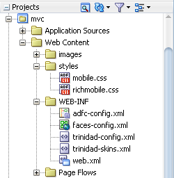
Table 4-1 lists the skinning files provided to ADF Mobile pages.
Table 4-1 The ADF Mobile Browser Skins
| CSS File | Skin Family | Use |
|---|---|---|
|
|
mobile |
Used for basic HTML browsers. This family is used for rendering on Windows Mobile and BlackBerry, Version 4.6 and higher. See Chapter 5, "Supporting Basic HTML Mobile Browsers." |
|
|
richmobile |
Used for smartphone browsers that use the Webkit rendering engine. The Nokia S60 and also iOS- and Android-powered devices use these browsers. |
Creating an ADF Mobile browser view controller project populates the <skin-family> element of the trinidad-config.xml file with the following EL expression that selects the renderkit appropriate to the browser's user agent.
#{requestContext.agent.type == 'desktop'?'richmobile': 'mobile'}
The ADF Mobile browser framework then applies the style defined for the renderkit. This expression, which is shown in Example 4-1, must be added to the trinidad-config.xml file to enable ADF Mobile browser applications to use the mobile and richmobile skin families.
Note:
Ensure that thetrinidad-config.xml file includes this statement.Example 4-1 The Skin Family Selection Logic within Trinidad-config.xml
<?xml version="1.0" encoding="windows-1252"?>
<trinidad-config xmlns="http://myfaces.apache.org/trinidad/config">
  <skin-family>#{requestContext.agent.type == 'desktop'? 'richmobile': 'mobile'}</skin-family>
</trinidad-config>
The trinidad-skins.xml file, shown in Example 4-2, defines the default skin families that are applied using the EL expression.
Example 4-2 trinidad-skins.xml Populated with ADF Mobile browser <skin> Definitions
<?xml version="1.0" encoding="windows-1252"?>
  <skins xmlns="http://myfaces.apache.org/trinidad/skin">
    <skin>
      <id>richmobile</id>
      <family>richmobile</family>
      <render-kit-id>org.apache.myfaces.trinidad.desktop</render-kit-id>
      <style-sheet-name>styles/richmobile.css</style-sheet-name>
      <extends>trinidad-simple.desktop</extends>
    </skin>
    <skin>
      <id>mobile</id>
      <family>mobile</family>
      <render-kit-id>org.apache.myfaces.trinidad.pda</render-kit-id>
      <style-sheet-name>styles/mobile.css</style-sheet-name>
      <extends>trinidad-simple.pda</extends>
    </skin>
  </skins>
4.2.1 Extending the ADF Mobile Skins
You can configure the trinidad-config.xml file and the trinidad-skins.xml file to call CSS files other than richmobile.css and mobile.css. You can also modify the richmobile.css and mobile.css files to render to a specific mobile device or platform using at-rules.
To add mobile features to a non-mobile project:
-
Create a skin. This includes creating the
trinidad-skins.xmlfile within the WEB-INF node of the ADF Mobile browser view project. -
Create a style sheet.
-
Set the skin family in the
trinidad-config.xmlfile (located in the WEB-INF node).For more information, see "Create a Skin—An Overview" in Development Guidelines for Apache MyFaces Trinidad (
http://myfaces.apache.org/trinidad/devguide/skinning.html).
Skin families in Apache MyFaces Trinidad are associated with a renderkit and a unique CSS file. Because Trinidad uses the desktop renderkit for Webkit-based mobile browsers and the PDA renderkit for all other mobile browsers, you can support all mobile browsers by creating two skin families, both of which reference one of these renderkits and a CSS file. Use the @agent and @platform selector rules to enable rendering based on the browser's name, version, or platform. For more information, see "Skinning CSS Features" in Development Guidelines for Apache MyFaces Trinidad (http://myfaces.apache.org/trinidad/devguide/skinning.html).
4.3 Applying ADF Mobile Browser Skinning
Although CSS styles are applied automatically for many components, you can optimize the rendering of a component by defining its styleClass attribute.
4.3.1 Headers
Augmenting the <tr:panelHeader> component with the styleClass attribute enables the application to display title-only headers, as well as headers with both a title and links.
4.3.1.1 Creating a Title-Only Header
To create a title-only header, add styleClass="af_m_toolbar" to the <tr:panelHeader> component, as illustrated in Example 4-3.
Example 4-3 Adding Attributes to Create a Title-Only Header
<tr:panelHeader styleClass="af_m_toolbar" text="Welcome"/>
Figure 4-2 shows how this ADF Mobile browser attribute creates a title-only header on an Apple iPhone.
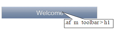
Table 4-2 lists examples of how title-only headers display on Windows Mobile devices, BlackBerry smartphones, and the Nokia Webkit.
4.3.1.2 Creating Headers with Titles and Links
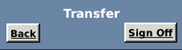
As illustrated in Figure 4-3, you can add links and a title within a header. Figure 4-3 shows such a header as it displays in on the Apple iPhone.
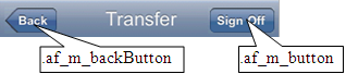
As described in Section 4.3.1.1, "Creating a Title-Only Header," you define the title for the header (in Figure 4-3, a title called Transfer) by adding styleClass="af_m_toolbar" within the <tr:panelHeader> element. The links are defined as buttons (styleClass="af_m_backButton" and styleClass="af_m_button", respectively) within the child <tr:commandLink> element as illustrated in Example 4-4. In Example 4-4, the <tr:panelHeader> element includes these attributes (in bold).
Example 4-4 Adding Titles and Links to Headers
<tr:panelHeader styleClass="af_m_toolbar"
                 text="Transfer">
            <tr:commandLink styleClass="af_m_backButton"
                            text="Back"
                            action="back"/>
            <tr:spacer rendered="#{requestContext.agent.skinFamilyType eq 'blackberryminimal'}"
                       height="5" width="105"/>
            <tr:spacer rendered="#{requestContext.agent.skinFamilyType eq 'windowsmobile'}"
                       height=""
                       width="28"/>
             <tr:commandLink styleClass="af_m_button"
                             text="Sign Off"
                             action="signoff"/>
         </tr:panelHeader>
Table 4-3 lists examples of how the <tr:panelHeader> that includes a title and links display on Windows Mobile devices, BlackBerry smartphones, and the Nokia Webkit.
4.3.2 Table Components
Using the styleClass attribute enables table components within ADF Mobile browser application to render appropriately on various browsers.
4.3.2.1 Multi-Column Tables
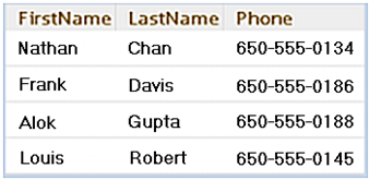
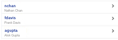
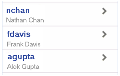
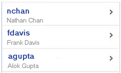
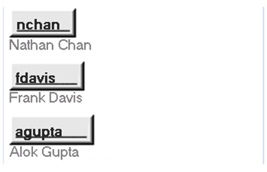
Unlike panel headers, which require that you include the styleClass attribute to apply the style appropriately on the target platform, the table column headers do not require any attributes. Instead, you use the <tr:columns> component described in Section 3.7.1, "Creating Tables." Figure 4-4 illustrates how column headers render on the Apple iPhone.
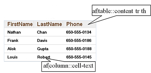
Example 4-5 illustrates how to define the <tr:columns> element (in bold).
Example 4-5 Creating Column Headers
<tr:table  var="row" …./>
            <tr:column  headerText="LastName">
                <tr:outputText value="#{row.bindings.LastName.inputValue}"/>
            </tr:column>
            <tr:column  headerText="FirstName">
                <tr:outputText value="#{row.bindings.FirstName.inputValue} "/>
             </tr:column>
             <tr:column headerText="Phone">
                <tr:outputText value="#{row.bindings.Phone.inputValue}"/>
            </tr:column>
</tr:table>
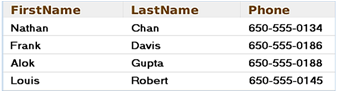
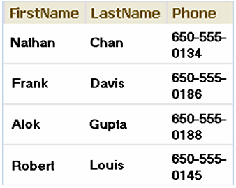
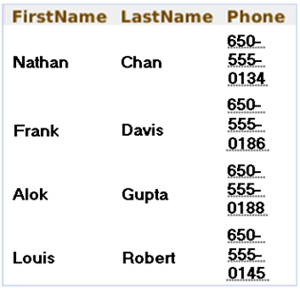
Table 4-4 shows examples of how column headers display on Windows Mobile devices, the Nokia Webkit, and BlackBerry smartphones.
4.3.2.2 Adding Images and Primary Details with Links
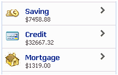
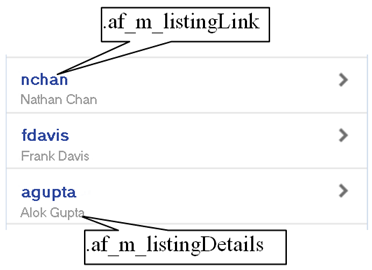
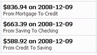
Figure 4-5 demonstrates creating the links and details within a table using the styleClass values af_m_listingLink and af_m_listingDetails.
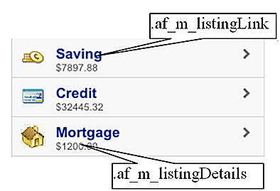
As illustrated in Example 4-6, you create these features by adding a <tr:panelGroupLayout> component as a child of a <tr:column> component. You then add the styleClass="af_m_listingLink" and styleClass="af_m_listingDetails" attributes to the panelGroupLayout's <tr:commandLink> and <tr:outputText> subcomponents. See Chapter 3, "Component Support" for information on the tr:panelGroupLayout, tr:commandLink, and tr:outputText.
Example 4-6 Adding Links with Details
<tr:table  horizontalGridVisible="false"
           var="row"
           width="100%">
            <tr:column>
                <tr:image source="#{row.bindings.TypeIconUrl.inputValue}"/>1
            </tr:column>
            <tr:column inlineStyle="width:100%;">
                <tr:panelGroupLayout layout="vertical">
                    <tr:commandLink text="#{row.bindings.DescShort.inputValue}"
                                    action="detail"
                                    styleClass="af_m_listingLink">
                    </tr:commandLink>
                    <tr:outputText value="#{row.bindings.Balance.inputValue}"
                                   styleClass="af_m_listingDetails">
                    </tr:outputText>
                </tr:panelGroupLayout>
            </tr:column>
 </tr:table>
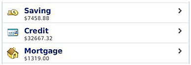
Table 4-5 shows examples of how images, links, and details display on Windows Mobile devices, the Nokia Webkit, and BlackBerry smartphones.
4.3.2.3 Creating Primary Details with Links
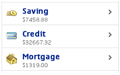
Figure 4-6 illustrates how to create primary details and links within a table.
Similar to adding the primary links and details with images described in Section 4.3.2.2, "Adding Images and Primary Details with Links," you create these features by adding a <tr:panelGroupLayout> component as a child of a <tr:column> component. As illustrated in Example 4-7, you then add the styleClass="af_m_listingLink" and styleClass="af_m_listingDetails" attributes to the panelGroupLayout's <tr:commandLink> and <tr:outputText> subcomponents. See Chapter 3, "Component Support" for information on the tr:panelGroupLayout, tr:commandLink, and tr:outputText.
Example 4-7 Primary Details and Links
<tr:table  horizontalGridVisible="false"
           var="row"
           width="100%">
            <tr:column>
                <tr:panelGroupLayout layout="vertical">
                    <tr:commandLink text="#{row.bindings.Email.inputValue}"
                          styleClass=" af_m_listingLink">
                    </tr:commandLink>
                    <tr:outputText value="#{row.bindings.FirstName.inputValue}"
                          styleClass="af_m_listingDetails"/>
                </tr:panelGroupLayout>
            </tr:column>
</tr:table>
Table 4-6 shows examples of how links and details display on Windows Mobile devices, the Nokia Webkit, and BlackBerry smartphones.
4.3.2.4 Creating Primary Details Without Links
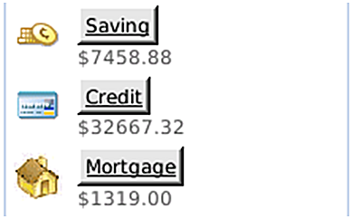
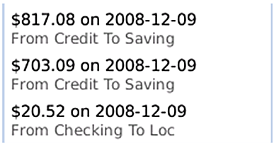
As illustrated in Figure 4-7, af_m_listingPrimaryDetails and af_m_listingDetails style classes enable you to create details that do not function as links; their behavior is different from the primary details described in Section 4.3.2.2, "Adding Images and Primary Details with Links."
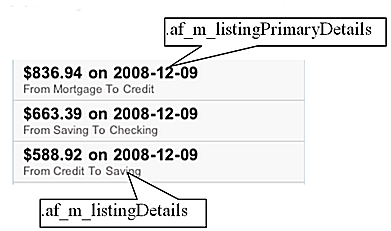
As illustrated in Example 4-8, you create non-linking primary details by adding styleClass="af_m_listingPrimaryDetails" and styleClass="af_m_listingDetails" to the <tr:outputText> element. This element is a child of the <tr:panelGroupLayout> element (which is itself a child of the <tr:column> element).
Example 4-8 Adding Non-Linking Primary Details
tr:table  horizontalGridVisible="false"
          var="row"
          width="100%">
             <tr:column>
                <tr:panelGroupLayout layout="vertical">
                    <tr:outputText value="#{row.bindings.Amount.inputValue}
                        styleClass="af_m_listingPrimaryDetails">
                    </tr:outputText>
                    <tr:outputText value="#{row.bindings.FromAccountName.inputValue} "
                        styleClass="af_m_listingDetails"/>
                </tr:panelGroupLayout>
             </tr:column>
</tr:table>
Table 4-7 shows examples of how non-linking details display on Windows Mobile devices, the Nokia Webkit, and BlackBerry smartphones.
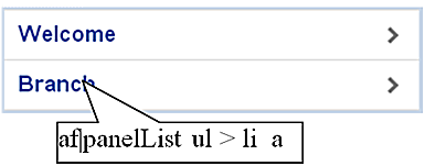
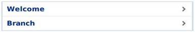
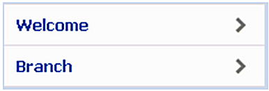
4.3.3 Panel List Components
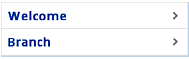
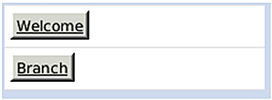
Defining the value of the styleClass as af_m_panelBase within the <tr:panelGroupLayout> component applies padding to the <tr:panelList> components, as shown in Figure 4-8.
As illustrated in Example 4-9, you do not have to include a styleClass attribute in the child <tr:panelList> component. For more information on using <tr:panelList> and <tr:panelGroupLayout>, see Section 3.2.2, "Creating Lists" and Section 3.4, "Layout Components," respectively.
Example 4-9 Adding Padding to panelList Components
<tr:panelGroupLayout styleClass="af_m_panelBase">
        <tr:panelList>
            <tr:commandLink text="Welcome" action="welcome"/>
            <tr:commandLink text="Branch" action="branch"/>
         </tr:panelList>
</tr:panelGroupLayout>
Table 4-8 shows examples of padding in the <tr:panelList> component on Windows Mobile devices, the Nokia Webkit, and BlackBerry smartphones.
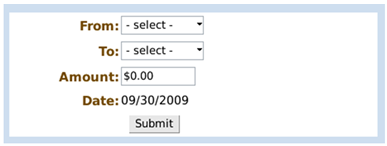
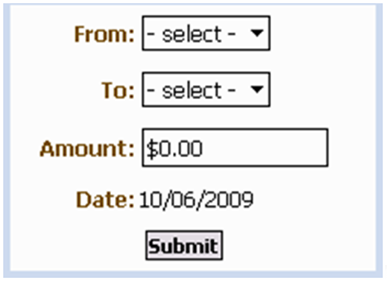
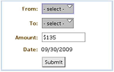
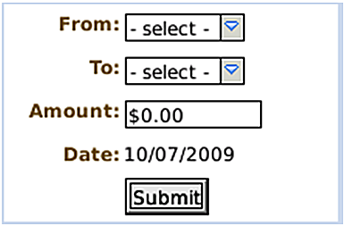
4.3.4 PanelFormLayout
Defining the value of the styleClass attribute as af_m_panelBase within the <tr:panelGroupLayout> component applies padding to the child <tr:panelFormLayout> components, as shown in Figure 4-9.
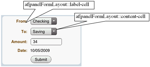
As illustrated in Example 4-10, you do not need to add styleClass to the <tr:panelFormLayout> component.
Example 4-10 Applying Padding to the PanelFormLayout Component
<tr:panelGroupLayout styleClass="af_m_panelBase">
     <tr:panelFormLayout labelWidth="35%" fieldWidth="65%">
         <tr:selectOneChoice value="#{transferBean.transferFromAccount}"
              label="From:" showRequired="false">
                    <f:selectItems value="#{bindings.AccountView1.items}"/>
         </tr:selectOneChoice>
         <tr:selectOneChoice  value="#{transferBean.transferToAccount}"
                              showRequired="false"
                              unselectedLabel="- select -"
                              label="To:">
                    <f:selectItems value="#{bindings.AccountView1.items}"/>
         </tr:selectOneChoice>
         <tr:inputText id="amount"
                       columns="#{requestContext.agent.capabilities.narrowScreen ? '8' : '12'}"
                       required="false" showRequired="false"
                       value="#{transferBean.transferAmount}"
                       label="Amount:">
                    <f:converter converterId="Bank10.amountConverter"/>
         </tr:inputText>
         <tr:panelLabelAndMessage label="Date: ">
              <tr:outputText value="#{transferBean.transferDate}"/>
         </tr:panelLabelAndMessage>
        <f:facet name="footer">
            <tr:panelGroupLayout>
                 <tr:spacer rendered="#{requestContext.agent.skinFamilyType eq
                                     'blackberryminimal'}"
                            height="5"
                            width="75"/>
                  <tr:commandButton text="Submit"
                                    action="#{transferBean.validateTransferRequest}"/>
            </tr:panelGroupLayout>
        </f:facet>
     </tr:panelFormLayout>
</tr:panelGroupLayout>
Table 4-9 shows examples of padding in the <tr:panelList> component on Windows Mobile devices, the Nokia Webkit, and BlackBerry smartphones.
4.3.5 Panel Accordion
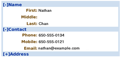
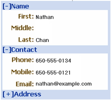
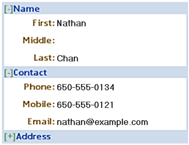
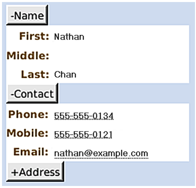
Defining the value of the styleClass attribute as af_m_panelBase within the <tr:panelGroupLayout> component applies padding to its <tr:panelAccordion> component, as shown in Figure 4-10.
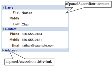
As illustrated in Example 4-11, you do not need to add the styleClass attribute to the <tr:panelAccordion> component.
Example 4-11 Applying Padding to the <tr:panelAccordion> Component
<tr:panelGroupLayout styleClass="af_m_panelBase">
        <tr:panelAccordion discloseMany="true">
            <tr:showDetailItem text="Name" disclosed="true">
                <tr:panelFormLayout fieldWidth="70%" labelWidth="30%">
                    ...
                </tr:panelFormLayout>
            </tr:showDetailItem>
            <tr:showDetailItem text="Contact" disclosed="true">
                <tr:panelFormLayout fieldWidth="70%" labelWidth="30%">
                    ...
                </tr:panelFormLayout>
            </tr:showDetailItem>
            <tr:showDetailItem text="Address">
                <tr:panelFormLayout fieldWidth="70%" labelWidth="30%">
                   ...
                </tr:panelFormLayout>
            </tr:showDetailItem>
        </tr:panelAccordion>
</tr:panelGroupLayout>
Example 4-11 shows examples of padding in the <tr:panelAccordion> component on Windows Mobile devices, the Nokia Webkit, and BlackBerry smartphones.