
| Tag Name: | <af:inputFile> |
| Java Class: | oracle.adf.view.rich.component.rich.input.RichInputFile |
| Component Type: | oracle.adf.RichInputFile |
| Unsupported Agent(s): | pda |
The component supports custom converters to transform the org.apache.myfaces.trinidad.model.UploadedFile. To archive this, the the getAsObject() method is invoked, where the the String value is a key, which must be used to query the actual uploaded file from the request Map:
  public Object getAsObject(FacesContext context, UIComponent component, String fileKey)
  {
    UploadedFile file = (UploadedFile)context.getExternalContext().getRequestMap().get(fileKey);
    // do transformation
    return file;
  }
There is a maximum size for downloaded files. For further information, see Configuration (The Configuration page comes from the Apache Trinidad site and therefore refers to tr: components. Simply replace tr: with af: for ADF Faces).
The attributes "disabled", "immediate", "readOnly", "required", "requiredMessageDetail", "value" are not settable from the client for security reasons.
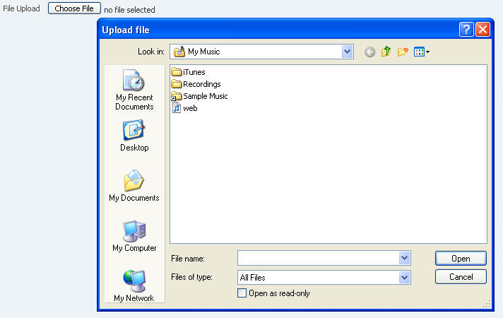
<af:form usesUpload="true">
  <af:inputFile columns="10"
                valueChangeListener="#{backing.fileUploaded}"/>
</af:form>
For all input components (and compound components that have an input component part to which a label can be assigned), the component requires a label. This can be accomplished in one of the following ways (all ways may not be available for all components):
Any one of these approaches is sufficient, though label or labelAndAccessKey is the most convenient and should be used where possible.
|
|
|
| Type | Phases | Description |
|---|---|---|
| javax.faces.event.ValueChangeEvent | Process Validations, Apply Request Values |
The valueChange event is delivered when the value attribute is changed. |
| org.apache.myfaces.trinidad.event.AttributeChangeEvent | Invoke Application, Apply Request Values |
Event delivered to describe an attribute change. Attribute change events are not delivered for any programmatic change to a property. They are only delivered when a renderer changes a property without the application's specific request. An example of an attribute change event might include the width of a column that supported client-side resizing. |
| Name | Description |
|---|---|
| help | This facet is deprecated, helpTopicId should be used for providing help. This is a no-op for form components. |
| Name | Type | Supports EL? | Description |
|---|---|---|---|
| accessKey | char | Yes | a character used to gain quick access to the form element specified by the for, if set (or this component itself, if it is a "non-simple" form element). If the same access key appears in multiple locations in the same page of output, the rendering user agent will cycle among the elements accessed by the similar keys.
This attribute is sometimes referred to as the "mnemonic". Note that the accessKey is triggered by browser-specific and platform-specific modifier keys. It even has browser-specific meaning. For example, Internet Explorer will set focus when you press Alt+<accessKey>. Firefox sets focus on some operating systems when you press Alt+Shift+<accessKey>. Firefox on other operating systems sets focus when you press Control+<accessKey>. Refer to your browser's documentation for how it treats access keys. |
| attributeChangeListener | javax.el.MethodExpression | Only EL | a method reference to an attribute change listener. Attribute change events are not delivered for any programmatic change to a property. They are only delivered when a renderer changes a property without the application's specific request. An example of an attribute change events might include the width of a column that supported client-side resizing. |
| autoHeightRows | int | Yes | an attribute that specifies the number of rows used to size the component height. The default value is -1 (no auto-sizing for any number of rows).
|
| autoSubmit | boolean | Yes | Default Value: false an attribute which if set to TRUE on a form element, the component will automatically submit when an appropriate action takes place (a click, text change, etc.). Since autoSubmit is a partial submit, also submitted and re-rendered are any other components with partialTriggers pointing to this component. |
| binding | oracle.adf.view.rich.component.rich.input.RichInputFile | Only EL | an EL reference that will store the component instance on a bean. This can be used to give programmatic access to a component from a backing bean, or to move creation of the component to a backing bean. |
| changed | boolean | Yes | Default Value: false an attribute which if set to true, the changed indicator icon will be displayed on the component. |
| changedDesc | String | Yes | the text commonly used by user agents to display tooltip text on the changed indicator icon. Default value is "Changed". The behavior of the tooltip is controlled by the user agent, e.g. Firefox 2 truncates long tooltips. |
| clientComponent | boolean | Yes | Default Value: false whether a client-side component will be generated. A component may be generated whether or not this flag is set, but if client Javascript requires the component object, this must be set to true to guarantee the component's presence. Client component objects that are generated today by default may not be present in the future; setting this flag is the only way to guarantee a component's presence, and clients cannot rely on implicit behavior. However, there is a performance cost to setting this flag, so clients should avoid turning on client components unless absolutely necessary. |
| columns | int | Yes | the size of the text control specified by the number of characters shown.The default value depends on the browser. |
| contentStyle | String | Yes | the style of the content piece of the component. You can style width by setting this attribute like this: width: 100px. Be aware that because of browser CSS precedence rules, CSS rendered on a DOM element takes precedence over external stylesheets like the skin file. Therefore skins will not be able to override what you set on this attribute. |
| converter | javax.faces.convert.Converter | Yes | a converter object |
| customizationId | String | Yes | This attribute is deprecated. This attribute will be removed in the next release. Use the 'id' attribute instead. This attribute is deprecated. The 'id' attribute should be used when applying persistent customizations. This attribute will be removed in the next release. |
| disabled | boolean | Yes | Default Value: false whether the element is disabled. Unlike a readonly component, a disabled component is unable to receive focus. If the component has the potential to have a scrollbar, and you want the user to be able to scroll through the component's text or values, use the 'readOnly' attribute, not the 'disabled' attribute. |
| displayMode | String | Yes | Valid Values: default, none, dropArea Default Value: default an attribute that determines the way the multifile upload UI is displayed. The value "default" is used to display the default multifile upload UI. A value of "none" means no UI is displayed and the developer can use the JS APIs to build a custom UI on top of inputFile. A value of "dropArea" means that a dropArea for Drag and Drop of files is rendered. |
| editable | String | Yes | Valid Values: inherit, always, onAccess Default Value: inherit the editable look and feel to use for input components. 'always' indicates that the input component should always look editable. 'onAccess' indicates that the input will only look editable when accessed (hover, focus). 'inherit' indicates that we want to use the component parent's setting. None of the ancestor components define 'always' or 'onAccess', then 'always' will be used. |
| helpTopicId | String | Yes | the id used to look up a topic in a helpProvider. |
| id | String | No | the identifier for the component. Every component may be named by a component identifier that must conform to the following rules:
|
| immediate | boolean | Yes | Default Value: false whether the value is converted and validated immediately in the Apply Request Values phase, or is handled in the Process Validators phase, the default. By default, values are converted and validated together in the Process Validators phase. However, if you need access to the value of a component during Apply Request Values - for example, if you need to get the value from an actionListener on an immediate commandButton - then setting this to "immediate" makes that possible. |
| inlineStyle | String | Yes | the CSS styles to use for this component. This is intended for basic style changes. The inlineStyle is a set of CSS styles that are applied to the root DOM element of the component. Be aware that because of browser CSS precedence rules, CSS rendered on a DOM element takes precedence over external stylesheets like the skin file. Therefore skins will not be able to override what you set on this attribute. If the inlineStyle's CSS properties do not affect the DOM element you want affected, then you will have to create a skin and use the skinning keys which are meant to target particular DOM elements, like ::label or ::icon-style. |
| label | String | Yes | the label of the component. If you want the label to appear above the control, use a panelFormLayout. |
| labelAndAccessKey | String | Yes | an attribute that will simultaneously set both the "label"and "accessKey" attributes from a single value, usingconventional ampersand notation. For example, setting this attribute to "T&ext" willset the label to "Text" and the access key to 'e'. |
| labelStyle | String | Yes | the CSS styles to use for the label of this component. The labelStyle is a set of CSS styles that are applied to the label DOM element of the component. This allows a label to be styled without requiring a new skin definition. |
| maximumFiles | int | Yes | Default Value: 1 an attribute that is used to restrict the number of files a user can upload. If the user tries to upload more files than specified in maximumFiles then an error is returned. If maximumFiles is less than 1 then the number of files is unlimited. |
| partialTriggers | String[] | Yes | the IDs of the components that should trigger a partial update. This component will listen on the trigger components. If one of the trigger components receives an event that will cause it to update in some way, this component will request to be updated too. Identifiers are relative to the source component (this component), and must account for NamingContainers. If your component is already inside of a naming container, you can use a single colon to start the search from the root of the page, or multiple colons to move up through the NamingContainers - "::" will pop out of the component's naming container (or itself if the component is a naming container) and begin the search from there, ":::" will pop out of two naming containers (including itself if the component is a naming container) and begin the search from there, etc. |
| readOnly | boolean | Yes | Default Value: false whether the control is displayed as an editable field or as an output-style text control. Unlike a disabled component, a readonly component is able to receive focus. |
| rendered | boolean | Yes | Default Value: true whether the component is rendered. When set to false, no output will be delivered for this component (the component will not in any way be rendered, and cannot be made visible on the client). If you want to change a component's rendered attribute from false to true using PPR, set the partialTrigger attribute of its parent component so the parent refreshes and in turn will render this component. |
| required | boolean | Yes | Default Value: false whether a non-null, non-empty value must be entered. If false, validators will not be executed when the value is null or empty. |
| requiredMessageDetail | String | Yes | the message to be displayed, if 'required' validation fails.
Parameters:
|
| rows | int | Yes | Default Value: 5 an attribute that determines the number of rows in the file list. There will be a scrollbar which will be displayed when the number of files exceeds this number. |
| shortDesc | String | Yes | the short description of the component. The shortDesc text may be used in two different ways, depending on the component.
For components with images, the shortDesc is often used to render an HTML alt attribute for the image. Please see the accessibility guidelines section for correct alt text usage of the shortDesc attribute. shortDesc is also commonly used to render an HTML title attribute, which is used by user agents to display tooltip help text. In this case the behavior for the tooltip is controlled by the user agent, e.g. Firefox 2 truncates long tooltips. For form components, the shortDesc is displayed in a note window. For components that support the helpTopicId attribute and are not using the shortDesc as image alt text, it is recommended that helpTopicId is used instead of shortDesc as it is more flexible and provides more accessible descriptive text than the use of the title attribute. |
| showRequired | boolean | Yes | Default Value: false whether the associated control displays a visual indication of required user input. If a "required" attribute is also present, both the "required" attribute and the "showRequired" attribute must be false for the visual indication not to be displayed. An example of when it can be desirable to use the showRequired property is if you have a field that is initially empty and is required only if some other field on the page is touched. |
| simple | boolean | Yes | Default Value: false a boolean value that controls whether the component provides label support; when set to "true", the component will not display the label (these may be ignored: label, labelAndAccessKey, accessKey, showRequired, help facet) and may use simpler layout primitives. One of the usecases can be when the component is used in repeatable elements like in table, for-each etc., where label is not required. |
| styleClass | String | Yes | a CSS style class to use for this component. The style class can be defined in your jspx page or in a skinning CSS file, for example, or you can use one of our public style classes, like 'AFInstructionText'. |
| unsecure | java.util.Set | Yes | A whitespace separated list of attributes whose values ordinarily can be set only on the server, but need to be settable on the client. Currently, this is supported only for the "disabled" attribute. Note that when you are able to set a property on the client, you will be allowed to by using the the .setProperty('attribute', newValue) method, but not the .setXXXAttribute(newValue) method. For example, if you have unsecure="disabled", then on the client you can use the method .setProperty('disabled', false), while the method .setDisabled(false) will not work and will provide a javascript error that setDisabled is not a function. |
| uploadType | String | Yes | Valid Values: submit, auto, manual, autoIfMultiple, manualIfMultiple Default Value: autoIfMultiple an attribute that controls the upload behavior of the component. Depending on what value is used, the Upload button will appear to enable manual uploading of files or files will be upload automatically once added.
|
| validator | javax.faces.el.MethodBinding | Only EL | a method reference to a validator method |
| value | Object | Yes | the value of the component. If the EL binding for the "value" points to a bean property with a getter but no setter, and this is an editable component, the component will be rendered in read-only mode. |
| valueChangeListener | javax.faces.el.MethodBinding | Only EL | a method reference to a value change listener |
| visible | boolean | Yes | Default Value: true the visibility of the component. If it is "false", the component will be hidden on the client. Unlike "rendered", this does not affect the lifecycle on the server - the component may have its bindings executed, etc. - and the visibility of the component can be toggled on and off on the client, or toggled with PPR. When "rendered" is false, the component will not in any way be rendered, and cannot be made visible on the client. In most cases, use the "rendered" property instead of the "visible" property. Not supported on the following renderkits: org.apache.myfaces.trinidad.core |