
| Tag Name: | <af:panelSplitter> |
| Java Class: | oracle.adf.view.rich.component.rich.layout.RichPanelSplitter |
| Component Type: | oracle.adf.RichPanelSplitter |
| Unsupported Agent(s): | pda |
PanelSplitters are used to divide a region into two parts with a repositionable divider. The two parts are identified as the "first" facet and the "second" facet. If the contained component supports it, the contents of a section will stretch to fill up all available space in that section. The panel splitter can be adjusted with the mouse, by pressing a collapse button, or by use of the arrow keys when the splitter is selected. A panel splitter can split horizontally or vertically based on the orientation attribute. With focus on the page, pressing Ctrl+Alt+P will move to the next splitter collapse/restore button. Subsequently pressing Ctrl+Alt+P will then cycle focus among the splitter buttons on the page.
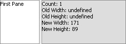
If a splitter's collapsed pane contains a component that has an error, e.g. a required input with no value, no error will be reported to the user.
If you use an <af:showPrintablePageBehavior> within one of the panes of the splitter, only that pane will be present for printing when the user activates that behavior. If the behavior is outside of the splitter, the printed result will be roughly in line with the normal layout, which may mean that not all content will be visible. It's therefore encouraged to support printing from within any pane of a splitter where printing is important.
<af:panelSplitter orientation="horizontal"
                  splitterPosition="200"
                  positionedFromEnd="true"
                  id="ps1">
  <f:facet name="first">
    <af:button text="Button Three First" id="cb1"/>
  </f:facet>
  <f:facet name="second">
    <af:button text="Button Three Second" id="cb2"/>
  </f:facet>
</af:panelSplitter>
|
|
|
| Type | Phases | Description |
|---|---|---|
| org.apache.myfaces.trinidad.event.AttributeChangeEvent | Invoke Application, Apply Request Values |
Event delivered to describe an attribute change. Attribute change events are not delivered for any programmatic change to a property. They are only delivered when a renderer changes a property without the application's specific request. An example of an attribute change event might include the width of a column that supported client-side resizing. |
| Name | Description |
|---|---|
| first | The first pane of this splitter. As with JSP pages, when using Facelets, multiple components are not allowed in this facet. |
| second | The second pane of this splitter. As with JSP pages, when using Facelets, multiple components are not allowed in this facet. |
| Name | Type | Supports EL? | Description |
|---|---|---|---|
| attributeChangeListener | javax.el.MethodExpression | Only EL | a method reference to an attribute change listener. Attribute change events are not delivered for any programmatic change to a property. They are only delivered when a renderer changes a property without the application's specific request. An example of an attribute change events might include the width of a column that supported client-side resizing. |
| binding | oracle.adf.view.rich.component.rich.layout.RichPanelSplitter | Only EL | an EL reference that will store the component instance on a bean. This can be used to give programmatic access to a component from a backing bean, or to move creation of the component to a backing bean. |
| clientComponent | boolean | Yes | Default Value: false whether a client-side component will be generated. A component may be generated whether or not this flag is set, but if client Javascript requires the component object, this must be set to true to guarantee the component's presence. Client component objects that are generated today by default may not be present in the future; setting this flag is the only way to guarantee a component's presence, and clients cannot rely on implicit behavior. However, there is a performance cost to setting this flag, so clients should avoid turning on client components unless absolutely necessary. |
| collapsed | boolean | Yes | Default Value: false whether the splitter is in a collapsed state. When the splitter is collapsed (collapsed="true") and the splitter is positioned from the beginning (positionedFromEnd="false"), the first pane is hidden such that the second pane stretches to fill all available space. When the splitter is positioned from the end (positionedFromEnd="true"), collapsing the splitter hides the second pane. By default collapse is "false", which means that both panes are displayed. |
| customizationId | String | Yes | This attribute is deprecated. This attribute will be removed in the next release. Use the 'id' attribute instead. This attribute is deprecated. The 'id' attribute should be used when applying persistent customizations. This attribute will be removed in the next release. |
| dimensionsFrom | String | Yes | Valid Values: auto, children, parent Default Value: parent determines how the component will handle geometry management. This specifies where the dimensions of the panelSplitter come from:
|
| disabled | boolean | Yes | Default Value: false an attribute which if set to "true", the component becomes non-interactive. Otherwise,the default value is "false" and component assumes its expected behavior. |
| dontPersist | String[] | Yes | a list of attributes whose changes are NOT to be persisted by FilteredPersistenceChangeManager via the "Persistent Change Manager" registered in adf-config.xml. The token 'ALL' can be used in the list here to indicate that all attribute changes that the component implicitly persists should be excluded. If there is a conflict of values, "dontPersist" always precedes "persist". |
| firstBorder | String | Yes | Valid Values: skin, all, none Default Value: skin Specifies how you want borders to be displayed around the contents of the "first" facet. The "first" facet contents will have a border surrounding it if either this value is set to "all" or if set to "skin" and the active skin's "-tr-first-border" property is set "all". The "first" facet contents will not have a border surrounding it if either this value is set to "none" or if set to "skin" and the active skin's "-tr-first-border" property is set "none". The default value is "skin". It is important to note that this attribute (just like inlineStyle) can easily be abused. More times than not, you should not use this attribute because by using it, you are likely optimizing your page design for a specific skin. You should only force the borders on or off for cases where the contents of the pane would either provide enough or not enough delineation among the 2 panes of your splitter. For example, forcing borders off on a splitter that surrounds your entire page or forcing borders on for a pane that needs emphasis. You may want to test your application in a variety of skins to see if your use of these kinds of styling attributes will prevent others from being able to display your application with custom skins. |
| firstLandmark | String | Yes | Valid Values: none, banner, complementary, contentinfo, main, navigation, search Default Value: none Specifies the WAI-ARIA landmark role for the content of the first facet. |
| id | String | No | the identifier for the component. Every component may be named by a component identifier that must conform to the following rules:
|
| inlineStyle | String | Yes | the CSS styles to use for this component. This is intended for basic style changes. The inlineStyle is a set of CSS styles that are applied to the root DOM element of the component. Be aware that because of browser CSS precedence rules, CSS rendered on a DOM element takes precedence over external stylesheets like the skin file. Therefore skins will not be able to override what you set on this attribute. If the inlineStyle's CSS properties do not affect the DOM element you want affected, then you will have to create a skin and use the skinning keys which are meant to target particular DOM elements, like ::label or ::icon-style. |
| orientation | String | Yes | Valid Values: horizontal, vertical Default Value: horizontal whether a horizontal or vertical split is created. The string literal value of "horizontal" indicates that the splitter panes will be side-by-side, and a string literal value of "vertical" indicates the panes will be on top of each other. |
| partialTriggers | String[] | Yes | the IDs of the components that should trigger a partial update. This component will listen on the trigger components. If one of the trigger components receives an event that will cause it to update in some way, this component will request to be updated too. Identifiers are relative to the source component (this component), and must account for NamingContainers. If your component is already inside of a naming container, you can use a single colon to start the search from the root of the page, or multiple colons to move up through the NamingContainers - "::" will pop out of the component's naming container (or itself if the component is a naming container) and begin the search from there, ":::" will pop out of two naming containers (including itself if the component is a naming container) and begin the search from there, etc. |
| persist | String[] | Yes | a list of attributes whose changes are to be persisted by FilteredPersistenceChangeManager via the "Persistent Change Manager" registered in adf-config.xml. The token 'ALL' can be used in the list here to indicate that all attribute changes that the component implicitly persists should be included. |
| positionedFromEnd | boolean | Yes | Default Value: false an attribute which if set to "false" (the default), the initial position of the repositionable divider is measured from the start side (the top or start).If the value is "true", the initial position of the repositionable divider is measured from the end side (the bottom or end). |
| rendered | boolean | Yes | Default Value: true whether the component is rendered. When set to false, no output will be delivered for this component (the component will not in any way be rendered, and cannot be made visible on the client). If you want to change a component's rendered attribute from false to true using PPR, set the partialTrigger attribute of its parent component so the parent refreshes and in turn will render this component. |
| secondBorder | String | Yes | Valid Values: skin, all, none Default Value: skin Specifies how you want borders to be displayed around the contents of the "second" facet. The "second" facet contents will have a border surrounding it if either this value is set to "all" or if set to "skin" and the active skin's "-tr-second-border" property is set "all". The "second" facet contents will not have a border surrounding it if either this value is set to "none" or if set to "skin" and the active skin's "-tr-second-border" property is set "none". The default value is "skin". It is important to note that this attribute (just like inlineStyle) can easily be abused. More times than not, you should not use this attribute because by using it, you are likely optimizing your page design for a specific skin. You should only force the borders on or off for cases where the contents of the pane would either provide enough or not enough delineation among the 2 panes of your splitter. For example, forcing borders off on a splitter that surrounds your entire page or forcing borders on for a pane that needs emphasis. You may want to test your application in a variety of skins to see if your use of these kinds of styling attributes will prevent others from being able to display your application with custom skins. |
| secondLandmark | String | Yes | Valid Values: none, banner, complementary, contentinfo, main, navigation, search Default Value: none Specifies the WAI-ARIA landmark role for the content of the second facet. |
| shortDesc | String | Yes | the short description of the component. The shortDesc text may be used in two different ways, depending on the component.
For components with images, the shortDesc is often used to render an HTML alt attribute for the image. Please see the accessibility guidelines section for correct alt text usage of the shortDesc attribute. shortDesc is also commonly used to render an HTML title attribute, which is used by user agents to display tooltip help text. In this case the behavior for the tooltip is controlled by the user agent, e.g. Firefox 2 truncates long tooltips. For form components, the shortDesc is displayed in a note window. For components that support the helpTopicId attribute and are not using the shortDesc as image alt text, it is recommended that helpTopicId is used instead of shortDesc as it is more flexible and provides more accessible descriptive text than the use of the title attribute. |
| splitterPosition | int | Yes | Default Value: 200 the initial position of the repositionable divider. The panelSplitter separates two areas with a separator. The user may drag this separator to adjust how much space is allocated for each area. This attribute specifies the number of pixels for the width or height (depending on the orientation) for one of the areas and the other area gets the remaining space. The positionedFromEnd attribute determines which area is sized and which area gets the remaining space. |
| styleClass | String | Yes | a CSS style class to use for this component. The style class can be defined in your jspx page or in a skinning CSS file, for example, or you can use one of our public style classes, like 'AFInstructionText'. |
| unsecure | java.util.Set | Yes | A whitespace separated list of attributes whose values ordinarily can be set only on the server, but need to be settable on the client. Currently, this is supported only for the "disabled" attribute. Note that when you are able to set a property on the client, you will be allowed to by using the the .setProperty('attribute', newValue) method, but not the .setXXXAttribute(newValue) method. For example, if you have unsecure="disabled", then on the client you can use the method .setProperty('disabled', false), while the method .setDisabled(false) will not work and will provide a javascript error that setDisabled is not a function. |
| visible | boolean | Yes | Default Value: true the visibility of the component. If it is "false", the component will be hidden on the client. Unlike "rendered", this does not affect the lifecycle on the server - the component may have its bindings executed, etc. - and the visibility of the component can be toggled on and off on the client, or toggled with PPR. When "rendered" is false, the component will not in any way be rendered, and cannot be made visible on the client. In most cases, use the "rendered" property instead of the "visible" property. Not supported on the following renderkits: org.apache.myfaces.trinidad.core |