
| Tag Name: | <af:panelTabbed> |
| Java Class: | oracle.adf.view.rich.component.rich.layout.RichPanelTabbed |
| Component Type: | oracle.adf.RichPanelTabbed |
The panelTabbed control can be used to display a group of contents that belongs to a showDetailItem. Tab bar(s) with tabs representing the showDetailItem children are displayed. Selecting a tab, displays the associated showDetailItem. If none of the showDetailItem children are selected, the first showDetailItem that is enabled is selected. Typically you would put one or more showDetailItem components inside of the panelTabbed but you may also alternatively place a facetRef, group, iterator, or switcher inside of the panelTabbed as long as these wrappers provide showDetailItem components as a result of their execution.
PanelTabbed supports compressed layout modes of overflow or conveyor belt. Which compressed layout mode is used depends on the assignment of the -tr-layout-type skinning key (see skinning documentation). In order for a compressed layout component to work properly, it must be part of a supported layout on the page.
A compressed layout (overflow or conveyor belt) component requires that it is either:
Under these circumstances, when the compressed layout component is larger than the parent container, the compressed layout component will display buttons to support its particular compressed layout mode (overflow or conveyor belt).
For overflow compressed layout mode, selecting the overflow button(s) will show a popup containing the items that didn't fit on the page.
For conveyor belt compressed layout mode, selecting the conveyor belt buttons will roll the shown content. In addition, there is a conveyor belt droplist button that shows a popup containing all of the managed items.
Setting up a compressed layout (overflow or conveyor belt) component with the following layouts is not supported. If you use one of these layouts, you may have unexpected and inconsistent results:
At this time overflow and the conveyor belt only works when the position attribute is "above", "below", or "both". It does not work when the position attribute is "start", "end", "right", or "left".
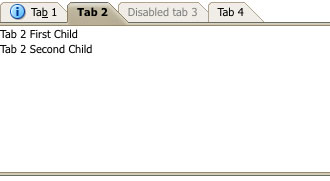
The following is an example of panelTabbed.
<af:panelTabbed id="pt1">
  <af:showDetailItem text="ADF Faces Components" id="sdi1">
    <af:panelHeader text="ADF Faces Components First Child" id="ph1"/>
    <af:panelHeader text="ADF Faces Components Second Child" id="ph2"/>
  </af:showDetailItem>
  <af:showDetailItem text="Architecture" disabled="true" id="sdi2">
    <af:panelHeader text="Architecture First Child" id="ph3"/>
    <af:panelHeader text="Architecture Second Child" id="ph4"/>
  </af:showDetailItem>
  <af:showDetailItem text="Release" id="sdi3">
    <af:panelHeader text="Release First Child" id="ph5"/>
    <af:panelHeader text="Release Second Child" id="ph6"/>
  </af:showDetailItem>
</af:panelTabbed>
The following example renders with the tab bar appearing only above the contents.
<af:panelTabbed>
  <af:showDetailItem text="ADF Faces Components" position="above">
    <af:panelHeader text="ADF Faces Components First Child"/>
    <af:panelHeader text="ADF Faces Components Second Child"/>
  </af:showDetailItem>
  <af:showDetailItem text="Architecture">
    <af:panelHeader text="Architecture First Child"/>
    <af:panelHeader text="Architecture Second Child"/>
  </af:showDetailItem>
  <af:showDetailItem text="Release" disabled="true">
    <af:panelHeader text="Release First Child"/>
    <af:panelHeader text="Release Second Child"/>
  </af:showDetailItem>
</af:panelTabbed>
|
|
|
| Type | Phases | Description |
|---|---|---|
| oracle.adf.view.rich.event.ItemEvent | Apply Request Values | The itemEvent is triggered when a containing object has an event on one of its child items. For example, a panelTabbed will launch an itemEvent of type 'remove' for one of its child tabs. |
| org.apache.myfaces.trinidad.event.AttributeChangeEvent | Invoke Application, Apply Request Values |
Event delivered to describe an attribute change. Attribute change events are not delivered for any programmatic change to a property. They are only delivered when a renderer changes a property without the application's specific request. An example of an attribute change event might include the width of a column that supported client-side resizing. |
| Name | Type | Supports EL? | Description |
|---|---|---|---|
| attributeChangeListener | javax.el.MethodExpression | Only EL | a method reference to an attribute change listener. Attribute change events are not delivered for any programmatic change to a property. They are only delivered when a renderer changes a property without the application's specific request. An example of an attribute change events might include the width of a column that supported client-side resizing. |
| binding | oracle.adf.view.rich.component.rich.layout.RichPanelTabbed | Only EL | an EL reference that will store the component instance on a bean. This can be used to give programmatic access to a component from a backing bean, or to move creation of the component to a backing bean. |
| childCreation | String | No | Valid Values: immediate, lazy, lazyUncached Default Value: immediate Controls when the children components are created. Introduces a server-side performance enhancement by postponing construction of the components under the undisclosed disclosure components. The non-immediate settings will only work when the children components are created via the UIXComponentELTag and are not in a stamping component (like af:iterator). Legal values are:
|
| clientComponent | boolean | Yes | Default Value: false whether a client-side component will be generated. A component may be generated whether or not this flag is set, but if client Javascript requires the component object, this must be set to true to guarantee the component's presence. Client component objects that are generated today by default may not be present in the future; setting this flag is the only way to guarantee a component's presence, and clients cannot rely on implicit behavior. However, there is a performance cost to setting this flag, so clients should avoid turning on client components unless absolutely necessary. |
| customizationId | String | Yes | This attribute is deprecated. This attribute will be removed in the next release. Use the 'id' attribute instead. This attribute is deprecated. The 'id' attribute should be used when applying persistent customizations. This attribute will be removed in the next release. |
| dimensionsFrom | String | Yes | Valid Values: auto, disclosedChild, parent Default Value: parent determines how the component will handle geometry management. This specifies where the dimensions of the panelTabbed come from:
If the oracle.adf.view.rich.geometry.DEFAULT_DIMENSIONS context-param is set to "auto" in the project's web.xml, the default value for this attribute will be "auto". Otherwise, the default value will be "parent". |
| id | String | No | the identifier for the component. Every component may be named by a component identifier that must conform to the following rules:
|
| inlineStyle | String | Yes | the CSS styles to use for this component. This is intended for basic style changes. The inlineStyle is a set of CSS styles that are applied to the root DOM element of the component. Be aware that because of browser CSS precedence rules, CSS rendered on a DOM element takes precedence over external stylesheets like the skin file. Therefore skins will not be able to override what you set on this attribute. If the inlineStyle's CSS properties do not affect the DOM element you want affected, then you will have to create a skin and use the skinning keys which are meant to target particular DOM elements, like ::label or ::icon-style. |
| maxTabSize | String | Yes | Default Value: infinity the maximum tab size that is rendered by default when the tab bar has more than enough space. Only fixed dimension units are supported, e.g. "px", "em", "pt" (not "auto" "nor "%"). |
| minTabSize | String | Yes | Default Value: 0px the minimum tab size that a tab can shrink to before using a compressed layout manager (overflow or conveyor belt). Only fixed dimension units are supported, e.g. "px", "em", "pt" (not "auto" "nor "%"). |
| partialTriggers | String[] | Yes | the IDs of the components that should trigger a partial update. This component will listen on the trigger components. If one of the trigger components receives an event that will cause it to update in some way, this component will request to be updated too. Identifiers are relative to the source component (this component), and must account for NamingContainers. If your component is already inside of a naming container, you can use a single colon to start the search from the root of the page, or multiple colons to move up through the NamingContainers - "::" will pop out of the component's naming container (or itself if the component is a naming container) and begin the search from there, ":::" will pop out of two naming containers (including itself if the component is a naming container) and begin the search from there, etc. |
| position | String | Yes | Valid Values: above, both, below, start, end, left, right Default Value: above the position of the tab bar. Defaults to "above". In accessibility screen reader mode, tab bar position is always "above". When using right/left the position will remain right or left regardless of the language, for example it will remain right or left even in right to left languages like Hebrew and Arabic. Use start/end if the alignment should change depending on the language. At this time overflow and/or the conveyor belt only works when the position attribute is "above", "below", or "both". It does not work when the position attribute is "start", "end", "right", or "left". At this time the tabRemoval attribute only works when the position attribute is "above", "below", or "both". It does not work when the position attribute is "start", "end", "right", or "left". |
| rendered | boolean | Yes | Default Value: true whether the component is rendered. When set to false, no output will be delivered for this component (the component will not in any way be rendered, and cannot be made visible on the client). If you want to change a component's rendered attribute from false to true using PPR, set the partialTrigger attribute of its parent component so the parent refreshes and in turn will render this component. |
| shortDesc | String | Yes | the short description of the component. The shortDesc text may be used in two different ways, depending on the component.
For components with images, the shortDesc is often used to render an HTML alt attribute for the image. Please see the accessibility guidelines section for correct alt text usage of the shortDesc attribute. shortDesc is also commonly used to render an HTML title attribute, which is used by user agents to display tooltip help text. In this case the behavior for the tooltip is controlled by the user agent, e.g. Firefox 2 truncates long tooltips. For form components, the shortDesc is displayed in a note window. For components that support the helpTopicId attribute and are not using the shortDesc as image alt text, it is recommended that helpTopicId is used instead of shortDesc as it is more flexible and provides more accessible descriptive text than the use of the title attribute. |
| styleClass | String | Yes | a CSS style class to use for this component. The style class can be defined in your jspx page or in a skinning CSS file, for example, or you can use one of our public style classes, like 'AFInstructionText'. |
| tabRemoval | String | Yes | Valid Values: none, all, allExceptLast Default Value: none determines if tab removal is enabled. This attribute supports these tabRemoval types:
Choosing to remove a tab will cause an ItemEvent of type 'remove' to be launched. This event can be listened for on a showDetailItem using the itemListener attribute. It is up to the developer to handle this event and code the actual removal of the tab. This is because of the dynamic nature of the panelTabbed component, which may have dynamic children. This also allows a finer level of control by the developer, who can then choose a custom implementation that may (for example) include warning dialogs, and control of which tab gains focus after a tab is removed. At this time the tabRemoval attribute only works when the position attribute is "above", "below", or "both". It does not work when the position attribute is "start", "end", "right", or "left". |
| truncationStyle | String | Yes | Valid Values: none, ellipsis Default Value: none the truncation style applied to tab text when the text size exceeds the tab size. |
| unsecure | java.util.Set | Yes | A whitespace separated list of attributes whose values ordinarily can be set only on the server, but need to be settable on the client. Currently, this is supported only for the "disabled" attribute. Note that when you are able to set a property on the client, you will be allowed to by using the the .setProperty('attribute', newValue) method, but not the .setXXXAttribute(newValue) method. For example, if you have unsecure="disabled", then on the client you can use the method .setProperty('disabled', false), while the method .setDisabled(false) will not work and will provide a javascript error that setDisabled is not a function. |
| visible | boolean | Yes | Default Value: true the visibility of the component. If it is "false", the component will be hidden on the client. Unlike "rendered", this does not affect the lifecycle on the server - the component may have its bindings executed, etc. - and the visibility of the component can be toggled on and off on the client, or toggled with PPR. When "rendered" is false, the component will not in any way be rendered, and cannot be made visible on the client. In most cases, use the "rendered" property instead of the "visible" property. Not supported on the following renderkits: org.apache.myfaces.trinidad.core |