
| Tag Name: | <af:panelWindow> |
| Java Class: | oracle.adf.view.rich.component.rich.RichPanelWindow |
| Component Type: | oracle.adf.RichPanelWindow |
| Required Ancestor Tag(s): | af:popup |
The af:panelWindow type of popup has identical features to the af:dialog except that it does not have the buttonBar facet or button type configurations. The panelWindow control is a layout element that displays its children inside a window. The af:panelWindow must only be used as the immediate child of the af:popup and only a single occurrence is supported.
Using partial submit commands along with the panel window is recommended because by default, a popup will not restore visibility after a full postback. The immediate parent (af:popup) controls this behavior. If the parent popup's autoCancel property is enabled, full submit commands will cause the popup panel window to auto-dismiss. When the autoCancel property is disabled, full submit commands will restore visibility on postback. See the af:popup tag documentation for more information on controlling aspects of auto-dismissal.
Panel windows will not automatically dismiss for command buttons. Additional logic must be added to dismiss the popup. See the af:popup tag documentation for more information on hiding and displaying popups.
Selecting the panelWindow's close icon translates into a popup-canceled event of the owning inline popup component. Server-side listeners can be registered with the parent af:popup component and will be invoked when the panelWindow is dismissed using the close icon or pressing the Esc key. The parent popup component can also be configured to automatically reset input components on cancellation. This feature is managed using the resetEditableValues property. See af:popup for more information on cancel dismissal.
The table below lists the combinations of two panelWindow properties that have effects on layout. The first two columns list the property value combinations and the other two columns outline the assumed behaviors for these options besides caveats to look out for.
| stretchChildren | resize | Behaviors | Caveats |
|---|---|---|---|
| none | off |
|
|
| first | off |
|
|
| none | on |
|
|
| first | on |
|
|
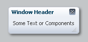
<af:popup>
  <af:panelWindow closeIconVisible="true" title="Window Header" id="pw1">
    <af:panelGroupLayout id="pgl1">
       <af:outputText id="ot1" value="Some Text or Components"/>
    </af:panelGroupLayout>
  </af:panelWindow>
</af:popup>
|
|
|
| Type | Phases | Description |
|---|---|---|
| org.apache.myfaces.trinidad.event.AttributeChangeEvent | Invoke Application, Apply Request Values |
Event delivered to describe an attribute change. Attribute change events are not delivered for any programmatic change to a property. They are only delivered when a renderer changes a property without the application's specific request. An example of an attribute change event might include the width of a column that supported client-side resizing. |
| Name | Type | Supports EL? | Description |
|---|---|---|---|
| attributeChangeListener | javax.el.MethodExpression | Only EL | a method reference to an attribute change listener. Attribute change events are not delivered for any programmatic change to a property. They are only delivered when a renderer changes a property without the application's specific request. An example of an attribute change events might include the width of a column that supported client-side resizing. |
| binding | oracle.adf.view.rich.component.rich.RichPanelWindow | Only EL | an EL reference that will store the component instance on a bean. This can be used to give programmatic access to a component from a backing bean, or to move creation of the component to a backing bean. |
| clientComponent | boolean | Yes | Default Value: false whether a client-side component will be generated. A component may be generated whether or not this flag is set, but if client Javascript requires the component object, this must be set to true to guarantee the component's presence. Client component objects that are generated today by default may not be present in the future; setting this flag is the only way to guarantee a component's presence, and clients cannot rely on implicit behavior. However, there is a performance cost to setting this flag, so clients should avoid turning on client components unless absolutely necessary. |
| closeIconVisible | boolean | Yes | Default Value: true whether the close icon is visible. |
| contentHeight | int | Yes | the height of the content area of the dialog in pixels. |
| contentWidth | int | Yes | the width of the content area of the dialog in pixels. |
| customizationId | String | Yes | This attribute is deprecated. This attribute will be removed in the next release. Use the 'id' attribute instead. This attribute is deprecated. The 'id' attribute should be used when applying persistent customizations. This attribute will be removed in the next release. |
| helpTopicId | String | Yes | the id used to look up a topic in a helpProvider. If provided, a help icon will appear in the title bar. |
| id | String | No | the identifier for the component. Every component may be named by a component identifier that must conform to the following rules:
|
| inlineStyle | String | Yes | the CSS styles to use for this component. This is intended for basic style changes. The inlineStyle is a set of CSS styles that are applied to the root DOM element of the component. Be aware that because of browser CSS precedence rules, CSS rendered on a DOM element takes precedence over external stylesheets like the skin file. Therefore skins will not be able to override what you set on this attribute. If the inlineStyle's CSS properties do not affect the DOM element you want affected, then you will have to create a skin and use the skinning keys which are meant to target particular DOM elements, like ::label or ::icon-style. |
| modal | boolean | Yes | Default Value: false whether the window is modal; by default false. |
| partialTriggers | String[] | Yes | the IDs of the components that should trigger a partial update. This component will listen on the trigger components. If one of the trigger components receives an event that will cause it to update in some way, this component will request to be updated too. Identifiers are relative to the source component (this component), and must account for NamingContainers. If your component is already inside of a naming container, you can use a single colon to start the search from the root of the page, or multiple colons to move up through the NamingContainers - "::" will pop out of the component's naming container (or itself if the component is a naming container) and begin the search from there, ":::" will pop out of two naming containers (including itself if the component is a naming container) and begin the search from there, etc. |
| rendered | boolean | Yes | Default Value: true whether the component is rendered. When set to false, no output will be delivered for this component (the component will not in any way be rendered, and cannot be made visible on the client). If you want to change a component's rendered attribute from false to true using PPR, set the partialTrigger attribute of its parent component so the parent refreshes and in turn will render this component. |
| resize | String | Yes | Valid Values: off, on Default Value: off The dialog's resizing behavior. Acceptable values include:
|
| shortDesc | String | Yes | the short description of the component. The shortDesc text may be used in two different ways, depending on the component.
For components with images, the shortDesc is often used to render an HTML alt attribute for the image. Please see the accessibility guidelines section for correct alt text usage of the shortDesc attribute. shortDesc is also commonly used to render an HTML title attribute, which is used by user agents to display tooltip help text. In this case the behavior for the tooltip is controlled by the user agent, e.g. Firefox 2 truncates long tooltips. For form components, the shortDesc is displayed in a note window. For components that support the helpTopicId attribute and are not using the shortDesc as image alt text, it is recommended that helpTopicId is used instead of shortDesc as it is more flexible and provides more accessible descriptive text than the use of the title attribute. |
| stretchChildren | String | Yes | Valid Values: none, first Default Value: none The stretching behavior for children. Acceptable values include:
|
| styleClass | String | Yes | a CSS style class to use for this component. The style class can be defined in your jspx page or in a skinning CSS file, for example, or you can use one of our public style classes, like 'AFInstructionText'. |
| title | String | Yes | the title of the window. |
| titleIconSource | String | Yes | the URI specifying the location of the title icon source. The title icon will typically be displayed in the top left corner of the window |
| unsecure | java.util.Set | Yes | A whitespace separated list of attributes whose values ordinarily can be set only on the server, but need to be settable on the client. Currently, this is supported only for the "disabled" attribute. Note that when you are able to set a property on the client, you will be allowed to by using the the .setProperty('attribute', newValue) method, but not the .setXXXAttribute(newValue) method. For example, if you have unsecure="disabled", then on the client you can use the method .setProperty('disabled', false), while the method .setDisabled(false) will not work and will provide a javascript error that setDisabled is not a function. |
| visible | boolean | Yes | Default Value: true visible has been deprecated. Use the af:showPopupBehavior tag or the show/hide methods on the popup client component.This property has a no-op setter for both the client and server components effectively making it a read-only property. the visibility of the component. If it is "false", the component will be hidden on the client. Unlike "rendered", this does not affect the lifecycle on the server - the component may have its bindings executed, etc. - and the visibility of the component can be toggled on and off on the client, or toggled with PPR. When "rendered" is false, the component will not in any way be rendered, and cannot be made visible on the client. In most cases, use the "rendered" property instead of the "visible" property. Not supported on the following renderkits: org.apache.myfaces.trinidad.core |