Screen Shot(s)
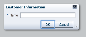
Dialog component with type="okCancel" and closeIconVisible="true".
| Oracle Fusion Middleware Tag Reference for Oracle ADF Faces 12c (12.2.1) E52774-02 |
af:dialog dialog dialog
UIComponent class: oracle.adf.view.rich.component.rich.RichDialog
Component type: oracle.adf.RichDialog
The dialog control is a layout element that displays its children inside a dialog window and delivers DialogEvents when the OK, Yes, No and Cancel actions are activated. The af:dialog must be placed inside a af:popup component and has to be the immediate child of the af:popup and only a single child occurrence is supported. To show a dialog use the af:showPopupBehavior tag or programmatically from Javascript, call show() on the popup client component. A dialog will automatically hide itself when OK, Yes or No buttons are selected provided that there are not any faces messages of severity of error or greater on the page. Selecting the Cancel button or close icon will cancel the popup and raise a popup canceled event.
When using the dialog type button configurations, action outcomes of type "ok", "yes", "no" and "cancel" can be intercepted on the client with a "dialog" type listener. Only "ok", "yes" and "no" events will be propagated to the server. The ESC key, "cancel" button and close icon queues a client dialog event with a "cancel" outcome. Dialog events with a "cancel" outcome will not be sent to the server. Propagation of dialog events to the server can be blocked, as with any RCF event, by calling cancel() on the JS event object. Use the af:clientListener with a type of dialog to listen for a dialog client event.
A dialog will hide after processing the dialog event for error free actions. If an error occurs during the server-side processing (specifically, if faces messages of error severity or greater) of the dialog event, then the dialog will not be closed.
When using input components, such as inputText, pressing the Cancel-button will not reset the values on those controls. If you open a dialog for the second time, the old values will still be there. If you want the values to match with the current values on the server, this can be accomplished by setting contentDelivery to lazyUncached on the containing popup component. The lazyUncached content delivery type will cause the content of the popup to be re-rendered but does not reset the server-side state of the component. You can force the af:popup to reset any input components in its content when canceled using the resetEditableValues property set to "whenCanceled".
The dialogs cancel button, Esc key and close icon dismisses the inline popup dialog without saving any changes. However, input components having the autoSubmit property turned on, overrides the dialog's cancel behavior.
The af:dialog component provides a buttonBar facet that is the container to add additional command components to the dialogs footer. Custom buttons are added after pre-configured buttons. Pre-configured buttons are specified using the type property. Custom buttons will not queue the associated dialogListener but requires custom action listeners.
Using partial submit custom buttons is recommended because by default, a popup will not restore visibility after a full postback. The immediate parent (af:popup) controls this behavior. If the parent popup's autoCancel property is enabled, full submit commands will cause the popup dialog to auto-dismiss. When the autoCancel property is disabled, full submit commands will restore visibility on postback. See the af:popup tag documentation for more information on controlling aspects of auto-dismissal.
A dialog will not automatically dismiss for custom buttons. Additional logic must be added to dismiss the popup. This task is accomplished by calling on the server-side popup API.
Another common misunderstanding with inline dialogs is that they do not automatically reset submitted values. If you have created custom dialog buttons and dismiss the dialog with validation errors, the previous submitted errors will be displayed on subsequent showings if the page has not be refreshed. There are a couple ways to solve this problem.
resetEditableValues of the owning af:popup to "whenCanceled". This will force input component within the content of the popup to be reset when the popup is canceled.af:resetListener. You can choose from any event type but action, popupFetch, popupCanceled, and dialog are all popup choices.Custom cancel dialog buttons will not discard values like the pre-configured cancel button using the dialog's type property. This is because the pre-configured cancel button doesn't send a dialog event to the server so the input values contained within the dialogs content will not be applied. A custom cancel button should have the immediate property set to true and use one of the two method previously described for resetting input components.
The dialog's cancel button, Esc key, and close icon all raise a client only dialog event with a "cancel" outcome. A dialogListener will not be notified when the dialog is dismissed using these two commands. However, these commands translate into a popup-canceled event of the owning inline popup component. Server-side listeners can be registered with the parent af:popup component and will be invoked when the dialog is dismissed using a closed dialog event outcome. The parent popup component can also be configured to automatically reset input components on cancellation. This feature is managed using the resetEditableValues property. See af:popup for more information on cancel dismissal.
The table below lists the combinations of two dialog properties that have effects on layout. The first two columns list the property value combinations and the other two columns outline the assumed behaviors for these options besides caveats to look out for.
| stretchChildren | resize | Behaviors | Caveats |
|---|---|---|---|
| none | off |
|
|
| first | off |
|
|
| none | on |
|
|
| first | on |
|
|
<af:popup>
  <af:dialog modal="true">
    <af:panelGroupLayout>
    <af:selectManyListbox value="bean">
      <af:selectItem label="coffee" value="bean" shortDesc="Coffee from Kona"/>
      <f:selectItem itemLabel="tea" itemValue="leaf" itemDescription="Tea from China"/>
      <af:selectItem disabled="true" label="orange juice" value="orange"/>
      <f:selectItem itemDisabled="true" itemLabel="wine" itemValue="grape"/>
      <af:selectItem label="milk" value="moo"/>
    </af:selectManyListbox>
    </af:panelGroupLayout>
  </af:dialog>
</af:popup>
| Type | Phases | Description |
|---|---|---|
| oracle.adf.view.rich.event.DialogEvent | Invoke Application | The dialog event is delivered when a dialog is triggered. |
| org.apache.myfaces.trinidad.event.AttributeChangeEvent | Invoke Application, Apply Request Values |
Event delivered to describe an attribute change. Attribute change events are not delivered for any programmatic change to a property. They are only delivered when a renderer changes a property without the application's specific request. An example of an attribute change event might include the width of a column that supported client-side resizing. |
| Name | Description |
|---|---|
| buttonBar | A panel containing custom buttons. However, when using Facelets for the page declaration language (PDL), the dialog buttonBar facet can have multiple buttons and it is not necessary to place the buttons in a panel. |
| Name | Type | Supports EL? | Description |
|---|---|---|---|
| affirmativeTextAndAccessKey | String | Yes | An attribute that simultaneously sets the textual label of the ok and yes footer buttons as well as the an optional accessKey character used to gain quick access to the button. The accessKey is identified using conventional ampersand ('&') notation.
For example, setting this attribute to "T&ext" will set the textual label to "Text" and the accessKey to 'e'. If the same accessKey appears in multiple locations in the same page of output, the rendering user agent will cycle among the elements accessed by the similar keys. This accessKey is sometimes referred to as the "mnemonic". Note that the accessKey is triggered by browser-specific and platform-specific modifier keys. It even has browser-specific meaning. For example, Internet Explorer will set focus when you press Alt+<accessKey>. Firefox sets focus on some operating systems when you press Alt+Shift+<accessKey>. Firefox on other operating systems sets focus when you press Control+<accessKey>. Refer to your browser's documentation for how it treats access keys. |
| attributeChangeListener | javax.el.MethodExpression | Only EL | a method reference to an attribute change listener. Attribute change events are not delivered for any programmatic change to a property. They are only delivered when a renderer changes a property without the application's specific request. An example of an attribute change events might include the width of a column that supported client-side resizing. |
| binding | oracle.adf.view.rich.component.rich.RichDialog | Only EL | an EL reference that will store the component instance on a bean. This can be used to give programmatic access to a component from a backing bean, or to move creation of the component to a backing bean. |
| cancelTextAndAccessKey | String | Yes | An attribute that simultaneously sets the textual label of the cancel footer button as well as the an optional accessKey character used to gain quick access to the button. The accessKey is identified using conventional ampersand ('&') notation.
For example, setting this attribute to "T&ext" will set the textual label to "Text" and the accessKey to 'e'. If the same accessKey appears in multiple locations in the same page of output, the rendering user agent will cycle among the elements accessed by the similar keys. This accessKey is sometimes referred to as the "mnemonic". Note that the accessKey is triggered by browser-specific and platform-specific modifier keys. It even has browser-specific meaning. For example, Internet Explorer will set focus when you press Alt+<accessKey>. Firefox sets focus on some operating systems when you press Alt+Shift+<accessKey>. Firefox on other operating systems sets focus when you press Control+<accessKey>. Refer to your browser's documentation for how it treats access keys. |
| cancelVisible | boolean | Yes | Default Value: true the value that specifies if the Cancel button is visible. It will be ignored when the type attribute value is not equal to "okCancel". |
| clientComponent | boolean | Yes | Default Value: false whether a client-side component will be generated. A component may be generated whether or not this flag is set, but if client Javascript requires the component object, this must be set to true to guarantee the component's presence. Client component objects that are generated today by default may not be present in the future; setting this flag is the only way to guarantee a component's presence, and clients cannot rely on implicit behavior. However, there is a performance cost to setting this flag, so clients should avoid turning on client components unless absolutely necessary. For the components outputText and outputFormatted, setting the clientComponent to true will render id attribute for the html DOM. This ID attribute can alternatively be generated by setting oracle.adf.view.rich.SUPPRESS_IDS to "auto" in web.xml. |
| closeIconVisible | boolean | Yes | Default Value: true whether the close icon is visible. |
| contentHeight | int | Yes | the height of the content area of the dialog in pixels. |
| contentWidth | int | Yes | the width of the content area of the dialog in pixels. |
| customizationId | String | Yes | This attribute is deprecated. The 'id' attribute should be used when applying persistent customizations. This attribute will be removed in the next release. |
| dialogListener | javax.el.MethodExpression | Only EL | a method reference to a dialog listener method |
| helpTopicId | String | Yes | the id used to look up a topic in a helpProvider. If provided, a help icon will appear in the title bar. |
| id | String | No | the identifier for the component. Every component may be named by a component identifier that must conform to the following rules:
|
| inlineStyle | String | Yes | the CSS styles to use for this component. This is intended for basic style changes. The inlineStyle is a set of CSS styles that are applied to the root DOM element of the component. Be aware that because of browser CSS precedence rules, CSS rendered on a DOM element takes precedence over external stylesheets like the skin file. Therefore skins will not be able to override what you set on this attribute. If the inlineStyle's CSS properties do not affect the DOM element you want affected, then you will have to create a skin and use the skinning keys which are meant to target particular DOM elements, like ::label or ::icon-style. |
| modal | boolean | Yes | Default Value: true if the dialog is modal. A modal dialog does not allow the user to make changes on the base page until the dialog is closed. A non-modal dialog will allow the user to make changes on the base page; if the user navigates away from the base page, the dialog will close. |
| noTextAndAccessKey | String | Yes | An attribute that simultaneously sets the textual label of the no footer button as well as the an optional accessKey character used to gain quick access to the button. The accessKey is identified using conventional ampersand ('&') notation.
For example, setting this attribute to "T&ext" will set the textual label to "Text" and the accessKey to 'e'. If the same accessKey appears in multiple locations in the same page of output, the rendering user agent will cycle among the elements accessed by the similar keys. This accessKey is sometimes referred to as the "mnemonic". Note that the accessKey is triggered by browser-specific and platform-specific modifier keys. It even has browser-specific meaning. For example, Internet Explorer will set focus when you press Alt+<accessKey>. Firefox sets focus on some operating systems when you press Alt+Shift+<accessKey>. Firefox on other operating systems sets focus when you press Control+<accessKey>. Refer to your browser's documentation for how it treats access keys. |
| okVisible | boolean | Yes | Default Value: true the value that specifies if the OK button is visible. It will be ignored when the type attribute value is not equal to "okCancel". |
| partialTriggers | String[] | Yes | the IDs of the components that should trigger a partial update. This component will listen on the trigger components. If one of the trigger components receives an event that will cause it to update in some way, this component will request to be updated too. Identifiers are relative to the source component (this component), and must account for NamingContainers. If your component is already inside of a naming container, you can use a single colon to start the search from the root of the page, or multiple colons to move up through the NamingContainers - "::" will pop out of the component's naming container (or itself if the component is a naming container) and begin the search from there, ":::" will pop out of two naming containers (including itself if the component is a naming container) and begin the search from there, etc. |
| rendered | boolean | Yes | Default Value: true whether the component is rendered. When set to false, no output will be delivered for this component (the component will not in any way be rendered, and cannot be made visible on the client). If you want to change a component's rendered attribute from false to true using PPR, set the partialTrigger attribute of its parent component so the parent refreshes and in turn will render this component. |
| resize | String | Yes | Valid Values: off, on Default Value: off The dialog's resizing behavior. Acceptable values include:
|
| shortDesc | String | Yes | the short description of the component. The shortDesc text may be used in two different ways, depending on the component.
For components with images, the shortDesc is often used to render an HTML alt attribute for the image. Please see the accessibility guidelines section for correct alt text usage of the shortDesc attribute. shortDesc is also commonly used to render an HTML title attribute, which is used by user agents to display tooltip help text. In this case the behavior for the tooltip is controlled by the user agent, e.g. Firefox 2 truncates long tooltips. For form components, the shortDesc is displayed in a note window. For components that support the helpTopicId attribute and are not using the shortDesc as image alt text, it is recommended that helpTopicId is used instead of shortDesc as it is more flexible and provides more accessible descriptive text than the use of the title attribute. |
| stretchChildren | String | Yes | Valid Values: none, first Default Value: none The stretching behavior for children. Acceptable values include:
|
| styleClass | String | Yes | a CSS style class to use for this component. The style class can be defined in your jspx page or in a skinning CSS file, for example, or you can use one of our public style classes, like 'AFInstructionText'. |
| title | String | Yes | the title of the window. |
| titleIconSource | String | Yes | the URI specifying the location of the title icon source. The title icon will typically be displayed in the top left corner of the window |
| type | String | Yes | Valid Values: none, ok, cancel, yesNo, okCancel, yesNoCancel Default Value: okCancel the buttons in the dialog. For example, value yesNoCancel means there will be "Yes", "No" and "Cancel" buttons in the dialog. |
| unsecure | java.util.Set | Yes | A whitespace separated list of attributes whose values ordinarily can be set only on the server, but need to be settable on the client. Currently, this is supported only for the "disabled" attribute. Note that when you are able to set a property on the client, you will be allowed to by using the the .setProperty('attribute', newValue) method, but not the .setXXXAttribute(newValue) method. For example, if you have unsecure="disabled", then on the client you can use the method .setProperty('disabled', false), while the method .setDisabled(false) will not work and will provide a javascript error that setDisabled is not a function. |
| visible | boolean | Yes | Default Value: true the visibility of the component. If it is "false", the component will be hidden on the client. Unlike "rendered", this does not affect the lifecycle on the server - the component may have its bindings executed, etc. - and the visibility of the component can be toggled on and off on the client, or toggled with PPR. When "rendered" is false, the component will not in any way be rendered, and cannot be made visible on the client. In most cases, use the "rendered" property instead of the "visible" property. Not supported on the following renderkits: org.apache.myfaces.trinidad.core |