| Oracle Fusion Middleware Data Visualization Tools Tag Reference for Oracle ADF Faces 12c (12.2.1.2) E76719-01 |
dvt:scatterChart scatterChart scatter chart
UIComponent class: oracle.adf.view.faces.bi.component.chart.UIScatterChart
Component type: oracle.dss.adf.chart.ScatterChart
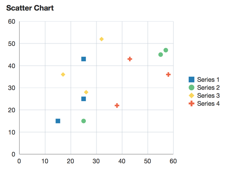
A chart displaying two measures using data markers plotted on a 2D plane.
<dvt:scatterChart value="#{chartDataSource.defaultScatterData}" var="row">
  <f:facet name="dataStamp">
    <dvt:chartDataItem series="#{row.series}" group="#{row.group}" x="#{row.x}" y="#{row.y}"/>
  </f:facet>
</dvt:scatterChart>
dvt:chartDataItemdvt:chartLegenddvt:chartSeriesStyledvt:chartValueFormatdvt:chartXAxisdvt:chartYAxisAnimations can be enabled on data change or on initial display by adding af:transition as a child of this component. The following trigger types and transitions are supported:
dataChange: none (default), autodisplay: none (default), autoThe chart axes can be customized using the dvt:chartXAxis and dvt:chartYAxis tags. Customization options include titles, axis extents, and tick increments.
Properties of specific data items or series can be customized using EL expressions for attributes on the dvt:chartDataItem and dvt:chartSeriesStyle.
Data labels can be specified using the label attribute on dvt:chartDataItem. The position and style of the data labels can also be customized.
The legend can be hidden, positioned, or customized using dvt:chartLegend.
Number formatting options are available through dvt:chartValueFormat and dvt:chartTickLabel.
Reference lines and reference areas can be added to the chart through the associated axis. For example, to add a reference line for a y-axis value, a dvt:referenceLine should be added as a child of dvt:chartYAxis.
Series properties can be customized using dvt:chartSeriesStyle, which is supported within the seriesStamp facet. To declaratively specify several dvt:chartSeriesStyle tags, wrap within an af:group:
<f:facet name="seriesStamp">
  <af:group>
    <dvt:chartSeriesStyle series="Series 1" color="#0000ff"/>
    <dvt:chartSeriesStyle series="Series 2" color="#ff0000"/>
  </af:group>
</f:facet>
The fill effect of the data objects can be customized using the seriesEffect attribute, providing support for gradient, pattern, and solid fills.
Stacked charts can be used to compare cumulative values across groups. Stacking can be enabled by using the stack attribute.
The hideAndShowBehavior attribute allows the end user to filter the visible data set by clicking on the legend items.
The hoverBehavior attribute provides support for dimming of unrelated data objects as the user hovers on objects in the chart.
Popups and context menus can be displayed using af:showPopupBehavior, which is a supported child of dvt:chartDataItem.
Selection of data items can be enabled using the dataSelection attribute. Selection can be processed using selectionListener on the server or the selection event type on the client.
Zoom and scroll can be enabled using the zoomAndScroll attribute. The initial viewport of the chart can be set using the viewportMinimum/Maximum attributes in dvt:chartXAxis and dvt:chartYAxis.
| Type | Phases | Description |
|---|---|---|
| org.apache.myfaces.trinidad.event.AttributeChangeEvent | Invoke Application, Apply Request Values |
Event delivered to describe an attribute change. Attribute change events are not delivered for any programmatic change to a property. They are only delivered when a renderer changes a property without the application's specific request. An example of an attribute change event might include the width of a column that supported client-side resizing. |
| Name | Description |
|---|---|
| dataStamp | the data item component or components to stamp for each row of the model. To stamp multiple data items, wrap them in a group tag. |
| overview |
Specifies the rendering of the overview window. Only applicable for charts that have |
| seriesStamp | the series style component to stamp for each row of the model. The properties of the stamp will be processed once for each unique series. To declaratively define multiple series, wrap them in a group tag. |
| Name | Type | Supports EL? | Description |
|---|---|---|---|
| attributeChangeListener | javax.el.MethodExpression | Only EL | a method reference to an attribute change listener. Attribute change events are not delivered for any programmatic change to a property. They are only delivered when a renderer changes a property without the application's specific request. An example of an attribute change events might include the width of a column that supported client-side resizing. |
| binding | oracle.adf.view.faces.bi.component.chart.UIScatterChart | Only EL |
Specifies a binding reference to store a specific instance of UIScatterChart from a backing bean. Set this attribute only to access code in a backing bean. For example, to reference a chart component in the sample managed bean, use the following code: |
| contentDelivery | String | Yes | Valid Values: whenAvailable, lazy, immediate Default Value: whenAvailable Specifies whether to fetch content with page load or after page load. |
| coordinateSystem | String | Yes | Valid Values: cartesian, polar Default Value: cartesian Specifies the coordinate system of the chart. |
| dataLabelPosition | String | Yes | Valid Values: auto, center, aboveMarker, belowMarker, beforeMarker, afterMarker Default Value: auto Specifies the position of the data labels. Valid values are:
|
| dataSelection | String | Yes | Valid Values: none, single, multiple Default Value: none Specifies the data selection mode for the chart. |
| emptyText | String | Yes | The text of the component when empty. |
| footnote | String | Yes | Specifies the footnote for the chart. |
| footnoteHalign | String | Yes | Valid Values: start, end, center Default Value: start Specifies the horizontal alignment of the chart footnote. |
| hideAndShowBehavior | String | Yes | Valid Values: none, withRescale, withoutRescale Default Value: none Specifies the hide/show behavior when clicking on the legend items. |
| hoverBehavior | String | Yes | Valid Values: none, dim Default Value: none Specifies the behavior when hovering over the chart data items. |
| id | String | No | Specifies the identifier for the component |
| inlineStyle | String | Yes | Style of the outer element (enclosing div) of the component |
| partialTriggers | String[] | Yes | The IDs of the components that should trigger a partial update. This component will listen on the trigger components. If one of the trigger components receives an event that will cause it to update in some way, this component will request to be updated too. |
| rendered | boolean | Yes | Default Value: true Specifies whether the component is rendered. |
| selectedRowKeys | org.apache.myfaces.trinidad.model.RowKeySet | Yes | The set of selected rows for this component. |
| selectionListener | javax.el.MethodExpression | Only EL | a method reference to a selection listener, the method is invoked when the selected nodes are changed. |
| seriesEffect | String | Yes | Valid Values: color, gradient, pattern Default Value: gradient Specifies the fill effect for the data items. |
| styleClass | String | Yes | Sets a CSS style class to use for this component. |
| subtitle | String | Yes | Specifies the subtitle for the chart. |
| title | String | Yes | Specifies the title for the chart. |
| titleHalign | String | Yes | Valid Values: start, end, center Default Value: start Specifies the horizontal alignment of the chart title. |
| value | String | Yes | The data model for the chart - can be an instance of javax.faces.CollectionModel |
| var | String | No | Name of the EL variable used to reference each element of this collection. Once this component has completed rendering, this variable is removed (or reverted back to its previous value). |
| varStatus | String | No | Name of the EL variable used to reference the varStatus information. Once this component has completed rendering, this variable is removed (or reverted back to its previous value). The VarStatus provides contextual information about the state of the component to EL expressions. For components that iterate, varStatus also provides loop counter information. Please see the this component's documentation for the specific properties on the varStatus. The common properties on varStatus include:
|
| zoomAndScroll | String | Yes | Valid Values: off, delayedScrollOnly, liveScrollOnly, delayed, live Default Value: off Specifies the zoom and scroll behavior of the graph. "Live" behavior means that the chart will be updated continuously as it is being manipulated, while "delayed" means that the update will wait until the zoom/scroll action is done. The "delayed" behavior is recommended if the chart rendering is slow. Valid values are:
|