Screen Shot(s)
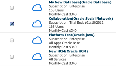
A ListView component.
| Oracle Fusion Middleware Tag Reference for Oracle ADF Faces 12c (12.2.1.3) E80089-01 |
af:listView listView list view
UIComponent class: oracle.adf.view.rich.component.rich.data.RichListView
Component type: oracle.adf.RichListView
Naming container: Yes. When referring to children of this component ("partialTriggers", findComponent(), etc.), you must prefix the child's ID with this component's ID and a colon (':')
The component displays a List of Items based on rows of a collection model.
The ListView component uses a model to access the data in the underlying list. The specific model class is oracle.adf.view.rich.model.CollectionModel. You may also use other model instances, e.g., java.util.List, array, and javax.faces.model.DataModel. The listView will automatically convert the instance into a CollectionModel. Please note that if the TreeModel implementation is provided, the ListView shall display group header area for each row(with or without disclosure). Initial implementation will only support only one level of disclosure. If the treeModel contains more than one level of data, we will specifically throw an error to prevent any ambiguity.
The ListView component shall not display on the client all the rows that are available on the server. "fetchSize" is the number of rows requested from the client to the server on each attempt to fill the component.
The "first" and "rows" attributes inherited from the UIXIterator superclass are not currently supported for the rich render kit.
Listviews are a single tabstop, with arrow key support to move focus between listview items. Up/Down Arrow keys provide convenient keyboard focus movement between listview items in a listview. Spacebar is used to select any listitem which is in focus. Ctrl + Spacebar will toggle selection of listitem. Shift + Spacebar is used for range selection of listitems. Left/Right Arrow keys is used for collapse/expand any group which is disclosable.
To access tabstopable components inside a listitem use F2/Enter key to switch to actionable mode. In actionable mode pressing tab key will move focus between tabstopable elements within the listitem and will cycle up. ESC key is used to switch back to navigation mode. In navigation mode, list view is single tabstop.
<af:listView id="list1" value="#{taskList.collection}" var="row">
      <af:listItem id="listItem1" shortDesc="#{row.projectTitle}">
                <af:panelGroupLayout id="panelGroupLayout1" layout="horizontal">
                    <af:panelGroupLayout id="panelGroupLayout2" layout="horizontal" styleClass="ListItemIcon"
                                          halign="center" valign="middle" rendered="#{row.projectStatus ne null}">
                        <af:image id="image1" source="#{row.image}"/>
                    </af:panelGroupLayout>
                    <af:panelGroupLayout id="panelGroupLayout3" layout="vertical" inlineStyle="width:300px">
                        <af:outputText id="outputText1" value="#{row.projectTitle}" styleClass="ProjectTitle"/>
                        <af:outputText id="outputText2" value="#{row.projectdetail}"/>
                        <af:outputText id="outputText3" value="#{row.projectInfo}" styleClass="ProjectInfo"/>
                    </af:panelGroupLayout>
                    <af:panelGroupLayout id="panelGroupLayout4" layout="horizontal"
                                          halign="center" valign="middle" styleClass="ListItemAction">
                        <af:commandButton id="cb1" text="Action"/>
                    </af:panelGroupLayout>
                </af:panelGroupLayout>
       </af:listItem>
</af:listView>
| Type | Phases | Description |
|---|---|---|
| org.apache.myfaces.trinidad.event.SelectionEvent | Apply Request Values, Invoke Application |
The selection event is delivered when the table selection changes. |
| org.apache.myfaces.trinidad.event.RowDisclosureEvent | Apply Request Values, Invoke Application |
The expansion event is generated for a table when the detail facet of a row is expanded or collapsed. For tree or a treeTable, the expansion event is generated when tree nodes are expanded or collapsed. |
| org.apache.myfaces.trinidad.event.AttributeChangeEvent | Invoke Application, Apply Request Values |
Event delivered to describe an attribute change. Attribute change events are not delivered for any programmatic change to a property. They are only delivered when a renderer changes a property without the application's specific request. An example of an attribute change event might include the width of a column that supported client-side resizing. |
| Name | Description |
|---|---|
| groupHeaderStamp | the component used to stamp children to display in the group header(with or without disclosure) region of the ListView. A listItem child is required. As with JSP pages, when using Facelets, multiple components are not allowed in this facet. |
| Name | Type | Supports EL? | Description |
|---|---|---|---|
| attributeChangeListener | javax.el.MethodExpression | Only EL | a method reference to an attribute change listener. Attribute change events are not delivered for any programmatic change to a property. They are only delivered when a renderer changes a property without the application's specific request. An example of an attribute change events might include the width of a column that supported client-side resizing. |
| binding | oracle.adf.view.rich.component.rich.data.RichListView | Only EL | an EL reference that will store the component instance on a bean. This can be used to give programmatic access to a component from a backing bean, or to move creation of the component to a backing bean. |
| clientComponent | boolean | Yes | Default Value: false whether a client-side component will be generated. A component may be generated whether or not this flag is set, but if client Javascript requires the component object, this must be set to true to guarantee the component's presence. Client component objects that are generated today by default may not be present in the future; setting this flag is the only way to guarantee a component's presence, and clients cannot rely on implicit behavior. However, there is a performance cost to setting this flag, so clients should avoid turning on client components unless absolutely necessary. For the components outputText and outputFormatted, setting the clientComponent to true will render id attribute for the html DOM. This ID attribute can alternatively be generated by setting oracle.adf.view.rich.SUPPRESS_IDS to "auto" in web.xml. |
| customizationId | String | Yes | This attribute is deprecated. The 'id' attribute should be used when applying persistent customizations. This attribute will be removed in the next release. |
| emptyText | String | Yes | the text of an empty ListView. If the text is enclosed in an open and closing html tag, it will be formatted. The formatting behavior is similar to outputFormatted component. If it is not enclosed in an open and closing html tag, it will not be formatted. |
| fetchSize | int | Yes | Default Value: 25 the number of items in the data fetch block Not supported on the following renderkits: org.apache.myfaces.trinidad.core |
| first | int | Yes | Default Value: 0 the first property is used internally in the rich client and should not be set externally Not supported on the following renderkits: oracle.adf.rich |
| groupDisclosedRowKeys | org.apache.myfaces.trinidad.model.RowKeySet | Yes | the set of disclosed groups for this component. Each entry in the set is a rowKey. |
| groupDisclosureListener | javax.el.MethodExpression | Only EL | a method reference to a group disclosure listener |
| groupDisclosurePolicy | String | Yes | Valid Values: noDisclosure, initiallyExpanded, modelDependent Default Value: modelDependent specifies the policy for disclosing groups. possible values are: modelDependent(default), noDisclosure, initiallyExpanded. If groupDisclosurePolicy="noDisclosure" is set and the model is a treeModel, all group headers will be displayed and there will be no way to collapse the groups. Attribute value "initiallyExpanded" can be used to expand all groups initially. The default value is "modelDependent", wherein the model defines the groupDisclosurePolicy and initial expanded state. |
| id | String | No | the identifier for the component. Every component may be named by a component identifier that must conform to the following rules:
|
| immediate | boolean | Yes | Default Value: false whether or not data validation - client-side or server-side - should take place when events are generated by this component. When immediate is true, the default ActionListener provided by the JavaServer Faces implementation should be executed during Apply Request Values phase of the request processing lifecycle, rather than waiting until the Invoke Application phase. |
| inlineStyle | String | Yes | the CSS styles to use for this component. This is intended for basic style changes. The inlineStyle is a set of CSS styles that are applied to the root DOM element of the component. Be aware that because of browser CSS precedence rules, CSS rendered on a DOM element takes precedence over external stylesheets like the skin file. Therefore skins will not be able to override what you set on this attribute. If the inlineStyle's CSS properties do not affect the DOM element you want affected, then you will have to create a skin and use the skinning keys which are meant to target particular DOM elements, like ::label or ::icon-style. |
| partialTriggers | String[] | Yes | the IDs of the components that should trigger a partial update. This component will listen on the trigger components. If one of the trigger components receives an event that will cause it to update in some way, this component will request to be updated too. Identifiers are relative to the source component (this component), and must account for NamingContainers. If your component is already inside of a naming container, you can use a single colon to start the search from the root of the page, or multiple colons to move up through the NamingContainers - "::" will pop out of the component's naming container (or itself if the component is a naming container) and begin the search from there, ":::" will pop out of two naming containers (including itself if the component is a naming container) and begin the search from there, etc. |
| rendered | boolean | Yes | Default Value: true whether the component is rendered. When set to false, no output will be delivered for this component (the component will not in any way be rendered, and cannot be made visible on the client). If you want to change a component's rendered attribute from false to true using PPR, set the partialTrigger attribute of its parent component so the parent refreshes and in turn will render this component. |
| rows | int | Yes | Default Value: 25 the rows property is used internally in the rich client and should not be set externally Not supported on the following renderkits: oracle.adf.rich |
| selectedRowKeys | org.apache.myfaces.trinidad.model.RowKeySet | Yes | the selection state for this component. |
| selection | String | Yes | Valid Values: none, single, multiple Default Value: none whether listItem in this listView are selectable. Use the value "single" to enable single selection, "multiple" to enable multiple selection. The default is "none", which means no items are selected |
| selectionListener | javax.el.MethodExpression | Only EL | a method reference to a selection listener |
| shortDesc | String | Yes | the short description of the component. The shortDesc text may be used in two different ways, depending on the component.
For components with images, the shortDesc is often used to render an HTML alt attribute for the image. Please see the accessibility guidelines section for correct alt text usage of the shortDesc attribute. shortDesc is also commonly used to render an HTML title attribute, which is used by user agents to display tooltip help text. In this case the behavior for the tooltip is controlled by the user agent, e.g. Firefox 2 truncates long tooltips. For form components, the shortDesc is displayed in a note window. For components that support the helpTopicId attribute and are not using the shortDesc as image alt text, it is recommended that helpTopicId is used instead of shortDesc as it is more flexible and provides more accessible descriptive text than the use of the title attribute. |
| styleClass | String | Yes | a CSS style class to use for this component. The style class can be defined in your jspx page or in a skinning CSS file, for example, or you can use one of our public style classes, like 'AFInstructionText'. |
| unsecure | java.util.Set | Yes | A whitespace separated list of attributes whose values ordinarily can be set only on the server, but need to be settable on the client. Currently, this is supported only for the "disabled" attribute. Note that when you are able to set a property on the client, you will be allowed to by using the the .setProperty('attribute', newValue) method, but not the .setXXXAttribute(newValue) method. For example, if you have unsecure="disabled", then on the client you can use the method .setProperty('disabled', false), while the method .setDisabled(false) will not work and will provide a javascript error that setDisabled is not a function. |
| value | Object | Yes | the data model being used by this component. The specific model class is org.apache.myfaces.trinidad.model.CollectionModel. You may also use other model instances, e.g., java.util.List , array, and javax.faces.model.DataModel. This component will automatically convert the instance into a CollectionModel. |
| var | String | No | Name of the EL variable used to reference each element of this collection. Once this component has completed rendering, this variable is removed (or reverted back to its previous value). |
| varStatus | String | No | Name of the EL variable used to reference the varStatus information. Once this component has completed rendering, this variable is removed (or reverted back to its previous value). The VarStatus provides contextual information about the state of the component to EL expressions. For components that iterate, varStatus also provides loop counter information. Please see the this component's documentation for the specific properties on the varStatus. The common properties on varStatus include:
|
| visible | boolean | Yes | Default Value: true the visibility of the component. If it is "false", the component will be hidden on the client. Unlike "rendered", this does not affect the lifecycle on the server - the component may have its bindings executed, etc. - and the visibility of the component can be toggled on and off on the client, or toggled with PPR. When "rendered" is false, the component will not in any way be rendered, and cannot be made visible on the client. In most cases, use the "rendered" property instead of the "visible" property. Not supported on the following renderkits: org.apache.myfaces.trinidad.core |