13 Creating the MAF AMX User Interface
This chapter describes how to create the user interface for MAF AMX pages.
This chapter includes the following sections:
13.1 Introduction to Creating the User Interface for MAF AMX Pages
MAF provides a set of UI components and operations that enable you to create MAF AMX pages which behave appropriately for both the iOS and Android user experience.
MAF AMX adheres to the typical JDeveloper development experience by allowing you to drag UI components and operations onto a Source editor or Structure window from either the Components window or the Data Controls window. In essence, MAF AMX UI components render HTML equivalents of the native components on the iOS and Android platforms, with their design-time behavior in JDeveloper being similar to components used by other technologies. In addition, the UI components are integrated with MAF's controller and model for declarative navigation and data binding.
Note:
When developing interfaces for mobile devices, always be aware of the fact that screen space is very limited. In addition, touchscreen support is not available on some mobile devices.For more information, see the following:
13.2 Designing the Page Layout
MAF AMX provides layout components (listed in Table 13-1) that let you arrange UI components in a page. Usually, you begin building pages with these components, and then add other components that provide other functionality either inside these containers, or as child components to the layout components. Some of these components provide geometry management functionality, such as the capability to stretch when placed inside a component that stretches.
Table 13-1 MAF AMX Page Management, Layout, and Spacing Components
| Component | Type | Description |
|---|---|---|
|
View |
Core Page Structure Component |
Creates a |
|
Panel Page |
Core Page Structure Component |
Creates a For more information about MAF AMX files, see Section 12.3.1.2, "Creating MAF AMX Pages." |
|
Facet |
Core Page Structure Component |
Creates a |
|
Fragment |
Core Page Structure Component |
Creates a |
|
Facet Definition |
Core Page Structure Component |
Creates a |
|
Panel Group Layout |
Page Layout Container |
Creates a |
|
Panel Form Layout |
Page Layout Container |
Creates a |
|
Panel Label And Message |
Page Layout Container |
Creates a |
|
Panel Stretch Layout |
Page Layout Container |
Creates a |
|
Popup |
Secondary Window |
Creates a |
|
Panel Splitter |
Interactive Page Layout Container |
Creates a |
|
Panel Item |
Interactive Page Layout Component |
Creates a |
|
Deck |
Page Layout Container |
Creates a |
|
Spacer |
Spacing Component |
Creates a |
|
Table Layout |
Page Layout Container |
Creates a |
|
Row Layout |
Page Layout Container |
Creates a |
|
Cell Format |
Page Layout Component |
Creates a |
You add a layout component by dragging and dropping it onto a MAF AMX page from the Components window (see Section 12.3.2.1, "Adding UI Components"). Then you use the Properties window to set the component's attributes (see Section 12.3.2.3, "Configuring UI Components"). For information on attributes of each particular component, see Oracle Fusion Middleware Tag Reference for Oracle Mobile Application Framework.
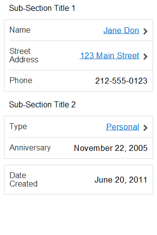
Example 13-1 demonstrates several page layout elements defined in a MAF AMX file.
Note:
You declare the page layout elements under the<amx> namespace.Example 13-1 Page Layout Components Definition
<amx:panelPage id="pp1">
   <amx:outputText id="outputText1"
                   value="Sub-Section Title 1"
                   styleClass="adfmf-text-sectiontitle"/>
   <amx:panelFormLayout id="panelFormLayout1" labelPosition="start">
      <amx:panelLabelAndMessage id="panelLabelAndMessage1" label="Name">
         <amx:commandLink id="commandLink1" text="Jane Don" action="editname" />
      </amx:panelLabelAndMessage>
      <amx:panelLabelAndMessage id="panelLabelAndMessage2" label="Street Address">
         <amx:commandLink id="commandLink2"
                          text="123 Main Street"
                          action="editaddr" />
      </amx:panelLabelAndMessage>
      <amx:panelLabelAndMessage id="panelLabelAndMessage3" label="Phone">
         <amx:outputText id="outputText2" value="212-555-0123" />
      </amx:panelLabelAndMessage>
   </amx:panelFormLayout>
   <amx:outputText id="outputText3"
                   value="Sub-Section Title 2"
                   styleClass="adfmf-text-sectiontitle" />
   <amx:panelFormLayout id="panelFormLayout2" labelPosition="start">
      <amx:panelLabelAndMessage id="panelLabelAndMessage4" label="Type">
         <amx:commandLink id="commandLink3" text="Personal" action="edittype" />
      </amx:panelLabelAndMessage>
      <amx:panelLabelAndMessage label="Anniversary">
         <amx:outputText id="outputText4" value="November 22, 2005" />
      </amx:panelLabelAndMessage>
   </amx:panelFormLayout>
   <amx:panelFormLayout id="panelFormLayout3" labelPosition="start">
      <amx:panelLabelAndMessage id="panelLabelAndMessage5" label="Date Created">
         <amx:outputText id="outputText5" value="June 20, 2011" />
      </amx:panelLabelAndMessage>
   </amx:panelFormLayout>
</amx:panelPage>
You use the standard Cascading Style Sheets (CSS) to manage visual presentation of your layout components. CSS are located in the Web Content/css directory of your ViewController project, with default CSS provided by MAF. For more information, see Section 13.6.1, "How to Use Component Attributes to Define Style."
The user interface created using MAF AMX displays correctly in both the left-to-right (LTR) and right-to-left (RTL) language environments. In the latter case, the components originate on the right-hand side of the screen instead of on the left-hand side. Some of the MAF AMX layout components, such as the Popup (see Section 13.2.8, "How to Use a Popup Component"), Panel Item, and Panel Splitter (see Section 13.2.9, "How to Use a Panel Splitter Component") can be configured to enable specific RTL behavior. For more information about the RTL configuration of MAF AMX pages, see Section 13.4, "Enabling Gestures" and Section 12.2.11, "How to Specify the Page Transition Style."
Note:
The right-to-left text direction is not supported on Android prior to version 4.2.A MAF sample application called UIDemo demonstrates how to use layout components in conjunction with such MAF AMX UI components as a Button, to achieve some of the typical layouts that follow common patterns. In addition, this sample application shows how to work with styles to adjust the page layout to a specific pattern. The UIDemo application is located in the PublicSamples.zip file within the jdev_install/jdeveloper/jdev/extensions/oracle.maf/Samples directory on your development computer.
13.2.1 How to Use a View Component
A View (view element in a MAF AMX file) is a core page structure component that is automatically inserted into a MAF AMX file when the file is created. This component provides a hierarchical representation of the page and its structure and represents a single MAF AMX page.
For more information, see Oracle Fusion Middleware Tag Reference for Oracle Mobile Application Framework.
13.2.2 How to Use a Panel Page Component
A Panel Page (panelPage element in a MAF AMX file) is a component that allows you to define a scrollable area of the screen for laying out other components.
By default, when you create a MAF AMX page, JDeveloper automatically creates and inserts a Panel Page component into the page. When you add components to the page, they will be inserted inside the Panel Page component.
To prevent scrolling of certain areas (such as a header and footer of the page) and enable stretching when orientation changes, you can specify a Facet component for your Panel Page. The Panel Page's header Facet includes the title placed in the Navigation Bar of each page. For information about other types of Facet components that the Panel Page can contain, see Section 13.2.7, "How to Use a Facet Component."
Example 13-2 shows the panelPage element defined in a MAF AMX file. This Panel Page contains a header Facet.
Example 13-2 Panel Page Definition
<amx:panelPage id="pp1">
   <amx:facet name="header">
      <amx:outputText id="ot1" value="Welcome"/>
   </amx:facet>
</amx:panelPage>
For more information, see Oracle Fusion Middleware Tag Reference for Oracle Mobile Application Framework.
13.2.3 How to Use a Panel Group Layout Component
The Panel Group Layout component is a basic layout component that lays out its children horizontally or vertically. In addition, there is a wrapping layout option that enables child components to flow across and down the page.
To create the Panel Group Layout component, use the Components window.
To add the Panel Group Layout component:
-
In the Components window, drag and drop a Panel Group Layout to the MAF AMX page.
-
Insert the desired child components into the Panel Group Layout component.
-
To add spacing between adjacent child components, insert the Spacer (
spacer) component. -
Use the Properties window to set the component attributes. For more information, see Oracle Fusion Middleware Tag Reference for Oracle Mobile Application Framework.
Example 13-3 shows the panelGroupLayout element defined in a MAF AMX file.
Example 13-3 Panel Group Layout Definition
<amx:panelGroupLayout styleClass="prod" id="pgl1">
   <amx:outputText styleClass="prod-label" value="Screen Size:" id="ot1"/>
</amx:panelGroupLayout>
13.2.3.1 Customizing the Scrolling Behavior
Scrolling behavior of the Panel Group Layout component is defined by its scrollPolicy attribute which can be set to auto (default), none, or scroll. By default, this behavior matches the one defined in the active skin.
To disable scrolling regardless of the behavior defined in the active skin, you set the scrollPolicy attribute to none. When the Panel Group Layout component is not scrollable, its content is not constrained.
To enable scrolling regardless of the behavior defined in the active skin, you set the scrollPolicy attribute to scroll. If the Panel Group Layout component is scrollable, the scrolling is provided when the component's dimensions are constrained.
Since scrolling consumes a lot of memory and may lead to the application crashing, you should minimize its use. In the mobileAlta skin (see Section 13.6.2, "What You May Need to Know About Skinning"), scrolling of the Panel Group Layout, Panel Form Layout (see Section 13.2.4, "How to Use a Panel Form Layout Component"), and Table Layout (see Section 13.2.11, "How to Use a Table Layout Component") is disabled. It is recommended that you use the mobileAlta skin for your application and limit instances of setting the scrollPolicy to scroll to when it is necessary. To simulate the scrolling behavior for the Panel Form Layout and Table Layout, you can enclose them within a scrollable Panel Group Layout component when scrolling is required.
For more information, see Section 13.3.15.2, "What You May Need to Know About Memory Consumption by MAF AMX UI Components."
13.2.4 How to Use a Panel Form Layout Component
The Panel Form Layout (panelFormLayout) component positions components so that their labels and fields align horizontally. In general, the main content of the Panel Form Layout component is comprised of input components (such as Input Text) and selection components (such as Choice). If a child component with a label attribute defined is placed inside the Panel Form Layout component, the child component's label and field are aligned and sized based on the Panel Form Layout definitions. Within the Panel Form Layout, the label area can either be displayed on the start side of the field area or on a separate line above the field area. Separate lines are used if the labelPosition attribute of the Panel Form Layout is set to topStart, topCenter, or topEnd. Otherwise the label area appears on the start side of the field area. Within the label area, the labelPosition attribute controls where the label text can be aligned:
-
to the start side (
labelPosition="start"orlabelPosition="topStart") -
to the center (
labelPosition="center"orlabelPosition="topCenter") -
to the end side (
labelPosition="end"orlabelPosition="topEnd")
Within the field area, the fieldHalign attribute controls where the field content can be aligned:
-
to the start side (
fieldHalign="start") -
to the center (
fieldHalign="center") -
to the end side (
fieldHalign="end")
Within the Panel Form Layout, the child components can be placed in one or more columns using maxColumns and rows attributes. These attributes should be used in conjunction with labelWidth, fieldWidth, labelPosition, and showHorizontalDividers attributes to obtain the optimal multi-column layout.
Note:
To switch from a single-column to multi-column layout, the value of therows attribute must be greater than 1, regardless of the value to which the maxColumns attribute is set. When the rows attribute is specified, the maxColumns attribute restricts the layout to that number of columns as a maximum; however, there are as many rows as are required to lay out the child components.To add the Panel Form Layout component:
-
In the Components window, drag and drop a Panel Form Layout component to the MAF AMX page.
-
In the Properties window, set the component's attributes. For more information, see Oracle Fusion Middleware Tag Reference for Oracle Mobile Application Framework.
Example 13-4 shows the panelFormLayout element defined in a MAF AMX file.
13.2.5 How to Use a Panel Stretch Layout Component
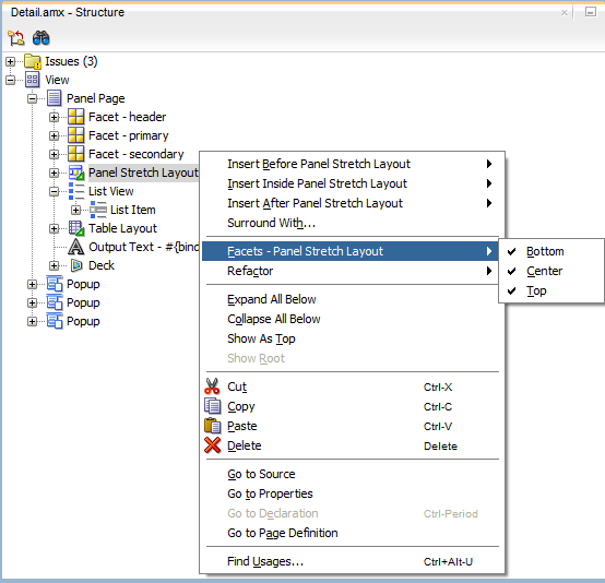
The Panel Stretch Layout (panelStretchLayout) component manages three child Facet components: top, bottom, and center (see Example 13-5). You can use any number and combination of these facets.
Example 13-5 Basic Panel Stretch Layout Definition
<amx:panelStretchLayout id="psl1">
   <amx:facet name="top">
   </amx:facet>
   <amx:facet name="center">
   </amx:facet>
   <amx:facet name="bottom">
   </amx:facet>
</amx:panelStretchLayout>
If an attempt is made to represent the Panel Stretch Layout component as a set of three rectangles stacked one on top of another, the following would apply:
-
The height of the top rectangle is defined by the natural height of the top facet.
-
The height of the bottom rectangle is defined by the natural height of the bottom facet.
-
The rest of the vertical space is distributed to the rectangle in the middle. If the height of this rectangle is smaller than the value defined for
Center.heightand thescrollPolicyattribute of thepanelStretchLayoutis set to eitherscrollorauto, then scroll bars are added.
To add the Panel Stretch Layout component:
-
In the Components window, drag and drop a Panel Stretch Layout onto the MAF AMX page.
-
Review the created child Facet components and, if necessary, remove some of them.
-
Use the Properties window to set the component attributes. For more information, see Oracle Fusion Middleware Tag Reference for Oracle Mobile Application Framework.
13.2.6 How to Use a Panel Label And Message Component
Use the Panel Label And Message (panelLabelAndMessage) component to place a component which does not have a label attribute. These components usually include an Output Text, Button, or Link.
To add the Panel Label And Message component:
-
In the Components window, drag and drop a Panel Label And Message component into a Panel Group Layout component.
-
In the Properties window, set the component's attributes. For more information, see Oracle Fusion Middleware Tag Reference for Oracle Mobile Application Framework.
Example 13-4 shows the panelLabelAndMessage element defined in a MAF AMX file. The label attribute is used for the child component.
13.2.7 How to Use a Facet Component
You use the Facet (facet) component to define an arbitrarily named facet, such as a header or footer, on the parent layout component. The position and rendering of the Facet are determined by the parent component.
The MAF AMX page header is typically represented by the Panel Page component (see Section 13.2.2, "How to Use a Panel Page Component") in combination with the Header, Primary, and Secondary facets:
-
Header facet: contains the page title.
-
Primary Action facet: represents an area that appears in the left corner of the header bar and typically hosts Button or Link components, but can contain any component type.
-
Secondary Action facet: represents an area that appears in the right corner of the header bar and typically hosts Button or Link components, but can contain any component type.
The MAF AMX page footer is represented by the Panel Page component (see Section 13.2.2, "How to Use a Panel Page Component") in combination with the footer facet:
-
Footer facet: represents an area that appears below the content area and typically hosts Button or Link components, but can contain any component type.
Example 13-7 shows the facet element declared inside the Panel Page container. The type of the facet is always defined by its name attribute (see Table 13-2).
<amx:panelPage id="pp1">
   <amx:facet name="footer">
      <amx:commandButton id="cb2" icon="folder.png"
                         text="Move (#{myBean.mailcount})"
                         action"move"/>
   </amx:facet>
</amx:panelPage>
Table 13-2 lists predefined Facet types that you can use with specific parent components.
Table 13-2 Facet Types and Parent Components
| Parent Component | Facet Type (name) |
|---|---|
|
Panel Page ( |
|
|
List View ( |
|
|
Carousel ( |
|
|
Panel Splitter ( |
|
|
Panel Stretch Layout ( |
|
|
Data Visualization Components. For more information, see Section 13.5, "Providing Data Visualization." |
|
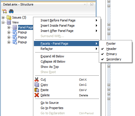
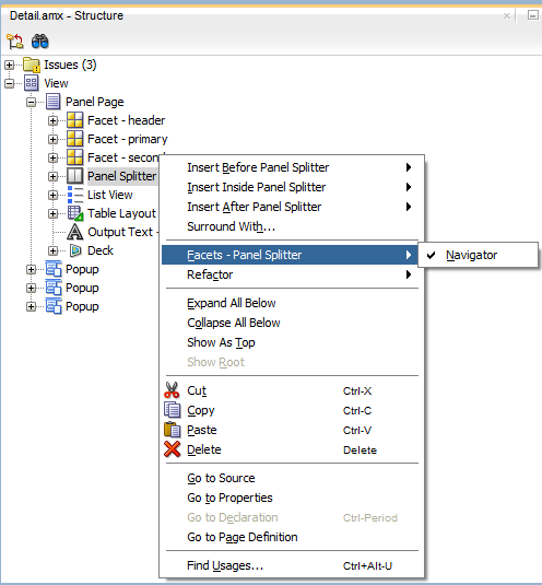
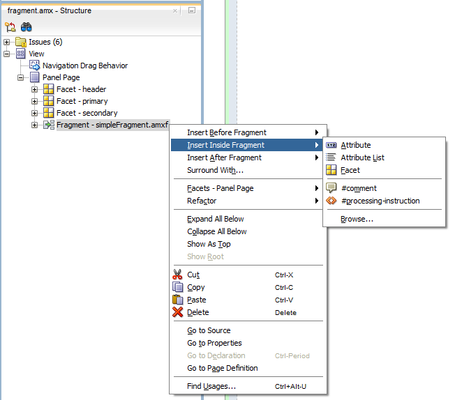
You can use the context menu displayed on the Structure window or Source editor to add a Facet component as a child of another component. The context menu displays only facets that are valid for your selected parent component. To add a Facet, first select and then right-click the parent component in the Structure window or Source editor, and then select one of the following:
-
If the parent component is a Panel Page, select Facets - Panel Page, and then choose the type of Facet from the list, as Figure 13-2 shows.
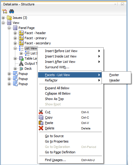
-
If the parent component is a List View, select Facets - List View, and then choose the type of Facet from the list, as Figure 13-3 shows.
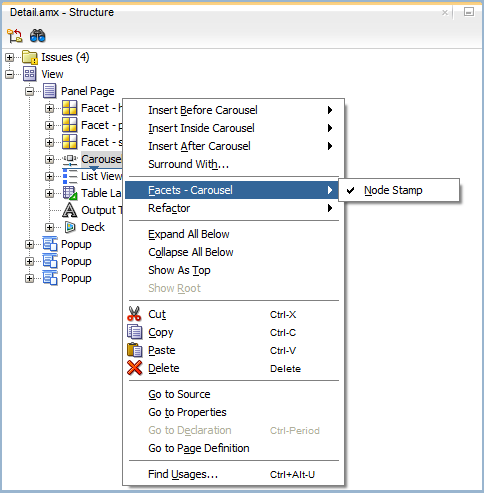
-
If the parent component is a Carousel, select Facets - Carousel > Node Stamp, as Figure 13-4 shows.
-
If the parent component is a Panel Splitter, select Facets - Panel Splitter > Navigator, as Figure 13-5 shows.
-
If the parent component is a Panel Stretch Layout, select Facets - Panel Stretch Layout, and then choose the type of Facet from the list, as Figure 13-6 shows.
-
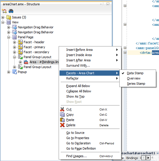
If the parent component is one of the data visualization components, select Facets > <MAF AMX Data Visualizations Component Name>, and then choose the type of Facet from the list, as Figure 13-7 shows.
For more information about data visualization components and their attributes, see Section 13.5, "Providing Data Visualization."
-
In the Components window, drag and drop a Facet component into another component listed in Table 13-2.
-
In the Properties window, set the component's attributes. For more information, see Oracle Fusion Middleware Tag Reference for Oracle Mobile Application Framework.
13.2.8 How to Use a Popup Component
Use the Popup (popup) component to display a popup window. You can declare this component as a child of the View component.
You can use the following operations in conjunction with the Popup component:
-
Close Popup Behavior (
closePopupBehavior) operation represents a declarative way to close the Popup in response to a client-triggered event specified using thetypeattribute of the Close Popup Behavior.For more information about the Close Popup Behavior component's attributes and their values, see Oracle Fusion Middleware Tag Reference for Oracle Mobile Application Framework.
-
Show Popup Behavior (
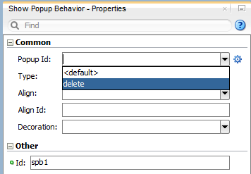
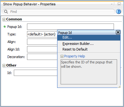
showPopupBehavior) operation represents a declarative way to show the Popup in response to a client-triggered event specified using thetypeattribute of the Show Popup Behavior.The
popupIdattribute of the Show Popup Behavior specifies the unique identifier of the Popup component relative to its parent component. ThealignIdattribute of the Show Popup Behavior specifies the unique identifier of the UI component relative to which the Popup is to be aligned. Since setting identifiers manually is tedious and can lead to invalid references, you set values for these two attributes using an editor that is integrated with the standard Properties window (see Figure 13-9). There is an Audit rule that is specifically defined to validate these identifiers (see Section 12.3.2.5, "What You May Need to Know About Element Identifiers and Their Audit").The
decorationattribute of the Show Popup Behavior allows you to configure the Popup to have an anchor pointing to the component that matches the specifiedalignId. You do so by setting thedecorationattribute toanchor(the default value issimple).Note:
There is no need to definedecoration="anchor"to use thealignIdattribute. When usingdecoration="anchor", if thealignIdattribute is not specified or a match is not found for thealignId, thedecorationdefaults tosimpleresulting in minimal ornamentation of the Popup component.Values you set for the
alignattribute of the Show Popup Behavior indicate where the alignment of the Popup component is to be positioned if there is enough space to satisfy that positioning. When there is not enough space, alternate positioning is chosen by MAF.Tip:
To center a Popup on the screen, you should set thealignIdattribute of the Panel Page component, and then use thealign="center".For more information on the Show Popup Behavior component's attributes and their values, see Oracle Fusion Middleware Tag Reference for Oracle Mobile Application Framework.
Example 13-8 shows popup and its showPopupBehavior and closePopupBehavior elements defined in a MAF AMX file.
Example 13-8 Popup, Show Popup Behavior, and Close Popup Behavior Definition
<amx:view>
   <amx:panelPage id="panelPage1">
      <amx:commandButton id="commandButton1" text="Show Popup">
         <amx:showPopupBehavior popupId="popup1" type="action"
                                align="topStart" alignId="panelPage1"
                                decoration="anchor"/>
      </amx:commandButton>
   </amx:panelPage>
   <amx:popup id="popup1"
              animation="slideUp"
              autoDismiss="true"
              backgroundDimming="off">
      <amx:panelGroupLayout id="pgl2" layout="vertical">
         <amx:commandButton id="commandButton3" text="Close Popup">
            <amx:closePopupBehavior type="action" popupId="popup1"/>
         </amx:commandButton>
      </amx:panelGroupLayout>
   </amx:popup>
</amx:view>
Popup components can display validation messages when the user input errors occur. For more information, see Section 13.9, "Validating Input."
-
Select either the
showPopupBehaviororcloseopupBehaviorelement in the Source editor or Structure window. -
Click the down arrow to the right of the Popup Id field to make a selection from a list of available Popup components (see Figure 13-8), or click on the Property Menu icon to the right of the Popup Id field to open the Popup Id property editor (see Figure 13-9).
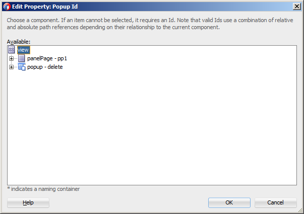
-
If you use the property editor, select Edit on the Popup Id property editor to open the Edit Property: Popup Id dialog that Figure 13-10 shows.
-
Select the Popup component to be displayed or the Popup component to be closed when this Show Popup Behavior or Close Popup Behavior is invoked.
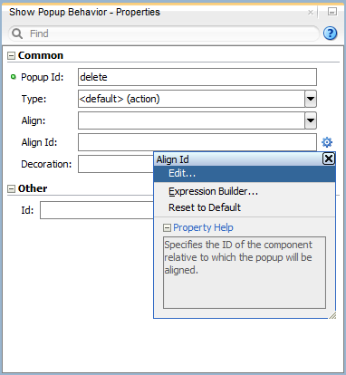
-
Select the
showPopupBehaviorelement in the Source editor or Structure window. -
Click on the Property Menu icon to the right of the Align Id field to open the Align Id property editor, as Figure 13-11 shows.
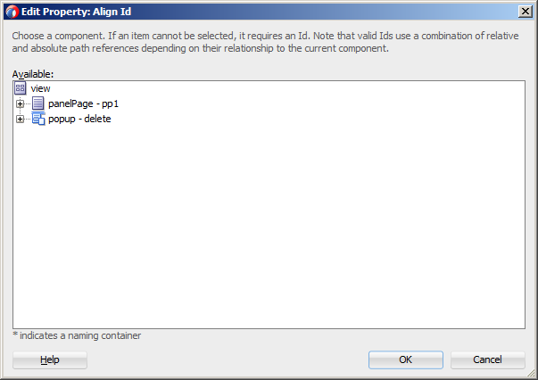
-
Select Edit on the Align Id property editor to open the Edit Property: Align Id dialog that Figure 13-12 shows.
-
Select the parent component of the Show Popup Behavior operation.
When developing for both iOS platform and Android 4.2 or later platform, you can configure the Popup to accommodate the right-to-left (RTL) language environment by setting its animation attribute to either slideStart or slideEnd.
A MAF sample application called UIDemo demonstrates how to use the Popup component and how to apply styles to adjust the page layout to a specific pattern. The UIDemo application is located in the PublicSamples.zip file within the jdev_install/jdeveloper/jdev/extensions/oracle.maf/Samples directory on your development computer.
13.2.9 How to Use a Panel Splitter Component
Use the Panel Splitter (panelSplitter) component to display multiple content areas that may be controlled by a left-side navigation pane. Panel Splitter components are commonly used on tablet devices that have larger display size. These components are typically used with a list on the left and the content on the right side of the display area.
A Panel Splitter can contain a navigator Facet (see Section 13.2.7, "How to Use a Facet Component") which is generated automatically when you drag and drop the Panel Splitter onto a MAF AMX page, and a Panel Item component. The Panel Item (panelItem) component represents the content area of a Panel Splitter. Since each Panel Splitter component must have a least one Panel Item, the Panel Item is automatically added to the Panel Splitter when the Panel Splitter is created. Each Panel Item component can contain any component that a Panel Group Layout can contain (see Section 13.2.3, "How to Use a Panel Group Layout Component").
The left side of the Panel Splitter is represented by a navigator facet (navigator), which is optional in cases where only multiple content with animations is desired (for example, drawing a multicontent area with a Select Button that requires animation when selecting different buttons to switch content). When in landscape mode, this facet is rendered; in portrait mode, a button is placed above the content area and when clicked, the content of the facet is launched in a popup.
When developing for both iOS platform and Android 4.2 or later platform, you can configure the Panel Splitter and Panel Item to accommodate the right-to-left (RTL) language environment by setting their animation attribute to either slideStart, slideEnd, flipStart, or flipEnd. The animation attribute of the Panel Item components overrides the Panel Splitter's animation attribute. For more information, see Oracle Fusion Middleware Tag Reference for Oracle Mobile Application Framework.
Example 13-9 shows the panelSplitter element defined in a MAF AMX file, with the navigator facet used as a child component.
Example 13-9 Panel Splitter with Navigator Definition
<amx:panelSplitter id="ps1"
               selectedItem="#{bindings.display.inputValue}"
               animation="flipEnd">
   <amx:facet name="navigator">
      <amx:listView id="lv1"
                    value="#{bindings.data.collectionModel}"
                    var="row"
                    showMoreStrategy="autoScroll"
                    bufferStrategy="viewport>
         ...
      </listView>
   </facet>
   <amx:panelItem id="x">
      <amx:panelGroupLayout>
         ...
      </panelGroupLayout>
   </panelItem>
   <amx:panelItem id="y">
      <amx:panelGroupLayout>
         ...
      </panelGroupLayout>
   </panelItem>
</panelSplitter>
For more examples, see the UIDemo application located in the PublicSamples.zip file within the jdev_install/jdeveloper/jdev/extensions/oracle.maf/Samples directory on your development computer.
For more information, see Oracle Fusion Middleware Tag Reference for Oracle Mobile Application Framework.
13.2.10 How to Use a Spacer Component
Use the Spacer (spacer) component to create an area of blank space with a purpose to separate components on a MAF AMX page. You can include vertical and horizontal spaces in a page using the height (for vertical spacing) and width (for horizontal spacing) attributes of the spacer:
-
In the Components window, drag and drop a Spacer onto the MAF AMX page.
-
Use the Properties window to set the attributes of the component. For more information, see Oracle Fusion Middleware Tag Reference for Oracle Mobile Application Framework.
Example 13-10 shows the spacer element and its children defined in a MAF AMX file.
13.2.11 How to Use a Table Layout Component
Use the Table Layout (tableLayout) component to display data in a typical table format that consists of rows containing cells.
The Row Layout (rowLayout) component represents a single row in the Table Layout. The Table Layout component must contain either one or more Row Layout components or Iterator components that can produce Row Layout components.
The CellFormat (cellFormat) component represents a cell in the Row Layout. The Row Layout component must contain either one or more CellFormat components, Iterator components, Attribute List Iterator components, or Facet Definition components that can produce CellFormat components.
The Table Layout structure does not allow cell contents to use percentage heights nor can a height be assigned to the overall table structure as a whole. For details, see the description of the following attributes in the Oracle Fusion Middleware Tag Reference for Oracle Mobile Application Framework:
-
layoutandwidthattributes of the Table Layout component -
widthandheightattributes of the Row Layout component
To add the Table Layout component:
-
In the Components window, drag and drop a Table Layout onto the MAF AMX page.
-
Insert the desired number of Row Layout, Iterator, Attribute List Iterator, or Facet Definition child components into the Table Layout component.
-
Insert Cell Format, Iterator, Attribute List Iterator, or Facet Definition child components into each Row Layout component.
-
Use the Properties window to set the attributes of all added components. For more information, see Oracle Fusion Middleware Tag Reference for Oracle Mobile Application Framework.
Example 13-11 shows the tableLayout element and its children defined in a MAF AMX file.
Example 13-11 Defining Table Layout
<amx:tableLayout id="tableLayout1"
                 rendered="#{pageFlowScope.pRendered}"
                 styleClass="#{pageFlowScope.pStyleClass}"
                 inlineStyle="#{pageFlowScope.pInlineStyle}"
                 borderWidth="#{pageFlowScope.pBorderWidth}"
                 cellPadding="#{pageFlowScope.pCellPadding}"
                 cellSpacing="#{pageFlowScope.pCellSpacing}"
                 halign="#{pageFlowScope.pHalign}"
                 layout="#{pageFlowScope.pLayoutTL}"
                 shortDesc="#{pageFlowScope.pShortDesc}"
                 summary="#{pageFlowScope.pSummary}"
                 width="#{pageFlowScope.pWidth}">
   <amx:rowLayout id="rowLayout1">
      <amx:cellFormat id="cellFormatA" rowSpan="2" halign="center">
         <amx:outputText id="otA" value="Cell A"/>
      </amx:cellFormat>
      <amx:cellFormat id="cellFormatB" rowSpan="2" halign="center">
         <amx:outputText id="otB" value="Cell B (wide content)"/>
      </amx:cellFormat>
      <amx:cellFormat id="cellFormatC" rowSpan="2" halign="center">
         <amx:outputText id="otC" value="Cell C"/>
      </amx:cellFormat>
   </amx:rowLayout>
   <amx:rowLayout id="rowLayout2">
      <amx:cellFormat id="cellFormatD" halign="end">
         <amx:outputText id="otD" value="Cell D"/>
      </amx:cellFormat>
      <amx:cellFormat id="cellFormatE">
         <amx:outputText id="otE" value="Cell E"/>
      </amx:cellFormat>
   </amx:rowLayout>
</amx:tableLayout>
13.2.12 How to Use a Deck Component
The Deck (deck) component represents a container that shows one of its child components at a time. The transition from one displayed child component (defined by the displayedChild attribute) to another is enabled by the Transition (transition) operation. The transition can take a form of animation. For more information about the transition, see Section 12.2.11, "How to Specify the Page Transition Style."
The Deck can be navigated forward and backwards.
-
In the Components window, drag and drop a Deck onto the MAF AMX page.
-
Insert the desired number of Transition operations and child UI components into the Deck component.
-
Use the Properties window to set the attributes of all added components. For more information, see Oracle Fusion Middleware Tag Reference for Oracle Mobile Application Framework.
Example 13-12 shows the deck element and its children defined in a MAF AMX file. The Deck component's displayedChild attribute to define which child component ID should be displayed. Typically, this is controlled by a component such as a Select One Button or other selection component.
<amx:deck id="deck1"
             rendered="#{pageFlowScope.pRendered}"
             styleClass="#{pageFlowScope.pStyleClass}"
             inlineStyle="width:95px;height:137px;overflow:hidden;
                                    #{pageFlowScope.pInlineStyle}"
             landmark="#{pageFlowScope.pLandmark}"
             shortDesc="#{pageFlowScope.pShortDesc}"
             displayedChild="#{pageFlowScope.pDisplayedChild}">

   <amx:transition triggerType="#{pageFlowScope.pTriggerType}"
                   transition="#{pageFlowScope.pTransition}"/>
   <amx:transition triggerType="#{pageFlowScope.pTriggerType2}"
                   transition="#{pageFlowScope.pTransition2}"/>
   <amx:commandLink id="linkCardBack1" text="Card Back">>
     <amx:setPropertyListener from="linkCardA"
                              to="#{pageFlowScope.pDisplayedChild}"/>
   </amx:commandLink>
   <amx:commandLink id="linkCardA1" text="Card Front A">
   <amx:setPropertyListener id="setPL1"
                            from="linkCardB"
                            to="#{pageFlowScope.pDisplayedChild}"/>
   </amx:commandLink>
   <amx:commandLink id="linkCardB1" text="Card Front B">
      <amx:setPropertyListener id="setPL2"
                               from="linkCardC"
                               to="#{pageFlowScope.pDisplayedChild}"/>
   </amx:commandLink>
   <amx:commandLink id="linkCardC1" text="Card Front C">
      <amx:setPropertyListener id="setPL3"
                               from="linkCardD"
                               to="#{pageFlowScope.pDisplayedChild}"/>
   </amx:commandLink>
   <amx:commandLink id="linkCardD1" text="Card Front D">
      <amx:setPropertyListener id="setPL4"
                               from="linkCardE"
                               to="#{pageFlowScope.pDisplayedChild}"/>
   </amx:commandLink>
   <amx:commandLink id="linkCardE1" text="Card Front E">
      <amx:setPropertyListener id="setPL5"
                               from="linkCardBack"
                               to="#{pageFlowScope.pDisplayedChild}"/>
   </amx:commandLink>
</amx:deck>
For more information, see Oracle Fusion Middleware Tag Reference for Oracle Mobile Application Framework.
13.2.13 How to Use the Fragment Component
The Fragment (fragment) component enables sharing of MAF AMX page contents. This component is used in conjunction with a MAF AMX fragment file. For more information, see Section 12.3.1.6, "Sharing the Page Contents."
To add the Fragment component:
-
In the Components window, drag and drop a Fragment to the MAF AMX page.
-
Use the Insert Fragment dialog to set the Src attribute of the Fragment to a fragment file (
.amxf). -
Optionally, use the Structure view to add child components, such as an Attribute, Attribute List, or Facet.
-
Use the Properties window to set the attributes of all added components. For more information, see Oracle Fusion Middleware Tag Reference for Oracle Mobile Application Framework.
-
Add the Facet Definition (
facetRef) to the MAF AMX fragment file whose contents is to be included in the Fragment and set thefacetRef'sfacetNameattribute to the name of a facet.
Example 12-12, "Fragment in MAF AMX Page" shows a fragment element added to a MAF AMX page. Example 12-11, "Fragment Definition" shows the corresponding MAF AMX fragment file.
A MAF sample application called FragmentDemo demonstrates how to create and use the Fragment. This sample application is located in the PublicSamples.zip file within the jdev_install/jdeveloper/jdev/extensions/oracle.maf/Samples directory on your development computer.
13.3 Creating and Using UI Components
You can use the following UI components when developing your MAF AMX application feature:
-
Input Text (see Section 13.3.1, "How to Use the Input Text Component")
-
Input Number Slider (see Section 13.3.2, "How to Use the Input Number Slider Component")
-
Input Date (see Section 13.3.3, "How to Use the Input Date Component")
-
Output Text (see Section 13.3.4, "How to Use the Output Text Component")
-
Button (see Section 13.3.5, "How to Use Buttons")
-
Link (see Section 13.3.6, "How to Use Links")
-
Image (see Section 13.3.7, "How to Display Images")
-
Checkbox (see Section 13.3.8, "How to Use the Checkbox Component")
-
Select Many Checkbox (see Section 13.3.9, "How to Use the Select Many Checkbox Component")
-
Select Many Choice (see Section 13.3.11, "How to Use the Select Many Choice Component")
-
Boolean Switch (see Section 13.3.12, "How to Use the Boolean Switch Component")
-
Choice (see Section 13.3.10, "How to Use the Choice Component")
-
Select Button (see Section 13.3.13, "How to Use the Select Button Component")
-
Radio Button (see Section 13.3.14, "How to Use the Radio Button Component")
-
List View (see Section 13.3.15, "How to Use List View and List Item Components")
-
Carousel (see Section 13.3.16, "How to Use Carousel Component")
-
Film Strip (see Section 13.3.17, "How to Use the Film Strip Component")
-
Verbatim (see Section 13.3.18, "How to Use Verbatim Component")
-
Output HTML (see Section 13.3.19, "How to Use Output HTML Component")
-
Iterator (see Section 13.3.20, "How to Enable Iteration")
You can also use the following miscellaneous components that include operations, listener-type components, and converters as children of the UI components when developing your MAF AMX application feature:
-
Load Bundle (see Section 13.3.21, "How to Load a Resource Bundle")
-
Action Listener (see Section 13.3.22, "How to Use the Action Listener")
-
Set Property Listener (see Section 13.3.23, "How to Use the Set Property Listener")
-
Client Listener (see Section 13.3.24, "How to Use the Client Listener")
-
Convert Date Time (see Section 13.3.25, "How to Convert Date and Time Values")
-
Convert Number (see Section 13.3.26, "How to Convert Numerical Values")
-
Navigation Drag Behavior (see Section 13.3.27, "How to Enable Drag Navigation")
-
Loading Indicator Behavior (see Section 13.3.28, "How to Use the Loading Indicator")
You add a UI component by dragging and dropping it onto a MAF AMX page from the Components window (see Section 12.3.2.1, "Adding UI Components"). Then you use the Properties window to set the component's attributes (see Section 12.3.2.3, "Configuring UI Components"). For information on attributes of each particular component, see Oracle Fusion Middleware Tag Reference for Oracle Mobile Application Framework.
Note:
On a MAF AMX page, you place UI components within layout components (see Section 13.2, "Designing the Page Layout"). UI elements are declared under the<amx> namespace, except data visualization components that are declared under the <dvtm> namespace.You can add event listeners to some UI components. For more information, see Section 13.10, "Using Event Listeners." Event listeners are applicable to components for the MAF AMX runtime description on both iOS and Android-powered devices, but the listeners do not have any effect at design time.
For information on the UI components' support for accessibility, see Section 13.8, "Understanding MAF Support for Accessibility."
Note:
MAF does not evaluate EL expressions at design time. If the value of a component's attribute is set to an expression, this value appears as such in JDeveloper's Preview and the component may look different at runtime.The user interface created for both iOS platform and Android 4.2 or later platform using MAF AMX displays correctly in both the left-to-right (LTR) and right-to-left (RTL) language environments. In the latter case, the components originate on the right-hand side of the screen instead of on the left-hand side.
A MAF sample application called CompGallery demonstrates how to create and configure MAF AMX UI components. Another sample application called UIDemo shows how to lay out components on a MAF AMX page. The sample applications are located in the PublicSamples.zip file within the jdev_install/jdeveloper/jdev/extensions/oracle.maf/Samples directory on your development computer.
13.3.1 How to Use the Input Text Component
The Input Text (inputText) component represents an editable text field. The following types of Input Text components are available:
-
Standard single-line Input Text, which is declared as an
inputTextelement in a MAF AMX file:<amx:inputText id="text1" label="Text Input:" value="#{myBean.text}" /> -
Password Input Text:
<amx:inputText id="text1" label="Password Input:" value="#{myBean.text}" secret="true" /> -
Multiline Input Text (also known as text area):
<amx:inputText id="text1"
               label="Textarea:"
               value="#{myBean.text}"
               simple="true"
               rows="4" />
Figure 13-14 shows the Input Text component displayed in the Preview pane. This component has its parameters set as follows:
<amx:inputText id="inputText1"
               label="Input Text"
               value="text"/>
The inputType attribute lets you define how the component interprets the user input: as a text (default), email address, number, telephone number, or URL. These input types are based on the values allowed by HTML5.
To enable conversion of numbers, as well as date and time values that are entered in the Input Text component, you use the Convert Number (see Section 13.3.26, "How to Convert Numerical Values") and Convert Date Time (see Section 13.3.25, "How to Convert Date and Time Values") components.
For more information, illustrations, and examples, see the following:
-
Oracle Fusion Middleware Tag Reference for Oracle Mobile Application Framework
-
CompGallery, a MAF sample application located in the
PublicSamples.zipfile within thejdev_install/jdeveloper/jdev/extensions/oracle.maf/Samplesdirectory on your development computer.
On some mobile devices, when the end user taps an Input Text field, the keyboard is displayed (slides up). If an Input Text is the only component on a MAF AMX page, the input focus is on this field and the keyboard is displayed by default when the page loads.
A multiline Input Text may be displayed on a secondary page where it is the only component, in which case the multiline Input Text receives focus when the page loads and the keyboard becomes visible.
Input Text components render and behave differently on iOS and Android-powered devices: on iPhone and iPad, Input Text components may be displayed with or without a border.
When creating an Input Text component, consider the following:
-
To input or edit content, the end user has to tap in the field, which triggers a blinking insertion cursor to be displayed at the point of the tap, allowing the end user to edit the content. If the field does not contain content, the insertion cursor is positioned at the start of the field.
-
Fields represented by Input Text components may contain default text, typically used as a prompt. When the end user taps a key on the keyboard in such a field, the default text clears when Edit mode is entered. This behavior is enabled and configured through the Input Text's
hintTextattribute. -
Fields represented by Input Text components do not have a selected appearance. Selection is indicated by the blinking insertion cursor within the field.
-
If the end user enters more text than fits in the field, the text content shifts left one character at a time as the typing continues.
-
A multiline Input Text component is rendered as a rectangle of any height. This component supports scrolling when the content is too large to fit within the boundaries of the field: rows of text scroll up as the text area fills and new rows of text are added. The end user may flick up or down to scroll rows of text if there are more rows than can be displayed in the given display space. A scroll bar is displayed within the component to indicate the area is being scrolled.
-
Password field briefly echoes each typed character, and then reverts the character to a dot to protect the password.
-
The appearance and behavior of the Input Text component on iOS can be customized (see Section 13.3.1.1, "Customizing the Input Text Component").
13.3.1.1 Customizing the Input Text Component
MAF AMX provides support for the input capitalization and correction on iOS-powered devices. It also allows you to indicate whether the field is to be used for navigating or for searching. Depending on the version of the operating system and keyboard used, the return button located at the bottom right of the mobile devices's soft keypad (see Figure 13-15) might visually change to a Go or Search button (see Figure 13-16). In addition, upon activation the button triggers a DataChangeEvent for a single-line Input Text component.
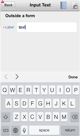
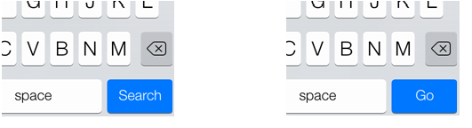
Table 13-3 lists attributes of the Input Text component that allow you to customize the appearance and behavior of that component and the soft keypad that is used to enter values into fields represented by the Input Text.
Table 13-3 Input-Customizing Attributes of the Input Text Component
| Attribute | Values | Description |
|---|---|---|
|
|
|
Indicates how the text field is to be used. If Some operating systems or keyboards might give special treatment to the keyboard, whereas others show no visual distinction. For example, instead of displaying a Return button on a single-line input text field, that button is replaced with a Go or a Search button. Depending on the skin, this may also alter the appearance of the input field. |
|
|
|
Requests special treatment by iOS for capitalization of values while the field represented by the Input Text is being edited. 
Note that setting this property has no impact on Android. |
|
|
|
Requests special treatment by iOS for correcting values while the field represented by the Input Text is being edited. 
Note that setting this property has no impact on Android. |
Since iOS provides limited support for auto-capitalization and auto-correction on its device simulator, you must test this functionality on an iOS device.
13.3.2 How to Use the Input Number Slider Component
The Input Number Slider (inputNumberSlider) component enables selection of numeric values from a range of values by using a slider instead of entering the value by using keys. The filled portion of the trough or track of the slider visually represents the current value.
The Input Number Slider may be used in conjunction with the Output or Input Text component to numerically show the value of the slider. The Input Text component also allows direct entry of a slider value: when the end user taps the Input Text field, the keyboard in numeric mode slides up; the keyboard can be dismissed by either using the slide-down button or by tapping away from the slider component.
The Input Number Slider component always shows the minimum and maximum values within the defined range of the component.
Note:
The Input Number Slider component should not be used in cases where a precise numeric entry is required or where there is a wide range of values (for example, 0 to 1000).Example 13-13 demonstrates the inputNumberSlider element defined in a MAF AMX file.
Example 13-13 Input Number Slider Definition
<amx:inputNumberSlider id="slider1" value="#{myBean.count}"/>
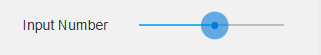
Figure 13-17 shows the Input Number Slider component displayed in the Preview pane. This component has its parameters set as follows:
<amx:inputNumberSlider id="inputNumberSlider1"
                       label="Input Number"
                       minimum="0"
                       maximum="20"
                       stepSize="1"
                       value="10"/>
To enable conversion of numbers that are entered in the Input Number Slider component, you use the Convert Number component (see Section 13.3.26, "How to Convert Numerical Values").
For more information, illustrations, and examples, see the following:
-
Oracle Fusion Middleware Tag Reference for Oracle Mobile Application Framework
-
CompGallery, a MAF sample application located in the
PublicSamples.zipfile within thejdev_install/jdeveloper/jdev/extensions/oracle.maf/Samplesdirectory on your development computer.
Similar to other MAF AMX UI components, the Input Number Slider component has a normal and selected state. The component is in its selected state at any time it is touched. To change the slider value, the end user touches, and then interacts with the slider button.
The Input Number Slider component has optional imageLeft and imageRight attributes which point to images that can be displayed on either side of the slider to provide the end user with additional information.
13.3.3 How to Use the Input Date Component
The Input Date (inputDate) component presents a popup input field for entering dates. The default date format is the short date format appropriate for the current locale. For example, the default format in American English (ENU) is mm/dd/yy. The inputType attribute defines if the component accepts date, time, or date and time as an input. The time zone depends on the time zone configured for the mobile device, and, therefore, it is relative to the device. At runtime, the Input Date component has the device's native look and feel.
Example 13-14 demonstrates the inputDate element defined in a MAF AMX file. The inputType attribute of this component is set to the default value of date. If the value attribute is read-only, it can be set to either an EL expression or any other type of value; if value is not a read-only attribute, it can be specified only as an EL expression.
Example 13-14 Input Date Definition
<amx:inputDate id="inputDate1" label="Input Date" value="#{myBean.date}"/>
For more information, see the following:
-
Oracle Fusion Middleware Tag Reference for Oracle Mobile Application Framework
-
HTML5 global dates and times defined by W3C
-
CompGallery, a MAF sample application located in the
PublicSamples.zipfile within thejdev_install/jdeveloper/jdev/extensions/oracle.maf/Samplesdirectory on your development computer
13.3.4 How to Use the Output Text Component
MAF AMX provides the Output Text (outputText) component for you to use as a label to display text.
Example 13-15 demonstrates the outputText element defined in a MAF AMX file.
Example 13-15 Output Text Definition
<amx:outputText id="ot1"
                value="output"
                styleClass="#{pageFlowScope.pStyleClass}"/>
Figure 13-18 shows the Output Text component displayed in the Preview pane.
You use the Convert Number (see Section 13.3.26, "How to Convert Numerical Values") and Convert Date Time (see Section 13.3.25, "How to Convert Date and Time Values") converters to facilitate the conversion of numerical and date-and-time-related data for the Output Text components.
For more information, illustrations, and examples, see the following:
-
Oracle Fusion Middleware Tag Reference for Oracle Mobile Application Framework
-
CompGallery and UIDemo, MAF sample applications located in the
PublicSamples.zipfile within thejdev_install/jdeveloper/jdev/extensions/oracle.maf/Samplesdirectory on your development computer
13.3.5 How to Use Buttons
The Button (commandButton) component is used to trigger actions (for example, Save, Cancel, Send) and to enable navigation to other pages within the application (for example, Back: see Section 13.3.5.7, "Enabling the Back Button Navigation" for more information).
You may use the Button in one of the following ways:
-
Button with a text label.
-
Button with a text label and an image icon.
Note:
You may define the icon image and placement as left or right of the text label. -
Button with an image icon only (for example, the " + " and " - " buttons for adding or deleting records).
MAF supports one default Button type for the following three display areas:
-
Buttons that appear in the top header bar: in MAF AMX pages, the header is represented by the Panel Page component (see Section 13.2.2, "How to Use a Panel Page Component") in combination with the header, primary, and secondary facets, which is typical on iPhones:
-
Header Facet contains the page title.
-
Primary Action Facet represents an area that appears in the left corner of the header bar and typically hosts Button or Link components, but can contain any component type.
-
Secondary Action Facet represents an area that appears in the right corner of the header bar and typically hosts Button or Link components, but can contain any component type.
-
-
Buttons that appear in the content area of a page.
-
Buttons that appear in the footer bar of a page. In MAF AMX pages, the footer is represented by the Panel Page component (see Section 13.2.2, "How to Use a Panel Page Component") in combination with the footer facet:
-
Footer Facet represents an area that appears below the content area and typically hosts Button or Link components, but can contain any component type.
-
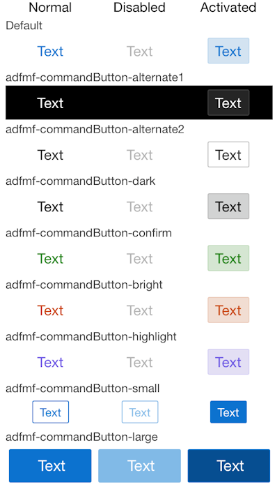
All Button components of any type have three states:
-
Normal.
-
Activated: represents appearance when the Button is tapped or touched by the end user. When a button is tapped (touch and release), the button action is performed. Upon touch, the activated appearance is displayed; upon release, the action is performed. If the end user touches the button and then drags their finger away from the button, the action is not performed. However, for the period of time the button is touched, the activated appearance is displayed.
-
Disabled.
The appearance of a Button component is defined by its styleClass attribute that you set to an adfmf-commandButton-<style>. You can apply any of the styles detailed in Table 13-4 to a Button placed in any valid location within the MAF AMX page.
| Button Style Name | Description |
|---|---|
|
Default |
The default style of a Button placed:
|
|
Back |
The back style of a Button placed in any of the Panel Page facets (Primary, Secondary, Header, Footer). This style may be applied to the default Button to give the "back to page" appearance. This button style is typical for "Back to Springboard" or any "Back to Page" buttons. For more information, see Section 13.3.5.2, "Displaying Back Style Buttons." |
|
Highlight |
The highlight style of a Button placed in any of the Panel Page facets (Primary, Secondary, Header, Footer) or the content area of a MAF AMX page. This style may be added to a Button to provide the iPhone button appearance typical of Save (or Done) buttons. For more information, see Section 13.3.5.3, "Displaying Highlight Style Buttons." |
|
Alert |
The Alert style adds the delete appearance to a button. For more information, see Section 13.3.5.4, "Displaying Alert Style Buttons." |
There is a Rounded style (adfmf-commandButton-rounded) that you can apply to a Button to decorate it with a thick rounded border (see Figure 13-19). You can define this style in combination with any other style.
MAF AMX provides a number of additional decorative styles (see Section 13.3.5.5, "Using Additional Button Styles").
There is a particular order in which MAF AMX processes the Button component's child operations and attributes. For more information, see Section 13.3.5.8, "What You May Need to Know About the Order of Processing Operations and Attributes."
13.3.5.1 Displaying Default Style Buttons
The following are various types of default style buttons that can be placed within Panel Page facets or content area:
-
Normal, activated, or disabled Button with a text label only.
-
Normal, activated, or disabled Button with an image icon only.
Example 13-16 and Example 13-17 demonstrate the commandButton element declared in a MAF AMX file.
Example 13-16 Definition of Default Button with Text Label
<amx:panelPage id="pp1">
   <amx:facet name="primary">
      <amx:commandButton id="cb1"
                         text="Cancel"
                         action="cancel"
                         actionListener="#{myBean.rollback}"/>
   </amx:facet>
</amx:panelPage>
Example 13-17 Definition of Default Button with Image Icon
<amx:panelPage id="pp1">
   <amx:facet name="primary">
      <amx:commandButton id="cb1"
                         icon="plus.png"
                         action="add"
                         actionListener="#{myBean.AddItem}"/>
   </amx:facet>
</amx:panelPage>
Example 13-18 shows the commandButton element declared inside the Panel Page's footer facet.
Example 13-18 Definition of Default Button with Text Label and Image in Footer Facet
<amx:panelPage id="pp1">
   <amx:facet name="footer">
      <amx:commandButton id="cb2"
                         icon="folder.png"
                         text="Move (#{myBean.mailcount})"
                         action="move"/>
   </amx:facet>
</amx:panelPage>
Example 13-19 demonstrates the commandButton element declared as a part of the Panel Page content area.
Example 13-19 Definition of Default Button with Text Label in the Page Content Area
<amx:panelPage id="pp1">
   <amx:commandButton id="cb1"
                      text="Reply"
                      actionListener="#{myBean.share}"/>
</amx:panelPage>
For more information, illustrations, and examples, see the following:
-
Oracle Fusion Middleware Tag Reference for Oracle Mobile Application Framework
-
CompGallery, a MAF sample application located in the
PublicSamples.zipfile within thejdev_install/jdeveloper/jdev/extensions/oracle.maf/Samplesdirectory on your development computer
13.3.5.2 Displaying Back Style Buttons
The following are various types of back style buttons that are placed within Panel Page facets or content area:
-
Normal, activated, or disabled Button with a text label only.
-
Normal, activated, or disabled Button with an image icon only:
Example 13-20 demonstrates the commandButton element declared in a MAF AMX file.
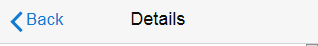
Example 13-20 Definition of Back Button with Text Label
<amx:panelPage id="pp1">
   <amx:facet name="header">
      <amx:outputText value="Details" id="ot1"/>
   </amx:facet>
   <amx:facet name="primary">
      <amx:commandButton id="cb1"
                         text="Back"
                         action="__back"/>
   </amx:facet>
   ...
</amx:panelPage>
Every time you place a Button component within the primary facet and set its action attribute to __back, MAF AMX automatically applies the back arrow styling to it, as Figure 13-20
For more information, illustrations, and examples, see the following:
-
Oracle Fusion Middleware Tag Reference for Oracle Mobile Application Framework
-
CompGallery, a MAF sample application located in the
PublicSamples.zipfile within thejdev_install/jdeveloper/jdev/extensions/oracle.maf/Samplesdirectory on your development computer
13.3.5.3 Displaying Highlight Style Buttons
Similar to other types of Buttons, highlight style buttons that are placed within Panel Page facets or content area can have their state as normal, activated, or disabled.
Example 13-21 demonstrates the commandButton element declared in a MAF AMX file.
Example 13-21 Definition of Highlight Button with Text Label
<amx:panelPage id="pp1">
   <amx:facet name="secondary">
      <amx:commandButton id="cb2"
                         text="Save"
                         action="save"
                         styleClass="adfmf-commandButton-highlight"/>
   </amx:facet>
</amx:panelPage>
For more information, illustrations, and examples, see the following:
-
Oracle Fusion Middleware Tag Reference for Oracle Mobile Application Framework
-
CompGallery, a MAF sample application located in the
PublicSamples.zipfile within thejdev_install/jdeveloper/jdev/extensions/oracle.maf/Samplesdirectory on your development computer
13.3.5.4 Displaying Alert Style Buttons
Alert style buttons placed within the Panel Page can have normal, activated, or disabled state.
Example 13-22 demonstrates the commandButton element declared in a MAF AMX file.
Example 13-22 Definition of Alert Button with Text Label
<amx:commandButton id="cb1"
                   text="Delete"
                   actionListener="#{myBean.delete}"
                   styleClass="adfmf-commandButton-alert" />
For more information, illustrations, and examples, see the following:
-
Oracle Fusion Middleware Tag Reference for Oracle Mobile Application Framework
-
CompGallery, a MAF sample application located in the
PublicSamples.zipfile within thejdev_install/jdeveloper/jdev/extensions/oracle.maf/Samplesdirectory on your development computer
13.3.5.5 Using Additional Button Styles
MAF AMX provides the following additional Button styles:
-
Dark style
-
Bright style
-
Small style
-
Large style
-
Highlight style
-
Confirm style
-
Two varieties of the Alternate style
13.3.5.6 Using Buttons Within the Application
In your MAF application, you can use the Button component within the following contexts:
-
The Content Area to perform specific actions
-
Popup-style Alert Messages
MAF lets you create standard buttons for use on a navigation bar:
-
Edit button allows the end user to enter an editing or content-manipulation mode.
-
Cancel button allows the end user to exit the editing or content-manipulation mode without saving changes.
-
Save button allows the end user to exit the editing or content-manipulation mode by saving changes.
-
Done button allows the end user to exit the current mode and save changes, if any.
-
Undo button allows the end user to undo the most recent action.
-
Redo button allows the end user to redo the most recent undone action.
-
Back button allows the end user to navigate back to the springboard.
-
Back to Page button allows the end user to navigate back to the page identified by the button text label.
-
Add button allows the end user to add or create a new object.
Buttons that are positioned within the content area of a page perform a specific action given the location and context of the button within the page. These buttons may have a different visual appearance than buttons positioned with the navigation bar:
An example of buttons placed within an action sheet is a group of Delete Note and Cancel buttons.
An action sheet button expands to the width of the display.
An OK button can be placed within a validation message, such as a login validation after a failed password input.
13.3.5.7 Enabling the Back Button Navigation
MAF AMX supports navigation using the back button, with the default behavior of going back to the previously visited page. For more information, see Section 12.2.9, "How to Specify Action Outcomes Using UI Components."
If any Button component is added to the primary facet of a Panel Page that is equipped with the __back navigation, this Button is automatically given the back arrow visual styling (see Section 13.3.5.2, "Displaying Back Style Buttons"). To disable this, set the styleClass attribute to amx-commandButton-normal.
For more information, illustrations, and examples, see the following:
-
Oracle Fusion Middleware Tag Reference for Oracle Mobile Application Framework
-
CompGallery, a MAF sample application located in the
PublicSamples.zipfile within thejdev_install/jdeveloper/jdev/extensions/oracle.maf/Samplesdirectory on your development computer
13.3.5.8 What You May Need to Know About the Order of Processing Operations and Attributes
The following is the order in which MAF AMX processes operations and attributes when such components as a Button, Link, and List Item are activated:
-
The following child operations are processed in the order they appear in the XML file:
-
Set Property Listener
-
Action Listener
-
Show Popup Behavior
-
Close Popup Behavior
-
-
The Action Listener (
actionListener) attribute is processed and the associated Java method is invoked. -
The Action (
action) attribute is processed and any navigation case is followed.
13.3.6 How to Use Links
You use the Link (commandLink) component to trigger actions and enable navigation to other views.
The Link component can have any type of component defined as its child. By using such components as Set Property Listener (see Section 13.3.23, "How to Use the Set Property Listener"), Action Listener (see Section 13.3.22, "How to Use the Action Listener"), Show Popup Behavior, Close Popup Behavior see Section 13.2.8, "How to Use a Popup Component"), and Validation Behavior (see Section 13.9, "Validating Input") as children of the Link component, you can create an actionable area within which clicks and gestures can be performed.
By placing an Image component (see Section 13.3.7, "How to Display Images") inside a Link you can create a clickable image.
Example 13-23 demonstrates the commandLink element declared in a MAF AMX file.
Example 13-23 Basic Link Definition
<amx:commandLink id="cl1"
                 text="linked"
                 action="gotolink"
                 actionListener="#{myBean.doSomething}"/>
Figure 13-24 shows the basic Link component displayed in the Preview pane.

Example 13-24 demonstrates the commandLink element declared in a MAF AMX file. This component is placed within the panelFormLayout and panelLabelAndMessage components.
Example 13-24 Definition of Link Within Form
<amx:panelPage id="pp1">
   <amx:panelFormLayout id="form">
      <amx:panelLabelAndMessage id="panelLabelAndMessage1" label="Label">
         <amx:commandLink id="cl1"
                          text="linked"
                          action="gotolink"
                          actionListener="#{myBean.doSomething}"/>
      </amx:panelLabelAndMessage>
   </amx:panelFormLayout>
</amx:panelPage>
Figure 13-25 shows the Link component placed within a form and displayed in the Preview pane.
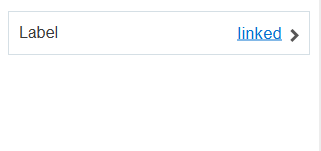
There is a particular order in which MAF AMX processes the Link component's child operations and attributes. For more information, see Section 13.3.5.8, "What You May Need to Know About the Order of Processing Operations and Attributes."
MAF AMX provides another component which is similar to the Link, but which does not allow for navigation between pages: Link Go (goLink) component. You use this component to enable linking to external pages. Figure 13-26 shows the Link Go component displayed in the Preview pane. This component has its parameters set as follows:
<amx:goLink id="goLink1"
            text="Go Link"
            url="http://example.com"/>

Image is the only component that you can specify as a child of the Link Go component.
For more information, illustrations, and examples, see the following:
-
Oracle Fusion Middleware Tag Reference for Oracle Mobile Application Framework
-
CompGallery, a MAF sample application located in the
PublicSamples.zipfile within thejdev_install/jdeveloper/jdev/extensions/oracle.maf/Samplesdirectory on your development computer
13.3.7 How to Display Images
MAF AMX enables the display of images on iOS and Android-powered devices using the Image (image) component represented by a bitmap.
In addition to placing an Image in a Button and List View, you can place it inside a Link component (see Section 13.3.6, "How to Use Links") to create a clickable image.
Example 13-25 demonstrates the image element definition in a MAF AMX file.
Example 13-25 Image Definition
<amx:image id="i1"
           styleClass="prod-thumb"
           source="images/img-big-#{pageFlowScope.product.uid}.png" />
The following are supported formats on the Android platform:
-
GIF
-
JPEG
-
PNG
-
BMP
The following are supported formats on iOS platform:
-
PNG
For more information, illustrations, and examples, see the following:
-
Oracle Fusion Middleware Tag Reference for Oracle Mobile Application Framework
-
CompGallery and UIDemo, MAF sample applications located in the
PublicSamples.zipfile within thejdev_install/jdeveloper/jdev/extensions/oracle.maf/Samplesdirectory on your development computer
13.3.8 How to Use the Checkbox Component
The Checkbox (selectBooleanCheckbox) component represents a check box that you create to enable single selection of true or false values, which allows toggling between selected and deselected states.
You can use the label attribute of the Checkbox component to place text to the left of the checkbox, and the text attribute places text on the right.
Example 13-26 demonstrates the selectBooleanCheckbox element declared in a MAF AMX file.
Example 13-26 Unchecked Checkbox Definition
<amx:selectBooleanCheckbox id="check1"
                           label="Agree to the terms:"
                           value="#{myBean.bool1}"
                           valueChangeListener=
                              "#{PropertyBean.ValueChangeHandler}"/>
Figure 13-27 shows the unchecked Checkbox component displayed in the Preview pane. This component has its parameters set as follows:
<amx:selectBooleanCheckbox id="selectBooleanCheckbox1"
                           label="Checkbox"
                           value="false"
                           valueChangeListener=
                                "#{PropertyBean.ValueChangeHandler}"/>

shows the checked Checkbox component displayed in the Preview pane. This component has its parameters set as follows:
Example 13-27 Checked Checkbox at Design Time
<amx:selectBooleanCheckbox id="selectBooleanCheckbox1"
                           label="Checkbox"
                           value="true"
                           valueChangeListener=
                                "#{PropertyBean.ValueChangeHandler}"/>

For more information, illustrations, and examples, see the following:
-
Oracle Fusion Middleware Tag Reference for Oracle Mobile Application Framework
-
CompGallery, a MAF sample application located in the
PublicSamples.zipfile within thejdev_install/jdeveloper/jdev/extensions/oracle.maf/Samplesdirectory on your development computer
13.3.8.1 Support for Checkbox Components on the iOS Platform
iOS does not support a native Checkbox component. The Boolean Switch is usually used in Properties pages to enable a boolean selection (see Section 13.3.12, "How to Use the Boolean Switch Component").
13.3.9 How to Use the Select Many Checkbox Component
The Select Many Checkbox (selectManyCheckbox) component represents a group of check boxes that you use to enable multiple selection of true or false values, which allows toggling between selected and deselected states of each check box in the group. The selection mechanism is provided by the Select Items or Select Item component (see Section 13.3.10.3, "What You May Need to Know About Differences Between Select Items and Select Item Components") contained by the Select Many Checkbox component.
Note:
The Select Many Checkbox component can contain more than one Select Item or Select Items components.Example 13-28 demonstrates the selectManyCheckbox element declared in a MAF AMX file.
Example 13-28 Select Many Checkbox Definition
<amx:selectManyCheckbox id="selectManyCheckbox1"
                        label="Select shipping options"
                        value="#{myBean.shipping}"
                        valueChangeListener="#{PropertyBean.ValueChangeHandler}">
   <amx:selectItem id="selectItem1"
                   label="Air"
                   value="#{myBean.shipping.air}"/>
   <amx:selectItem id="selectItem2"
                   label="Rail"
                   value="#{myBean.shipping.rail}"/>
   <amx:selectItem id="selectItem3"
                   label="Water"
                   value="#{myBean.shipping.water}"/>
</amx:selectManyCheckbox>
Figure 13-29 shows the Select Many Checkbox component displayed in the Preview pane. This component has its parameters set as follows:
<amx:selectManyCheckbox id="selectManyCheckbox1"
                        label="Select Many Checkbox"
                        value="value2"
                        valueChangeListener="#{PropertyBean.ValueChangeHandler}">
   <amx:selectItem id="selectItem1" label="Selection 1" value="value1"/>
   <amx:selectItem id="selectItem2" label="Selection 2" value="value2"/>
   <amx:selectItem id="selectItem3" label="Selection 3" value="value3"/>
</amx:selectManyCheckbox>
For more information, illustrations, and examples, see the following:
-
Oracle Fusion Middleware Tag Reference for Oracle Mobile Application Framework
-
CompGallery, a MAF sample application located in the
PublicSamples.zipfile within thejdev_install/jdeveloper/jdev/extensions/oracle.maf/Samplesdirectory on your development computer
13.3.9.1 What You May Need to Know About the User Interaction with Select Many Checkbox Component
MAF AMX provides two alternative ways for displaying the Select Many Checkbox component: pop-up style (default) and list style that is used when the number of available choices exceeds the device screen size.
The end user interaction with a pop-up style Select Many Checkbox component on both iPhone and iPad occurs as follows: when the end user taps the component, the list of choices is displayed in a popup. To make a choice, the end user taps one or more choices. To save the selections, the end user either taps outside the popup or closes the popup using the close (" x ") button.
Upon closing of the popup, the value displayed in the component is updated with the selected value.
When the number of choices exceed the dimensions of the device, a full-page popup containing a scrollable List View (see Section 13.3.15, "How to Use List View and List Item Components") is generated.
The end user interaction with a list-style Select Many Checkbox component on both iPhone and iPad occurs as follows: when the end user taps the component, the list of choices is displayed. To make a choice, the end user scrolls up or down to browse available choices, and then taps one or more choices. To save the selections, the end user taps the close (" x ") button.
Upon closing of the list, the value displayed in the component is updated with the selected value.
Note:
In both cases, there is no mechanism provided to cancel the selection.13.3.10 How to Use the Choice Component
The Choice (selectOneChoice) component represents a combo box that is used to enable selection of a single value from a list. The selection mechanism is provided by the Select Items or Select Item component (see Section 13.3.10.3, "What You May Need to Know About Differences Between Select Items and Select Item Components") contained by the Choice component.
Note:
The Choice component can contain more than one Select Items or Select Item components.Example 13-29 demonstrates the selectOneChoice element definition with the selectItems subelement in a MAF AMX file.
Example 13-29 Choice Definition Using Select Item Component
<amx:selectOneChoice id="choice1"
                     label="Your state:"
                     value="#{myBean.myState}"
                     valueChangeListener="#{PropertyBean.ValueChangeHandler}">
   <amx:selectItem id="selectItem1" label="Alaska" value="AK"/>
   <amx:selectItem id="selectItem2" label="Alabama" value="AL"/>
   <amx:selectItem id="selectItem3" label="California" value="CA"/>
   <amx:selectItem id="selectItem4" label="Connecticut" value="CT"/>
</amx:selectOneChoice>
Example 13-30 Choice Definition Using Select Items Component
<amx:selectOneChoice id="choice1"
                     label="Your state:"
                     value="#{myBean.myState}"
                     valueChangeListener="#{PropertyBean.ValueChangeHandler}">
   <amx:selectItems id="selectItems1" value="myBean.allStates"/>
</amx:selectOneChoice>
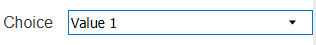
Figure 13-30 shows the Choice component displayed in the Preview pane. This component has its parameters set as follows:
<amx:selectOneChoice id="selectOneChoice1"
                     label="Choice"
                     value="value1"
                     valueChangeListener="#{PropertyBean.ValueChangeHandler}">
   <amx:selectItem id="selectItem1" label="Value 1" value="value1"/>
   <amx:selectItem id="selectItem2" label="Value 2" value="value2"/>
   <amx:selectItem id="selectItem3" label="Value 3" value="value3"/>
</amx:selectOneChoice>
The initial value of the selectOneChoice element cannot be null. Instead, it must be set to the value displayed in the Select One Choice component. To accomplish this, you have to ensure that the value in the model (in the bean or binding) is identical to the default value displayed in JDeveloper at design time.
For more information, illustrations, and examples, see the following:
-
Oracle Fusion Middleware Tag Reference for Oracle Mobile Application Framework
-
CompGallery, a MAF sample application located in the
PublicSamples.zipfile within thejdev_install/jdeveloper/jdev/extensions/oracle.maf/Samplesdirectory on your development computer
13.3.10.1 What You May Need to Know About the User Interaction with Choice Component on iOS Platform
MAF AMX provides two alternative ways for displaying the Choice component: pop-up style and drop-down style.
On an iPhone, the end user interaction with a native Choice component occurs as follows: when the end user taps the components list of choices is displayed, with the first option selected by default. To make a choice, the end user scrolls up or down to browse available choices. To save the selection, the end user taps Done in the tool bar.
On an iPad, the user interaction is similar to the interaction on an iPhone, except the following:
-
The list of choices is displayed in a popup dialog.
-
iPad styling is implemented around the list of choices, with a notch used to indicate the source of the list.
To close the list of choices without selecting an item, the end user must tap outside the popup dialog.
Note:
The UI to display the list of choices and the tool bar are native to the browser and cannot be styled using CSS.List values within the Choice component may be displayed as disabled.
When the number of choices exceeds the dimensions of the device display, a list page is generated that may be scrolled in a native way.
13.3.10.2 What You May Need to Know About the User Interaction with Choice Component on the Android Platform
The end user interaction with a native Choice component on an Android-powered device occurs as follows: when the end user taps the component, the list of choices in the form of a popup dialog is displayed. A simple popup is displayed if the number of choices fits within the dimensions of the device, in which case:
-
A single tap on an item from the selection list selects that item and closes the popup; the selection is reflected in the Choice component label.
-
A single tap outside the popup or a click on the Back key closes the popup with no changes applied.
If the number of choices to be displayed does not fit within the device dimensions, the popup contains a scrollable list, in which case:
-
A single tap on an item from the selection list selects that item and closes the popup; the selection is reflected in the Choice component label.
-
A click on the Back key closes the popup with no changes applied.
13.3.10.3 What You May Need to Know About Differences Between Select Items and Select Item Components
The Select Items (selectItems) component provides a list of objects that can be selected in both multiple-selection and single-selection components.
The Select Item (selectItem) component represents a single selectable item of selection components.
13.3.11 How to Use the Select Many Choice Component
The Select Many Choice (selectManyChoice) component allows selection of multiple values from a list. The selection mechanism is provided by the Select Items or Select Item component (see Section 13.3.10.3, "What You May Need to Know About Differences Between Select Items and Select Item Components") contained by the Select Many Checkbox component.
Note:
The Select Many Checkbox component can contain more than one Select Items or Select Item components.Example 13-31 demonstrates the selectManyChoice element declared in a MAF AMX file.
Example 13-31 Select Many Choice Definition Using Select Item Component
<amx:selectManyChoice id="check1"
                      label="Select Option:"
                      value="#{myBean.shipping}"
                      valueChangeListener="#{PropertyBean.ValueChangeHandler}">
   <amx:selectItem id="selectItem1"
                   label="Signature Required"
                   value="signature" />
   <amx:selectItem id="selectItem2"
                   label="Insurance"
                   value="insurance" />
   <amx:selectItem id="selectItem3"
                   label="Delivery Confirmation"
                   value="deliveryconfirm"/>
</amx:selectManyChoice>
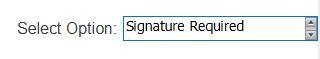
Example 13-32 Select Many Choice Definition Using Select Items Component
<amx:selectManyChoice id="check1"
                      label="Select Shipping Options:"
                      value="#{myBean.shipping}">
   <amx:selectItems id="selectItems1" value="#{myBean.shippingOptions}"/>
</amx:selectManyChoice>
For more information, illustrations, and examples, see the following:
-
Oracle Fusion Middleware Tag Reference for Oracle Mobile Application Framework
-
CompGallery, a MAF sample application located in the PublicSamples.zip file within the
jdev_install/jdeveloper/jdev/extensions/oracle.maf/Samplesdirectory on your development computer
The look and behavior of the Select Many Choice component on all supported devices is almost identical to the Select Many Checkbox component (see Section 13.3.9, "How to Use the Select Many Checkbox Component" for more information).
13.3.12 How to Use the Boolean Switch Component
The Boolean Switch (selectBooleanSwitch) component allows editing of boolean values as a switch metaphor instead of a checkbox.
Similar to other MAF AMX UI components, this component has a normal and selected state. To toggle the value, the end user taps (touches and releases) the switch once. Each tap toggles the switch.
Example 13-33 demonstrates the selectBooleanSwitch element defined in a MAF AMX file.
Example 13-33 Boolean Switch Definition
<amx:selectBooleanSwitch id="switch1"
                         label="Flip switch:"
                         onLabel="On"
                         offLabel="Off"
                         value="#{myBean.bool1}"
                         valueChangeListener=
                                "#{PropertyBean.ValueChangeHandler}"/>
Figure 13-32 shows the Boolean Switch component displayed in the Preview pane. This component has its parameters set as follows:
<amx:selectBooleanSwitch id="selectBooleanSwitch1"
                         label="Switch"
                         value="value1"
                         valueChangeListener=
                                "#{PropertyBean.ValueChangeHandler}"/>

For more information, illustrations, and examples, see the following:
-
Oracle Fusion Middleware Tag Reference for Oracle Mobile Application Framework
-
CompGallery, a MAF sample application located in the
PublicSamples.zipfile within thejdev_install/jdeveloper/jdev/extensions/oracle.maf/Samplesdirectory on your development computer
13.3.13 How to Use the Select Button Component
The Select Button (selectOneButton) component represents a button group that lists actions, with a single button active at any given time. The selection mechanism is provided by the Select Items or Select Item component (see Section 13.3.10.3, "What You May Need to Know About Differences Between Select Items and Select Item Components") contained by the Select Button component.
Note:
The Select Button component can contain more than one Select Items or Select Item components.Example 13-34 demonstrates the selectOneButton element defined in a MAF AMX file.
Example 13-34 Select Button Definition
<amx:selectOneButton id="bg1"
                     value="#{myBean.myState}"
                     valueChangeListener="#{PropertyBean.ValueChangeHandler}">
   <amx:selectItem id="selectItem1" label="Yes" value="yes"/>
   <amx:selectItem id="selectItem2" label="No" value="no"/>
   <amx:selectItem id="selectItem3" label="Maybe" value="maybe"/>
</amx:selectOneButton>
Figure 13-33 shows the Select Button component displayed in the Preview pane. This component has its parameters set as follows:
<amx:selectOneButton id="selectOneButton1"
                     label="Select Button"
                     value="value1"
                     valueChangeListener="#{PropertyBean.ValueChangeHandler}">
   <amx:selectItem id="selectItem1" label="Value 1" value="value1"/>
   <amx:selectItem id="selectItem2" label="Value 2" value="value2"/>
   <amx:selectItem id="selectItem3" label="Value 3" value="value3"/>
</amx:selectOneButton>
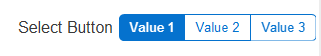
For more information, illustrations, and examples, see the following:
-
Oracle Fusion Middleware Tag Reference for Oracle Mobile Application Framework
-
CompGallery, a MAF sample application located in the
PublicSamples.zipfile within thejdev_install/jdeveloper/jdev/extensions/oracle.maf/Samplesdirectory on your development computer
13.3.14 How to Use the Radio Button Component
The Radio Button (selectOneRadio) component represents a group of radio buttons that lists available choices. The selection mechanism is provided by the Select Items or Select Item component (see Section 13.3.10.3, "What You May Need to Know About Differences Between Select Items and Select Item Components") contained by the Radio Button component.
Note:
The Radio Button component can contain more than one Select Items or Select Item components.Example 13-35 and Example 13-36 demonstrate the selectOneRadio element definition in a MAF AMX file.
Example 13-35 Radio Button Definition Using Select Item Component
<amx:selectOneRadio id="radio1"
                    label="Choose a pet:"
                    value="#{myBean.myPet}"
                     valueChangeListener="#{PropertyBean.ValueChangeHandler}">
   <amx:selectItem id="selectItem1" label="Cat" value="cat"/>
   <amx:selectItem id="selectItem2" label="Dog" value="dog"/>
   <amx:selectItem id="selectItem3" label="Hamster" value="hamster"/>
   <amx:selectItem id="selectItem4" label="Lizard" value="lizard"/>
</amx:selectOneRadio>
Example 13-36 Radio Button Definition Using Select Items Component
<amx:selectOneRadio id="radio1"
                    label="Choose a pet:"
                    value="#{myBean.myPet}"
                     valueChangeListener="#{PropertyBean.ValueChangeHandler}">
   <amx:selectItems id="selectItems1" value="myBean.allPets"/>
</amx:selectOneRadio>
Figure 13-34 shows the Boolean Switch component displayed in the Preview pane. This component has its parameters set as follows:
<amx:selectOneRadio id="selectOneRadio1"
                     label="Radio Button"
                     value="value1"
                     valueChangeListener="#{PropertyBean.ValueChangeHandler}">
   <amx:selectItem id="selectItem1" label="Value 1" value="value1"/>
   <amx:selectItem id="selectItem2" label="Value 2" value="value2"/>
   <amx:selectItem id="selectItem3" label="Value 3" value="value3"/>
</amx:selectOneRadio>
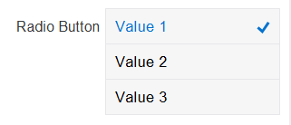
For more information, illustrations, and examples, see the following:
-
Oracle Fusion Middleware Tag Reference for Oracle Mobile Application Framework
-
CompGallery, a MAF sample application located in the
PublicSamples.zipfile within thejdev_install/jdeveloper/jdev/extensions/oracle.maf/Samplesdirectory on your development computer
13.3.15 How to Use List View and List Item Components
Use the List View (listView) component to display data as a list of choices where the end user can select one option.
Typically, the List Item (listItem) component represents a single item in the List View component, where you place a List Item component inside the List View to lay out and style a list of data items. Each item can contain more than one List Item component, in which case List Item components fill the item (line) and excess List Item components wrap onto the subsequent lines. You configure this by setting the List View's layout attribute to cards (the default layout is rows and displays one List Item component per item within the list). For more information, see Section 13.3.15.4, "Configuring the List View Layout."
The List View allows you to define one of the following:
-
A selectable item that is replicated based on the number of items in the list (collection).
-
A static item that is produced by adding a child List Item component without specifying the List View's
varandvalueattributes. You can add as many of these static items as necessary, which is useful when you know the contents of the list at design time. In this case, the list is not editable and behaves like a set of menu items.
At runtime, List Item components respond to swipe gestures (see Section 13.4, "Enabling Gestures").
You can create the following types of List View components:
-
Basic List
Example 13-37 shows the
listViewelement defined in a MAF AMX file. This definition corresponds to the basic component.Example 13-37 Basic List View Definition
<amx:listView id="listView1"
              showMoreStrategy="autoScroll"
              bufferStrategy="viewport">
   <amx:listItem id="listItem1">
      <amx:outputText id="outputText1" value="ListItem Text"/>
   </amx:listItem>
   <amx:listItem id="listItem2">
      <amx:outputText id="outputText3" value="ListItem Text"/>
   </amx:listItem>
   <amx:listItem id="listItem3">
      <amx:outputText id="outputText5" value="ListItem Text"/>
   </amx:listItem>
   <amx:listItem id="listItem4">
      <amx:outputText id="outputText7"
                      value="This is really long text to test how it is handled"/>
   </amx:listItem>
</amx:listView>
Figure 13-35 demonstrates a basic List View component at design time.
Example 13-38 shows another definition of the
listViewelement in a MAF AMX file. This definition also corresponds to the basic component; however, the value of this List View is provided by a collection.Example 13-38 Basic List View Definition
<amx:listView id="list1"
              value="#{myBean.listCollection}"
              var="row"
              showMoreStrategy="autoScroll"
              bufferStrategy="viewport">
   <amx:listItem actionListener="#{myBean.selectRow}"
                 showLinkIcon="false"
                 id="listItem1">
      <amx:outputText value="#{row.name}" id="outputText1"/>
   </amx:listItem>
</amx:listView>
Note:
Currently, when a text string in an Output Text inside a List Item is too long to fit on one line, the text does not wrap at the end of the line. You can prevent this by adding"white-space: normal;"to theinlineStyleattribute of the subject Output Text child component. -
List with icons
Example 13-39 shows the
listViewelement defined in a MAF AMX file. This definition corresponds to the component with icons.Example 13-39 List View with Icons Definition
<amx:listView id="list1"
              value="#{myBean.listCollection}"
              var="row"
              showMoreStrategy="autoScroll"
              bufferStrategy="viewport">
   <amx:listItem id="listItem1">
      <amx:tableLayout id="tl1" width="100%">
         <amx:rowLayout id="rl1">
            <amx:cellFormat id="cf11" width="40px" halign="center">
               <amx:image id="image1" source="#{row.image}"/>
            </amx:cellFormat>
            <amx:cellFormat id="cf12" width="100%" height="43px">
               <amx:outputText id="outputText1" value="#{row.desc}"/>
            </amx:cellFormat>
         </amx:rowLayout>
      </amx:tableLayout>
   </amx:listItem>
</amx:listView>
Figure 13-36 demonstrates a List View component with icons and text at design time.
-
List with search
-
List with dividers. This type of list allows you to group data and show order. Attributes of the List View component define characteristics of each divider. For information about attributes, see Oracle Fusion Middleware Tag Reference for Oracle Mobile Application Framework.
MAF AMX provides a list divider that can do the following:
-
Collapse its contents independently.
-
Show a count of items in each divider.
-
Collapse at the same time.
Example 13-40 shows the
listViewelement defined in a MAF AMX file. This definition corresponds to the component with collapsible dividers and item counts.Example 13-40 List View with Dividers Definition
<amx:listView id="list1"
          value="#{bindings.data.collectionModel}"
          var="row"
          collapsibleDividers="true"
          collapsedDividers="#{pageFlowScope.mylistDisclosedDividers}"
          dividerMode="all"
          dividerAttribute="type"
          showDividerCount="true"
          showMoreStrategy="autoScroll"
          bufferStrategy="viewport"
          fetchSize="10">
   <amx:listItem>
      <amx:outputText id="ot1" value="#{row.name}">
   </amx:listItem>
</amx:listView>
Note:
Data in the list with dividers must be sorted by thedividerAttributebecause this type of list does not sort the data; instead, it expects the data it receives to be already sorted.Note:
Dividers are not displayed when a List View component is in edit mode (that is, itseditModeattribute is specified).When dividers are visible, the end user can quickly navigate to a specific divider using the List View's localized alphabetical index utility, which is available for List View components whose
dividerModeattribute is set tofirstLetter. You can disable this utility by setting thesectionIndexattribute tooff.The index utility (indexer) consists of an index bar and index item and has the following characteristics:
-
If the list contains unsorted data or duplicate dividers, the index item points to the first occurrence in the list.
-
Only available letters are highlighted in the index, and only those highlighted become active. This is triggered by the change in the data model (for example, when the end user taps on More row item).
-
The index is not case-sensitive.
-
Unknown characters are hidden under the hash ( # ) sign.
The indexer letters can only be activated (tapped) on rows that have been loaded into the list. For example, if the List View, using its
fetchSizeattribute, has loaded rows up to the letter C, the indexer enables letters from A to C. Other letters appear on the indexer when more rows are loaded into it.Table 13-5 describes styles that you can define for the index utility.
Table 13-5 The List View Index Styles
styleClass name Description adfmf-listView-indexDefines style of the index bar.
adfmf-listView-indexItemDefines style of one item in the index bar.
adfmf-listView-indexItem-activeDefines style of the item in the index bar which has link to a related divider.
adfmf-listView-indexCharacterDefines style of a character in the index bar.
adfmf-listView-indexBulletDefines style of a bullet between two characters in index bar.
adfmf-listView-indexOtherDefines style of a character that represents all unknown characters in the index bar.
When the List View component with visible dividers functions as a container that provides scrolling and it becomes a subject to scrolling, the dividers are pinned at the top of the view. If this is the case, you have to explicitly set the height of the List View component. In all other cases, when the List View does not perform any scrolling itself but instead uses the scrolling of its parent container (such as the Panel Page), the List View does not have any height constraint set and its height is determined by its child components. This absence of the defined height constraint effectively disables the animated transition and pinning of dividers.
-
-
Inset List
Example 13-41 shows the
listViewelement defined in a MAF AMX file. This definition corresponds to the inset component.Example 13-41 Inset List View Definition
<amx:listView id="listView1"
              styleClass="adfmf-listView-insetList"
              showMoreStrategy="autoScroll"
              bufferStrategy="viewport">
   <amx:listItem id="listItem1">
      <amx:outputText id="outputText1" value="ListItem Text"/>
   </amx:listItem>
   <amx:listItem id="listItem2">
      <amx:outputText id="outputText3" value="ListItem Text"/>
   </amx:listItem>
   <amx:listItem id="listItem3">
      <amx:outputText id="outputText5" value="ListItem Text"/>
   </amx:listItem>
   <amx:listItem id="listItem4">
      <amx:outputText id="outputText7"
                      value="This is really long text to test how it is handled"/>
   </amx:listItem>
</amx:listView>
Figure 13-37 demonstrates an inset List View component at design time.
Example 13-42 shows another definition of the
listViewelement in a MAF AMX file. This definition also corresponds to the inset component, however, the value of this List View is provided by a collection.Example 13-42 Inset List Definition
<amx:listView id="list1"
              value="#{CarBean.carCollection}"
              var="row"
              styleClass="adfmf-listView-insetList"
              showMoreStrategy="autoScroll"
              bufferStrategy="viewport"
              fetchSize="10">
   <amx:listItem id="li1" action="go">
      <amx:outputText id="ot1" value="#{row.name}"/>
   </amx:listItem>
</amx:listView>
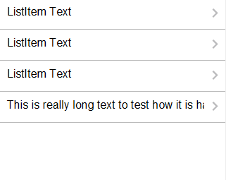
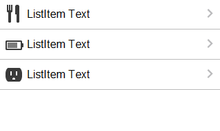
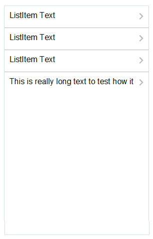
There is a particular order in which MAF AMX processes the List Item component's child operations and attributes. For more information, see Section 13.3.5.8, "What You May Need to Know About the Order of Processing Operations and Attributes."
Unlike other MAF AMX components, when you drag and drop a List View onto a MAF AMX page, a dialog called ListView Gallery appears (see Figure 13-38). This dialog allows you to choose a specific layout for the List View.
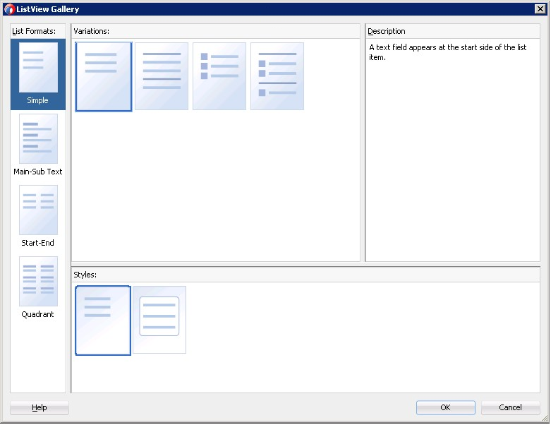
Table 13-6 lists the supported List Formats that are displayed in the ListView Gallery.
| Format | Element Row Values |
|---|---|
|
Simple |
|
|
Main-Sub Text |
|
|
Start-End |
|
|
Quadrant |
|
The Variations presented in the ListView Gallery (see Figure 13-38) for a selected list format consist of options to add either dividers, a leading image, or both:
-
Selecting a variation with a leading image adds an Image row to the List Item Content table (see Figure 13-39).
-
Selecting a variation with a divider defaults the Divider Attribute field to the first attribute in its list rather than the default No Divider value, and populates the Divider Mode field with its default value of All.
The Styles options presented in the ListView Gallery (see Figure 13-38) allow you to suppress chevrons, use an inset style list, or both:
-
The selections do not modify any state in the Edit List View dialog (see Figure 13-39). They only affect the generated MAF AMX markup.
-
Selecting a style with the inset list sets the
adfmf-listView-insetListstyle class on thelistViewelement in the generated MAF AMX markup.
The following is an example of the Simple format with the inset list:
<amx:listView var="row"
              value="#{bindings.employees.collectionModel}"
              fetchSize="#{bindings.employees.rangeSize}"
              styleClass="adfmf-listView-insetList"
              id="listView2"
              showMoreStrategy="autoScroll"
              bufferStrategy="viewport">
   <amx:listItem id="li2">
      <amx:outputText value="#{row.employeename}" id="ot3"/>
   </amx:listItem>
</amx:listView>
The ListView Gallery's Description pane is updated based on the currently selected Variation. The format includes a brief description of the main style, followed by the details of the selected variation. Four main styles with four variations on each provide sixteen unique descriptions detailed in Table 13-7.
Table 13-7 List View Variations and Styles
| List Format | Variation | Description |
|---|---|---|
|
Simple |
Basic |
A text field appears at the start side of the list item. |
|
Simple |
Dividers |
A text field appears at the start side of the list item, with items grouped by dividers. |
|
Simple |
Images |
A text field appears at the start side of the list item, following a leading image. |
|
Simple |
Dividers and Images |
A text field appears at the start side of the list item, following a leading image. The list items are grouped by dividers. |
|
Main-Sub Text |
Basic |
A prominent main text field appears at the start side of the list item with subordinate text below. |
|
Main-Sub Text |
Dividers |
A prominent main text field appears at the start side of the list item with subordinate text below. The list items are grouped by dividers. |
|
Main-Sub Text |
Images |
A prominent main text field appears at the start side of the list item with subordinate text below, following a leading image. |
|
Main-Sub Text |
Dividers and Images |
A prominent main text field appears at the start side of the list item with subordinate text below, following a leading image. The list items are grouped by dividers. |
|
Start-End |
Basic |
Text fields appear on each side of the list item. |
|
Start-End |
Dividers |
Text fields appear on each side of the list item, with the items grouped by dividers. |
|
Start-End |
Images |
Text fields appear on each side of the list item, following a leading image. |
|
Start-End |
Dividers and Images |
Text fields appear on each side of the list item, following a leading image. The list items are grouped by dividers. |
|
Quadrant |
Basic |
Text fields appear in the four corners of the list item. |
|
Quadrant |
Dividers |
Text fields appear in the four corners of the list item, with items grouped by dividers. |
|
Quadrant |
Images |
Text fields appear in the four corners of the list item, following a leading image. |
|
Quadrant |
Dividers and Images |
Text fields appear in the four corners of the list item, following a leading image. The list items are grouped by dividers. |
After you make your selection from the ListView Gallery and click OK, the Edit List View wizard is invoked that lets you create either an unbound List View component that displays static text in the List Item child components (see Figure 13-39), or choose a data source for the dynamic binding (see Figure 13-40).
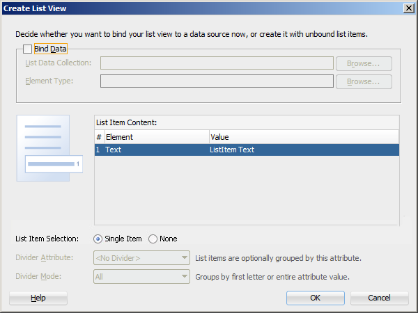
When completing the dialog that Figure 13-39 shows, consider the following:
-
The List Data Collection and Element Type fields are disabled when the Bind Data checkbox is in the deselected state.
-
The image on the left reflects the main content elements from the selected List View format
-
The editable cells of the Value column are populated with static text strings (see Table 13-8).
-
If the List Item Content cell contains an Image, the
Valuecell is defaulted to the<add path to your image>string. If this is the case, you have to replace it with the path to the image. -
The List Item Selection indicates the selection mode. For details, see the description of this option following Figure 12-75, "Edit Dialog for MAF AMX List View".
-
Since you cannot set the divider attribute when the List View contains List Item child components, rather than being data bound, both the Divider Attribute and the Divider Mode fields are disabled.
Table 13-8 Static Text Strings for List View
| List Format | Element Row Values | Values for the Output Text |
|---|---|---|
|
Simple |
|
|
|
Main-Sub Text |
|
|
|
Start-End |
|
|
|
Quadrant |
|
|
Figure 13-40 shows the Create List View dialog when you choose to bind the List View component to data.
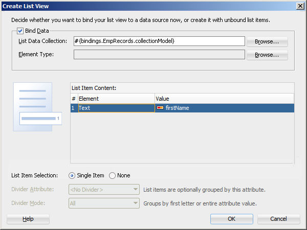
When completing the dialog that Figure 13-40 shows, consider the following:
-
When you select the Bind Data checkbox, the List Data Collection field becomes enabled. The Element Type field becomes enabled if you set the List Data Collection field to an EL expression by using the Expression Builder. If you choose a data control from the Data Control Definitions tab, the Element Type field will continue to be disabled.
-
To select a data source, click Browse. This opens the Select List View Data Collection dialog that enables you to either choose a data control definition (see Figure 13-41) or to use the EL Builder to select an appropriate EL expression (see Figure 13-42).
-
You may declare the type of the data collection using the Element Type field (see Figure 13-40).
-
After you have selected a valid data collection, the Value column in the List Item Content table changes to Value Bindings whose editable cells are populated with lists of attributes from the data collection. For a description of a special case setting, refer to Figure 13-43.
-
The image on the left reflects the main content elements from the selected List View format and provides a mapping from the schematic representation to the named elements in the underlying table.
-
The List Item is generated as either an Output Text or Image component, depending on whichever is appropriate for the particular element.
-
Since the number of elements (rows) is predetermined by the selected List View format, rows cannot be added or removed.
-
The order of elements cannot be modified.
-
The default value of the Divider Attribute field is No Divider, in which case the Divider Mode field is disabled. If you select value other than the default, then you need to specify Divider Mode parameters. In addition, if you chose a Variation in the ListView Gallery that includes dividers, the default value will be set to the first attribute in the list.
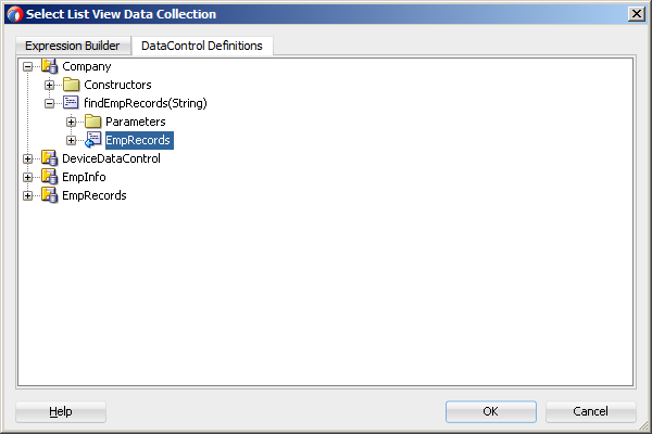
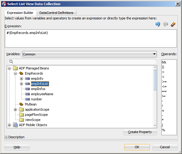
The following are special cases to consider when creating a bound List View:
-
If a Java bean method returns a list without generics, you should use the Element Type field to create the List Item content, as Figure 13-40 shows.
-
If the list data collection value provided is not collection-based, a Value column replaces the Value Bindings column with blank values, as Figure 13-43 shows.
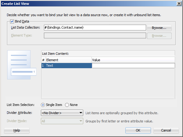
For more information, see the following:
-
Oracle Fusion Middleware Tag Reference for Oracle Mobile Application Framework
-
UIDemo, a MAF sample application located in the
PublicSamples.zipfile within thejdev_install/jdeveloper/jdev/extensions/oracle.maf/Samplesdirectory on your development computer. This sample demonstrates how to use various types of the List View component and how to apply styles to adjust the page layout to a specific pattern.
13.3.15.1 Configuring Paging and Dynamic Scrolling
You can configure the List View component to display data in a list that is arbitrarily long by appending data to the bottom of the list as requested by a user gesture.
The fetchSize attribute determines how many rows the List View component should initially load. If there are more rows available than defined by the fetchSize, the List View waits for a specific user gesture before loading and displaying more rows (see Section 13.3.15.1.1, "List View Scrolling Strategies"). The fetchSize attribute is then used to determine how many rows will be loaded and displayed each time the user gestures for more rows to be displayed.
If the fetchSize attribute is set to -1, all records are retrieved and displayed, in which case neither paging nor dynamic scrolling behavior occurs.
When the List View component is created by dragging a collection from the Data Controls window onto a MAF AMX page, the fetchSize attribute is by default set to use an EL expression that points to the rangeSize of the PageDef iterator and should not be modified. For information on the PageDef file, see Section 12.3.2.4.5, "What You May Need to Know About Generated Drag and Drop Artifacts" and Figure 12-81, "PageDef File".
Example 13-43 shows the listView element that was created from a collection called testResults of a data control (see Section 12.3.2.4, "Adding Data Controls to the View").
Example 13-43 Setting fetchSize Attribute
<amx:listView var="row"
              value="#{bindings.testResults.collectionModel}"
              fetchSize="#{bindings.testResults.rangeSize}">
In the preceding example, the fetchSize attribute points to the rangeSize on bindings.testResults. Example 13-44 shows a line from the PageDef file for this MAF AMX page. This PageDef file contains an accessorIterator element called testResultsIterator to which the testResults is bound.
Example 13-44 accessorIterator in PageDef File
<accessorIterator MasterBinding="Class1Iterator"
                  Binds="testResults"
                  RangeSize="25"
                  DataControl="Class1"
                  BeanClass="mobile.Test"
                  id="testResultsIterator"/>
13.3.15.1.1 List View Scrolling Strategies
The following attributes of the List View component enable its scrolling behavior:
-
showMoreStrategy: defines the List View component's strategy for loading more rows when required.When a List View component provides its own scrolling (see Section 13.3.15.1.2, "List View's Own Scrolling") and that List View is scrolled to the end, it automatically invokes the
showMoreStrategybased on the attribute's value, as follows:-
autoLink: If more rows are available from the model, the List View displays a Load More Rows link at the bottom of the displayed list, as Figure 13-44 shows.The end user must tap on this link to cause the List View to load and display more rows.
-
autoScroll: If more rows are available from the model, the List View displays a load indicator while it loads more rows for display. -
forceLink: A Load More Rows link is displayed (see Figure 13-44). When the end user taps on the link, the List View attempts to load and display more rows. -
off: The List View does not perform any actions. Only the initially loaded rows are displayed.
-
-
bufferStrategy: defines the List View component's strategy for buffering displayed rows.When the List View's height is constrained allowing it to provide its own scrolling (see Section 13.3.15.1.2, "List View's Own Scrolling"), it retains rows in the rendering engine's buffer based on the bufferStrategy attribute's value, as follows:
-
additive: New rows are added to the rendering engine's buffer and all rows are retained in the buffer. This option is useful for short lists where you are not concerned about memory consumption. -
viewport: Rows are added to the rendering engine's buffer only when they become visible within the List View's viewport. Rows are removed from the buffer when they are no longer visible, based on the List View'sbufferSizeattribute. This option is useful for reducing the amount of memory consumption when displaying long lists.
-
-
bufferSize: when the bufferStrategy attribute is set to viewport, the bufferSize attribute defines the distance (in pixels) at which the row must be located from the viewport to become hidden.
For more information, see Oracle Fusion Middleware Tag Reference for Oracle Mobile Application Framework.
13.3.15.1.2 List View's Own Scrolling
By default, the scrolling behavior of the List View component is controlled by its parent container (which, in turn, may default to its parent container, and so forth).
To force the List View component to provide its own scrolling, you can do one of the following
-
Make the List View the only non-Facet child of a Panel Page.
-
Set a fixed height for the List View. For example:
inlineStyle="height: 200px;"
13.3.15.1.3 Server-Side Paging
The List View component supports server-side paging through events such as the oracle.adfmf.amx.event.RangeChangeEvent.
When the List View component is created by dragging a collection from the Data Controls window onto a MAF AMX page, the List View component retrieves the rows from the binding iterator (see Section 13.3.15.1, "Configuring Paging and Dynamic Scrolling"). The binding iterator retrieves rows from the data control's collection in batches defined by the AttributeIterator's RangeSize attribute. When all the available data has been exhausted, a RangeChangeEvent is fired. To catch this event, the data control's provider code must implement the oracle.adfmf.amx.event.RangeChangeListener and provide a rangeChange method. Within this method, you can load more data from the server and append it to the collection. You must call the addDataControlProviders method of the AdfmfJavaUtilities class to inform the data control framework of the newly added rows so these rows can be displayed by the List View component.
Example 13-45 Implementing RangeChangeListener
public class Departments implements RangeChangeListener {
   public void rangeChange(RangeChangeEvent rce) {
      List newRows = null;
      if (rangeChangeEvent.isDataExhausted()) {
         newRows = loadMoreData(rangeChangeEvent.getFetchSize());
         AdfmfJavaUtilities.addDataControlProviders("Departments",
                                   rangeChangeEvent.getProviderKey(),
                                   rangeChangeEvent.getKeyAttribute(),
                                   newRows,
                                   newRows.size() > 0);
      }
   }
...
}
Note:
When instantiating the data control's provider class, the initial load of data from the server should request the same number of rows as defined by the binding iterator'sRangeSize attribute.When using a managed bean to provide the model for a List View, the rangeChangeListener attribute (see Section 13.10, "Using Event Listeners") of the List View component allows you to bind a Java handler method that is called when the end user gestures for more rows to be loaded. This method uses the oracle.adfmf.amx.event.RangeChangeEvent object as its parameter and is created when you invoke the Edit Property: Range Change Listener dialog from the Properties window, as Figure 13-45 and Figure 13-46 show.
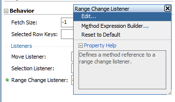
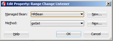
When you click OK on the dialog, the following setting is added to the listView element in the MAF AMX page and the Java method that Example 13-46 shows is added to a sample HRBean class:
<amx:listView id="listView1" rangeChangeListener="#{pageFlowScope.HRBean.goGet}" >
Example 13-46 Java Method for Triggering RangeChangeEvent
public void goGet(RangeChangeEvent rangeChangeEvent) {
   // Add event code here
   ...
}
Note:
When using theRangeChangeEvent to support server-side paging, you should not set the ListView's fetchSize attribute to -1.13.3.15.2 What You May Need to Know About Memory Consumption by MAF AMX UI Components
All scrollable MAF AMX UI components, including the List View, are optimized to conserve resources when a mobile device is running low on memory. These components lose their flickability (that is, the end user cannot flick the component with their finger in order for that component to continue to scroll after the end user has stopped touching the screen) and scrolling is powered by inertia.
13.3.15.3 Rearranging List View Items
Items in a List View can be rearranged. This functionality is similar on iOS and Android platforms: both show a Rearrange icon aligned along the right margin for each list item. The Rearrange operation is initiated when the end user touches and drags a list item using the Rearrange affordance as a handle. The operation is completed when the end user lifts their finger from the display screen.
Note:
If the end user touches and drags anywhere else on the list item, the list scrolls up or down.The Rearrange Drag operation "undocks" the list item and allows the end user to move the list item up or down in the list.
For its items to be rearrangeable, the List View must not be static, must be in an edit mode, and must be able to listen to moves.
Example 13-47 shows the listView element defined in a MAF AMX file. This definition presents a list with an Edit and Stop Editing buttons at the top that allow switching between editable and read-only list mode.
Example 13-47 Rearrangeable List View Definition
<amx:panelPage id="pp1">
   <amx:commandButton id="edit"
                      text="Edit"
                      rendered="#{!bindings.inEditMode.inputValue}">
      <amx:setPropertyListener id="spl1"
                               from="true"
                               to="#{bindings.inEditMode.inputValue}"
                               type="action"/>
   </amx:commandButton>
   <amx:commandButton id="stop"
                      text="Stop Editing"
                      rendered="#{bindings.inEditMode.inputValue}">
      <amx:setPropertyListener id="spl2"
                               from="false"
                               to="#{bindings.inEditMode.inputValue}"
                               type="action"/>
   </amx:commandButton>
   <amx:listView id="lv1"
                 value="#{bindings.data.collectionModel}"
                 var="row"
                 editMode="#{bindings.inEditMode.inputValue}"
                 moveListener="#{MyBean.Reorder}">
      <amx:listItem id="li1">
         <amx:outputText id= "ot1" value="#{row.description}">
      </amx:listItem>
   </amx:listView>
</amx:panelPage>
For more information, see Oracle Fusion Middleware Tag Reference for Oracle Mobile Application Framework.
13.3.15.4 Configuring the List View Layout
The List View component can be laid out as either a set of rows, with each row containing one List Item component (default), or s set of cards, with each card containing one or more List Item components.
To define the layout, you use the List View's layout attribute and set it to either rows or cards. When using the cards layout, consider the following:
-
Each List Item component is presented as a card in a group of horizontally arranged cards.
-
If all available space is consumed, the next card wraps onto a new line.
-
To control horizontal alignment of List Item components (cards) within the List View, set the
halignattribute of the List View to eitherstart,center, orend. -
To generally customize the appearance of the List View:
-
To override the card size defined by default in the skin, specify a new width using the List Item's
inlineStyleattribute. For more information, see Section 13.6.1, "How to Use Component Attributes to Define Style."Note:
You cannot set the value toautoor use percent units.Alternatively, you can use skinning to override the width from the
.amx-listView-cards .amx-listItemselector (see Section 13.6.2, "What You May Need to Know About Skinning"). -
To override spacing around the cards defined by default in the skin, you can specify new
margin-topandmargin-leftusing the List Item'sinlineStyleattribute (see Section 13.6.1, "How to Use Component Attributes to Define Style"), as well as newpadding-bottomandpadding-rightusing the List View'scontentStyleattribute.Alternatively, you can use skinning to override the
margin-topandmargin-leftfrom the.amx-listView-cards .amx-listItemselector, as well aspadding-bottomand padding-right from the.amx-listView-cards .amx-listView-contentselector (see Section 13.6.2, "What You May Need to Know About Skinning").
-
For the rows layout, you can use the halign attribute to change the alignment of trivial List Item content. However, the use of this attribute might not have a visual effect.
When the List View component with cards layout is in edit mode, its layout switches to rows mode.
To adjust the MAF AMX page layout to a specific pattern, you can combine the use of the various types of List View components and styles that are defined through the styleClass attribute (see Section 13.6, "Styling UI Components") that uses a set of predefined styles.
A MAF sample application called UIDemo demonstrates all the optional styles for each component and their associated rendering. The UIDemo application is located in the PublicSamples.zip file within the jdev_install/jdeveloper/jdev/extensions/oracle.maf/Samples directory on your development computer.
Example 13-48 shows the listView element and its child elements defined in a MAF AMX file. The way each outputText child element is laid out in the list is specified by the tableLayout child element of the listItem. Alternatively, you may use the styleClass attribute to lay out and style outputText elements: setting this attribute to adfmf-listItem-startText places the Output Text component to the start (left side) of the row and applies a black font to its text; setting this attribute to adfmf-listItem-endText places the Output Text component to the end (right side) of the row and applies a blue font to its text. Whether or not the arrow pointing to the right is visible is configured by the showLinkIcon attribute of the listItem element. Since the default value of this attribute is true, the example does not contain this setting.
Example 13-48 Definition of List View with Start and End Text
<amx:listView id="listView1" value="#{myBean.listCollection}" var="row">
   <amx:listItem id="listItem1">
      <amx:tableLayout id="tl1" width="100%">
         <amx:rowLayout id="rl1">
            <amx:cellFormat id="cf1s1" width="10px"/>
            <amx:cellFormat id="cf11" width="60%" height="43px">
               <amx:outputText id="outputText11" value="#{row.name}"/>
            </amx:cellFormat>
            <amx:cellFormat id="cf1s2" width="10px"/>
            <amx:cellFormat id="cf12" halign="end" width="40%">
               <amx:outputText id="outputText12"
                               value="#{row.status}"
                               styleClass="adfmf-listItem-highlightText"/>
            </amx:cellFormat>
         </amx:rowLayout>
      </amx:tableLayout>
   </amx:listItem>
</amx:listView>
Figure 13-47 shows a List View component with differently styled text added to the start (left side) and end (right side) of each row. Besides the text, rows are equipped with a right-pointing arrow representing a link that expands each list item.
Example 13-49 shows the listView element and its child elements defined in a MAF AMX file. The way each outputText child element is laid out in the list is specified by the tableLayout child element of the listItem. Alternatively, you may use the styleClass attribute to lay out and style outputText elements: setting this attribute to adfmf-listItem-startText places the Output Text component to the start of the row and applies a black font to its text; setting this attribute to adfmf-listItem-endText places the Output Text component to the end of the row and applies a blue font to its text. Whether or not the arrow pointing to the right is visible on each particular row is configured by the showLinkIcon attribute of the listItem element. Since in this example this attribute is set to false for every listItem element, arrows pointing to the right are not displayed.
Example 13-49 Definition of List View with Start and End Text Without Expansion Links
<amx:listView id="listView1" value="#{myBean.listCollection}" var="row">
   <amx:listItem id="listItem1" showLinkIcon="false">
      <amx:tableLayout id="tl1" width="100%">
         <amx:rowLayout id="rl1">
            <amx:cellFormat id="cf1s1" width="10px"/>
            <amx:cellFormat id="cf11" width="60%" height="43px">
               <amx:outputText id="outputText11" value="#{row.name}"/>
            </amx:cellFormat>
            <amx:cellFormat id="cf1s2" width="10px"/>
            <amx:cellFormat id="cf12" halign="end" width="40%">
               <amx:outputText id="outputText12"
                               value="#{row.status}"
                               styleClass="adfmf-listItem-highlightText"/>
            </amx:cellFormat>
         </amx:rowLayout>
      </amx:tableLayout>
   </amx:listItem>
</amx:listView>
Figure 13-48 shows a List View component with differently styled text added to the start and end of each row. The rows do not contain right-pointing arrows representing links.
Example 13-50 shows the listView element and its child elements defined in a MAF AMX file. In addition to the text displayed at the start and end of each row, this List View contains subtext placed under the end text. The way each outputText child element is laid out in the list is specified by the tableLayout child element of the listItem. Alternatively, you may use the styleClass attribute to lay out and style outputText elements: setting this attribute to adfmf-listItem-upperStartText places the Output Text component to the left side of the row and applies a black font to its text; setting this attribute to adfmf-listItem-upperEndText places the Output Text component to the right side of the row and applies a smaller grey font to its text; setting this attribute to adfmf-listItem-captionText places the Output Text component under the Output Text component whose styleClass attribute is set to adfmf-listItem-upperStartText and applies a smaller grey font to its text.
Example 13-50 Defining List View with Start and End Text and Subtext
<amx:listView id="listView1" value="#{myBean.listCollection}" var="row">
   <amx:listItem id="listItem1">
      <amx:tableLayout id="tl1" width="100%">
         <amx:rowLayout id="rl11">
            <amx:cellFormat id="cf1s1" width="10px" rowSpan="2"/>
            <amx:cellFormat id="cf11" width="60%" height="28px">
               <amx:outputText id="outputTexta1" value="#{row.name}"/>
            </amx:cellFormat>
            <amx:cellFormat id="cf1s2" width="10px"/>
            <amx:cellFormat id="cf12" halign="end" width="40%">
               <amx:outputText id="outputTexta2"
                               value="#{row.status}"
                               styleClass="adfmf-listItem-highlightText"/>
            </amx:cellFormat>
         </amx:rowLayout>
         <amx:rowLayout id="rl12">
            <amx:cellFormat id="cf13" columnSpan="3" width="100%" height="12px">
               <amx:outputText id="outputTexta3"
                               value="#{row.desc}"
                               styleClass="adfmf-listItem-captionText"/>
            </amx:cellFormat>
         </amx:rowLayout>
      </amx:tableLayout>
   </amx:listItem>
</amx:listView>
Figure 13-49 shows a List View component with differently styled text added to the start and end of each row, and with a subtext added below the end text on the left.
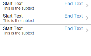
Example 13-51 shows the listView element and its child elements defined in a MAF AMX file. This List View is populated with rows containing a main text and subtext. The way each outputText child element is laid out in the list is specified by the tableLayout child element of the listItem. Alternatively, you may use the styleClass attribute to lay out and style outputText elements: setting this attribute to adfmf-listItem-mainText places the Output Text component to the start of the row and applies a large black font to its text; setting this attribute to adfmf-listItem-captionText places the Output Text component under the Output Text component whose styleClass attribute is set to adfmf-listItem-mainText and applies a smaller grey font to its text.
Example 13-51 Defining List View with Main Text and Subtext
<amx:listView id="listView1" value="#{myBean.listCollection}" var="row">
   <amx:listItem id="listItem1">
      <amx:tableLayout id="tla1" width="100%">
         <amx:rowLayout id="rla1">
            <amx:cellFormat id="cf1s1" width="10px" rowSpan="2"/>
            <amx:cellFormat id="cfa1" width="100%" height="28px">
               <amx:outputText id="outputTexta1" value="#{row.name}"/>
            </amx:cellFormat>
         </amx:rowLayout>
         <amx:rowLayout id="rla2">
            <amx:cellFormat id="cfa2" width="100%" height="12px" >
               <amx:outputText id="outputTexta2"
                               value="#{row.desc}"
                               styleClass="adfmf-listItem-captionText"/>
            </amx:cellFormat>
         </amx:rowLayout>
      </amx:tableLayout>
   </amx:listItem>
</amx:listView>
Figure 13-50 shows a List View component with differently styled text added as a main text and subtext to each row.
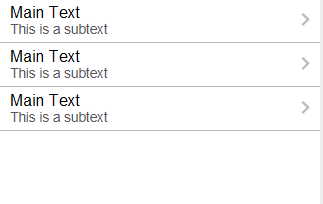
Example 13-52 shows the listView element and its child elements defined in a MAF AMX file. This List View is populated with cells containing an icon, main text, and subtext. The way each outputText child element is laid out in the list is specified by the tableLayout child element of the listItem. Alternatively, you may use the styleClass attribute to lay out and style outputText elements: setting this attribute to adfmf-listItem-mainText places the Output Text component to the left side of the row and applies a large black font to its text; setting this attribute to adfmf-listItem-captionText places the Output Text component under the Output Text component whose styleClass attribute is set to adfmf-listItem-mainText and applies a smaller grey font to its text. The position of the image element is defined by its enclosing cellFormat.
Example 13-52 Defining List View with Icons, Main Text and Subtext
<amx:listView id="lv1" value="#{myBean.listCollection}" var="row">
   <amx:listItem id="li1">
      <amx:tableLayout id="tl1" width="100%">
         <amx:rowLayout id="rl1">
            <amx:cellFormat id="cf1" rowSpan="2" width="40px" halign="center">
               <amx:image id="i1" source="#{row.image}"/>
            </amx:cellFormat>
            <amx:cellFormat id="cf2" width="100%" height="28px">
               <amx:outputText id="ot1" value="#{row.name}"/>
            </amx:cellFormat>
         </amx:rowLayout>
         <amx:rowLayout id="rl2">
            <amx:cellFormat id="cf3" width="100%" height="12px">
               <amx:outputText id="ot2"
                               value="#{row.desc}"
                               styleClass="adfmf-listItem-captionText"/>
            </amx:cellFormat>
         </amx:rowLayout>
      </amx:tableLayout>
   </amx:listItem>
</amx:listView>
Figure 13-51 shows a List View component with icons and differently styled text added as a main text and subtext to each row.
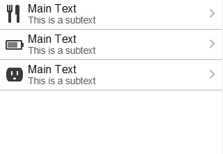
Example 13-53 shows the listView element and its child elements defined in a MAF AMX file. In addition to the text displayed at the start and end of each row, this List View contains two different types of text placed on each side of each row. The way each outputText child element is laid out in the list is specified by the tableLayout child element of the listItem. Alternatively, you may use the styleClass attribute to lay out and style outputText elements: setting this attribute to adfmf-listItem-upperStartText places the Output Text component at the top left corner of the row and applies a large black font to its text; setting this attribute to adfmf-listItem-upperEndText places the Output Text component at the top right corner of the row and applies a large grey font to its text; setting this attribute to adfmf-listItem-lowerStartText places the Output Text component at the bottom left corner of the row and applies a smaller grey font to its text; setting this attribute to adfmf-listItem-lowerEndText places the Output Text component at the bottom right corner of the row and applies a smaller grey font to its text. Whether or not the arrow pointing to the right is visible is configured by the showLinkIcon attribute of the listItem element. Since the default value of this attribute is true, the example does not contain this setting.
Example 13-53 Defining List View with Four Types of Text
<amx:listView id="lv1" value="#{myBean.listCollection}" var="row">
   <amx:listItem id="li1">
      <amx:tableLayout id="tl1" width="100%">
         <amx:rowLayout id="rl1">
            <amx:cellFormat id="cf1" width="10px" rowSpan="2"/>
            <amx:cellFormat id="cf2" width="60%" height="28px">
               <amx:outputText id="ot1" value="#{row.name}"/>
            </amx:cellFormat>
            <amx:cellFormat id="cf3" width="10px" rowSpan="2"/>
            <amx:cellFormat id="cf4" width="40%" halign="end">
               <amx:outputText id="ot2"
                               value="#{row.status}"
                               styleClass="adfmf-listItem-highlightText"/>
            </amx:cellFormat>
         </amx:rowLayout>
         <amx:rowLayout id="rla2">
            <amx:cellFormat id="cf5" width="60%" height="12px">
               <amx:outputText id="ot3"
                               value="#{row.desc}"
                               styleClass="adfmf-listItem-captionText"/>
            </amx:cellFormat>
            <amx:cellFormat id="cf6" width="40%" halign="end">
               <amx:outputText id="ot4"
                               value="#{row.priority}"
                               styleClass="adfmf-listItem-captionText"/>
            </amx:cellFormat>
         </amx:rowLayout>
      </amx:tableLayout>
   </amx:listItem>
</amx:listView>
Figure 13-52 shows a List View component with two types of differently styled text added to the start and end of each row. Besides the text, rows are equipped with a right-pointing arrow representing a link that expands each list item.
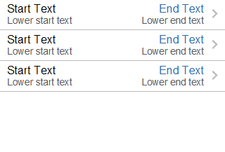
Example 13-54 shows the listView element and its child elements defined in a MAF AMX file. In addition to the text displayed at the start and end of each row, this List View contains two different types of text placed on each side of each row. The way each outputText child element is laid out in the list is specified by the tableLayout child element of the listItem. Alternatively, you may use the styleClass attribute to lay out and style outputText elements: setting this attribute to adfmf-listItem-upperStartText places the Output Text component at the top left corner of the row and applies a large black font to its text; setting this attribute to adfmf-listItem-upperEndText places the Output Text component at the top right corner of the row and applies a large grey font to its text; setting this attribute to adfmf-listItem-lowerStartTextNoChevron places the Output Text component at the bottom left corner of the row and applies a smaller grey font to its text; setting this attribute to adfmf-listItem-lowerEndTextNoChevron places the Output Text component at the bottom right corner of the row and applies a smaller grey font to its text. Whether or not the arrow pointing to the right is visible on each particular row is configured by the showLinkIcon attribute of the listItem element. Since in this example this attribute is set to false for every listItem element, arrows pointing to the right are not displayed.
Example 13-54 Defining List View with Four Types of Text and Without Expansion Links
<amx:listView id="lv1" value="#{myBean.listCollection}" var="row">
   <amx:listItem id="li1" showLinkIcon="false">
      <amx:tableLayout id="tl1" width="100%">
         <amx:rowLayout id="rl1">
            <amx:cellFormat id="cf1" width="10px" rowSpan="2"/>
            <amx:cellFormat id="cf2" width="60%" height="28px">
               <amx:outputText id="ot1" value="#{row.name}"/>
            </amx:cellFormat>
            <amx:cellFormat id="cf3" width="10px" rowSpan="2"/>
            <amx:cellFormat id="cf4" width="40%" halign="end">
               <amx:outputText id="ot2"
                               value="#{row.status}"
                               styleClass="adfmf-listItem-highlightText"/>
            </amx:cellFormat>
         </amx:rowLayout>
         <amx:rowLayout id="rl2">
            <amx:cellFormat id="cf5" width="60%" height="12px">
               <amx:outputText id="ot3"
                               value="#{row.desc}"
                               styleClass="adfmf-listItem-captionText"/>
            </amx:cellFormat>
            <amx:cellFormat id="cf6" width="40%" halign="end">
               <amx:outputText id="ot4"
                               value="#{row.priority}"
                               styleClass="adfmf-listItem-captionText"/>
            </amx:cellFormat>
         </amx:rowLayout>
      </amx:tableLayout>
   </amx:listItem>
</amx:listView>
Figure 13-53 shows a List View component with two types of differently styled text added to the start and end of each row.
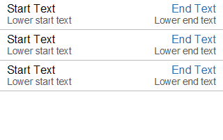
13.3.15.5 What You May Need to Know About Using Static List View
If you create a List View component that is not populated from the model but by hard-coded values, this List View becomes static resulting in some of its properties that you set at design time (for example, dividerAttribute, dividerMode, fetchSize, moveListener) ignored at run time.
MAF AMX treats a List View component as static if its value attribute is not set. Such lists cannot be editable (that is, you cannot specify its editMode attribute).
13.3.16 How to Use Carousel Component
You use the Carousel (carousel) component to display other components, such as images, in a revolving carousel. The end user can change the active item by using either the slider or by dragging another image to the front.
The Carousel component contains a Carousel Item (carouselItem) component, whose text represented by the text attribute is displayed when it is the active item of the Carousel. Although typically the Carousel Item contains an Image component, other components may be used. For example, you can use a Link as a child that surrounds an image. Instead of creating a Carousel Item component for each object to be displayed and then binding these components to the individual object, you bind the Carousel component to a complete collection. The component then repeatedly renders one Carousel Item component by stamping the value for each item. As each item is stamped, the data for the current item is copied into a property that can be addressed using an EL expression using the Carousel component's var attribute. Once the Carousel has completed rendering, this property is removed or reverted back to its previous value. Carousel components contain a Facet named nodeStamp, which is both a holder for the Carousel Item used to display the text and short description for each item, and also the parent component to the Image displayed for each item.
The Carousel Item stretches its sole child component. If you place a single Image component inside of the Carousel Item, the Image stretches to fit within the square allocated for the item (as the end user spins the carousel, these dimensions shrink or grow).
Tip:
To minimize any negative effect on performance of your application, you should avoid using heavy-weight components as children: a complex structure creates a multiplied effect because several Carousel Items stamps are displayed simultaneously.By default, the Carousel displays horizontally. The objects within the horizontal orientation of the Carousel are vertically-aligned to the middle and the Carousel itself is horizontally-aligned to the center of its container. You can configure the Carousel so that it can be displayed vertically, as you might want for a reference rolodex. By default, the objects within the vertical orientation of the Carousel are horizontally-aligned to the center and the Carousel itself is vertically aligned middle. You can change the alignments using the Carousel's orientation attribute.
Instead of partially displaying the previous and next images, you can configure your Carousel to display images in a filmstrip or circular design using the displayItems attribute.
By default, if the Carousel is configured to display in the circular mode, when the end user hovers over an auxiliary item (that is, an item that is not the current item at the center), the item is outlined to show that it can be selected. Using the auxiliaryPopOut attribute, you can configure the Carousel so that instead the item pops out and displays at full size.
In JDeveloper, the Carousel is located under Data Views in the Components window (see Figure 13-54).
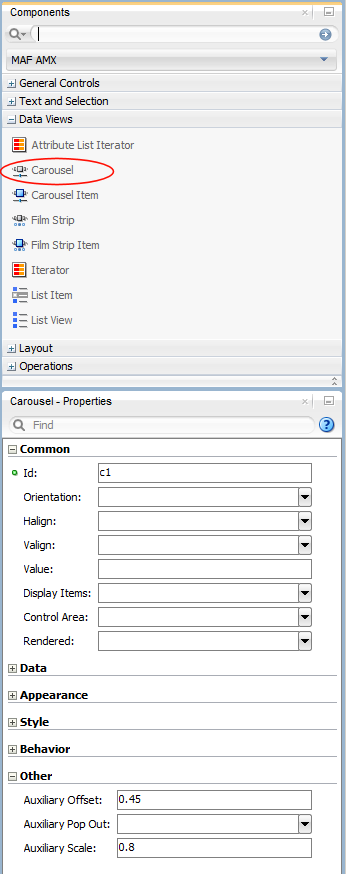
To create a Carousel component, you must first create the data model that contains images to display, then bind the Carousel to that model and insert a Carousel Item component into the nodeStamp facet of the Carousel. Lastly, you insert an Image component (or other components that contain an Image component) as a child to the Carousel Item component.
Example 13-55 demonstrates the carousel element definition in a MAF AMX file. When defining the carousel element, you must place the carouselItem element inside of a carousel elements's nodeStamp facet.
Example 13-55 Carousel Definition
<amx:carousel id="carousel1"
              value="#{bindings.products.collectionModel}"
              var="item"
              auxiliaryOffset="0.9"
              auxiliaryPopOut="hover"
              auxiliaryScale="0.8"
              controlArea="full"
              displayItems="circular"
              halign="center"
              valign="middle"
              disabled="false"
              shortDesc="spin"
              orientation="horizontal"
              styleClass="AMXStretchWidth"
              inlineStyle="height:250px;background-color:#EFEFEF;">
   <amx:facet name="nodeStamp">
      <amx:carouselItem id="item1" text="#{item.name}"
                        shortDesc="Product: #{item.name}">
         <amx:commandLink id="link1" action="goto-productDetails"
                          actionListener="#{someMethod()}">
            <amx:image id="image1" styleClass="prod-thumb"
                       source="images/img-big-#{item.uid}.png"/>
            <amx:setPropertyListener id="spl1"
                                     from="#{item}"
                                     to="#{pageFlowScope.product}"
                                     type="action"/>
         </amx:commandLink>
      </amx:carouselItem>
   </amx:facet>
</amx:carousel>
The Carousel component uses the CollectionModel class to access the data in the underlying collection. You may also use other model classes, such as java.util.List or array, in which case the Carousel automatically converts the instance into a CollectionModel class, but without any additional functionality.
A slider allows the end user to navigate through the Carousel collection. Typically, the thumb on the slider displays the current object number out of the total number of objects. When the total number of objects is too great to calculate, the thumb on the slider shows only the current object number.
For more information and examples, see the following:
-
Oracle Fusion Middleware Tag Reference for Oracle Mobile Application Framework
-
CompGallery, a MAF sample application located in the
PublicSamples.zipfile within thejdev_install/jdeveloper/jdev/extensions/oracle.maf/Samplesdirectory on your development computer
13.3.17 How to Use the Film Strip Component
A Film Strip (filmStrip) is a container component that visualizes data distributed among a set of groups (pages) in a form of a vertical or horizontal strip. The UI components that represent display items (filmStripItem) included in a group must be of the same size and type, and only one group visible at a time. The end user can navigate pages of the Film Strip, select an item and generate actions by tapping it.
In JDeveloper, the Film Strip is located under Data Views in the Components window (see Figure 13-55).
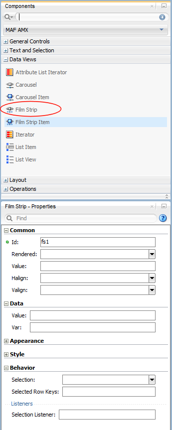
Example 13-56 demonstrates the filmStrip element definition in a MAF AMX file.
Example 13-56 Film Strip Definition
<amx:filmStrip id="fs1"
               var="item"
               value="#{bindings.contacts.collectionModel}"
               rendered="#{pageFlowScope.pRendered}"
               styleClass="#{pageFlowScope.pStyleClass}"
               inlineStyle="#{pageFlowScope.pInlineStyle}"
               shortDesc="#{pageFlowScope.pShortDesc}"
               halign="#{pageFlowScope.pFsHalign}"
               valign="#{pageFlowScope.pFsValign}"
               itemsPerPage="#{pageFlowScope.pMaxItems}"
               orientation="#{pageFlowScope.pOrientation}">
   <amx:filmStripItem id="fsi1"
                      inlineStyle="text-align:center; width:200px;">
      <amx:commandLink id="ciLink"
                       action="details"
                       shortDesc="Navigate to details">
         <amx:image id="ciImage" source="images/people/#{item.first}.png"/>
         <amx:setPropertyListener id="spl1"
                                  from="#{item.rowKey}"
                                  to="#{pageFlowScope.currentContact}"
                                  type="action"/>
         <amx:setPropertyListener id="spl2"
                                  from="#{item.first}"
                                  to="#{pageFlowScope.currentContactFirst}"
                                  type="action"/>
         <amx:setPropertyListener id="spl3"
                                  from="#{item.last}"
                                  to="#{pageFlowScope.currentContactLast}"
                                  type="action"/>
      </amx:commandLink>
   </amx:filmStripItem>
</amx:filmStrip>
For more information and examples, see the following:
-
Oracle Fusion Middleware Tag Reference for Oracle Mobile Application Framework
-
CompGallery, a MAF sample application located in the
PublicSamples.zipfile within thejdev_install/jdeveloper/jdev/extensions/oracle.maf/Samplesdirectory on your development computer
13.3.17.1 What You May Need to Know About the Film Strip Layout
In a vertically laid out Film Strip, the display items are placed in a top-down manner. Depending on the text direction, the page control is located as follows:
-
For the left-to-right text direction, the page control is on the right side;
-
For the right-to-left text direction, the page control is on the left side.
In a horizontally laid out Film Strip should reflect the text direction mode: in the left-to-ride mode, the first item is located on the left; in the right-to-left mode, the first item is located on the right. In both cases, the page status component is at the bottom.
13.3.17.2 What You May Need to Know About the Film Strip Navigation
The navigation of the Film Strip component is similar to the Deck (see Section 13.2.12, "How to Use a Deck Component") and Panel Splitter component (see Section 13.2.9, "How to Use a Panel Splitter Component"): one page at the time is displayed and the page change is triggered by selection of the page ID or number.
Since the child Film Strip Item component is not meant to be used for navigation to other MAF AMX pages, it does not support the action attribute. When required, you can enable navigation through the nested Command Link component.
13.3.18 How to Use Verbatim Component
You use the Verbatim (verbatim) operation to insert your own HTML into a page in cases where such a component does not exist or you prefer laying it out yourself using HTML.
In JDeveloper, Verbatim is located under General Controls in the Components window (see Figure 13-58).
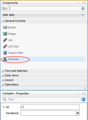
For more information and examples, see the following:
-
Oracle Fusion Middleware Tag Reference for Oracle Mobile Application Framework
-
CompGallery, a MAF sample application located in the
PublicSamples.zipfile within thejdev_install/jdeveloper/jdev/extensions/oracle.maf/Samplesdirectory on your development computer
13.3.18.1 What You May Need to Know About Using JavaScript and AJAX with Verbatim Component
Inserting JavaScript directly into the verbatim content (within the amx:verbatim element) is not a recommended practice as it may not execute properly on future versions of the currently supported platforms or on other platforms that MAF might support in the future. Instead, JavaScript and CSS inclusions should be done through the existing adfmf:include elements in the maf-feature.xml file, which ensures injection of the script into the page at the startup of the MAF AMX application feature.
In addition, the use of JavaScript with the Verbatim component is affected by the fact that AJAX calls from an AMX page to a server are not supported. This is due to the security architecture that guarantees that the browser hosting the MAF AMX page does not have access to the security information needed to make connections to a secure server to obtain its resources. Instead, communication with the server must occur from the embedded Java code layer.
13.3.19 How to Use Output HTML Component
The Output HTML (outputHtml) component allows you to dynamically and securely obtain HTML content from an EL-bound property or method with the purpose of displaying it on a MAF AMX page. The Output HTML component behaves similarly to the Verbatim component (see Section 13.3.18, "How to Use Verbatim Component") and the same restrictions with regards to JavaScript and AJAX usage apply to it (see Section 13.3.18.1, "What You May Need to Know About Using JavaScript and AJAX with Verbatim Component").
In JDeveloper, Output HTML is located under General Controls in the Components window (see Figure 13-57).
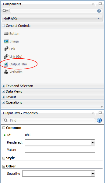
Example 13-57 demonstrates the outputHtml element definition in a MAF AMX file. The value attribute provides an EL binding to a String property that is used to obtain the HTML content to be displayed as the outputHTML in the final rendering of the MAF AMX page.
Example 13-57 Output HTML Definition
<amx:tableLayout id="t1" width="100%">
   <amx:rowLayout id="r1">
      <amx:cellFormat id="cf1" width="100%">
         <amx:outputHtml id="ReceiptView"
                         value="#{pageFlowScope.purchaseBean.htmlReceiptView}"/>
      </amx:cellFormat>
   </amx:rowLayout>
   <amx:rowLayout id="r2">
      <amx:cellFormat id="cf2" width="100%">
         <amx:outputHtml id="CheckView"
                         value="#{pageFlowScope.purchaseBean.htmlCheckView}"/>
      </amx:cellFormat>
   </amx:rowLayout>
</amx:tableLayout>
Example 13-58 shows the code from the Java bean called MyPurchaseBean that provides HTML for the Output HTML component shown in Example 13-57.
// The property accessor that gets the receipt view HTML
public String getHtmlReceiptView() {
   // Perform some URL remote call to get the HTML to be
   // inserted as a view of the Receipt and return that value
   return obtainReceiptHTMLFromServer();
}
// The property accessor that gets the check view HTML
public String getHtmlCheckView() {
   // Perform some URL remote call to get the HTML to be
   // inserted as a view of the Check and return that value
   return obtainCheckHTMLFromServer();
}
Since the Output HTML component obtains its HTML content from a Java bean property as opposed to downloading it directly from a remote source, consider using the existing MAF security features when coding the retrieval or generation of the dynamically provided HTML. For more information, see Chapter 29, "Securing MAF Applications" and Section 28.7.3, "About Injection Attack Risks from Custom HTML Components." In addition, ensure that the HTML being provided comes from a trusted source and is free of threats.
For more information and examples, see the following:
-
Oracle Fusion Middleware Tag Reference for Oracle Mobile Application Framework
-
CompGallery, a MAF sample application located in the
PublicSamples.zipfile within thejdev_install/jdeveloper/jdev/extensions/oracle.maf/Samplesdirectory on your development computer
13.3.20 How to Enable Iteration
You use the Iterator (iterator) operation to stamp an arbitrary number of items with the same kind of data, which allows you to iterate through the data and produce UI for each element.
In JDeveloper, the Iterator is located under Data Views in the Components window (see Figure 13-58).
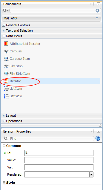
For more information, see Oracle Fusion Middleware Tag Reference for Oracle Mobile Application Framework.
13.3.21 How to Load a Resource Bundle
The Load Bundle (loadBundle) operation allows you to specify the resource bundle that provides localized text for the MAF AMX UI components on a page. For more information, see Section 13.7, "Localizing UI Components."
In JDeveloper, the Load Bundle is located under Operations in the Components window (see Figure 13-59).
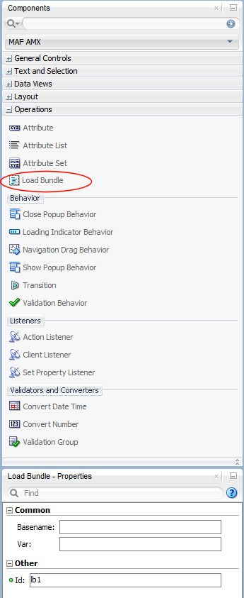
In your MAF AMX file, you declare the loadBundle element as a child of the view element.
For more information, see Oracle Fusion Middleware Tag Reference for Oracle Mobile Application Framework.
13.3.22 How to Use the Action Listener
The Action Listener (actionListener) component allows you to declaratively invoke commands through EL based on the type of the parent component's usage.
The predominate reason for using the Action Listener component is to add gesture-supported actions to its parent components, as well as ability to perform multiple operations for a single gesture, including tap. For more information, see Section 13.3.22.1, "What You May Need to Know About Differences Between the Action Listener Component and Attribute."
In JDeveloper, the Action Listener component is located under Operations -> Listeners in the Components window (see Figure 13-60).
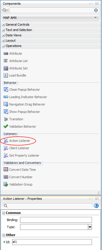
You can add zero or more Action Listener components as children of any command component (Button, Link, List Item, Film Strip Item). The type attribute of the Action Listener component defines which gesture, such as swipeLeft, swipeRight, tapHold, and so on, causes the ActionEvent to fire.
For more information, see the following:
13.3.22.1 What You May Need to Know About Differences Between the Action Listener Component and Attribute
Components such as the Button, Link, and List Item have an actionListener attribute, which by inference seems to make the Action Listener component redundant. However, unlike the Action Listener component, these components do not have the type attribute that supports gestures, which is the reason MAF provides the Action Listener component in addition to the actionListener attribute of the parent components.
13.3.23 How to Use the Set Property Listener
The Set Property Listener (setPropertyListener) component allows you to declaratively copy values from one location (defined by the component's from attribute) to another (defined by the component's to attribute) as a result of an end-user action on a component, thus freeing you from the need to write Java code to achieve the same result.
In JDeveloper, the Set Property Listener component is located under Operations -> Listeners in the Components window (see Figure 13-61).
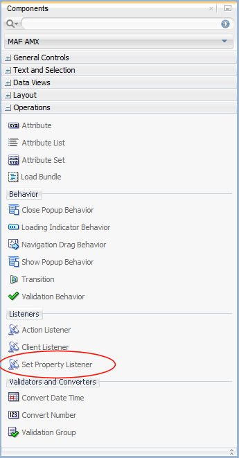
Example 13-59 demonstrates the setPropertyListener element definition in a MAF AMX file.
Example 13-59 Set Property Listener Definition
<amx:listView value="#{bindings.products.collectionModel}" var="row" id="lv1">
   <amx:listItem id="li1" action="details">
      <amx:outputText value="#{row.name}" id="ot1" />
      <amx:setPropertyListener id="spl1"
                               from="#{row}"
                               to="#{pageFlowScope.product}"
                               type="action"/>
   </amx:listItem>
</amx:listView>
You can add zero or more Set Property Listener components as children of any command component (Button, Link, List Item, Film Strip Item, as well as a subset of data visualization components and their child components). The type attribute of the Set Property Listener component defines which gesture, such as swipeLeft, swipeRight, tapHold, and so on, causes the ActionEvent to fire.
For more information, see the following:
13.3.24 How to Use the Client Listener
The Client Listener (clientListener) component allows you to declaratively register a JavaScript listener script that is to be executed when a specific event type is fired.
Before using the Client Listener component, you should check whether or not the MAF AMX page contains any existing behavior components, such as the Navigation Drag Behavior or Show Popup Behavior, because these components might eliminate the need for scripts.
In JDeveloper, the Client Listener component is located under Operations -> Listeners in the Components window (see Figure 13-62).
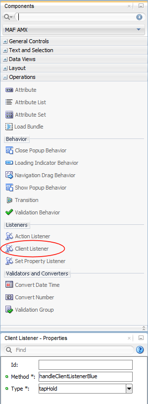
Example 13-60 demonstrates the clientListener element definition in a MAF AMX file. Both attributes are required and should be specified as follows:
-
method: defines the client-side JavaScript method name to invoke when triggered by an event of the specified type. -
type: defines the type of the client-side component event for which to listen. Note that not all events exist for all components and not all events behave consistently across platforms or versions of the same platform. Examples of events includeactionif the parent component is a Button;valueChangeif the parent component is an Input Text. Depending on the parent component, there might be some DOM events that you can use, such astouchstart,touchend,tap,taphold, and so on. In addition, some components might have special DOM events, such as the View component'sshowpagecomplete,mafviewvisible,mafviewhidden,amxnavigatestart, andamxnavigateend(see Section 14.11.10, "What You May Need to Know About Device Properties" for more information on these events).The
typeattribute supports EL for its initial declaration, but it does not support updates to that EL value—the value associated with the expression must not change unless actions are taken that cause the parent component to rerender.
Example 13-60 Client Listener Definition
<amx:view xmlns:xsi="http://www.w3.org/2001/XMLSchema-instance"
          xmlns:amx="http://xmlns.oracle.com/adf/mf/amx"
          xmlns:dvtm="http://xmlns.oracle.com/adf/mf/amx/dvt">
   <amx:clientListener type="showpagecomplete" method="handleClientListenerBlue"/>
   <amx:clientListener type="mafviewvisible" method="handleClientListenerBlue"/>
   <amx:clientListener type="mafviewhidden" method="handleClientListenerBlue"/>
   <amx:clientListener type="amxnavigatestart" method="handleClientListenerBlue"/>
   <amx:clientListener type="amxnavigateend" method="handleClientListenerBlue"/>
   <amx:panelPage id="pp1">
      <amx:facet name="header">
         <amx:outputText id="header" value="clientListener"/>
      </amx:facet>
      <amx:facet name="primary">
         <amx:commandButton id="back" action="__back" text="Back"/>
      </amx:facet>
      <amx:facet name="secondary">
         <amx:commandButton id="props" text="Properties" action="properties"/>
      </amx:facet>
      <amx:commandButton id="button1" text="Click Me">
         <amx:clientListener type="#{bindings.pType}"
                             method="#{bindings.pMethod}"/>
      </amx:commandButton>
      <amx:verbatim id="v1"><![CDATA[
         <script type="text/javascript">
         function handleClientListenerGray(clientEvent) {
            _handleClientListener(clientEvent, "gray");
         }
         function handleClientListenerBlue(clientEvent) {
            _handleClientListener(clientEvent, "blue");
         }
         function handleClientListenerOrange(clientEvent) {
            _handleClientListener(clientEvent, "orange");
         }
         function clearRecentEvents(clientEvent) {
            for (var i=9; i>=0; --i) {
               var row = document.getElementsByClassName("recent"+i)[0];
               row.textContent = "n/a";
               row.style.color = "";
            }
         }
         function _handleClientListener(clientEvent, color) {
            try {
               for (var i=9; i>0; --i) {
                  var currentRow = document.getElementsByClassName("recent"+i)[0];
                  var olderRow = document.getElementsByClassName
                                                      ("recent"+(i-1))[0];
                  currentRow.textContent = olderRow.textContent;
                  currentRow.style.color = olderRow.style.color;
               }
               document.getElementsByClassName("recent0")[0].
                                                   textContent = clientEvent;
               document.getElementsByClassName("recent0")[0].style.color = color;
               console.log("Handled clientListener: " + clientEvent, clientEvent);
            }
            catch (problem) {
               console.log("Error in verbatim code: " +
                                         clientEvent, clientEvent, problem);
               alert("Error in verbatim code: " + clientEvent + "\n\n" + problem);
            }
         }
         </script>
         <style type="text/css">
         .recentLine {
            white-space: normal;
            word-wrap: break-word;
            font-size: 12px;
            color: gray;
         }
         </style>
         <fieldset style="min-width: 50px;">
            <legend style="color: gray;">Recent Events</legend>
            <div id="recent0" class="recent0 recentLine">n/a</div>
            <div id="recent1" class="recent1 recentLine">n/a</div>
            <div id="recent2" class="recent2 recentLine">n/a</div>
            <div id="recent3" class="recent3 recentLine">n/a</div>
            <div id="recent4" class="recent4 recentLine">n/a</div>
            <div id="recent5" class="recent5 recentLine">n/a</div>
            <div id="recent6" class="recent6 recentLine">n/a</div>
            <div id="recent7" class="recent7 recentLine">n/a</div>
            <div id="recent8" class="recent8 recentLine">n/a</div>
            <div id="recent9" class="recent9 recentLine">n/a</div>
         </fieldset>
      ]]></amx:verbatim>
   </amx:panelPage>
</amx:view>
For more information, see the following:
13.3.25 How to Convert Date and Time Values
The Convert Date Time (convertDateTime) is not an independent UI component: it is a converter operation that you use in conjunction with an Output Text and Input Text component to display converted date, time, or a combination of date and time in a variety of formats following the specified pattern.
In JDeveloper, the Convert Date Time is located under Validators and Converters in the Components window (see Figure 13-63).
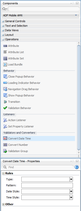
Example 13-61 demonstrates the convertDateTime element declared in a MAF AMX file.
Example 13-61 Using Convert Date Time
<amx:panelPage id="pp1">
   <amx:inputText styleClass="ui-text" value="Order Date" id="it1" >
      <amx:convertDateTime id="cdt1" type="both"/>
   </amx:inputText>
</amx:panelPage>
To convert date and time values:
-
From the Components window, drag a Convert Date Time component and insert it within an Output Text or Input Text component, making it a child element of that component.
-
Open the Properties window for the Convert Date Time component and define its attributes. For more information, see Oracle Fusion Middleware Tag Reference for Oracle Mobile Application Framework.
Note:
The Convert Date Time component does not produce any effect at design time.The Convert Date Time component allows a level of leniency while converting an input value string to date:
-
A converter with associated pattern
MMMfor month, when attached to any value holder, accepts values with month specified in the formMMorMas valid. -
Allows use of such separators as dash ( - ) or period ( . ) or slash ( / ), irrespective of the separator specified in the associated pattern.
-
Leniency in pattern definition set by the
patternattribute.
For example, when a pattern on the converter is set to "MMM/d/yyyy", the following inputs are accepted as valid by the converter:
Jan/4/2004
Jan-4-2004
Jan.4.2004
01/4/2004
01-4-2004
01.4.2004
1/4/2004
1-4-2004
1.4.2004
The converter supports the same parsing and formatting conventions as the java.text.SimpleDateFormat (specified using the dateStyle, timeStyle, and pattern attributes), except the case when the time zone is specified to have a long display, such as timeStyle=full or a pattern set with zzzz. Instead of a long descriptive string, such as "Pacific Standard Time", the time zone is displayed in the General Time zone format (GMT +/- offset) or RFC-822 time zones.
The exact result of the conversion depends on the locale, but typically the following rules apply:
-
SHORTis completely numeric, such as 12.13.52 or 3:30pm -
MEDIUMis longer, such as Jan 12, 1952 -
LONGis longer, such as January 12, 1952 or 3:30:32pm -
FULLis completely specified, such as Tuesday, April 12, 1952 AD or 3:30:42pm PST
13.3.25.1 What You May Need to Know About Date and Time Patterns
As per java.text.SimpleDateFormat definition, date and time formats are specified by date and time pattern strings. Within date and time pattern strings, unquoted letters from A to Z and from a to z are interpreted as pattern letters representing the components of a date or time string. Text can be quoted using single quotes ( ' ) to avoid interpretation. " ' ' " represents a single quote. All other characters are not interpreted; instead, they are simply copied into the output string during formatting, or matched against the input string during parsing.
Table 13-9 lists the defined pattern letters (all other characters from A to Z and from a to z are reserved).
Table 13-9 Date and Time Pattern Letters
| Letter | Date or Time Component | Presentation | Examples |
|---|---|---|---|
|
G |
Era designator |
Text |
|
|
y |
Year |
Year |
|
|
M |
Month in year |
Month |
|
|
w |
Week in year |
Number |
|
|
W |
Week in month |
Number |
|
|
D |
Day in year |
Number |
|
|
d |
Day in month |
Number |
|
|
F |
Day of week in month |
Number |
|
|
E |
Day in week |
Text |
|
|
a |
Am/pm marker |
Text |
|
|
H |
Hour in day (0-23) |
Number |
|
|
k |
Hour in day (1-24) |
Number |
|
|
K |
Hour in am/pm (0-11) |
Number |
|
|
h |
Hour in am/pm (1-12) |
Number |
|
|
m |
Minute in hour |
Number |
|
|
s |
Second in minute |
Number |
|
|
S |
Millisecond |
Number |
|
|
z |
Time zone |
General time zone |
|
|
Z |
Time zone |
RFC 822 time zone |
|
Pattern letters are usually repeated, as their number determines the exact presentation.
13.3.26 How to Convert Numerical Values
The Convert Number (convertNumber) is not an independent UI component: it is a converter operation that you use in conjunction with an Output Text, Input Text, and Input Number Slider components to display converted number or currency figures in a variety of formats following a specified pattern.
The Convert Number component provides the following types of conversion:
-
From value to string, for display purposes.
-
From formatted string to value, when formatted input value is parsed into its underlying value.
When the Convert Number is specified as a child of an Input Text component, the numeric keyboard is displayed on a mobile device by default.
In JDeveloper, the Convert Number is located under Validators and Converters in the Components window (see Figure 13-64).
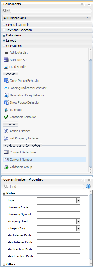
Example 13-62 demonstrates the convertNumber element defined in a MAF AMX file.
Example 13-62 Using Convert Number
<amx:panelPage id="pp1">
   <amx:inputText styleClass="ui-text" value="Product Price" id="it1" >
      <amx:convertNumber id="cn1"
                         type="percent"
                         groupingUsed="false"
                         integerOnly="true"/>
   </amx:inputText>
</amx:panelPage>
-
From the Components window, drag a Convert Number component and insert it within an Output Text, Input Text, or Input Number Slider component, making it a child element of that component.
-
Open the Properties window for the Convert Number component and define its attributes. For more information, see Oracle Fusion Middleware Tag Reference for Oracle Mobile Application Framework.
Note:
The Convert Number component does not produce any effect at design time.13.3.27 How to Enable Drag Navigation
The Navigation Drag Behavior (navigationDragBehavior) operation allows you to invoke the action of navigating to the next or previous MAF AMX page by dragging a portion of the mobile device screen in a specified direction (left or right). As the drag in the specified direction occurs, an indicator is displayed on the appropriate side of the screen to hint that an action will be performed if the dragging continues and then stops as soon as the indicator is fully revealed. If the drag is released before the indicator is fully revealed, the indicator slides away and no action is invoked.
Note:
This behavior does not occur if another, closer container consumes the drag gesture.A MAF AMX page cannot contain more than two instances of the navigationDragBehavior element: one with its direction attribute set to back and one set to forward.
In JDeveloper, the Navigation Drag Behavior is located under Operations in the Components window (see Figure 13-65).
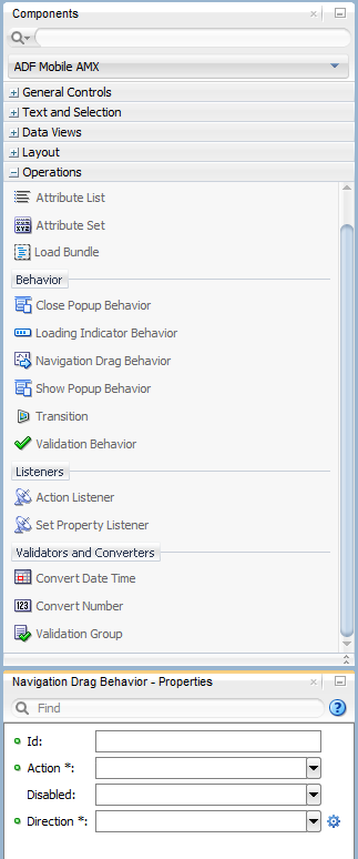
Example 13-63 demonstrates the navigationDragBehavior element defined in a MAF AMX file. Note that this element can only be a child of the view element.
Example 13-63 Using Navigation Drag Behavior
<amx:view xmlns:xsi="http://www.w3.org/2001/XMLSchema-instance"
          xmlns:amx="http://xmlns.oracle.com/adf/mf/amx"
          xmlns:dvtm="http://xmlns.oracle.com/adf/mf/amx/dvt">
   <amx:navigationDragBehavior id="ndb1"
                               direction="forward"
                               action="gotoDetail"/> Foot 1
   <amx:panelPage id="pp1">
      <amx:facet name="header">
      ...
   </amx:panelPage>
</amx:view>
Figure 13-66 shows the Navigation Drag Behavior at runtime (displayed using the mobileFusionFx skin).
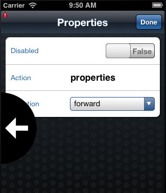
For more information and examples, see the following:
-
Oracle Fusion Middleware Tag Reference for Oracle Mobile Application Framework
-
CompGallery, a MAF sample application located in the
PublicSamples.zipfile within thejdev_install/jdeveloper/jdev/extensions/oracle.maf/Samplesdirectory on your development computer
13.3.27.1 What You May Need to Know About the disabled Attribute
The value of the disabled attribute (see Example 13-64 and Example 13-65) is calculated when one of the following occurs:
-
A MAF AMX page is rendered
-
A
PropertyChangeListenerupdates the component: If you wish to dynamically enable or disable the end user's ability to invoke the Navigation Drag Behavior, you use thePropertyChangeListener(similarly to how it is used with other components that require updates from a bean).
Example 13-64 shows a MAF AMX page containing the navigationDragBehavior element with a defined disabled attribute. The functionality is driven by the Button (commandButton) that, when activated, changes the backing bean boolean value (navDisabled in Example 13-65) from which the disabled attribute reads its value. The backing bean, in turn, uses the PropertyChangeListener.
Example 13-64 Navigation Drag Behavior with disabled Attribute in MAF AMX Page
<amx:view xmlns:xsi="http://www.w3.org/2001/XMLSchema-instance"
          xmlns:amx="http://xmlns.oracle.com/adf/mf/amx"
          xmlns:dvtm="http://xmlns.oracle.com/adf/mf/amx/dvt">
   <amx:panelPage id="pp1">
      <amx:facet name="header">
         <amx:outputText value="Header1" id="ot1"/>
      </amx:facet>
      <amx:commandButton id="cb1"
                         text="commandButton1"
                         actionListener="#{pageFlowScope.myBean.doSomething}"/>
   </amx:panelPage>
   <amx:navigationDragBehavior id="ndb1"
                               direction="forward"
                               action="goView2"
                               disabled="#{pageFlowScope.myBean.navDisabled}"/>
</amx:view>
Example 13-65 shows the backing bean (myBean in Example 13-64) that provides value for the navigationDragBehavior's disabled attribute.
Example 13-65 Backing Bean for Navigation Drag Behavior Disabled Functionality
public class MyBean {
   boolean navDisabled = true;
   private PropertyChangeSupport propertyChangeSupport =
                                    new PropertyChangeSupport(this);

   public void setNavDisabled(boolean navDisabled) {
      boolean oldNavDisabled = this.navDisabled;
      this.navDisabled = navDisabled;
      propertyChangeSupport.firePropertyChange("navDisabled",
                                               oldNavDisabled,
                                               navDisabled);
   }

   public boolean isNavDisabled() {
      return navDisabled;
   }

   public void doSomething(ActionEvent actionEvent) {
      setNavDisabled(!navDisabled);
   }

   public void addPropertyChangeListener(PropertyChangeListener l) {
      propertyChangeSupport.addPropertyChangeListener(l);
   }

   public void removePropertyChangeListener(PropertyChangeListener l) {
      propertyChangeSupport.removePropertyChangeListener(l);
   }
}
13.3.28 How to Use the Loading Indicator
The Loading Indicator Behavior (loadingIndicatorBehavior) operation allows you to define the behavior of the loading indicator by overriding the following:
-
The duration of the fail-safe timer (in milliseconds).
-
An optional JavaScript function name that can be invoked to decide on the course of action when the fail-safe threshold is reached.
For additional information, see the adf.mf.api.amx.showLoadingIndicator in Table 19-1, "Static APIs".
In JDeveloper, the Loading Indicator Behavior is located under Operations in the Components window (see Figure 13-67).
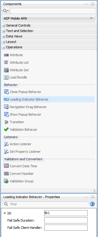
Example 13-66 demonstrates the loadingIndicatorBehavior element defined in a MAF AMX file. Note that this element can only be a child of the view element.
Example 13-66 Using Loading Indicator Behavior
<amx:view xmlns:xsi="http://www.w3.org/2001/XMLSchema-instance"
          xmlns:amx="http://xmlns.oracle.com/adf/mf/amx"
          xmlns:dvtm="http://xmlns.oracle.com/adf/mf/amx/dvt">
   <amx:loadingIndicatorBehavior id="lib1"
                        failSafeDuration="3000"
                        failSafeClientHandler="window.customFailSafeHandler"/>
   <amx:panelPage id="pp1">
      <amx:facet name="header">
      <!-- The loading indicator custom fail safe handler will appear
           if the long running operation runs longer than 3 seconds -->
      <amx:commandButton id="cb1"
                         text="longRunningOperation"
                         actionListener=
                               "#{pageFlowScope.myBean.longRunningOperation} />
   </amx:panelPage>
</amx:view>
In the preceding example, the commandButton is bound to a long-running method to illustrate that the loading indicator applies to long running operations once the page is loaded (not when the page itself takes a long time to load).
Example 13-67 demonstrates the custom.js file included with the application feature. It defines the client handler for the failSafeClientHandler in the loadingIndicatorBehavior page. As per the API requirement, this function returns a String of either hide, repeat, or freeze. For more information, see the adf.mf.api.amx.showLoadingIndicator in Table 19-1, "Static APIs".
Example 13-67 Sample custom.js File
window.customFailSafeHandler = function() {
   var answer =
      prompt(
         "This is taking a long time.\n\n" +
         "Use \"a\" to hide the indicator.\n" +
         "Use \"z\" to wait for it.\n" +
         "Otherwise, give it more time.");

   if (answer == "a")
      return "hide"; // don't ask again; hide the indicator
   else if (answer == "z")
      return "freeze" // don't ask again; wait for it to finish
   else
      return "repeat"; // ask again after another duration
};
For more information and examples, see the following:
-
Oracle Fusion Middleware Tag Reference for Oracle Mobile Application Framework
-
CompGallery, a MAF sample application located in the
PublicSamples.zipfile within thejdev_install/jdeveloper/jdev/extensions/oracle.maf/Samplesdirectory on your development computer
13.4 Enabling Gestures
You can configure Button, Link, List Item, as well as a number of data visualization components to react to the following gestures:
-
Swipe to the right
-
Swipe to the left
-
Swipe up
-
Swipe down
-
Tap-and-hold
-
Action: as a gesture, Action represents a basic tap.
-
Swipe to the start: this gesture is used for accommodating the right-to-left (RTL) text direction. This gesture resolves as follows:
-
Swipe to the left for the left-to-right text direction.
-
Swipe to the right for the right-to-left text direction.
-
-
Swipe to the end: this gesture is used for accommodating the right-to-left (RTL) text direction. This gesture resolves as follows:
-
Swipe to the right for the left-to-right text direction.
-
Swipe to the left for the right-to-left text direction.
-
You can define swipeRight, swipeLeft, swipeUp, swipeDown, swipeStart, swipeEnd, action, and tapHold values for the type attribute of the following operations:
-
Set Property Listener (see Section 13.3.23, "How to Use the Set Property Listener")
-
Action Listener (see Section 13.3.22, "How to Use the Action Listener")
-
Show Popup Behavior (see Section 13.2.8, "How to Use a Popup Component")
-
Close Popup Behavior (see Section 13.2.8, "How to Use a Popup Component")
The values of the type attribute are restricted based on the parent component and are supported only for Link (commandLink) and List Item (listItem) components.
Note:
There is no gesture support for the Link Go (linkGo) component.Swiping from start and end is used for accommodating the right-to-left (RTL) text direction. It is generally recommended to set the start and end swipe style as opposed to left and right.
Example 13-68 demonstrates use of the tapHold value of the type attribute in a MAF AMX file. In this example, the tap-and-hold gesture triggers the display of a Popup component.
Example 13-68 Using Tap-and-Hold Gesture
<amx:panelPage id="pp1">
   <amx:listView id="lv1"
                 value="#{bindings.data.collectionModel}"
                 var="row">
      <amx:listItem id="li1" action="gosomewhere">
         <amx:outputText id="ot1" value="#{row.description}"/>
         <amx:setPropertyListener id="spl1"
                                  from="#{row.rowKey}"
                                  to="#{mybean.currentRow}"
                                  type="tapHold"/>
         <amx:showPopupBehavior id="spb1"
                                type="tapHold"
                                alignid="pp1"
                                popupid="pop1"
                                align="startAfter"/>
      </amx:listItem>
   </amx:listView>>
</amx:panelPage>
<amx:popup id="pop1">
   <amx:panelGroupLayout id="pgl1" layout="horizontal">
      <amx:commandLink id="cm1" actionListener="#{mybean.doX}">
         <amx:image id="i1" source="images/x.png"/>
         <amx:closePopupBehavior id="cpb1" type="action" popupid="pop1"/>
      </amx:commandLink>
      <amx:commandLink id="cm2" actionListener="#{mybean.doY}">
         <amx:image id="i2" source="images/y.png"/>
         <amx:closePopupBehavior id="cpb2" type="action" popupid="pop1"/>
      </amx:commandLink>
      <amx:commandLink id="cm3" actionListener="#{mybean.doZ}">
         <amx:image id="i3" source="images/y.png"/>
         <amx:closePopupBehavior id="cpb3" type="action" popupid="pop1"/>
      </amx:commandLink>
   </amx:panelGroupLayout>
</amx:popup>
Example 13-69 demonstrates use of the swipeRight gesture in a MAF AMX file.
Example 13-69 Using Swipe Right Gesture
<amx:panelPage id="pp1">
   <amx:listView id="lv1"
                 value="#{bindings.data.collectionModel}"
                 var="row">
      <amx:listItem id="li1" action="gosomewhere">
         <amx:outputText id="ot1" value="#{row.description}"/>
         <amx:setPropertyListener id="spl1"
                                  from="#{row.rowKey}"
                                  to="#{mybean.currentRow}"
                                  type="swipeRight"/>
         <actionListener id="al1" binding="#{mybean.DoX}" type="swipeRight"/>
      </amx:listItem>
   </amx:listView>>
</amx:panelPage>
For more information, see Oracle Fusion Middleware Tag Reference for Oracle Mobile Application Framework.
A MAF sample application called GestureDemo demonstrates how to use gestures with a variety of MAF AMX UI components. This sample application is located in the PublicSamples.zip file within the jdev_install/jdeveloper/jdev/extensions/oracle.maf/Samples directory on your development computer.
13.5 Providing Data Visualization
MAF employs a set of data visualization components that you can use to create various charts, gauges, and maps to represent data in your MAF AMX application feature. You can declare the following elements under the <dvtm> namespace in a MAF AMX file:
-
areaChart(see Section 13.5.1, "How to Create an Area Chart") -
barChart(see Section 13.5.2, "How to Create a Bar Chart") -
bubbleChart(see Section 13.5.3, "How to Create a Bubble Chart") -
comboChart(see Section 13.5.4, "How to Create a Combo Chart") -
lineChart(see Section 13.5.5, "How to Create a Line Chart") -
pieChart(see Section 13.5.6, "How to Create a Pie Chart") -
scatterChart(see Section 13.5.7, "How to Create a Scatter Chart") -
sparkChart(see Section 13.5.8, "How to Create a Spark Chart") -
funnelChart(see Section 13.5.9, "How to Create a Funnel Chart") -
ledGauge(see Section 13.5.12, "How to Create a LED Gauge") -
statusMeterGauge(see Section 13.5.13, "How to Create a Status Meter Gauge") -
dialGauge(see Section 13.5.14, "How to Create a Dial Gauge") -
ratingGauge(see Section 13.5.15, "How to Create a Rating Gauge") -
geographicMap(see Section 13.5.17, "How to Create a Geographic Map Component") -
thematicMap(see Section 13.5.18, "How to Create a Thematic Map Component") -
treemap(see Section 13.5.20, "How to Create a Treemap Component") -
sunburst(see Section 13.5.21, "How to Create a Sunburst Component") -
timeline(see Section 13.5.22, "How to Create a Timeline Component") -
nBox(see Section 13.5.23, "How to Create an NBox Component")
Chart, gauge, map, and advanced components' elements have a number of attributes that are common to all or most of them. For more information, see Oracle Fusion Middleware Tag Reference for Oracle Mobile Application Framework.
In JDeveloper, data visualization components are located as follows in the Components window:
-
Chart components are located under MAF AMX Data Visualizations > Common > Chart
-
Gauge components are located under MAF AMX Data Visualizations > Common > Gauge
-
Map components are located under MAF AMX Data Visualizations > Common > Map
-
Treemap, Sunburst, Timeline, and NBox are located under MAF AMX Data Visualizations > Common > Miscellaneous
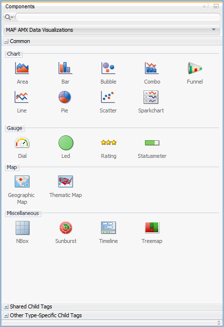
When you drag and drop a data visualization component, a dialog similar to one of the following opens to display the information about the type of component you are creating:
-
Create Mobile Chart (see Figure 13-69)
-
Create Mobile Gauge (see Figure 13-70)
-
Component Gallery (see Figure 13-71)
-
Create Sunburst or Treemap (see Figure 13-70)
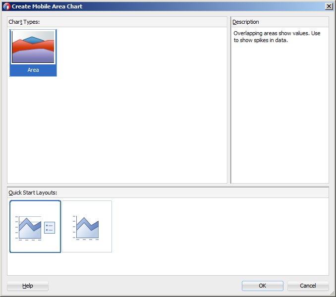
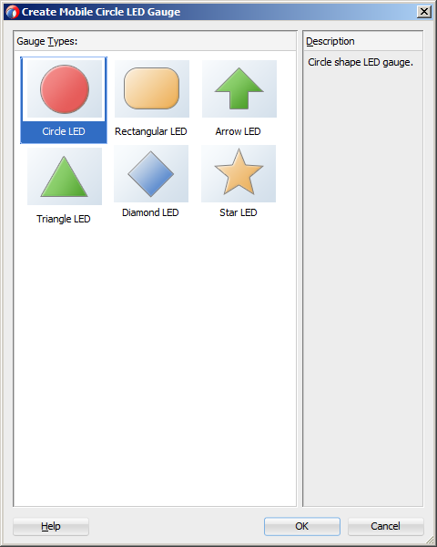
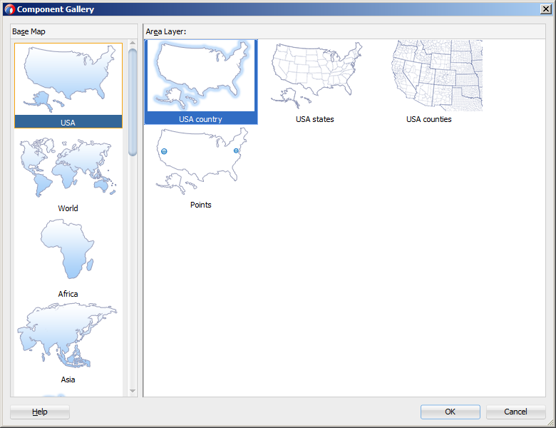
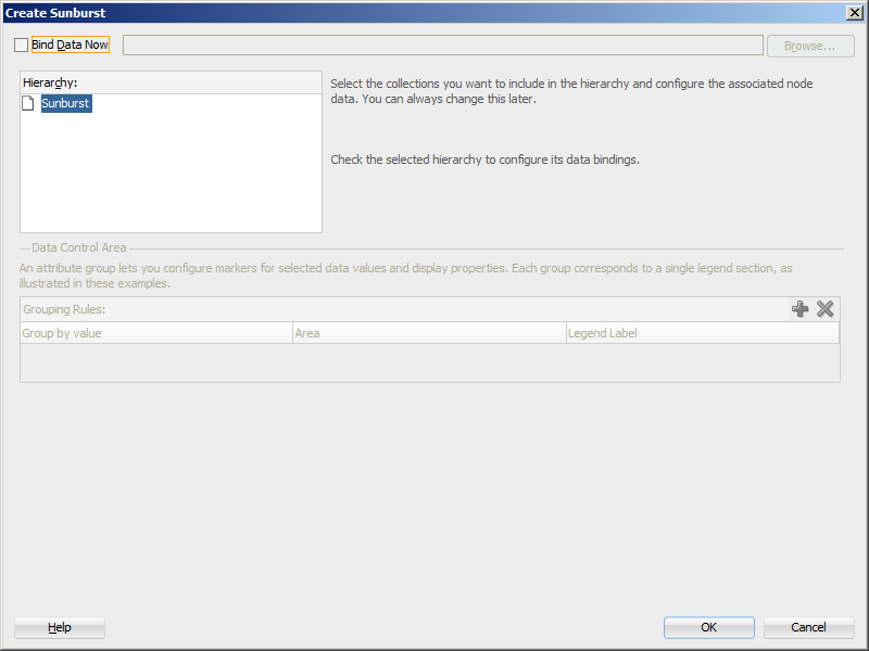
Note:
After you created the component, you can relaunch the creation dialog by selecting the component in the Source editor or Structure view, and then clicking Edit Component Definition in the Properties window.You can use the same editing functionality available from the Properties window to edit child components (for example, the Data Point Layer) of some data visualization components.
A MAF sample application called CompGallery demonstrates how to use various data visualization components in your MAF AMX application feature. This sample application is located in the PublicSamples.zip file within the jdev_install/jdeveloper/jdev/extensions/oracle.maf/Samples directory on your development computer.
For more information on MAF AMX data visualization components, see the following:
-
For information on how to add event listeners to data visualization components, see Section 13.10, "Using Event Listeners." Event listeners are applicable to components for the MAF AMX run-time description on both iOS and Android-powered devices, but the listeners do not have any effect at design time.
-
For information on databound data visualization components that are created from the Data Controls window, see Section 13.5.25, "How to Create Databound Data Visualization Components."
-
For information on providing static data for charts and other data visualization components, see Section 13.5.26, "How to Create Data Visualization Components Based on Static Data."
-
For information on chart components' interactivity, see Section 13.5.27, "How to Enable Interactivity in Chart Components."
-
For information on creating polar charts, see Section 13.5.28, "How to Create Polar Charts."
-
For information on data visualization components' support for accessibility, see Section 13.8, "Understanding MAF Support for Accessibility."
-
For information on limitations to the usage of MAF AMX data visualization components, see Section E.6.2, "Data Visualization Components Limitations."
13.5.1 How to Create an Area Chart
You use the Area Chart (areaChart) to visually represent data where sets of data items are related and categorized into groups and series. The series are visualized using graphical elements with some common style properties (such as, for example, an area color or pattern). Those properties have to be applied at the series level instead of per each individual data item. You have an option to use the default or custom series styles. For information about defining custom series styles, see Section 13.5.5, "How to Create a Line Chart."
The Area Chart can be zoomed and scrolled along its X Axis. This is enabled through the use of the zoomAndScroll attribute.
Example 13-70 shows the areaChart element defined in a MAF AMX file. To create a basic area chart with default series style, you pass it a collection and specify the dataStamp facet with a nested chartDataItem element.
Example 13-70 Area Chart Definition with Default Series Styles
<dvtm:areaChart id="areaChart1"
                value="#{bindings.lineData.collectionModel}"
                var="row"
                inlineStyle="width: 400px; height: 300px;"
                animationOnDisplay="auto"
                animationDuration="1500" >
   <amx:facet name="dataStamp">
      <dvtm:chartDataItem id="areaChartItem1"                          series="#{row.series}"
                          group="#{row.group}"
                          value="#{row.value}" />
   </amx:facet>
   <dvtm:yAxis id="yAxis1"
               axisMaxValue="80.0"
               majorIncrement="20.0"
               title="yAxis Title" />
   <dvtm:legend id="l1" position="end" />
</dvtm:areaChart>
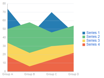
Data items are initialized in the collection model and equipped with the stamping mechanism. At a minimum, each collection row must include the following properties:
-
series: name of the series to which this data item belongs; -
group: name of the group to which this data item belongs; -
value: the data item value.
The collection row might also include other properties, such as color or markerShape, applicable to individual data items.
You can use Attribute Groups (attributeGroups element) to set style properties for a group of data items based on some grouping criteria, as Example 13-71 shows. In this case, the chartDataItem's color and markerShape attributes are set based on the additional grouping expression.
The attributeGroups settings can be shared between data visualization components and attribute values can be automatically applied across these components. You enable this functionality by setting the discriminant attribute of the attributeGroups: components with the same discriminant value share their settings, including value of the attributeMatchRule child element of their attributeGroups.
The attributeGroups can have the following child elements:
-
attributeExceptionRulefrom thedvtmnamespace: replaces an attribute value with another when a particular boolean condition is met. -
attributeMatchRulefrom thedvtmnamespace: replaces an attribute when the data matches a certain value. -
attributefrom theamxnamespace.
Example 13-71 Area Chart Definition with Default Series Styles and Grouping
<dvtm:areaChart id="areaChart1"
                value="#{bindings.lineData.collectionModel}"
                var="row"
                inlineStyle="width: 400px; height: 300px;"
                title="Chart Title"
                animationOnDisplay="auto"
                animationDuration="1500" >
   <amx:facet name="dataStamp">
      <dvtm:chartDataItem id="chartDataItem1"
                          series="#{row.series}"
                          group="#{row.group}"
                          value="#{row.value}" />
         <dvtm:attributeGroups id="ag1"
                               type="color"
                               value="#{row.brand}" />
   </amx:facet>
   <dvtm:yAxis id="yAxis1"
               axisMaxValue="80.0"
               majorIncrement="20.0"
               title="yAxis Title" />
   <dvtm:legend id="l1" position="end" />
</dvtm:areaChart>
Note:
In Example 13-70 and Figure 13-73, since custom styles are not set at the series level, series are displayed with the colors based on the default color ramp.The orientation attribute allows you to define the Area Chart as either horizontal or vertical.
For information on attributes of the areaChart and dvtm child elements that you can define for this component, see Oracle Fusion Middleware Tag Reference for Oracle Mobile Application Framework.
You can define a facet child element from the amx namespace. The facet can have a chartDataItem as its child (see Section 13.5.16.1, "Defining Chart Data Item").
You can style the Area Chart component's top-level element by overwriting the default CSS settings defined in the following class:
.dvtm-areaChart
   - supported properties: all
For more information on chart styling, see Section 13.5.10, "How to Style Chart Components."
For information on how to extend CSS files, see Section 13.6.4, "How to Style Data Visualization Components."
13.5.2 How to Create a Bar Chart
You use a Bar Chart (barChart) to visually display data as vertical bars, where sets of data items are related and categorized into groups and series. The series are visualized using graphical elements with some common style properties that you have to apply at the series level instead of per each individual data item.
The Bar Chart can be zoomed and scrolled along its X Axis. This is enabled through the use of the zoomAndScroll attribute.
Example 13-72 shows the barChart element defined in a MAF AMX file. The dataStamp facet is specified with a nested chartDataItem element.
Example 13-72 Bar Chart Definition
<dvtm:barChart id="barChart1"
               value="#{bindings.barData.collectionModel}"
               var="row"
               inlineStyle="width: 400px; height: 300px;"
               animationOnDisplay="zoom"
               animationDuration="3000" >
   <amx:facet name="dataStamp">
      <dvtm:chartDataItem id="chartDataItem1"
                          series="#{row.series}"
                          group="#{row.group}"
                          value="#{row.value}" />
   </amx:facet>
   <dvtm:yAxis id="yAxis1"
               axisMaxValue="80.0"
               majorIncrement="20.0"
               title="yAxis Title" />
   <dvtm:legend id="l1" position="start" />
</dvtm:barChart>
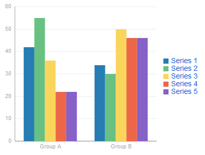
The data model for a bar chart is represented by a collection of items (rows) that describe individual bars. Typically, properties of each bar include the following:
-
series: name of the series to which this bar belongs; -
group: name of the group to which this bar belongs; -
value: the data item value (required).
Data must include the same number of groups per series. If any of the series or data pairs are missing, it is passed to the API as null.
The orientation attribute allows you to define the Bar Chart as either horizontal or vertical.
For information on attributes of the barChart and dvtm child elements that you can define for this component, see Oracle Fusion Middleware Tag Reference for Oracle Mobile Application Framework.
You can define a facet child element from the amx namespace. The facet can have a chartDataItem as its child (see Section 13.5.16.1, "Defining Chart Data Item").
You can style the Bar Chart component's top-level element by overwriting the default CSS settings defined in the following class:
.dvtm-barChart
   - supported properties: all
For more information on chart styling, see Section 13.5.10, "How to Style Chart Components."
For information on how to extend CSS files, see Section 13.6.4, "How to Style Data Visualization Components."
13.5.3 How to Create a Bubble Chart
A Bubble Chart (bubbleChart) displays a set of data items where each data item has x, y coordinates and size (bubble). In addition, each data item can have various style attributes, such as color and markerShape. You can either set properties of each data item individually, or categorize the data items into groups based on various criteria. You may use multiple grouping criteria at the same time, and may also use different style attributes to visualize the relationships of the data items. However, unlike line charts (see Section 13.5.5, "How to Create a Line Chart") or area charts (see Section 13.5.1, "How to Create an Area Chart"), bubble charts do not have a strict notion of the series and groups.
The Bubble Chart can be zoomed and scrolled along its X and Y Axis. This is enabled through the use of the zoomAndScroll attribute.
Example 13-73 shows the bubbleChart element defined in a MAF AMX file. The dataStamp facet is specified with a nested chartDataItem element. The color and markerShape attributes of each data item are set individually based on the values supplied in the data model. In addition, the underlying data control must support the respective variable references of row.label, row.size, and row.shape.
Example 13-73 Bubble Chart Definition with Custom Data Item Properties
<dvtm:bubbleChart id="bubbleChart1"
                  value="#{bindings.bubbleData.collectionModel}"
                  inlineStyle="width: 400px; height: 300px;"
                  dataSelection="multiple"
                  rolloverBehavior="dim"
                  animationOnDisplay="auto"
                  var="row">
   <amx:facet name="dataStamp">
      <dvtm:chartDataItem id="chartDataItem1"
                          group="#{row.group}"
                          x="#{row.x}"
                          y="#{row.y}"
                          markerSize="#{row.size}"
                          color="#{row.color}"
                          markerShape="#{row.shape}" />
   </amx:facet>
</dvtm:bubbleChart>
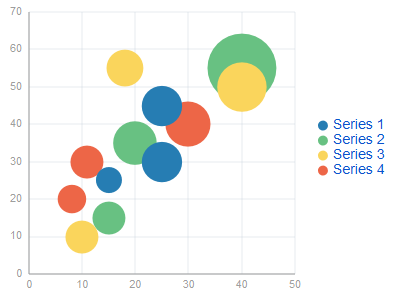
In Example 13-74, the attributeGroups element is used to set common style attributes for a related group of data items.
Example 13-74 Bubble Chart Definition with Attribute Groups
<dvtm:bubbleChart id="bubbleChart1"
                  value="#{bindings.bubbleData.collectionModel}"
                  dataSelection="multiple"
                  rolloverBehavior="dim"
                  animationOnDisplay="auto"
                  title="Bubble Chart"
                  var="row">
   <amx:facet name="dataStamp">
      <dvtm:chartDataItem id="chartDataItem1"
                          group="#{row.label}"
                          x="#{row.x}"
                          y="#{row.y}" >
         <dvtm:attributeGroups id="ag1" type="color" value="#{row.category}" />
         <dvtm:attributeGroups id="ag2" type="shape" value="#{row.brand}" />
      </dvtm:chartDataItem>
   </amx:facet>
</dvtm:bubbleChart>
The data model for a bubble chart is represented by a collection of items (rows) that describe individual data items. Typically, properties of each bar include the following:
-
label: data item label (optional); -
x,y: value coordinates (required); -
z: the size of data item (required).
The data must include the same number of groups per series. If any of the series or data pairs are missing, it is passed to the API as null.
For information on attributes of the bubbleChart and dvtm child elements that you can define for this component, see Oracle Fusion Middleware Tag Reference for Oracle Mobile Application Framework.
You can define a facet child element from the amx namespace. The facet can have a chartDataItem as its child (see Section 13.5.16.1, "Defining Chart Data Item").
You can style the Bubble Chart component's top-level element by overwriting the default CSS settings defined in the following class:
.dvtm-bubbleChart
   - supported properties: all
For more information on chart styling, see Section 13.5.10, "How to Style Chart Components."
For information on how to extend CSS files, see Section 13.6.4, "How to Style Data Visualization Components."
13.5.4 How to Create a Combo Chart
A Combo Chart (comboChart) represents an overlay of two or more different charts, such as a line and bar chart.
Example 13-75 shows the comboChart element defined in a MAF AMX file. The dataStamp facet is specified with a nested chartDataItem element. The seriesStamp facet overrides the default style properties for the series and sets custom series styles using the seriesStyle elements.
Example 13-75 Combo Chart Definition
<dvtm:comboChart id="comboChart1"
                 value="#{bindings.barData.collectionModel}"
                 var="row"
                 inlineStyle="width: 400px; height: 300px;"
                 animationOnDisplay="auto"
                 animationDuration="1500" >
   <amx:facet name="dataStamp">
      <dvtm:chartDataItem id="chartDataItem1"
                          series="#{row.series}"
                          group="#{row.group}"
                          value="#{row.value}" />
   </amx:facet>
   <amx:facet name="seriesStamp">
      <dvtm:seriesStyle id="seriesStyle1"
                        series="#{row.series}"
                        type="bar"
                        rendered="#{(row.series eq 'Series 1') or
                                    (row.series eq 'Series 2') or
                                    (row.series eq 'Series 3')}" />
      <dvtm:seriesStyle id="seriesStyle2"
                        series="#{row.series}"
                        type="line"
                        lineWidth="5"
                        rendered="#{(row.series eq 'Series 4') or
                                    (row.series eq 'Series 5')}" />
   </amx:facet>
   <dvtm:yAxis id="yAxis1"
               axisMaxValue="80.0"
               majorIncrement="20.0"
               title="yAxis Title" />
   <dvtm:legend position="start" id="l1" />
</dvtm:comboChart>
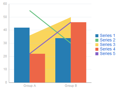
The orientation attribute allows you to define the Combo Chart as either horizontal or vertical.
For information on attributes of the comboChart and dvtm child elements that you can define for this component, see Oracle Fusion Middleware Tag Reference for Oracle Mobile Application Framework.
You can define a facet child element from the amx namespace. The facet can have a chartDataItem as its child (see Section 13.5.16.1, "Defining Chart Data Item").
You can style the Combo Chart component's top-level element by overwriting the default CSS settings defined in the following class:
.dvtm-comboChart
   - supported properties: all
For more information on chart styling, see Section 13.5.10, "How to Style Chart Components."
For information on how to extend CSS files, see Section 13.6.4, "How to Style Data Visualization Components."
13.5.5 How to Create a Line Chart
You use the Line Chart (lineChart) to visually represent data where sets of data items are related and categorized into groups and series. The series are visualized using graphical elements with some common style properties (such as, for example, a line color, width, or style). Those properties have to be applied at the series level instead of per each individual data item. You have an option to use the default or custom series styles.
The Line Chart can be zoomed and scrolled along its X Axis. This is enabled through the use of the zoomAndScroll attribute.
Example 13-76 shows the lineChart element defined in a MAF AMX file. To create a basic line chart with default series style, you pass it a collection and specify the dataStamp facet with a nested chartDataItem element.
Example 13-76 Line Chart Definition with Default Series Styles
<dvtm:lineChart id="lineChart1"
                inlineStyle="width: 400px; height: 300px;"
                rolloverBehavior="dim"
                animationOnDisplay="auto"
                value="#{bindings.lineData1.collectionModel}"
                var="row" >
   <amx:facet name="dataStamp">
      <dvtm:chartDataItem id="chartDataItem1"
                          series="#{row.series}"
                          group="#{row.group}"
                          value="#{row.value}"
                          color="#{row.color}" />
   </amx:facet>
</dvtm:lineChart>
Data items are initialized in the collection model and equipped with the stamping mechanism. At a minimum, each collection row must include the following properties:
-
series: name of the series to which this line belongs; -
group: name of the group to which this line belongs; -
value: the data item value.
The collection row might also include other properties, such as color or markerShape, applicable to individual data items.
You can use attribute groups (attributeGroups element) to set style properties for a group of data items based on some grouping criteria, as Example 13-77 shows. In this case, the data item color and shape attributes are set based on the additional grouping expression. The attributeGroups can have the following child elements:
-
attributeExceptionRulefrom thedvtmnamespace: replaces an attribute value with another when a particular boolean condition is met. -
attributeMatchRulefrom thedvtmnamespace: replaces an attribute when the data matches a certain value. -
attributefrom theamxnamespace.
Example 13-77 Line Chart Definition with Default Series Styles and Grouping
<dvtm:lineChart id="lineChart1"
                inlineStyle="width: 400px; height: 300px;"
                rolloverBehavior="dim"
                animationOnDisplay="auto"
                title="Line Chart"
                value="#{bindings.lineData1.collectionModel}"
                var="row" >
   <amx:facet name="dataStamp">
      <dvtm:chartDataItem id="chartDataItem1"
                          series="#{row.series}"
                          group="#{row.group}"
                          value="#{row.value}" />
         <dvtm:attributeGroups id="ag1"
                               type="color"
                               value="#{row.brand}" />
      </dvtm:chartDataItem>
   </amx:facet>
</dvtm:lineChart>
Note:
In Example 13-76 and Example 13-77, since custom styles are not set at the series level, series are displayed with the colors based on the default color ramp.To override the default style properties for the series, you can define an optional seriesStamp facet and set custom series styles using the seriesStyle elements, as Example 13-78 shows.
Example 13-78 Line Chart Definition with Custom Series Styles
<dvtm:lineChart id="lineChart1"
                inlineStyle="width: 400px; height: 300px;"
                rolloverBehavior="dim"
                animationOnDisplay="auto"
                title="Line Chart"
                value="#{bindings.lineData1.collectionModel}"
                var="row" >
   <amx:facet name="dataStamp">
      <dvtm:chartDataItem id="chartDataItem1"
                          series="#{row.series}"
                          group="#{row.group}"
                          value="#{row.value}" />
   </amx:facet>
   <amx:facet name="seriesStamp">
      <dvtm:seriesStyle series="#{row.series}"
                        lineStyle="#{row.lineStyle}"
                        lineWidth="#{row.lineWidth}" />
   </amx:facet>
</dvtm:lineChart>
In the preceding example, the seriesStyle elements are grouped based on the value of the series attribute. Series with the same name are supposed to share the same set of properties defined by other attributes of the seriesStyle, such as color, lineStyle, lineWidth, and so on. When MAF AMX encounters different attribute values for the same series name, it applies the value which was processed last.
Alternatively, you can control the series styles in a MAF AMX charts using the rendered attribute of the seriesStyle element, as Example 13-79 shows.
Example 13-79 Line Chart Definition with Filtered Series Styles
<dvtm:lineChart id="lineChart1"
                inlineStyle="width: 400px; height: 300px;"
                rolloverBehavior="dim"
                animationOnDisplay="auto"
                title="Line Chart"
                value="#{bindings.lineData1.collectionModel}"
                var="row" >
   <amx:facet name="dataStamp">
      <dvtm:chartDataItem id="chartDataItem1"
                          series="#{row.series}"
                          group="#{row.group}"
                          value="#{row.value}"
                          color="#{row.color}" />
   </amx:facet>
   <amx:facet name="seriesStamp">
      <dvtm:seriesStyle series="#{row.series}"
                        color="red"
                        lineWidth="3"
                        lineStyle="solid"
                        rendered="#{row.series == 'Coke'}" />
      <dvtm:seriesStyle series="#{row.series}"
                        color="blue"
                        lineWidth="2"
                        lineStyle="dotted"
                        rendered="#{row.series == 'Pepsi'}" />
   </amx:facet>
</dvtm:lineChart>
The orientation attribute allows you to define the Line Chart as either horizontal or vertical.
For information on attributes of the lineChart and dvtm child elements that you can define for this component, see Oracle Fusion Middleware Tag Reference for Oracle Mobile Application Framework.
You can define a facet child element from the amx namespace. The facet can have a chartDataItem as its child (see Section 13.5.16.1, "Defining Chart Data Item").
You can style the Line Chart component's top-level element by overwriting the default CSS settings defined in the following class:
.dvtm-lineChart
   - supported properties: all
For more information on chart styling, see Section 13.5.10, "How to Style Chart Components."
For information on how to extend CSS files, see Section 13.6.4, "How to Style Data Visualization Components."
13.5.6 How to Create a Pie Chart
You use a Pie Chart (pieChart) to illustrate proportional division of data, with each data item represented by a pie segment (slice). Slices can be sorted by size (from largest to smallest), and small slices can be aggregated into a single "other" slice.
Example 13-80 shows the pieChart element defined in a MAF AMX file. The dataStamp facet is specified with a nested pieDataItem element.
Example 13-80 Pie Chart Definition
<dvtm:pieChart id="pieChart1"
               inlineStyle="width: 400px; height: 300px;"
               value="#{bindings.pieData.collectionModel}"
               var="row"
               animationOnDisplay="zoom"
               animationDuration="3000" >
   <amx:facet name="dataStamp">
      <dvtm:pieDataItem id="pieDataItem1"
                        label="#{row.name}"
                        value="#{row.data}" />
   </amx:facet>
   <dvtm:legend position="bottom" id="l1" />
</dvtm:pieChart>
You can configure the positioning of the pie slice labels using the sliceLabelPosition attribute. By default (auto), labels are placed inside of a slice if the slice is big enough to accommodate the label; otherwise the labels are placed outside the slice.
You can also define the explosion (slice separation) effect for a Pie Chart component by setting the selectionEffect attribute.
The data model for a pie chart is represented by a collection of items that define individual pie data items. Typically, properties of each data item include the following:
-
label: slice label; -
value: slice value.
The model might also define other properties of the data item, such as the following:
-
borderColor: slice border color; -
color: slice color; -
explode: slice explosion offset.
For information on attributes of the pieChart and dvtm child elements that you can define for this component, see Oracle Fusion Middleware Tag Reference for Oracle Mobile Application Framework.
You can define a facet child element from the amx namespace. The facet can have a pieDataItem as its child (see Section 13.5.16.4, "Defining Pie Data Item").
13.5.6.1 Configuring the Pie Chart as a Ring Chart
You can create a Pie Chart component with an empty center so it looks like a ring. The size of the empty space (and, subsequently, the width of the ring) is configured using the innerRadius attribute of the pieChart. You may also specify text for the center of the ring by setting the centerLabel attribute.
13.5.6.2 Styling the Pie Chart
You can style the Pie Chart component by overwriting the default CSS settings defined in dvtm-pieChart, dvtm-chartPieLabel, dvtm-chartPieCenterLabel, and dvtm-chartSliceLabel classes:
-
The top-level element can be styled using
.dvtm-pieChart
   - supported properties: all
-
The pie labels can be styled using
.dvtm-chartPieLabel - supported properties: font-family, font-size, font-weight, color, font-style -
The pie slice labels can be styled using
.dvtm-chartSliceLabel - supported properties: font-family, font-size, font-weight, color, font-style -
The ring center label can be styled using
.dvtm-chartPieCenterLabel
   - supported properties:
               font-family, font-size, font-weight, color, font-style
For more information on chart styling, see Section 13.5.10, "How to Style Chart Components."
For more information on how to extend CSS files, see Section 13.6.4, "How to Style Data Visualization Components."
13.5.7 How to Create a Scatter Chart
A Scatter Chart (scatterChart) displays data as unconnected dots that represent data items, where each item has x, y coordinates and size. In addition, each data item can have various style attributes, such as color and markerShape. You can either set properties of each data item individually, or categorize the data items into groups based on various criteria. You may use multiple grouping criteria at the same time, and may also use different style attributes to visualize the data items relationships. However, unlike line charts (see Section 13.5.5, "How to Create a Line Chart") or area charts (see Section 13.5.1, "How to Create an Area Chart"), scatter charts do not have a strict notion of the series and groups.
The Scatter Chart can be zoomed and scrolled along its X and Y Axis. This is enabled through the use of the zoomAndScroll attribute.
Example 13-81 shows the scatterChart element defined in a MAF AMX file. The dataStamp facet is specified with a nested chartDataItem element. The color and markerShape attributes of each data item are set individually based on the values supplied in the data model.
Example 13-81 Scatter Chart Definition
<dvtm:scatterChart id="scatterChart1"
                   inlineStyle="width: 400px; height: 300px;"
                   animationOnDisplay="zoom"
                   animationDuration="3000"
                   value="#{bindings.scatterData.collectionModel}"
                   var="row" >
   <amx:facet name="dataStamp">
      <dvtm:chartDataItem id="chartDataItem1"
                          group="#{row.group}"
                          color="#{row.color}"
                          markerShape="auto"
                          x="#{row.data.x}"
                          y="#{row.data.y}">
         <dvtm:attributeGroups type="color"
                               value="#{row.series}"
                               id="ag1" />
      </dvtm:chartDataItem>
   </amx:facet>
   <dvtm:xAxis id="xAxis1" title="X Axis Title" />
   <dvtm:yAxis id="xAxis2" title="Y Axis Title" />
   <dvtm:legend position="bottom" id="l1" />
</dvtm:scatterChart>
The data model for a scatter chart is represented by a collection of items (rows) that describe individual data items. Attributes of each data item are defined by stamping (dataStamp) and usually include the following:
-
x,y: value coordinates (required); -
markerSize: the size of the marker (optional).
The model might also define other properties of the data item, such as the following:
-
borderColor: data item border color; -
color: data item color.
For information on attributes of the scatterChart and dvtm child elements that you can define for this component, see Oracle Fusion Middleware Tag Reference for Oracle Mobile Application Framework.
You can define a facet child element from the amx namespace. The facet can have a chartDataItem as its child (see Section 13.5.16.1, "Defining Chart Data Item").
You can style the Scatter Chart component's top-level element by overwriting the default CSS settings defined in the following class:
.dvtm-scatterChart
   - supported properties: all
For more information on chart styling, see Section 13.5.10, "How to Style Chart Components."
For information on how to extend CSS files, see Section 13.6.4, "How to Style Data Visualization Components."
13.5.8 How to Create a Spark Chart
A Spark Chart (sparkChart) is a simple, condensed chart that displays trends or variations, often in the column of a table. The charts are often used in a dashboard to provide additional context to a data-dense display.
Example 13-82 shows the sparkChart element defined in a MAF AMX file. The dataStamp facet is specified with a nested sparkDataItem element.
Example 13-82 Spark Chart Definition
<dvtm:sparkChart id="sparkChart1"
                 value="#{bindings.sparkData.collectionModel}"
                 var="row"
                 type="line"
                 inlineStyle="width:400px; height:300px; float:left;">
   <amx:facet name="dataStamp">
      <dvtm:sparkDataItem id="sparkDataItem1" value="#{row.value}" />
   </amx:facet>
</dvtm:sparkChart>
The data model for a spark chart is represented by a collection of items (rows) that describe individual spark data items. Typically, properties of each data item include the following:
-
value: spark value.
For information on attributes and dvtm child elements of the sparkChart, see Oracle Fusion Middleware Tag Reference for Oracle Mobile Application Framework.
You can define a facet child element from the amx namespace. The facet can have a sparkDataItem as its child (see Section 13.5.16.5, "Defining Spark Data Item").
You can style the Spark Chart component's top-level element by overwriting the default CSS settings defined in the following class:
.dvtm-sparkChart
   - supported properties: all
For more information on chart styling, see Section 13.5.10, "How to Style Chart Components."
For information on how to extend CSS files, see Section 13.6.4, "How to Style Data Visualization Components."
13.5.9 How to Create a Funnel Chart
A Funnel Chart (funnelChart) component provides a visual representation of data related to steps in a process. The steps appear as vertical slices across a horizontal cylinder. As the actual value for a given step or slice approaches the quota for that slice, the slice fills. Typically, a Funnel Chart requires actual values and target values against a stage value, which might be time.
Example 13-83 shows the funnelChart element defined in a MAF AMX file. The dataStamp facet is specified with a nested funnelDataItem element.
Example 13-83 Funnel Chart Definition
<dvtm:funnelChart id="funnelChart1"
                  var="row"
                  value="#{bindings.funnelData.collectionModel}"
                  styleClass="dvtm-gallery-component"
                  sliceGaps="on"
                  threeDEffect="#{pageFlowScope.threeD ? 'on' : 'off'}"
                  orientation="#{pageFlowScope.orientation}"
                  dataSelection="#{pageFlowScope.dataSelection}"
                  footnote="#{pageFlowScope.footnote}"
                  footnoteHalign="#{pageFlowScope.footnoteHalign}"
                  hideAndShowBehavior="#{pageFlowScope.hideAndShowBehavior}"
                  rolloverBehavior="#{pageFlowScope.rolloverBehavior}"
                  seriesEffect="#{pageFlowScope.seriesEffect}"
                  subtitle="#{pageFlowScope.titleDisplay ?
                                            pageFlowScope.subtitle : ''}"
                  title="#{pageFlowScope.titleDisplay ? pageFlowScope.title : ''}"
                  titleHalign="#{pageFlowScope.titleHalign}"
                  animationOnDataChange="#{pageFlowScope.animationOnDataChange}"
                  animationDuration="#{pageFlowScope.animationDuration}"
                  animationOnDisplay="#{pageFlowScope.animationOnDisplay}"
                  shortDesc="#{pageFlowScope.shortDesc}">
   <amx:facet name="dataStamp">
      <dvtm:funnelDataItem id="funnelDataItem1"
                           label="#{row.label}"
                           value="#{row.value}"
                           targetValue="#{row.targetValue}"
                           color="#{row.color}"
                           shortDesc="This is a tooltip">
      </dvtm:funnelDataItem>
   </amx:facet>
   <dvtm:legend id="l1"
                position="#{pageFlowScope.legendPosition}"
                rendered="#{pageFlowScope.legendDisplay}"/>
</dvtm:funnelChart>
The data model for a funnel chart is represented by a collection of items (rows) that describe individual funnel data items. Typically, properties of each data item include the following:
-
value: funnel value -
label: funnel slice label
For information on attributes and dvtm child elements of the funnelChart, see Oracle Fusion Middleware Tag Reference for Oracle Mobile Application Framework.
You can define a facet child element from the amx namespace. The facet can have a funnelDataItem as its child (see Section 13.5.16.6, "Defining Funnel Data Item").
You can style the Funnel Chart component by overwriting the default CSS settings defined in dvtm-funnelChart and dvtm-funnelDataItem classes:
-
The top-level element can be styled using
.dvtm-funnelChart
   - supported properties: all
-
The Funnel Chart data items cal be styled using
.dvtm-funnelDataItem
   - supported properties: border-color, background-color
For more information on chart styling, see Section 13.5.10, "How to Style Chart Components."
For more information on how to extend CSS files, see Section 13.6.4, "How to Style Data Visualization Components."
13.5.10 How to Style Chart Components
With the exception of the Spark Chart, you can style chart components by overwriting the default CSS settings defined in the following classes:
-
A chart component's legend can be styled using
.dvtm-legend - supported properties used for text styling: font-family, font-size, font-weight, color, font-style - supported properties used for background styling: background-color - supported properties used for border styling: border-color (used when border width > 0) .dvtm-legendTitle - supported properties: font-family, font-size, font-weight, color, font-style .dvtm-legendSectionTitle - supported properties: font-family, font-size, font-weight, color, font-style -
A chart component's title, subtitle, and so on, can be styled using
.dvtm-chartTitle - supported properties: font-family, font-size, font-weight, color, font-style .dvtm-chartSubtitle - supported properties: font-family, font-size, font-weight, color, font-style .dvtm-chartFootnote - supported properties: font-family, font-size, font-weight, color, font-style .dvtm-chartTitleSeparator - supported properties: visibility (is title separator rendered), border-top-color, border-bottom-color -
A chart component's axes can be styled using
.dvtm-chartXAxisTitle
   - supported properties:
               font-family, font-size, font-weight, color, font-style

.dvtm-chartYAxisTitle
   - supported properties:
               font-family, font-size, font-weight, color, font-style

.dvtm-chartY2AxisTitle
   - supported properties:
               font-family, font-size, font-weight, color, font-style

.dvtm-chartXAxisTickLabel
   - supported properties:
               font-family, font-size, font-weight, color, font-style

.dvtm-chartYAxisTickLabel
   - supported properties:
               font-family, font-size, font-weight, color, font-style

.dvtm-chartY2AxisTickLabel
   - supported properties:
               font-family, font-size, font-weight, color, font-style
In addition to styling the chart component's top-level element, you can style specific child elements of some charts.
13.5.11 How to Use Events with Chart Components
You can use the ViewportChangeEvent to handle zooming and scrolling of chart components. When either zooming or scrolling occurs, the component fires an event loaded with information that defines the new viewport.
You can specify the viewportChangeListener as an attribute of Area Chart, Bar Chart, Combo Chart, and Line Chart components.
For more information, see the following:
13.5.12 How to Create a LED Gauge
Unlike charts, gauges focus on a single data point and examine that point relative to minimum, maximum, and threshold indicators to identify problem areas. A LED (lighted electronic display) gauge (ledGauge) graphically depicts a measurement, such as key performance indicator (KPI). There are several styles of LED gauges. The ones with arrows are used to indicate good (up arrow), fair (left- or right-pointing arrow), or poor (down arrow). You can specify any number of thresholds for a gauge. However, some LED gauges (such as those with arrow or triangle indicators) support a limited number of thresholds because there is a limited number of meaningful directions for them to point. For arrow or triangle indicators, the threshold limit is three.
Example 13-84 shows the ledGauge element defined in a MAF AMX file.
Example 13-84 LED Gauge Definition
<dvtm:ledGauge id="ledGauge1"
               value="65"
               inlineStyle="width: 100px; height: 80px; float: left;
                            border-color: navy; background-color: lightyellow;">
   <dvtm:threshold id="threshold1" text="Low" maxValue="40" />
   <dvtm:threshold id="threshold2" text="Medium" maxValue="60" />
   <dvtm:threshold id="threshold3" text="High" maxValue="80" />
</dvtm:ledGauge>
The data model for a LED gauge is represented by a single metric value which is specified by the value attribute.
For information on attributes of the ledGauge and dvtm child elements that you can define for this component, see Oracle Fusion Middleware Tag Reference for Oracle Mobile Application Framework.
You can define the following amx child elements:
-
showPopupBehavior(see Section 13.2.8, "How to Use a Popup Component") -
closePopupBehavior(see Section 13.2.8, "How to Use a Popup Component") -
validationBehavior(see Section 13.9, "Validating Input")
13.5.13 How to Create a Status Meter Gauge
A Status Meter Gauge (statusMeterGauge) indicates the progress of a task or the level of some measurement along a horizontal rectangular bar or a circle. One part of the component shows the current level of a measurement against the ranges marked on another part. In addition, thresholds can be displayed behind the indicator whose size can be changed.
MAF AMX data visualization provides support for the reference line (referenceLine) on its status meter gauge component. You can use this line to produce a bullet graph.
Example 13-85 shows the statusMeterGauge element defined in a MAF AMX file.
Example 13-85 Status Meter Gauge Definition
<dvtm:statusMeterGauge id="meterGauge1"
                       value="65"
                       animationOnDisplay="auto"
                       animationDuration="1000"
                       inlineStyle="width: 300px;
                                    height: 30px;
                                    float: left;
                                    border-color: black;
                                    background-color: lightyellow;"
                       minValue="0"
                       maxValue="100">
   <dvtm:metricLabel/>
   <dvtm:threshold id="threshold1" text="Low" maxValue="40" />
   <dvtm:threshold id="threshold2" text="Medium" maxValue="60" />
   <dvtm:threshold id="threshold3" text="High" maxValue="80" />
</dvtm:statusMeterGauge>
To create a Status Meter Gauge represented by a vertical rectangle, you set its orientation attribute to vertical. By default, this attribute is set to horizontal resulting in a horizontal rectangle.
To create a Status Meter Gauge represented by a circle (see Figure 13-85), you set its orientation attribute to circular.
The data model for a status meter gauge is a single metric value which is specified by the value attribute. In addition, the minimum and maximum values can also be specified by the minValue and maxValue attributes.
For information on attributes of the statusMeterGauge and dvtm child elements that you can define for this component, see Oracle Fusion Middleware Tag Reference for Oracle Mobile Application Framework.
You can define the following amx child elements:
-
showPopupBehavior(see Section 13.2.8, "How to Use a Popup Component") -
closePopupBehavior(see Section 13.2.8, "How to Use a Popup Component") -
validationBehavior(see Section 13.9, "Validating Input")
13.5.14 How to Create a Dial Gauge
A Dial Gauge (dialGauge) specifies ranges of values (thresholds) that vary from poor to excellent. The gauge indicator specifies the current value of the metric while the graphic allows for evaluation of the status of that value.
Example 13-85 shows the dialGauge element defined in a MAF AMX file.
Example 13-86 Dial Gauge Definition
<dvtm:dialGauge id="dialGauge1"
                background="#{pageFlowScope.background}"
                indicator="#{pageFlowScope.indicator}"
                value="#{pageFlowScope.value}"
                minValue="#{pageFlowScope.minValue}"
                maxValue="#{pageFlowScope.maxValue}"
                animationDuration="1000"
                animationOnDataChange="auto"
                animationOnDisplay="auto"
                shortDesc="#{pageFlowScope.shortDesc}"
                inlineStyle="#{pageFlowScope.inlineStyle}"
                styleClass="#{pageFlowScope.styleClass}"
                readOnly="true">
</dvtm:dialGauge>
The data model for a dial gauge is a single metric value which is specified by the value attribute. In addition, the minimum and maximum values can be specified by the minValue and maxValue attributes.
For information on attributes of the dialGauge and dvtm child elements that you can define for this component, see Oracle Fusion Middleware Tag Reference for Oracle Mobile Application Framework.
Example 13-87 shows the definition of dialGauge element with the dark background theme and custom tick labels setting a range from -5000 to 5000.
Example 13-87 Defining Metric and Tick Labels
<dvtm:dialGauge id="dialGauge1"
                background="circleDark"
                indicator="needleDark"
                value="#{pageFlowScope.value}"
                minValue="-5000"
                maxValue="5000"
                readOnly="false">
   <dvtm:metricLabel id="metricLabel1"
                     scaling="thousand"
                     labelStyle="font-family: Arial, Helvetica;
                                 font-size: 20; color: white;"/>
   <dvtm:tickLabel id="tickLabel1"
                   scaling="thousand"
                   labelStyle="font-family: Arial, Helvetica;
                               font-size: 18; color: white;"/>
</dvtm:dialGauge>
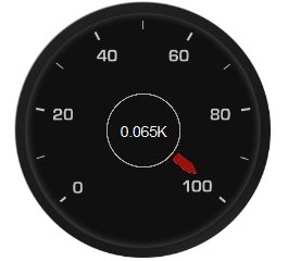
You can define the following amx child elements for the dialGauge:
-
showPopupBehavior(see Section 13.2.8, "How to Use a Popup Component") -
closePopupBehavior(see Section 13.2.8, "How to Use a Popup Component") -
validationBehavior(see Section 13.9, "Validating Input")
13.5.15 How to Create a Rating Gauge
A Rating Gauge (ratingGauge) provides means to view and modify ratings on a predefined visual scale. By default, a rating unit is represented by a star. You can configure it as a circle, rectangle, star, or diamond by setting the shape attribute of the ratingGauge.
Example 13-88 shows the ratingGauge element defined in a MAF AMX file.
Example 13-88 Rating Gauge Definition
<dvtm:ratingGauge id="ratingGauge1"
                  value="#{pageFlowScope.value}"
                  minValue="0"
                  maxValue="5"
                  inputIncrement="full"
                  shortDesc="#{pageFlowScope.shortDesc}"
                  inlineStyle="#{pageFlowScope.inlineStyle}"
                  readOnly="true"
                  shape="circle"
                  unselectedShape="circle">
</dvtm:ratingGauge>
The data model for a rating gauge is a single metric value which is specified by the value attribute. In addition, the minimum and maximum values can be specified by the minValue and maxValue attributes.
For information on attributes of the ratingGauge and dvtm child elements that you can define for this component, see Oracle Fusion Middleware Tag Reference for Oracle Mobile Application Framework.
You can define the following amx child elements for the ratingGauge:
-
showPopupBehavior(see Section 13.2.8, "How to Use a Popup Component") -
closePopupBehavior(see Section 13.2.8, "How to Use a Popup Component") -
validationBehavior(see Section 13.9, "Validating Input")
13.5.15.1 Applying Custom Styling to the Rating Gauge Component
Depending on the action performed by the user on a rating gauge component, its units (images) can acquire one of the following states:
-
selected: the unit is selected. -
unselected: the unit is not selected. -
hover: the unit is being hovered over.Note:
On mobile devices with touch interface, the hover state is invoked through the tap-and-hold gesture. -
changed: the unit has been changed.
Each state can be represented by two attributes: color and borderColor. By default, the shape attribute of the ratingGauge determines the selection of the hover and changed states. The unselected state can be set separately using the unselectedShape attribute of the ratingGauge.
You can style the Rating Gauge component by overwriting the default CSS settings. For more information on how to extend CSS files, see Section 13.6.4, "How to Style Data Visualization Components."
Example 13-89 shows the default CSS style definitions for the color and borderColor of each state of the rating gauge unit.
.dvtm-ratingGauge {
}

.dvtm-ratingGauge .dvtm-ratingGaugeSelected {
   border-width: 1px;
   border-style: solid;
   border-color: #FFC61A;
   color: #FFBB00;
}

.dvtm-ratingGauge .dvtm-ratingGaugeUnselected {
   border-width: 1px;
   border-style: solid;
   border-color: #D3D3D3;
   color: #F4F4F4;
}

.dvtm-ratingGauge .dvtm-ratingGaugeHover {
   border-width: 1px;
   border-style: solid;
   border-color: #6F97CF;
   color: #7097CF;
}

.dvtm-ratingGauge .dvtm-ratingGaugeChanged {
   border-width: 1px;
   border-style: solid;
   border-color: #A8A8A8;
   color: #FFBB00;
}
13.5.16 How to Define Child Elements for Chart and Gauge Components
You can define a variety of child elements for charts and gauges. The following are some of these child elements:
-
chartDataItem(see Section 13.5.16.1, "Defining Chart Data Item") -
xAxis,yAxis, andy2Axis(see Section 13.5.16.3, "Defining and Configuring X Axis, YAxis, and Y2Axis") -
legend(see Section 13.5.16.2, "Defining and Configuring Legend") -
pieDataItem(see Section 13.5.16.4, "Defining Pie Data Item") -
sparkDataItem(see Section 13.5.16.5, "Defining Spark Data Item") -
threshold(see Section 13.5.16.7, "Defining Threshold") -
funnelDataItem
For more information on these and other child elements, see Oracle Fusion Middleware Tag Reference for Oracle Mobile Application Framework.
In JDeveloper, child components of data visualization components are located under MAF AMX Data Visualization > Shared Child Tags and MAF AMX Data Visualization > Other Type-Specific Child Tags in the Components window (see Figure 13-68).
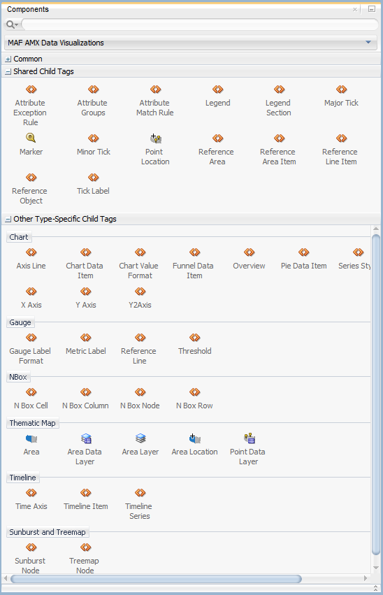
13.5.16.1 Defining Chart Data Item
The Chart Data Item (chartDataItem) element specifies the parameters that chart data items use in all supported charts, except the pie chart.
You can enable the text display on Chart Data Items and control its label, the label position, and the label style by setting relevant attributes of the chartDataItem element, as well as the dataLabelPosition attribute of the chart itself to specify the position of all data labels in a given chart.
Note:
The Spark Chart, Pie Chart, and Funnel Chart components do not support thedataLabelPosition attribute.For information on attributes of the chartDataItem element, see Oracle Fusion Middleware Tag Reference for Oracle Mobile Application Framework.
13.5.16.2 Defining and Configuring Legend
The Legend (legend) element specifies the legend parameters.
You can customize sizes of chart areas dedicated to legend using the Legend component's size and maxSize attributes.
For more information on attributes of the legend element, see Oracle Fusion Middleware Tag Reference for Oracle Mobile Application Framework.
13.5.16.3 Defining and Configuring X Axis, YAxis, and Y2Axis
X Axis (xAxis) and Y Axis (yAxis) elements define the X and Y axis for a chart. Y2Axis (y2Axis) defines an optional Y2 axis. These elements are declared as follows in a MAF AMX file:
<dvtm:xAxis id="xAxis1" scrolling="on" axisMinValue="0.0" axisMaxValue="50.0" />
You can customize sizes of chart areas dedicated to axis using the size and maxSize attributes of the X Axis, Y Axis, and Y2Axis components. In addition, you can customize color, width, and style of the axis baseline by configuring its Major Tick child element.
For more information on attributes and child elements of xAxis, yAxis, and y2Axis elements, see Oracle Fusion Middleware Tag Reference for Oracle Mobile Application Framework.
13.5.16.4 Defining Pie Data Item
The Pie Data Item (pieDataItem) element specifies the parameters of the pie chart slices (see Section 13.5.6, "How to Create a Pie Chart").
For information on attributes of the pieDataItem element, see Oracle Fusion Middleware Tag Reference for Oracle Mobile Application Framework.
13.5.16.5 Defining Spark Data Item
The Spark Data Item (sparkDataItem) element specifies the parameters of the spark chart items (see Section 13.5.8, "How to Create a Spark Chart").
For information on attributes of the sparkDataItem element, see Oracle Fusion Middleware Tag Reference for Oracle Mobile Application Framework.
13.5.16.6 Defining Funnel Data Item
The Funnel Data Item (funnelDataItem) element specifies the parameters of the funnel chart items (see Section 13.5.9, "How to Create a Funnel Chart").
For information on attributes of the funnelDataItem element, see Oracle Fusion Middleware Tag Reference for Oracle Mobile Application Framework.
13.5.16.7 Defining Threshold
The Threshold (threshold) element specifies the threshold ranges of a gauge (see Section 13.5.12, "How to Create a LED Gauge" and Section 13.5.13, "How to Create a Status Meter Gauge").
For information on attributes of the threshold element, see Oracle Fusion Middleware Tag Reference for Oracle Mobile Application Framework.
13.5.17 How to Create a Geographic Map Component
A Geographic Map (geographicMap) represents business data in one or more interactive layers of information superimposed on a single map. You can configure this component to use either Google or Oracle maps as the underlying map provider (see Section 13.5.17.1, "Configuring Geographic Map Components With the Map Provider Information").
Example 13-90 shows the geographicMap element defined in a MAF AMX file.
Example 13-90 Geographic Map Definition
<dvtm:geographicMap id="g1" mapType="ROADMAP"
                    centerX="-98.57" centerY="39.82"
                    zoomLevel="2" initialZooming="auto">
   <dvtm:pointDataLayer id="pdl1"
                        var="row"
                        value="#{bindings.locationData.collectionModel}"
                        dataSelection="multiple"
                        selectionListener="#{myBean.doSomeGood}">
      <dvtm:pointLocation id="pl1" type="address" address="#{row.address}">
         <dvtm:marker shortDesc="#{row.shortDesc}" id="m1" />
      </dvtm:pointLocation>
   </dvtm:pointDataLayer>
</dvtm:geographicMap>
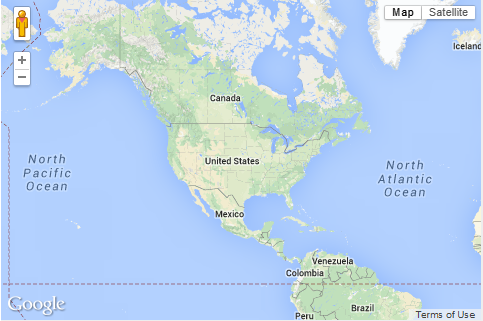
You can define a pointDataLayer child element for the geographicMap. The pointDataLayer allows you to display data associated with a point on the map.The pointDataLayer can have a pointLocation as a child element. The pointLocation specifies the columns in the data layer's model that determine the location of the data points. These locations can be represented either by address or by X and Y coordinates.
The pointLocation can have a marker as a child element. The marker is used to stamp out predefined or custom shapes associated with data points on the map. The marker supports a set of properties for specifying a URI to an image that is to be rendered as a marker. The marker can have a convertNumber as its child element (see Section 13.3.26, "How to Convert Numerical Values"). In addition, you can enable a Popup (see Section 13.2.8, "How to Use a Popup Component") to be displayed on a geographicMap's marker. To do so, you declare the showPopupBehavior element as a child of the marker element, and then set the showPopupBehavior's alignId attribute to the value of the marker's id attribute, as Example 13-91 shows.
Example 13-91 Displaying Popup on a Marker
<dvtm:geographicMap id="geographicMap_1" shortDesc="#{pageFlowScope.shortDesc}">
   <dvtm:pointDataLayer id="pdl1"
                        var="row"
                        value=
                          "#{bindings.geographicMapPointData.collectionModel}">


      <dvtm:pointLocation id="pl1"
                          pointX="#{row.pointX}"
                          pointY="#{row.pointY}">
         <dvtm:marker id="marker1"
                      shortDesc="#{row.shortDesc}"
                      rendered="true">
            <amx:showPopupBehavior id="spb1"
                                   popupId="popup1"
                                   alignId="marker1"
                                   align="topCenter"
                                   decoration="anchor"/>
            <amx:setPropertyListener from="#{row.shortDesc}"
                                     to="#{pageFlowScope.currentCity}"
                                     type="action"/>
         </dvtm:marker>
      </dvtm:pointLocation>
   </dvtm:pointDataLayer>
</dvtm:geographicMap>
...
<amx:popup id="popup1" backgroundDimming="off" autoDismiss="true">
   <amx:outputText id="otTest" value="City: #{pageFlowScope.currentCity}"/>
   ...
</amx:popup>
For information on attributes of the geographicMap element and its child elements, see Oracle Fusion Middleware Tag Reference for Oracle Mobile Application Framework.
The Geographic Map component allows for insertion of a pin (creation of a point on the map) using a touch gesture. You can configure this functionality by using the mapInputListener. For more information, see Section 13.5.19, "How to Use Events with Map Components."
13.5.17.1 Configuring Geographic Map Components With the Map Provider Information
To configure a Geographic Map component to use a specific provider for the underlying map (Google or Oracle), you can set the following properties as name-value pairs in the application's adf-config.xml file:
-
mapProvider: specify eitheroraclemapsorgooglemaps. -
geoMapKey: specify the license key if themapProvideris set togooglemaps. -
geoMapClientId: if themapProvideris set togooglemaps, specify the client ID for Google maps business license. -
mapViewerUrl: if themapProvideris set tooraclemaps, specify the map viewer URL for Oracle maps. -
baseMap: if themapProvideris set tooraclemaps, specify the base map to use with Oracle maps.
Note:
To configure the Geographic Map component to use Google maps, you must obtain an appropriate license from Google.Example 13-92 shows the configuration for Google maps.
Example 13-92 Google Maps Configuration
<adf-properties-child xmlns="http://xmlns.oracle.com/adf/config/properties">
   <adf-property name="mapProvider" value="googlemaps"/>
   <adf-property name="geoMapKey" value="your key"/>
</adf-properties-child>
Example 13-93 shows the configuration for Oracle maps.
Example 13-93 Oracle Maps Configuration
<adf-properties-child xmlns="http://xmlns.oracle.com/adf/config/properties">
   <adf-property name="mapProvider" value="oraclemaps"/>
   <adf-property name="mapViewerUrl"
                 value="http://elocation.oracle.com/mapviewer"/>
   <adf-property name="baseMap" value="ELOCATION_MERCATOR.WORLD_MAP"/>
</adf-properties-child>
If you do not specify the map provider information, the MAF AMX Geographic Map component uses Google maps for its map, but without the license key.
For information on issues related to using Google maps as the map provider, see Section A.2, "The Geographic Map Component Limits Number of Address Points."
For information on the adf-config.xml file, see Section C.2, "About the Application Controller Project-Level Resources."
13.5.17.2 Displaying Route in Geographic Map Components
When using Google maps as a provider for the Geographic Map component, you can specify route between two points with possible waypoints by adding a Route (route) child component.
Each Geographic Map component can have multiple Route child components, with each specifying a single route. Route origin, destination and optional waypoints can be specified using the Geographic Map's Point Location child component. By convention, the first Point Location in the set defines the origin and the last defines the destination. All points between these two Point Locations represent route waypoints.
You can define the color, width, and opacity of the line used for visualizing the route in the map. In addition, you can specify a hint indicating whether the route should preferably follow driving routes, bicycling tracks, or walking paths.
Example 13-94 shows how to define a route element in a MAF AMX page.
<dvtm:geographicMap id="gm1">

   <!-- route defined using a collection model -->
   <dvtm:route travelMode="driving" id="d1">
      <amx:iterator value="#{el.collectionModel}" var="row">
         <dvtm:pointLocation address="#{row.address}" type="address"/>
      </amx:iterator>
   </dvtm:route>

   <!-- route with explicitly defined start and destination -->
   <dvtm:route travelMode="driving|walking|bicycling" id="d2">
      <!-- route origin -->
      <dvtm:pointLocation address="#{pageFlowScope.origin}" type="address">
      <!-- route destination -->
      <dvtm:pointLocation address="#{pageFlowScope.destination}" type="address"/>
   </dvtm:route/>

   <dvtm:pointDataLayer id="pdl1">
      ...
   </dvtm:pointDataLayer>

   <dvtm:pointDataLayer id="pdl2">
      ...
   </dvtm:pointDataLayer>

</dvtm:geographicMap>
When the end user clicks or taps on the line representing the route, an ActionEvent is fired. The event can be used to either drive navigation via the action attribute or to invoke a handler in the Java layer using the actionListener attribute. The action can also be used to trigger event listeners and behaviors specified in child setPropertyListener, actionListener, showPopupBehavior, and showPopupBehavior elements. For more information, see Section 13.10, "Using Event Listeners."
13.5.18 How to Create a Thematic Map Component
A Thematic Map (thematicMap) represents business data as patterns in stylized areas or associated markers. Thematic maps focus on data without the geographic details.
Example 13-95 shows the thematicMap element and its children defined in a MAF AMX file.
Example 13-95 Defining Thematic Map
<dvtm:thematicMap id="tm1"
                  animationOnDisplay="#{pageFlowScope.animationOnDisplay}"
                  animationOnMapChange="#{pageFlowScope.animationOnMapChange}"
                  animationDuration="#{pageFlowScope.animationDuration}"
                  basemap="#{pageFlowScope.basemap}"
                           tooltipDisplay="#{pageFlowScope.tooltipDisplay}"
                  inlineStyle="#{pageFlowScope.inlineStyle}"
                  zooming="#{pageFlowScope.zooming}"
                  panning="#{pageFlowScope.panning}"
                  initialZooming="#{pageFlowScope.initialZooming}">
   <dvtm:areaLayer id="areaLayer1"
                   layer="#{pageFlowScope.layer}"
                   animationOnLayerChange=
                      "#{pageFlowScope.animationOnLayerChange}"
                   areaLabelDisplay="#{pageFlowScope.areaLabelDisplay}"
                   labelType="#{pageFlowScope.labelType}"
                   areaStyle="background-color"
                   rendered="#{pageFlowScope.rendered}">
      <dvtm:areaDataLayer id="areaDataLayer1"
                          animationOnDataChange=
                             "#{pageFlowScope.dataAnimationOnDataChange}"
                          animationDuration=
                             "#{pageFlowScope.dataAnimationDuration}"
                          dataSelection="#{pageFlowScope.dataSelection}"
                          var="row"
                          value="#{bindings.thematicMapData.collectionModel}">
         <dvtm:areaLocation id="areaLoc1" name="#{row.name}">
            <dvtm:area action="sales" id="area1" shortDesc="#{row.name}">
               <amx:setPropertyListener id="spl1"
                                        to=
                   "#{DvtProperties.areaChartProperties.dataSelection}"
                                        from="#{row.name}"
                                        type="action"/>
               <dvtm:attributeGroups id="ag1" type="color" value="#{row.cat1}" />
            </dvtm:area>
         </dvtm:areaLocation>
      </dvtm:areaDataLayer>
   </dvtm:areaLayer>
   <dvtm:legend id="l1" position="end">
      <dvtm:legendSection id="ls1" source="ag1"/>
   </dvtm:legend>
</dvtm:thematicMap>
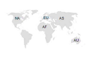
Using the markerZoomBehavior attribute, you can enable scaling of the Thematic Map's markers when the map experiences zooming. You can enable the Marker rotation by setting its rotation attribute, whose value represents the angle at which the marker rotates in clockwise degrees around the center of the image.
MAF AMX Thematic Map supports the following advanced functionality:
-
Custom markers (see Section 13.5.18.1, "Defining Custom Markers")
-
Area isolation (see Section 13.5.18.3, "Defining Isolated Areas")
-
Initial zooming (see Section 13.5.18.4, "Enabling Initial Zooming"
-
Custom base maps (see Section 13.5.18.5, "Defining a Custom Base Map"
For information on attributes of the thematicMap element and its child elements, see Oracle Fusion Middleware Tag Reference for Oracle Mobile Application Framework.
13.5.18.1 Defining Custom Markers
MAF AMX Thematic Map does not support MAF AMX Image component. To use an image in the map's pointLocation, you can specify an image within the pointLocation's marker child element by using its source attribute. If the source attribute is set on the Marker, its shape attribute is ignored by MAF AMX.
The sourceHover, sourceSelected, and sourceHoverSelected attributes allow you to specify images for hover and selection effects. If one of these is not specified, the image specified by the source attribute is used for that particular marker state. If sourceSelected is specified, then its value is used if sourceHoverSelected is not specified. The image can be of any format supported by the mobile device's browser, including PNG, JPG, SVG, and so on.
13.5.18.2 Defining Isolated Area Layers
A region outline is not always needed to convey the geographic location of data. Instead, since the Thematic Map component has the option of centering an image or marker within an area, you have the option of defining invisible area layers where region outlines are not drawn.
To define an invisible area layer, you use the areaStyle attribute of the areaLayer which accepts the CSS values of background-color and border-color as follows:
<dvtm:areaLayer id="areaLayer1"
                ...
                areaStyle="background-color:transparent;border-color:transparent">
This attribute allows you to override the default area layer color and border treatments without using the dvtm-area skinning key.
13.5.18.3 Defining Isolated Areas
You can configure the MAF AMX Thematic Map component to render and zoom to fit on a single isolated area of the map by using the isolatedRowKey attribute of the areaDataLayer, in which case the rest of the areas in the area or area data layers is not rendered.
Note:
You can isolate only one area on a map.13.5.18.4 Enabling Initial Zooming
The initial zooming allows the map component to be rendered as usual, and then zoom to fit on the data objects which includes both markers and areas. To enable this functionality, you use the initialZooming attribute of the Thematic Map.
13.5.18.5 Defining a Custom Base Map
As part of the custom base map support, MAF AMX allows you to specify the following for the Thematic Map component:
-
Layers with images for different resolutions.
-
Point layers with named points that can be referenced from the Point Location (
pointLocation). -
The Thematic Map's
sourceattribute that points to the custom base map metadata XML file.
Note:
MAF AMX does not support the following for custom base maps:-
Stylized areas: since area layers cannot be defined for custom base maps, use point layers.
-
Resource bundles: if you want to add locale-specific tool tips, you can use EL in the
shortDescattribute of the Marker (marker).
To create a custom base map, you specify an area layer which points to a definition in the metadata file (see Example 13-96). To define a basic custom base map, you specify a background layer and a pointer data layer. In the metadata file, you can specify different images for different screen resolutions and display directions, similar to MAF AMX gauge components. Just like a gauge-type component, the Thematic Map chooses the correct image for the layer based on the screen resolution and direction. The display direction is left-to-right.
You can define any number of layers. All named points are accessible in all the layers. The X and Y positions of the named points are mapped to the image dimensions of the first image. The Thematic Map component calculates the position of the points when one of the following occurs:
-
Zooming in is performed.
-
A different image is displayed in a different resolution.
Example 13-96 Metadata File With List of Images
<basemap id="car" >
   <layer id="exterior" >
      <image source="/maps/car-800x800.png"
             width="2560"
             height="1920" />
      <image source="/maps/car-200x200.png"
             width="640"
             height="480" />
   </layer>
</basemap>
Example 13-97 shows a MAF AMX file that declares a custom area layer with points. The MAF AMX file points to the metadata file shown in Example 13-96 containing a list of possible images, which are, in fact, scaled versions of the same image.
Example 13-97 Declaring Custom Area Layer With Points
<dvtm:thematicMap id="tm1" basemap="car" source="customBasemaps/map1.xml" >
   <dvtm:areaLayer id="al1" layer="exterior" >
      <dvtm:pointDataLayer id="pdl1"
                           var="row"
                           value="{bindings.thematicMapData.collectionModel}" >
         <dvtm:pointLocation id="pl1"
                             type="pointXY"
                             pointX="#{row.x}"
                             pointY="#{row.y}" >
            <dvtm:marker id="m1" fillColor="#FFFFFF" shape="circle" />
         </dvtm:pointLocation>
      </dvtm:pointDataLayer>
   </dvtm:areaLayer>
</dvtm:thematicMap>
In the preceding example, the base map ID is matched with the basemap attribute of the thematicMap, and the layer ID is matched with the layer attribute of the areaLayer. The points are defined through the X and Y coordinates (just like for a predefined base map) to accommodate dynamic points that can change at the time the data are updated.
Example 13-98 shows an alternative way to declare a custom area layer with points. In this example, the pointDataLayer is a direct child of the thematicMap. Despite this variation, Example 13-98 renders the same result as the declaration demonstrated in Example 13-97.
Example 13-98 Declaring Custom Area Layer With Points Using Direct Child Element
<dvtm:thematicMap id="demo1" basemap="car" source="customBasemaps/map1.xml" >
   <dvtm:areaLayer id="al1" layer="exterior" />
   <dvtm:pointDataLayer id="pdl1"
                        var="row"
                        value="{bindings.thematicMapData.collectionModel}" >
      <dvtm:pointLocation id="pl1"
                          type="pointXY"
                          pointX="#{row.x}"
                          pointY="#{row.y}" >
         <dvtm:marker id="m1" fillColor="#FFFFFF" shape="circle" />
      </dvtm:pointLocation>
   </dvtm:pointDataLayer>
</dvtm:thematicMap>
To create a custom base map with static points, you specify the points by name in the metadata file shown in Example 13-99. This process is similar to adding city markers for a predefined base map.
Example 13-99 Metadata File With List of Named Points
<basemap id="car" >
   <layer id="exterior" >
      <image source="/maps/car-800x800.png"
             width="2560"
             height="1920" />
      <image source="/maps/car-800x800-rtl.png"
             width="2560"
             height="1920"
             dir="rtl" />
      <image source="/maps/car-200x200.png"
             width="640"
             height="480" />
      <image source="/maps/car-200x200-rtl.png"
             width="640"
             height="480"
             dir="rtl" />
   </layer>
   <points >
      <point name="hood" x="219.911" y="329.663" />
      <point name="frontLeftTire" x="32.975" y="32.456" />
      <point name="frontRightTire" x="10.334" y="97.982" />
   </points>
</basemap>
The X and Y positions of the named points are assumed to be mapped to the image dimensions of the first image element in the layer.
Note:
Since the points are global in scope within the base map and apply to all layers, you cannot define points for a specific layer and its images.Example 13-100 shows a MAF AMX file that declares a custom area layer with named points. The MAF AMX file refers to the metadata file shown in Example 13-96 containing a list of points and their names.
Example 13-100 Declaring Custom Area Layer With Named Points
<dvtm:thematicMap id="demo1" basemap="car" source="customBasemaps/map1.xml" >
   <dvtm:areaLayer id="al1" layer="exterior" />
   <dvtm:pointDataLayer id="pdl1"
                        var="row"
                        value="#{bindings.thematicMapData.collectionModel}" >
      <dvtm:pointLocation id="pl1" type="pointName" pointName="#{row.name}" >
         <dvtm:marker id="m1" fillColor="#FFFFFF" shape="circle" />
      </dvtm:pointLocation>
   </dvtm:pointDataLayer>
</dvtm:thematicMap>
13.5.18.6 What You May Need to Know About the Marker Support for Event Listeners
MAF AMX data visualization does not support the actionListener attribute for the marker. Instead, the same functionality can be achieved by using the action attribute.
13.5.18.7 Applying Custom Styling to the Thematic Map Component
You can style the Thematic Map component by overwriting the default CSS settings or using a custom JavaScript file. For more information on how to extend these files, see Section 13.6.4, "How to Style Data Visualization Components."
Example 13-101 shows the default CSS styles for the Thematic Map component.
.dvtm-thematicMap {
   background-color: #FFFFFF;
   -webkit-user-select: none;
   -webkit-touch-callout: none;
   -webkit-tap-highlight-color: rgba(0,0,0,0);
}

.dvtm-areaLayer {
   background-color: #B8CDEC;
   border-color: #FFFFFF;
   border-width: 0.5px;
   /* border style and color must be set when setting border width */
   border-style: solid;
   color: #000000;
   font-family: tahoma, sans-serif;
   font-size: 13px;
   font-weight: bold;
   font-style: normal;
}

.dvtm-area {
   border-color: #FFFFFF;
   border-width: 0.5px;
   /* border style and color must be set when setting border width */
   border-style: solid;
}

.dvtm-marker {
   background-color: #61719F;
   opacity: 0.7;
   color: #FFFFFF;
   font-family: tahoma, sans-serif;
   font-size: 13px;
   font-weight: bold;
   font-style: normal;
   border-style: solid
   border-color: #FFCC33
   border-width: 12px
}
Some of the style settings cannot be specified using CSS. Instead, you must define them using a custom JavaScript file. Example 13-102 shows how to apply custom styling to the Thematic Map component without using CSS.
Example 13-102 Non-CSS Custom Styling
my-custom.js:

   CustomThematicMapStyle = {
      // selected area properties
      'areaSelected': {
         // selected area border color
         'borderColor': "#000000",
         // selected area border width
         'borderWidth': '1.5px'
      },

      // area properties on mouse hover
      'areaHover': {
         // area border color on hover
         'borderColor': "#FFFFFF",
         // area border width on hover
         'borderWidth': '2.0px'
      },

      // marker properties
      'marker': {
         // separator upper color
         'scaleX': 1.0,
         // separator lower color
         'scaleY': 1.0,
         // should display title separator
         'type': 'circle'
      },

      // thematic map legend properties
      'legend': {
         // legend position, such as none, auto, start, end, top, bottom
         'position': "auto"
      }
   };

})();
Note that you cannot change the name and the property names of the CustomThematicMapStyle object. Instead, you can modify specific property values to suit the needs of your application. For information on how to add custom CSS and JavaScript files to your application, see Section 5.3, "Defining the Application Feature Content as a MAF AMX Page or Task Flow."
When the attributeGroups attribute is defined for the Thematic Map component, you can use the CustomThematicMapStyle to define a default set of shapes and colors for that component. In this case, the CustomThematicMapStyle object must have the structure that Example 13-103 shows, where styleDefaults is a nested object containing the following fields:
-
colors: represents a set of colors to be used for areas and markers. -
shapes: represents a set of shapes to be used for markers.
13.5.19 How to Use Events with Map Components
You can use the MapBoundsChangeEvent to handle the following map view property changes in the Geographic Map component:
-
Changes to the zoom level.
-
Changes to the map bounds.
-
Changes to the map center.
When these changes occur, the component fires an event loaded with new map view property values.
You can define the mapBoundsChangeListener as an attribute of the Geographic Map.
You can use the MapInputEvent to handle the end user actions, such as taps and mouse clicks, in the Geographic Map component. When these actions occur, the component fires an event loaded with the information on the latitude and longitude for the map, as well as the type of the action (for example, mouse down, mouse up, click, and so on).
You can define the mapInputListener as an attribute of the Geographic Map component.
For more information, see the following:
13.5.20 How to Create a Treemap Component
A Treemap (treemap) displays hierarchical data across two dimensions represented by the size and color of its nodes (treemapNode).
In the Components window, the Treemap is located under MAF AMX Data Visualizations > Common > Miscellaneous, and its child components are located under MAF AMX Data Visualizations > Other Type-Specific Child Tags > Sunburst and Treemap and MAF AMX Data Visualizations > Shared Child Tags (see Figure 13-92).
Example 13-104 shows the treemap element and its children defined in a MAF AMX file.
Example 13-104 Defining Treemap
<dvtm:treemap id="treemap1"
              value="#{bindings.treemapData.collectionModel}"
              var="row"
              animationDuration="#{pageFlowScope.animationDuration}"
              animationOnDataChange="#{pageFlowScope.animationOnDataChange}"
              animationOnDisplay="#{pageFlowScope.animationOnDisplay}"
              layout="#{pageFlowScope.layout}"
              nodeSelection="#{pageFlowScope.nodeSelection}"
              rendered="#{pageFlowScope.rendered}"
              emptyText="#{pageFlowScope.emptyText}"
              inlineStyle="#{pageFlowScope.inlineStyle}"
              sizeLabel="#{pageFlowScope.sizeLabel}"
              styleClass="dvtm-gallery-component"
              colorLabel="#{pageFlowScope.colorLabel}"
              sorting="#{pageFlowScope.sorting}"
              selectedRowKeys="#{pageFlowScope.selectedRowKeys}"
              isolatedRowKey="#{pageFlowScope.isolatedRowKey}"
              legendSource="ag1">
   <dvtm:treemapNode id="node1"
                     fillPattern="#{pageFlowScope.fillPattern}"
                     label="#{row.label}"
                     labelDisplay="#{pageFlowScope.labelDisplay}"
                     value="#{row.marketShare}"
                     labelHalign="#{pageFlowScope.labelHalign}"
                     labelValign="#{pageFlowScope.labelValign}">
      <dvtm:attributeGroups id="ag1"
                            type="color"
                            value="#{row.deltaInPosition}"
                            attributeType="continuous"
                            minLabel="-1.5%"
                            maxLabel="+1.5%"
                            minValue="-1.5"
                            maxValue="1.5" >
         <amx:attribute id="a1" name="color1" value="#ed6647" />
         <amx:attribute id="a2" name="color2" value="#f7f37b" />
         <amx:attribute id="a3" name="color3" value="#68c182" />
      </dvtm:attributeGroups>
   </dvtm:treemapNode>
</dvtm:treemap>
By setting the attributeType attribute of the attributeGroups element to continuous, you can enable visualization of a value associated with the Treemap item using a gradient color where the color intensity represents the relative value within a specified range.
For information on attributes of the treemap element and its child elements, see Oracle Fusion Middleware Tag Reference for Oracle Mobile Application Framework.
13.5.20.1 Applying Custom Styling to the Treemap Component
You can style the Treemap component by overwriting the default CSS settings or using a custom JavaScript file. For more information on how to extend these files, see Section 13.6.4, "How to Style Data Visualization Components."
Example 13-105 shows the Treemap component's default CSS styles that you can override.
Example 13-105 Treemap Default CSS Styling
.dvtm-treemap {
   border-style: solid;
   border-color: #E2E8EE;
   border-radius: 3px;
   background-color: #EDF2F7;
   ...
}
Example 13-106 shows the Treemap Node's default CSS styles that you can override.
Example 13-106 Treemap Node Default CSS Styling
.dvtm-treemapNodeSelected {
   // Selected node outer border color
   border-top-color: #E2E8EE;
   // Selected node inner border color
   border-bottom-color: #EDF2F7;
}
Example 13-107 shows the Treemap Node's label text CSS properties that you can style using custom CSS.
Example 13-107 Label CSS Styling
.dvtm-treemapNodeLabel {
   font-family: Helvetica, sans-serif;
   font-size: 14px;
   font-style: normal;
   font-weight: normal;
   color: #7097CF;
   ...
}
Some of the style settings cannot be specified using CSS. Instead, you must define them using a custom JavaScript file. Example 13-108 shows how to apply custom styling to the Treemap component without using CSS.
Example 13-108 Non-CSS Custom Styling
my-custom.js:

   window["CustomTreemapStyle"] = {

      // treemap properties
      "treemap" : {
         // Specifies the animation effect when the data changes - none, auto
         "animationOnDataChange": "auto",

         // Specifies the animation that is shown on initial display - none, auto
         "animationOnDisplay": "auto",

         // Specifies the animation duration in milliseconds
         "animationDuration": "500",

         // The text of the component when empty
         "emptyText": "No data to display",

         // Specifies the layout of the treemap -
         // squarified, sliceAndDiceHorizontal, sliceAndDiceVertical
         "layout": "squarified",

         // Specifies the selection mode - none, single, multiple
         "nodeSelection": "multiple",

         // Specifies whether or not the nodes are sorted by size - on, off
         "sorting": "on"
      },

      // treemap node properties
      "node" : {
         // Specifies the label display behavior for nodes - node, off
         "labelDisplay": "off",

         // Specifies the horizontal alignment for labels displayed
         // within the node - center, start, end
         "labelHalign": "end",

         // Specifies the vertical alignment for labels displayed
         // within the node - center, top, bottom
         "labelValign": "center"
      },
   }
13.5.21 How to Create a Sunburst Component
A Sunburst (sunburst) displays hierarchical data across two dimensions represented by the size and color of its nodes (sunburstNode).
In the Components window, the Sunburst is located under MAF AMX Data Visualizations > Common > Miscellaneous, and its child components are located under MAF AMX Data Visualizations > Other Type-Specific Child Tags > Sunburst and Treemap and MAF AMX Data Visualizations > Shared Child Tags (see Figure 13-92, "Treemap and Other Advanced Components in Components Window").
Example 13-109 shows the sunburst element and its children defined in a MAF AMX file.
Example 13-109 Defining Sunburst
<dvtm:sunburst id="sunburst1"
               value="#{bindings.sunburstData.collectionModel}"
               var="row"
               animationDuration="#{pageFlowScope.animationDuration}"
               animationOnDataChange="#{pageFlowScope.animationOnDataChange}"
               animationOnDisplay="#{pageFlowScope.animationOnDisplay}"
               colorLabel="#{pageFlowScope.colorLabel}"
               emptyText="#{pageFlowScope.emptyText}"
               inlineStyle="#{pageFlowScope.inlineStyle}"
               nodeSelection="#{pageFlowScope.nodeSelection}"
               rendered="#{pageFlowScope.rendered}"
               rotation="#{pageFlowScope.rotation}"
               shortDesc="#{pageFlowScope.shortDesc}"
               sizeLabel="#{pageFlowScope.sizeLabel}"
               sorting="#{pageFlowScope.sorting}"
               rotationAngle="#{pageFlowScope.startAngle}"
               styleClass="#{pageFlowScope.styleClass}"
               legendSource="ag1">
   <dvtm:sunburstNode id="node1"
                      fillPattern="#{pageFlowScope.fillPattern}"
                      label="#{row.label}"
                      labelDisplay="#{pageFlowScope.labelDisplay}"
                      value="#{pageFlowScope.showRadius ? 1 : row.marketShare}"
                      labelHalign="#{pageFlowScope.labelHalign}"
                      radius="#{pageFlowScope.showRadius ? row.booksCount : 1}">
      <dvtm:attributeGroups id="ag1"
                            type="color"
                            value="#{row.deltaInPosition}"
                            attributeType="continuous"
                            minLabel="-1.5%"
                            maxLabel="+1.5%"
                            minValue="-1.5"
                            maxValue="1.5">
         <amx:attribute id="a1" name="color1" value="#ed6647" />
         <amx:attribute id="a2" name="color2" value="#f7f37b" />
         <amx:attribute id="a3" name="color3" value="#68c182" />
      </dvtm:attributeGroups>
   </dvtm:sunburstNode>
</dvtm:sunburst>
By setting the attributeType attribute of the attributeGroups element to continuous, you can enable visualization of a value associated with the Sunburst item using a gradient color where the color intensity represents the relative value within a specified range.
For information on attributes of the sunburst element and its child elements, see Oracle Fusion Middleware Tag Reference for Oracle Mobile Application Framework.
13.5.21.1 Applying Custom Styling to the Sunburst Component
You can style the Sunburst component by overwriting the default CSS settings or using a custom JavaScript file. For more information on how to extend these files, see Section 13.6.4, "How to Style Data Visualization Components."
Example 13-110 shows the Sunburst component's default CSS styles that you can override.
Example 13-110 Sunburst Default CSS Styling
.dvtm-sunburst {
   border-style: solid;
   border-color: #E2E8EE;
   border-radius: 3px;
   background-color: #EDF2F7;
   ...
}
Example 13-111 shows the Sunburst Node's default CSS styles that you can override.
Example 13-111 Sunburst Node Default CSS Styling
.dvtm-sunburstNode {
   // Node border color
   border-color: "#000000";
}

.dvtm-sunburstNodeSelected {
   // Selected node border color
   border-color: "#000000";
}
Example 13-112 shows the Sunburst Node's label text CSS properties that you can style using custom CSS.
Example 13-112 Label CSS Styling
.dvtm-sunburstNodeLabel {
   font-family: Helvetica, sans-serif;
   font-size: 14px;
   font-style: normal;
   font-style: normal;
   color: #7097CF;
   ...
}
Some of the style settings cannot be specified using CSS. Instead, you must define them using a custom JavaScript file. Example 13-113 shows how to apply custom styling to the Sunburst component without using CSS.
Example 13-113 Non-CSS Custom Styling
my-custom.js:

window["CustomSunburstStyle"] = {
   // sunburst properties
   "sunburst" : {
      // Specifies whether or not the client side rotation is enabled - on, off
      "rotation": "off",

      // The text of the component when empty
      "emptyText": "No data to display",

      // Specifies the selection mode - none, single, multiple
      "nodeSelection": "multiple",

      // Animation effect when the data changes - none, auto
      "animationOnDataChange": "auto",

      // Specifies the animation that is shown on initial display - none, auto
      "animationOnDisplay": "auto",

      // Specifies the animation duration in milliseconds
      "animationDuration": "500",

      // Specifies the starting angle of the sunburst
      "startAngle": "90",

      // Specifies whether or not the nodes are sorted by size - on, off
      "sorting": "on"
   },

   // sunburst node properties
   "node" : {
      // Specifies whether or not the label is displayed - on, off
      "labelDisplay": "off"
   }
}
13.5.22 How to Create a Timeline Component
A Timeline (timeline) is an interactive component that allows viewing of events in chronological order, as well as navigating forward and backwards within a defined yet adjustable time range that can be used for zooming.
Events are represented by Timeline Item components (timelineItem) that include the title, description, and duration fill color. You can configure a dual timeline to display two series of events for a side-by-side comparison of related information.
Note:
MAF AMX does not support the following functionality, child elements, and properties that are often available in components similar to the Timeline:-
Nested UI components
-
Animation
-
Attribute and time range change awareness
-
Time fetching
-
Custom time scales
-
Time currency
-
Partial triggers
-
Data sorting
-
Formatted time ranges
-
Time zone
-
Visibility
In the Components window, the Timeline is located under MAF AMX Data Visualizations > Common > Miscellaneous, and its child components are located under MAF AMX Data Visualizations > Other Type-Specific Child Tags > Timeline and MAF AMX Data Visualizations > Shared Child Tags (see Figure 13-92, "Treemap and Other Advanced Components in Components Window").
Example 13-114 shows the timeline element and its children defined in a MAF AMX file.
Example 13-114 Timeline Definition
<dvtm:timeline id="tl"
               itemSelection="#{pageFlowScope.itemSelection}"
               startTime="#{pageFlowScope.startTime}"
               endTime="#{pageFlowScope.endTime}">
   <dvtm:timelineSeries id="ts1"
                        label="#{pageFlowScope.s1Label}"
                        value="#{bindings.series1Data.collectionModel}"
                        var="row"
                        selectionListener=
                            "#{PropertyBean.timelineSeries1SelectionHandler}">
      <dvtm:timelineItem id="ti1"
                         startTime="#{row.startDate}"
                         endTime="#{row.endDate}"
                         title="#{row.title}"
                         description="#{row.description}"
                         durationFillColor="#AAAAAA"/>
   </dvtm:timelineSeries>
   <dvtm:timeAxis id="ta1" scale="#{pageFlowScope.scale}"/>
</dvtm:timeline>
You can control the fill color of a specific Timeline Item's duration bar using its durationFillColor attribute.
To display two time scales at the same time on the Timeline, use the Time Axis' scale attribute that determines the scale of the second axis.
The Timeline can be scrolled horizontally as well as vertically. When the component is scrollable (that is, contains data outside of the visible display area), it is indicated by arrows pointing in the direction of the scroll.
Tip:
If the Timeline start time is set to the same value as the start time of the first Timeline Item, the bubbles of corresponding Timeline Item components might appear truncated. In addition, if the Timeline end time is set to the same value as the end time of the last Timeline Item, the bubbles of corresponding Timeline Item components might appear truncated. You should set the start and end time of the Timeline component such that it ensures full visibility of all Timeline Item bubbles.For information on attributes of the timeline element and its child elements, see Oracle Fusion Middleware Tag Reference for Oracle Mobile Application Framework.
13.5.22.1 Applying Custom Styling to the Timeline Component
You can style the Timeline component by overwriting the default CSS settings or using a custom JavaScript file. For more information on how to extend these files, see Section 13.6.4, "How to Style Data Visualization Components."
The following CSS style classes that you can override are defined for the Timeline and its child components:
-
.dvtm-timelinesupported properties:
all -
.timelineSeries-backgroundColorsupported properties:
color.timelineSeries-labelStylesupported properties:
font-family, font-size, font-weight, color, font-style.timelineSeries-emptyTextStylesupported properties:
font-family, font-size, font-weight, color, font-style -
.timelineItem-backgroundColorsupported properties:
color.timelineItem-selectedBackgroundColorsupported properties:
color.timelineItem-borderColorsupported properties:
color.timelineItem-selectedBorderColorsupported properties:
color.timelineItem-borderWidthsupported properties:
width.timelineItem-selectedBorderWidthsupported properties:
width.timelineItem-feelerColorsupported properties:
color.timelineItem-selectedFeelerColorsupported properties:
color.timelineItem-feelerWidthsupported properties:
width.timelineItem-selectedFeelerWidthsupported properties:
width.timelineItem-descriptionStyle- supported properties:
font-family, font-size, font-weight, color, font-style.timelineItem-titleStyle- supported properties:
font-family, font-size, font-weight, color, font-style -
.timeAxis-separatorColorsupported properties:
color.timeAxis-backgroundColorsupported properties:
color.timeAxis-borderColorsupported properties:
color.timeAxis-borderWidthsupported properties:
width.timeAxis-labelStyle- supported properties:
font-family, font-size, font-weight, color, font-style
Example 13-115 shows a custom JavaScript file that you could use to override the default styles of the Timeline component.
Example 13-115 Custom JavaScript File
// Custom timeline style definition with listing
// of all properties that can be overriden
window["CustomTimelineStyle"] = {
   // Determines if items in the timeline are selectable
   "itemSelection": none

   // Timeline properties
   "timelineSeries" : {
      // Duration bars color palette
      "colors" : [comma separated list of hex colors]
   }
}
13.5.23 How to Create an NBox Component
An NBox (nBox) component presents data across two dimensions, with each dimension split into a number of ranges whose intersections form distinct cells into which each data item is placed.
In the Components window, the NBox is located under MAF AMX Data Visualizations > Common > Miscellaneous, and its child components are located under MAF AMX Data Visualizations > Other Type-Specific Child Tags > NBox and MAF AMX Data Visualizations > Shared Child Tags (see Figure 13-92, "Treemap and Other Advanced Components in Components Window").
Example 13-114 shows the nBox element and its children defined in a MAF AMX file.
Example 13-116 NBox Definition
<dvtm:nBox id="nBox1"
           var="item"
           value="#{bindings.NBoxNodesDataList.collectionModel}"
           columnsTitle="#{pageFlowScope.columnsTitle}"
           emptyText="#{pageFlowScope.emptyText}"
           groupBy="#{pageFlowScope.groupBy}"
           groupBehavior="#{pageFlowScope.groupBehavior}"
           highlightedRowKeys="#{pageFlowScope.showHighlightedNodes ?
                                 pageFlowScope.highlightedRowKeys : ''}"
           inlineStyle="#{pageFlowScope.inlineStyle}"
           legendDisplay="#{pageFlowScope.legendDisplay}"
           maximizedColumn="#{pageFlowScope.maximizedColumn}"
           maximizedRow="#{pageFlowScope.maximizedRow}"
           nodeSelection="#{pageFlowScope.nodeSelection}"
           rowsTitle="#{pageFlowScope.rowsTitle}"
           selectedRowKeys="#{pageFlowScope.selectedRowKeys}"
           shortDesc="#{pageFlowScope.shortDesc}">
   <amx:facet name="rows">
      <dvtm:nBoxRow value="low" label="Low" id="nbr1"/>
       <dvtm:nBoxRow value="medium" label="Med" id="nbr2"/>
       <dvtm:nBoxRow value="high" label="High" id="nbr3"/>
   </amx:facet>
   <amx:facet name="columns">
      <dvtm:nBoxColumn value="low" label="Low" id="nbc2"/>
      <dvtm:nBoxColumn value="medium" label="Med" id="nbc1"/>
      <dvtm:nBoxColumn value="high" label="High" id="nbc3"/>
   </amx:facet>
   <amx:facet name="cells">
      <dvtm:nBoxCell row="low"
                     column="low"
                     label=""
                     background="rgb(234,153,153)"
                     id="nbc4"/>
      <dvtm:nBoxCell row="medium"
                     column="low"
                     label=""
                     background="rgb(234,153,153)"
                     id="nbc5"/>
      <dvtm:nBoxCell row="high"
                     column="low"
                     label=""
                     background="rgb(159,197,248)"
                     id="nbc6"/>
      <dvtm:nBoxCell row="low"
                     column="medium"
                     label=""
                     background="rgb(255,229,153)"
                     id="nbc7"/>
      <dvtm:nBoxCell row="medium"
                     column="medium"
                     label=""
                     background="rgb(255,229,153)"
                     id="nbc8"/>
      <dvtm:nBoxCell row="high"
                     column="medium"
                     label=""
                     background="rgb(147,196,125)"
                     id="nbc9"/>
      <dvtm:nBoxCell row="low"
                     column="high"
                     label=""
                     background="rgb(255,229,153)"
                     id="nbc10"/>
      <dvtm:nBoxCell row="medium"
                     column="high"
                     label=""
                     background="rgb(147,196,125)"
                     id="nbc11"/>
      <dvtm:nBoxCell row="high"
                     column="high"
                     label=""
                     background="rgb(147,196,125)"
                     id="nbc12"/>
   </amx:facet>
   <dvtm:nBoxNode id="nbn1"
                  row="#{item.row}"
                  column="#{item.column}"
                  label="#{item.name}"
                  labelStyle="font-style:italic"
                  secondaryLabel="#{item.job}"
                  secondaryLabelStyle="font-style:italic"
                  shortDesc="#{item.name + ': ' + item.job}">
      <dvtm:attributeGroups id="ag1"
                            type="indicatorShape"
                            value="#{item.indicator1}"
                            rendered="#{pageFlowScope.showIndicator}"/>
      <dvtm:attributeGroups id="ag2"
                            type="indicatorColor"
                            value="#{item.indicator2}"
                            rendered="#{pageFlowScope.showIndicator}"/>
      <dvtm:attributeGroups id="ag3"
                            type="color"
                            value="#{item.group}"
                            rendered="#{pageFlowScope.showColors}"/>
   </dvtm:nBoxNode>
</dvtm:nBox>
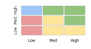
For information on attributes of the nBox element and its child elements, see Oracle Fusion Middleware Tag Reference for Oracle Mobile Application Framework.
13.5.24 How to Define Child Elements for Map Components, Sunburst, Treemap, Timeline, and NBox
You can define a variety of child elements for map components, Sunburst, Treemap, Timeline, and NBox. For information on available child elements and their attributes, see Oracle Fusion Middleware Tag Reference for Oracle Mobile Application Framework.
In JDeveloper, the Map, Sunburst, Treemap, Timeline, and NBox child components are located under MAF AMX Data Visualizations > Other Type-Specific Child Tags and MAF AMX Data Visualizations > Shared Child Tags in the Components window (see Figure 13-97).
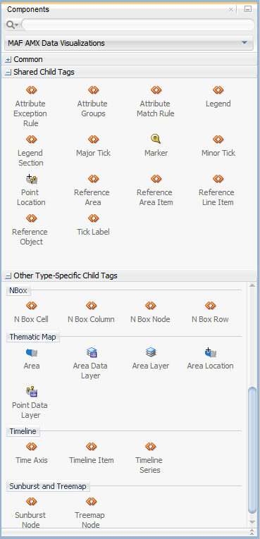
13.5.25 How to Create Databound Data Visualization Components
You can declaratively create a databound data visualization component using a data collection inserted from the Data Controls window (see Section 12.3.2.4, "Adding Data Controls to the View"). The Component Gallery dialog that Figure 13-111 shows allows you to choose from a number of data visualization component categories, types, and layout options.

Note:
Some data visualization component types require very specific kinds of data. If you bind a component to a data collection that does not contain sufficient data to display the component type requested, then the component is not displayed and a message about insufficient data appears.To trigger the display of the Component Gallery, you drag and drop a collection from the Data Controls window onto a MAF AMX page, and then select either MAF Chart, MAF Gauge, or MAF Thematic Map from the context menu that appears (see Figure 13-101).
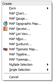
After you select the category, type, and layout for your new databound component from the Component Gallery and click OK, you can start binding the data collection attributes in the data visualization component using data binding dialogs. The name of the dialog and the input field labels depend on the category and type of the data visualization component that you selected. For example, if you select Bar as the category and Bar as the type, then the name of the dialog that appears is Create Mobile Bar Chart, and the input field is labeled Bars, as Figure 13-102 shows.
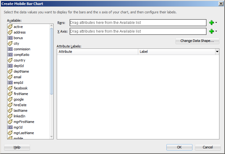
The attributes in a data collection can be data values or categories of data values. Data values are numbers represented by markers, like bar height, or points in a scatter chart. Categories of data values are members represented as axis labels. The role that an attribute plays in the bindings (either data values or identifiers) is determined by both its data type (chart requires numeric data values) and where it is mapped (for example, Bars or X Axis).
If you use the Component Gallery to create a databound gauge component, and then you select LED as the category and Star LED as the type, then the name of the dialog that appears is Create Mobile Star LED Gauge, as Figure 13-103 shows.
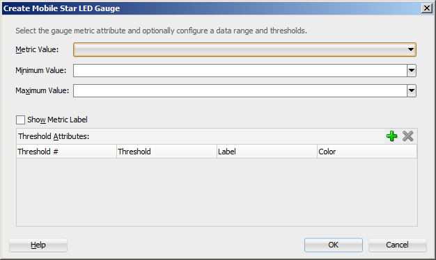
If you use the Component Gallery to create a databound thematic map component, then regardless of your selection, the name of the dialog that appears is Create Data Layer, but the fields that are displayed depend on the selection you made in the Component Gallery. For example, if you select World as the base map and World continents as the area layer, the dialog show in Figure 13-103 opens.
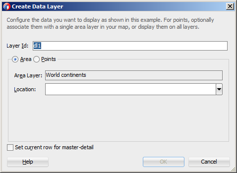
After completing one or more data binding dialogs, you can use the Properties window to specify settings for the component attributes. You can also use the child elements associated with the component to further customize it (see Section 13.5.16, "How to Define Child Elements for Chart and Gauge Components").
When you select MAF Geographic Map, MAF Sunburst, MAF NBox, MAF Timeline, or MAF Treemap from the context menu upon dropping a collection onto a MAF AMX page, one of the following dialogs appear:
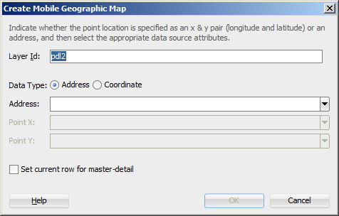
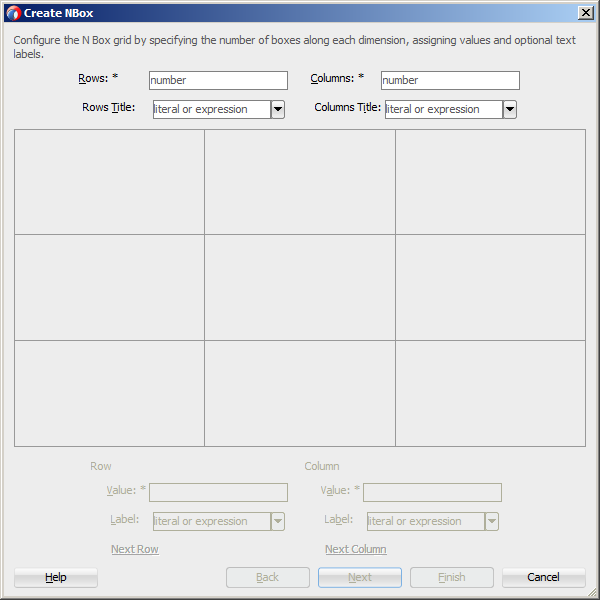
To complete the Create NBox dialog, you start by defining the number of rows and columns. Then you can select a cell on the box and specify values for the whole row or column in the bottom portion of the dialog, as Figure 13-110 shows.
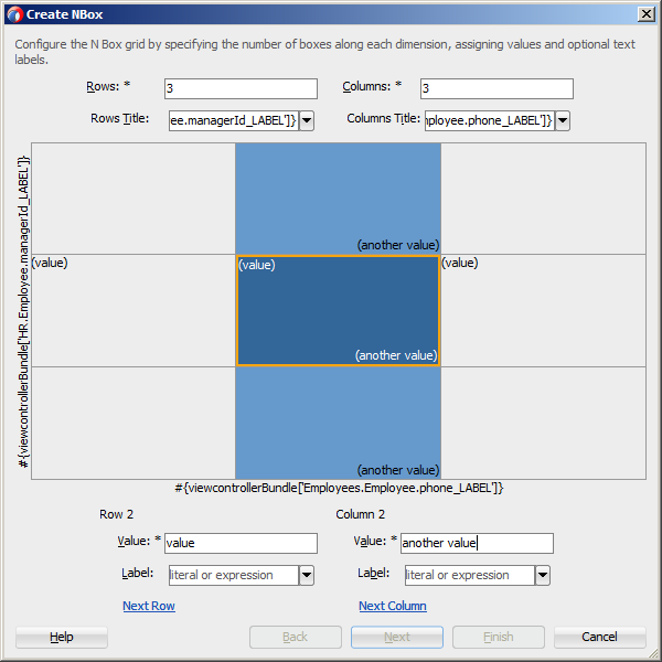
The NBox component is created when you complete all pages of the series of dialogs by clicking Next.
For details on values for each field of each dialog, consult the online help by clicking Help or pressing F1.
13.5.25.1 What You May Need to Know About Setting Series Style for Databound Chart Components
When creating databound chart components from the Data Controls window, you can declaratively specify styling information for the chart series data by adding seriesStyle elements, and then using the Properties window to open a list for the series attribute of the seriesStyle element. This list is already populated with the values of the series attribute based on the values of the chartDataItem elements within the dataStamp facet.
13.5.26 How to Create Data Visualization Components Based on Static Data
For charts, as well as Treemap, Sunburst, and Timeline, you may choose not to specify their var and value attributes. Instead, you can define the component structure statically by enumerating elements that correspond to data items (for example, charDataItem elements for charts, or timelineItems for Timeline Series). You can add as many of these static items as necessary, which is useful when you know the data at design time.
Example 13-117 shows a Pie Chart component that uses static data defined through its pieDataItem child components.
Example 13-117 Defining Hardcoded Static Value
<dvtm:pieChart id="pieChart1" >
   <amx:facet name="dataStamp">
      <dvtm:pieDataItem id="di1" value="80000" label="Salary"/>
      <dvtm:pieDataItem id="di2" value="7500" label="Bonus"/>
      <dvtm:pieDataItem id="di3" value="12000" label="Commision"/>
   </amx:facet>
   <dvtm:legend position="none" id="l1"/>
</dvtm:pieChart>
Example 13-118 shows the pieDataItem child component whose value is specified based on an attribute binding instead of a collection.
13.5.27 How to Enable Interactivity in Chart Components
You can enable the end user interaction through tap with some chart components by defining event-driven triggers for the following child components of charts:
-
Chart Data Item
-
Pie Data Item
-
Series Style
In addition to using the supported operations, such as Set Property Listener and Show Popup Behavior (see Table 13-16, "Supported Event Listeners and Event Types" for complete list), you can set the action attribute to define the type of action to be fired.
Example 13-119 Defining Events for Charts' Child Components
<amx:panelPage id="pp1" styleClass="dvtm-gallery-panelPage">
...
   <dvtm:lineChart id="lineChart1"
                   var="row"
                   value="#{bindings.lineData1.collectionModel}"
                   ... >
      <amx:facet name="dataStamp">
         <dvtm:chartDataItem group="#{row.group}"
                             value="#{row.value}"
                             series=" #{row.series}"
                             label="#{pageFlowScope.labelDisplay ?
                                      row.value : ''}" >
            <amx:showPopupBehavior popupId="pAdvancedOptions"
                                   type="action"
                                   align="overlapTopCenter"
                                   alignId="pflOptionsForm"
                                   decoration="anchor"/>
         </dvtm:chartDataItem>
      </amx:facet>
   ...
   </dvtm:lineChart>
   ...
</amx:panelPage>
<amx:popup id="pAdvancedOptions" styleClass="dvtm-gallery-options-dialog">
...
For information, see Oracle Fusion Middleware Tag Reference for Oracle Mobile Application Framework.
13.5.28 How to Create Polar Charts
You can enable the polar view for the following chart components by setting their coordinateSystem attribute to polar:
-
Area Chart
-
Bar Chart
-
Combo Chart
-
Bubble Chart
-
Line Chart
-
Scatter Chart
When the polar setting is applied to any of the preceding charts except the Bar Chart, you can define its polar grid as either circular or polygonal by using the polarGridShape attribute.
The polar chart's radial axis can be customized through its Y Axis child component, and the tangential axis are customized through the X Axis child component.
For information, see Oracle Fusion Middleware Tag Reference for Oracle Mobile Application Framework.
13.6 Styling UI Components
MAF enables you to employ CSS to apply style to UI components.
13.6.1 How to Use Component Attributes to Define Style
You style your UI components by setting the following attributes:
-
styleClassattribute defines a CSS style class to use for your layout component:<amx:panelPage styleClass="#{pageFlowScope.pStyleClass}">You can define the style class for layout, command, and input components in a MAF AMX page or in a skinning CSS file, in which case a certain style is applied to all components within the MAF AMX application feature (see Section 13.6.2, "What You May Need to Know About Skinning"). Alternatively, you can use the public style classes provided by MAF.
Note:
The CSS file is not accessible from JDeveloper. Instead, MAF injects this file into the package at build or deploy time, upon which the CSS file appears in thecssdirectory under theWeb Contentroot directory. -
inlineStyleattribute defines a CSS style to use for any UI component and represents a set of CSS styles that are applied to the root DOM element of the component:<amx:outputText inlineStyle="color:red;">
You should use this attribute when basic style changes are required.
Note:
Some UI components are rendered with such subelements as HTMLdivelements and more complex markup. As a result, setting theinlineStyleattribute on the parent component may not produce the desired effect. In such cases, you should examine the generated markup and, instead of defining theinlineStyleattribute, apply a CSS class that would propagate the style to the subelement.For information on how to configure JavaScript debugging, see Section 30.3.5, "How to Enable Debugging of Java Code and JavaScript."
These attributes are displayed in the Style section in the Properties window, as Figure 13-111 shows.
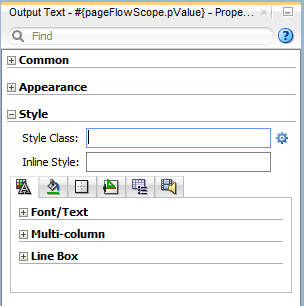
Within the Properties window MAF AMX provides a drop-down editor that you can use to set various properties of the inlineStyle attribute (see Figure 13-112).
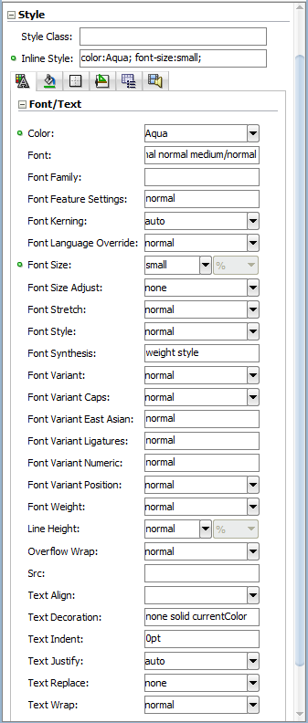
For more information, see Oracle Fusion Middleware Tag Reference for Oracle Mobile Application Framework.
13.6.2 What You May Need to Know About Skinning
Skinning allows you to define and apply a uniform style to all UI components within a MAF AMX application feature to create a theme for the entire feature.
The default skin family for MAF is called mobileAlta and the default version is the latest version of that skin. For more information, see Chapter 7, "Skinning MAF Applications."
13.6.3 What You May Need to Know About Using CSS ID Selectors for Skinning
MAF AMX does not support the use of CSS ID selectors in skinning elements. As a result, a markup such as the following would cause rough AMX page transitions:
#tb1 {
   position:absolute;
   overflow:hidden;
   width: 300px;
   background-color: rgb(90,148,0);
}
The reason for this condition is that when a transition between AMX pages occurs, two pages are rendered on the screen at the same time, and therefore, to prevent ID collisions, the page from which the transition occurs is stripped of all its IDs just before the transition.
Instead of using CSS ID selectors, you must use class names. Example 13-120 shows a MAF AMX UI component defined in a MAF AMX page, with its styleClass attribute set to a specific custom class. Example 13-121 show how to use the custom class for skinning.
13.6.4 How to Style Data Visualization Components
Most of the style properties of MAF AMX data visualization components are defined in the dvtm.css file located in the css directory. You can override the default values by adding a custom CSS file with custom style definitions at the application feature level (see Section 7.7, "Overriding the Default Skin Styles").
Some of the style properties cannot be mapped to CSS and have to be defined in custom JavaScript files. These properties include the following:
-
Background and needle images for the Dial Gauge component (see Section 13.5.14, "How to Create a Dial Gauge").
-
Duration bars color palette for the Timeline component (see Section 13.5.22, "How to Create a Timeline Component").
-
Base maps for the Thematic Map component (see Section 13.5.18.5, "Defining a Custom Base Map").
-
Style properties of the Geographic Map component (see Section 13.5.17, "How to Create a Geographic Map Component").
-
Style properties of the Thematic Map component (see Section 13.5.18.7, "Applying Custom Styling to the Thematic Map Component").
-
Selected and unselected states of the Rating Gauge component (see Section 13.5.15.1, "Applying Custom Styling to the Rating Gauge Component").
You should specify these custom JavaScript files in the Includes section at the application feature level (see Section 5.3, "Defining the Application Feature Content as a MAF AMX Page or Task Flow"). By doing so, you override the default style values defined in the XML style template. Example 13-122 shows a JavaScript file similar to the one you would add to your MAF project that includes the MAF AMX application feature with data visualization components which require custom styling of properties that cannot be styled using CSS.
Example 13-122 Defining Custom Style Properties
my-custom.js:

   CustomChartStyle = {

      // common chart properties
      'chart': {
         // text to be displayed, if no data is provided
         'emptyText': null,
         // animation effect when the data changes
         'animationOnDataChange': "none",
         // animation effect when the chart is displayed
         'animationOnDisplay': "none",
         // time axis type - disabled, enabled, mixedFrequency
         'timeAxisType': "disabled"
      },

      // chart title separator properties
      'titleSeparator': {
         // separator upper color
         'upperColor': "#74779A",
         // separator lower color
         'lowerColor': "#FFFFFF",
         // should display title separator
         'rendered': false
      },

      // chart legend properties
      'legend': {
         // legend position - none, auto, start, end, top, bottom
         'position': "auto"
      },

      // default style values
      'styleDefaults': {
         // default color palette
         'colors': ["#003366", "#CC3300", "#666699", "#006666", "#FF9900",
                    "#993366", "#99CC33", "#624390", "#669933", "#FFCC33",
                    "#006699", "#EBEA79"],
         // default shapes palette
         'shapes': ["circle", "square", "plus", "diamond",
                    "triangleUp", "triangleDown", "human"],
         // series effect
         'seriesEffect': "gradient",
         // animation duration in ms
         'animationDuration': 1000,
         // animation indicators - all, none
         'animationIndicators': "all",
         // animation up color
         'animationUpColor': "#0099FF",
         // animation down color
         'animationDownColor': "#FF3300",
         // default line width for line chart
         'lineWidth': 3,
         // default line style for line chart - solid, dotted, dashed
         'lineStyle': "solid",
         // should markers be displayed for line and area charts
         'markerDisplayed': false,
         // default marker color
         'markerColor': null,
         // default marker shape
         'markerShape': "auto",
         // default marker size
         'markerSize': 8,
         // pie feeler color for pie chart
         'pieFeelerColor': "#BAC5D6",
         // slice label position and text type for pie chart
         'sliceLabel': {
            'position': "outside",
            'textType': "percent" }
      }
   };

   CustomGaugeStyle = {
      // default animation duration in milliseconds
      'animationDuration': 1000,
      // default animation effect on data change
      'animationOnDataChange': "none",
      // default animation effect on gauge display
      'animationOnDisplay': "none",
      // default visual effect
      'visualEffects': "auto"
   };

   CustomTimelineStyle = {
      'timelineSeries' : {
      // duration bars color palette
      'colors' : ["#267db3", "#68c182", "#fad55c", "#ed6647"]
   };
...
}
After the JavaScript file has been defined, you can uncomment and modify any values. You add this file as an included feature in the maf-feature.xml file, as Example 13-123 shows.
Example 13-123 Including Custom Style File in the Application Feature
<?xml version="1.0" encoding="UTF-8" ?>
<adfmf:features xmlns:xsi="http://www.w3.org/2001/XMLSchema-instance"
                          xmlns:adfmf="http://xmlns.oracle.com/adf/mf">
   <adfmf:feature id="feature1" name="feature1">
      <adfmf:content id="feature1.1">
         <adfmf:amx file="feature1/untitled1.amx">
            <adfmf:includes>
               <adfmf:include type="StyleSheet" file="css/custom.css"/>
               <adfmf:include type="JavaScript" file="feature1/js/my-custom.js"/>
            </adfmf:includes>
         </adfmf:amx>
      </adfmf:content>
   </adfmf:feature>
</adfmf:features>
13.7 Localizing UI Components
In your MAF AMX page, you can localize the text that UI components display by using the standard resource bundle provided by JDeveloper. You do so by selecting a component and one of its text-presenting properties whose value you intend to localize, and then choosing Select Text Resource in the appropriate box in the Properties window (see Figure 13-113).
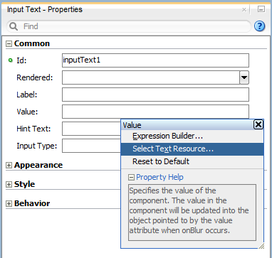
This displays the standard Select Text Resource dialog that Figure 13-114 shows. You use this dialog to enter or find a string reference for the property you are modifying.
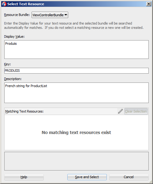
After you have defined a localized string resource, the EL for that reference is automatically placed in the property from which the Select Text Resource dialog was launched. An XLIFF (XML Localization Interchange File Format) file is created, if it is not already present. If it is present, the new entry is added to the existing XLIFF file. In addition, a corresponding Load Bundle (loadBundle) component is created as a child of the View component that points to the ViewControllerBundle.xlf file (default name, but basically it would match the name of the project).
Note:
TheViewControllerBundle.xlf is a default file name. This name matches the name of the project.Figure 13-115 shows the changes in the MAF AMX file.
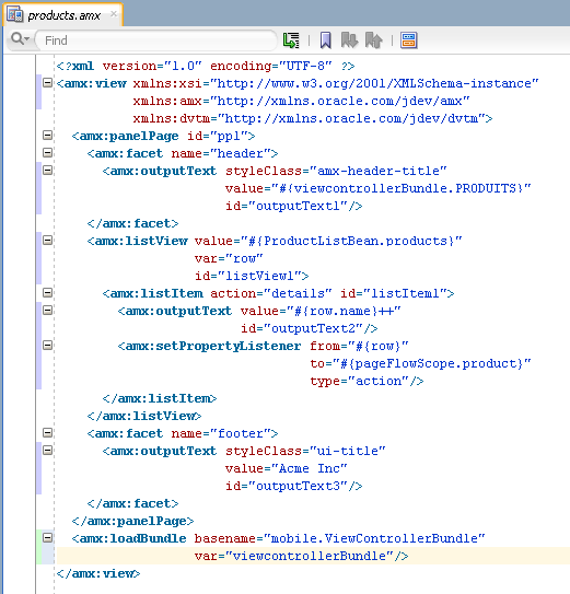
For more information, see Chapter 6, "Localizing MAF Applications."
13.8 Understanding MAF Support for Accessibility
When developing MAF applications, you may need to accommodate visually and physically impaired users by addressing accessibility issues. User agents, such as web browsers rendering to nonvisual media (for example, a screen reader) can read text descriptions of UI components to provide useful information to impaired users. MAF AMX UI and data visualization components are designed to be compliant with the following accessibility standards:
-
The Accessible Rich Internet Applications (WAI-ARIA) 1.0 specification.
For more information, see the following:
-
"Introduction" to WAI-ARIA 1.0 specification at
http://www.w3.org/TR/wai-aria/introduction -
"Using WAI-ARIA" at
http://www.w3.org/TR/wai-aria/usage -
Section 13.8.2, "What You May Need to Know About the Basic WAI-ARIA Terms"
-
-
The Oracle Global HTML Accessibility Guidelines (OGHAG).
For more information, see Section 13.8.3, "What You May Need to Know About the Oracle Global HTML Accessibility Guidelines."
-
iOS Accessibility guidelines.
For more information, see the Accessibility Programming Guide for iOS.
Accessible components do not change their appearance nor is the application logic affected by the introduction of such components.
To enable the proper functioning of the accessibility in your MAF AMX application feature, follow these guidelines:
-
The navigation must not be more than three levels deep and it must be easy for the user to traverse back to the home screen.
-
Keep scripting to a minimum.
-
Do not provide direct interaction with the DOM.
-
Do not use JavaScript time-outs.
-
Avoid unnecessary focus changes
-
Provide explicit popup triggers
-
If needed, utilize the WAI-ARIA live region (see Section 13.8.2, "What You May Need to Know About the Basic WAI-ARIA Terms").
-
Keep CSS use to a minimum.
-
Try not to override the default component appearance.
-
Choose scalable size units.
-
Do not use CSS positioning.
For more information, see the following:
-
"Mobile Accessibility" at
http://www.w3.org/WAI/mobile -
"Web Content Accessibility and Mobile Web: Making a Web Site Accessible Both for People with Disabilities and for Mobile Devices" at
http://www.w3.org/WAI/mobile/overlap.html
13.8.1 How to Configure UI and Data Visualization Components for Accessibility
MAF AMX UI and data visualization components have a built-in accessibility support, with most components being subject to the accessibility audit (see Figure 13-118).
Table 13-10 lists components and their attributes that you can set through the Accessibility section of the Properties window.
Table 13-10 UI Components with Configurable Accessibility Attributes
| Component | Accessibility Attribute | Accessibility Audit Message |
|---|---|---|
|
Button ( |
Short Desc ( |
The |
|
Select Button ( |
Short Desc ( |
The |
|
Link ( |
Short Desc ( |
The |
|
Link Go ( |
Short Desc ( |
The |
|
Carousel ( |
Short Desc ( |
The |
|
CarouselItem ( |
Short Desc ( |
The |
|
List Item ( |
Short Desc ( |
The |
|
Popup ( |
Short Desc ( |
The |
|
Image ( |
Short Desc ( |
The |
|
Input Text ( |
Hint Text ( |
The |
|
Panel Group Layout ( |
Landmark ( |
NA Foot 1 |
|
Deck ( |
Landmark ( |
NA (see footnote 1) |
|
Table Layout ( |
Short Desc ( |
The |
|
Cell Format ( |
Short Desc ( |
The |
|
Film Strip ( |
Short Desc ( |
The |
|
Film Strip Item ( |
Short Desc ( |
The |
|
Area Chart ( |
Short Desc ( |
The |
|
Bar Chart ( |
Short Desc ( |
The |
|
Bubble Chart ( |
Short Desc ( |
The |
|
Combo Chart ( |
Short Desc ( |
The |
|
Line Chart ( |
Short Desc ( |
The |
|
Scatter Chart ( |
Short Desc ( |
The |
|
Spark Chart ( |
Short Desc ( |
The |
|
Pie Chart ( |
Short Desc ( |
The |
|
NBox Node ( |
Short Desc ( |
The |
|
Reference Object ( |
Short Desc ( |
The |
|
Reference Area ( |
Short Desc ( |
The |
|
Reference Line ( |
Short Desc ( |
The |
|
Chart Data Item ( |
Short Desc ( |
The |
|
Pie Data Item ( |
Short Desc ( |
The |
|
Funnel Data Item ( |
Short Desc ( |
The |
|
Area ( |
Short Desc ( |
The |
|
Marker ( |
Short Desc ( |
The |
|
Treemap Node ( |
Short Desc ( |
The |
|
Sunburst Node ( |
Short Desc ( |
The |
|
Led Gauge ( |
Short Desc ( |
The |
|
Status Meter Gauge ( |
Short Desc ( |
The |
|
Dial Gauge ( |
Short Desc ( |
The |
|
Rating Gauge ( |
Short Desc ( |
The |
|
Geographic Map ( |
Short Desc ( |
The |
|
Thematic Map ( |
Short Desc ( |
The |
|
Funnel Chart ( |
Short Desc ( |
The |
|
NBox ( |
Short Desc ( |
The |
|
Sunburst ( |
Short Desc ( |
The |
|
Timeline ( |
Short Desc ( |
The |
|
Treemap ( |
Short Desc ( |
The |
Footnote 1 The landmark attribute has a default value (none) and is not subject to the accessibility audit.
You use the shortDesc attribute for different purposes for different components. For example, if you set the shortDesc attribute for the Image component, in the MAF AMX file it will appear as a value of the alt attribute of the image element.
The value of the shortDesc attribute can be localized.
For the Panel Group Layout and Deck components, you define the landmark role type (see Table 13-15, "Landmark Roles") that is applicable as per the context of the page. You can set one of the following values for the landmark attribute:
-
default (none)
-
application
-
banner
-
complementary
-
contentinfo
-
form
-
main
-
navigation
-
search
Table 13-11 lists UI components whose accessible attributes defined by WAI-ARIA specification are automatically applied at run time and that you cannot modify.
Table 13-11 UI Components with Static Accessibility Attributes
| Component | Accessibility Attribute | Accessibility Audit Message |
|---|---|---|
|
Input Date ( |
Label ( |
|
|
Input Number Slider ( |
Label ( |
|
|
Panel Label and Message ( |
Label ( |
|
|
Select Item ( |
Label ( |
|
|
Checkbox ( |
Label ( |
|
|
Boolean Switch ( |
Label ( |
|
|
Radio Button ( |
Label ( |
|
|
Select Many Checkbox ( |
Label ( |
|
|
Select Many Choice ( |
Label ( |
|
|
Choice ( |
Label ( |
|
|
Output Text ( |
Value ( |
NA Foot 1 |
Footnote 1 The value attribute is not subject to the accessibility audit.
You can configure the accessibility audit rules using JDeveloper's Preferences dialog as follows:
-
In JDeveloper, select Tools > Preferences from the main menu (on a Windows computer).
-
From the list of preferences, select Audit (see Figure 13-116).
-
On the Audit pane that Figure 13-116 shows, click Manage Profiles to open the Audit Profile dialog.
-
In the Audit Profile dialog that Figure 13-117 shows, expand the Mobile Application Framework node from the tree of rules, and then expand Accessibility.
-
Select the accessibility audit rules to apply to your application, as Figure 13-117 shows.
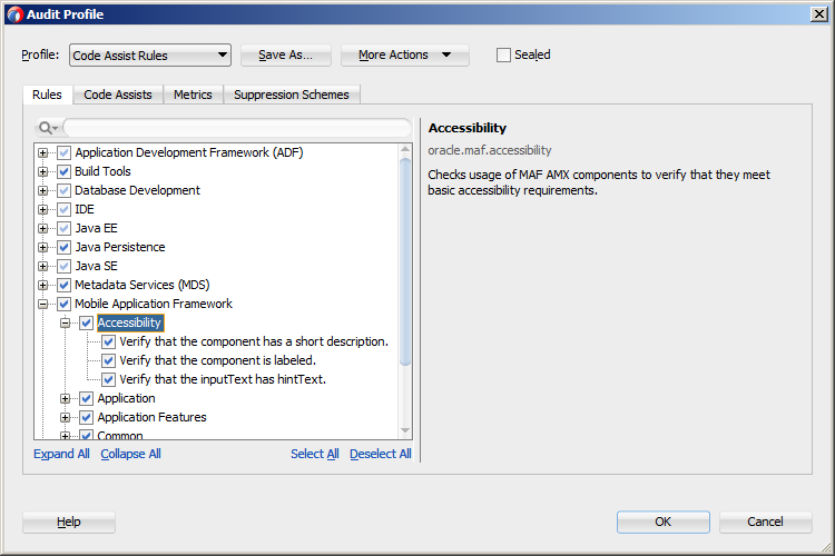
Figure 13-118 shows the accessibility audit warning displayed in JDeveloper.
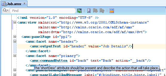
For information on how to test your accessible MAF AMX application feature, see Section 30.2.1, "How to Perform Accessibility Testing on iOS-Powered Devices."
Note:
WAI-ARIA accessibility functionality is not supported on Android for data visualization components.Other MAF AMX UI components might not perform as expected when the application is run in the Android screen reader mode.
13.8.2 What You May Need to Know About the Basic WAI-ARIA Terms
As stated in the WAI-ARIA 1.0 specification, complex web applications become inaccessible when assistive technologies cannot determine the semantics behind portions of a document or when the user is unable to effectively navigate to all parts of it in a usable way. WAI-ARIA divides the semantics into roles (the type defining a user interface element), and states and properties supported by the roles. The following semantic associations form the base for the WAI-ARIA terms:
-
Role
-
Landmark
-
Live region
For more information, see "Important Terms" at http://www.w3.org/TR/wai-aria/terms.
The following tables list role categories (as defined in the WAI-ARIA 1.0 specification) that are applicable to MAF.
Table 13-12 lists abstract roles that are used to support the WAI-ARIA role taxonomy for the purpose of defining general role concepts.
| Abstract Role | Description |
|---|---|
|
input |
A generic type of widget that allows the user input. |
|
landmark |
A region of the page intended as a navigational landmark. |
|
select |
A form widget that allows the user to make selections from a set of choices. |
|
widget |
An interactive component of a graphical user interface. |
Table 13-13 lists widget roles that act as standalone user interface widgets or as part of larger, composite widgets.
| Widget Role | Description | Widget Required States |
|---|---|---|
|
alertdialog |
A type of dialog that contains an alert message, where initial focus moves to an element within the dialog. |
aria-labelledby, aria-describedby |
|
button |
An input that allows for user-triggered actions when clicked or pressed. |
aria-expanded (state), aria-pressed (state) |
|
checkbox |
A checkable input that has three possible values: |
aria-checked (state) |
|
dialog |
A dialog represented by an application window that is designed to interrupt the current processing of an application in order to prompt the user to enter information or require a response. |
aria-labelledby, aria-describedby |
|
link |
An interactive reference to an internal or external resource that, when activated, causes the user agent to navigate to that resource. |
aria-disabled (state), aria-describedby |
|
option |
A selectable item in a select list. |
aria-labelledby, aria-checked (state), aria-selected (state) |
|
radio |
A checkable input in a group of radio roles, only one of which can be checked at a time. |
aria-checked (state), aria-disabled (state) |
|
slider |
A user input where the user selects a value from within a given range. |
aria-valuemax, aria-valuemin, aria-valuenow, aria-disabled (state) |
|
listbox |
A widget that allows the user to select one or more items from a list of choices. |
aria-live |
|
radiogroup |
A group of radio buttons. |
aria-disabled (state) |
|
listitem |
A single item in a list or directory. |
aria-describedby |
|
textbox |
Input that allows free-form text as its value. |
aria-labelledby, aria-readonly, aria-required, aria-multiline, aria-disabled (state) |
Table 13-14 lists document structure roles that describe structures that organize content in a page. Typically, document structures are not interactive.
Table 13-14 Document Structure Roles
| Document Structure Role | Description |
|---|---|
|
img |
A container for a collection of elements that form an image. |
|
list |
A group of non-interactive list items. |
|
listitem |
A single item in a list or directory. |
Table 13-15 lists landmark roles that represent regions of the page intended as navigational landmarks.
| Landmark Role | Description |
|---|---|
|
application |
A region declared as a web application (as opposed to a web document). |
|
banner |
A region that contains mostly site-oriented content (rather than page-specific content). |
|
complementary |
A supporting section of a document designed to be complementary to the main content at a similar level in the DOM hierarchy, but that remains meaningful when separated from the main content. |
|
contentinfo |
A large perceivable region that contains information about the parent document. |
|
form |
A region that contains a collection of items and objects that, as a whole, combine to create a form. |
|
main |
The main content of a document. |
|
navigation |
A collection of navigational elements (usually links) for navigating the document or related documents. |
|
search |
A region that contains a collection of items and objects that, as a whole, combine to create a search facility. |
For the majority of MAF UI components, you cannot modify accessible WAI-ARIA attributes. For some components, you can set special accessible attributes at design time, and for the Panel Group Layout and Deck, you can use the WAI-ARIA landmark role type. For more information, see Section 13.8.1, "How to Configure UI and Data Visualization Components for Accessibility."
13.8.3 What You May Need to Know About the Oracle Global HTML Accessibility Guidelines
The Oracle Global HTML Accessibility Guidelines (OGHAG) is a set of scripting standards for HTML that Oracle follows. These standards represent a combination of Section 508 (see http://www.section508.gov) and Web Content Accessibility Guidelines (WCAG) 1.0 level AA (see http://www.w3.org/TR/WCAG10), with improved wording and checkpoint measurements.
For more information, see Oracle's Accessibility Philosophy and Policies at http://www.oracle.com/us/corporate/accessibility/policies/index.html.
13.9 Validating Input
MAF allows you to inform the end user about data input errors and other conditions that occur during data input. Depending on their type (error or warning), validation messages have a different look and feel.
The user input validation is triggered when an input is submitted: Input Text components are automatically validated when the end user leaves the field; for selection components, such as a Checkbox or Choice, the validation occurs when the end user makes a selection. For validation purposes, UI components on a MAF AMX page are grouped together within a Validation Group operation (validationGroup) to define components whose input is to be validated when the submit operation takes place. A Validation Behavior (validationBehavior) component defines which Validation Group is to be validated before a command component's action is taken. A command component can have multiple child Validation Behavior components. Validation does not occur if a component does not have a Validation Behavior defined for it.
Note:
You cannot define nested Validation Group operations.The following is an invalid definition of a Validation Group:
<amx:view>
   <amx:panelPage>
      <amx:validationGroup>
         <amx:panelGroupLayout>
            <amx:validationGroup/>
         <amx:panelGroupLayout/>
      </amx:validationGroup>
   </amx:panelPage>
</amx:view>
The following is a valid definition:
<amx:view>
   <amx:panelPage>
      <amx:validationGroup>
   </amx:panelPage>
   <amx:popup>
      <amx:validationGroup>
   </amx:popup>
</amx:view>
If a MAF AMX page contains any validation error messages, you can use command components, such as List Item, Link, and Button, to prevent the end user from navigating off the page. Messages containing warnings do not halt the navigation.
Example 13-124 shows how to define validation elements, including multiple Validation Group and Validation Behavior operations, in a MAF AMX file.
Example 13-124 Defining Input Validation
<amx:panelPage id="pp1">
   <amx:facet name="header">
      <amx:outputText id="outputText1" value="Validate"/>
   </amx:facet>
   <amx:facet name="secondary">
      <amx:commandButton id="commandButton2" action="go" text="Save">
         <amx:validationBehavior id="vb1"
                                 disabled="#{pageFlowScope.myPanel ne 'panel1'}"
                                 group="group1"/>
         <amx:validationBehavior id="vb2"
                                 disabled="#{pageFlowScope.myPanel ne 'panel2'}"
                                 group="group2"/>
         <!-- invalid, should be caught by audit rule but for any reason
         if group not found at run time, this validate is ignored -->
         <amx:validationBehavior id="vb3" disabled="false" group="groupxxx"/>
         <!-- group is not found at run time, this validate is ignored -->
         <amx:validationBehavior id="vb4" disabled="false" group="group3"/>
      </amx:commandButton>
   </amx:facet>
   <amx:panelSplitter id="ps1" selectedItem="#{pageFlowScope.myPanel}">
      <amx:panelItem id="pi1">
         <amx:validationGroup id="group1">
            <amx:panelFormLayout id="pfl1">
               <amx:inputText value="#{bindings.first.inputValue}"
                              required="true"
                              label="#{bindings.first.hints.label}"
                              id="inputText1"/>
               <amx:inputText value="#{bindings.last.inputValue}"
                              label="#{bindings.last.hints.label}"
                              id="inputText2"/>
            </amx:panelFormLayout>
         </amx:validationGroup>
      </amx:panelItem>
      <amx:panelItem id="pi2">
         <amx:validationGroup id="group2">
            <amx:panelFormLayout id="pfl2">
               <amx:inputText value="#{bindings.salary.inputValue}"
                              label="#{bindings.first.hints.label}"
                              id="inputText3"/>
               <amx:inputText value="#{bindings.last.inputValue}"
                              label="#{bindings.last.hints.label}"
                              id="inputText4"/>
            </amx:panelFormLayout>
         </amx:validationGroup>
      </amx:panelItem>
   </amx:panelSplitter>
   <amx:panelGroupLayout id="pgl1" rendered="false">
      <amx:validationGroup id="group3">
         <amx:panelFormLayout id="pfl4">
            <amx:inputText value="#{bindings.salary.inputValue}"
                           label="#{bindings.first.hints.label}"
                           id="inputText5"/>
            <amx:inputText value="#{bindings.last.inputValue}"
                           label="#{bindings.last.hints.label}"
                           id="inputText6"/>
         </amx:panelFormLayout>
      </amx:validationGroup>
   </amx:panelGroupLayout>
</amx:panelPage>
Example 13-125 shows how to define a validation message displayed in a popup in a MAF AMX file.
Example 13-125 Defining Input Validation with Popup Message
<amx:panelPage id="pp1">
   <amx:facet name="header">
      <amx:outputText id="outputText1" value="Login Demo"/>
   </amx:facet>
   <amx:facet name="secondary">
      <amx:commandButton id="btnBack" action="__back" text="Back"/>
   </amx:facet>
   <amx:panelGroupLayout id="panelGroupLayout1">
      <amx:validationGroup id="group1">
         <amx:panelGroupLayout id="panelGroupLayout2">
            <amx:inputText value="#{bindings.userName.inputValue}"
                           label="#{bindings.userName.hints.label}"
                           id="inputText1"
                           showRequired="true"
                           required="true"/>
            <amx:inputText value="#{bindings.password.inputValue}"
                           label="#{bindings.password.hints.label}"
                           id="inputText2"
                           required="true"
                           showRequired="true"
                           secret="true"/>
            <amx:outputText id="outputText2"
                            value="#{bindings.timeToStayLoggedIn.hints.label}:
                            #{bindings.timeToStayLoggedIn.inputValue} minutes"/>
        </amx:panelGroupLayout>
      </amx:validationGroup>
      <amx:commandButton id="commandButton2"
                         text="Login"
                         action="navigationSuccess">
         <amx:validationBehavior id="validationBehavior2" group="group1"/>
      </amx:commandButton>
   </amx:panelGroupLayout>
</amx:panelPage>
Validation messages are displayed in a Popup component (see Section 13.2.8, "How to Use a Popup Component"). You cannot configure the title of a validation popup, which is automatically determined by the relative message severity: the most severe of all of the current messages becomes the title of the validation popup. That is, if all validation messages are of type WARNING, then the title is "Warning"; if some of the messages are of type WARNING and others are of type ERROR, then the title is set to "Error".
Figure 13-119 shows a popup validation message produced at runtime.
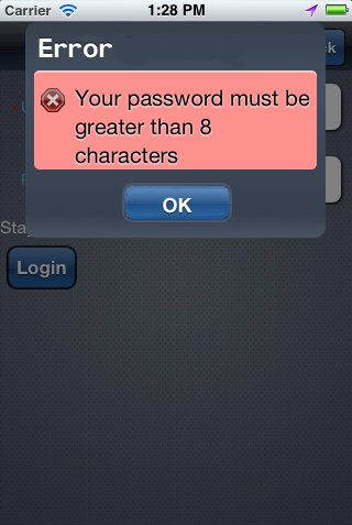
13.10 Using Event Listeners
To invoke Java code from your MAF AMX pages and perform the application logic, you define listeners as attributes of UI components in one of the following ways:
-
Manually in the source of your MAF AMX file.
-
From the Properties window for the selected component. For more information, see Oracle Fusion Middleware Tag Reference for Oracle Mobile Application Framework
You may use the following listeners to add awareness of the UI-triggered events to your MAF AMX page:
-
valueChangeListener: listens toValueChangeEventthat is constructed with the following parameters:-
java.lang.Objectrepresenting an old value -
java.lang.Objectrepresenting a new changed value
-
-
actionListener: listens toActionEventthat is constructed without parameters; -
selectionListener: listens toSelectionEventthat is constructed with the following parameters:-
java.lang.Objectrepresenting an old row key -
java.lang.String[]representing selected row keys
-
-
moveListener: listens toMoveEventthat is constructed with the following parameters: of theRowKeytype representing an old row key;-
java.lang.Objectrepresenting the moved row key -
java.lang.String[]representing the row key before which the moved row key was inserted
-
-
rangeChangeListener: listens toRangeChangeEventthat is constructed without parameters. -
mapBoundsChangeListener: listens toMapBoundsChangeEventthat is constructed with the following parameters:-
java.lang.Objectrepresenting the X coordinate (longitude) of minimum map bounds -
java.lang.Objectrepresenting the Y coordinate (latitude) of minimum map bounds -
java.lang.Objectrepresenting the X coordinate (longitude) of maximum map bounds -
java.lang.Objectrepresenting the Y coordinate (latitude) of maximum map bounds -
java.lang.Objectrepresenting the X coordinate (longitude) of the map center -
java.lang.Objectrepresenting the Y coordinate (latitude) of the map center -
intrepresenting the current zoom level
-
-
mapInputListener: listens toMapInputEventthat is constructed with the following parameters:-
java.lang.Stringrepresenting the event type -
java.lang.Objectrepresenting the X coordinate of the event point -
java.lang.Objectrepresenting the Y coordinate of the event point
-
-
viewportChangeListener: listens toViewportChangeEventthat is constructed with the following parameters:-
java.lang.Objectrepresenting the minimum X coordinate -
java.lang.Objectrepresenting the maximum X coordinate -
java.lang.Objectrepresenting the minimum Y coordinate -
java.lang.Objectrepresenting the maximum Y coordinate -
java.lang.Objectrepresenting the first visible group -
java.lang.Objectrepresenting the last visible group
-
The value for your listener must match the pattern #{*} and conform to the following requirements:
-
Type name: EL Expression
-
Base type: string
-
Primitive type: string
For information on EL events, see Section 14.3.6, "About EL Events."
Most MAF AMX event classes extend the oracle.adfmf.amx.event.AMXEvent class. When defining event listeners in your Java code, you need to pass the oracle.adfmf.amx.event.AMXEvent class.
For more information, see the following:
-
Oracle Fusion Middleware Java API Reference for Oracle Mobile Application Framework
-
Oracle Fusion Middleware Tag Reference for Oracle Mobile Application Framework
MAF allows you to create managed bean methods for listeners so that your managed bean methods use MAF AMX-specific event classes. Example 13-126, Example 13-127, and Example 13-128 demonstrate a Button and a Link component calling the same managed bean method. The source value of the AMXEvent determines which object invoked the event by showing a message box with the component's ID.
Example 13-126 Calling a Bean Method from MAF AMX File
<amx:commandButton text="commandButton1"
                   id="commandButton1"
                   actionListener="#{applicationScope.Bean.actionListenerMethod}">
</amx:commandButton>
<amx:commandLink text="commandLink1"
                 id="commandLink1"
                 actionListener="#{applicationScope.Bean.actionListenerMethod}">
</amx:commandLink>
private void actionListenerMethod(AMXEvent amxEvent) {
   // Some Java handling
}
Example 13-128 Invoking the Event Method
public Object invokeMethod(String methodName, Object[] params) {
   if (methodName.equals("actionListenerMethod")) {
      actionListenerMethod((AMXEvent) params[0]);
   }
   return null;
}
For additional examples, see a MAF sample application called APIDemo located in the PublicSamples.zip file within the jdev_install/jdeveloper/jdev/extensions/oracle.maf/Samples directory on your development computer. This sample demonstrates how to call listeners from Java beans.
13.10.1 What You May Need to Know About Constrained Type Attributes for Event Listeners
You can define event listeners as children of some MAF AMX UI components. The listeners' type attribute identifies which event they are to be registered to handle. Since each parent UI component supports only a subset of the events (suitable for that particular component), these supported events are presented in a constrained list of types that you can select for a listener.
Table 13-16 lists parent UI components, event listeners they can have as children, and event types they support.
Table 13-16 Supported Event Listeners and Event Types
| UI Component (parent) | Action Listener (child component) | Set Property Listener (child component) | Client Listener (child component) | Show Popup Behavior (child component) | Close Popup Behavior (child component) | Validation Behavior (child component) | actionListener (attribute) | valueChangeListener (attribute) | moveListener (attribute) | selectionListener (attribute) | mapBoundsChangeListener (attribute) | mapInputListener (attribute) | viewportChangeListener (attribute) | rangeChangeListener (attribute) |
|---|---|---|---|---|---|---|---|---|---|---|---|---|---|---|
|
Button |
Supported |
Supported |
Supported |
Supported |
Supported |
Supported |
Supported |
Not supported |
Not supported |
Not supported |
Not supported |
Not supported |
Not supported |
Not supported |
|
Link |
Supported |
Supported |
Supported |
Supported |
Supported |
Supported |
Supported |
Not supported |
Not supported |
Not supported |
Not supported |
Not supported |
Not supported |
Not supported |
|
List Item |
Supported |
Supported |
Supported |
Supported |
Supported |
Supported |
Supported |
Not supported |
Not supported |
Not supported |
Not supported |
Not supported |
Not supported |
Not supported |
|
Input Date |
Not supported |
Not supported |
Not supported |
Not supported |
Not supported |
Not supported |
Not supported |
Supported |
Not supported |
Not supported |
Not supported |
Not supported |
Not supported |
Not supported |
|
Input Number Slider |
Not supported |
Not supported |
Not supported |
Not supported |
Not supported |
Not supported |
Not supported |
Supported |
Not supported |
Not supported |
Not supported |
Not supported |
Not supported |
Not supported |
|
Input Text |
Not supported |
Not supported |
Supported |
Not supported |
Not supported |
Not supported |
Not supported |
Supported |
Not supported |
Not supported |
Not supported |
Not supported |
Not supported |
Not supported |
|
Output Text |
Not supported |
Not supported |
Supported |
Not supported |
Not supported |
Not supported |
Not supported |
Not supported |
Not supported |
Not supported |
Not supported |
Not supported |
Not supported |
Not supported |
|
List View |
Not supported |
Not supported |
Not supported |
Not supported |
Not supported |
Not supported |
Not supported |
Not supported |
Supported |
Supported |
Not supported |
Not supported |
Not supported |
Supported |
|
Checkbox |
Not supported |
Not supported |
Not supported |
Not supported |
Not supported |
Not supported |
Not supported |
Supported |
Not supported |
Not supported |
Not supported |
Not supported |
Not supported |
Not supported |
|
Switch |
Not supported |
Not supported |
Not supported |
Not supported |
Not supported |
Not supported |
Not supported |
Supported |
Not supported |
Not supported |
Not supported |
Not supported |
Not supported |
Not supported |
|
Checkbox (Select Many) |
Not supported |
Not supported |
Not supported |
Not supported |
Not supported |
Not supported |
Not supported |
Supported |
Not supported |
Not supported |
Not supported |
Not supported |
Not supported |
Not supported |
|
Choice (Select Many) |
Not supported |
Not supported |
Not supported |
Not supported |
Not supported |
Not supported |
Not supported |
Supported |
Not supported |
Not supported |
Not supported |
Not supported |
Not supported |
Not supported |
|
Choice |
Not supported |
Not supported |
Not supported |
Not supported |
Not supported |
Not supported |
Not supported |
Supported |
Not supported |
Not supported |
Not supported |
Not supported |
Not supported |
Not supported |
|
Select Button |
Not supported |
Not supported |
Not supported |
Not supported |
Not supported |
Not supported |
Not supported |
Supported |
Not supported |
Not supported |
Not supported |
Not supported |
Not supported |
Not supported |
|
Radio Button |
Not supported |
Not supported |
Not supported |
Not supported |
Not supported |
Not supported |
Not supported |
Supported |
Not supported |
Not supported |
Not supported |
Not supported |
Not supported |
Not supported |
|
Link (Go) |
Not supported |
Not supported |
Supported |
Not supported |
Not supported |
Not supported |
Not supported |
Not supported |
Not supported |
Not supported |
Not supported |
Not supported |
Not supported |
Not supported |
|
Carousel |
Not supported |
Not supported |
Not supported |
Not supported |
Not supported |
Not supported |
Not supported |
Not supported |
Not supported |
Not supported |
Not supported |
Not supported |
Not supported |
Not supported |
|
Carousel Item |
Not supported |
Not supported |
Not supported |
Not supported |
Not supported |
Not supported |
Not supported |
Not supported |
Not supported |
Not supported |
Not supported |
Not supported |
Not supported |
Not supported |
|
Image |
Not supported |
Not supported |
Supported |
Not supported |
Not supported |
Not supported |
Not supported |
Not supported |
Not supported |
Not supported |
Not supported |
Not supported |
Not supported |
Not supported |
|
View |
Not supported |
Not supported |
Supported |
Not supported |
Not supported |
Not supported |
Not supported |
Not supported |
Not supported |
Not supported |
Not supported |
Not supported |
Not supported |
Not supported |
|
Film Strip |
Not supported |
Not supported |
Not supported |
Not supported |
Not supported |
Not supported |
Not supported |
Not supported |
Not supported |
Supported |
Not supported |
Not supported |
Not supported |
Not supported |
|
Film Strip Item |
Supported |
Supported |
Supported |
Supported |
Supported |
Not supported |
Not supported |
Not supported |
Not supported |
Not supported |
Not supported |
Not supported |
Not supported |
Not supported |
|
Area Chart |
Not supported |
Not supported |
Not supported |
Not supported |
Not supported |
Not supported |
Not supported |
Not supported |
Not supported |
Supported |
Not supported |
Not supported |
Supported |
Not supported |
|
Bar Chart |
Not supported |
Not supported |
Not supported |
Not supported |
Not supported |
Not supported |
Not supported |
Not supported |
Not supported |
Supported |
Not supported |
Not supported |
Supported |
Not supported |
|
Bubble Chart |
Not supported |
Not supported |
Not supported |
Not supported |
Not supported |
Not supported |
Not supported |
Not supported |
Not supported |
Supported |
Not supported |
Not supported |
Not supported |
Not supported |
|
Combo Chart |
Not supported |
Not supported |
Not supported |
Not supported |
Not supported |
Not supported |
Not supported |
Not supported |
Not supported |
Supported |
Not supported |
Not supported |
Supported |
Not supported |
|
Line Chart |
Not supported |
Not supported |
Not supported |
Not supported |
Not supported |
Not supported |
Not supported |
Not supported |
Not supported |
Supported |
Not supported |
Not supported |
Supported |
Not supported |
|
Pie Chart |
Not supported |
Not supported |
Not supported |
Not supported |
Not supported |
Not supported |
Not supported |
Not supported |
Not supported |
Supported |
Not supported |
Not supported |
Not supported |
Not supported |
|
Pie Data Item |
Not supported |
Supported |
Not supported |
Supported |
Supported |
Not supported |
Not supported |
Not supported |
Not supported |
Not supported |
Not supported |
Not supported |
Not supported |
Not supported |
|
Scatter Chart |
Not supported |
Not supported |
Not supported |
Not supported |
Not supported |
Not supported |
Not supported |
Not supported |
Not supported |
Supported |
Not supported |
Not supported |
Not supported |
Not supported |
|
Spark Chart |
Not supported |
Not supported |
Not supported |
Not supported |
Not supported |
Not supported |
Not supported |
Not supported |
Not supported |
Not supported |
Not supported |
Not supported |
Not supported |
Not supported |
|
Funnel Chart |
Not supported |
Not supported |
Not supported |
Not supported |
Not supported |
Not supported |
Not supported |
Not supported |
Not supported |
Supported |
Not supported |
Not supported |
Not supported |
Not supported |
|
Funnel Data Item |
Not supported |
Supported |
Not supported |
Supported |
Supported |
Not supported |
Not supported |
Not supported |
Not supported |
Not supported |
Not supported |
Not supported |
Not supported |
Not supported |
|
Chart Data Item |
Not supported |
Supported |
Not supported |
Supported |
Supported |
Not supported |
Not supported |
Not supported |
Not supported |
Not supported |
Not supported |
Not supported |
Not supported |
Not supported |
|
Series Style |
Not supported |
Supported |
Not supported |
Supported |
Not supported |
Not supported |
Supported |
Not supported |
Not supported |
Not supported |
Not supported |
Not supported |
Not supported |
Not supported |
|
Led Gauge |
Not supported |
Not supported |
Not supported |
Supported |
Supported |
Not supported |
Not supported |
Not supported |
Not supported |
Not supported |
Not supported |
Not supported |
Not supported |
Not supported |
|
Dial Gauge |
Not supported |
Not supported |
Not supported |
Supported |
Supported |
Not supported |
Not supported |
Supported |
Not supported |
Not supported |
Not supported |
Not supported |
Not supported |
Not supported |
|
Rating Gauge |
Not supported |
Not supported |
Not supported |
Supported |
Supported |
Not supported |
Not supported |
Supported |
Not supported |
Not supported |
Not supported |
Not supported |
Not supported |
Not supported |
|
Status Meter Gauge |
Not supported |
Not supported |
Not supported |
Supported |
Supported |
Not supported |
Not supported |
Supported |
Not supported |
Not supported |
Not supported |
Not supported |
Not supported |
Not supported |
|
Geographic Map |
Not supported |
SupportedFoot 1 |
Not supported |
Not supported |
Not supported |
Not supported |
Not supported |
Not supported |
Not supported |
SupportedFoot 2 |
Supported |
Supported |
Not supported |
Not supported |
|
Thematic Map |
Not supported |
SupportedFoot 3 |
Not supported |
Not supported |
Not supported |
Not supported |
Not supported |
Not supported |
Not supported |
SupportedFoot 4 |
Not supported |
Not supported |
Not supported |
Not supported |
|
Area |
Not supported |
Supported |
Not supported |
Supported |
Supported |
Not supported |
Not supported |
Not supported |
Not supported |
Not supported |
Not supported |
Not supported |
Not supported |
Not supported |
|
Route |
Supported |
Supported |
Not supported |
Supported |
Supported |
Not supported |
Supported |
Not supported |
Not supported |
Not supported |
Not supported |
Not supported |
Not supported |
Not supported |
|
Marker |
Not supported |
Supported |
Not supported |
Supported |
Supported |
Not supported |
Not supported |
Not supported |
Not supported |
Not supported |
Not supported |
Not supported |
Not supported |
Not supported |
|
Area Data Layer |
Not supported |
Not supported |
Not supported |
Not supported |
Not supported |
Not supported |
Not supported |
Not supported |
Not supported |
Supported |
Not supported |
Not supported |
Not supported |
Not supported |
|
Point Data Layer |
Not supported |
Not supported |
Not supported |
Not supported |
Not supported |
Not supported |
Not supported |
Not supported |
Not supported |
Supported |
Not supported |
Not supported |
Not supported |
Not supported |
|
Sunburst |
Not supported |
Not supported |
Not supported |
Not supported |
Not supported |
Not supported |
Not supported |
Not supported |
Not supported |
Supported |
Not supported |
Not supported |
Not supported |
Not supported |
|
Treemap |
Not supported |
Not supported |
Not supported |
Not supported |
Not supported |
Not supported |
Not supported |
Not supported |
Not supported |
Supported |
Not supported |
Not supported |
Not supported |
Not supported |
|
Timeline |
Not supported |
Not supported |
Not supported |
Not supported |
Not supported |
Not supported |
Not supported |
Not supported |
Not supported |
Not supported |
Not supported |
Not supported |
Not supported |
Not supported |
|
Timeline Series |
Not supported |
Not supported |
Not supported |
Not supported |
Not supported |
Not supported |
Not supported |
Not supported |
Not supported |
Supported |
Not supported |
Not supported |
Not supported |
Not supported |
|
Timeline Item |
Not supported |
Supported |
Not supported |
Supported |
Supported |
Not supported |
Not supported |
Not supported |
Not supported |
Not supported |
Not supported |
Not supported |
Not supported |
Not supported |
|
NBox |
Not supported |
Not supported |
Not supported |
Not supported |
Not supported |
Not supported |
Not supported |
Not supported |
Not supported |
Supported |
Not supported |
Not supported |
Not supported |
Not supported |
Footnote 1 The Set Property Listener can be specified as a child of the Geographic Map's Marker of Area.
Footnote 2 The selectionListener attribute can be set on the Geographic Map's Area Data Layer or Point Data Layer.
Footnote 3 The Set Property Listener can be specified as a child of the Thematic Map's Marker of Area.
Footnote 4 The selectionListener attribute can be set on the Thematic Map's Area Data Layer or Point Data Layer.
The type attribute (see Figure 13-120) of each of the child event listeners has a base set of values that match the listener events. These values are filtered based on the information presented in Table 13-16 such that when the child event listener is within the context of the identified parent UI component, only the events that the parent supports are shown. For example, under a Button component, the Action Listener or Set Property Listener child would show only the action Type value, as well as gestures.
Figure 13-120 shows values available in the constrained Type list of the Set Property Listener for a parent List Item component.
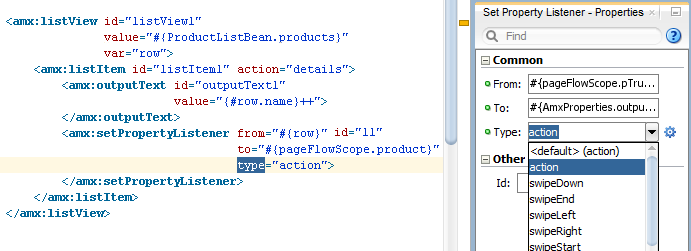
Footnote Legend
Footnote 1: See Section 13.3.27.1, "What You May Need to Know About the disabled Attribute" for details.