Working With Layouts in JavaFX
2 Tips for Sizing and Aligning Nodes
This topic describes techniques for controlling the size and alignment of nodes when placed in a JavaFX layout pane.
A main advantage of using the built-in JavaFX layout panes is that the size and alignment of nodes is handled by the pane. As the pane is resized, the nodes are resized according to their preferred size range preferences. Note that not all node classes are resizable. UI controls and layout panes are resizable, but shapes, Text objects, and Group objects are not resizable and are treated as rigid objects in a layout.
If you want more control over the size of controls in your UI, you can set their preferred size range directly. The layout pane then uses your settings to determine the size of the control. To manage the position of the controls, you can use the alignment properties for the layout panes.
This topic provides simple examples for sizing and aligning nodes in a pane. The LayoutSizingAligning.java file contains the source code for the samples described in this topic. The LayoutSizingAligning.zip file contains the NetBeans IDE project for the sample.
Sizing Nodes
Layouts query the preferred size of their nodes by invoking the prefWidth(height) and prefHeight(width) methods. By default, UI controls compute default values for their preferred size that is based on the content of the control. For example, the computed size of a Button object is determined by the length of the text and the size of the font used for the label, plus the size of any image. Typically, the computed size is just big enough for the control and the label to be fully visible.
UI controls also provide default minimum and maximum sizes that are based on the typical usage of the control. For example, the maximum size of a Button object defaults to its preferred size because you don't usually want buttons to grow arbitrarily large. However, the maximum size of a ScrollPane object is unbounded because typically you do want them to grow to fill their spaces.
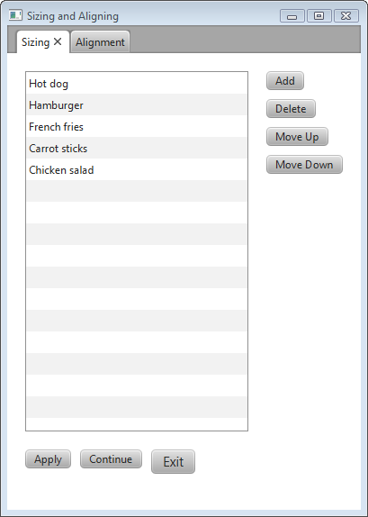
You can use the default size constraints of nodes, or you can set them to provide the look that you want. For example, Figure 2-1 shows the default size of several buttons and a list view in a border pane.
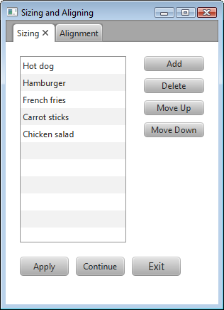
Suppose that the look that you want is the screen shown in Figure 2-2, which shows the UI controls sized according to desired constraints.
Applications often need to directly set the minimum, preferred, and maximum size constraints on controls. The following sections provide tips for overriding the computed sizes to get the look that you want.
Making Buttons the Same Size
You can go through the trouble of determining the height and width of each button and then setting the preferred size of each button to the greatest height and width of the buttons in the set. An easier option is to let the layout panes do the work. The layout pane that you want to use is determined by the effect that you want to achieve.
Using a VBox
The scene in Figure 2-1 uses a VBox layout pane for the buttons on the right and uses the computed sizes for the buttons. The buttons already have the same height, so only the width needs to be changed.
The scene in Figure 2-2 uses a VBox pane to take advantage of the default behavior that makes the width of the VBox pane the same as the preferred width of its widest element. To enable all of the buttons to be resized to the width of the VBox pane, the maximum width of each button is set to the Double.MAX_VALUE constant, which enables a control to grow without limit. An alternative to using the maximum value constant is to set the maximum width to a specific value, such as 80.0.
Example 2-1 shows how to make a column of buttons the same width using a VBox pane.
Example 2-1 Set a Column of Buttons to the Same Width
BorderPane border = new BorderPane();
border.setPadding(new Insets(20, 0, 20, 20));

Button btnAdd = new Button("Add");
Button btnDelete = new Button("Delete");
Button btnMoveUp = new Button("Move Up");
Button btnMoveDown = new Button("Move Down");

btnAdd.setMaxWidth(Double.MAX_VALUE);
btnDelete.setMaxWidth(Double.MAX_VALUE);
btnMoveUp.setMaxWidth(Double.MAX_VALUE);
btnMoveDown.setMaxWidth(Double.MAX_VALUE);

VBox vbButtons = new VBox();
vbButtons.setSpacing(10);
vbButtons.setPadding(new Insets(0, 20, 10, 20));
vbButtons.getChildren().addAll(btnAdd, btnDelete, btnMoveUp, btnMoveDown);
In the Layout Sizing and Aligning sample, the elements of the UI are laid out using a border pane. The column of buttons is put in the right region of the border pane to limit the size of the buttons to the preferred width of the widest button. The center region of a border pane expands to fill any space available so if you put the VBox pane in the center region, the VBox pane and the buttons also expand.
Using a TilePane
The scene in Figure 2-1 uses an HBox layout pane for the buttons on the bottom and uses the computed sizes for those buttons. The buttons have different widths and heights.
The scene in Figure 2-2 uses a horizontal TilePane layout pane to take advantage of the default behavior that makes each cell (tile) the same size. The size of each tile is the size needed to hold the preferred size of the largest node in the tile pane.
To enable the buttons to be resized to the size of the tile, set the maximum width and height to the Double.MAX_VALUE constant. Example 2-2 shows how make a row of buttons the same width and height using a tile pane.
Example 2-2 Set a Row of Buttons to the Same Size
Button btnApply = new Button("Apply");
Button btnContinue = new Button("Continue");
Button btnExit = new Button("Exit");
btnExit.setStyle("-fx-font-size: 15pt;");

btnApply.setMaxSize(Double.MAX_VALUE, Double.MAX_VALUE);
btnContinue.setMaxSize(Double.MAX_VALUE, Double.MAX_VALUE);
btnExit.setMaxSize(Double.MAX_VALUE, Double.MAX_VALUE);

TilePane tileButtons = new TilePane(Orientation.HORIZONTAL);
tileButtons.setPadding(new Insets(20, 10, 20, 0));
tileButtons.setHgap(10.0);
tileButtons.setVGap(8.0);
tileButtons.getChildren().addAll(btnApply, btnContinue, btnExit);
Tiles are not resized as the window size changes so the buttons don't change size when set in a tile pane. Note that if the width of the window is reduced, the buttons in the tile pane change position, but do not get smaller.
Keeping Nodes at Their Preferred Size
As a stage is resized, layout panes within the stage might have more or less space to allocate to the controls that they contain. Each layout pane has its own rules for allocating space according to the minimum, preferred, and maximum size ranges of the controls.In general, controls that have a default maximum size of Double.MAX_VALUE expand to fill their space while controls with constrained maximum sizes do not expand. For example, a ListView object has an unbounded maximum. If you want to limit the height to its preferred size, you can set the maximum size to the Control.USE_PREF_SIZE constant, as shown in Example 2-3.
Example 2-3 Set Maximum Height to Preferred Height
ListView<String> lvList = new ListView<String>();
ObservableList<String> items = FXCollections.observableArrayList (
        "Hot dog", "Hamburger", "French fries",
        "Carrot sticks", "Chicken salad");
lvList.setItems(items);
lvList.setMaxHeight(Control.USE_PREF_SIZE);
By default, buttons grow only to their preferred size. However, buttons shrink to where the label is shown as three dots (...) if the minimum width is not overridden. To prevent a button from becoming smaller than its preferred width, set its minimum width to its preferred width as shown in Example 2-4.
Example 2-4 Set Minimum Width to Preferred Width
Button btnMoveDown = new Button("Move Down");
btnMoveDown.setMinWidth(Control.USE_PREF_SIZE);
The preferred size of a control is initially based on the computed size. You can override the default preferred size by setting the preferred size constraint to the size of your choice. The following statement overrides the preferred width of a list view:
lvList.setPrefWidth(150.0);
Preventing Resizing
If you do not want the size of a node to change, set the minimum, maximum, and preferred sizes to the same size. To prevent only the width or height from changing, set the width or height constraints to the same value. In Example 2-5, a list is created with all size constraints set to the same width and height values so that the size of the list doesn't change as the size of the window changes. A button is created with all width constraints set to the same value.
Example 2-5 Set Size Constraints to Prevent Resizing
ListView<String> lvList = new ListView<String>();
lvList.setMinSize(150.0, Control.USE_PREF_SIZE);
lvList.setMaxSize(150.0, Control.USE_PREF_SIZE);

Button btnDelete = new Button("Delete");
btnDelete.setMinWidth(80.0);
btnDelete.setPrefWidth(80.0);
btnDelete.setMaxWidth(80.0);
Aligning Content
Each layout pane has a default way of aligning the nodes within the pane. For example, in HBox and VBox layout panes, nodes are top-justified and left-justified. In TilePane and FlowPane layout panes, nodes are centered. The panes themselves by default are typically top-justified and left-justified.
You can manage the alignment of nodes and panes by using the setAlignment() method for the panes. Alignment constants are available in the following enum types in the javafx.geometry package:
-
HPos- Values for specifying horizontal alignment. -
Pos- Values for specifying vertical and horizontal alignment. The value to the left of the underscore specifies the vertical alignment, the value to the right of the underscore specifies the horizontal alignment. For example,Pos.BOTTOM_LEFTaligns a node at the bottom of the space vertically and at the left edge of the space horizontally. -
VPos- Values for specifying vertical alignment.
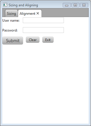
Figure 2-3 is created by the code shown in Example 2-6. Without any alignment constraints specified, the layout pane is placed in the top left corner.
Example 2-6 Create a UI with Default Alignment
    GridPane grid = new GridPane();
    grid.setHgap(10);
    grid.setVgap(12);

    HBox hbButtons = new HBox();
    hbButtons.setSpacing(10.0);

    Button btnSubmit = new Button("Submit");
    Button btnClear = new Button("Clear");
    Button btnExit = new Button("Exit");
    btnSubmit.setStyle("-fx-font-size: 15pt;");

    Label lblName = new Label("User name:");
    TextField tfName = new TextField();
    Label lblPwd = new Label("Password:");
    PasswordField pfPwd = new PasswordField();

    hbButtons.getChildren().addAll(btnSubmit, btnClear, btnExit);
    grid.add(lblName, 0, 0);
    grid.add(tfName, 1, 0);
    grid.add(lblPwd, 0, 1);
    grid.add(pfPwd, 1, 1);
    grid.add(hbButtons, 0, 2, 2, 1);
}
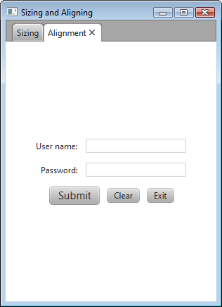
Suppose the look that you want is the screen shown in Figure 2-4, which centers the layout pane in the screen and changes the default alignment of the controls.
The following sections provide tips for overriding the default positions.
Centering the Grid
To center the grid from Example 2-6 in the scene, use the following statement:
grid.setAlignment(Pos.CENTER);
Aligning Controls in the Columns
In the desired layout, the labels are right-justified and the fields are left-justified. To achieve this in a grid, define each column using the ColumnConstraints class and set the horizontal alignment constraint. Example 2-7 defines the columns for the grid from Example 2-6.
Example 2-7 Define the Columns in the Grid
GridPane grid = new GridPane();
grid.setAlignment(Pos.CENTER);
grid.setHgap(10);
grid.setVgap(12);

ColumnConstraints column1 = new ColumnConstraints();
column1.setHalignment(HPos.RIGHT);
grid.getColumnConstraints().add(column1);

ColumnConstraints column2 = new ColumnConstraints();
column2.setHalignment(HPos.LEFT);
grid.getColumnConstraints().add(column2);
An alternative for right-justifying controls in a column is to use a VBox layout pane. Use the setAlignment() method as shown in the following statements:
VBox vbox = new VBox;
vbox.setAlignment(Pos.CENTER_RIGHT);
Centering the Buttons
The buttons are laid out in an HBox layout pane that spans both columns in the grid. The following statement centers the buttons in the grid from Example 2-6:
hbButtons.setAlignment(Pos.CENTER);
The setAlignment() method for the HBox pane centers the HBox pane within its layout area and also centers the nodes within the HBox pane. You might prefer to center the HBox pane within the row but bottom-justify the buttons within the HBox pane as shown in Figure 2-5.
Figure 2-5 Override Positions and Bottom-Justify the Buttons

Description of "Figure 2-5 Override Positions and Bottom-Justify the Buttons"
For this arrangement, place the HBox pane in an inner grid with a single cell and place that grid in the third row of the outer grid. Set the alignment constraint for the inner grid to center the grid and set the alignment constraint for the HBox pane to bottom-justify the contents as shown in Example 2-8.
Additional Resources
To learn more about the layout panes in JavaFX, see the information for the javafx.scene.layout package in the API Documentation.
 Joni develops documentation for JavaFX. She has been a technical writer for over 10 years and has a background in enterprise application development.


