|
Product Administration Guide > Creating Custom Siebel Configurator User Interfaces >
About Themes for the Siebel Configurator UI
When you create a work space for a customizable product, you can select a base theme and product theme. These control the basic look and feel of the pages a user sees when they configure the product. About the Base Theme
A base theme defines the home page for the customizable product. It is the container within which the product theme pages display. The base theme has a thread bar you can use to navigate between product theme pages. Two types of base theme are provided:
- Base Theme with Auto Pricing. When the user selects an item, its price is updated immediately.
- Base Theme with Manual Pricing. The pricing of items is not updated until the user clicks Update Price.
Upgrade users: If you do not select a base or product theme, default themes are used. If you do not specify groups or controls, intelligent defaults are used. These defaults replace Configuration Assistant in release 6.x and lower. About Product Themes
Product themes specify the style used to group items together on selection pages. You define which items appear on a page by defining groups in the User Interface view and adding products to the groups. Each group is displayed on a separate selection page. Three basic product theme types are provided.
- Tab Product Theme
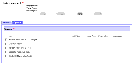
The items in each group are displayed on a separate page, as shown in Figure 5. The Stereos group and the Options group each have a tab, and the user can move between pages by clicking the tab. A standard group of buttons, Save, Cancel, Done, and Finish It display above the tabs. A Red Star displays next to the title of the Stereos page to indicate that the user is required to choose an item and has not done so.
Figure 5. Tab Product Theme
- Wizard Product Theme
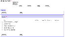
The items in each group are presented on separate pages, as shown in Figure 6. The Stereos group is displayed by itself as the first page in the sequence. A standard group of buttons, Save, Cancel, Done, and Finish It display above the page. A Red Star displays next to the title of the Stereos page to indicate that the user is required to choose an item and has not done so. Previous and Next buttons, located within the page, allow the user to move between pages.
Figure 6. Wizard Product Theme
- Single Page Product Theme
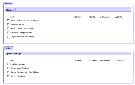
All the groups in the customizable product are presented on a single selection page, as shown in Figure 7. The tab pages used in the Tab theme and Wizard theme are stacked vertically one beneath the other to form the selection page. A standard group of buttons, Save, Cancel, Done, and Finish It display at the top of the selection page. A Red Star displays next to the title of the Stereos group to indicate that the user is required to choose an item and has not done so.
The top portion of the page, containing the product name and standard buttons, is not shown in the figure.
Figure 7. Single Page Product Theme
|