


| Bookshelf Home | Contents | Index | Search | PDF | |
Siebel Tools Reference > Physical UI Navigation and Templates > Applet Templates >
Toggle Applets
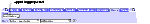
Links to navigate between the toggle applets can be rendered as drop-down select controls or links, or tabs (Figure 229).
The toggle selection control can be rendered in any applet template using the new tag
<swe:togglebar>. This tag works similarly to the <swe:viewbar> and<swe:screenbar>tags.
<swe:togglebar>Usage:
<swe:togglebar type="xxx" property="zzz">Attributes:
- Type. This can have one value, which is Select. If the type is set to Select, the togglebar will be rendered as a HTML Select control showing the set of applets that are available for the toggle. The applet titles are used as values in the select control.
- Property. This attribute is to be used only when the type is set to Select (will not have any effect in other cases). This attribute can have a value of FormattedHtml, in which case the HTML Select control is rendered. If this attribute is not specified, this tag acts as a conditional tag to show its contents if there are toggle applets defined. The
<swe:this>tag will be used within the body of this tag in this case to render the select control.If the applet does not have toggle applets defined, this tag and its contents are skipped.
When the type attribute is not set to Select,
<swe:togglelink>and<swe:togglename>tags can be used within the body of the<swe:togglebar>tag to create the toggle links or tabs, similar to use of<swe:viewlink>and<swe:viewname>tags.
<swe:togglelink>Usage:
<swe:togglelink state="xxx" property="yyy">Attributes:
- State. This is optional. Can have values Active or Inactive. If state is Active, this tag will be used only if the current applet title being rendered is the currently active applet. If state is Inactive, this tag will be used only if the current applet title being rendered is not the currently active applet. If not specified, the tag is shown for all applets.
- Property. This is optional. Can have only one value, FormattedHtml, which will output the HTML for creating a link to toggle to the applet. If this attribute is not specified, then no output is generated.
<swe:togglename>Usage:
<swe:togglename/>Outputs the title of the applet.
Examples
To show the toggle applets as a select control:
<swe:togglebar type="Select" >
<table><tr>
<td>
<swe:control id="1" property="DisplayName">
</td>
<td>
<swe:this property="FormattedHtml"/>
</td>
</tr></table>
</swe:togglebar>
Here the control is used to create a label like Show: before the select control. To show the toggle applets as tabs or links:
<swe:togglebar>
<table><tr>
<td>
<swe:togglelink property="FormattedHtml">
<swe:togglename>
</swe:togglelink>
</td>
</tr></table>
</swe:togglebar>
| Bookshelf Home | Contents | Index | Search | PDF | |
Siebel Tools Reference, Version 7.5, Rev. A Published: 18 April 2003 |