| Oracle® WebCenter Framework Tutorial 10g (10.1.3.2.0) Part Number B31072-02 |
|
|
View PDF |
| Oracle® WebCenter Framework Tutorial 10g (10.1.3.2.0) Part Number B31072-02 |
|
|
View PDF |
In this lesson you will extend the page created in the previous lesson by adding customizable components to the page and experimenting with ways to affect the component's look and feel. Along the way you will test your page to confirm that your page is developing the way you expect it to.
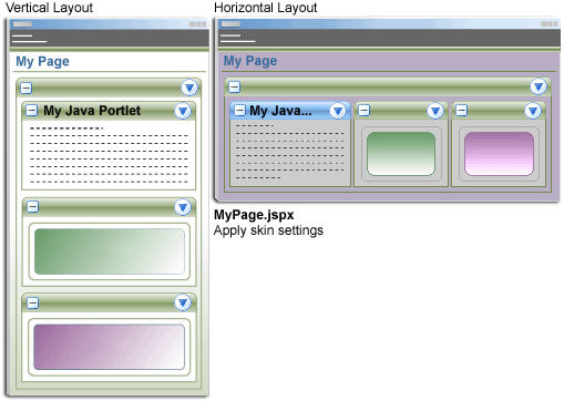
Figure 4-1 shows how the components on your page will be laid out once you complete this lesson.
Figure 4-1 MyPage.jspx at the End of Lesson 4
We will customize the page by completing the following steps:
Let's begin by examining some of the benefits that Oracle WebCenter Framework provides.
One of the key features of Oracle WebCenter Framework is the concept of "Design Time at Run Time", which allows site administrators to customize the page for others. Customization is achieved through customizable components, specifically PanelCustomizable and ShowDetailFrame. (Customizing pages is different from customizing portlets, which you did using portlet actions in the last chapter.)
Using these two components, you can give users the option of hiding a certain piece of content, or moving it to a different location on the page. Let's see how this works.
Make sure MyPage.jspx appears in the Visual Editor.
Open the Component Palette.
Using the drop-down list, select Customizable Components Core (Figure 4-2).
There are two items in this group:
PanelCustomizable, which provides a horizontal or vertical layout in which to include Oracle ADF components. By setting a few attributes in the Property Inspector, you can enable actions for showing or hiding whatever content is placed within the layout.
ShowDetailFrame, through which you can display the actions allowed for a particular component. In this release of Oracle WebCenter Framework, users can move, minimize, or maximize content. You can think of ShowDetailFrame as the chrome, or border that goes around the components on the page.
Let's see these concepts in action.
In the Applications Navigator, highlight MyPage.jspx.
Notice how the structure of the page appears in the Structure window (Figure 4-3).
In the Component Palette, highlight PanelCustomizable, and drag it to the Structure window. Drop it over the h:form tag.
Tip:
When you drop a component inside a form, make sure thath:form has a box around it.Working with the Structure view provides greater certainty where a component is being placed but you can also drag and drop components directly onto the Visual Editor.
In the Component Palette, highlight ShowDetailFrame, and drag it to the Structure window. Drop it over cust:panelCustomizable.
cust:showDetailFrame becomes a child of cust:panelCustomizable, as shown in Figure 4-4.
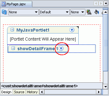
In the Visual Editor (shown in Figure 4-5), you can see showDetailFrame1 within a grey box. The grey box indicates the cust:panelCustomizable, so we know that we safely dropped showDetailFrame within it. The area that is circled represents the control that users will use to customize the content of showDetailFrame.
Figure 4-5 ShowDetailFrame Component Added to MyPage.jspx
Let's add some content now, in the form of a simple image.
In the Component Palette drop-down list, select ADF Faces Core.
This presents you with a list of commonly used ADF components.
Scroll down the alphabetical list until you see the ObjectImage component.
Highlight ObjectImage, and drag it to the Structure window. Drop it on top of cust:showDetailFrame.
The Insert ObjectImage window opens.
Use the ... button to locate the directory where you unzipped webcentertutorialcontent.zip (see Downloading Sample Tutorial Files). For example: C:\TutorialContent
Highlight the image camera.gif, and click OK.
A dialog opens asking you if you want to locate the image under the document root. If you choose Yes, a copy of the image is saved to a location that is automatically included when you create the application deployment archive.
Click Yes.
Click Save, then OK.
Figure 4-6 Adding an Image to MyPage.jspx
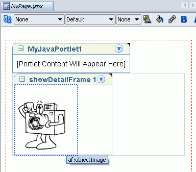
The image camera.gif appears inside the showDetailFrame component as shown in Figure 4-6.
Tip:
You can drag and drop images directly from your file system, for example C:\TutorialContent\camera.gif, onto aShowDetailFrame component. An ObjectImage is created automatically, and the image is copied to the project.Let's add another image so you can see how users will be able to move the images around the page.
In the Component Palette drop-down list, select Customizable Components Core, and select ShowDetailFrame.
Drag ShowDetailFrame to the Structure window and drop it on cust:panelCustomizable.
In the Component Palette drop-down list, select ADF Faces Core, and select ObjectImage.
Drag ObjectImage to the Structure window. Drop it on top of the second cust:showDetailFrame.
Use the ... button to locate hula.gif (see Downloading Sample Tutorial Files), and click OK.
A dialog opens asking you if you want to locate the image under the document root.
Choose Yes.
Click Save, then OK.
The Design tab in the Visual Editor should now look something like Figure 4-7.
Figure 4-7 Two Images and a Portlet on MyPage.jspx
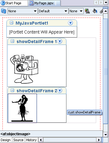
Each image has its own actions icon on the showDetailFrame header, so each can be acted upon independently.
Now let's run the page and see what kind of customizations are possible.
In this step, we run the page and test the customizations that a user might make.
Right-click MyPage.jspx, and click Run.
Assuming there aren't any compiler errors, the page opens in another browser window, as shown in Figure 4-8.
Click the Actions icon on the first image.
You should see two actions: Move and Maximize as shown in Figure 4-9.
These actions are automatically provided by showDetailFrame. Any components you drop within a showDetailFrame can be moved or maximized within the context of its parent panelCustomizable.
Click Maximize in the first image and see how its showDetailFrame expands to fill the entire panelCustomizable as shown in Figure 4-10. The second image is hidden.
Notice that MyJavaPortlet is unaffected by this action. That's because the portlet is not part of this panelCustomizable.
Click the Actions menu, and then click Restore to return the image to its original size.
On either of the images, click Move, Down or Move, Up to see the images switch places on the page. Again, because MyJavaPortlet is not controlled by this panelCustomizable, it remains stationary as the images trade places.
Figure 4-11 shows the browser after Move, Down was used on the first graphic, the camera. The hula graphic is now on top of the camera graphic.
In the next step, we'll move MyJavaPortlet into cust:panelCustomizable, and experiment with the Property Inspector to affect the behavior of different components on the page.
In the Structure window, drag adfp:portlet, which represents MyJavaPortlet, and drop it on cust:panelCustomizable (Figure 4-12).
Figure 4-12 Dropping the Portlet Onto PanelCustomizable
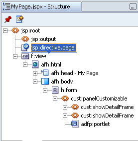
The portlet automatically goes to the bottom of the list of objects, and the Design view follows suit. The portlet now appears beneath the second image.
Notice that we dropped the portlet directly onto cust:panelCustomizable without inserting a showDetailFrame first. That's because the portlet comes automatically equipped with the customization capabilities provided by the portlet chrome; that is, the ability to maximize/minimize and to reposition the portlet on the page.
Now let's choose a different orientation for the portlet and images. Rather than displaying them vertically, let's display them horizontally.
In the Structure window, highlight cust:panelCustomizable.
In the Property Inspector, under General, click the field beside Layout.
The Property Inspector is to the right of your JDeveloper screen (Figure 4-13).
Figure 4-13 JDeveloper Property Inspector
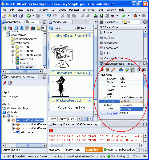
Select horizontal as shown in Figure 4-14.
Figure 4-14 Selecting a Horizontal Layout
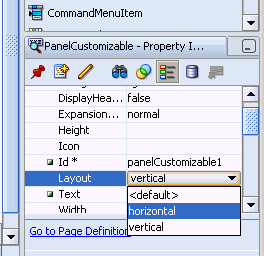
You can see in the Visual Editor that the portlets and images are now side by side, rather than on top of one another as seen in Figure 4-15.
Now let's activate the ability to hide or show content.
In the Property Inspector, under General, locate DisplayHeader, and change it to true as shown in Figure 4-16.
Figure 4-16 Changing DisplayHeader to True
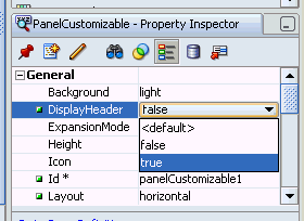
This displays a header area at the top of the layout so that there is room for the Action icon to appear as part of the menu. (If for some reason you don't want to display the header in your own applications, you can keep DisplayHeader set to false. As long as you complete the next step, the menu actions for the component are displayed by hovering over the panelCustomizable area.)
In the Property Inspector, under Actions, locate IsSeededInteractionAvailable, and change it to true.
The IsSeededInteractionAvailable attribute makes it possible to display whatever menu actions are supported by the component. In this case, the user will be able to hide or show any content that appears within the layout.
Now let's change the name of MyJavaPortlet through the Property Inspector, just so you can see how it's done.
Note that once you make changes through the Property Inspector, you can never again customize or personalize the portlet's name at runtime. Although this behavior is acceptable for the purposes of this tutorial, it's something you'll want to keep in mind as you develop your own applications in the future.
In the Structure window, highlight adfp:portlet so that the Property Inspector now reflects the portlet's properties.
In the Property Inspector, under General, locate the Text field, and enter: Sample Portlet as shown in Figure 4-17.
This changes the name that appears in the portlet header.
Click Save All in the JDeveloper toolbar.
Let's run the page again to see how these changes affect the page.
To test the customizations, we run the page and make sure it looks as we expect it to:
Before running the page again, stop the embedded OC4J Server. Choose Run, Terminate, Embedded OC4J Server from the main menu.
Alternatively, click the red square Terminate icon in the Embedded OC4J Server Log window.
Click MyPage.jspx in the Visual Editor, then click the green arrow in the toolbar to run the page.
Assuming there aren't any compiler errors, the page opens in a new browser window (Figure 4-18).
Figure 4-18 panelCustomizable with Two showDetailFrames and a Portlet
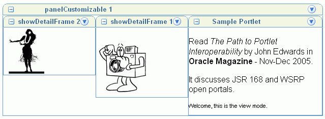
As a result of activating IsSeededInteractionAvailable, the container object's Action icon now contains a Show Content action, through which you can hide or show the images and portlet (Figure 4-19). Take a moment now to experiment with them.
All the other page customizations we made in Step 3 are also there:
The title of the portlet has changed to Sample Portlet. Now that the portlet title is driven by the Text property you can no longer customize or personalize the title at runtime. If you click the Actions icon and choose Customize, you'll see this for yourself.
The components are displayed horizontally, instead of vertically. If you click the Actions icon on one of the images, you can see that the Move action now says Left and Right instead of Up and Down.
Because we changed DisplayHeader to true, the container object, panelCustomizable, now displays a header area. Recall that the layout had no such header in Step 3, before we changed the DisplayHeader setting.
Everyone who runs the page will see these page customizations.
Before moving on, let's remove the permanent portlet title customization we made through the Property Inspector. In Chapter 8, "Providing Security" we use the portlet's title property to demonstrate page personalization so we must be able to change the name at runtime:
Close the browser, and return to JDeveloper.
In the Structure Window for MyPage.jpsx, highlight adfp:portlet.
In the Property Inspector, click the Text field, and then click the Reset to Default icon in the Property Inspector toolbar. This will remove the text Sample Portlet.
In the Visual Editor, the name in the portlet header should change back to MyJavaPortlet1.
In the future, you may want to use multiple panelCustomizable components on a page, each containing one or more portlets or objects within a showDetailFrame component. Because each layout has its own Move, Maximize, and Show/Hide capabilities, placing multiple layouts on the page enables you to treat blocks of components and portlets as separate entities. You'll find more information in the Oracle WebCenter Framework Developer's Guide.
In Oracle WebCenter Framework, there are two ways to control the style (that is, look and feel) of your application:
Use an Oracle ADF Faces skin to apply a global style to the entire application. If you choose this option, you can use style selectors in your own custom skin to modify selected aspects of a component or area of a component.
Use the Property Inspector to change style-related properties at design time.
In the following steps, you'll use both of these methods to change the look and feel of MyPage.jspx:
In this step, you'll use the default ADF Faces skin (called Oracle) to influence style-related properties.
In the Structure window, highlight one of the cust:showDetailFrame entries. We'll use this component to see how to specify style property values.
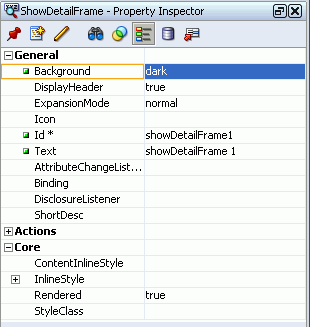
In the Property Inspector, expand the Background property.
The default ADF Faces skin offers three settings, light, medium, and dark. Let's choose a dark background for this component.
Change the value to dark, as shown in Figure 4-20.
Figure 4-20 Property Inspector: Background
Click File, Save All to save your work.
Click the red square to stop the embedded OC4J in preparation to run your page again.
Right-click MyPage.jspx, and click Run.
Assuming there aren't any compiler errors, the page opens in a new browser window (Figure 4-21). Notice how the background decoration of the showDetailFrame has changed.
Now let's see how to create a brand new skin and override the styles defined by the default ADF Faces skin.
In this step you'll create a new skin, register the skin with your application, and learn how to apply custom styles to components on MyPage.
First, return to JDeveloper and create a brand new style sheet (.css):
In the Applications Navigator, right-click ViewController, and choose New.
In the New Gallery under Categories, expand the Web Tier, and select HTML.
Under Items, select CSS File, and click OK.
For File Name, enter mystyle.css as shown in Figure 4-22.
Click OK.
Your new style sheet appears in the Applications Navigator under ViewController, Web Content, css and also displays in the Editor. Notice the default style selectors BODY, H1, H2, and H3.
In the steps that follow, you'll register a new skin with your application. This involves creating a file named adf-faces-skins.xml, and populating it with a short list of tags that identify the skin's ID, location, .css, and the like.
Let's create adf-faces-skins.xml:
In the Applications Navigator, under ViewController, Web Content, right click the WEB-INF folder, and select New.
In the New Gallery, set the Filter By scope to All Technologies.
Under the General node, select XML.
In the right pane, select XML Document, and click OK.
In the File Name field, enter the file name: adf-faces-skins.xml as shown in Figure 4-23.
The file must be stored in the WEB-INF folder, so just click OK to create the file.
An empty XML file displays in the Editor. It appears in the Applications Navigator under WEB-INF.
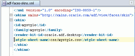
Add tags to adf-faces-skins.xml to identify your new skin (and point to your new style sheet mystyle.css):
Copy and paste the following code into the XML Editor:
<?xml version="1.0" encoding="ISO-8859-1"?>
<skins xmlns="http://xmlns.oracle.com/adf/view/faces/skin">
 <skin>
  <id>mystyle</id>
  <family>mystyle</family>
  <render-kit-id>oracle.adf.desktop</render-kit-id>
  <style-sheet-name>css/mystyle.css</style-sheet-name>
 </skin>
</skins>
Your file should look Figure 4-24.
Figure 4-24 Configure adf-faces-skins.xml
Click File, Save to save adf-faces-skins.xml.
In the next step you'll configure your application to use this new skin by setting the <skin-family> tag in adf-faces-config.xml.
Edit the <skin-family> tag in adf-faces-config.xml:
Open adf-faces-config.xml, located under ViewController, Web Content, WEB-INF.
Replace oracle (the default skin) with the family name of your new skin. Enter mystyle as shown in Figure 4-25.
Figure 4-25 Edit Skin Family in adf-faces-config.xml

Click File, Save.
Now the new skin is registered with your application, let's add some style selectors to your style sheet that apply to showDetailFrame components on MyPage.
Add the following style selectors to mystyle.css:
In the Applications Navigator, under ViewController, Web Content, css, double-click mystyle.css.
Copy the following code, and paste it at the bottom of the file:
af|showDetailFrame::header-light
{
 color:Purple;
}
af|showDetailFrame::header-medium
{
 color:Purple;
}
af|showDetailFrame::header-dark
{
 color:White;
}
This code specifies the color for the text that displays in a showDetailFrame component's header and a portlet's header. We've chosen purple text for header-light and header-medium, and white text for header-dark. Choose another color scheme if you prefer.
Copy the following code, and paste it at the bottom of the file:
af|showDetailFrame::content-light, af|showDetailFrame::content-medium, af|showDetailFrame::content-dark
{
 color: Black;
 background-color: Silver;
 border-left:1px black solid;
 border-right:1px black solid;
 border-bottom:1px black solid;
}
This code changes the content of a showDetailFrame and portlet body to have a silver background, with black text and black borders. Choose another color scheme if you prefer.
For a full list of style selectors for showDetailFrame and panelCustomizable components, see Oracle WebCenter Framework Developer's Guide.
Now change the background color of your page. Scroll to the BODY tag at the top of the style sheet, and change the background-color from White to Purple. The BODY tag should look like this:
BODY
{
   background-color: Purple;
   color: black;
   font-family: Arial, Helvetica, sans-serif;
}
Click File, Save All to save your work.
Click the red square to stop the embedded OC4J in preparation to run your page again.
Right-click MyPage.jspx, and click Run.
Assuming there aren't any compiler errors, the page opens in a new browser window.
Take a moment to examine the new look and feel. If you used the styles we suggested your page will look like Figure 4-26. Notice how showDetailFrames display purple/white header text, black content text, and have a silver background. The background of the page will be colored purple too.
Figure 4-26 MyPage.jspx Using mystyle.css

During this lesson you've experimented with ways to affect the look and feel of your application. You'll find more detailed information in the Oracle WebCenter Framework Developer's Guide.
Before moving on, let's change back to the default Oracle skin.
To remove the custom skin:
Open adf-faces-config.xml, located under ViewController, Web Content, WEB-INF.
Change the <skin-family> tag back to oracle as shown in Figure 4-27.
Figure 4-27 Edit Skin Family in adf-faces-config.xml

Click File, Save All.
In the next lesson, you'll learn how to add the Rich Text portlet, which provides a bulletin board-like feature to users.