|
|
This chapter describes the components you can add to pages and how to use them.
Page components are user interface elements that can be added to pages. A page component can display data stored in the Pages repository or an external data source, static content, or content keyed off of the preferences assigned to the component. You create page components by selecting from a palette of component types and then completing a wizard to define the component instance.
The following components are available by default:
Enables you to add an image to the page. You can use an uploaded image or point to a URL. For more information on image components, see Image Components.
|
|
Enables you to add a list of records to the page. A record list enables users to search for and view records. With editable DataSpaces, users with the proper permissions can also edit, add, and delete records. For more information on record list components, see Record List Components.
|
|
Enables you to add formatted text to a page. For more information on rich text components, see Rich Text.
|
|
Enables you to add a table of records to the page. A table enables users to search for, sort, and view records. With editable DataSpaces, users with the proper permissions can also edit, add, and delete records. For more information on table components, including descriptions and examples of the three types of tables, see Tables.
|
You add a component to a page by dragging the appropriate component icon to the location you want. As you drag the component a blue box serves as a placeholder for the component, and other components move to make room for the new component. When you drop the component where you want it, a dialog box prompts you for a title and description for the component. If the component relies on a DataSpace, you must also create a new DataSpace or select an existing one.
When you place components next to each other in a row, the row height is based on the height of the tallest component in the row. The horizontal space allotted for each component is divided equally between the components in the row. Components are top and left aligned within their horizontal space in the row. Here is an example:
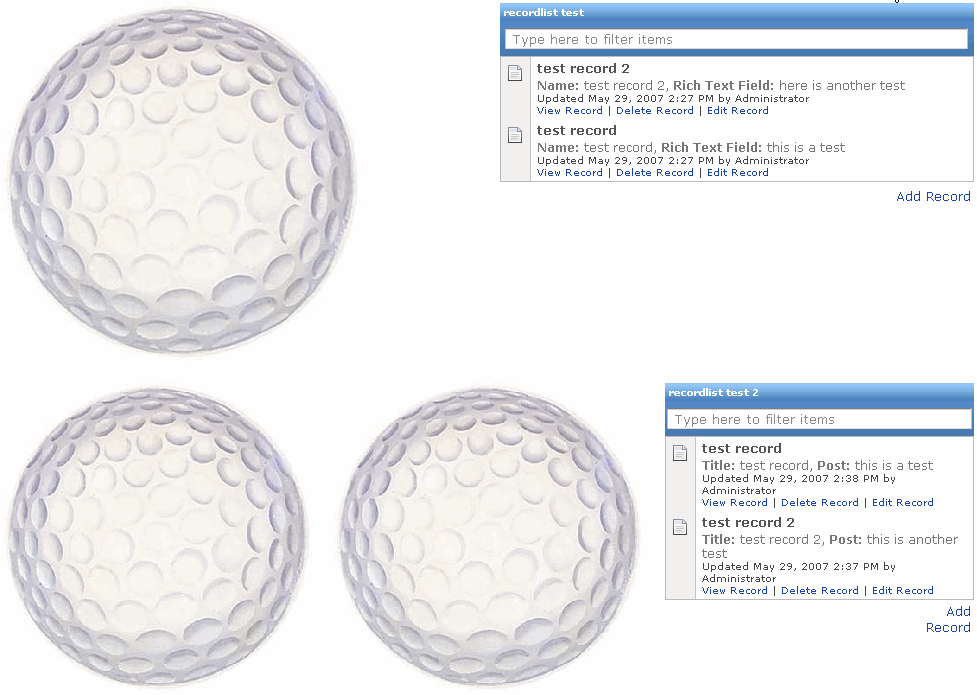
All three golf ball images are the exactly the same, and the two record lists are exactly the same. However, you can see how the sizes of the components change depending on whether there are two or three components in the row. You can also see that the height of the first row is based on the height of the golf ball image, whereas the height of the second row is based on the height of the record list.
If you want a component to span more than one row, you need to place that component in another column. Here is an example:
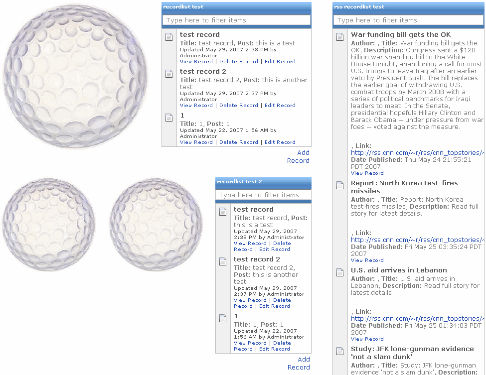
This example is the same as the previous example, but with the addition of another column with a longer record list in it. Because the longer record list is in a different column, it does not affect the height of the rows in the other column (the column containing the golf ball images and shorter record lists).
After placing a component on a page, you can change it by moving it to a new location or changing its settings:
If you delete a component from a page, any underlying DataSpace and its data remains available in Pages. If you need to retrieve a deleted component, you can revert to a previous version of the page that included the component.
The image component enables you to add an image to the page. You can point to a URL, use an uploaded image, or use an image attached to the page. For example, when viewing a record of a customer issue, you might want to display a screenshot of the issue experienced by the customer.
There are several ways to include an image:
| Note: | For more information on image components, see the online help. |
The record list component enables you to add a list of records from a DataSpace to the page. A record list enables users to search for and view records. With editable DataSpaces, users with the proper permissions can also edit, add, and delete records.
| Note: | For information on working with records, see Records. |
Here is an example record list:
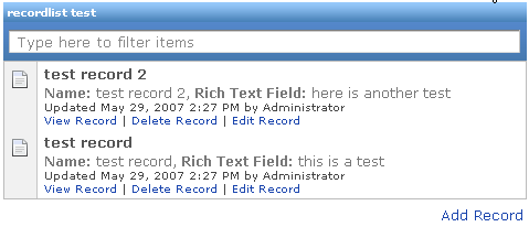
Record lists are a good way to display data from DataSpaces with a significant number of fields (since each field is not represented by a table column) or large amounts of data in some or all of the fields (since the data for each field is not displayed in a single table cell).
| Note: | For more information on record list components, see the online help. |
The rich text component enables you to add formatted text to the page. After adding a rich text component, you type your text and then use the formatting toolbar to change the formatting.
| Note: | Rich text fields in custom DataSpaces use the rich text formatting toolbar. However, not all functions are available in rich text fields, as noted in the table. |
| Note: | For more information on rich text components, see the online help. |
The table component enables you to add a table of records from a DataSpace to the page. The table automatically includes a column for each field in the associated DataSpace. A table enables users to search for, sort, and view records. With editable DataSpaces, users with the proper permissions can also edit, add, and delete records.
| Note: | For information on working with records, see Records. |
There are three table modes, all of which enable similar functionality, but in slightly different interfaces. To learn about and see examples of the different table modes, see Table Modes.
Tables are a good way to display data from DataSpaces with a minimal number of fields (since each field is represented by a column) or small amounts of data in the fields (since the data for each field is displayed in a single table cell).
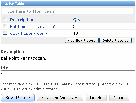
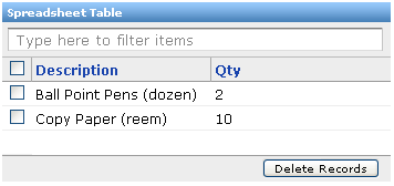
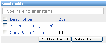
There are three table modes: Master/Detail, Spreadsheet, and Simple. Each table enables users to search for, sort, and view records. With editable DataSpaces, users with the proper permissions can also edit, add, and delete records. The difference between the tables is the user interface.
| Note: | For information on working with records, see Records.
|
| Note: | For more information on table components, see the online help. |


|
 .
. .
.