7 Working with Page Content
The process of adding content to a page is simple and straightforward. Things get interesting when you arrange and configure that content to meet the requirements of your enterprise. This chapter describes how to add and arrange page content and how to manage that content. It also describes how to configure the properties commonly shared among many types of components. It contains the following sections:
This chapter is intended for users who want to build pages by adding different objects and dynamic components. Such users include everyone working in their personal spaces (provided their WebCenter application enables their control over all aspects of their personal spaces—the out-of-the-box default) and authorized users working in group spaces.
The WebCenter Spaces application administrator has the authority to expose or hide a particular service's task flows. Tasks discussed in this chapter are not available to you if the relevant service is hidden.
7.1 Adding Content to a Page
This section describes how to add content from the Oracle Composer Catalog to your application pages. It contains the following subsections:
Note:
See Chapter 6, "Creating, Editing, and Deleting Pages," for information about creating pages and adding and configuring page layout components.7.1.1 What You Should Know About Adding Content
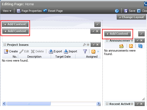
In the edit page mode of Oracle Composer, you can add content wherever you see the Add Content button (Figure 7-1).
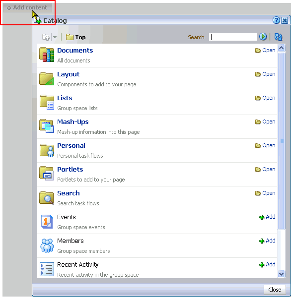
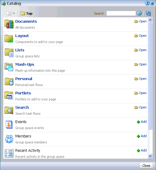
Clicking Add Content opens the Oracle Composer Catalog, which provides access to all the documents, task flows, Portlets, and layout components you can add to a page (Figure 7-2).
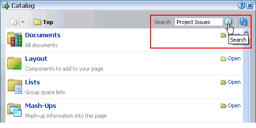
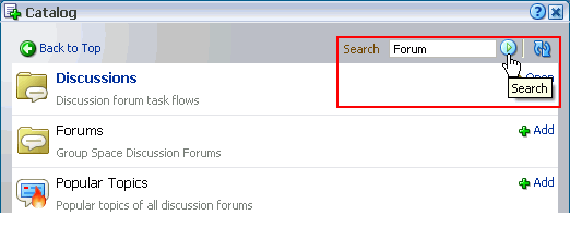
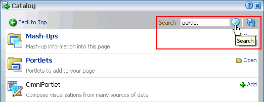
Many Catalog resources are organized in folders and subfolders. Because the Catalog can get quite deep with resources, it also provides a search feature for finding the object you want to add. Enter a search term in the Search field (Figure 7-3).
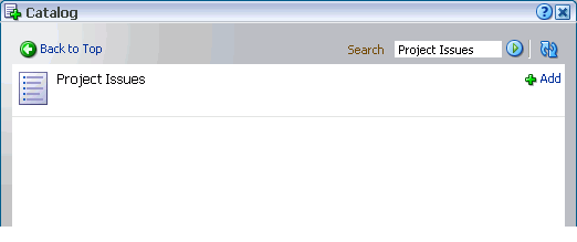
Results display in the Catalog (Figure 7-4).
7.1.2 Adding Document Library Content to a Page
You can add content from a document library to an application page to expose a list of files, the content of a particular document, or an entire document library. When you add Document Library content to a page, the way it is rendered depends on the type of content you are adding. For example, folders are rendered as a flat list of files with a subset of the controls you find in a document library. Files are rendered according to the type of file you add:
-
An image file is rendered as an image.
Note:
An image from the Document Library is different from an Image layout component. For example, you click an Add button to add an image from the Document Library. You click an Add button and then specify an image location for an Image layout component. Additionally, the Image layout component includes aDestination URIproperty, which you can use to specify a link that executes when users click the image. For more information, see Section 6.5.1.4, "Introducing the Image Layout Component."
This section describes how to add folders and files (including image, HTML, and other file types) to a page.
To add a folder or a file to a page:
-
Log in to your WebCenter application.
For information about logging in, see Section 2.2.1, "Logging In to a WebCenter Application."
-
Go to the page where you want to add a file or folder.
For information about locating pages, see Section 2.4, "Hiding, Showing, Opening, and Closing Pages."
-
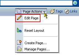
From the Page Actions menu, select Edit Page to open Oracle Composer (Figure 7-5).
Note:
If the Edit Page command is not available on the Page Actions menu or the Page Actions menu does not display, it is likely that you do not have sufficient page access privileges. If this is the case, ask your application administrator for the privilege to edit pages. See Section 2.7, "Contacting Your Application Administrator."In custom WebCenter applications, open Oracle Composer according to your page design. For example, in the Fusion Order Demo for WebCenter, you can open Oracle Composer by clicking the Edit link at the top of the page (Figure 7-6).
Note:
For more information about the Fusion Order Demo for WebCenter, see Oracle Fusion Middleware Developer's Guide for Oracle WebCenter.The page opens in Oracle Composer (Figure 7-7).
Figure 7-7 A Page Viewed Through Oracle Composer
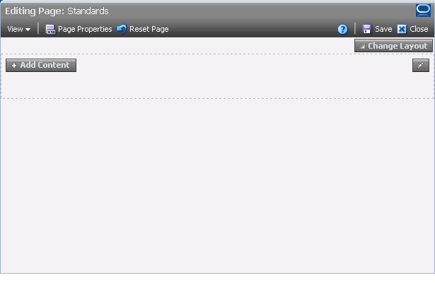
Description of "Figure 7-7 A Page Viewed Through Oracle Composer"
-
Click the Add Content button where you want to place the content (Figure 7-8).
The Catalog opens (Figure 7-9).
Note:
When the Catalog is open, the page goes gray, and you cannot perform any other actions on the page until you close the Catalog. -
Click the Open link next to Documents (Figure 7-10).
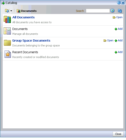
The content of the Documents folder appears (Figure 7-11).
Note:
When you drill into the Documents folder, you are actually drilling into the live connection with the document repository. The documents you see in the content Catalog are not static resources, but reflect the latest status of files and folders in the content repository associated with your enterprise application.Users of custom WebCenter applications see similar types of components.
-
The next link you click depends on your current location in the application:
-
In a custom WebCenter application, or in a group or personal space in WebCenter Spaces, click All Documents to access all documents to which you have access.
-
In a WebCenter Spaces group space, click Group Space Documents to open a list of all of the files and folders to which you have access in the current group space.
-
In a WebCenter Spaces personal space, click Personal Documents to open a list of all the files and folders to which you have access in your personal space.
If necessary, continue to drill into the Documents folder until you arrive at the content you want to add to the page.
-
-
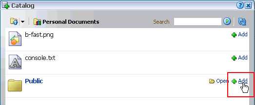
Click the Add link next to the folder or file you want to add to the page (Figure 7-12).
The document library content you add to a page renders according to its type. For example:
-
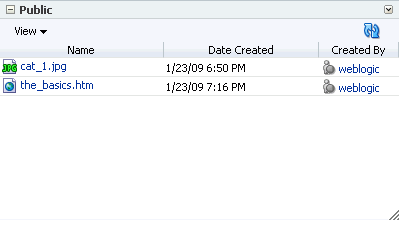
A folder is rendered as a list of folders and files (Figure 7-13).
-
An image file displays the image in-place.
-
An HTML file displays the HTML in-place.
-
All other file types are rendered as links.
-
-
Click the Save button in Oracle Composer to save your changes (Figure 7-14).
-
Optionally, click the Close button to exit Oracle Composer (Figure 7-15).
7.1.3 Adding Task Flows to a Page
WebCenter Spaces exposes collaborative, social networking, and personal productivity features through services, which, in turn, expose subsets of their features and functionality through task flows. Services provide a wide variety of functionality in support of personal and team objectives. Task flows provide reusable functionality that may expose all or a subset of the features available from a particular service. See Section 1.2, "Introducing WebCenter Services."
The different task flows of a particular service can range from offering all of the service's features to a subset of those features. For example, the Documents service provides multiple task flows that each provide a different view of your content repository back end and different subsets of the repository's features. One task flow allows for the creation and display of files and folders; another simply lets you view and access files.
Note:
In addition to task flows, you can place a file from a Document Library directly onto a page. How that file is rendered depends on the file's type (see Section 7.1.2, "Adding Document Library Content to a Page").This section describes how to add a task flow to a page.
-
Log in to Oracle WebCenter Spaces.
For information about logging in, see Section 2.2.1, "Logging In to a WebCenter Application."
-
Go to the page where you want to add a task flow.
For information about locating pages, see Section 2.4, "Hiding, Showing, Opening, and Closing Pages."
-
From the Page Actions menu, select Edit Page to open Oracle Composer (Figure 7-5).
Note:
If the Edit Page command is not available on the Page Actions menu or the Page Actions menu does not display, it is likely that you do not have sufficient page access privileges. If this is the case, ask your application administrator for the privilege to edit pages. See Section 2.7, "Contacting Your Application Administrator."In custom WebCenter applications, open Oracle Composer according to your page design. For example, in the Fusion Order Demo for WebCenter, you can open Oracle Composer by clicking the Edit link at the top of the page (Figure 7-6).
Note:
For more information about the Fusion Order Demo for WebCenter, see Oracle Fusion Middleware Developer's Guide for Oracle WebCenter.The page opens in Oracle Composer (Figure 7-7).
Figure 7-18 A Page Viewed Through Oracle Composer

Description of "Figure 7-18 A Page Viewed Through Oracle Composer"
-
Click the Add Content button where you want to place the content (Figure 7-19).
The Catalog opens (Figure 7-20).
Note:
When the Catalog is open, the page goes gray, and you cannot perform any other actions on the page until you close the Catalog. -
Optionally, use the Catalog Search feature to locate the task flow of interest (Figure 7-21).
-
Click the Add link next to the task flow of interest, or drill to the task flow by clicking the Open link next to the folder that contains it.
-
Optionally, continue to add task flows in this way.
-
Click Close to close the Catalog.
-
Click the Save button in Oracle Composer to save your changes (Figure 7-22).
-
Optionally, click the Close button to exit Oracle Composer (Figure 7-23).
Adding a task flow is often just the first step in getting the content you want on your page. Many task flows have unique properties that take values that determine task flow content. For more information, see Section 7.4, "Setting Properties on Page Content."
7.1.4 Adding Portlets to a Page
In addition to task flows and layout components, the Oracle Composer Catalog provides access to all the portlets your application administrator has integrated with your WebCenter application. This section provides information about portlets, describes how to place them on a page, and how to manage them after they are placed. It contains the following subsections:
7.1.4.1 Introducing Portlets
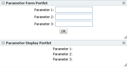
Portlets offer functionality, just like task flows, and they look like any other task flow when you place them on a WebCenter Spaces page (Figure 7-24).
One difference between portlets and task flows is that portlets are provided by applications rather than services. Central to the purpose of portlets is to provide a standard way for applications to integrate with other applications.
Note:
Before you can access portlets in the Catalog, your application administrator must register the portlet's producer with your WebCenter application. For more information, see Oracle Fusion Middleware Administrator's Guide for Oracle WebCenter.You can create more dynamic sets of pages by wiring portlets to other portlets and to pages using page parameters and contextual events. Use different portlets in combination to create your own enterprise mashups. For more information, see Chapter 8, "Wiring Pages, Task Flows, Portlets, and UI Components."
Note:
For a more-detailed look at portlets, see Chapter 31, "What You Should Know About Portlets."7.1.4.2 Adding a Portlet to a Page
At runtime, you can add portlets to any WebCenter page on which you have sufficient access. This section describes how.
Note:
Avoid adding a portlet to a Movable Box layout component (see Section 6.5.1.5, "Introducing the Movable Box Layout Component"). The Movable Box layout component duplicates the user interaction functionalities of a portlet. Adding a portlet to a Movable Box creates an unnecessary and potentially error-prone redundancy.To add a portlet to a page:
-
Log in to Oracle WebCenter Spaces.
For information about logging in, see Section 2.2.1, "Logging In to a WebCenter Application."
-
Go to the page where you want to add a portlet.
For information about locating pages, see Section 2.4, "Hiding, Showing, Opening, and Closing Pages."
-
From the Page Actions menu, select Edit Page to open Oracle Composer (Figure 7-25).
Note:
If the Edit Page command is not available on the Page Actions menu or the Page Actions menu does not display, it is likely that you do not have sufficient page access privileges. If this is the case, ask your application administrator for the privilege to edit pages. See Section 2.7, "Contacting Your Application Administrator."In custom WebCenter applications, open Oracle Composer according to your page design. For example, in the Fusion Order Demo for WebCenter, you can open Oracle Composer by clicking the Edit link at the top of the page (Figure 7-26).
Note:
For more information about the Fusion Order Demo for WebCenter, see Oracle Fusion Middleware Developer's Guide for Oracle WebCenter.The page opens in Oracle Composer (Figure 7-27).
Figure 7-27 A Page Viewed Through Oracle Composer

Description of "Figure 7-27 A Page Viewed Through Oracle Composer"
-
Click the Add Content button associated with the location where you want to place the portlet (Figure 7-28).
The Oracle Composer Catalog opens (Figure 7-29).
Note:
When the Catalog is open, the page goes gray, and you cannot perform any other actions on the page until you close the Catalog. -
Optionally, use the Catalog Search feature to locate the portlet of interest (Figure 7-30).
-
Click the Add link next to the portlet of interest, or drill to the portlet by clicking the Open link next to the folder that contains the portlet.
-
Optionally, continue to add portlets in this way.
-
Click the Close button to close the Catalog.
-
Click the Save button in Oracle Composer to save your changes (Figure 7-31).
-
Optionally, click the Close button to exit Oracle Composer (Figure 7-32).
Adding a portlet is often just the first step in getting the content you want on your page. Many portlets have unique properties that take values that determine the portlet content. For more information, see the following sections and chapters:
7.1.5 Embedding Video, Music, Slides, and Other Types of Content
You can use the HTML Markup layout component to expose video, music, Google Gadgets, and other types of content in your application pages. This section describes how.
To embed different types of media on an application page:
-
Copy the link location of the content you want to embed.
-
Log in to Oracle WebCenter Spaces.
For information about logging in, see Section 2.2.1, "Logging In to a WebCenter Application."
-
Go to the page where you want to embed video, music, or some other type of medium.
For information about locating pages, see Section 2.4, "Hiding, Showing, Opening, and Closing Pages."
-
From the Page Actions menu, select Edit Page to open Oracle Composer (Figure 7-33).
Note:
If the Edit Page command is not available on the Page Actions menu or the Page Actions menu does not display, it is likely that you do not have sufficient page access privileges. If this is the case, ask your application administrator for the privilege to edit pages. See Section 2.7, "Contacting Your Application Administrator."In custom WebCenter applications, open Oracle Composer according to your page design. For example, in the Fusion Order Demo for WebCenter, you can open Oracle Composer by clicking the Edit link at the top of the page (Figure 7-34).
Note:
For more information about the Fusion Order Demo for WebCenter, see Oracle Fusion Middleware Developer's Guide for Oracle WebCenter.The page opens in Oracle Composer (Figure 7-35).
Figure 7-35 A Page Viewed Through Oracle Composer

Description of "Figure 7-35 A Page Viewed Through Oracle Composer"
-
Click the Add Content button associated with the location where you want to embed content (Figure 7-36).
The Oracle Composer Catalog opens (Figure 7-37).
Note:
When the Catalog is open, the page goes gray, and you cannot perform any other actions on the page until you close the Catalog. -
Click the Open link next to Layout, and then click the Add link next to HTML Markup.
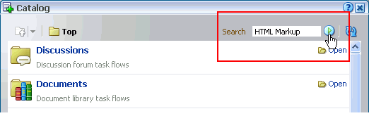
Optionally, use the Catalog Search feature to locate the layout component (Figure 7-38), and then click the Add link next to HTML Markup.
-
Click the Close button to close the Catalog.
-
Click the Edit icon on the HTML Markup component (Figure 7-39).
The Component Properties dialog box opens.
-
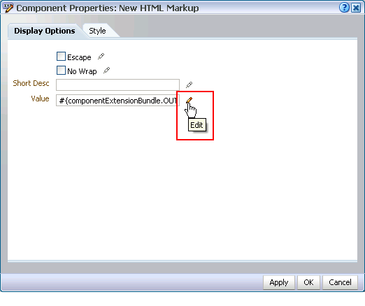
If necessary, click the Display Options tab to bring it forward, and then click the Edit icon next to the Value field (Figure 7-40).
-
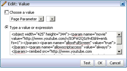
In the EL Editor, select Type a value or expression, and then paste the link you copied in step 1 (Figure 7-41).
-
Click OK to close the EL Editor.
-
Click OK to close the Component Properties dialog box.
-
Click the Save button in Oracle Composer to save your changes (Figure 7-42).
-
Optionally, click the Close button to exit Oracle Composer (Figure 7-43).
7.2 Customizing and Personalizing Page Content
The runtime flexibility of your WebCenter application is realized in both customization and personalization. Customization involves changes made in page edit mode. Customizations affect all users' views of a page. Personalization involves changes made in page view mode. Personalizations affect only your view of a page.
Note:
When you revise a component in page view mode (personalization) while another user deletes the same component in page edit mode (customization), a WebCenter error page opens. Simply navigate back to the original page. The deleted component does not appear, and you can continue working on other components.In page edit mode, you see only customizations. In page view mode, you see your personalizations layered over customizations. If the same property is set in both customization and personalization, the personalized value takes precedence (in your view of a page in page view mode). For example, imagine a List task flow that an authorized user has customized to display color banding every other column. In your page view, you personalize the list to instead show color banding every other row. As you toggle between page edit mode and page view mode, you see column color banding in page edit mode, but your own row color banding in page view mode.
You can make customizations and personalizations at the page level and at the component level. Page-level customizations and personalizations include such actions as rearranging page content, changing the page layout, and the like. Component customizations and personalizations—made to task flows, portlets, and layout components—include such actions as resizing and rearranging columns and filtering content. The types of personalizations available to components differ from component to component.
Note:
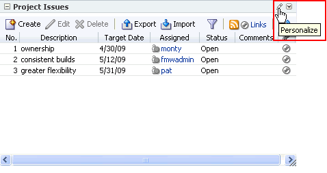
Customizations made to service task flows and to portlets are committed immediately, regardless of whether you click the Save button in Oracle Composer. These types of customizations include entering page edit mode and resizing a list column, adding color banding, sorting discussion forums, and the like.Page personalization is available to users with, minimally, personalize permission on the page. Provided the component supports it, some personalization settings are available through the Personalize icon that appears on the component header in page view mode (Figure 7-44).
Page customization is available to users with, minimally, edit permission on the page. Provided the component supports it, some customization settings are available through the Edit icon that appears in the component header or on a floating tool palette when the component's host page is opened in Oracle Composer (Figure 7-45).
Note:
For information about Oracle Composer (customization), see Section 4.3, "Introducing Oracle Composer."For more information about page personalization, see Section 3.4, "Personalizing Your Page View."
For more information about customizations and personalizations available to specific components, see the chapters on specific services and portlets:
7.3 Deleting Page Content
You can remove content in your own page view (personalization), and you can remove it from all users' page views (customization).
Note:
When you revise a component in page view mode (personalize) while another user deletes the same component in page edit mode (customize), a WebCenter error page opens. Simply navigate back to the original page. The deleted component does not appear, and you can continue working on other components.When you delete a component, any children of that component are also deleted. For example, if you delete a layout Box, any content within that Box is also deleted. This section describes deleting components from everyone's page view, that is, deleting components as a page customization. For information on removing a component from your own view, see Section 3.4.3, "Removing Components from Your View of a Page."
Note:
For information about personalization and customization, see Section 7.2, "Customizing and Personalizing Page Content."To delete page content:
-
Log in to Oracle WebCenter Spaces.
For information on how to log in, see Section 2.2.1, "Logging In to a WebCenter Application."
-
Go to the page where you want to delete page content.
For information about locating pages, see Section 2.4, "Hiding, Showing, Opening, and Closing Pages."
-
From the Page Actions menu, select Edit Page to open Oracle Composer (Figure 7-46).
Note:
If the Edit Page command is not available on the Page Actions menu or the Page Actions menu does not display, it is likely that you do not have sufficient page access privileges. If this is the case, ask your application administrator for the privilege to edit pages. See Section 2.7, "Contacting Your Application Administrator."In custom WebCenter applications, open Oracle Composer according to your page design. For example, in the Fusion Order Demo for WebCenter, you can open Oracle Composer by clicking the Edit link at the top of the page (Figure 7-47).
Note:
For more information about the Fusion Order Demo for WebCenter, see Oracle Fusion Middleware Developer's Guide for Oracle WebCenter.The page opens in Oracle Composer.
-
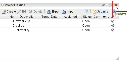
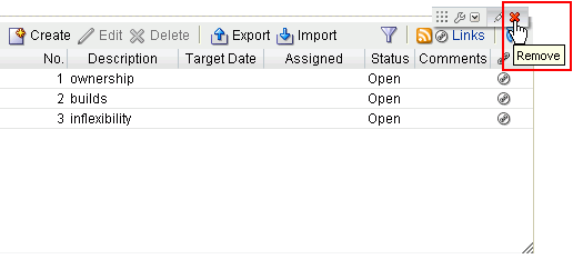
Click the Remove icon on the component header (Figure 7-48) or on the component's floating tool palette (Figure 7-49).
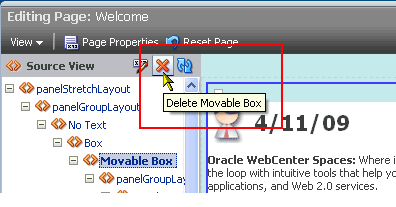
Alternatively, switch Oracle Composer to Source view (see Section 4.3.2, "Introducing Design View and Source View"), select the component on the hierarchical list of components, and click the Delete icon on the Source View header (Figure 7-50).
-
Click the Delete button in the resulting confirmation dialog box.
The selected component and all its child components are deleted from the application page.
7.4 Setting Properties on Page Content
Components, such as task flows and portlets, and UI components, such as buttons, boxes, and images, carry with them a set of configurable properties that control the appearance and behavior of a particular component instance. Such properties are exposed in Oracle Composer through its Component Properties dialog box (Figure 7-51).
Components of all types share many properties in common. Typically, individuality is expressed on the Parameters and Events tabs, though there may be variations on Display Options, Style, and Content Style tabs.
Note:
In this guide, unique properties are discussed in the chapters that cover individual services, portlets, and layout components. See:This section discusses commonly-shared properties. It contains the following subsections:
Note:
For information about page parameters, see Chapter 8, "Wiring Pages, Task Flows, Portlets, and UI Components."7.4.1 What You Should Know About Component Properties
Application components have associated properties, which users with sufficient privileges can access through the Oracle Composer Component Properties dialog box. Use properties to adjust the appearance and behavior of a component instance and to wire components to each other and to page parameters and page definition variables.
Note:
For information about wiring pages and components, see Chapter 8, "Wiring Pages, Task Flows, Portlets, and UI Components".To access component properties, edit the page and click the Edit icon associated with a particular component instance (Figure 7-52).
The component's properties display in the Oracle Composer Component Properties dialog box (Figure 7-53).
The Component Properties dialog box is divided into multiple tabs. These can include all of the following tabs, but more likely include a subset of them:
-
Parameters—Settings, unique to the component type, that can control such things as the source of the component's content. For more information, see Section 7.4.3, "Working with Component Parameters."
-
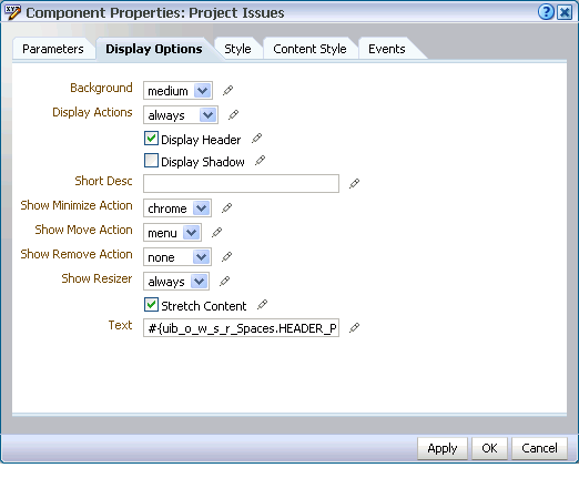
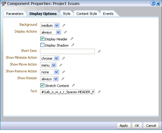
Display Options—Settings for determining content orientation, hiding and showing a header, selecting a display method for an actions menu, and the like. For more information, see Section 7.4.4, "Working with Component Display Options."
-
Style—Font, color, and dimension settings that override such values on the parent component, the page, and the application. Style values affect component content and the elements that surround the content. For more information, see Section 7.4.6, "Working with Style and Content Style Properties."
-
Content Style—Font, color, and dimension settings on component content that override such values specified for Style. For more information, see Section 7.4.6, "Working with Style and Content Style Properties."
-
Events—Contextual events and event handlers for all the components on the current page that can be consumed by the currently selected component. Events are defined occurrences within the current context, and event handlers are the engines that drive the results of that occurrence. For more information, see Section 7.4.7, "Working with Component Contextual Events."
Some components include settings in all of these sections. Other components include a subset of these sections.
7.4.2 Setting Component Properties
The steps outlined in this section are useful for all selectable components on an application page.
Note:
When you enter most types of property values in the Component Properties dialog box and then click Apply, the dialog box remains open. With values other than expected value types, the dialog box closes, and the page is refreshed to reflect the new value.Expected values types include a string or an array of strings, where the component expects a value of type java.lang.String[], and primitive values, such as integer, boolean, float, double, and short.
To set component properties:
-
Log in to Oracle WebCenter Spaces.
For information on how to log in, see Section 2.2.1, "Logging In to a WebCenter Application."
-
Go to the page where you want to configure component properties.
For information about locating a page, see Section 2.4, "Hiding, Showing, Opening, and Closing Pages."
-
From the Page Actions menu, select Edit Page to open Oracle Composer (Figure 7-54).
Note:
If the Edit Page command is not available on the Page Actions menu or the Page Actions menu does not display, it is likely that you do not have sufficient page access privileges. If this is the case, ask your application administrator for the privilege to edit pages. See Section 2.7, "Contacting Your Application Administrator."In custom WebCenter applications, open Oracle Composer according to your page design. For example, in the Fusion Order Demo for WebCenter, you can open Oracle Composer by clicking the Edit link at the top of the page (Figure 7-55).
Note:
For more information about the Fusion Order Demo for WebCenter, see Oracle Fusion Middleware Developer's Guide for Oracle WebCenter.The page opens in Oracle Composer.
-
Click the Edit icon (the pencil) on the component of interest (Figure 7-56).
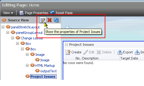
Alternatively, switch Oracle Composer to Source view (see Section 4.3.2, "Introducing Design View and Source View"), select the component on the hierarchical list of components, and click the Properties icon on the Source view header (Figure 7-57).
The Component Properties dialog box opens (Figure 7-58).
Enter Parameter and Display Option values either unwrapped or wrapped in Expression Language syntax, for example,
valueor#{value}. If you entervalue, Oracle Composer automatically wraps it in EL syntax when you save your changes.Note:
For information about component properties and the types of values they require, see: -
When you finish revising component properties, click OK.
-
Click the Save button in Oracle Composer to save your changes (Figure 7-59).
-
Optionally, click the Close button to exit Oracle Composer (Figure 7-60).
Note:
When you encounter errors in page edit mode in the WebCenter Spaces application and in custom WebCenter applications where the sandbox is enabled, you can recover by closing your browser and then reopening it and relogging in to the application instance.7.4.3 Working with Component Parameters
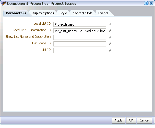
Component parameters appear on the Parameters tab of the Component Properties dialog box (Figure 7-61).
Component parameters vary from component to component. For example, on some components they provide the opportunity to specify the source and range of task flow content; on other components they present read-only, application-generated identifiers that are used in maintaining a task flow instance's association with its customizations.
Enter parameter values, or click the Edit icon next to a parameter field to open an editor. (Figure 7-62).
The editor enables you to enter an expression when a value is retrievable, but otherwise unknown, for example, when you want a parameter value to be the name of the current user or the current application skin.
Note:
For more information about using the editor and for a table of useful EL expressions, see Section 7.4.5, "Using Expression Language (EL) Expressions with Component Properties."In view of the uniqueness of parameters within a particular service or a particular portlet, parameter details are discussed with their associated services and portlets.
-
For information about services and their associated parameters, see Part IV, "Working with Shared Services", Part V, "Working with Social Networking Services", and Part VI, "Working with Personal Productivity Services".
-
For information about portlets and their associated parameters, see Part VII, "Working with Portlets".
-
For information about accessing the Component Properties dialog box, see Section 7.4.2, "Setting Component Properties."
7.4.4 Working with Component Display Options
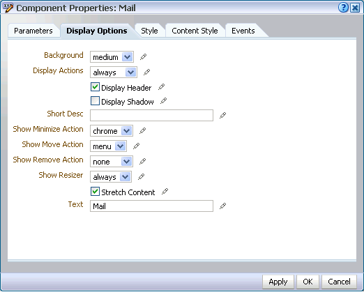
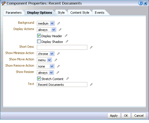
The Display Options tab provides access to properties that control a range of display-related behaviors on a given component instance (Figure 7-63).
For example, use the display options on an Image layout component to specify the image source URL and its optional link target. Use the display options on the Announcement Manager task flow to hide or show a header and enable or disable menus and other options on the header.
In addition to the values provided, a simple editor is available for entering custom values, such as text strings and Expression Language (EL) expressions (see Section 7.4.5, "Using Expression Language (EL) Expressions with Component Properties").
Typically, the Display Options tab presents settings that affect the display elements surrounding component content (that is, its chrome). Chrome includes the header, the Actions menu, Expand and Collapse icons, and the like.
Table 7-1 lists and describes the Display Options properties that generally apply to most components (task flows, portlets, and layout components). Where there are variations, they are noted in the chapters covering specific services and task flows (see Part IV, "Working with Shared Services", Part V, "Working with Social Networking Services", and Part VI, "Working with Personal Productivity Services").
Note:
For information about accessing the Component Properties dialog box, see Section 7.4.2, "Setting Component Properties."Table 7-1 Display Options Properties
| Property | Description |
|---|---|
|
Select to specify a shade for the component background. Choose from:
|
|
|
Specify how to display actions on the component instance. Actions include the Remove icon, the Actions menu icon, and the Resizer. Choose from:
|
|
|
Select this check box to display a header on the component instance. The
|
|
|
Select to display a shadow behind the component instance.
|
|
|
Provide Note that, for the Web Page component, the padding-top:30px; For more information about |
|
|
Select whether to display the minimize action on the component header (that is, a Collapse icon on the component chrome). Choose from: Choose from:
The Minimize action collapses the task flow like a window shade, leaving only its header displayed.
When a task flow is minimized, the icon toggles to an Expand icon, which you can use to restore the full task flow to view. |
|
|
Select whether to display Move Up and Move Down (or Move Left and Move Right) commands on the component Actions menu. Choose from:
Move actions include Move Up, Move Down, or Move Left, Move Right, depending on the orientation of the parent container (horizontal or vertical). Move actions are context sensitive. For example, in a vertically-oriented parent container if there are no task flows or other objects above the current task flow the Move Up action does not display on the Actions menu. |
|
|
Select whether to display the Remove icon on the component header (that is, the component chrome). Choose from:
Note that after you select to remove a component in this way in page view mode, you can restore it using the following methods:
|
|
|
Select whether to display a window resizer on a component instance. The window resizer enables you to increase the component height. Choose from:
|
|
|
Select to stretch the content to fill the container. For example, all task flows and portlets are wrapped in a container. If you change the height of the container, through the Content Style Content always takes up the full width of its parent container. |
|
|
Enter text to appear in the component header. If you select to hide the header, the value you enter here is ignored. |
7.4.5 Using Expression Language (EL) Expressions with Component Properties
When configuring page components, you can express values as variables that take advantage of the current application context by grabbing information that happens to be true at the moment. All of this is possible in light of the EL Editor provided with each Parameter and Display Option property.
This section provides information about the editor and useful EL expressions. It contains the following subsections:
7.4.5.1 Introducing the Expressions Editor
All properties on the Parameters and Display Options tabs provide an Edit icon that opens a simple Expression Language (EL) Editor. Use the EL Editor when you want to use some sort of dynamic computation for your property value.
Click the Edit icon next to a property to open the editor. (Figure 7-62).
Note:
For information about accessing component properties, see Section 7.4.2, "Setting Component Properties."The editor is particularly useful when you want a value that is retrievable but otherwise unknown, for example, when you want a value to be the name of the current user or the current application skin.
Select predefined values, under Choose a value, or enter a value or an Expression Language expression, under Type a value or expression.
Use the following formats to enter values:
-
a literal number:
#{123} -
a literal string:
#{'string'} -
a literal boolean:
#{true} -
a Java Bean called to return a value:
#{generalSettings.preferredTimeStyle}
The editor provides a Test button for validating your EL entry. The Test button is enabled only when you select Type a value or expression.
Validation checks the EL syntax and evaluates the expression. Because expression values vary according to the context in which they are executed, the resulting value that appears in the editor may differ from the value returned during actual use.
Note, however, that only EL is validated when you click Test; other types of values are not validated.
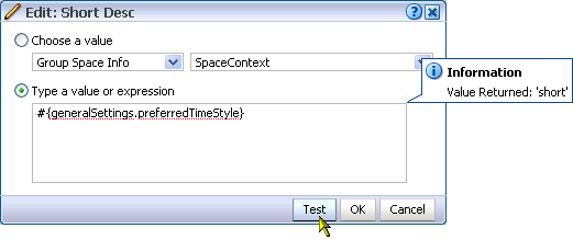
Test results are shown in a popup (Figure 7-65).
7.4.5.2 Expression Language Expressions
This section provides a series of tables that list and describe useful EL expressions. Tables are grouped according to their applicable context. This section contains the following subsections:
-
EL Expressions Relating to WebCenter Spaces Application Information
-
EL Expressions Relating to WebCenter Spaces User Preferences
7.4.5.2.1 EL Expressions Relating to WebCenter Spaces Application Information
Table 7-2 lists EL expressions relating to WebCenter Spaces application information and describes the types of values they return.
Table 7-2 EL Expressions Relating to WebCenter Spaces Application Information
| Expression | Returns |
|---|---|
|
|
An oracle.webcenter.webcenterapp.context.WCApplicationContext object that provides an access point in the current Web request for all WebCenter application-related information. |
|
|
Returns a URL representing the current Web request with bookmarkable WebCenter Spaces URL parameters of the request appended to the end (parameters are not necessarily in a fixed order). Example payload: http://stacv75.us.oracle.com/webcenter/faces/oracle/webcenter/page/scopedMD/someguid/SomePage.jspx? wc.contextURL=/spaces/somename&wc.pageScope=1234 |
|
|
An oracle.webcenter.webcenterapp.beans.WebCenterType bean with a payload of metadata from the current WebCenter Spaces application. |
|
|
Returns the display name of the current WebCenter Spaces application (as configured through WebCenter Administration Settings). Out of the box, this returns WebCenter Spaces. |
|
|
If an application logo was uploaded through WebCenter Administration Settings, this expression returns the URL to the application logo image. Out of the box, this returns null. |
|
|
Returns the URL to the Help application used for the current WebCenter Spaces application (as configured through WebCenter Administration Settings). Out of the box, this returns /webcenterhelp/spaces. |
|
|
If a copyright message was configured through WebCenter Administration Settings, the application copyright message. Out of the box, this returns null. |
|
|
Returns the URL to the privacy policy document followed by the application (as configured through WebCenter Administration Settings). Out of the box, this returns http://www.oracle.com/html/privacy.html. |
|
|
Returns the name of the default ADF Faces skin family to use for rendering pages in the application (as configured through WebCenter Administration Settings). This expression represents only the application-level setting that may not necessarily be used in all Web requests. For example, you cannot use it successfully if a user has chosen to override the skin through application Preferences (see Section 3.3, "Setting Personal Preferences"). |
|
|
Returns the name of the ADF Faces skin family being used for the current Web request, depending on factors such as what has been configured at the application level, the current user's preference setting, and so on. Returns the same value as |
7.4.5.2.2 EL Expressions Relating to WebCenter Spaces Group Spaces
Table 7-3 lists EL expressions relating to WebCenter Spaces group spaces and describes the types of values they return.
Note:
The group space name and the group space display name are two different things: The group space name is the value entered for Group Space Name on the General tab of a group space Settings page; the group space display name is the name the appears, for example, on the group space's tab. Many of the EL expressions in Table 7-3 call for the group space name.Table 7-3 EL Expressions Relating to WebCenter Spaces Group Spaces
| Expression | Returns |
|---|---|
|
|
An oracle.webcenter.spaces.context.SpacesContext object that provides an access point in the current Web request for all group-space related information. The value of this expression is whatever is returned on invoking the java API: |
|
|
An oracle.webcenter.spaces.Space object that represents the group space associated with the current Web request. If the current Web request is not in a group space context (that is, it is in a personal space context), it returns a value of null. The value of this expression is whatever is returned on invoking the java API: |
|
|
The name of the group space associated with the current Web request. If the current Web request is not in a group space context (that is, it is in a personal space context), it returns a value of null. The value of this expression is whatever is returned on invoking the java API: |
|
|
An oracle.webcenter.spaces.Space object that represents the group space with the specified name The value of this expression is whatever is returned in java on invoking .getSpace(...) on the current SpacesManager passing in the MDSSession of the current ADFContext. |
|
|
The MDS path of the space metadata document for the group space with specified name The value of this expression is whatever is returned in java on invoking .getMetadataPath() on the space object for the group space. |
|
|
An oracle.webcenter.spaces.beans.SpaceType bean that carries metadata about the group space with the specified name The value of this expression is whatever is returned in java on invoking .getMetadata() on the space object for the group space passing in the MDSSession of the current ADFContext. |
|
#{spaceContext.space[spaceName].metadata.displayName} #{spaceContext.currentSpace.metadata.displayName} |
The display name of the group space with the specified name |
|
|
A URL to the icon associated with the group space with the specified name |
|
|
The description of the group space with the specified name |
|
|
A java.util.Calendar object representing the date-time on which the group space with specified name |
|
|
The user-name of the person who created the group space with the specified name |
|
|
A comma-delimited list of searchable keywords associated with the group space with the name |
|
|
Boolean value that indicates whether the group space with the specified name |
|
|
Boolean value that indicates whether the group space with the specified name |
|
|
Boolean value that indicates whether users are allowed to register themselves with the group space with the specified name |
|
|
Boolean value that indicates whether users can discover the existence of the group space with the specified name |
|
|
Boolean value indicating whether the group space with the specified name |
|
|
The e-mail address to the mailing list associated with the group space with the specified name |
|
|
The value of a specific custom attribute of the name |
|
|
Returns the group space logo/icon URL for the group space named |
7.4.5.2.3 EL Expressions Relating to Application Pages
Table 7-4 lists EL expressions relating to application pages and describes the types of values they return. These expressions are useful in WebCenter Spaces and in custom WebCenter applications that include the Page service.
Table 7-4 EL Expressions Relating to Application Pages
| Expression | Returns |
|---|---|
|
|
Returns the page display name, for example: FinanceProject |
|
|
Returns the user name of the person who created the page, for example: monty |
|
|
Returns the date and time the page was created, for example: 2008-11-19T10:18:36 |
|
|
Returns the user name of the person who last updated the page, for example: monty |
|
|
Returns the date and time the page was last updated, for example: 2008-11-19T10:18:36 |
|
|
Returns the file directory path to the page relative to the application root directory, for example: /oracle/webcenter/page/scopedMD/s8bba98ff_4cbb_40b8_beee_296c916a23ed/user/Umonty/Page4.jspx |
|
|
Returns the file name of the page, for example: Page4.jspx |
|
|
Returns the name of the style scheme used on the page, for example: WCSchemeEggShell |
|
|
Returns the directory path and file name of the page scheme background image. |
|
|
Returns the hexadecimal value of the page scheme background color, for example: #ffa500 |
|
|
Returns the permission the current user has on the page, for example: oracle.webcenter.page.model.security.CustomPagePermission |
|
|
A string of 60 or so characters that uniquely identifies the current page to the security system, for example: oracle_webcenter_page_scopedMD_s8bba98ff_4cbb_40b8_beee_296c916a23ed_user_Umonty_Page4PageDef |
7.4.5.2.4 EL Expressions Relating to Services
Table 7-5 lists EL expressions relating to services and describes the types of values they return.
Table 7-5 EL Expressions Relating to Services
| Expression | Returns |
|---|---|
|
|
An oracle.webcenter.framework.service.Service object representing the WebCenter service with the service ID |
|
|
Returns a boolean value that indicates whether the WebCenter Service with the service ID |
|
|
Returns the forum ID of the specified group space Discussion forum. Enter the group space name in lieu of |
|
|
Returns the category ID of the specified group space Discussion forums. Enter the group space name in lieu of |
Table 7-6 lists service IDs associated with WebCenter Web 2.0 services at runtime.
| Service | ID |
|---|---|
|
Announcements |
oracle.webcenter.collab.announcement |
|
Discussions |
oracle.webcenter.collab.forum |
|
Documents |
oracle.webcenter.doclib |
|
Events |
oracle.webcenter.collab.calendar.community |
|
Instant Messaging and Presence (IMP) |
oracle.webcenter.collab.rtc |
|
Links |
oracle.webcenter.relationship |
|
Lists |
oracle.webcenter.list |
|
|
oracle.webcenter.collab.mail |
|
Notes |
oracle.webcenter.note |
|
Page |
oracle.webcenter.page |
|
Recent Activities |
oracle.webcenter.recentactivity |
|
RSS |
oracle.webcenter.rss |
|
Search |
oracle.webcenter.search |
|
Tags |
oracle.webcenter.tagging |
|
Worklist |
oracle.webcenter.worklist |
7.4.5.2.5 EL Expressions Relating to WebCenter Spaces Navigation
Table 7-7 lists EL expressions relating to WebCenter Spaces navigation and describes the types of values they return.
Table 7-7 EL Expressions Relating to WebCenter Spaces Navigation
| Expression | Returns |
|---|---|
|
|
Used in a directory path, this expression returns the current page. For example, the following directory path, relative to the application root directory, returns the General subtab of the group space Settings page: The following example returns a link to the Discussions page in the current group space: You can use the second example for navigating to any group space page; simply replace Discussions with the desired page name. |
7.4.5.2.6 EL Expressions Relating to Application Security
Table 7-8 lists EL expressions relating to application security and describes the types of values they return.
7.4.5.2.7 EL Expressions Relating to WebCenter Spaces User Preferences
Table 7-9 lists EL expressions applicable to user preferences and describes the types of values they return.
Table 7-9 EL Expressions Relating to User Preferences
| Expression | Returns |
|---|---|
|
|
Returns the time zone the current user has selected in application Preferences. See Section 3.3.2.3, "Selecting Your Preferred Time Zone." |
|
|
Returns the time format the current user has selected in application Preferences. See Section 3.3.2.1, "Selecting Your Preferred Time Format." |
|
|
Returns the current time in the user's selected locale. |
|
|
Returns the date format the current user has selected in application Preferences. See Section 3.3.2.2, "Selecting Your Preferred Date Format." |
|
|
Returns the current date in the user's selected locale. |
|
|
Returns the current date and time in the user's selected locale. |
|
|
Returns the name of the ADF Faces skin family being used for the current Web request, depending on factors such as what has been configured at the application level, the current user's preference setting, and so on. |
|
|
Returns the preferred accessibility mode (either |
7.4.5.2.8 Utilitarian EL Expressions
Table 7-10 lists utilitarian EL expressions and describes the types of values they return.
Table 7-10 Utilitarian EL Expressions
| Expression | Returns |
|---|---|
|
|
Returns the current date in the format specified in the current user's preferences. |
|
|
Returns a truncation of the string specified as |
|
|
Returns the user name of the currently logged in user. Useful for passing to task flows or portlets or creating user-specific URLs. Examples of returned values include:
|
|
|
Returns the user name of the currently logged in user. If the current user is not logged in, this expression returns no value. |
|
|
Both of these expressions return the request locale (that is, the browser locale setting). |
|
|
Returns true if current application page is in Oracle Composer mode. Returns false if current application page is not in Oracle Composer mode |
|
|
Returns the current application skin family. Returns the same value as |
7.4.6 Working with Style and Content Style Properties
Style and Content Style properties provide an opportunity to fine-tune your application look-and-feel at the component level. Enter values for Style and Content Style properties, or specify your own values through the Other CSS property that appears on both tabs.
This section introduces Style and Content Style properties and provides tables that list and describe them. Additionally, it provides information about how to use the Other CSS property. It contains the following subsections:
7.4.6.1 Understanding Style and Content Style Properties
Use component Style and Content Style properties to specify color, style, and margin settings on the selected component instance.
Style settings override style settings on hierarchically superior components, such as the component's parent container, the page, and the application. Content Style settings override Style settings. For example, Style settings control the look and feel of a Movable Box; when Content Style settings come into play, Style settings control only the Movable Box chrome. Content Style settings control the look and feel of the components contained within the Movable Box. This look and feel may, in turn, be overridden by the Style settings set on those individual components.
Note, however, that Content Style properties set for a container, such as a Movable Box, may not take effect if the component inside the container overrides the container Content Style properties by a means other than the component's own Content Style properties. For example, the background color set for a Movable Box that contains a task flow may not take effect if, at design time, instead of being set to inherit from the container, the task flow background color was set with a hard-coded value.
Table 7-11 lists and describes common component Style properties. Note that some components use only a subset of the following style properties. These include the Movable Box layout component and task flows and portlets added through the Oracle Composer Catalog. Such components provide only Margin and Other CSS properties.
| Property | Description |
|---|---|
|
A pick-list for selecting a default color for text Select a default color for any text included in the component instance. For example, imagine that you have added a Text layout component to a Box layout component. When you set Box Style properties, the default text color you apply to the Box is also automatically applied to the Text layout component, unless you also define a Color value for the Text layout component. |
|
|
A pick-list for selecting a component background color If you specify a background color for Content Style, then the background color specified for the Style property is not applied. |
|
|
A field for specifying the width of component content Set a fixed width for component content. You can use any standard CSS unit of measure, such as pt, px, pc, li, %, and so on. |
|
|
A field for specifying the height of component content Set a fixed height for component content. You can use any standard CSS unit of measure, such as pt, px, pc, li, and so on. Never express a Height value as a percentage. Because of differences between browsers and between layout containers, percentages do not work as you expect. If you want your component to take up 100% of a page, consider creating a page using the Stretch page style and adding the component to it (see Section 6.4.1, "What You Should Know About Page Layouts, Styles, and Schemes"). The Height property works with the |
|
|
A field for entering a default font for component text Enter one or more default fonts for any text included in the component instance. Separate multiple values with a comma (,), for example |
|
|
Options for applying styles to component fonts Select a default font style for any text added to the layout component. Choose from:
The font style you select here applies to any text inside the component instance. |
|
|
A field for entering a URL to a component background image Enter the URL to an image you want to display in the component background. Use standard CSS syntax. For example:
|
|
|
Fields for specifying the border of space to draw around the component Enter:
|
|
|
A field for specifying additional CSS for the component Add any other CSS encoding you care to that is not covered by the other Style properties. You must use standard CSS syntax for this value to be valid (for more information about Other CSS, see Section 7.4.6.2, "Entering Other CSS on the Style and Content Style Tabs"). |
Use the properties listed on the Content Style tab of the Component Properties dialog box to specify color, style, and margin settings on the content of a selected component instance. The styles you specify here are applied to the component instance, overriding any styles specified for Style properties, for the page, and for the entire application.
Table 7-12 lists and describes Content Style properties.
Table 7-12 Content Style Properties
| Property | Description |
|---|---|
|
A pick-list for selecting a default color for any text included in component content |
|
|
A pick-list for selecting a background color for component content When you specify a background color for Content Style, the background color specified for the Style property is not applied. |
|
|
A field for specifying the width of component content Set a fixed width for component content. You can use any standard CSS unit of measure, such as pt, px, pc, li, %, and so on. |
|
|
A field for specifying the height of component content Set a fixed height for component content. You can use any standard CSS unit of measure, such as pt, px, pc, li, and so on. Never express a Height value as a percentage. Because of differences between browsers and between layout containers, percentages do not work as you expect. If you want your component to take up 100% of a page, consider creating a page using the Stretch page style and adding the component to it (see Section 6.4.1, "What You Should Know About Page Layouts, Styles, and Schemes"). The Height property works with the |
|
|
A field for specifying the font to use for component content Select a default font for any text included in the layout component The font you select here applies to any text inside the container/parent component. Select a default font for component content. Separate multiple values with a comma (,), for example |
|
|
Options for applying styles to component fonts Choose from:
The font style you select here applies to any text inside the component. |
|
|
A field for entering a URL to a component background image Enter the URL to an image you want to display in the layout component background. Note that task flows, text, and other objects added to the component display on top of the image. Use standard CSS syntax. For example:
|
|
|
Fields for specifying the border of space to draw around component content Enter:
|
|
|
A field for specifying additional CSS for the component Add any other CSS encoding you care to that is not covered by the other Style properties. You must use standard CSS syntax for this value to be valid (for more information about Other CSS, see Section 7.4.6.2, "Entering Other CSS on the Style and Content Style Tabs"). For an example of using Other CSS to create borders around a task flow, see Section 7.4.6.3, "Using the Other CSS Property to Change Component Borders." |
7.4.6.2 Entering Other CSS on the Style and Content Style Tabs
The Other CSS field that appears on Component Properties Style and Content Style tabs provides an opportunity to apply CSS styles that are not otherwise covered on the tabs.
Use standard CSS syntax (for example, see http://www.w3.org/TR/CSS2/propidx.html). Separate multiple entries with a semi-colon (;), for example:
background: #00FF00 url(http://www.google.com/intl/en_ALL/images/logo.gif) no-repeat fixed top; font-size: xx-small
Note, however, that some CSS styles are not supported by popular browsers. Moreover, some styles are specific to one browser and may not work correctly in another browser.
Table 7-13 provides a few examples of CSS you can use in the Other CSS field.
Table 7-13 Example Values for Other CSS
| Value | Description and Examples |
|---|---|
|
|
Specify whether and how the background image should repeat. Enter a values in the format For example: background-repeat: repeat
|
|
|
Set the starting position of a background image. Enter a value in the format For example: background-position: top left Except where noted, if you specify only one value, the second value is interpreted as The first set of value pairs express horizontal and vertical as positions:
The second set of value pairs express horizontal and vertical positions as either percentages or units of measure:
|
|
|
The size of component text relative to either your browser's default font size or the font size of the parent element. Enter a value in the format For example: font-size: xx-small
|
|
|
A collective property for setting the white space (or clear space) around a component in one expression. Enter up to four values. Express values in a specific length or as a percentage of the closest element, using the syntax padding: <value> <value> <value> <value> For example: padding: 5px 10px 5px 10px Where:
Use any standard CSS unit of measure, such as pt, px, pc, li, %, and so on. |
|
|
Sets the white space (or clear space) at the bottom of the element. Express values in a specific length or as a percentage of the closest element. For example: padding-bottom: 10px |
|
|
Sets the white space (or clear space) at the left side of the element. Express values in a specific length or as a percentage of the closest element. For example: padding-left: 2% |
|
|
Sets the white space (or clear space) at the right of the element. Express values in a specific length or as a percentage of the closest element. For example: padding-right: 1pc |
|
|
Sets the white space (or clear space) at the top of the element. Express values in a specific length or as a percentage of the closest element. For example: padding-top: 16pt |
7.4.6.3 Using the Other CSS Property to Change Component Borders
One application of the Other CSS property is to provide a variety of borders on task flows, portlets, and some layout components.
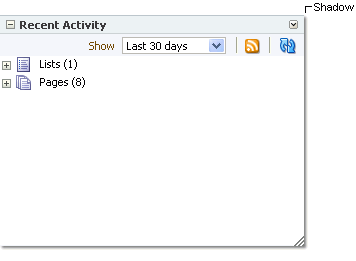
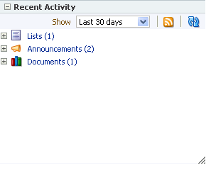
For example, Figure 7-66 depicts a Recent Activity task flow without borders.
To create borders around the task flow, access its properties (see Section 7.4.2, "Setting Component Properties") and add CSS encoding. For example, enter the following code in the Other CSS field on the Style tab in the Component Properties dialog box:
Example 7-1 Other CSS for Creating Borders
border-bottom-width:4px;
border-bottom-color:red;
border-bottom-style:dashed;
border-top-width:4px;
border-top-color:red;
border-top-style:dashed;
border-left-width:4px;
border-left-color:red;
border-left-style:dashed;
border-right-width:4px;
border-right-color:red;
border-right-style:dashed;
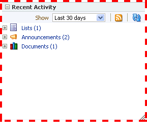
Figure 7-67 illustrates the result.
7.4.7 Working with Component Contextual Events
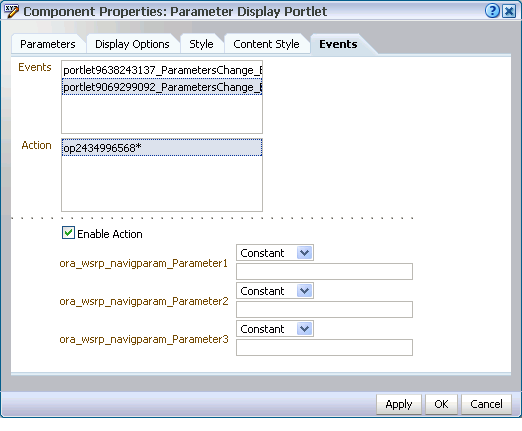
Events are defined occurrences within the current context, and event handlers are the engines that drive the results of that occurrence. The Events tab in the Component Properties dialog box provides a means of wiring a contextual event to an action handler to enable the passing of values from a producer component to a consumer component when the event is triggered on the producer (Figure 7-68).
For example, imagine two components: one is the producer of some kind of content (a payload) and the other consumes the content. When you wire these components to each other, you can use events to specify that when an event is triggered on the producer, the producer broadcasts a contextual event with a payLoad parameter, which the consumer component consumes through an event handler.
Note:
Contextual events differ from the business events that can be raised by ADF Business Components. Additionally, contextual events differ from events raised by UI components. For a description of these types of events, see Oracle Fusion Middleware Web User Interface Developer's Guide for Oracle Application Development Framework. Contextual events can be used in association with UI events. In this case, an action listener that is invoked due to a UI event can, in turn, invoke a method action binding that then raises the event.The Events tab does not display for all components. Event capability must be included in a component when the component is developed for Events to be available at runtime.
Table 7-14 lists and describes the properties presented on an Events tab.
Table 7-14 Properties on the Events Tab
| Property | Description |
|---|---|
|
A list of all contextual events associated with components on the current page An event describes the type of action that triggers another action, such as the passing of a value. The events listed in the Events pane were built-in to the component when the component was created. All components do not include events; therefore, all components are not intrinsically capable of being wired to other components. |
|
|
A list of action handlers associated with the selected consumer component The actions listed in the Actions pane vary according to which consumer component is selected. Actions enable you to associate an event with an event handler, which specifies what should happen when the triggering event occurs. The actions listed in the Actions pane were built-in to the component when the component was created. |
|
|
A check box for enabling or disabling the selected event and action When you select this check box, a list of selected action handler parameters appears. |
|
|
Fields for entering values to use to deliver the payload from the producer component to the consumer component whenever the event occurs Choose from:
This field appears only when the |
For information about wiring components, see Chapter 8, "Wiring Pages, Task Flows, Portlets, and UI Components."
