Portal User Interface Framework Guide
|
|
|
Portal User Interface Framework Guide
Overview
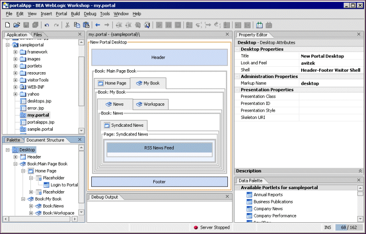
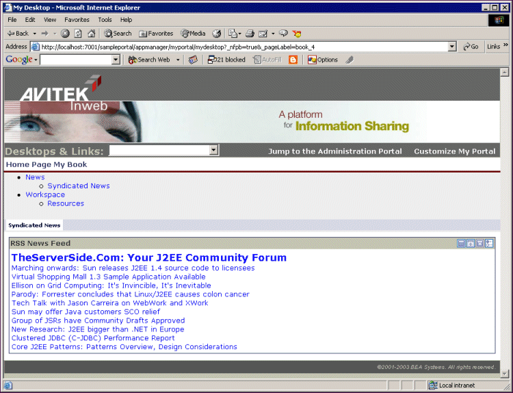
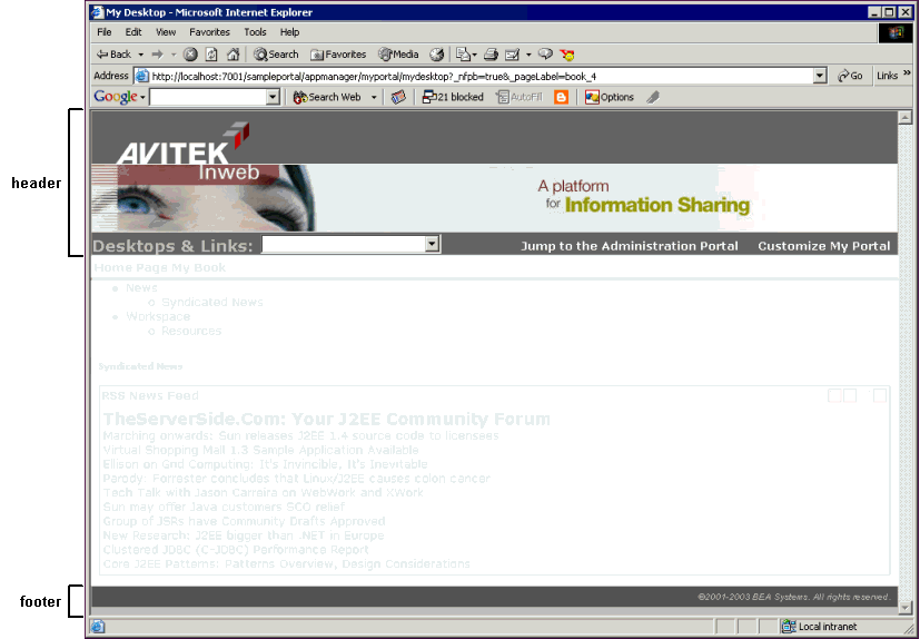
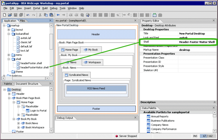
This document details how the portal framework turns a portal you develop in WebLogic Workshop (see Figure 1) into the portal desktop visitors see in a browser (see Figure 2). The goal of describing the portal framework is to help you develop and troubleshoot your portals. These topics enable you to look at a rendered portal in a browser and understand which pieces of the underlying framework you need to modify to get the results you want. In addition, the Look & Feel Editor is discussed. The Look & Feel Editor lets you interactively modify the text styles used by a portal.
The topics in this document describe key portal framework components and walk you through the portal rendering process. These topics include:
- How Look & Feel Determines Rendering
- How the Shell Determines Header and Footer Content
- How Portal Components Are Rendered
- The Look & Feel Editor
How Look & Feel Determines Rendering
When you build a portal in WebLogic Workshop, the look & feels you use are the key to how your portal is rendered and what it looks like when it is rendered. This topic shows you how the different pieces of the look & feel framework are combined and configured to provide what the portal framework needs to render the look & feel in HTML.
This topic contains the following sections:
- Overview
- The Look & Feel File
- The Portal File
- Location of the Look & Feel Resources
- The
skin.propertiesFile - Look & Feel Overrides
- Summary
Overview
The look & feel encompasses the following:
- Skin - A skin is a group of Cascading Style Sheet (CSS) files, framework images (mainly for portlet title bar icons), and JavaScript functionality that is used in the portal desktop when it is rendered in HTML. A portal Web project can have multiple skins. When you select a look & feel for a desktop, a specific skin is used. Following are example skin elements, Image, CSS Style, and JavaScript Functions:
- Skeleton JSPs - A skeleton is a group of JSPs that are used to render each component of the portal desktop as HTML, from the desktop to books and pages to portlet title bars. The skeleton provides the physical boundaries of the portal components and provides references to the images, CSS classes, and JavaScript functions from the skin needed to render the portal. A portal Web project can have multiple skeletons. When you select a look & feel for a desktop, a specific skin and skeleton is used.
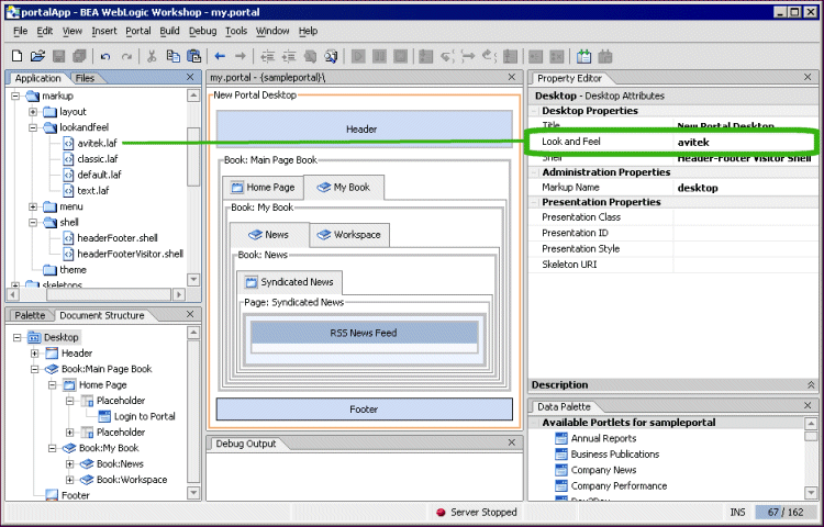
A look & feel is represented by an XML file (with a .laf extension). As shown in the following figure, the .laf (avitek.laf) file is located in the lookandfeel folder of a portal project. In addition, the .laf file name (for example, avitek) can be selected in the Desktop properties panel.
Figure 3 Portal rendered in HTML.
Developers building portals with WebLogic Workshop are not the only users who can select the look & feel used by a portal desktop. While developers create look & feels and select the default look & feel used by a portal, portal administrators and visitors may ultimately determine the desktop look & feel. The following figures show how portal administrators and users can change the look & feel used by the desktop.
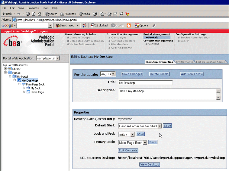
After a portal administrator creates a desktop in the WebLogic Administration Portal, the administrator can change the desktop look & feel on the Desktop Properties page, as shown in the following figure.
Figure 4 The Desktop Properties page
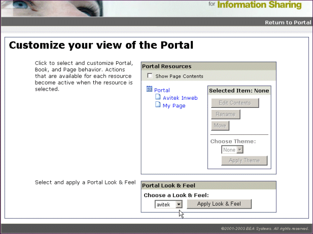
If visitor tools are enabled for the desktop, visitors can click the "Customize My Portal" link and change the desktop look & feel, as shown in the following figure.
The following section shows the contents of a look & feel XML-based .laf file and describes how it is used as the basis of portal desktop rendering.
The Look & Feel File
Look & feel files point to the specific skin and skeleton to be used for the overall desktop look & feel.
Look & feel files are stored in the following location: <portal_Web_project>/framework/markup/lookandfeel. Following is the avitek.laf provided by BEA. The key attributes are highlighted.
<?xml version="1.0" encoding="UTF-8"?>
<netuix:markupDefinition xmlns:netuix="http://www.bea.com/servers/netuix/xsd/controls/netuix/1.0.0"
xmlns:xsi="http://www.w3.org/2001/XMLSchema-instance"
xsi:schemaLocation="http://www.bea.com/servers/netuix/xsd/controls/netuix/1.0.0 markup-netuix-1_0_0.xsd">
<netuix:locale language="en"/>
<netuix:markup>
<netuix:lookAndFeel
definitionLabel="avitek" title="avitek"
description="The avitek look and feel"
skin="avitek" skinPath="/framework/skins/"
skeleton="default" skeletonPath="/framework/skeletons/"
markupType="LookAndFeel" markupName="avitek"/>
</netuix:markup>
</netuix:markupDefinition>
The following table describes the look & feel file's key attributes.
When you select a Look & Feel in the WebLogic Workshop Property Editor for a selected desktop, the look & feel XML is automatically added to the underlying XML in the .portal file, as shown in the following section.
The Portal File
The following example portal file, created with the Portal Designer, shows the inserted look & feel XML (in bold) from the .laf file. The portal file is a template with which multiple desktops can be created in the WebLogic Administration Portal. When used as a template, the portal file determines the default look & feel of any desktop created from it.
<?xml version="1.0" encoding="UTF-8"?>
<portal:root xmlns:html="http://www.w3.org/1999/xhtml-netuix-modified/1.0.0"
xmlns:netuix="http://www.bea.com/servers/netuix/xsd/controls/netuix/1.0.0"
xmlns:portal="http://www.bea.com/servers/netuix/xsd/portal/support/1.0.0"
xmlns:xsi="http://www.w3.org/2001/XMLSchema-instance"
    xsi:schemaLocation="http://www.bea.com/servers/netuix/xsd/portal/support/1.0.0
    portal-support-1_0_0.xsd">
<portal:directive.page contentType="text/html;charset=UTF-8"/>
    <netuix:desktop definitionLabel="defaultDesktopLabel" markupName="desktop"
      markupType="Desktop" title="New Portal Desktop">
        <netuix:lookAndFeel definitionLabel="avitek" description="The avitek look
          and feel"
markupName="avitek" markupType="LookAndFeel" skeleton="default"
            skeletonPath="/framework/skeletons/" skin="avitek"
               skinPath="/framework/skins/" title="avitek"/>
<netuix:shell description="A header with a link and footer is included in this shell."
            markupName="headerFooterVisitor" markupType="Shell"
              title="Header-Footer Visitor Shell">
<netuix:head/>
<netuix:body>
<netuix:header>
<netuix:jspContent contentUri="/portlets/header/header.jsp"/>
</netuix:header>
[XML for books, pages, and portlets...]
<netuix:footer>
<netuix:jspContent contentUri="/portlets/footer/footer.jsp"/>
</netuix:footer>
The look & feel XML is inserted when the Look & Feel property is set for the selected desktop in the Property Editor. For example, in the following figure, the look & feel called avitek is selected.
Figure 6 Selecting a Look & Feel
When the .laf file is inserted into the .portal file, its job is finished in the rendering process and the .portal file is used to set look & feel.
Location of the Look & Feel Resources
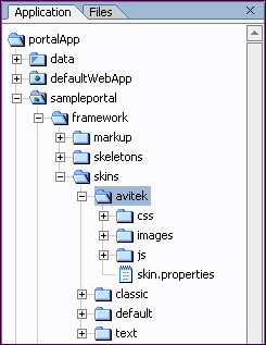
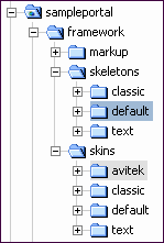
The look & feel attributes in the portal file tell the portal which skin and skeleton to use to render the portal in HTML. The portal in the previous example will use the following skin and skeleton resources:
|
The Skins can also contain subdirectories for sub-skins, or themes (discussed in Look & Feel Overrides). |
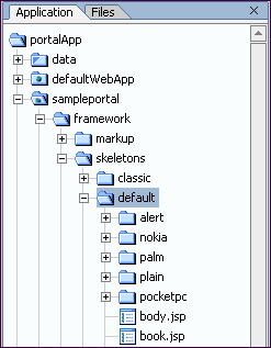
The skeleton is made up of JSPs that map to and convert each portal component to HTML. The XML elements for the portal components in the This figure shows a clipped view of the skeleton contents. The subdirectories shown are skeleton themes and skeletons used for mobile devices. The JSPs in the Themes are discussed in Look & Feel Overrides. |
Note About Portlet Titlebar Icons
The icons used in portlet title bars are stored in the skin's /images directory. The portal framework reads the portal Web project's WEB-INF/netuix-config.xml file to determine which of these graphics to use for the portlet's different states and modes (minimize, maximize, help, edit, and so on).
The skin.properties File
Each skin has a skin.properties file, which is used by the portal framework to populate the <head> section of the rendered HTML, among other things. Included in skin.properties are references to the images directory, the CSS files containing the styles to be used in the HTML, and the JavaScript files containing the functions that will be used in the HTML.
Note: You can also create a file called skin_custom.properties in the same directory as skin.properties. Any entries you include in skin_custom.properties are also added to the HTML <head> region. This feature lets you customize the properties without having them overwritten by product updates.
The following will not be rendered:
- Style Sheet styles that do not exist in one of the
.cssfiles listed in the<head>. - JavaScript functions that do not exist in one of the
.jsfiles listed in the<head>.
That is why it is important to add references to all skin resources in skin.properties or skin_custom.properties.
The skin.properties or skin_custom.properties files can also contain skeleton path information that is used if skeleton attributes are omitted from the look & feel (.laf) file, as described in The Look & Feel File.
The following table shows an example of how entries in skin.properties for the active skin are converted to HTML <head> entries. Different skins may have different entries.
You can control the order in which the CSS and JavaScript entries are inserted into the HTML <head> section by adding
to a script entry, where the number is the order in which the entry should be inserted. All CSS entries are inserted first, followed by all script entries.
Look & Feel Overrides
You can override the skin elements and skeletons on individual portal components so that those components have a different look & feel than the other portal components. For example, you can override the look & feel of a portlet so that it looks different than the other portlets on a page.
Overriding Look & Feel with Themes
As part of each skin or skeleton, you can create sub-skins and sub-skeletons called "themes." Themes contain all or part of the resources contained in a skin or skeleton. For example, a skin theme can contain a /css subdirectory with a single CSS file, and a skeleton theme can contain a single JSP to render a portlet titlebar. Themes can be used on books, pages, and portlets.
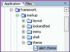
Each theme requires a .theme file located in <portal_Web_project>/framework/markup/theme/. Following is a sample theme file:
<?xml version="1.0" encoding="UTF-8"?>
<netuix:markupDefinition xmlns:netuix="http://www.bea.com/servers/netuix/xsd/controls/netuix/1.0.0"
xmlns:xsi="http://www.w3.org/2001/XMLSchema-instance"
xsi:schemaLocation="http://www.bea.com/servers/netuix/xsd/controls/netuix/1.0.0 markup-netuix-1_0_0.xsd">
<netuix:locale language="en"/>
<netuix:markup>
<netuix:theme
name="alert"
title="Alert Theme" description="A simple alert theme."
markupType="Theme" markupName="alert"/>
</netuix:markup>
</netuix:markupDefinition>
The theme file contains two key attributes:
- name - The name attribute value tells the portal framework the name of the theme directory to look in to apply theme resources to the book, page, or portlet.
- title - The title attribute value is used to populate the Theme drop-down list where it appears in the book, page, and portlet properties in the Portal Designer and in the WebLogic Administration Portal.
The theme XML is inserted in the .portal around the XML for the book, page, or portlet to which the theme applies.
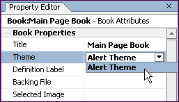
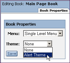
The following figures show where you set a theme in WebLogic Workshop and in the WebLogic Administration Portal.
Theme selection for a book, page, or portlet does not depend on the look & feel selected for a desktop. All themes are available for selection for all look & feels, whether or not the skins and skeletons for the look & feels contain the selected theme. If a skin or skeleton does not contain the selected theme, the theme is ignored. If both a skin and a skeleton theme exists for the selected look & feel, both are used.
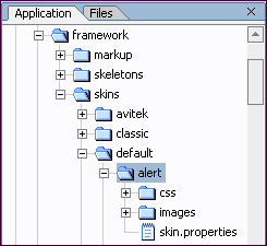
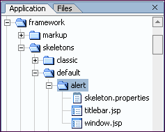
The following figures show an example theme directory structure for the theme file, a skin theme, and a skeleton theme:
If skin or skeleton resources are not explicitly contained in a theme, the parent skin or skeleton resources are used. For example, if a skeleton theme uses only a JSP to render a portlet titlebar, the parent skeleton JSPs are used to render the rest of the portlet.
For skeletons, the ability to use parent resources is dependent on a file in the skeleton theme directory called skeleton.properties,which contains a single entry:
where ., .. is a relative path to the theme's own skeleton JSPs and to the parent skeleton's JSPs.
In the parent skin, the skin.properties must contain path information to its skin themes in the following format:
theme.alert.search.path: alert/images, images
The name of the theme directory is the second entry in the property. The path to the theme images is set (alert/images), along with the path to the parent skin's images directory (images) in case the theme images are an incomplete subset of the necessary images.
Overriding Look & Feel with Properties
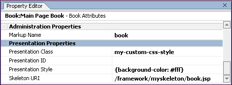
For any selected component in the Portal Designer, you can override CSS properties and the skeleton JSP used to render the component. With the portal component selected in the Portal Designer, set the property overrides you want in the Property Editor under Presentation Properties, as shown in the following figure.
When the portal desktop is rendered as HTML, the skeleton JSP you selected is used to render the component, and the style overrides you entered are automatically inserted into the XML of the .portal file.
Summary
The look & feel selected for a portal desktop serves as the basis for how the desktop is rendered in HTML. The look & feel XML file (.laf) points to a specific skin and a specific skeleton on the file system to use for rendering.
Skins are made up of framework images (like portlet titlebar icons), CSS files, and script files, such as JavaScript. Skeletons are JSPs that convert XML-based portal components to HTML.
Once a look & feel is selected, its XML is inserted into the .portal XML file, which is the primary XML file used to control desktop rendering (.portlet XML files are used to render portlets). The look & feel settings point to the file-based skin and skeleton resources that are used to generate and used in the rendered HTML.
The skin used in a look & feel contains a skin.properties and an optional skin_custom.properties file that contains references to all images, CSS files, and script files that are used by the skin. The entries in skin.properties and skin_custom.properties are converted to HTML <head> entries so that any framework images, CSS styles, and script functions used in the HTML are recognized.
You can override the look & feel for any book, page, or portlet by using themes; and using the Portal Designer and Portlet Designer Property Editor you can override CSS styles, attributes, and the skeleton JSP used to render desktops, books, pages, and portlet title bars and windows.
How the Shell Determines Header and Footer Content
When you build a portal in WebLogic Workshop, the shell that you select determines the header and footer content of the portal desktop. The shell can point to JSP or HTML files that contain the content, personalization, or other behavior you want to include in your headers and footers.
This topic contains the following sections:
- Overview
- The Shell File
- The Portal File
- Location of the Shell Resources
- How the Shell Relates to Look & Feel
- Summary
Overview
The following figure shows the area of a portal desktop controlled by the shell:
Figure 8 Portal areas controlled by the shell
The shell could also be set up to include a left navigation region, as illustrated in the left navigation sample in the WebLogic Workshop sample portal. So the shell really controls everything outside the main page book in a portal.
A shell is represented by an XML file (with .shell extension), as shown in the following figure.
Developers building portals with WebLogic Workshop are not the only users who can determine the shell used by a portal desktop. While developers create shells and select the default shell used by a portal, portal administrators ultimately determine the desktop shell.
After a portal administrator creates a desktop in the WebLogic Administration Portal, the administrator can change the desktop shell on the Desktop Properties page.
Figure 10 Changing the desktop shell
The following section shows the shell XML file and describes how it is used to provide header and footer content.
The Shell File
The shell provides paths to the JSP or HTML files to be used in the desktop header and footer.
Shell files are stored in the following location: <portal_Web_project>/framework/markup/shell/. Following is the headerFooterVisitor.shell provided by BEA with the key attributes highlighted.
<?xml version="1.0" encoding="UTF-8"?>
<netuix:markupDefinition xmlns:netuix="http://www.bea.com/servers/netuix/xsd/controls/netuix/1.0.0"
xmlns:xsi="http://www.w3.org/2001/XMLSchema-instance"
xsi:schemaLocation="http://www.bea.com/servers/netuix/xsd/controls/netuix/1.0.0 markup-netuix-1_0_0.xsd">
<netuix:locale language="en"/>
<netuix:markup>
<netuix:shell
title="Header-Footer Visitor Shell"
description="A header with a link and footer is included in this shell."
markupType="Shell" markupName="headerFooterVisitor">
<netuix:head/>
<netuix:body>
<netuix:header>
<netuix:jspContent contentUri="/portlets/header/header.jsp"/>
</netuix:header>
<netuix:break/>
<netuix:footer>
<netuix:jspContent contentUri="/portlets/footer/footer.jsp"/>
</netuix:footer>
</netuix:body>
</netuix:shell>
</netuix:markup>
</netuix:markupDefinition>
The following table describes the shell attributes and shows how they are used to put content in the desktop header and footer:
The shell XML is automatically added to the underlying XML in the .portal file.
The Portal File
Following is an example portal file, created with the Portal Designer, showing the inserted shell XML from the .shell file (in bold). The shell XML was inserted when the Shell property was set for the selected desktop in the Property Editor. When the .shell file is inserted into the .portal file, its job is finished in the rendering process and the .portal file is used to set the header and footer content.
<?xml version="1.0" encoding="UTF-8"?>
<portal:root xmlns:html="http://www.w3.org/1999/xhtml-netuix-modified/1.0.0"
xmlns:netuix="http://www.bea.com/servers/netuix/xsd/controls/netuix/1.0.0"
xmlns:portal="http://www.bea.com/servers/netuix/xsd/portal/support/1.0.0"
xmlns:xsi="http://www.w3.org/2001/XMLSchema-instance"
xsi:schemaLocation="http://www.bea.com/servers/netuix/xsd/portal/support/1.0.0 portal-support-1_0_0.xsd">
<portal:directive.page contentType="text/html;charset=UTF-8"/>
<netuix:desktop definitionLabel="defaultDesktopLabel" markupName="desktop" markupType="Desktop" title="New Portal Desktop">
<netuix:lookAndFeel definitionLabel="avitek" description="The avitek look
and feel"
markupName="avitek" markupType="LookAndFeel" skeleton="default"
skeletonPath="/framework/skeletons/" skin="avitek"
skinPath="/framework/skins/" title="avitek"/>
<netuix:shell description="A header with a link and footer is included in
this shell."
markupName="headerFooterVisitor" markupType="Shell" title="Header-Footer Visitor Shell">
<netuix:head/>
<netuix:body>
<netuix:header>
<netuix:jspContent contentUri="/portlets/header/header.jsp"/>
</netuix:header>
[XML for books, pages, and portlets...]
<netuix:footer>
<netuix:jspContent contentUri="/portlets/footer/footer.jsp"/>
</netuix:footer>
The portal file is a template with which multiple desktops can be created in the WebLogic Administration Portal. When used as a template, the portal file determines the default shell of any desktop created from it.
Location of the Shell Resources
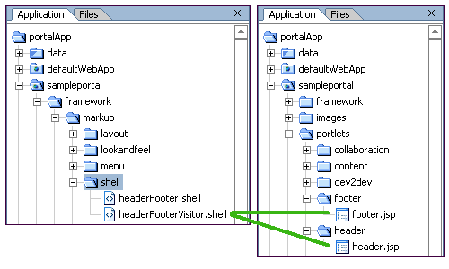
The shell attributes in the portal file tell the portal which content to use for the portal header and footer when the portal is rendered in HTML. The portal in the previous example will use the following shell resources:
The headerFooterVisitor.shell example file contains two tags that point to the content to use in the header and footer, one inside the <header> element and one inside the <footer> element:
<netuix:jspContent contentUri="/portlets/header/header.jsp"/>
<netuix:jspContent contentUri="/portlets/footer/footer.jsp"/>
The locations of those files are highlighted in the previous figure. When the portal is rendered, those JSPs are converted to HTML and inserted into the header and footer regions of the portal. The JSP files can contain any content or functionality allowed in a JSP, including personalization.
The JSPs referenced by this example shell do not have to be called header.jsp and footer.jsp. They could be any JSPs in the portal Web project. However, the skeleton JSPs used to render the boundaries of the header and footer regions are always called header.jsp and footer.jsp in the skeleton framework. The skeleton JSPs are different than the JSPs referenced by the shell. The following section explains the difference in more detail.
How the Shell Relates to Look & Feel
While the shell controls the content of the area surrounding the main book of a portal, the look & feel determines which skeleton header.jsp and footer.jsp are used to render the boundaries and styles of the header and footer areas.
In the following examples, do not be confused by the identically named header.jsp for both the look & feel and the shell header. They are different files with different uses. The fact that both have the same name is coincidence.
Look & Feel (header.jsp skeleton)
The "avitek" look & feel in the portal file uses the "default" skeleton located in /sampleportal/framework/skeletons/default/. Included in the default skeleton is a file called header.jsp that is used to render the <header> element in the portal file.
<%@ page import="com.bea.netuix.servlets.controls.application.HeaderPresentationContext" %>
<%@ page session="false"%>
<%@ taglib uri="render.tld" prefix="render" %>
<%
HeaderPresentationContext header = HeaderPresentationContext.getHeaderPresentationContext(request);
%>
<render:beginRender>
<%-- Begin Body Header --%>
<div
<render:writeAttribute name="id" value="<%= header.getPresentationId() %>"/>
<render:writeAttribute name="class" value="<%= header.getPresentationClass() %>" defaultValue="bea-portal-body-header"/>
<render:writeAttribute name="style" value="<%= header.getPresentationStyle() %>"/>
>
</render:beginRender>
[The JSP referenced in the shell <header> element is inserted here at rendering.]
<render:endRender>
</div>
<%-- End Body Header --%>
</render:endRender>
This is a simple skeleton file that, when rendered, produces the following HTML:
<!-- Begin Body Header -->
<div
class="bea-portal-body-header"
>
</div>
<!-- End Body Header -->
The opening <div> tag uses a CSS class called bea-portal-body-header and then closes itself. The ending </div> tag at the end of rendering closes the <div> section. The JSP referenced in the shell header is inserted between the opening and closing <div></div> tags where its content is rendered as shown in the following example:
<!-- Begin Body Header -->
<div
class="bea-portal-body-header"
>
[The JSP referenced in the shell <header> element is inserted here at rendering.]
</div>
<!-- End Body Header -->
The shell's header.jsp inserted into the <div> tag of the header region controls the content, styles, and behavior of the header content. The only elements provided by the look & feel are the <div> tag and the bea-portal-body-header style class.
For troubleshooting purposes, you could view the rendered portal and view the bea-portal-body-header class (contained in the avitek skin's body.css) to find out which style elements for which the look & feel is responsible. Following is the definition of bea-portal-body-header:
.bea-portal-body-header, .bea-portal-body-footer
{
margin: 0px;
padding: 1px;
color: #C3C6B1;
}
.bea-portal-body-header
{
font-size: large;
font-weight: bold;
}
Summary
The shell selected for a portal desktop determines the content of the area surrounding the portal's main book. The shell XML file (.shell) includes references to the HTML or JSP files you want to appear in the desktop header and footer.
HTML and JSP files used in a header or footer can contain any content or functionality allowed in those types of files, including personalization in JSP files.
Once a shell is selected, its XML is inserted into the .portal XML file, which is the primary XML file used to control desktop rendering (.portlet XML files are used to render portlets).
While look & feel determines the physical boundaries of the header and footer and can include CSS styles and other skin elements generated by the skeleton header.jsp or footer.jsp files, the HTML or JSP files inserted in the header or footer by the shell control the content, styles, style overrides, and behavior of the header and footer.
How Portal Components Are Rendered
With the look & feel and shell selected for a portal desktop, the rendering service has the basic information it needs to convert a .portal XML file into a final HTML file.
This topic shows the rendering lifecycle, step by step, for a single portal component. The same rendering principles apply for all other portal components.
This topic includes the following sections:
Overview
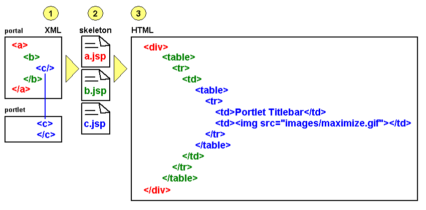
There are three basic stages in the portal rendering process—a process that ultimately results in a portal desktop being displayed in a browser:
1. Building a portal in XML: In the portal development process, you use the Portal and Portlet designers in WebLogic Workshop to build .portal and .portlet files. Both types are XML files. As you build portals and portlets in WebLogic Workshop, the XML elements and attributes are automatically built under the surface.
The previous topics, How Look & Feel Determines Rendering and How the Shell Determines Header and Footer Content, described part of the XML-building process: how the look & feel and shell XML files are added to the portal XML file to provide rendering instructions.
2. Portal XML elements mapped to JSP skeleton files: The portal framework maps specific XML elements to specific JSP skeleton files. They are called skeleton files because they are used to render the physical boundaries and structure—the skeleton—of their portal components. For example, a portlet titlebar in a portlet XML file uses an element called <netuix:titlebar>. The portal framework knows to use the titlebar.jsp skeleton file to render the portlet titlebar.
3. JSP skeleton files and skin.properties are rendered as HTML: Each skeleton JSP file performs its own processing, such as retrieving property values you set in the WebLogic Workshop Property Editor (and were automatically added to the portal XML file), and generates the appropriate HTML for the portal component. The skin.properties and optional skin_custom.properties files for the selected look & feel are converted to image path entries, CSS file entries, and script file entries in the HTML <head> area.
The following figure is a simplified illustration of the rendering process.
Figure 12 Portal rendering process
This topic will expand on these three stages using the rendering lifecycle of a single portal component as an example.
Before going into greater detail on the rendering process, it is important to understand the difference between viewing a portal in the development environment (WebLogic Workshop) and viewing it in the administration/end user environment (WebLogic Administration Portal/browser). The three-stage rendering process occurs in slightly different ways in the two different environments. The following section describes the basic principles of each.
Single File vs. Streamed Rendering
The .portal file you create in WebLogic Workshop is a template. In this template you create books, pages and portlets and define defaults for them. When you view the .portal file with your browser the portal is rendered in "single file mode," meaning that you are viewing the portal from your file system as opposed to a database. The .portal file's XML is parsed and the rendered portal is returned to the browser. The creation and use of a .portal is intended for development purposes, but you can access a .portal file in production. Because there is no database involved you cannot take advantage of features such as user customization or entitlements.
Once you have created a .portal file you can use it to create desktops for a production environment.
A desktop is a particular view of a portal that visitors access. A portal can be made up of multiple desktops, making the portal a container for desktops. A desktop contains all the portlets, content, shells, layouts, and look & feel elements necessary to create individual user views of a portal.
When you create a desktop based on the .portal file in the WebLogic Administration Portal, the .portal and its resources are placed into the database. The settings in the .portal file, such as the look & feel, serve as defaults to the desktop. Once a new desktop is created from a .portal template, the desktop is decoupled from the template, and modifications to the .portal file do not affect the desktop, and vice versa. For example, when you change a desktop's look & feel in the WebLogic Administration Portal, the change is made only to the desktop, not to the original .portal file. When you view a desktop with a browser it is rendered in "streaming mode" (from the database). Now that a database is involved, desktop customizations can be saved and delegated administration and entitlements can be set on portal resources.
The following table compares streamed and file based portals in more detail:
Rendering Lifecycle of a Book
This section illustrates the rendering lifecycle of a book, which will help you understand the rendering lifecycle of other portal components, such as pages and portlets.
This section contains the following topics:
1. Building a portal in XML
This section describes steps that populate and configure the .portal XML file.
Selecting Look & Feel
When you select the look & feel for a desktop, the look & feel file determines which skin and skeleton is used to render all desktop components. In the following example, the "avitek" look & feel has been selected, which uses the "avitek" skin and the "default" skeleton. The look & feel XML is added to the .portal XML file.
The skin and skeleton come into play later in the rendering process, when the desktop is viewed with a browser. Before that happens, the book that will be used to illustrate the rendering process will be added to the portal.
Adding a Book to a Portal
In this section a book is added to the desktop in the .portal file and configured. Books can also be added by portal administrators in the WebLogic Administration Portal, which adds the book directly to the database.
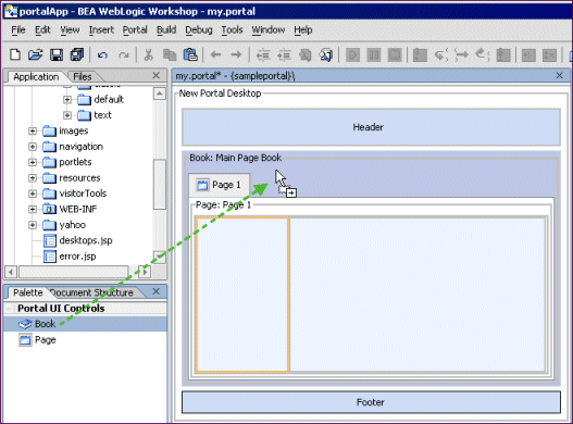
The following figure shows a book control being dragged onto the desktop.
Figure 13 Dragging a control to the Desktop
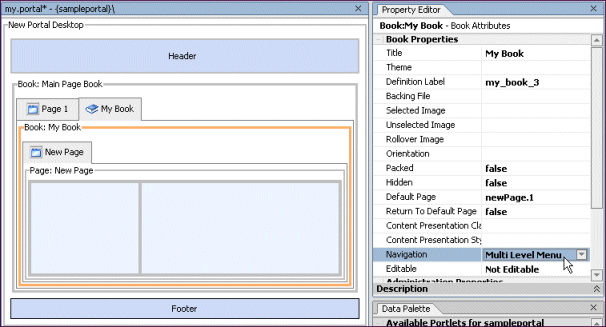
After the book is added to the desktop, the book title is changed from "New Book" to "My Book," and the navigation style is set to Multi Level Menu, as shown in the following figure.
Navigation controls the way a book's sub-books and pages are accessed. The single-level menu provides text links/tabs to sub-books and pages, and the multi-level menu provides a drop-down menu to access sub-books and pages. (Books must be added to books rather than to pages inside books for drop-down navigation to work. So in the following example, for the multi-level menu to produce a drop-down menu, you would need to drag a new book control into Main Page Book, right next to Page 1, as shown in the following figure.)
Figure 14 Arranging portal components
After the Navigation style is set on My Book, the following is what the book looks like in XML in the .portal file. If you add a book in the WebLogic Administration Portal, the XML is added to the database. This XML is used as the basis for the rendering of the book.
<netuix:book defaultPage="newPage.1" definitionLabel="my_book_3"
markupName="book" markupType="Book" title="My Book">
<netuix:multiLevelMenu
description="This menu can navigate across may nested books."
markupName="multiLevelMenu" markupType="Menu" title="Multi Level Menu"/>
<!-- in this example, the nested page content has been removed -->
</netuix:book>
2. Portal XML elements mapped to JSP skeleton files
When the desktop is viewed in a browser, the portal framework reads the XML elements and uses the skeleton path to map the desktop's XML elements to skeleton JSPs. The following examples show which elements in the book XML are mapped to skeleton JSPs and which skeleton JSPs are used to render the elements.
|
Once rendering has been handed off to the JSPs, the JSPs perform the tasks necessary for conversion to HTML. Following are the book.jsp, multilevelmenu.jsp, and submenu.jsp used in this example. Comments are added to describe what the JSPs are doing.
book.jsp
The book.jsp serves as a high-level container for the book's menu and the book's child books and pages. Comments in the JSP code are highlighted in bold text.
<%@ page import="com.bea.netuix.servlets.controls.page.BookPresentationContext,
                 com.bea.netuix.servlets.controls.page.MenuPresentationContext"
%>
<%@ page session="false"%>
<%@ taglib uri="render.tld" prefix="render" %>
<render:beginRender>
<%-- The content inside the <render:beginRender> tag is processed first
and ultimately renders whatever is inside it. In most cases, the
skeletons produce an opening <div> HTML tag with specific attributes
such as CSS classes.
The following block determines where the book falls in the desktop
hierarchy (whether it is the top-level book or a nested book). It
also sets the base name of the CSS class to use (bea-portal-book)
and appends different endings to the base class to apply a
different CSS class for each book context. Only processing,
not HTML rendering, occurs in this block.
--%>
<%
    BookPresentationContext book =
          BookPresentationContext.getBookPresentationContext(request);
    MenuPresentationContext menu = (MenuPresentationContext)
          book.getFirstChild("page:menu");
    String bookClass = "bea-portal-book";
    String useBookClass = bookClass;
    if (book.isDesktopBook())
    {
        bookClass += "-primary";
        useBookClass = bookClass;
    }
    else if (book.isLikePage())
    {
        useBookClass += "-invisible";
    }
    String bookContentClass = bookClass + "-content";
%>
<%-- The next block begins the actual HTML rendering, beginning with
the comment "Begin Book" followed by an opening <div> HTML
tag. Notice the JSP tags used before the closing bracket of the
<div> tag. These populate the div tag with style attributes.
The methods retrieve any presentation property override values
you entered in the WebLogic Workshop Property Editor for the book.
For the "class" attribute, the default value is useBookClass,
which earlier is set to "bea-portal-book". (If through getting
the context the book was found to be the top-level book, the value
of useBookClass would be "bea-portal-book-primary".)
With no overrides, the useBookClass variable will produce the
following HTML, because the book is acting like a page:
<div
class="bea-portal-book-invisible"
>
The style sheet class is provided by the skin, and the CSS file
containing the class is referenced in the skin's skin.properties
file and added to the HTML <head> region.
--%>
<%-- Begin Book --%>
    <div
        <render:writeAttribute name="id" value="<%= book.getPresentationId() %>"/>
        <render:writeAttribute name="class" value="<%=
book.getPresentationClass()%>" defaultValue="<%= useBookClass %>"/>
        <render:writeAttribute name="style" value="<%= book.getPresentationStyle() %>"/>
    >
<%-- The following JSP tag gets the names of the pages and books it will
display in its navigation menu, and based on the navigation element
used in the portal XML file (in this case netuix:multiLevelMenu),
uses the corresponding menu JSP (multilevelmenu.jsp) to render the menu
in this position of the HTML.
--%>
<render:renderChild presentationContext="<%= menu %>"/>
<%-- The following block provides a <div> HTML container for the
book's content area--the child books and pages. Again, it uses
a JSP tag to set the style sheet "class" attribute.
--%>
        <%-- Begin Book Content --%>
        <div
            <render:writeAttribute name="class" value="<%= book.getContentPresentationClass()%>" defaultValue="<%=  bookContentClass %>"/>
            <render:writeAttribute name="style" value="<%= book.getContentPresentationStyle() %>"/>
        >
</render:beginRender>
<%-- The closing </render:beginRender> tag signals the portal framework
to stop rendering the book. After the book's children and their
children are rendered, the portal framework uses the following
<render:endRender> tag to close the book's parent HTML tags.
--%>
<render:endRender>
        </div>
        <%-- End Book Content --%>
    </div>
    <%-- End Book --%>
</render:endRender>
Following is a description of the multilevelmenu.jsp, which is used by the book to render the navigation menu for the book's child books and pages.
multilevelmenu.jsp
The multilevelmenu.jsp is rendered inside the book container and provides the boundaries for multi-level menus on books. This JSP also uses submenu.jsp to perform the actual rendering of the menu links.Comments are highlighted in bold text.
<%@ page import="com.bea.netuix.servlets.controls.window.WindowPresentationContext,
                 com.bea.netuix.servlets.controls.page.BookPresentationContext,
                 com.bea.netuix.servlets.controls.page.MenuPresentationContext,
                 java.util.List,
                 java.util.Iterator,
                 com.bea.netuix.servlets.controls.page.PagePresentationContext,
                 com.bea.netuix.servlets.controls.window.WindowCapabilities" %>
<%@ page session="false"%>
<%@ taglib uri="render.tld" prefix="render" %>
<%-- The following block determines where the book falls in the desktop
hierarchy (whether it is the top-level book or a nested book). It
also sets the base name of the CSS class to use (bea-portal-book)
and defines different menu style classes by appending different
endings to the base class. Only processing, not HTML rendering,
occurs in this block.
--%>
<%
    BookPresentationContext book =
        BookPresentationContext.getBookPresentationContext(request);
    MenuPresentationContext menu =
        MenuPresentationContext.getMenuPresentationContext(request);
    String bookClass = "bea-portal-book";
    if (book.isDesktopBook())
    {
        bookClass += "-primary";
    }
    final String menuClass = bookClass + "-menu";
    final String menuContainerClass = menuClass + "-container";
    final String menuItemClass = menuClass + "-item";
    final String menuItemActiveClass = menuItemClass + "-active";
    final String menuItemLinkClass = menuItemClass + "-link";
    final String menuHookClass = menuClass + "-hook";
    final String menuButtonsClass = menuItemClass + "-buttons";
    List menuChildren = menu.getChildren();
%>
<render:beginRender>
<%-- The content inside the <render:beginRender> tag is processed first
and ultimately renders whatever is inside it, such as opening <div>
HTML tags with specific attributes and tables.
The following block creates a table cell, sets CSS styles on the <td>
tag (based on the members defined in the previous block).
--%>
<%-- Begin Multi Level Menu --%>
    <div class="bea-portal-ie-table-buffer-div">
        <table border="0" cellpadding="0" cellspacing="0" width="100%">
            <tr>
                <td class="<%= menuContainerClass %>" align="left" nowrap="nowrap">
<%-- The following block builds the menu in the table cell. It first adds an
unordered list <ul> to the cell and sets its style class. Then, an IF
statement checks to see if the book is in VIEW mode. If true, CSS styles
are put in the request as attributes to be used by the menu.
After the attributes are added to the request, the skeleton's submenu.jsp
is inserted, which does the following:
* Gets the CSS styles from the request.
* Gets the book's child pages and books.
* Creates list items <li> of the children and creates links out of them.
The menuHookClass at the end of the block is used by the skin's menu.js file
to insert the rendered menu. The <ul> that is generated is a menu
structure description that is read and rewritten by menu.js.
* Adds CSS styles to the request and includes submenu.jsp to handle
the menus of nested books.
After the menu is built, the CSS styles are removed from the request.
--%>
                    <ul
                        <render:writeAttribute name="id" value="<%=
                         menu.getPresentationId() %>"/>
                        <render:writeAttribute name="class" value="<%=
menu.getPresentationClass() %>" defaultValue="<%=
                         menuClass %>"/>
                        <render:writeAttribute name="style" value="<%=
                         menu.getPresentationStyle() %>"/>
                    ><%
                        if (book.getWindowMode().equals(WindowCapabilities.VIEW))
                        {
                            request.setAttribute(BookPresentationContext.class.getName() + ".root-flag", Boolean.TRUE);
                            request.setAttribute(BookPresentationContext.class.getName() + ".menu-item", book);
                            request.setAttribute(BookPresentationContext.class.getName() + ".menu-class", menuClass);
                            request.setAttribute(BookPresentationContext.class.getName() + ".menu-item-class", menuItemClass);
                            request.setAttribute(BookPresentationContext.class.getName() + ".menu-item-active-class", menuItemActiveClass);
                            request.setAttribute(BookPresentationContext.class.getName() + ".menu-item-link-class", menuItemLinkClass);
                            %><jsp:include page="submenu.jsp"/><%
                            request.removeAttribute(BookPresentationContext.class.getName() + ".root-flag");
                            request.removeAttribute(BookPresentationContext.class.getName() + ".menu-item");
                            request.removeAttribute(BookPresentationContext.class.getName() + ".menu-class");
                            request.removeAttribute(BookPresentationContext.class.getName() + ".menu-item-class");
                            request.removeAttribute(BookPresentationContext.class.getName() + ".menu-item-active-class");
                            request.removeAttribute(BookPresentationContext.class.getName() + ".menu-item-link-class");
                        }
                    %></ul>
                    <div class="<%= menuHookClass %>"></div>
                </td>
<%-- The following block adds a table cell next to the menu table cell
if a menu is present. The <render:endRender> contents are inserted
in the HTML after all menu children are inserted, which closes
the menu table.
--%>
<%
    if (menuChildren != null && menuChildren.size() > 0)
    {
%>
                <td class="<%= menuButtonsClass %>" align="right" nowrap="nowrap">
<%
    }
%>
</render:beginRender>
<render:endRender>
<%
    if (menuChildren != null && menuChildren.size() > 0)
    {
%>
                </td>
<%
    }
%>
            </tr>
        </table>
    </div>
    <%-- End Multi Level Menu --%>
</render:endRender>
submenu.jsp
The submenu.jsp is inserted inside the multilevelmenu.jsp. It retrieves a book's child books and pages and builds the navigation links to those children. Comments are shown in bold text.
<%@ page import="java.util.Iterator,
                 java.util.List,
                 com.bea.netuix.servlets.controls.page.BookPresentationContext,
                 com.bea.portlet.PageURL,
                 com.bea.netuix.servlets.controls.page.PagePresentationContext"%>
<%@ page session="false"%>
<%-- The following block gets the CSS styles placed in the request by
multilevelmenu.jsp.
--%>
<%
    Boolean isRoot
        = (Boolean) request.getAttribute(BookPresentationContext.class.getName() + ".root-flag");
    BookPresentationContext bookCtx
        = (BookPresentationContext)
request.getAttribute(BookPresentationContext.class.getName() +
         ".menu-item");
    String menuClass
        = (String) request.getAttribute(BookPresentationContext.class.getName() +
         ".menu-class");
    String menuItemClass
        = (String) request.getAttribute(BookPresentationContext.class.getName() +
         ".menu-item-class");
    String menuItemActiveClass
        = (String) request.getAttribute(BookPresentationContext.class.getName() +
         ".menu-item-active-class");
    String menuItemLinkClass
        = (String) request.getAttribute(BookPresentationContext.class.getName() +
         ".menu-item-link-class");
%>
<%-- The following block checks to see if the book and its children
are visible. If true, the labels of the children are retrieved,
iterated over, and inserted as hyperlinked list items <li>
inside the unordered list <ul> inserted by multilevelmenu.jsp.
Notice the nested <ul> at the end of the block, which provides
for submenu nesting.
--%>
<%
    if (!bookCtx.isHidden() && bookCtx.isVisible())
    {
        if (bookCtx instanceof BookPresentationContext)
        {
            List bookChildren = bookCtx.getPagePresentationContexts();
            Iterator it = bookChildren.iterator();
            while (it.hasNext())
            {
                PagePresentationContext childPageCtx = (PagePresentationContext)
it.next();
                if (!childPageCtx.isHidden() && childPageCtx.isVisible())
                {
%><li class="<%= isRoot.booleanValue() &&
childPageCtx.isActive() ? menuItemActiveClass : menuItemClass
                  %>"><%
                    %><a class="<%= menuItemLinkClass %>" href="<%= PageURL.createPageURL(request, response, childPageCtx.getDefinitionLabel()).toString() %>"><%= childPageCtx.getTitle() %></a><%
                    if (childPageCtx instanceof BookPresentationContext)
                    {
                        %><ul class="<%= menuClass %>"><%
                        request.setAttribute(BookPresentationContext.class.getName()
                        + ".root-flag", Boolean.FALSE);
                        request.setAttribute(BookPresentationContext.class.getName()
                        + ".menu-item", childPageCtx);
                        %><jsp:include page="submenu.jsp"/><%
                        request.removeAttribute(BookPresentationContext.class.getName() + ".root-flag");
                        request.removeAttribute(BookPresentationContext.class.getName() + ".menu-item");
                        %></ul><%
                    }
                    %></li><%
                }
            }
        }
    }
%>
JavaScript in Menus
The menus in a desktop use JavaScript functions for such functionality as drop-down menus and rollovers. These JavaScript functions are called from the skeleton's body.jsp, which contains the following entry:
<render:writeAttribute name="onload" value="<%= body.getOnloadScript() %>"/>
The onload value is retrieved from the following property in the skin's skin.properties file:
document.body.onload: initSkin()
Following is the HTML written by the body.jsp:
<body
class="bea-portal-body"
onload="initSkin();"
>
The initSkin() JavaScript function is the base function that calls menu-rendering functions in other JavaScript files. The initSkin() function is contained in the skin.js file. Other menu functions are contained in the menu.js and menufx.js files. Since all of those JavaScript files are listed in the skin's skin.properties file, they are automatically added to the HTML <head> region at rendering, and the functions they contain are recognized.
The next section describes the final process of the skeleton JSPs and skin.properties being converted to HTML.
3. JSP skeleton files and skin.properties are rendered as HTML
The previous section described the skeleton JSPs that are used to convert a book with a multi-level menu to HTML. The descriptions in that section described briefly some of the HTML generated by the JSPs.
This section shows the final HTML that is generated for a book, describes where it came from, and shows where some of the CSS styles used are defined.
Not all HTML for the desktop is shown in the following table. Only the sections that relate to the look & feel and the example book are shown.
skin.properties and skin_custom.properties - The paths to skeletons, skins, images, style sheets, and JavaScript files in the HTML <head> region are inserted from the skin's skin.properties and skin_custom.properties files. To see the original skin.properties entries, see The skin.properties File in "How Look & Feel Determines Rendering." The <head> tag is inserted by the head.jsp file used for the shell. The <title> is inserted from the desktop title in the .portal file.
The first three <meta> tags are for testing and debugging purposes. These can be removed from skin.properties by setting the enable.meta.info property to false.
<head>
<title>New Portal Desktop</title>
<meta name="bea-portal-meta-skeleton" content="/framework/skeletons/default"/>
<meta name="bea-portal-meta-skin" content="/framework/skins/avitek"/>
<meta name="bea-portal-meta-skin-images" content="/framework/skins/avitek/images"/>
<link href="/sampleportal/framework/skins/avitek/css/body.css" rel="stylesheet"/>
<link href="/sampleportal/framework/skins/avitek/css/button.css" rel="stylesheet"/>
<link href="/sampleportal/framework/skins/avitek/css/window.css" rel="stylesheet"/>
<link href="/sampleportal/framework/skins/avitek/css/plain/window.css" rel="stylesheet"/>
<link href="/sampleportal/framework/skins/avitek/css/portlet.css" rel="stylesheet"/>
<link href="/sampleportal/framework/skins/avitek/css/book.css" rel="stylesheet"/>
<link href="/sampleportal/framework/skins/avitek/css/fix.css" rel="stylesheet"/>
<link href="/sampleportal/framework/skins/avitek/css/layout.css" rel="stylesheet"/>
<link href="/sampleportal/framework/skins/avitek/css/form.css" rel="stylesheet"/>
<script type="text/javascript" src="/sampleportal/framework/skins/avitek/js/menu.js"></script>
<script type="text/javascript" src="/sampleportal/framework/skins/avitek/js/util.js"></script>
<script type="text/javascript" src="/sampleportal/framework/skins/avitek/js/delete.js"></script>
<script type="text/javascript" src="/sampleportal/framework/skins/avitek/js/float.js"></script>
<script type="text/javascript" src="/sampleportal/framework/skins/avitek/js/menufx.js"></script>
<script type="text/javascript" src="/sampleportal/framework/skins/avitek/js/skin.js"></script>
</head>
The following section shows the HTML that is produced by each skeleton JSP.
book.jsp
<div
class="bea-portal-book-invisible"
>
multilevelmenu.jsp
    <div class="bea-portal-ie-table-buffer-div">
        <table border="0" cellpadding="0" cellspacing="0" width="100%">
            <tr>
                <td class="bea-portal-book-menu-container" align="left"
                  nowrap="nowrap">
                    <ul
                        class="bea-portal-book-menu"
                    >
submenu.jsp
<li class="bea-portal-book-menu-item-active"><a class="bea-portal-book-menu-item-link"
href="http://localhost:7001/sampleportal/my.portal?_nfpb=true&_pageLabel=my_page_6">New Page</a></li>
        <div
            class="bea-portal-book-content"
        >
<%-- The book content (sub-books and pages) is inserted here. -->
</div>
</div>                    </ul>
                    <div class="bea-portal-book-menu-hook"></div>
                </td>
</tr>
</table>
</div>
When the desktop for this example is rendered, the following appears in the browser:
The circled area in this figure is the only content rendered for the book. The book contains only one page, so there is only one menu item for the book. The "Page 1" and "My Book" tabs are menu items rendered by the parent Main Page Book. That is why you do not see the "My Book" in the previous HTML block: because the book is responsible for rendering only a menu of its child books and pages.
If "New Page" contained a portlet, the portlet would appear in the browser. However, the rendering of the page and portlet is handled by different skeleton JSPs: one to provide a container for the page content, one to render the layout of the page (table cells that contain portlets and sub-books), and a few to handle the rendering of the portlet.
The book is responsible for rendering only two things:
- The menu of sub-books and pages it contains.
- Opening and closing
<div>tags to serve as the container for sub-books, pages, portlets, and other sub-components contained in the book.
CSS Styles in the Example
As you can see from the previous example of rendered HTML code, the skeleton JSPs insert many CSS styles. For example, the multilevelmenu.jsp inserts
<td class="bea-portal-book-menu-container" ...>
The style classes inserted by multilevelmenu.jsp are rewritten by the skin's menu.js file.
Also, some of the style classes inserted by the skeleton JSPs are not defined in any of the CSS files provided by BEA. You can add these style classes to your custom CSS files to control those styles in your portal desktops.
To determine which styles you want to modify, see The Look & Feel Editor.
Changing Look & Feel
If the look & feel is changed, a different skin and skeleton is referenced by the look & feel file, and rendering is subject to that skin and skeleton. With a different skin and skeleton, CSS files and script code can change completely.
Summary
There are three basic stages in the portal rendering process: building a portal in XML, portal XML components being mapped to skeleton JSPs, and skeleton JSPs rendering the portal desktop in HTML. The latter two stages are handled automatically by the portal framework.
There is a rendering difference between viewing a portal desktop in development mode and in administration/end user mode. In development mode, when you view the .portal file in a browser you see it in "single file" mode, meaning the desktop is being rendered from the file system. In administration/end user mode, you view a portal desktop in a browser in "streamed" mode, meaning the desktop components are being streamed from a database. When you create a portal desktop in the WebLogic Administration Portal using a .portal file as a template for the desktop, the portal components are added to the database and are decoupled from the original .portal file.
The Look & Feel Editor
The Look & Feel Editor lets you interactively edit the text styles used by portal text elements. Technically, the editor modifies Cascading Style Sheet (CSS) files that are referenced by a portal's skin.properties file. For example, using the Look & Feel Editor, you can change the size of a heading, the color of a list element, or the padding around a table cell for a portal.
The Look & Feel Editor also lets you change the properties of a portal's look & feel file (.laf file), such as the skin and skeleton files that it references.
In addition, the Editor shows you, at a glance:
- The CSS cascade for a portal
- The properties assigned to a selected CSS style
- The inherited properties of a selected CSS style
- The elements of the portal's
skin.propertiesfile
This topic discusses the functional parts of the Look & Feel Editor in greater detail than the corresponding online help topic. The goal is to offer additional insight into the purpose and use of the Editor than is covered elsewhere. This topic includes the following sections:
- Overview
- Application Window
- Style Hierarchy Window
- Style Description Window
- View Area
- Document Structure Window
- Property Editor Window
- Summary
Note: To use the Look & Feel Editor successfully, you must have a basic understanding of CSS. In this document, we provide minimal explanations of key CSS features, such as inheritance. If you are new to CSS, we recommend reviewing a book that covers the subject in detail. Many books and Websites are devoted exclusively to CSS.
Overview
With the Look & Feel Editor, you can easily experiment with a portal's look & feel and see the results immediately. The Look & Feel Editor lets you interactively edit the text styles used by a portal. Using the Look & Feel Editor, you can select text in a portal and modify the text's characteristics, such as font size, color, padding, and so on. The changes you make are immediately reflected in the Editor's View Area.
Remember that a portal's skin helps to define the overall look & feel of a portal. The portal's skin.properties file specifies one or more CSS files used by the skin. A portal's HTML text can reference these CSS files and use their style definitions. If you modify the font size for a particular text style, the Look & Feel Editor changes the style's definition inside a CSS file. The change is then immediately reflected in the HTML displayed in the Editor's View Area.
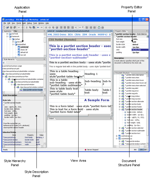
The following figure shows the parts of the Look & Feel Editor. This topic discusses each of these parts in detail.
Figure 16 Look & Feel Editor components
Application Window
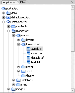
The Application panel displays the file structure of a portal project. Use this panel to locate and select the look & feel file for the portal that you wish to edit.
The look & feel (.laf) file contains references to the skins and skeletons that define a portal's look & feel. To use the Look & Feel Editor, you must use the Application panel to locate the .laf file for the portal you wish to edit. Then, double-click the filename to open the Look & Feel Editor. The .laf files for a portal are located in the portal's lookandfeel folder. For example, the avitek.laf file is shown selected in the Application Window in the following figure:
Figure 17 Selected Look & Feel file
For more information on the .laf file, see The Look & Feel File.
Style Hierarchy Window
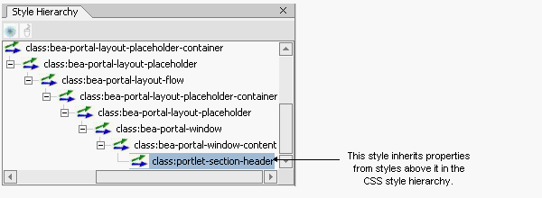
The Style Hierarchy panel shows the CSS cascade for the selected style. The cascade is a hierarchy of CSS styles, defined by the HTML document structure. It's useful to see the cascade because it can help you to locate and appropriately handle inherited style properties. In the following figure, the portlet-section-header style is selected. Note that the style portlet-section-header is below bea-portal-window-content in the hierarchy:
This means that portlet-section-header can inherit properties from portal-window-content, and, potentially, from all other style classes higher up the hierarchy. For more information on inheritance, see Understanding CSS Inheritance. When you select a style in the Style Hierarchy panel, its style definitions and inherited style properties appear in the Style Description panel, described in the next section.
Style Description Window
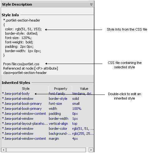
The Style Description panel lets you see at a glance the selected style's properties and its inherited style properties. The Style Info part, shown in the following figure, comes directly from the CSS file in which the style is defined. The Inherited Styles list, also shown in the following figure, is constructed directly from the document structure of the HTML text that is currently opened in the Look & Feel Editor. The Inherited Styles list shows the style properties and their values that are inherited from styles higher up in the document hierarchy. For instance, you can see that portlet-section-header inherits the font-family property from the bea-portal-body style.
Figure 19 Window shows inherited styles
To understand the value of the Inherited Styles list, it helps to have a basic understanding of HTML and CSS.
Understanding CSS Inheritance
Tip: This section is a very brief overview of CSS inheritance. Many books and Websites are devoted to CSS and cover this important subject in greater depth.
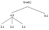
HTML documents are hierarchically organized. In other words, each element of an HTML document can have one or more child elements, one parent element and possibly many ancestor elements. A central feature of CSS is that styles are inherited down the HTML document hierarchy. For example, the following tree diagram depicts a simple HTML document hierarchy:
If you would like all the text in this document to be blue, you could define the body tag to be blue. Because of CSS inheritance, all of the elements below body (specifically, li and h1) will also be blue. If, on the other hand, you would like everything to be blue except list elements, you could define the ul tag to be another color, such as red. Then, all of the li elements will inherit the color red from their parent, ul. At the same time, the h1 tags will be blue (h1 tags will still inherit their color from body).
The Look & Feel Editor shows you all styles that a selected style inherits. Therefore, if you want to change the font size of a style, but font size is not defined in that style, you can see at a glance from which style font size is inherited. Then, you can easily edit the property, as explained in the next section.
Tip: Without this convenient feature, it would be difficult to decide which styles a given style inherited. Typically, you would have to open and examine the CSS files in the hierarchy to find where a specific style property is defined or possibly overridden.
Using the Inherited Styles List
As mentioned in the previous section, in some cases, the property you wish to modify is not defined in the specific CSS style class associated with the text you have selected. It is possible, for instance, to select a heading in the Look & Feel Editor, but find that font size is not a property of that heading's style. In this case, the property you wish to change may be an inherited property.
The Look & Feel Editor displays and lets you edit any inherited property for a given style. For example, suppose you wish to change the font size of some text. After selecting the style you wish to edit (for example, by clicking the text in the View Area), you then notice that font-size is not a property of that text's CSS style. Next you look at the Inherited Styles list, and you discover a style higher up in the cascade in which font-size is defined.
At this point, you must decide whether you want to edit the font-size property where it is currently defined (higher up in the cascade) or add the property directly to the style of the text you wish to modify. Of course, if you modify a property up the cascade, you may inadvertently change the properties of other text that inherits the same property. It is up to you to make this decision. If you change it directly in the selected style, then the inherited property is overridden, and only that style (and any styles down the hierarchy) receive the new property value (unless it is once again overridden).
Tip: To add or modify a property in an inherited style, double-click the style name in the Inherited Styles list. Then, use the CSS Style Wizard to make your changes.
View Area
The View Area displays the HTML that uses the CSS styles you wish to edit. When you start the Look & Feel Editor, a default HTML page is displayed. This page is supplied with WebLogic Workshop and contains a representative sample of text elements.
You can load any other HTML into the Editor by supplying a URL or path, or by entering HTML directly. To select the HTML to display, use the Portal > Look And Feel menu. For example, to edit the text styles for a portal, run the portal in a browser, copy its URL, and load the page into the Editor using the menu function Portal > Look And Feel > Render Custom URL.
Note: Remember that you start the Look & Feel Editor by opening a look & feel (.laf) file. The HTML file that is shown in the View Area must reference the same CSS files that the .laf file references in its skin. If you load the default HTML page into the Editor, this connection is automatically established. However, if you load HTML from a portal into the Editor, you must be sure the portal references the same .laf file as the Editor.
Document Structure Window
The Document Structure Window shows a representation of the files that are referenced by the portal's skin.properties file. In this panel you can edit properties of:
- The look & feel (
.laf) file for the portal - The style properties located in each of the CSS (
.css) files referenced by the portal's skin
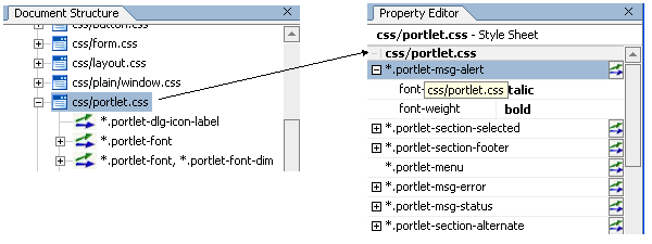
The following figure shows a portion of the Document Structure panel. In this figure, the css/portlet.css file is expanded to reveal the styles defined in it. You can double-click a style to add or modify its properties. You can also single-click a .css file, style name, or style property to display and edit values in the Property Editor panel.
Figure 21 Double-click a style to modify its properties
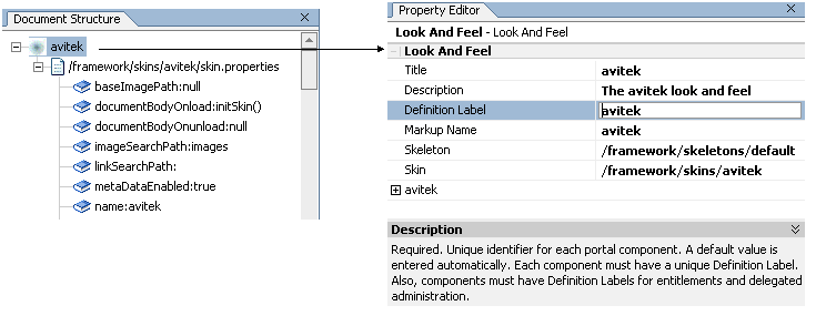
In addition to using this panel to access CSS styles, you can also access and edit the properties of the look & feel (.laf) file associated with a portal, as shown in the following figure. You can change any of these properties, including picking new skin and skeleton files. Note that the look & feel file node (e.g., avitek) occurs at the top of the document structure.
Figure 22 Look & Feel file in the Document Structure window
Note: If you select a new skin file, Weblogic Workshop automatically saves the currently open document. As a result, you will lose the ability to undo your most recent operations.
Property Editor Window
The Property Editor panel lets you interactively modify values of the selected CSS style or look & feel file. To display properties in the Property Editor, you can do one of the following:
- Click on a text element in the HTML file in the View Area.
- Click a CSS style or the look & feel filename in the Document Structure panel.
- Click on a CSS filename in the Document Structure panel, then expand the CSS file in the Property Editor to edit the properties, as shown in the following figure:
Figure 23 Displaying style properties in the Property Editor
Note: To see and edit values, you may have to expand the selected .css file or style by clicking a + icon on the left side of the Property Editor. To add or modify properties, you can also click the ![]() icon to the right of a style to bring up the CSS Style Wizard.
icon to the right of a style to bring up the CSS Style Wizard.
Summary
The Look & Feel Editor provides a convenient way to locate and edit the CSS-based styles that define the look of text elements in a portal. In addition, the Editor lets you modify the properties of the look & feel file associated with a portal.
