Web Application Development: Using the Web Page Editor
This document describes the following:
- Using the Design View
- Using the Preview Tab
- Using the Source View
- Using the Outline View
- Related Information
You use the Web Page Editor to edit JSP and HTML files. It is a multi-page editor that provides the following:
- Design page that supports visual development.
- Source page that lets you edit text.
- Preview page
The following views are associaged with the Web Page Editor:
- Properties view that enables editing of the most common attributes of tags using choice dialogs.
- Palette view that allows you to edit and create tags, such as HTML, JSP, and JSF.
- Outline view
- Display of horizonatally-split Design and Source pages
- Display of vertically-split Design and Source pages
- Display of Design page only
- Display of Source page only
- Underlining selected text
- Bolding selected text
- Italicizing selected text
- Making selected text appear small
- Making selected text appear large

Figure 1. Web Page Editor
To access the Editor, from your Web project open in the Project Explorer, right-click a page which you are planning to edit, and then select Open With > Web Page Editor from the drop-down menu, as Figure 2 shows.
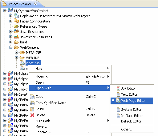
Figure 2. Opening the Web Page Editor
The Design view is editable and allows you to select elements and move them around on the page, display an element's properties in the properties editor, drop tags from the Palette onto the page, edit elements using the context menu, and so on.
Figure 3 shows a JSP page dispayed in the design view with an input text selected and its properties displayed in the properties editor.

Figure 3. Design View
Note that some elements enable tag-specific editing through the context menu.
The Design view provides tooltips with the information on which element will be selected upon a mouse click.
In addition, the Design view allows you to visually inspect and select nonvisual child componenents, such as converters and validators. To do so, float the cursor over an element, and you will see these nonvisual child components as semitransparent icons at the top-right of the element, as Figure 4 shows.
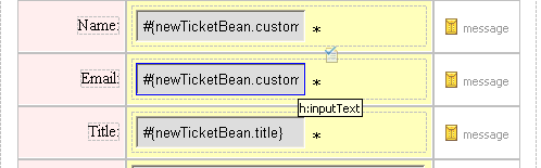
Figure 4. Displaying Nonvisual Child Components
Selecting the element and then clicking the "pin" icon that appears at the top-right of the element will then let you select the nonvisual child component by clicking the component's icon.
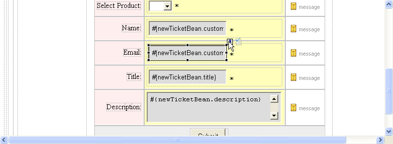
Figure 5. Selecting Nonvisual Child Components
The Preview tab represents a non-editable view that closely emulates the Web page as it will be rendered at run time.
Figure 6 shows a preview of a JSP page.

Figure 6. Preview Tab
The Source view is editable and allows you to select elements, display an element's properties in the properties editor, drop tags from the Palette onto the page, and so on. Figure 7 shows a JSP page dispayed in the Source view with an output text selected and its properties displayed in the properties editor.

Figure 7. Source View
You can use the content assist feature of the Source view that lets you select tags from a list of available tags with descriptions. You activate the content assist by pressing Ctrl+Space key combination.
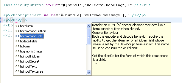
Figure 9. Content Assist in Source View
You can use the HyperLink feature of the Source view to open a managed bean's code. To do so, press Ctrl+Click key combination on the value attribute of a tag.
The Source view offers the HoverHelp that displays information about the page elements, or on how to use them, as Figure 9 shows.

Figure 9. HoverHelp in Source View
You can zoom in to the help topic by pressing F2.
The Outline view (see Figure 6) allows you to do the following:
- Visually inspect the document structure
- Change the selection of the current element
- Drag and drop elements within the view
- Modify elements and attributes using the context menu
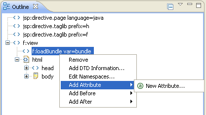
Figure 6. Outline View
- JavaServer Faces Technology
- JavaServer Pages Technology
- Editing Tags with Property Sheets
- Using the Web Page Editor Palette
- Enabling Localization in the Web Page Editor
- Creating JSF HTML Tags