Web Application Development: Adding JSF HTML Tags (Advanced)
This document describes the following:
OEPE provides tag drop support for JSF Web projects. This OEPE feature is made available through a series of wizard-style dialogs that are displayed during "specialty" drops that require not just simple tag editors, but tag-addition guides that assist you by offering appropriate attribute editors and default values. Note that you cannot use these editors to modify tags, but only to add
panelGrid, dataTable, and form tags.
To access this OEPE functionality, open your JSF Web project in Project Explorer, right-click a JSP page on which you are planning to drop tags, and select Open With > Web Page Editor from the drop-down menu, as Figure 1 shows.
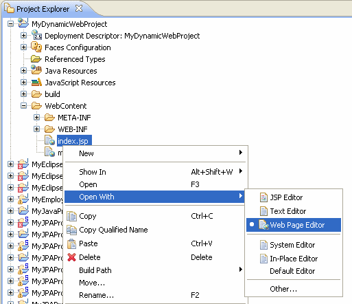
Figure 1. Opening JSP Page in Web Page Editor
With the page open in the editor view, click Show Palette (a gray triangular button located at the top right corner of the editor) to display the Palette, as Figure 2 shows.
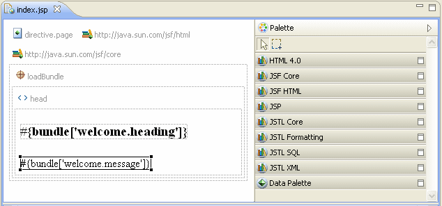
Figure 2. Palette
To add tags, you drag one of Panel Grid, Data Table, or Form components from the Palette to the body of your JSP page in the editor and complete New dialogs.
Note that you have an option of binding dialogs' fields to beans or bean properties by clicking buttons located to the right of most fields.
panelgrid tag using the New Panel Grid dialog that provides tag attribute editors, as Figure 3 shows.
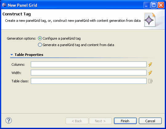
Figure 3. New Panel Grid Dialog
Using this dialog, in the Generation options field, specify whether you are adding a new
panelGrid tag, or generating one and its content from data. If you choose the former, proceed with the following:
- In the Columns field, enter a number of columns.
- In the Width field, specify the width as an integer.
- In the Table Class field, specify the table style class.
- Specify the bean property by clicking Select a Variable button located to the right of the Bean property field to open the Choose Bean/Bean Property dialog that Figure 5 shows.
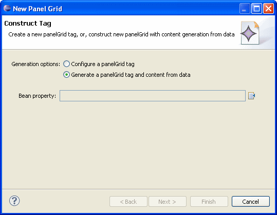
Figure 4. Specifying Bean Property
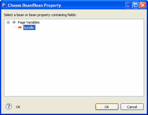
Figure 5. Choosing Bean for New Panel Grid
Click OK on the Choose Bean/Bean Property dialog, and then click Next on the New Panel Grid dialog to open the New Panel Grid > Choose Fields dialog. - On the New Panel Grid > Choose Fields dialog that Figure 6 shows, you may select the fields that you want to generate for your panel grid, and then click Next.
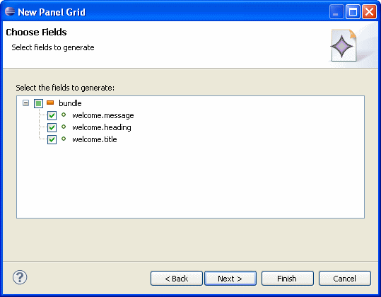
Figure 6. Choosing Fields to Generate - On the next New Panel Grid > Choose Field Components, Labels and Ordering dialog that Figure 7 shows, you may select components to represent fields and the labels for these fields. In addition, you may define the order in which the fields will appear by clicking Up and Down buttons located to the right of the Field Selection area.
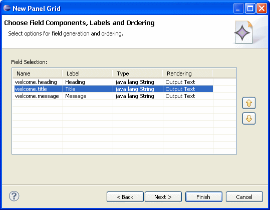
Figure 7. Choosing Field Components, Labels and Ordering - You may click Next to open the New Panel Grid > Choose Options dialog that Figure 8 shows. On this dialog, define if your panel grid should have a header and a footer, and whether or not validation messages should be displayed for input fields, and if so, choose their style by clicking a button to the right of Style class field to open the Choose CSS Style Class dialog.
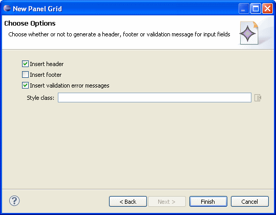
Figure 8. Choosing Options
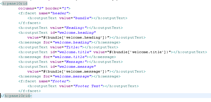
Upon completion, in the body element of your JSP page an empty h:panelGrid tag with the specified parameters is added, as the following example shows:
dataTable tag using the New Data Table dialog shown in Figure 9.
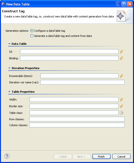
Figure 9. New Data Table Dialog
Using this dialog, in the Generation options field specify whether you are adding a new
dataTable tag, or generating one and its content from data. If you choose the former, proceed with the following:
- In the Data Table area, provide the table ID, as well as to which UI component this table is to be bound by clicking the Bind to a dynamic value button located to the right of the Binding field and making selection of either variables or resources on the Choose Binding dialog that Figure 10 shows.
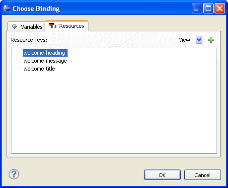
Figure 10. Choosing Binding for Data Table
- In the Iteration Properties area, you specify enumerable items by clicking the Bind to a dynamic value button located to the right of the Enumerable (items) field and making selection of either variables or resources on the Choose Binding dialog that Figure 10 shows. In addition, provide an iteration variable name to use. Note that
Enumerabletypes include typejava.util.Collection,java.util.Iterator,java.util.Map, and Java arrays. - In the Table Properties area, you may set the table's width and border size as integers, as well as specify classes for the table, row and column.
dataTable and its content from data,
the New Data Table dialog will change as Figure 11 shows, and you proceed as follows:
- Specify the enumerable bean property by clicking Select an Enumeration button located to the right of the Enumerable field to open the Choose Enumerable Bean Property dialog.
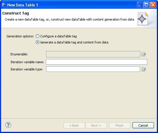
Figure 11. Generating dataTable Tag and Content from Data
- Enter the iteration variable name and type by completing appropriate dialogs. You may also choose the enumerable fields to generate and define their order, as well as insert a header and footer for your table. For information on how to do this, see procedures in adding a PanelGrid Tag section.
Upon completion, a h:dataTable tag with the specified parameters is added within the body element of your JSP page.
form tag using the New Form dialog shown in Figure 12.
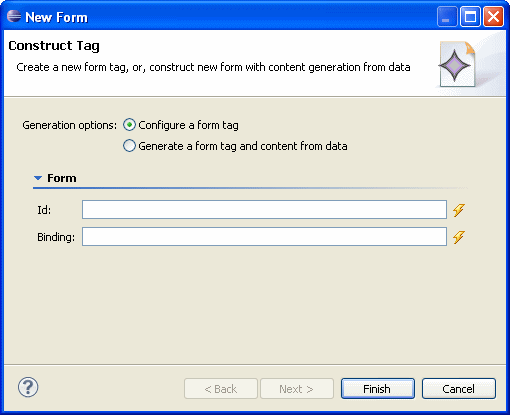
Figure 12. New Form Dialog
Using this dialog, in the Generation options field specify whether you are adding a new
form tag, or generating one and its content from data. If you choose the former, proceed with the following:
- In the Id field, enter the form ID.
- In the Binding field, specify to which UI component this form is to be bound by either entering the value, or clicking the Bind to a dynamic value button located to the right of the Binding field and making selection of either variables (of type
javax.faces.component.UIComponent) or resources on the Choose Binding dialog that Figure 10 shows.
dataTable and its content from data,
the New Form dialog will change as Figure 13 shows, and you proceed as follows:
- Specify an existing JSF managed bean by clicking the Select a Variable button located to the right of the Form bean field to open the Choose Bean/Bean Property dialog that Figure 14 shows.
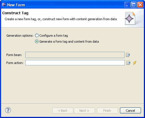
Figure 13. Generating form Tag and Content from Data
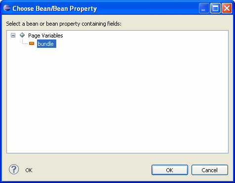
Figure14. Choosing a Bean for New Form
Click OK on the Choose Bean/Bean Property dialog. - Optionally, you can specify a form action, such as a navigation case outcome or a method binding, by clicking button to the right of the Form action field. Clicking Select a value will open the Select Navigation Case dialog. If there are no existing navigation cases listed, you may click New Navigation Case to open the dialog that will let you to define a new action (navigation case), as Figure 15 shows.
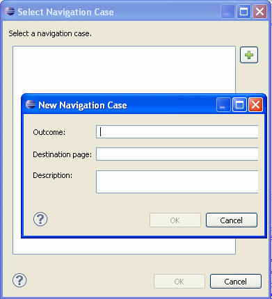
Figure 15. Selecting Existing or Defining New Navigation Case
To specify a method binding, click Bind to a dynamic value button located to the right of the Form action to open the Choose Method dialog that will let you select a method, if available, or add a new method in the selected bean. - Fields (see Figure 16) - from the list of fields with accessor methods, select fields to generate.
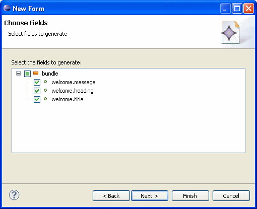
Figure 16. Choosing Fields
Note the following:- Fields of fields are displayed recursively as children.
- "Non-complex" first-level fields are selected by default; other fields, such as enumerated types and dates, are not selected because they are considered "complex".
- Field Components, Labels and Ordering (see Figure 17) - select components to represent fields and the labels for these fields. In addition, you may define the order in which the fields will appear by clicking Up and Down buttons located to the right of the Field Selection area.
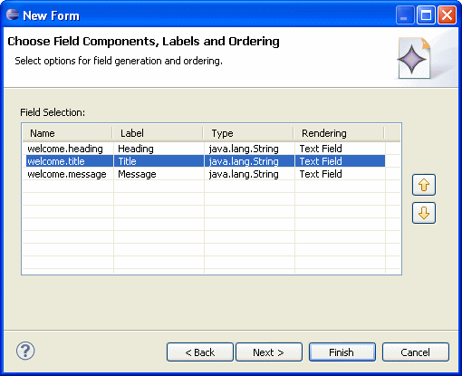
Figure 17. Choosing Form Field Components, Labels and Ordering
- Options (see Figure 8) - define if your form should have a header and a footer, and whether or not validation messages should be displayed for input fields, and if so, choose their style by clicking a button to the right of Style class field to open the Choose CSS Style Class dialog.
- JavaServer Faces Technology
- JavaServer Pages Technology
- Using the Web Page Editor
- Editing Tags with Property Sheets
- Using the Web Page Editor Palette
- Enabling Localization in the Web Page Editor
- adding JSF HTML Tags
You can either click Finish on the New Form dialog, or click Next sequentially to provide the following optional configurations:
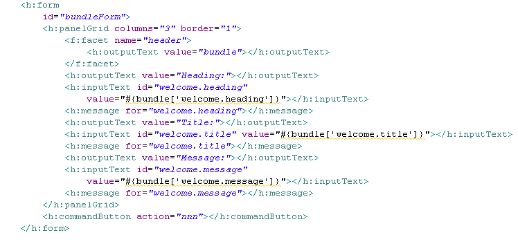
Upon completion, a h:form tag with the specified parameters is added, as the following example shows: