
 Read more...
Then work in JDeveloper's IDE to create the placeholder data control for your application.
Use the Create Placeholder Data Type dialog to add two new data types, sample data, and a fixed list of values (LOV).
Then create a runnable JSF page and drag and drop UI components from the Data Controls panel to the page.
| Purpose | Duration | Application |
|---|---|---|
This tutorial shows you how to use placeholder data controls with ADF data binding to build
complete, runnable pages. To see the complete application you will create, click the Download button to download a zip of the final application, and then unzip it in your JDeveloper mywork folder. |
30 minutes |  |
-
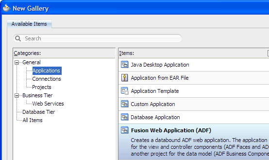
From the main menu, choose File > New. In the New Gallery, expand the General category and select Applications. Then in the Items list, select Fusion Web Application (ADF) and click OK.
-
To follow along with the example, enter
PlaceholderDCAppas the application name.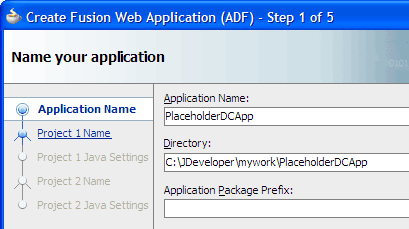
Accept the defaults and click Finish.
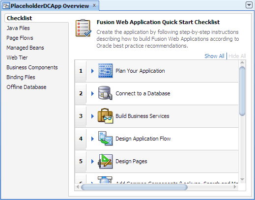
The Application Overview window opens by default in the editor window area when you create a new application. You can optionally close the window, since you will not be using it to create objects for this application.
-
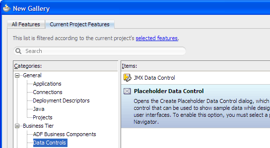
In the Application Navigator, select the Model project and choose File > New > Business Tier > Data Controls > Placeholder Data Control and click OK to open the Create Placeholder Data Control dialog.
-
Enter
ProductDataas the name for the data control, and add a description, for example,Dummy data for product pages. Then click OK.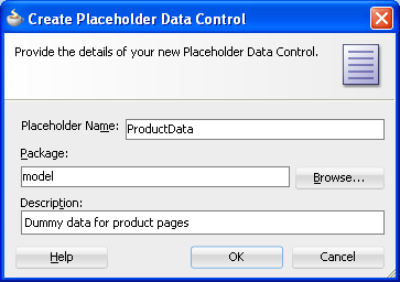
-
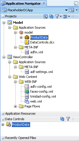
Click
 Save All to save your work. In the Application Navigator, expand the Data Controls panel to see the new ProductData data control.
Read more...
At the same time, it keeps track of your projects and all
environment settings.Based on prebuilt templates, a JDeveloper application allows you to specify a predefined type of environment, depending on the type of application you want to create (web application, Java application, and so on). Application templates provide you with a quick way to create the project structure for standard applications with the appropriate combination of features already specified. The application template also filters the work you do in JDeveloper such that the choices available are focused only on the features you are working with.
In this tutorial, you will use the Fusion Web Application template that is configured for building a databound ADF web application. Once you have created an application using a suitable template, you can still new projects to the application and specify what features are to be included. To do this, in the Application Navigator, right-click the application name and choose New Project. In the New Gallery, you can select any type of project in the Items list.
Read more...
The project or projects in the application define the associated features.
A JDeveloper project, which is used to logically group files that are related, keeps track of the source files, packages, classes, images, and other elements that your program may need. Projects manage environment variables such as the source and output paths used for compiling and running your program. Projects also maintain compiler, runtime, and debugging options so that you can customize the behavior of those tools per project.
You can add multiple projects to your application to easily access, modify, and reuse your source code. Different projects might contain files representing different tiers of a multi-tier application, for instance, or different subsystems of a complex application. These files can reside in any directory and still be contained within a single project.
Read more...
The Checklist steps you through the building of a Fusion Web application, according to Oracle recommended best practices. It optionally walks you through the entire process of configuring and building your application, with links to specific dialogs and wizards. Each step is also designed to teach you about the architecture, tools and resulting files using a combination of links to step-by-step instructions, relevant sections of the Developer's Guides, and descriptions of what happens in the IDE as a consequence of doing the work in a step.
All files and artifacts that you create within JDeveloper appear in the file summary pages, organized by object type. You can create new files and artifacts, and view them filtered by status and project.
Read more...
You will also manually create the data types. In this tutorial you create a placeholder data control
with sample static data, then build a simple JSF page that includes your placeholder data control.
Page designers can quickly create placeholder data controls without any knowledge of the underlying database or business services technology; they can then use these data controls with ADF data binding to build complete, runnable pages. These pages can be passed to a developer who rebinds the pages to a production data control.
Read more...
In this application you will use the ADF Business Components technology in the Model project, and the ADF Faces technology in the ViewController project. Each of the projects has appropriate technologies and files already included, defined by the Fusion Web Application (ADF) template you selected.
In JDeveloper, an application keeps track of the projects (collections of related files) you use while developing your application. Different projects might contain files representing different tiers of a multi-tier application, for instance, or different subsystems of a complex application. These files can reside in any directory and still be contained within a single project.
In the Application Navigator you can collapse and expand any panel. You adjust the size of panels by dragging the splitter between two panels. To group and sort items in the Projects panel, use the
 Navigator
Display Options dropdown menu. For application operations, you can
click
Navigator
Display Options dropdown menu. For application operations, you can
click  Application Menu and choose an
option from the dropdown menu.
Application Menu and choose an
option from the dropdown menu.
JDeveloper has the capability of recognizing many different file types, displaying each in its appropriate viewer or editor when you double-click the file in the Application Navigator. Closing an application or project closes all open editors or viewers for files in that application or project and unloads the files from memory.
-
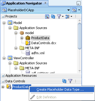
In the Data Controls panel, right-click the ProductData node and select Create Placeholder Data Type.
-
In the Create Placeholder Data Type dialog, enter
Categoriesas the name for the data type.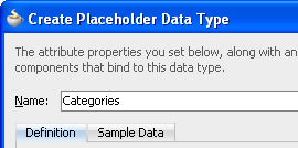
-
Replace the default first attribute (Attribute) with the name
CategoryIdand select Number as the Type.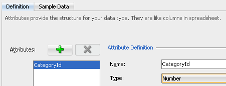
-
Click
 Add
to add a new attribute. Enter
Add
to add a new attribute. Enter CategoryNameas the name and confirm that String is selected as the Type. Then click OK.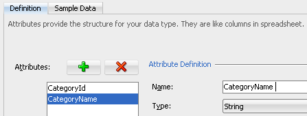
-
In the Data Controls panel, right-click the Categories node and select Create Placeholder Data Type.
By selecting Categories you are creating a detail data type as a child of the Categories data type. The first attribute in the master data type is the join attribute; it is automatically added to the detail data type and you cannot modify it.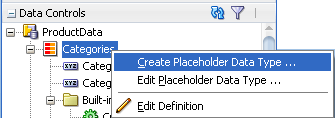
-
Enter
Productsas the name for the data type.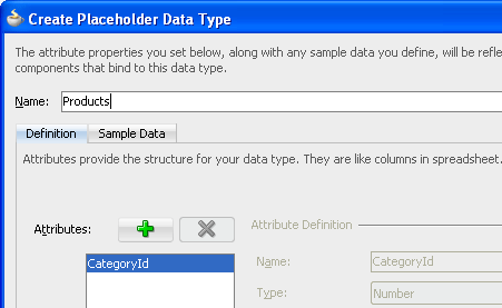
-
Click
Add
to add four attributes, with the following names and settings. Include the colon ":" as part of each label.
Name Type Label Format Type Default Component ProductName String Name: n/a n/a ProductDesc String Description: n/a n/a Price Number List Price: Currency n/a Supplier String Supplier: n/a Choice List 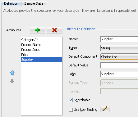
-
Click OK, then click the
 Refresh icon in the Data Controls panel toolbar.
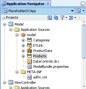
The Data Controls panel should now look like this when expanded: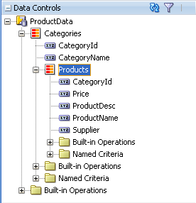
Categories and Products contain the definitions of your two data types
DTLink defines the master-detail relationship between them
ModelBundle.properties contains the translatable resources in your application, that is the labels and the formatter that you added
Read more...
For a placeholder data control, instead of data collections, it has placeholder data types. A placeholder data type is analogous to a data collection. It can be dropped onto a page to create complex components such as forms, tables, and trees. It also has a set of attributes that can be dropped onto pages as individual components such as input text, output text, and select choice. Some attributes may be defined as LOVs.
You will define a master-detail data model by adding the categories and products data types to your data control. You will create the categories data type first, then create the product data type, joined to categories in a master-detail relationship.
When you create a placeholder data type, you specify attribute names, types, default UI components, and other options. You can create multiple data types for a data control, similar to the multiple data collections in an application module.
Read more...
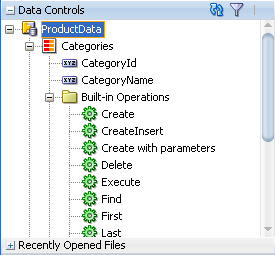
The Data Controls panel displays objects to which your UI components can be bound, including data collections, attributes, and methods that the business services developer exposed through the Oracle ADF data control, as well as specific, built-in operations that are generic to all data collections.
In the Data Controls panel, the placeholder data control appears alongside other data controls in the root tree. A placeholder data control that does not yet have data types defined will have only the Commit and Rollback built-in operations available. You can create master-detail relationships between placeholder data types, similar to the master-detail data collections in a standard data control. You can drop master-detail data types onto pages to create master-detail forms and tables.
Read more...
The built-in operations are also in the Data Controls panel; you can create UI components based on these operations but they will not
do anything to modify your application's data.
So for example, you can add a Delete button to your page but it won't delete your sample data.
When you create a placeholder data control, the package you selected to contain the data control appears under the project node in the Application Navigator (for example, model). The XML file for the placeholder data control appears under the package (for example, ProductData).
There are some new files in the Application Navigator:
In order to run an application using the placeholder data control, you need to add sample data for execution. You can add sample data to the placeholder data type attributes manually or by importing the data from a .csv file.
You can add sample data when you create a data type, or later, by editing the data types, after you have created them all, as well as the master-detail relationship.
-
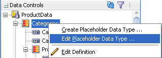
In the Data Controls panel, right-click the Categories node and select Edit Placeholder Data Type to edit the Categories data type.
-
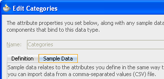
In the Edit Categories dialog, select the Sample Data tab.
-
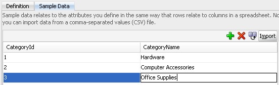
Click
Add
to enter the following values for CategoryId and CategoryName; press the
Tab key to move to the next field or add another row.
CategoryId CategoryName 1 Hardware 2 Computer Accessories 3 Office Supplies
-
Click OK.
-
In a text editor such as Notepad, copy and paste the sample data to use with the placeholder.
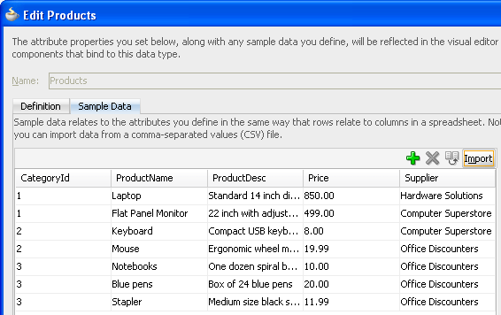
1,Laptop,Standard 14 inch display 2GB memory,850.00,Hardware Solutions
1,Flat Panel Monitor,22 inch with adjustable height stand,499.00,Computer Superstore
2,Keyboard,Compact USB keyboard,8.00,Computer Superstore
2,Mouse,Ergonomic wheel mouse,19.99,Office Discounters
3,Notebooks,One dozen spiral bound notebooks,10.00,Office Discounters
3,Blue pens,Box of 24 blue pens,20.00,Office Discounters
3,Stapler,Medium size black stapler,11.99,Office Discounters
-
Save your file in a temporary location, and name it
products.csv. -
In the Data Controls panel, click the
Refresh icon, then right-click the Products node and select
Edit Placeholder Data Type. 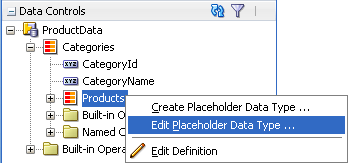
-
Select the Sample Data tab, and click Import. In the Open dialog, navigate to and select the
products.csvfile that you created earlier, then click Open. -
Verify that your data has been imported correctly into the Edit Products dialog, and click OK.
-
If the Externally Modified Files warning dialog pops up, click Yes.
Read more...
When the real data controls are ready, the UI components can be easily rebound to complete the application.
For many complex applications, the UI design may actually drive the development of the model, or data source.
In this UI-first scenario, having placeholder data controls with sample data is essential to properly model the behavior
of the application. In some cases, even if production data controls are available, UI designers may opt to use placeholder
data controls because of their flexibility and ease of use.
Adding sample data will give you a realistic view of your pages when the application is running. Next, you will create a
.csv file using a text editor, then you will
import the file from the Sample Data tab.
You can also create the file by exporting the data from a spreadsheet.
.csv file, is stored in message
bundle properties files within the placeholder data control packages.
Read more...
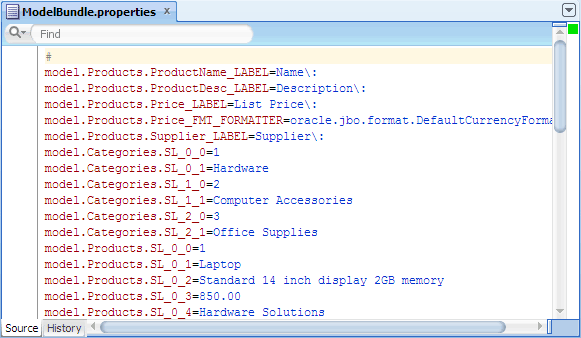
The ModelBundle.properties file shows a sample data properties file for the Categories and Products data.
After adding the sample data, the ModelBundle.properties file should look like this if opened in the source editor:
-
In the Data Controls panel, right-click the Products node and select Edit Placeholder Data Type.
-
In the Edit Products dialog, select Supplier and verify that the Default Component is set to Choice List.
You will configure the Supplier attribute to show a dropdown list of values in the running page. You will use a static list for your list of values; you could also use another placeholder data type.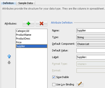
-
Click
 Edit next to
Use LOV Binding.
Edit next to
Use LOV Binding. -
In the Configure List of Values dialog, select Fixed List.
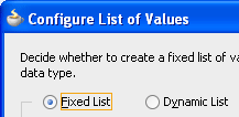
You will use the Configure List of Values dialog to configure a placeholder data type attribute as a fixed list, by manually adding list data. -
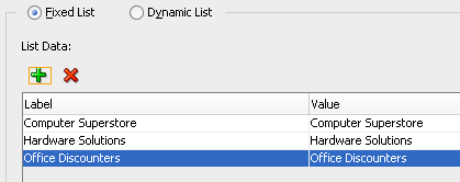
Click
Add
to add three rows of list data with the following labels and values.
The label is what will be displayed in the dropdown list, while the value is the corresponding value in the data type. In this case they are the same.Label Value Computer Superstore Computer Superstore Hardware Solutions Hardware Solutions Office Discounters Office Discounters
-
Click OK twice to close both dialogs. If a warning dialog pops up, click Yes.
As the only change has been to the Supplier attribute in the Products data type, there is no change in the data controls as they display in the IDE.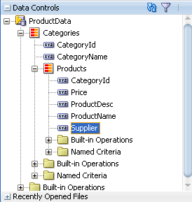
Read more...
An LOV-formatted attribute binds to UI components that display dropdown lists or list picker dialogs.
When you are creating a placeholder data type, you can select an option to open a dialog to configure that attribute to be an LOV. If you have only one data source, you can only create a fixed list LOV.
To create a dynamic list LOV, there must be more than one placeholder data type available to be the source.
To begin configuring the attribute, you will open the Edit Placeholder Data Type dialog again.
Now that you have created your placeholder data control, you can use it to design and build realistic pages containing sample data. You will build a simple JSF page to view and update product information.
-
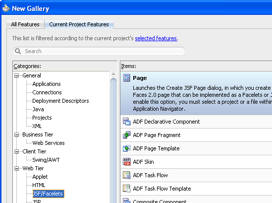
In the Application Navigator, select the ViewController project and from the main menu choose File > New > Web Tier > JSF/Facelets > Page. Then click OK to open the Create JSF Page dialog.
-
Enter the file name
editProducts.jsfand confirm that Facelets is selected as the Document Type. Under Initial Page Layout and Content, select Quick Start Layout. Then click Browse.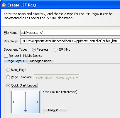
-
In the Component Gallery, select the Two Column category, the first type, and the first layout, (the default selections).
You should see Two Column Left Sidebar (Split and Stretched) under Options on the right.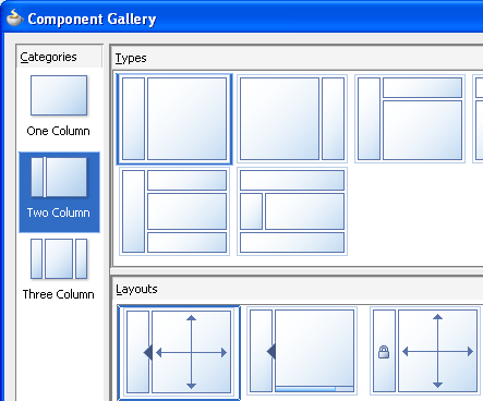
-
Click OK twice to close both dialogs.
-
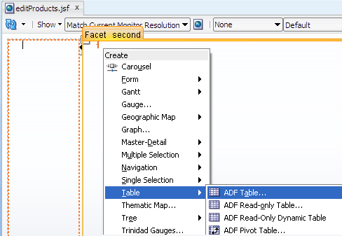
In the Data Controls panel, select the Products node and drag it onto the page, then drop it into the second facet. From the Create context menu, choose Table > ADF Table.
-
In the Edit Table Columns dialog, click
 Delete to remove CategoryId from the list, then click
OK.
Delete to remove CategoryId from the list, then click
OK.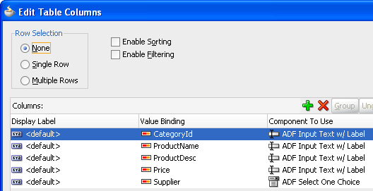
-
In the Data Controls panel, select the Categories node and drag it onto the page, then drop it into the first facet. From the Create context menu, choose Tree > ADF Tree.
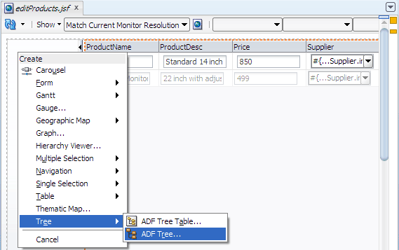
When you drag the Categories collection from the Data Controls panel onto the page and select ADF Tree from the context menu, you are creating a tree that allows you to navigate through the Products in the table. -
In the Edit Tree Binding dialog,
 shuttle
CategoryName into the Display Attributes list, and
shuttle
CategoryName into the Display Attributes list, and
 shuttle CategoryId
out of the Display Attributes list.
shuttle CategoryId
out of the Display Attributes list. 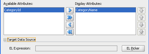
-
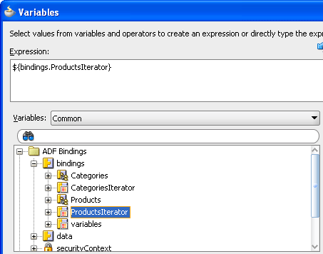
Expand Target Data Source and click EL Picker. In the Variables dialog, expand ADF Bindings, and bindings, and select ProductsIterator. Then click OK twice to close both dialogs.
-
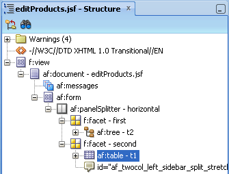
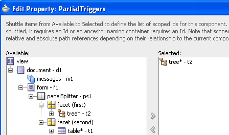
In the Structure window, select the af:table component. Then in the Property Inspector, expand the Behavior section.
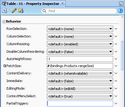
-
Select Edit from the Partial Triggers property menu. In the Edit Property: Partial Triggers dialog, expand facet (first) and
shuttle the tree component into the Selected list. Then click OK.
This is necessary to cause the table to refresh when the selection in the tree changes. After adding the tree and table components in the visual editor, your page should look similar to this: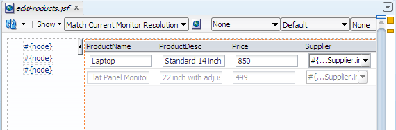
-
In the editor window, right-click the page and choose Run.
If the Create Default Domain dialog displays, enter the default password, for exampleweblogic1, in the Password and Confirm Password fields, then click OK.
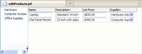
When you run theeditProducts.jsfpage, it should look similar to this page in your browser:
When your page displays you can select a category in the tree and view the products in that category; you can modify product details; and you can select a new Supplier from a dropdown list. In a complete application, other UI controls would be added for navigation between multiple web pages, and for committing data to the database.
.jsf) page, JDeveloper automatically creates a
starter page structure with two xmlns attributes for the ADF Faces and JSF Core tag libraries.
Read more...
The other elements included in a starter file are elements for laying out a page, specifically everything else within <!DOCTYPE html PUBLIC "-//W3C//DTD XHTML 1.0 Transitional//EN"
"http://www.w3.org/TR/xhtml1/DTD/xhtml1-transitional.dtd">
<f:view xmlns="http://www.w3.org/1999/xhtml"
xmlns:f="http://java.sun.com/jsf/core"
xmlns:af="http://xmlns.oracle.com/adf/faces/rich">
<af:document title="untitled1.jsf" id="d1">
<af:form id="f1"></af:form>
</af:document>
</f:view>In the Component Gallery of quick start layouts, you can choose from one, two, or three column layouts, and then determine how you want the columns to behave (for example, fixed widths or stretched). You can also choose to add color and styling to the quick start layout you select by checking the Apply Themes checkbox.
Read more...
The Data Controls panel comprises a hierarchical display of available business objects, methods, and data control operations. With the aid of the Data Controls panel, UI design is a series of drag-and-drop steps. The list of available UI controls appears when you drop the data object selection from the panel into the page. Only the UI controls that are appropriate to display the chosen data object (collection or attribute) will appear in the list. For example, when you drag a collection from the Data Controls panel, your UI choices do not include a text field, but do include table and form controls.
- Use JDeveloper wizards and dialogs to create an application and projects
- Add sample data manually, and by importing a
.csvfile - Add a fixed list of values (LOV)
- Create a JSF page and drag and drop UI components from the Data Controls panel
- Using a Bean Data Control
- Using a URL Service Data Control
- Fusion Developer's Guide for Oracle ADF
- Web User Interface Developer's Guide for Oracle ADF
 Expand all |
Hide all
Expand all |
Hide all