
 Read more...
Next you will register the Java class as a managed bean in faces-config.xml. Then you will
design a simple UI using two input text fields and a button, and bind the input fields and button to the managed bean using JSF EL Expressions.
Finally you will hook up the button to a method in the managed bean that will invoke the business method when the button is clicked.
When you test run the page, the page in the browser will look like this:
| Purpose | Duration | Application |
|---|---|---|
This tutorial shows you how to create a simple bean object and use the bean in a JSF application. To see the complete application you will create, click the Download button to download a zip of the final application, and then unzip it in your JDeveloper mywork folder. |
20 minutes |  |
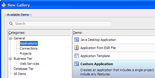
From the main menu, choose File > New. In the New Gallery, expand the General category and select Applications. Then in the Items list, select Custom Application and click OK.
-
To follow along with the example, enter
JSFBeanAppas the application name.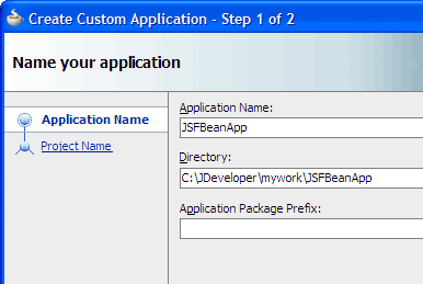
Accept the defaults and click Finish.
The Projects panel in the Application Navigator should look like this: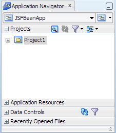
Read more...
At the same time, it keeps track of your projects and all
environment settings.Based on prebuilt templates, a JDeveloper application allows you to specify a predefined type of environment, depending on the type of application you want to create (web application, Java application, and so on). Application templates provide you with a quick way to create the project structure for standard applications with the appropriate combination of features already specified. The application template also filters the work you do in JDeveloper such that the choices available are focused only on the features you are working with.
In this tutorial, you will use the Custom Application template, which makes available objects associated with all the features that JDeveloper supports in a single project.
Once you have created an application using a suitable template, you can still add new projects to the application and specify what features are to be included. To do this, in the Application Navigator, right-click the application name and choose New Project. In the New Gallery, you can select any type of project in the Items list.
Read more...
The project or projects in the application define the associated features.
A JDeveloper project, which is used to logically group files that are related, keeps track of the source files, packages, classes, images, and other elements that your program may need. Projects manage environment variables such as the source and output paths used for compiling and running your program. Projects also maintain compiler, runtime, and debugging options so that you can customize the behavior of those tools per project.
You can add multiple projects to your application to easily access, modify, and reuse your source code. Different projects might contain files representing different tiers of a multi-tier application, for instance, or different subsystems of a complex application. These files can reside in any directory and still be contained within a single project.
Read more...
Projects are displayed as the top level in the hierarchy in the Application Navigator. The Custom Application template
that you used for your application creates one project using a default project name (or the project name you entered).
In the Application Navigator you can collapse and expand any panel. You adjust the size of panels by dragging the splitter between two panels. To group and sort items in the Projects panel, use the
 Navigator
Display Options dropdown menu. For application operations, you can
click
Navigator
Display Options dropdown menu. For application operations, you can
click  Application Menu and choose an
option from the dropdown menu.
Application Menu and choose an
option from the dropdown menu.
JDeveloper has the capability of recognizing many different file types, displaying each in its appropriate viewer or editor when you double-click the file in the Application Navigator. Closing an application or project closes all open editors or viewers for files in that application or project and unloads the files from memory.
Note: Nodes in italics in the Application Navigator mean that the elements have not yet been saved. A project node is bold when a file in the project is selected.
From the main menu, choose Application > Show Overview. The Application Overview window opens in the editor window area.
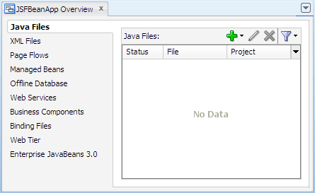
All objects that you create within JDeveloper appear in the Application Overview file summary pages, arranged by object type. As you create new files and artifacts, you can view them filtered by status and project.
You can optionally close the Application Overview window, since you will not be using it to create objects for this application.
-
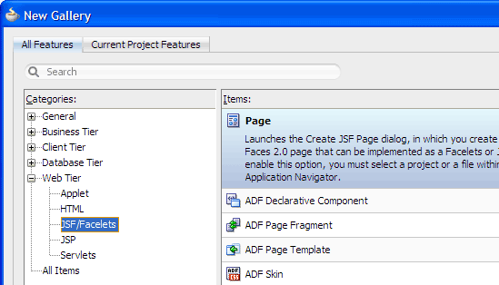
In the Application Navigator, right-click the project and choose New > Web Tier > JSF/Facelets > Page, then click OK.
-
In the Create JSF Page dialog, enter
Register.jsfas the file name. Make sure Facelets is the selected document type.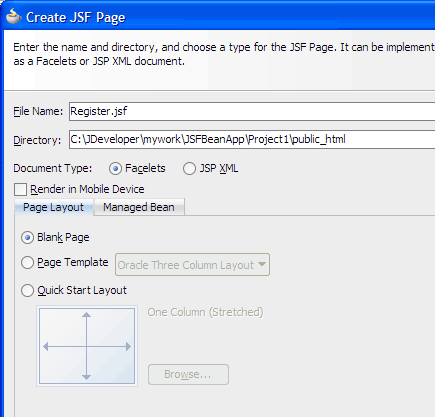
The New Gallery
The JSF navigation diagrammer
The ADF task flow diagrammer (available only in the Studio edition of JDeveloper)
-
On the Page Layout page, select Blank Page. On the Managed Bean page, select Do Not Automatically Expose UI Components in a Managed Bean.
-
Click OK.
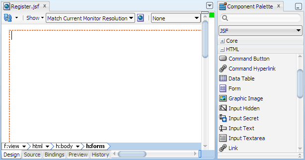
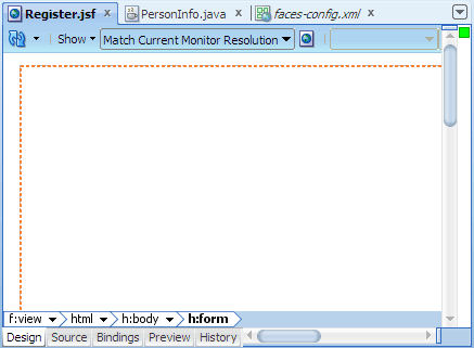
By default JDeveloper displays the new JSF Facelets page in the visual editor.
Web Content folder: Contains the pages you create, along with other files that must be visible to the client browser (such as stylesheet files and images) for your application.
/WEB-INF/ folder: Contains the required Web Application Deployment Descriptor (
web.xml) and the JSF configuration file (faces-config.xml).web.xml file: The web application deployment descriptor for your application. This is an XML file describing the components that make up your application, along with any initialization parameters and container-managed security constraints that you want the server to enforce for you.
faces-config.xml file: Where you register the JSF application's configuration resources, such as validators, converters, managed beans, and navigation rules.
jsf) or JSP documents written in XML syntax (which have file extension .jspx).
Read more...
You can create both types of JSF pages with the Create JSF Page dialog, opening it from:
Read more...
By default components are not exposed to managed beans. If you wish to bind components to managed beans, select one of the automatic binding options on the Managed Bean page in the dialog.
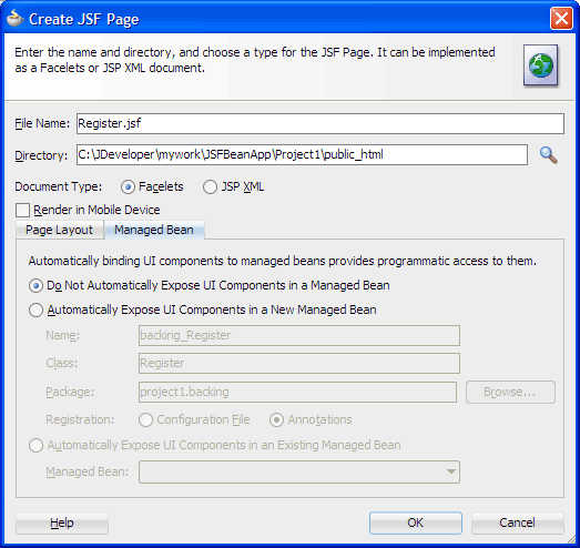
Note: The option to bind to an existing managed bean is enabled only if the application has a managed bean already configured.
If you choose to automatically expose UI components in a managed bean, JDeveloper automatically creates a backing bean for any new JSF page that you create. When you drop a component on the page, JDeveloper inserts a bean property for each component, and uses the
binding attribute to bind component instances to those properties, allowing the
bean to accept
and return component instances.
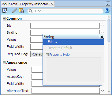
If you choose not to let JDeveloper use automatic component binding at page creation time, you can use the Property Inspector to manually bind any component on the page. For example, if you insert an input text component, click the
 dropdown menu at the
end of the component's Binding field in the Property Inspector and choose Edit. Then in the Edit Property dialog, you can
create a managed bean for the page if one does not already exist.
dropdown menu at the
end of the component's Binding field in the Property Inspector and choose Edit. Then in the Edit Property dialog, you can
create a managed bean for the page if one does not already exist.
 Read more...
The tabs at the bottom of the editor window for a
given file are the editor tabs. Selecting an editor tab opens the file in that editor or viewer. For example, to
switch from the visual editor to the XML editor, select the Source tab.
Read more...
The tabs at the bottom of the editor window for a
given file are the editor tabs. Selecting an editor tab opens the file in that editor or viewer. For example, to
switch from the visual editor to the XML editor, select the Source tab.
When you create a new JSF page as a Facelets document type (with file extension
.jsf), JDeveloper automatically
creates a starter page structure with two xmlns attributes for the JSF Core and JSF HTML tag libraries.
The other elements included in a starter file are elements for laying out a page,
specifically everything else within <f:view> and </f:view>. For example, the
following code is generated for the new page:
<!DOCTYPE html PUBLIC "-//W3C//DTD XHTML 1.0 Transitional//EN"
 "http://www.w3.org/TR/xhtml1/DTD/xhtml1-transitional.dtd">
<f:view xmlns:f="http://java.sun.com/jsf/core"
        xmlns:h="http://java.sun.com/jsf/html">
  <html xmlns="http://www.w3.org/1999/xhtml">
    <h:head>
      <title>Register</title>
    </h:head>
    <h:body>
      <h:form></h:form>
    </h:body>
  </html>
</f:view>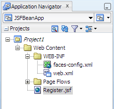
In the project, the folders and files that conform to the Java EE Web module directory structure are:
-
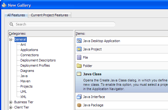
In the Application Navigator, right-click the project you just created and choose New > General > Java Class, then click OK.
-
In the Create Java Class dialog, enter the class name as
PersonInfo. Accept the default values and click OK.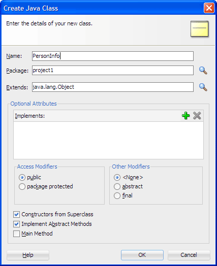
-
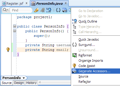
In the source editor, add code to create a simple JavaBean object.
For example, after the generated code:
public PersonInfo() {

          super();

    }
Add two properties by using the following code: Right-click the file in the editor and choose Generate Accessors.
Java Code Insight, the Java-specific implementation of completion insight
 Code Assist to fix common problems
Import statement assistance and sorting
Automatic doc comment templates
Customizable sorting and expansion for the Structure window
Distinctive highlighting for syntax and semantic errors
Customizable code separators
-
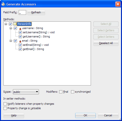
In the Generate Accessors dialog, select PersonInfo. Make sure public is selected in the Scope dropdown list, then click OK.
-
In the source editor, add code to retrieve the data that is entered and then display a message using the data.
For example, after the generated method:
public String getEmail() {

          return email;

    }
Add the following method: Click
 Save All to save your work.
In the Application Navigator, you should seePersonInfo.javain the project1 package in the Application Sources folder.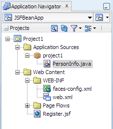
Oracle ADF Business Components (available only in the Studio edition of JDeveloper)
Enterprise JavaBeans (EJB)
Oracle TopLink, which helps to map your Java classes and EJBs to database tables.
private String email;
Read more...
The example you are creating requires a user to enter data in two fields and then click a button to display a message. To capture the data, you need to add two properties and create getter and setter methods on the properties. Later you will add a method to save the input data and display a message using the data.
Read more...
System.out.println("saving..." + name + " " + mail);
}
Read more...
You may also encounter situations where using a simple JavaBean for the data model is not sufficient, or you may
need to aggregate data from a variety of sources. In these cases, you can work with data sources based on entirely different
business service technologies, for example:
Whether you use JSF with JavaBeans, Enterprise JavaBeans (EJB), Oracle TopLink, or Web services in the model layer, JDeveloper's productive coding and data binding tools enable you to implement the application back end and integration code safely and easily. To work with a specific business service, you can open the New Gallery and use the provided wizards and dialogs to create or, in the case of web services, expose the entities in your model project.
In the Application Navigator, double-click faces-config.xml to open it in the editor window.
Managed beans
Custom message bundles
Custom validators and converters
-
Select the Overview tab at the bottom of the editor window to use the overview editor.
By default the Managed Beans page is shown on the overview editor.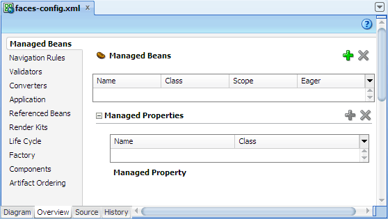
-
Click
 to open the Create Managed Bean
dialog. Enter
to open the Create Managed Bean
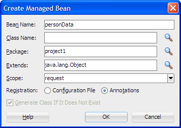
dialog. Enter personDataas the bean name. Then click next to
the Class Name field to open the class browser.
next to
the Class Name field to open the class browser.
-
Enter
PersonInfoin the field and then select PersonInfo (project1). Click OK to close the class browser.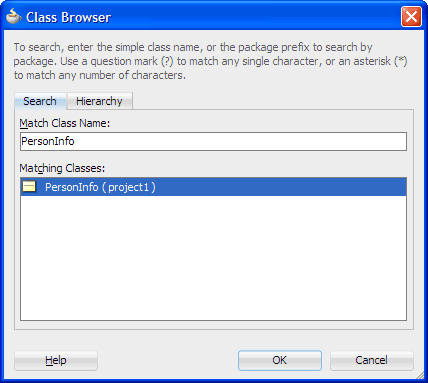
-
In the Create Managed Bean dialog, select Configuration File. Then verify you now have the following values entered or selected:
Field or Option Value Bean Name PersonDataClass Name PersonInfoPackage project1Extends java.lang.ObjectScope request Registration Configuration File Generate Class If It Does Not Exist selected application: The bean is available for the duration of the web application. This is helpful for global beans such as LDAP directories.session: The bean is available to the client throughout the client's session.request: The bean is available from the time it is instantiated until a response is sent back to the client. This is usually the life of the current page.none: The bean is instantiated each time it is referenced. This is helpful if the bean is referenced within another bean.-
Click OK.
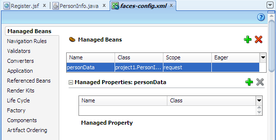
You should see the new managed bean definition in the overview editor:
Read more...
The resources your application needs are specified in the JSF configuration file,
faces-config.xml. The resources an application might need include:
faces-config.xml.
Read more...
At any time, you can add managed beans to the faces-config.xml file by either editing the XML in the file manually, or using
an overview editor for configuration files, which provides creation dialogs and browse features for finding class file
references for your beans.
To define a managed bean in
faces-config.xml, you add an entry to the JSF configuration file, giving a symbolic name that you will
use to refer to the bean and specifying the class to be used to instantiate the bean. You use the symbolic name to identify
the bean when you need to refer to the bean's properties and methods. Because you are using a symbolic name rather than
referring to the bean directly, the presentation is kept separate from the application logic, which means that you can change
the model without affecting the view.
Read more...
faces-config.xml. Using managed bean annotations reduces the size and complexity of the faces-config.xml file, which can grow quite substantially.
When you use annotations, instead of adding a <managed-bean> element in faces-config.xml
JDeveloper adds the annotations @ManagedBean and @RequestScope in the JavaBean class file. For example:
@ManagedBean(name="backing_mypage")

      @RequestScoped

      public class MypageInfo {

        ...


      }
faces-config.xml to configure a managed bean,
JDeveloper automatically updates the faces-config.xml file for you with the necessary configuration elements.
Read more...
For example:
<managed-bean>

	    <managed-bean-name>personData</managed-bean-name>

    <managed-bean-class>project1.PersonInfo</managed-bean-class>

    <managed-bean-scope>request</managed-bean-scope>

</managed-bean>
When the JSF application starts up, it parses
faces-config.xml and the managed beans are made available. Whenever a managed bean
is referenced (for example in an EL expression as a value for a component's tag attribute - called a value expression), the
Managed Bean Creation Facility instantiates the bean by calling the default constructor method on the bean. If any properties
are also declared, they are populated with the declared default values.
In the editor window, select the Register.jsf tab at the top to bring the page forward.
In the visual editor, type the text
Registration Format the top of the page.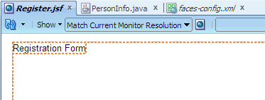
In the Component Palette, select the HTML page from the dropdown list and then expand the Common panel.
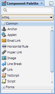
Click and drag
 Table to the visual editor, then drop it on the page to add a table.
In the Insert Table dialog, set the number of rows to
3and the number of columns to2. Accept the other default values and click OK.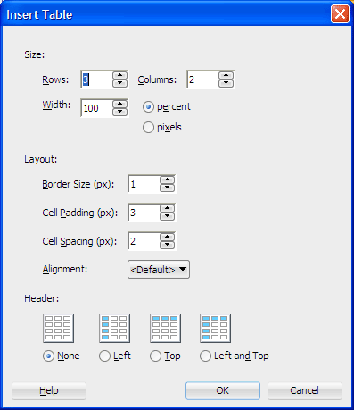
In the Component Palette, select the JSF page from the dropdown list and then expand the HTML panel.
The JavaServer Faces HTML tag library, which contains tags representing common HTML user interface components.
The JavaServer Faces Core tag library, which contains tags that perform core actions such as event handling and data conversion.
Drag and drop
 Input Text on the first row, second column of the table.
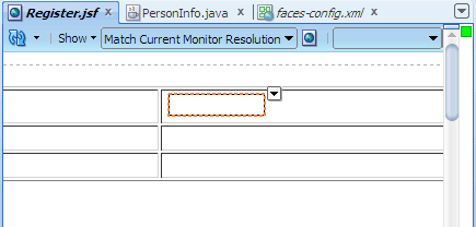
-
The entire table, place the cursor at the bottom right corner of the table border, and click when the
 table selector icon appears.
 -
Rows, place the cursor on the left border of the table and click when the
 row selector icon appears.
 -
Columns, place the cursor on the top border of the table, and click when the
 column selector icon appears.
 Cells, click in a single cell or press Ctrl and click in multiple cells.
-
Drag the
 resize handles to the desired size for the table.
 -
Place cursor at the border of the row or column you wish to resize, and click when the
 horizontal border handle or
  vertical border handle appears.
 -
Click
 Background Color to apply a color to the table, row, or cell in the selected color.
 Click


 Left Center Right to apply the respective left, center or right alignment to a selected table.
-
Click
 Indent or Outdent to indent or remove indentation from the selected table by applying or removing the
 <blockquote>tag. -
Drag and drop another
Input Text on the second row, second column. Drag and drop
 Command Button on the third row, second column.
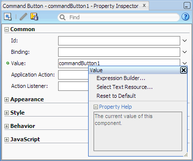
In the Property Inspector, Common section, click in the Value field and change the default text to
Command Button on the third row, second column.
In the Property Inspector, Common section, click in the Value field and change the default text to Sign Me Up.Common: Commonly used attributes, which varies from component to component. Also includes the attributes
idandbinding. Theidis the unique identifier of a component, which must be a valid XML name; you cannot use leading numeric values or spaces in the id name. Thebindingis the EL expression that binds a component instance to a property in a bean.Appearance: Basic attributes that control the visible parts, including
titleandaccessKey.Style: HTML style and presentation attributes such as
background,border,cellpadding,cellspacing,font,margin,style, andoutline. Most of the attributes that the HTML 4.01 specification declares for corresponding HTML elements are supported.Behavior: Basic attributes that control the component's behavior, including HTML pass-through attributes such as
disabledandreadOnly. Also includes an Internationalization section for HTML language translation attributes such aslanganddir.JavaScript: HTML event attributes (for associating client-side scripts with events) such as
onclick,onkeypress, andonmouseover.-
In the visual editor, click in the table cell of the first row, first column, and type
Username:. Then typeEmail:in the cell of the first column, second row.
The visual editor should now look similar to the following: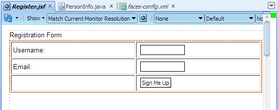
Read more...
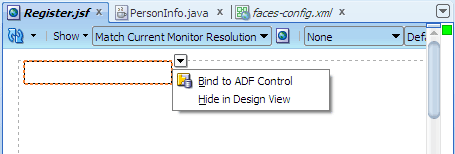
The editor breadcrumb links show the path of links from the currently selected component or tag back to its root parent component or tag.
When you click a component or tag in the editor breadcrumb links, JDeveloper shows the selected component or tag on the page with a dropdown menu icon at the top right corner of the selected item. When you click the dropdown menu, JDeveloper displays a context menu of actions that you can perform on the selected component or tag. For example:
The visual editor is also fully integrated with the Structure window. While inserting, copying, or moving JSF components, you may select an insertion point on the page in the visual editor or in the Structure window in relation to a target page element. JDeveloper provides visual cues to indicate the location of the insertion point before, after, or contained inside a target component.
After inserting components, you can set the properties of the components either using a dialog displayed at the time you drop the component, if one is required, or later using the Property Inspector.
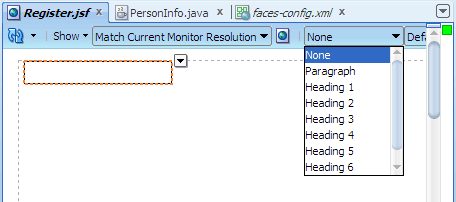
Your application pages can also use a style sheet, either one provided by JDeveloper or one of your own. You can add a style sheet to a page at the time you create it, or later, by editing the page. If you have added a style sheet to your page, you can set the text on the page, such as the heading text, to a style chosen from the dropdown list:
 Read more...
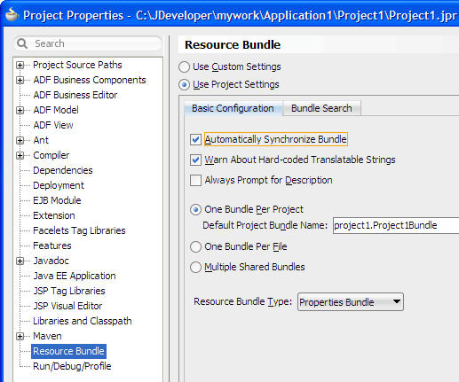
If you wish to use a resource bundle, select the Automatically Synchronize Bundle option in the Project Properties dialog,
Resource Bundle page. The default bundle type is Properties Bundle, which is a
Read more...
If you wish to use a resource bundle, select the Automatically Synchronize Bundle option in the Project Properties dialog,
Resource Bundle page. The default bundle type is Properties Bundle, which is a PropertyResourceBundle properties file or a
plain-text file containing translatable text. A properties file can contain values only for String objects. If you need to store
other types of objects, use a ListResourceBundle instead.
When Automatically Synchronize Bundle is selected, after you enter text in the visual editor and press Enter, JDeveloper displays the text as an EL expression:
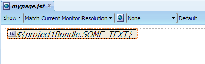
JDeveloper also creates the properties file. For example:
#


      SOME_TEXT=Some Text
Read more...
Help information is provided for each component, explaining its purpose and its attributes. To find such information, right-click an item in a panel in the Component Palette and choose Help.
Read more...
 Read more...
The Insert Table dialog helps you to add the HTML
<table> element and set up the initial properties in the skeleton table.
After inserting the skeleton table, you will use the Component Palette and visual editor to design the registration form by adding input fields and labels.
You can also easily modify both the appearance and the structure of the table using the visual editor. You can edit tables to add text and images; add, delete, resize, reorder, split, and merge rows and columns; modify table, row, or cell properties for color and alignment; copy and paste cells; and nest tables in table cells.
To modify all or part of a table in the visual editor, first select the table, rows, columns or cells. To select:
To resize a table:

#{expression} using JSF
Expression Language (EL). For example, #{personData.username}.
Read more...
When you add a component to the JSF page, the Property Inspector displays the supported attributes for the component tag grouped in these categories:
dropdown menu.
-
In the visual editor, select the first input text field. Then in the Property Inspector, Common section, choose Expression Builder from the
dropdown menu next to the Value field. 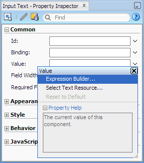
In the Expression Builder, expand JSF Managed Beans, then expand personData. Select username to create an expression using the
usernamevariable. Then click OK.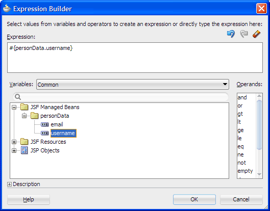
#{foo}#{foo.bar}#{foo.bar.baz}#{foo[bar]}#{foo["bar"]}#{foo[3]}#{foo[3].bar}#{foo.bar[3]}#{foo.bar == "Hello World"}#{(foo.bar) / 5 * 3}Offer Valid from #{offer.validFromDate} to {offer.validToDate}#{expression.value}#{expression[value]}Arithmetic:
+,-(binary),*,/anddiv,%andmod,-(unary)Logical:
and,&&,or,||,not,!Relational:
==,eq,!=,ne,<,lt,>,gt,<=,ge,>=,le. Comparisons can be made against other values, or against boolean, string, integer, or floating point literals.Empty: The
emptyoperator is a prefix operation that can be used to determine whether a value isnullor empty.Conditional:
A ? B : C. EvaluateBorC, depending on the result of the evaluation ofA.Repeat the procedure on the second input text field, selecting the email variable in the Expression Builder this time.
In the visual editor, double-click the command button to open the Bind Action Property dialog. In the Managed Bean dropdown list, select personData.
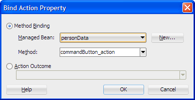
Accept the default values in the dialog and click OK.
JDeveloper displays the Java class file in the editor window, showing the code added for you when you bound the command button component: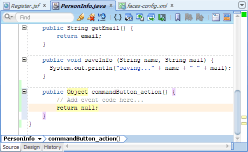
username and email, and registered the bean as a managed bean.
Read more...
By registering the bean as a managed bean, at runtime the
JSF application automatically instantiates the bean on demand, when the bean is accessed through an expression language (EL)
expression from a page for the first time. Property values on the bean can then be displayed, and can also be updated when data
from the page is submitted.
Bean properties can be bound to component values or component instances. In the example, you will bind the bean properties to component values using the Expression Builder.
Read more...
The unified EL continues to let page authors use EL expressions to bind UI component values and objects
to backing bean properties or reference backing bean methods from UI component tags.
Two kinds of expressions are defined in the unified EL: value expressions and method expressions. Value expressions allow both getting and setting data on external objects through bean properties, and can reference lists, maps, arrays, implicit objects, and resource bundles. Method expressions reference methods that handle component events, or validate or convert component data.
Value Expressions
The syntax for value expressions follows that same syntax used by JSP 2.0 expression language. Examples of value expressions follow:
Method expressions must use one of the following patterns:
expression can be any EL expression as described earlier for value expressions; the value must be an identifier that
matches a method name on the object in the expression.
Operators
Expression language provides the following operators, in addition to the
. and [] operators:
value
attributes to the bean properties. The command button component can be bound to methods in JavaBeans.
Read more...
The Bind Action Property dialog enables you to bind the button's
action attribute to a new method that you will
create next in the JavaBean.
Register.jsf page, if you click Source to switch to the XML editor,
Read more...
you should see value and method EL expressions in the input text and command button components code. For example:
<h:inputText value="#{personData.username}"/>
<h:inputText value="#{personData.email}"/>
<h:commandButton action="#{personData.commandButton_action}".../>If necessary, select the PersonInfo.java tab in the editor window to bring the source editor forward.
In the generated action method, add code to call the business method
saveInfothat you previously added to the bean.
Recall that thesaveInfomethod takes two parameters and writes the data to the console. So for example, after the comment line in the generated code:
// Add event code here...
Insert the following code shown in bold:In the Application Navigator, right-click Register.jsf and choose Run.
If the Create Default Domain dialog displays, enter the default password, for exampleweblogic1, in the Password and Confirm Password fields, then click OK.
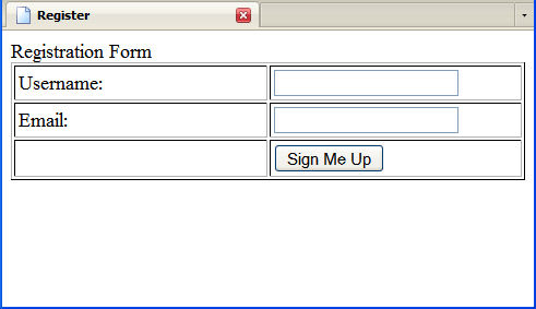
The page in the browser should look similar to this:
Starts Integrated WebLogic Server, if not already running.
Compiles and deploys the application to Integrated WebLogic Server.
-
Launches the application in your default browser using the following default address:
http://<your_machine_IP_address>:<http_port>/<your_application_name>-<your_project_name>-context-root>/faces/<path_to_the_page>
For example:http://127.0.0.1:7101/JSFBeanApp-Project1-context-root/faces/Register.jsf
// Add event code here...
saveInfo (this.username, this.email);
return null;
}
Read more...
Integrated WebLogic Server is a Java EE
runtime service for packaged archive deployment. Based on zero-copy deployment, Integrated WebLogic Server lets you run and
test an application and its projects as a Java EE application in a Java EE container. No special connection setup is required
to use Integrated WebLogic Server. You can run the entire application, a project, or individual JSF pages.
When you run a JSF application in the IDE, JDeveloper automatically:
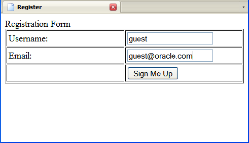
...the data you entered will be written to the Log window in JDeveloper. For example, if you entered
guest and
guest@oracle.com, you should see the following message at the bottom of the Log window:
saving...guest guest@oracle.com
To stop the application, click
 Terminate in JDeveloper
and choose the application bound instance JSFBeanApp from the dropdown menu.
Terminate in JDeveloper
and choose the application bound instance JSFBeanApp from the dropdown menu.
Note: Terminating the application stops and undeploys the application from Integrated WebLogic Server but it does not terminate Integrated WebLogic Server.
- Use JDeveloper wizards and dialogs to create applications, starter pages and starter Java classes
- Use the JSF configuration editor to register Java classes as managed beans
- Use the visual editor, Component Palette, and Property Inspector to create UI pages
- Use Integrated WebLogic Server to run a JSF application
 Expand all |
Hide all
Expand all |
Hide all