Management Console Reference
This section provides reference information about using controls and tools that are common to many views. It describes the following controls and tools:
Using the Analysis Tab
The Analysis tab displays detailed current performance and usage information for the selected object, either a transaction, service, endpoint, operation, or consumer. Because some types of information are relevant to only certain types of objects, the layout of the Analysis tab can vary from object to object.
The Analysis tab is composed of a number of panes that you display one at a time. Each pane displays a different type of information. The set of available panes changes depending on the object you select (in other words, not all panes are available for every type of object). The panes are described in this section.
Performance Pane
When you select a transaction, this pane provides started transactions, completed transactions, condition alerts, average response time, and maximum response time instruments. These instruments are displayed in a Count chart, Count table, Response Time chart, and Response Time table.
When you select a service, endpoint, operation, or consumer, this pane provides traffic, throughput, faults, fault percentage, average response time, and maximum response time instruments. These instruments are displayed in a Messages chart, Messages table, Response Time chart, and Response Time table.
The blue line in the Count chart indicates the number of transactions that started; the green line, the number of transactions that completed; and the red line, the number of condition alerts that occurred during the associated time segment, for example: 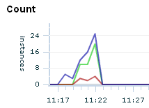
The Count table displays these measurements numerically.
The total height of the bars in the Messages chart indicates the traffic observed during the associated time segment. The green portion of the bar indicates the throughput, and the red portion indicates the fault count, for example: 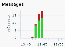
The Messages table displays these measurements numerically, with the addition of the fault percentage measurement. Clicking a hyperlinked value in the table opens the Message Log Search tool and runs a predefined query to return the messages associated with the measurement value. For example, if you want to examine the messages responsible for the Traffic value, click the value: 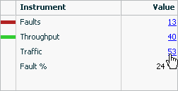
The green line in the Response Time chart indicates the average response time for the associated time segment; the orange line indicates the maximum response time, for example: 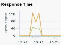
The Response Time table displays these measurements numerically.
Transaction Performance
Displays transaction performance measurements associated with the selected consumer. See the description of the Performance pane for details concerning the charts and tables.
Service Performance
Displays service performance measurements associated with the selected consumer. See the description of the Performance pane for details concerning the charts and tables.
Consumer Usage
Displays throughput, faults, fault percentage, average response time, and maximum response time measurements for the selected object, segmented by consumer. The table lists all consumers of the selected object and the aggregated performance measurements associated with each consumer's use of the object.
Transaction Usage
Displays started transactions, completed transactions, average response time, and maximum response time measurements associated with the selected consumer. These measurements are segmented by transaction.
Service/Endpoint Usage
Displays throughput, faults, and fault percentage associated with the selected consumer. These measurements are segmented by service and endpoint.
Condition Alerts
Lists information about the condition alerts that have been triggered in a given time period: the name of the condition that was met, the endpoint where the condition alert was triggered, and the number of condition alerts triggered.
Breakdown by Client Address
Displays throughput, faults, and fault percentage for the selected object, segmented by the client address, which is the machine host name from which the request was sent. The table lists all client addresses that sent requests to the selected object and the aggregated performance measurements associated with each client address's use of the object.
Callouts
Lists each operation (qualified by endpoint) to which the selected object made an outbound call. The Operation column identifies the operation that made the outbound call. Aggregated link throughput, link faults, and link average response time is displayed for each type of outbound call.
Custom Charting
Lets you set up a customized chart and table similar to the Performance pane, but with instruments of your choosing.
Click Choose Instruments and select the instruments you want displayed in the chart and table. You can select multiple instruments. When you set up a custom chart/table for a transaction, it is available for any selected transaction, likewise for consumers, and for services/endpoints/operations.
Custom Breakdown
Lets you set up a custom table of numeric instruments segmented in various ways.
Click Choose Instruments and select the instruments you want displayed in the table. You can select multiple instruments. Click Choose Segments and select how you want to segment the measurements. You can select multiple segments.
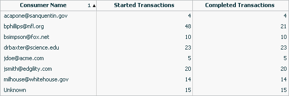
For example, you might set up a table that displays the number of started and completed transactions per consumer, where your instruments are started transactions and completed transactions and your segment is Consumer Name:
Health Summary Dashboards
The Admin Health Summary dashboard enables you to quickly assess the health of your Business Transaction Management system components. The Operational Health Summary dashboard provides that same information plus information about the health of your business components.
To display the Health Summary dashboards
-
Choose Dashboards > Admin Health Summary
-
Choose Dashboards > Operational Health Summary
These dashboards are composed of multiple tables. Each table provides summary information about a particular type of object, such as transactions, services, SLA alerts, and so forth. The rows in each table generally indicate a status that the object can be in, and the numerical value indicates how many instances of the object is in that state. For example, in the following case, 5 services are in a state of failure and 5 are in a state of warning.
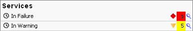
The clock icon at the far left indicates that the numeric value is relative to the Time Period selected at the top of dashboard. Click the magnifying glass next to a value to pop up a list of the individual objects in that state.
Using the Filter Tool
The Filter tool allows you to filter objects according to their salient characteristics, which varies according to the item chosen in the Navigator. Although the basic structure of the Filter tool does not change as the target object changes, the criteria you can select does change depending on whether the filter is used to modify the view of services, containers, policies, consumers, and so on.
In addition to the predefined filters, which are shown in a drop list next to the Filter link, you can also click on the link to open the Filter tool and obtain a richer choice of filtering criteria.
Note: You cannot filter condition alerts, observers, or schedules.
To open the filter tool, click on the Filter link in any view where it is displayed.
Business Transaction Management displays a dialog like the following:
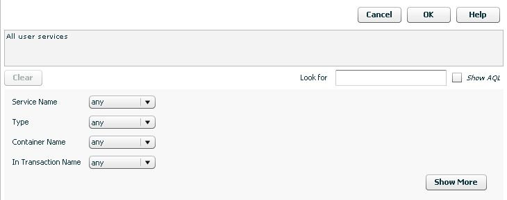
Description of the illustration filter_link.gif
The tool initially presents a short form that allows you to define a filter that references the most common criteria for the object of interest. The domain of objects for which you are creating a filter is displayed in the text box. For example, in the figure above, the text box informs you that you are creating a filter for all user services. To display additional criteria, click the Show More button.
As you select criteria for a query, either from the short form or from the longer form (Show More), Business Transaction Management translates your choices into an AQL expression that it uses to search the database. You can see that AQL query statement in the text box at the top of the tool by clicking the Show AQL check box.
You can use this feature to define AQL expressions that you can pass to CLI commands that use the -filterQuery flag. Simply use the filter tool controls to define your criteria, then copy and paste the AQL expression into the CLI command. Remember to enclose the query in quotation marks if it includes spaces.
When you are done selecting the criteria of interest, click the OK button to use this filter to modify the current view. See Saving a View for instructions on saving your view.
Adding a Custom Attribute for Filtering
You can add a custom attribute for any object in the sphere (service, endpoint, container, and so on). This enables you to use the filter tool to find objects that have specific attribute values. For example, you might want to assign priority levels to services and then filter services based on their priority.
Note that unlike default attribute labels, user-defined attribute labels are not automatically translated.
The basic process for adding and using custom attributes for filtering objects is as follows:
-
Add a custom attribute for the object type of interest.
-
Edit an individual object's profile to assign a value to the custom attribute.
-
Use the Filter tool to select only those objects whose custom attributes have the desired value.
Adding the Attribute
To add a custom attribute, do the following:
-
Navigate to Admin > Edit Data Model Attributes. The Edit Data Model Attributes tool is displayed.
-
In the Settings area, find the object to which you want to add a custom attribute.
-
Click the add attribute link.
-
Provide the following information. Only the name and type are required.
Name: Specify the name of the attribute.
Type: Select the type of the attribute.
Form Label: This is the name that will be used to identify the attribute in the Profile tab and in the Filter tool. You only need to specify a value if you want the label to be different from the name of the attribute.
Query Label: This is the name that will be used to identify the attribute in the Query text box in the filter tool. You only need to specify a value if you want the label to be different from the name of the attribute.
Value: Click the add value link to provide a suggested value for the attribute. This value is then displayed in the Profile tab for the selected object. (Optional)
Description: Add a description to remind of the use or purpose of this attribute. (Optional)
-
Click Apply
Assigning an Attribute Value
To assign values to the custom attribute, do the following:
-
Open the Profile tab for the object to which you have added a custom attribute. The attribute you have added should be shown in the Attributes area of the Profile tab.
-
Select Edit Profile for <Object> from the Modify menu.
-
Specify a value for the custom attribute in the adjoining text box.
-
Click Apply. The value you entered should now be shown in the Profile tab.
Filtering Based on a Custom Attribute
To filter objects based on a custom attribute, do the following:
-
From the Filters drop list, select Choose Filter...
-
Expand the attributes link for the object of interest. For example, Service Attributes or Container Attributes.
-
The custom attribute you have created for the object should be listed along with any default attributes defined for the object. If it is not, refresh your browser.
-
Use the drop down list for the custom attribute to specify a search criteria.
-
Click OK. All objects matching the specified criteria will be listed in the main area.
Keyboard Shortcuts
You can use keyboard shortcuts to navigate the Business Transaction Management management console. These shortcuts are supported for Microsoft Internet Explorer 8.
For general information on using shortcuts with Internet Explorer, see the information provided for viewing and exploring web pages at the following site:
http://windows.microsoft.com/en-US/windows-vista /Internet-Explorer-8-keyboard-shortcuts
This section provides additional detail on how to use keyboard shortcuts in the various areas of the management console.
As noted in General Console Design, the management console is divided into four sections: the menu bar, the navigator, the main area, and the tabs area. In addition, it is possible to access and use different tools while working with the console. Because these areas are created using different underlying technologies, keyboard shortcuts are not necessarily consistent. Please note the differences and limitations for each area; these are described in the following subsections.
The Tab key is the basic means of navigating through the console. (Tab to go forward; Shift-Tab to go back.) The general tab order is the following: top explorer controls, console menu, log out and refresh controls, console Navigator items, main area controls (filters and column chooser), main area items, tabs area.
Use the following guidelines to work with management console menus:
-
Use tab to move across the menus (shift-tab to move backward).
-
Press Enter to open a menu.
-
Use the up/down arrow keys to move forward/backward through menu items once the menu is open.
-
Use the right arrow key to navigate through layered menus.
-
Press Enter to execute the currently selected menu item.
Use the following guidelines to work with Navigator items:
-
Use the Tab key to reach the Navigator.
-
Use Tab to move forward and Shift-Tab to move backward through the Navigator. without highlighting items.
-
Use the up/down arrows to navigate directly from category to category.
-
Use the right/left arrows to navigate sequentially through categories and views.
-
To expand or collapse a Navigator category, tab to the category and press Enter.
-
To select a Navigator item, tab to the item and press Enter.
To access the main area, move the focus to the last item in the navigator and press the Tab key. This should move the focus to the Filter control in the main area.
To access items in the grid view in the main area, tab until the focus moves through the main area controls (Filters, column chooser ... and highlights the top line of the grid view.) When the top line of the grid view has the focus, use CTRL-down arrow to move the focus to the first item listed in the grid view.
-
To move through items in the grid view in the main area use the up/down arrow key.
-
To expand an item, move the focus to that item and press Shift-CTRL-right arrow. You can then use the up/down arrows to move linearly through grid items.
-
To open the tabs area for an item, place the focus on the item and press Enter.
To work in the tabs area you must display the area and then be able to navigate across tabs and into the content of a specific tab.
To display the tab area you can do one of the following:
-
Place the focus on the item for which you want to display detailed information, and press Enter.
-
Tab to the View menu and select Show/Hide Details Pane. You can then tab through the items shown in the main area to display detailed information about each item.
To access tab contents.
-
In the main area, move the focus to the last item in the grid view using the down arrow key. When you get to the last item, use the Tab key to navigate to the desired tab in the Tabs area.
-
Press Enter to open the tab that is currently in focus.
-
To navigate into the tab's contents, use the Tab key to move the focus across all the tabs to the right of the current tab. After the last one, the focus will shift to the open tab's contents.
-
When the focus moves to the tab contents, use the Tab key to move through elements in the tab. To activate a control or select an item, press the Space bar or press Return.
Caution:
Tabbing beyond the last item in a tab might cause you to lose focus. To be safe, back tab through the tab items (shift-tab) to the main area.You can access tools either from the menu or by using the controls displayed in the main area or in the tabs area. Within the tools:
-
Use the Tab key to move across items in the tool.
-
Press Esc to cancel a tool at any time.
-
Pressing Enter activates the OK or Apply button for the tool. Unless you mean to do that, pressing the Space bar is the means for executing an action within a tool. For example, press the Space bar to toggle check boxes or to execute an action specified by a link or a button,
-
To select items from a drop list, use the up/down arrows.
-
If the tool includes a tab area, use the right/left arrows to move across the tabs.
Caution:
Tabbing beyond the last item in a tool might cause you to lose focus. To be safe, back tab through the tab items (Shift-Tab) to move the focus out of the current tab.