3.3 Understanding Sample Database Application
This section describes the sample packaged application, Sample Database Application. Sample Database Application features an easy-to-use interface for viewing, updating, and searching order and customer information for clothing products. Users can navigate among the pages using the Home, Customers, Products, Orders, and Reports navigation menu. Like all sample packaged applications, Sample Database Application is fully editable.
3.3.1 Installing and Running Sample Database Application
Tip:
The Sample Database Application is automatically installed in new full workspace.To install Sample Database Application:
-
Access the Packaged App Gallery. See "Viewing the Packaged App Gallery."
-
Locate the Sample Database Application.
Tip:
Use the Search field at the top of the page to narrow the display. -
Click the Sample Database Application application image.
The Packaged Application Details page appears.
-
Click Install Application.
-
Select an Authentication scheme and click Next.
-
Click Install Application again.
The success message,
Application installeddisplays at the top of the page.Tip:
Once you install a packaged application, it displays under Installed Packaged Apps on the Packaged Apps page. -
Click Run.
-
Enter the appropriate login credentials:
-
Username - Enter your workspace username.
-
Password - Enter your workspace password.
-
Click Sign In.
-
3.3.2 Understanding Sample Database Application
Sample Database Application demonstrates the following functionality:
-
Examples of ways to display summary information.
-
Reports and forms for viewing, updating, and adding customers, products, and orders
-
Various flash charts and maps available in Oracle Application Express
-
A Calendar report
-
Mobile pages to replicate the majority of functionality available in the desktop pages
This section describes the functionality built-in to Sample Database Application.
Tip:
The size of left navigation menu changes depending upon the size of the window. In some of the images in this section, the navigation menu is minimized.See Also:
"What Is an Application Page?"3.3.2.1 Home Page
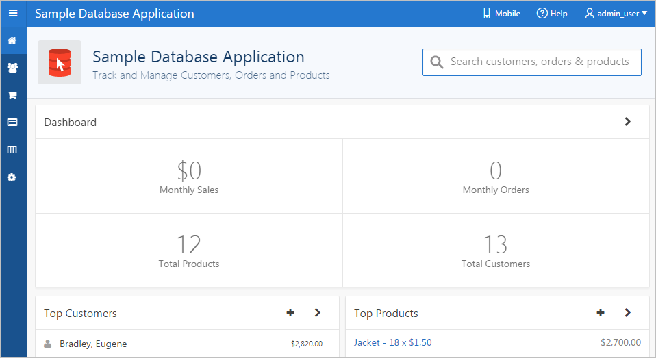
Description of the illustration ''sample_home.png''
The home page contains the following main regions:
-
Dashboard - Demonstrates the use of a Badge List plug-in. This regions displays a value based on an underlying SQL statement. Links in this region take you to reports on Monthly Sales, Monthly Orders, Total Products, and Total Customers.
-
Top Customers - Demonstrates the Badge List plug-in. This regions displays a value based on an underlying SQL statement. Links in this region take you to reports on Monthly Sales, Monthly Orders, Total Products, and Total Customers.
-
Top Products - Demonstrates the Slider Tooltip plug-in. The report is based on an underlying SQL statement and displays a subset of the information that appears on the Customers page. Users can view additional details for a given row by hovering over it to display a detailed tooltip, or by clicking the customer name or by clicking the View Customer icon (a right arrow) in the upper right corner of the region.
-
Top Orders by Date - Demonstrates the use of a HTML5 Bar Chart plug-in. This chart displays orders by date and order amount, based on an underlying SQL statement. Users can view the Orders page by clicking the right arrow in the upper right corner.
-
Tags - Demonstrates the use of a Tag Cloud plug-in. This region displays a value based on an underlying SQL statement. Links in this region take you to search results matching the selected tag.
3.3.2.2 Customers Page
The Customers page enables users to view and edit customer information.
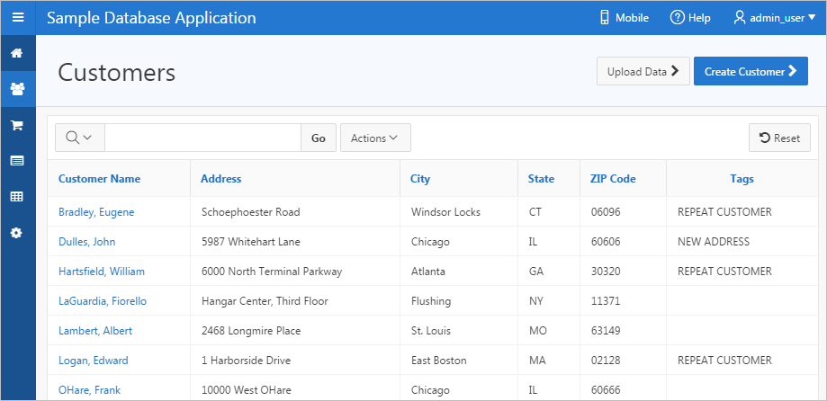
Description of the illustration ''customer.png''
Customers is an interactive report for tracking customer information. To search for a customer information, enter search terms in the Search field and click Go. To sort by customer, click the column heading and then select the sort icons.
You can change the appearance of the report using the Actions menu.
3.3.2.3 Using the Customers Page
This section describes functionality built into the Customers page.
3.3.2.3.1 Editing a Customer
To update existing customer information:
-
Click the customer name.
-
On the Customer Details page, edit the fields and click Apply Changes.
3.3.2.3.2 Creating a Customer
To add a new customer:
-
Click the Create Customer button.
-
On the Customer Details page, edit the fields and click Add Customer.
3.3.2.3.3 Uploading Data
To upload data:
-
Click the Upload Data button.
-
For Import From:
-
Import From - Select either:
-
Upload file, comma separated (*.csv) or tab delimited. If selected, select the file at the bottom of the window.
-
Copy and Paste. If selected, a Copy and Paste field displays at the bottom on the window.
Tip:
The option you select determines what additional fields display. To view sample data, expand the Sample Data region. -
-
Separator - Identify a column separator character. Use \t for tab separators.
-
Optionally Enclosed By - Enter a delimiter character. See field-level Help for more details.
-
First Row has Column Names - Select or deselect Yes. To view sample data, expand the Sample Data region.
-
File Character Set - Select the appropriate file character set.
-
Click Next.
-
-
On Data/Table Mapping, review the mappings and click Next.
-
Click Load Data.
3.3.2.4 Products Page
The Products page enables users to view and edit product information. The Products region is based on a SQL query that uses a custom function for displaying images stored in the database.
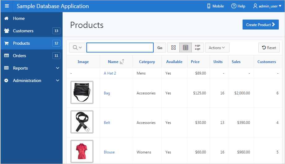
Description of the illustration ''products.png''
By default, this page displays in Report view. You can change the view by clicking View Icons and View Detail to the left of the Actions menu. In Report view, you can sort by column by clicking the column heading and then selecting the icons. Users can change the appearance of the report using the Actions menu.
3.3.2.5 Using the Products Page
This section describes functionality built into the Customers page.
3.3.2.5.1 Editing a Product
To update existing product:
-
Click the product name.
-
On the Product Details page, edit the fields and click Apply Changes.
3.3.2.5.2 Creating a Product
To add a new product:
-
Click the Create Product button.
-
On the Product Details page, edit the fields and click Add Product.
3.3.2.6 Orders Page
The Orders page enables users to view and edit customer orders.
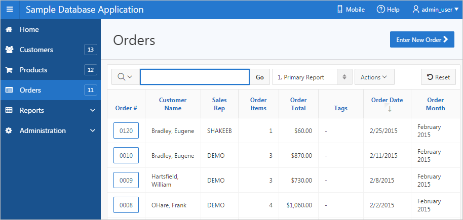
Description of the illustration ''orders.png''
Orders is an interactive report for tracking order information. To sort by column, click the column heading and then select the appropriate sort icon. You can change the appearance of the report using the Actions menu.
3.3.2.7 Using the Orders Page
This section describes functionality built into the Orders page.
3.3.2.7.1 Editing an Order
To edit an order:
-
Click the Order number.
The Order Details page appears.
-
On the Order Details page, edit the fields and click Apply Changes.
-
To delete an order, click Delete.
3.3.2.7.2 Creating an Order
To create an order:
-
Click the Enter New Order button.
The Enter New Order wizard appears.
-
Follow the on-screen instructions to enter order information.
-
Click Place Order.
3.3.2.8 Reports Page
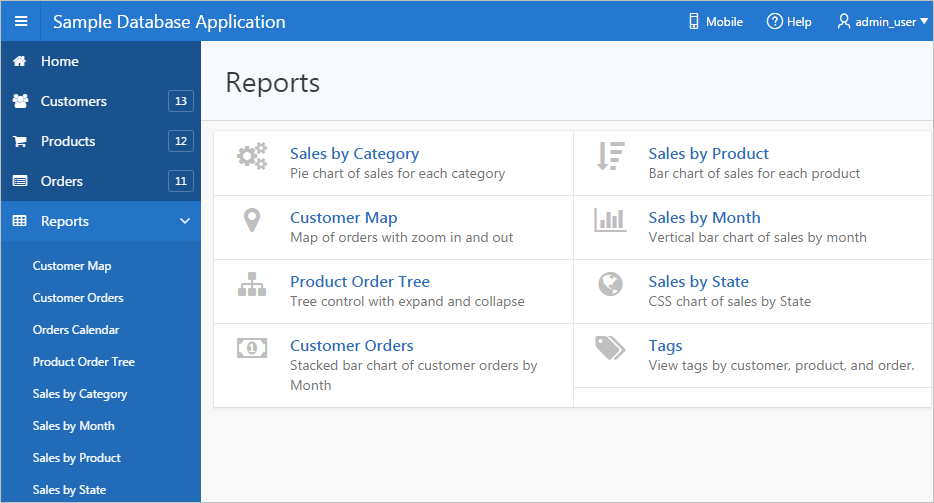
Description of the illustration ''reports.png''
The Reports page enables you to view information in various formats, including bar chart, pie chart, map, tree, and tags. To view a report or chart, select it.
3.3.2.9 Administration Page
Use the Administration page to manage sample data, manage state codes and names, and enable user feedback capability. Use the reports on the right side of the page to view user activity, view pages views, and view page views in a monthly calendar.
The Administration contains two regions: Administration and Reports.
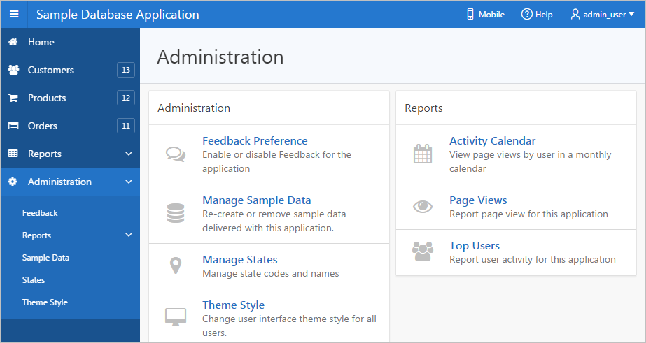
Description of the illustration ''admin.png''
The Administration region contains these sections:
-
Feedback Preference - Enable, disable, and manage feedback for the application. To learn more, see "Managing Feedback."
-
Manage Sample Data - Remove or re-create the sample data that ships with Sample Database Application.
-
Manage States - Add, edit, or delete states.
-
Theme Styles - Change the user interface theme style for all users. See "Using Theme Styles."
The Reports region contains these sections:
-
Activity Calendar - Displays page views by user in a monthly calendar.
-
Page Views - Displays a report of page views by user in the application.
-
Top Users - Displays a report of user activity for this application.
3.3.2.10 Accessing the Mobile Version
Clicking Mobile in the upper right corner of the home page displays Sample Database Application in a format compatible with a mobile device. This mobile version replicates the majority of functionality available in the desktop version.
To access the mobile version of Sample Database Application:
-
no to the Packaged Apps page and run Sample Database Application. See "Running an Installed Packaged Application."
-
Click Mobile in the upper right corner.
The Mobile version of Sample Database Application appears.
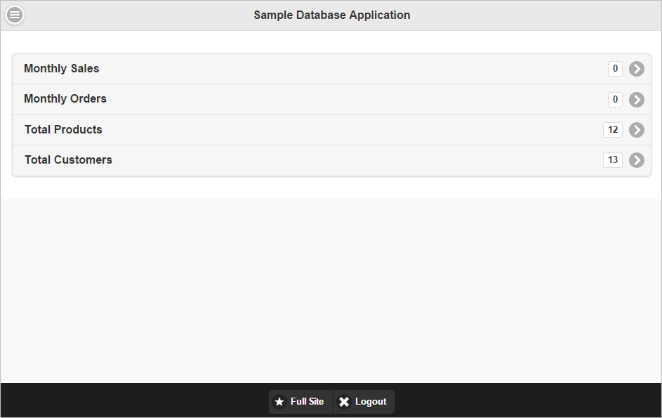
Description of the illustration ''samp_app_mobile1.png''
-
To view a page, select it.
-
To edit a specific customer or product, select it.
A form appears.
-
To return to the home page, click the Home icon in the upper left corner.
The home page appears.
-
On the home page:
-
Click Full Site to return to the desktop version of Sample Database Application.
-
Click Logout to return to Application Builder.
-
3.3.3 Modifying Sample Database Application
This section describes how to modify a sample database application.
3.3.3.1 Why Modify a Sample Database Application?
Once you understand the type of functionality available in a packaged application, such as Sample Database Application, the next step is to learn more about the construction of each page. An efficient way to speed up the learning process is to analyze and deconstruct the pages in the packaged applications. If you happen to break something, you can quickly delete the packaged application and install it again.
Tip:
Oracle Application Express includes two types of packaged applications: sample and productivity applications. By default, sample applications are fully editable. In contrast, you must unlock a productivity application before you can edit it. Unlocking a productivity packaged application makes it ineligible for future upgrades or support by Oracle Support.3.3.3.2 About Using the Runtime Developer Toolbar
When you run a desktop application from Application Builder, the Runtime Developer toolbar displays at the bottom of any editable running page. Use the Developer toolbar to quickly edit the current application or currently running page, or view session state. The Runtime Developer toolbar only displays if the Availability, Status attribute on the Application Definition page is set to Available with Developer Toolbar.
Description of the illustration ''dev_toolbar.png''
Note:
The Runtime Developer toolbar does not display on locked packaged applications pages or on jQuery Mobile Smartphone pages.The Runtime Developer toolbar consists of the following controls:
-
Home links to the Workspace home page. See "Understanding the Workspace Home Page."
-
Application links to the Application home page. See "Using the Application Builder Home Page."
-
Edit Page displays the currently running page ID. The View that appears depends upon your current preference. See "Understanding the Difference Between Page Designer and Component View."
-
Session links you to session state information for the current page. See "Viewing Session State."
-
View Debug displays the Debug reports. See "Debugging an Application."
-
Debug toggles the page between Debug and No Debug mode. See "Utilizing Debug Mode."
-
Show Grid toggles between Show Grid and Hide Grid. This option only applies if a grid layout is used and that layout supports showing a grid and the page has more than one column.
-
Quick Edit enables developers to enter Quick Edit mode and then select the desired component to instantly access that component in Page Designer. Press
ESCAPEor click outside a component to exit quick edit mode. -
Theme Roller enables developers to easily customize the appearance of an application by selecting colors from color picker and setting values. Only displays for themes supporting Theme Roller. See "Using Theme Styles."
-
Developer Toolbar Options displays on the far right and resembles a mechanical gear. You can customize how the Developer Toolbar displays by using the following controls:
Note:
The Developer toolbar does not display on locked packaged applications pages or on jQuery Mobile Smartphone pages.See Also:
"Runtime Developer Toolbar"3.3.3.3 Editing Sample Database Application
To edit a running application, click the Application link on the Runtime Developer toolbar. The Application home page appears. The application ID and application name display at the top of the page.
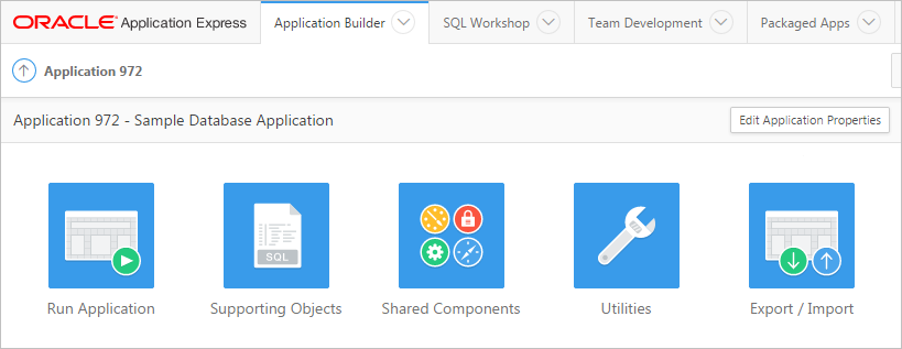
Description of the illustration ''bldr_hm_top_ico.png''
Click the following icons to run the current application, edit supporting objects, create shared components, or export and import an application:
-
Run Application submits the pages in the current application to the Application Express engine to render viewable HTML. See "How the Application Express Engine Renders and Processes Pages."
-
Supporting Objects links to the Supporting Objects page. See "How to Create a Custom Packaged Application."
-
Shared Components links to a list of shared components and user interface controls that can display or be applied on every page within an application. See "Managing Shared Components."
-
Utilities links to the Utilities page. Use this page to monitor developer activity, view dashboards, run Advisor, and view numerous other reports. See "Using Application Builder Utilities."
-
Export/Import links you to the Export/Import Wizard. Use this wizard to import and export an entire application and related files such as cascading style sheets, images, static files, script files, themes, user interface defaults, and workspace users. See "Exporting an Application and Application Components."
The pages that comprise the application appear on the Application home page. To access a specific page, simply click it. To search for a specific page, enter a case insensitive query for the page title or page number in the Page field and click Go.