70 Customizing the Contributor Interface Dashboard
Before you start customizing the dashboard, familiarize yourself with its configuration. You can also use a sample code to try out dashboard customization.
Topics:
70.1 About Dashboard Customization
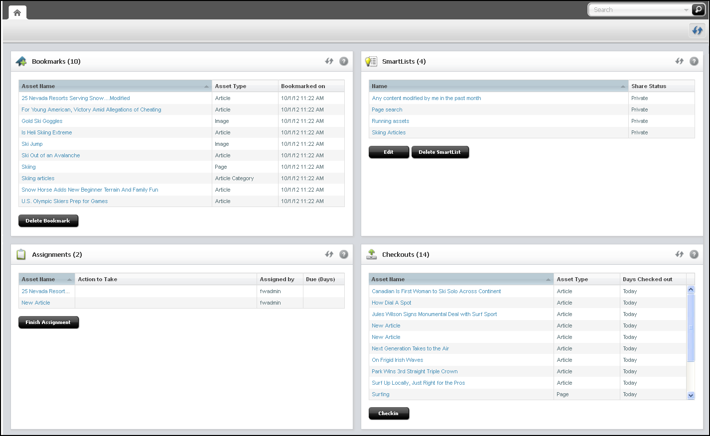
When you log in to the Contributor interface, the dashboard is displayed. By default, the dashboard opens the following ready-to-use widgets: Bookmarks, SmartLists, Checkouts, and Assignments.
Figure 70-1 Dashboard with Default Widgets

Description of "Figure 70-1 Dashboard with Default Widgets"
You can customize the following portions of the dashboard and its widgets:
-
Number of columns
-
Column width
-
Display name, height, and dashboard position
-
Number of widgets
70.2 Customizing the Dashboard
When you’re customizing the dashboard, you can override the controller element which generates the system-defined dashboard. You can configure a dashboard with a global setting or make it site-specific. On the dashboard, you can customize default widgets, add new widgets, and delete those that content and marketing teams no longer need.
- The system-defined dashboard is generated by the controller element
UI/Layout/CenterPane/DashboardContentsConfig.To customize the dashboard, override this element by creating your own
DashBoardContentsConfig.jspunderCustomElementsand customizing its properties.
Note:
When a new widget is added or an existing widget is updated, you must clear user preferences in the WEM UI for the changes to take place.
The UI/Layout/CenterPane/DashBoardContentsConfig element is shown next, followed by property descriptions in the next table.
Element UI/Layout/CenterPane/DashboardContentsConfig
<dashboardconfig>
   <dashboardlayout>
      <numberofcolumns></numberofcolumns>
      <columnwidths></columnwidths>
   </dashboardlayout>
   <components>
      <component id="widgetId">
         <name>widgetName</name>
         <url>widgetURL</url>
         <height>height_in_px</height>
         <dragRestriction>true | false </dragRestriction>
         <column>number_of_column_in_which_to_display_widget</column>
     </component>
         …
         …
         …
   </components>
</dashboardconfig>
Table 70-1 Properties in UI/Layout/CenterPane/DashBoardContentsConfig.jsp
| Property | Description | Value |
|---|---|---|
|
|
Number of columns in the dashboard display. |
Integer greater than 0. The system default is |
|
|
Comma-separated widths of columns. |
For example, if there are |
|
|
This section is used to define dashboard widgets. |
N/A |
|
|
Used to define a single widget. |
N/A |
|
|
ID of the widget. |
Alpha-numeric value unique across widgets. Special characters are not allowed. |
|
|
Displayed name of the widget. |
Arbitrary string. |
|
|
Controller URL. |
The file location of the widget in the |
|
|
Height of the widget. |
Height in pixels. For example, |
|
|
Restricts dragging of the widget. |
|
|
|
The column in which the widget is displayed. |
|
70.3 Examples of Customizing the Dashboard
You might want to ask content and marketing teams which widgets can help them be more productive. You can add those widgets to the Contributor dashboard.
To add a new widget:
- Create the widget element.
- Register the new widget in your custom
DashBoardContentsConfig.jspelement.
70.3.1 Adding a Hello World Widget
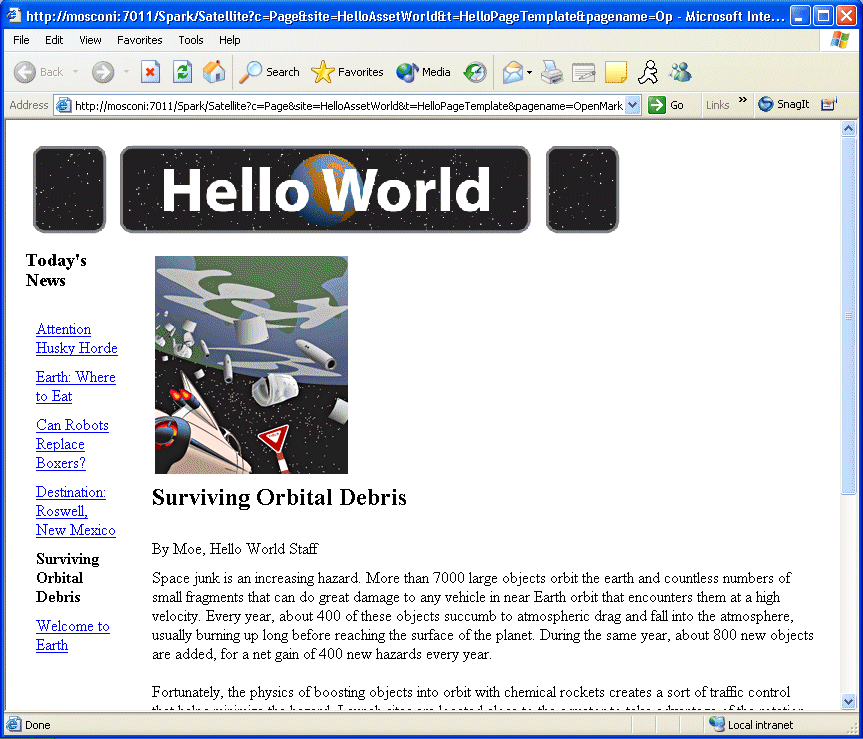
These steps show how to create and register the simple widget shown in this figure.
To add your widget to the dashboard create your widget as follows:
-
Create a JSP element under CustomElements. In this example, we name the element
HelloWorldHtml. -
For widget code, you can navigate to the sample file provided with this guide and copy its content.
To register your widget (add it to the dashboard):
70.3.2 Adding a Widget that Shows Recently Modified Assets
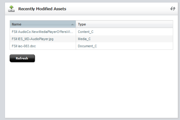
In this section, you create a widget that shows which assets were modified in the past week. After completing the steps in this section, your dashboard displays a widget similar to the one in this figure.
Figure 70-3 Recently Modified Assets Widget

Description of "Figure 70-3 Recently Modified Assets Widget"
To add your widget to the dashboard, create your widget as follows:
-
Create an
ActionJSP element underCustomElements. In this example, we name the elementRecentlyModifiedAssetsAction.jsp. For the widget code, you can navigate to the sample file provided with this guide and copy its content. -
Create a
JsonJSP element for the Action element created in the previous step. In this example, we name the elementRecentlyModifiedAssetsJson.jsp. For the code, you can navigate to the sample file provided with this guide and copy its content. Place the element in the same location as theRecentlyModifiedAssetsAction.jspelement. -
Create a presentation element under CustomElements for your widget. Name the element after the widget element. In this example, we name the display element
RecentlyModifiedAssetsHtml.jsp. For the code, you can navigate to the sample file provided with this guide and copy its content.Note:
The presentation element calls the
RecentlyModifiedAssetsAction.jspelement. Enter the path to that element.
To register your widget (add it to the dashboard):
