7 Working with Mobile Device Content
For information about working with mobile device content, see these topics:
7.1 About Mobile Websites
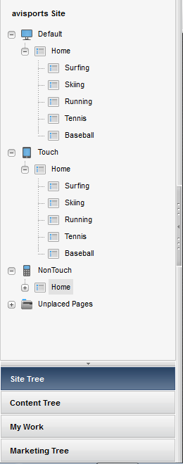
A mobile website, like your Default website for viewing on desktop/laptop devices, is represented by a site navigation node in the Site Tree of the Oracle WebCenter Sites: Contributor interface. Each node has a different icon which helps you differentiate a site's assets from those of other sites. For example, Figure 7-1 shows the Site Tree in the avisports sample site.
Figure 7-1 Site Navigations for the avisports Sample Site
Description of "Figure 7-1 Site Navigations for the avisports Sample Site"
At the top of Figure 7-1 is the Default site navigation node for desktop and laptop devices, which was created by default when the site was created. Below are the mobile site navigation nodes named Touch and NonTouch. Those nodes were created by an administrator who then assigned them to Device Groups, that is a group of devices with similar features, such as a group of touchscreen phones.
In Figure 7-1, the Touch site navigation node is assigned to Device Groups for mobile touchscreen devices. The NonTouch site navigation node is assigned to Device Groups for mobile devices with a QWERTY keypad. Under each site navigation node is a set of placed Pages which represent the site navigation. Whereas administrators create the site navigations, contributors place the Pages. Placed Pages can be viewed and edited in the context of a mobile device.
7.1.1 How Do I Create Mobile Websites?
To create mobile websites, you create a mobile site navigation under a mobile site navigation node by placing Pages. You can either create content assets and Pages or copy and edit existing content assets and Pages. For more information, see About Creating a Mobile Website.
7.1.2 How Do I Edit Mobile Websites?
You can edit the Page and content assets of your mobile website just as you would for the Default website in Form View and Web View. In addition, you have the option to edit Pages and content assets in the context of a mobile device, as described in Editing Assets in the Context of a Mobile Device.
7.1.3 How Do I Preview Mobile Websites?
You can preview the Page and content assets of your mobile website in the context of either a single mobile device or multiple mobile devices (associated with the same device group), as described in Previewing Assets in the Context of a Mobile Device.
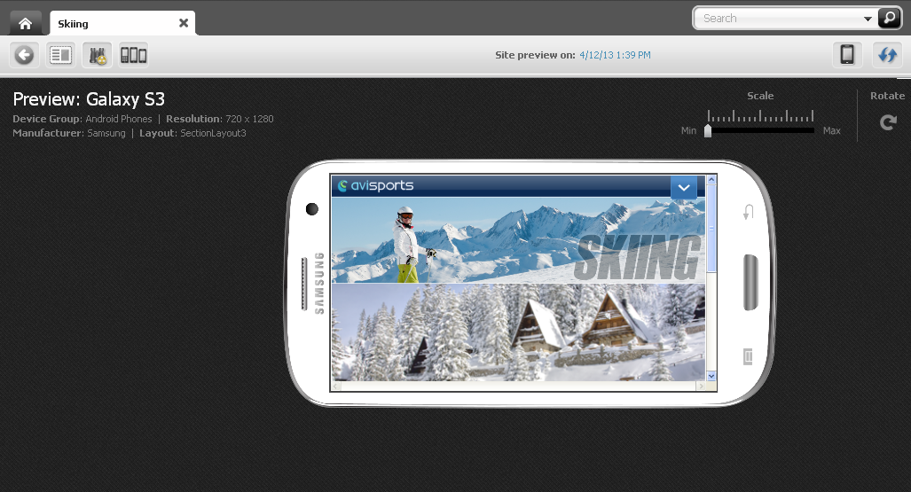
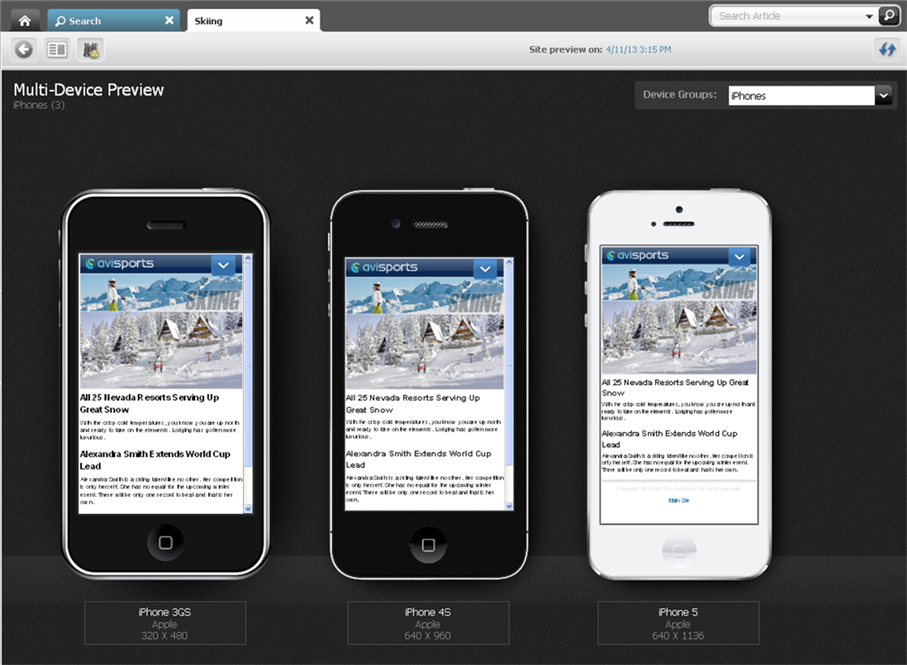
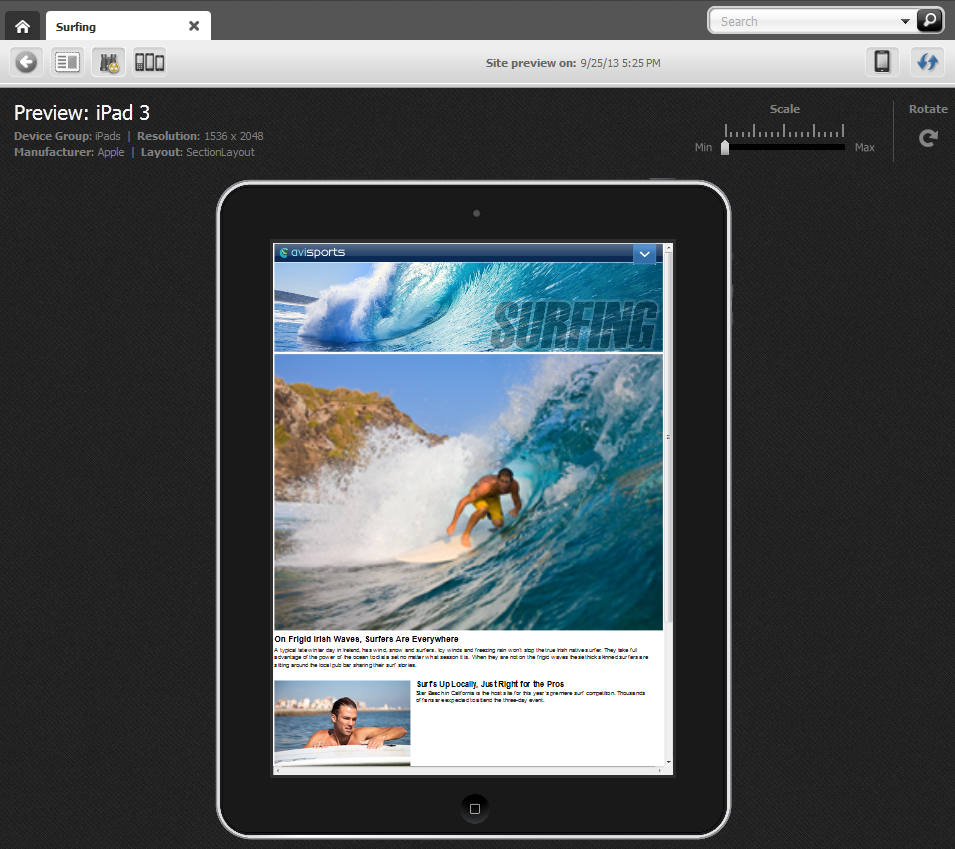
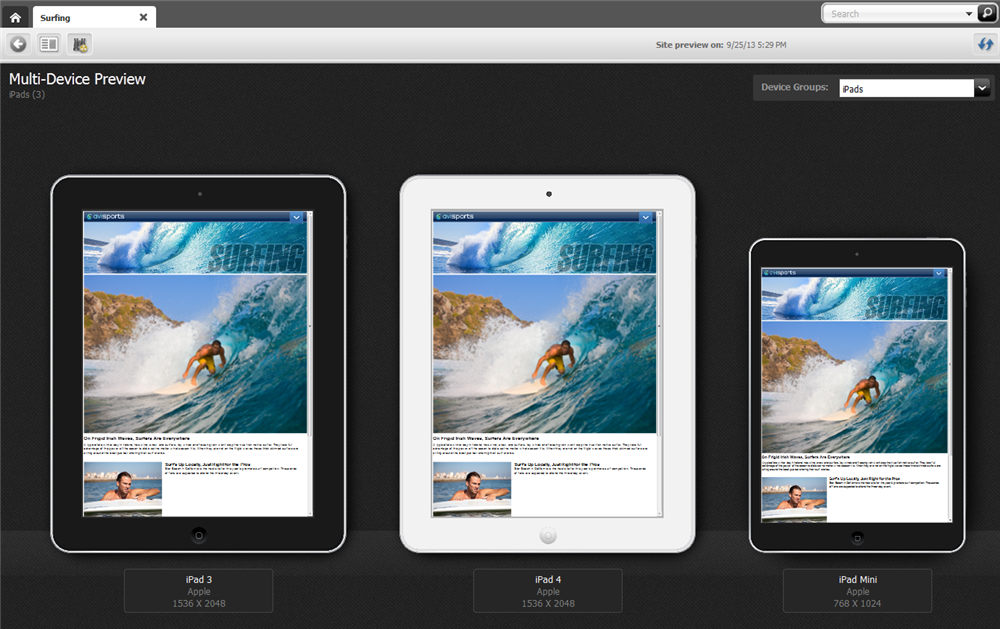
Figure 7-2shows the preview of the Surfing Page displayed on a single mobile device (represented by a Device asset). Figure 7-3shows the preview of the Surfing Page displayed on multiple mobile devices (associated with the same Device Group).
Figure 7-2 Preview of a Page Asset Displayed on a Single Device
Description of "Figure 7-2 Preview of a Page Asset Displayed on a Single Device"
Figure 7-3 Preview of a Page Asset Displayed on Multiple Devices
Description of "Figure 7-3 Preview of a Page Asset Displayed on Multiple Devices"
7.1.4 How Do I Approve Mobile Websites for Publishing?
To make a mobile website available for publishing, you must approve its site navigation (Site Navigation asset), content assets, placed Pages, and Device Groups. Since Device Groups are dependent on one another, when you approve one Device Group, you must approve them all. To publish the mobile website to a management system, you must also approve all Device assets associated with that mobile website For more information, see About Approving a Mobile Site Navigation for Publishing.
7.2 About Creating a Mobile Website
Creating a mobile website's navigation is much like creating the navigation for a default website, for viewing on desktop/laptop devices. First, you either create assets and Pages or copy and edit existing assets and Pages for your mobile website. You then create the mobile website's navigation by either placing Pages under the mobile site navigation or copying the navigation and pasting it under another mobile site navigation.
For information about creating a mobile website, see these topics:
7.2.1 About Creating or Copying the Content for the Mobile Website
To create the content for your mobile website, you can:
-
Create content assets and Pages. For instructions, see Creating an Asset in Form View and Creating an Asset in Web View.
-
Copy existing content assets and Pages, and then edit those assets to be specific to the mobile website you are creating. For instructions on copying assets, see Creating Assets by Copying Existing Assets.
7.2.2 About Creating or Copying the Navigation for the Mobile Website
The navigation of your mobile website is determined by the placement of the Page assets under a site navigation in the Site Tree of the Contributor interface. You can either place Pages under the mobile site navigation from the Unplaced Pages node, or copy the navigation and paste it under the mobile site navigation. You can also create a page directly in the mobile site navigation by right-clicking any node in the site tree and selecting New Page. For instructions, see Defining Website Navigation.
Note:
WebCenter Sites offers multiple ways to create a website's navigation. Your site design determines the way in which your website's navigation is created. This section is for users whose site design is configured to allow them to create their website's navigation using the Site Tree in the Contributor interface. For information about how the navigation for your website is created, see your site developers.
7.3 Editing Assets in the Context of a Mobile Device
Editing an asset in the context of a mobile device is the same as editing an asset in Web View, with one difference; your asset is shown on a Device asset representing a mobile device. When you edit the asset in the context of a mobile device, you can edit its content, change the web page layout, change the content layout of a slot, and edit the asset's associations.
Note:
You can also edit the assets of a mobile website in Form View and Web View just as you would for an asset of your Default website. For instructions, see Creating an Asset in Form View and Creating an Asset in Web View.
To edit an asset in the context of a mobile device:
-
From the Contributor interface, select the site containing the mobile website whose assets you want to edit.
-
Find and open the asset you want to edit in the context of a mobile device. See Finding and Organizing Assets and Using Placed Page Assets for Mobile Devices.
-
Select the device on which you want to edit the asset's content:
-
In the asset's toolbar, click the Show/Hide Devices icon.
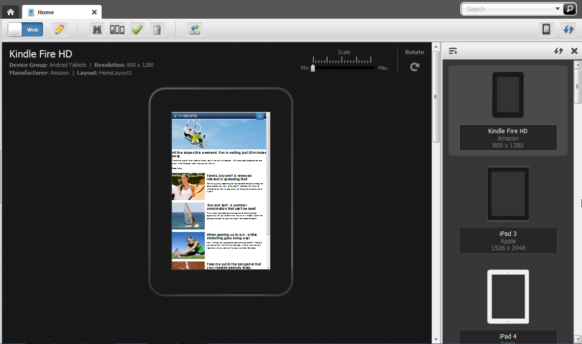
The device selection panel opens to the right of the asset (as shown in Figure 7-4).
Figure 7-4 Device Selection Panel Open to the Right of an Asset
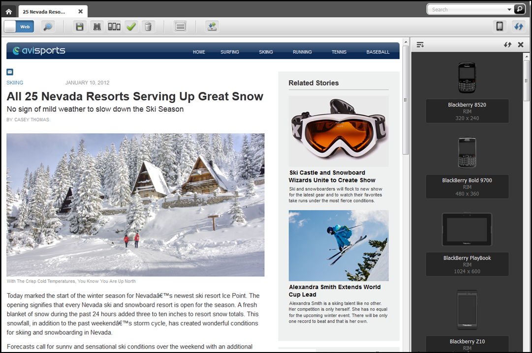
Description of "Figure 7-4 Device Selection Panel Open to the Right of an Asset" -
In the device selection panel, select the device on which you want to edit the asset.
The Edit view of the asset is shown on the screen of the selected device (as shown in Figure 7-5).
Figure 7-5 Asset Displayed on the Screen of a Mobile Device
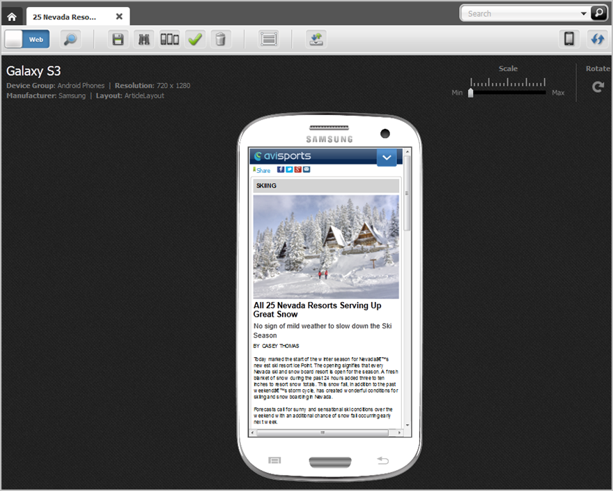
Description of "Figure 7-5 Asset Displayed on the Screen of a Mobile Device"At this point, you can edit the asset as you would an asset for your Default website.
-
-
Point to the different areas of the asset's Edit view to determine which areas contain modifiable content. Areas that support drag and drop functionality and other content management actions are highlighted when you point to them.
Note:
The types of editable areas you see and how those areas are displayed when you edit an asset in the context of a mobile device are determined by how your developers have coded the asset's web page layout (template). For information about web page layout, see Changing Web Page Layout.
For information about the different types of editable areas, see Creating an Asset in Web View.
-
Edit the content of the asset by clicking in a text area to display either a simple text field or a WYSIWYG-enabled text field. Then, modify the content displayed in the field. For information about WYSIWYG-enabled fields, see Working with the CKEditor.
-
Change the asset's web page layout. For instructions, see Changing Web Page Layout.
-
Change the content layout of a slot. For instructions, see Changing Content Layout.
-
Edit the asset's associations:
-
Add or replace an associated asset. For instructions, see Adding or Replacing an Association.
-
Edit the content of an associated asset. For instructions, see Editing the Content of an Associated Asset.
-
Remove an asset from a slot. For instructions, see Removing Associations.
-
Reposition the assets displayed in a multi-valued slot. For instructions, see Changing the Position of Content Displayed in a Multi-Valued Slot.
-
-
To save your changes, do one of the following:
-
In the asset's toolbar, click the Save icon.
-
In the menu bar, select Content, then select Save.
-
-
To inspect the asset, do one of the following:
-
In the asset's toolbar, click the Inspect icon.
-
In the menu bar, select Content, then select Inspect.
-
-
Preview the asset in the context of a mobile device. For instructions, see Previewing Assets in the Context of a Mobile Device.
7.4 Choosing Your Preferred Devices for Preview
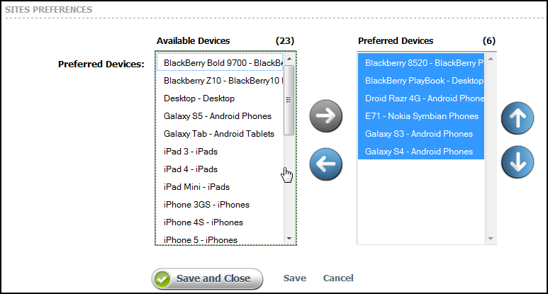
You can choose one or more devices as your preferred devices in whose context you would like to preview your site. Once you have set up your preferred devices, they are available in the Devices panel in the Contributor interface. You can also use your preferred devices for editing content in the context of these devices in Web View.
To choose your preferred devices:
7.5 Previewing Assets in the Context of a Mobile Device
Previewing an asset in the context of a mobile device is much like previewing an asset as it would look on a desktop/laptop device, with one difference; the preview of the asset is shown on a single Device asset or multiple Device assets which represent actual mobile devices. In addition, you can rotate the device to view the preview of the asset in landscape mode and zoom into and out of the asset's preview.
You can access an asset for preview on a mobile device the same way as you would for an asset of your Default website. The only difference being when you use the Site Tree to access a Page asset under a mobile site navigation, the Page is automatically displayed in a mobile device associated with that site navigation. For more information about accessing an asset's preview, see Previewing Assets.
To preview an asset in the context of a mobile device:
For more information about previewing assets, such as previewing an asset as it will look on the website at a future date, previewing an asset with a different page layout, or previewing an asset with segments, see Previewing Assets.
7.6 About Approving a Mobile Site Navigation for Publishing
Approving a mobile site navigation for publishing is the same as approving a site navigation for your Default website. Before a mobile website can be published, its Site Navigation asset must be approved for publishing along with its placed Pages (site navigation) and associated content assets. Approving a mobile website also requires you to approve all the Device Groups on your system. Device Groups are dependent on one another –when you approve one Device Group, you must approve them all. If you are approving the mobile site navigation for publishing to a management system, you must also approve the Device assets associated with that mobile site navigation. For instruction on approving a mobile site navigation, see Approving a Site Navigation for Publishing.
