18 Using ADF Model in a Fusion Web Application
This chapter includes the following sections:
18.1 About Using ADF Model in a Fusion Web Application
ADF Model implements concepts that enable decoupling the user interface technology from the business service implementation: data controls and declarative ADF bindings.
ADF Model builds upon the MVC (model-view-controller) design pattern, in which the code for the application's data model, visual interface, and application flow are all cleanly separated. As illustrated in Figure 18-1, ADF Model provides a layer of abstraction over the business services that typically serve as an application's model layer. For more information on how ADF Model fits in with the MVC architecture, see "Abstraction of the Application's Model Layer" in Understanding Oracle Application Development Framework.
Figure 18-1 ADF Model within the ADF Architecture
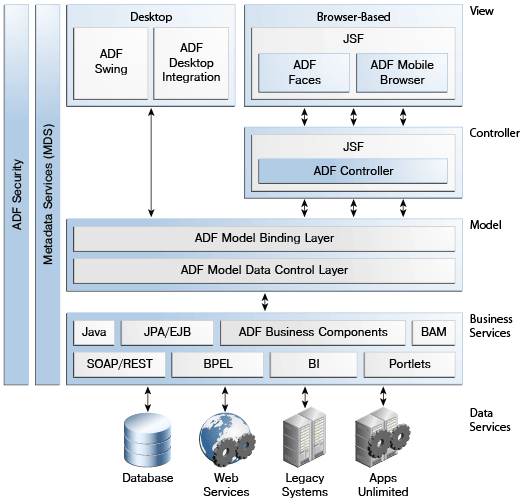
Description of "Figure 18-1 ADF Model within the ADF Architecture"
18.1.1 About ADF Data Controls
ADF data controls abstract the implementation technology of a business service by using standard metadata interfaces to describe the service's operations and data collections, including information about the properties, methods, and types involved. In an application that uses ADF Business Components, a data control is automatically created when you create an application module, and it contains all the functionality of the application module. Developers can then use the representation of the data control displayed in JDeveloper's Data Controls panel to create UI components that are automatically bound to the application module. At runtime, the ADF Model layer reads the information describing the data controls and bindings from the appropriate XML files and then implements the two-way connection between the user interface and the business service.
When you create an ADF Business Component application module and add view objects to the data model for that application module, a data control is created for you automatically.
You can also create data controls based on different types of business services, such as EJB session beans, plain Java objects, and web services. For information on working with these kinds of data controls, see Using ADF Data Controls in Developing Applications with Oracle ADF Data Controls.
Note:
Using the ADF Model layer to perform business service access ensures that the view and the business service stay in sync. For example, while you could call a method on an application module by class-casting the data control reference to the application module instance and then calling the method directly, doing so would bypass the model layer and it would then become unaware of any changes.
18.1.2 About JSF Data Binding
ADF declarative bindings are based on JSF data binding. In JSF, you use a simple expression language (called EL) to bind to the information you want to present and/or modify (for more information, see http://www.oracle.com/technetwork/java/unifiedel-139263.html). Example expressions look like #{userInfoBean.principalName} to reference a particular user's name, or #{userInfoBean.principalName eq 'SKING'} to evaluate whether a user's name is SKING or not. At runtime, a generic expression evaluator returns the String and boolean value of these respective expressions, automating access to the individual objects and their properties without requiring code.
At runtime, the value of certain JSF UI components is determined by the value attribute. While a component can have static text as its value, typically the value attribute will contain a binding that is an EL expression that the runtime infrastructure evaluates to determine what data to display. For example, an outputText component that displays the name of the currently logged-in user might have its value attribute set to the expression #{userInfoBean.principalName}. Since any attribute of a component can be assigned a value using an EL expression, it's easy to build dynamic, data-driven user interfaces. For example, you could hide a component when a user is not logged in by using a boolean-valued expression like #{userInfoBean.prinicpalName !=null} in the UI component's rendered attribute. If there is no principal name in the current instantiation of the userInfoBean, the rendered attribute evaluates to false and the component disappears from the page.
18.1.3 About ADF Data Binding
ADF data binding extends JSF data binding by enabling you to bind to ADF data controls declaratively. In a typical JSF application, you would create objects like the userInfoBean object as a managed bean. The JSF runtime manages instantiating these beans on demand when any EL expression references them for the first time. However, in an application that uses ADF Model, instead of binding the UI component attributes to properties or methods on managed beans, JDeveloper automatically binds the UI component attributes to ADF Model, which uses XML configuration files that drive generic data binding features.
ADF declarative bindings abstract the details of accessing data from data collections in a data control and of invoking its operations. There are three basic kinds of declarative binding objects:
-
Executable bindings: Included in executable bindings are iterator bindings, which simplify the building of user interfaces that allow scrolling and paging through collections of data and drilling-down from summary to detail information. Executable bindings also include bindings that allow searching and nesting a series of pages within another page, as well as bindings that cause operations to occur immediately.
-
Value bindings: Used by UI components that display data. Value bindings range from the most basic variety that work with a simple text field to more sophisticated list and tree bindings that support the additional needs of list, table, and tree UI controls.
-
Action bindings: Used by UI components like hyperlinks or buttons to invoke built-in or custom operations on data collections or a data control without writing code.
The group of bindings supporting the UI components on a page are described in a page-specific XML file called the page definition file. The ADF Model layer uses this file at runtime to instantiate the page's bindings. These bindings are held in a request-scoped map called the binding container, accessible during each page request using the EL expression #{bindings}. This expression always evaluates to the binding container for the current page.
Tip:
The current binding container is also available from AdfContext for programmatic access.
You can design a databound user interface by dragging an item from the Data Controls panel and dropping it on a page as a specific UI component. When you use data controls to create a UI component, JDeveloper automatically creates the various code and objects needed to bind the component to the data control you selected.
18.2 Additional Functionality for ADF Model Layer
You may find it helpful to understand other Oracle ADF features before you configure or use the ADF Model layer. Additionally, you may want to read about what you can do with your model layer configurations. Following are links to other functionality that may be of interest.
-
ADF model and data binding rely on the business layer. In most cases, you will be working with representations of your view objects. For more information, see Defining SQL Queries Using View Objects. You may also want to be familiar with advanced functionality discussed in Tuning View Object Performance.
-
You can use the ADF Model layer to create your view pages. After reading this chapter for the basic information on how data binding in the view layer works, you should refer to the chapters in Creating a Databound Web User Interface for information about using data binding to create specific view functionality.
-
For information about how ADF Model works with the page lifecycle, see Understanding the Fusion Page Lifecycle .
-
For a complete list of configuration parameters that affect the model layer, see DataBindings.cpx and pageNamePageDef.xml.
-
For a complete list of binding properties, see Oracle ADF Binding Properties.
18.3 Exposing Application Modules with ADF Data Controls
When you create an application module, a data control is created for the objects that you have added to the application module's data model.
Note:
You can also create data controls for other kinds of business services. See Using ADF Data Controls in Developing Applications with Oracle ADF Data Controls.
Importantly, the application module component directly implements interfaces that binding objects expected for data collections, built-in operations, and service methods. This optimized interaction allows the bindings to work directly with the application module instances in its data model in the following ways:
-
Iterator bindings directly bind to the default row set iterator of the default row set of any view object instance. The row set iterator manages the current object and current range information.
Tip:
You can also use the iterator binding to bind to a secondary named row set that you have created. To bind to a secondary row set iterator, you need to use the
RSIName. For information about the difference between the default row set and secondary row sets and how to create them, see Working with Multiple Row Sets and Row Set Iterators. -
Action bindings directly bind to either:
-
Custom methods on the data control client interface
-
Built-in operations of the application module and view objects
-
Figure 18-2 illustrates examples of iterator and action bindings connecting UI components with application module data control objects.
Figure 18-2 Bindings Connect UI Components to Data Controls
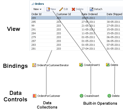
Description of "Figure 18-2 Bindings Connect UI Components to Data Controls"
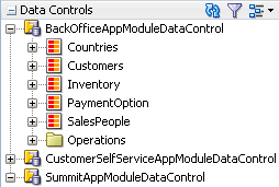
18.3.1 How an Application Module Data Control Appears in the Data Controls Panel
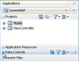
You use the Data Controls panel to create databound UI components by dragging and dropping icons from the panel onto the visual editor for a page. Figure 18-3 shows the Data Controls panel displaying the data controls for the Summit sample application for Oracle ADF.
Figure 18-3 Data Controls Panel in JDeveloper
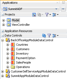
The Data Controls panel lists all the data controls that have been created for the application's business services and exposes all the collections (row sets of data objects), methods, and built-in operations that are available for binding to UI components.
Note:
If you've configured JDeveloper to expose them, any view link accessor returns are also displayed. For more information, see Working with Multiple Tables in a Master-Detail Hierarchy. To view the accessor methods:
-
From the JDeveloper main menu, choose Tools > Preferences.
-
Select the Data Controls Panel node.
-
Select Show Underlying Accessor Nodes to activate the checkbox.
In an application that uses ADF Business Components to define the business services, each data control on the Data Controls panel represents a specific application module, and exposes the view object instances in that application's data model. The hierarchy of objects in the data control is defined by the view links between view objects that have specifically been added to the application module data model. For information about creating view objects and view links, see Defining SQL Queries Using View Objects. For information about adding view links to the data model, see How to Enable Active Master-Detail Coordination in the Data Model.
Tip:
You can open the overview editor for a view object by right-clicking the associated data control object and choosing Edit Definition.
For example, BackOfficeAppModuleDataControl represents the BackOfficeAppModule application module, which implements the part of the business service layer of the Summit ADF sample application that is available to the company's employees. The application module's data model contains numerous view object instances, including several master-detail hierarchies. The view layer of the Summit ADF sample application consists of JSF pages whose UI components are bound to data from the view object instances in BackOfficeAppModule's data model, and to built-in operations and service methods on its client interface.
18.3.1.1 How the Data Model and Service Methods Appear in the Data Controls Panel
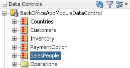
Each view object instance appears as a named data collection whose name matches the view object instance name. Figure 18-4 illustrates how the Data Controls panel displays the view object instances in BackOfficeAppModule's data model. The Data Controls panel reflects the master-detail hierarchies in your application module data model by displaying detail data collections nested under their master data collection.
Figure 18-4 How the Data Model Appears in the Data Controls Panel
The Data Controls panel also displays any custom method on the application module's client interface as a named data control custom operation whose name matches the method name. If a method accepts arguments, they appear in a Parameters node as operation parameters nested inside the operation's node.
18.3.1.2 How Transaction Control Operations Appear in the Data Controls Panel
The Operations folder node of the application module data control exposes two data control built-in operations named Commit and Rollback, as shown in Figure 18-5. At runtime, when these operations are invoked by the data binding layer, they delegate to the commit() and rollback() methods of the Transaction object associated with the current application module instance.
Note:
In an application module with many view object instances and custom methods, you may need to scroll the Data Controls panel display to find the Operations node that is the direct child node of the data control. This node is the one that contains these built-in operations.
Figure 18-5 How Transaction Control Operations Appear in the Data Controls panel
Description of "Figure 18-5 How Transaction Control Operations Appear in the Data Controls panel"
18.3.1.3 How View Objects Appear in the Data Controls Panel
The view object attributes are displayed as immediate child nodes of the corresponding data collection, as are any custom methods you've created. Figure 18-6 shows how each view object instance in the application module's data model appears in the Data Controls panel. If you have selected any custom methods to appear on the view object's client interface, they appear as custom methods immediately following the view object attributes at the same level. If the method accepts arguments, these appear in a nested Parameters node as operation parameters.
By default, implicit view criteria are created for each attribute that is able to be queried on a view object. They are represented by the All Queriable Attributes node under the Named Criteria node, as shown in Figure 18-6. If any named view criteria were created for the view object, they appear under the Named Criteria node. The conjunction used in the query, along with the criteria items and if applicable, any nested criteria, are shown as children. These items are used to create quick search forms, as detailed in Creating ADF Databound Search Forms .
Figure 18-6 How View Objects Appear in the Data Controls Panel
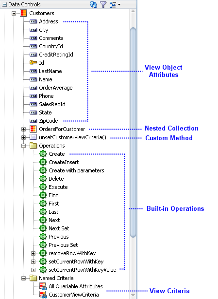
Description of "Figure 18-6 How View Objects Appear in the Data Controls Panel"
As shown in Figure 18-6, the Operations node under the data collection displays all its available built-in operations. If an operation accepts one or more parameters, then those parameters appear in a nested Parameters node. At runtime, when one of these data collection operations is invoked by name by the data binding layer, the application module data control delegates the call to an appropriate method on the ViewObject interface to handle the built-in functionality. The built-in operations fall into three categories: operations that affect the current row, operations that refresh the data collection, and all other operations.
Operations that affect the current row:
-
Create: Creates a new row that becomes the current row, but does not insert it. -
CreateInsert: Creates a new row that becomes the current row, and inserts the new blank row into the data source. -
Createwith Parameters: Creates a new row taking parameter values. The passed parameters can supply the create-time value for the following:-
A discriminator for a polymorphic view object
-
A composing parent's foreign key attribute needed for the creation of a polymorphic view object
-
A composed child view object row when it is not created in the context of a parent row
For more information about polymorphic view objects, see Defining Polymorphic View Objects.
-
-
Delete: Deletes the current row. -
First: Sets the current row to be the first row in the row set. -
Last: Sets the current row to be the last row in the row set. -
Next: Sets the row to be the next row in the row set. -
Next Set: Navigates forward one full set of rows. -
Previous: Sets the current row to be the previous row in the row set. -
PreviousSet: Navigates backward one full set of rows. -
setCurrentRowWithKey: Tries to finds a row using the serialized string representation of row key passed as a parameter. If found, that row becomes the current row. -
setCurrentRowWithKeyValue: Tries to finds a row using the primary key attribute value passed as a parameter. If found, that row becomes the current row.For more information on using
setCurrentRowWithKeyandsetCurrentRowWithKeyValue, see What You May Need to Know About Setting the Current Row in a Table.
Operations that refresh the data collection:
-
Execute: Refreshes the data collection by executing or reexecuting the view object's query, leaving any bind parameters at their current values. -
ExecuteWithParams: Refreshes the data collection by first assigning new values to the named bind variables passed as parameters, then executing or reexecuting the view object's query.
Note:
The executeWithParams operation appears only for view objects that have defined one or more named bind variables at design time.
All other operations:
-
removeRowWithKey: Tries to find a row using the serialized string representation of row key passed as a parameter. If found, the row is removed. -
Find: Toggles "Find Mode" on and off for the data collection.
18.3.1.4 How Nested Application Modules Appear in the Data Controls Panel
If you build composite application modules by including nested instances of other application modules, the Data Controls panel reflects this component assembly in the tree hierarchy. For example, the Summit ADF sample application contains the SummitAppModule application module, which contains nested instances of the BackOfficeAppModule and CustomerSelfServiceAppModule application modules. The nested instances are called BackOfficeAM and CustomerSelfServiceAM, respectively. As shown in Figure 18-7, there are top-level data controls for all three application modules, and the SummitAppModuleDataControl data control has subnodes for the BackOfficeAM and CustomerSelfServiceAM instances.
Figure 18-7 How Nested Application Modules Appear in the Data Controls Panel
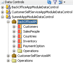
You need to be careful to perform your drag-and-drop data binding from the data control that corresponds to your intended usage. When you drop a data collection from the top-level BackOfficeAppModuleDataControl data control node in the panel, at runtime your page will use an instance of the BackOfficeAppModule application module acquired from a pool of BackOfficeAppModule components. When you drop a data collection from the BackOfficeAM nested instance of SummitAppModuleDataControl, at runtime your page will use an instance of the SummitAppModule application module acquired from a pool of SummitAppModule components. Since different types of application module data controls will have distinct transactions and database connections, inadvertently mixing and matching data collections from both a nested application module and a top-level data control will lead to unexpected runtime behavior.
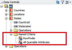
18.3.1.5 How a Row Finder Appears in the Data Controls Panel
By default, any row finders that you define on a view object will appear in the Data Controls panel. At runtime, the row finder in the named criteria gets displayed as a search panel and displays only the attributes present in the named criteria and does not display any operators. The row-finder mapped attributes of a view object that the application exposes as a collection in the Data Controls panel are available in the row finder lookup operations. Figure 18-8 shows the Row Finder under Named Criteria in the Data Controls panel.
Figure 18-8 Row Finder in Data Controls Panel
When the application programmatically invokes the row finder on the view object instance, or when the end user supplies a value for a row-finder mapped attribute in the web service payload, the row finder locates the rows that match the values supplied to bind variables of the view criteria. The row finder does not alter the row set when locating matching rows.
18.3.2 How to Open the Data Controls Panel
The Data Controls panel is a panel within the Applications window, located at the top left of JDeveloper. To view its contents, click the panel header to expand the panel. If you do not see the panel header, then the Applications window may not be displaying.
To open the Applications window and Data Controls panel:
18.3.3 How to Refresh the Data Controls Panel
Any time changes are made to the application module or underlying services, you need to manually refresh the data control in order to view the changes.
To refresh the Data Controls panel:
- Click the Refresh icon in the header of the Data Controls panel, as shown in Figure 18-10.
Figure 18-10 Refresh Icon on Data Controls Panel

When you click Refresh, the Data Controls panel looks for all available data controls, and therefore will now reflect any structural changes made to the data control.
18.3.4 Packaging a Data Control for Use in Another Project
You can package up data controls so that they can be used in another project. For example, one development group might be tasked with creating the services and data controls, while another development group might be tasked with creating the UI. The first group would create the services and data controls, and then package them up as an Oracle ADF Library and send it to the second group. The second group can then add the data controls to their project using the Resources window. For more information, see Reusing Application Components .
18.4 Using the Data Controls Panel
You can design a databound user interface by dragging an item from the Data Controls panel and dropping it on a page as a specific UI component. When you use data controls to create a UI component, JDeveloper automatically creates the various code and objects needed to bind the component to the data control you selected.
In the Data Controls panel, each data control object is represented by a specific icon. Table 18-1 describes what each icon represents, where it appears in the Data Controls panel hierarchy, and what components it can be used to create.
Table 18-1 Data Controls Panel Icons and Object Hierarchy
| Icon | Name | Description | Used to Create... |
|---|---|---|---|
|
|
Data Control |
Represents a data control. You cannot use the data control itself to create UI components, but you can use any of the child objects listed under it. Depending on how your business services were defined, there may be more than one data control. Usually, there is one data control for each application module. However, you may have additional data controls that were created for other types of business services (for example, for web services). For information about creating data controls for other business services, see Using ADF Data Controls in Developing Applications with Oracle ADF Data Controls. |
Serves as a container for the other object and is not used to create anything. |
|
|
Collection |
Represents a named data collection. A data collection represents a set of data objects (also known as a row set) in the data model. Each object in a data collection represents a specific structured data item (also known as a row) in the data model. Throughout this guide, data collection and collection are used interchangeably. For application modules, the data collection is the default row set contained in a view object instance. The name of the collection matches the view object instance name. A view link creates a master-detail relationship between two view objects. If you explicitly add an instance of a detail view object (resulting from a view link) to the application module data model, the collection contained in that detail view object appears as a child of the collection contained in the master view object. For information about adding detail view objects to the data model, see How to Enable Active Master-Detail Coordination in the Data Model. The children under a collection may be attributes of the collection, other collections that are related by a view link, custom methods that return a value from the collection, or built-in operations that can be performed on the collection. If you've configured JDeveloper to display view link accessor returns, then those are displayed as well. |
Forms, tables, graphs, trees, range navigation components, and master-detail components. For information about using collections on a data control to create forms, see Creating a Basic Databound Page. For information about using collections to create tables, see Creating ADF Databound Tables . For information about using master-detail relationships to create UI components, see Displaying Master-Detail Data . For information about creating graphs, charts, and other visualization UI components, see Creating Databound Chart and Gauge Components. |
|
|
Attribute |
Represents a discrete data element in an object (for example, an attribute in a row). Attributes appear as children under the collections or method returns to which they belong. For application module data controls, only attributes included in the corresponding view object are shown under a collection. If a view object joins one or more entity objects, that view object's collection will contain selected attributes from all of the underlying entity objects. |
Label, text field, date, list of values, and selection list components. For information about using attributes to create fields on a page, see Creating Text Fields Using Data Control Attributes. For information about creating lists, see Creating Databound Selection Lists and Shuttles . |
|
|
Structured Attribute |
Represents a returned object that is neither a Java primitive type (represented as an attribute) nor a collection of any type. An example of a structured attribute would be a domain, which is a developer-created data type used to simplify application maintenance. For information about domains, see Creating Custom, Validated Data Types Using Domains. |
Label, text field, date, list of values, and selection list components. |
|
|
Method |
Represents an operation in the data control or one of its exposed structures that may accept parameters, perform some business logic and optionally return a single value, a structure, or a collection. In application module data controls, custom methods are defined in the application module itself and usually return either nothing or a single scalar value. For information about creating custom methods, see Implementing Business Services with Application Modules. |
Command components For methods that accept parameters: command components and parameterized forms. |
|
|
Method Return |
Represents an object that is returned by a custom method. The returned object can be a single value or a collection. If a custom method defined in an application module returns anything at all, it is usually a single scalar value. Application module methods do not need to return a set of data to the view layer, because displaying the latest changes to the data is handled by the view objects in the data model (For information, see What Happens at Runtime: How View Objects and Entity Objects Cooperate). However, custom methods in non-application module data controls (for example, a data control for a CSV file) can return collections to the view layer. A method return appears as a child under the method that returns it. The objects that appear as children under a method return can be attributes of the collection, other methods that perform actions related to the parent collection, or operations that can be performed on the parent collection. |
The same components as for collections and attributes. When a single-value method return is dropped, the method is not invoked automatically by the framework. To invoke the method, you can drop the corresponding method as a button. If the form is part of a task flow, you can create a method activity to invoke the method. For information about executables, see Executable Binding Objects Defined in the Page Definition File. |
|
|
Operation |
Represents a built-in data control operation that performs actions on the parent object. Data control operations are located in an Operations node under collections or method returns, and also under the root data control node. The operations that are children of a particular collection or method return operate on those objects only, while operations under the data control node operate on all the objects in the data control. If an operation requires one or more parameters, they are listed in a Parameters node under the operation. |
UI command components, such as buttons, links, and menus. For information, see Creating Command Components Using Data Control Operations, and Creating a Form to Edit an Existing Record. |
|
|
Parameter |
Represents a parameter value that is declared by the method or operation under which it appears. Parameters appear in the Parameters node under a method or operation. |
Label, text, and selection list components. |
|
|
Named criteria |
Represents a query from which you can create a user search form. An All Queriable Attributes criteria is generated automatically for each accessor collection. This criteria can be used to create a search form where it is possible for the user to query based on any queriable attribute in the collection. You can create custom view criteria and add them to the Data Controls panel. See Working with Named View Criteria. |
For information on creating search forms, seeCreating ADF Databound Search Forms . |
18.4.1 How to Use the Data Controls Panel
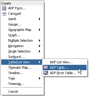
JDeveloper provides you with a predefined set of UI components from which to choose for each data control item you can drop.
Before you begin:
It may be helpful to have an understanding of the different objects in the Data Controls panel. For more information, see Using the Data Controls Panel.
You will need to complete these tasks:
-
Create an application module that contains instances of the view objects that you want in your data model, as described in Creating and Modifying an Application Module. Alternatively, if you are using another type of business service, create a data control for that business service as described in "Exposing Business Services with Data Controls" in Developing Applications with Oracle ADF Data Controls.
-
Create a JSF page as described in Creating a Web Page.
To use the Data Controls panel to create UI components:
18.4.2 What Happens When You Use the Data Controls Panel
When an Oracle ADF web application is built using the JSF framework, it requires a few additional application object definitions to render and process a page containing ADF databound UI components. If you do not use the Data Controls panel, you will have to manually configure these various files yourself. However, when you use the Data Controls panel, JDeveloper does all of the following required steps:
-
Creates a
DataBindings.cpxfile in the default package for the project (if one does not already exist), and adds an entry for the page.DataBindings.cpxfiles define the binding context for the application. The binding context is a container object that holds a list of available data controls and data binding objects. For more information, see What Happens at Runtime: How the Binding Context Works. EachDataBindings.cpxfile maps individual pages to the binding definitions in the page definition file and registers the data controls used by those pages. For more information, see Working with the DataBindings.cpx File . -
Creates the
adfm.xmlfile in the META-INF directory. This file creates a registry for theDataBindings.cpxfile, which allows the application to locate it at runtime so that the binding context can be created. -
Registers the ADF binding filter in the
web.xmlfile.The ADF binding filter preprocesses any HTTP requests that may require access to the binding context. For more information about the binding filter configuration, see Configuring the ADF Binding Filter.
-
Adds any necessary libraries to the view project, such as the following:
-
ADF Faces Databinding Runtime
-
Oracle XML Parser v2
-
JDeveloper Runtime
-
ADF Model Runtime
-
BC4J Runtime
-
Oracle JDBC
-
Connection Manager
-
BC4J Oracle Domains
-
-
Adds a page definition file (if one does not already exist for the page) to the page definition subpackage. The default subpackage is
view.pageDefsin theadfmsrcdirectory.Tip:
You can set the package configuration (such as name and location) in the ADF Model settings page of the Project Properties dialog (accessible by double-clicking the project node).
The page definition file (
pageNamePageDef.xml) defines the ADF binding container for each page in an application's view layer. The binding container provides runtime access to all the ADF binding objects for a page. In later chapters, you will see how the page definition files are used to define and edit the binding object definitions for specific UI components. For more information about the page definition file, see Working with Page Definition Files. -
Configures the page definition file, which includes adding definitions of the binding objects referenced by the page.
-
Adds ADF Faces components to the JSF page.
These prebuilt components include ADF data binding expression language (EL) expressions that reference the binding objects in the page definition file. For more information, see Creating ADF Data Binding EL Expressions.
-
Adds all the libraries, files, and configuration elements required by ADF Faces components. For more information, see the "ADF Faces Configuration" appendix in Developing Web User Interfaces with Oracle ADF Faces.
18.4.3 What Happens at Runtime: How the Binding Context Works
When a page contains ADF bindings, at runtime the interaction with the business services initiated from the client or controller is managed by the application through a single object known as the binding context. The binding context is a runtime map (named data and accessible through the EL expression #{data}) of all data controls and page definitions within the application.
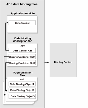
The ADF lifecycle creates the Oracle ADF binding context from the application module, DataBindings.cpx, and page definition files, as shown in Figure 18-14. The union of all the DataControls.dcx files and any application modules in the workspace define the available data controls at design time, but the DataBindings.cpx file defines what data controls are available to the application at runtime. A DataBindings.cpx file lists all the data controls that are being used by pages in the application and maps the binding containers, which contain the binding objects defined in the page definition files, to web page URLs. The page definition files define the binding objects used by the application pages. There is one page definition file for each page.
The binding context does not contain real live instances of these objects. Instead, it is a map that contains references that become data control or binding container objects on demand. When the object (such as a page definition) is released from the application (for example when a task flow ends or when the binding container or data control is released at the end of the request), data controls and binding containers turn back into reference objects. For information about the ADF lifecycle, see Understanding the Fusion Page Lifecycle .
Figure 18-14 ADF File Binding Runtime Usage
Description of "Figure 18-14 ADF File Binding Runtime Usage"
Note:
Application module data controls also take advantage of application module pooling. The application module data control is a thin adapter over an application module pool that automatically acquires an available application module instance at the beginning of the request. During the current request, the application module data control holds a reference to the application module instance on behalf of the current user session. At the end of the request, the data control releases the instance back to the pool. For more information, see What Happens at Runtime: How the Application Uses Application Module Pooling and State Management.
18.5 Working with the DataBindings.cpx File
The DataBindings.cpx files define the binding context for the entire application and provide the metadata from which the Oracle ADF binding objects are created at runtime. An application may have more than one DataBindings.cpx file if a component, for example a region, was created outside of the project and then imported. These files map individual pages to page definition files and declare which data controls are being used by the application. At runtime, only the data controls listed in the DataBindings.cpx files are available to the current application.
18.5.1 How JDeveloper Creates a DataBindings.cpx File
The first time you use the Data Controls panel to add a component to a page or an operation to an activity, JDeveloper automatically creates a DataBindings.cpx file in the default package of the view project. It resides in the adfmsrc directory for the project. Once the DataBindings.cpx file is created, JDeveloper adds an entry for the first page or task flow activity. Each subsequent time you use the Data Controls panel, JDeveloper adds an entry to the DataBindings.cpx for that page or activity, if one does not already exist.
Tip:
JDeveloper supports refactoring. That is, you can safely rename or move many of the objects referenced in the DataBindings.cpx file, and the references will be updated. For more information, see Refactoring a Fusion Web Application .
18.5.2 What Happens When JDeveloper Creates a DataBindings.cpx File
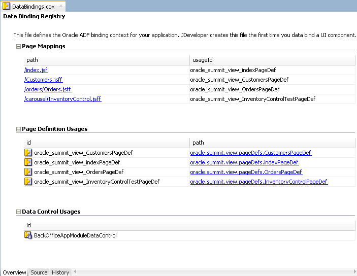
Once JDeveloper creates a DataBindings.cpx file, you can open it in the overview editor. Figure 18-15 shows the DataBindings.cpx file from the Summit ADF sample application, as viewed in the overview editor.
Figure 18-15 DataBindings.cpx File in the Overview Editor
Description of "Figure 18-15 DataBindings.cpx File in the Overview Editor"
The following example shows the contents of the .cpx file in the Summit ADF sample application.
<?xml version="1.0" encoding="UTF-8" ?>
<Application xmlns="http://xmlns.oracle.com/adfm/application"
             version="11.1.1.56.60" id="DataBindings" SeparateXMLFiles="false"
             Package="oracle.summit.view" ClientType="Generic">
  <definitionFactories>
    <factory nameSpace="http://xmlns.oracle.com/adf/controller/binding"
             className="oracle.adf.controller.internal.binding.
                        TaskFlowBindingDefFactoryImpl"/>
    <dtfactory className="oracle.adf.controller.internal.dtrt.binding.
                          BindingDTObjectFactory"/>
    <factory nameSpace="http://xmlns.oracle.com/adfm/dvt"
             className="oracle.adfinternal.view.faces.dvt.model.binding.
                        FacesBindingFactory"/>
  </definitionFactories>
  <pageMap>
    <page path="/index.jsf" usageId="oracle_summit_view_indexPageDef"/>
    <page path="/Customers.jsff" usageId="oracle_summit_view_CustomersPageDef"/>
    <page path="/orders/Orders.jsff"
          usageId="oracle_summit_view_OrdersPageDef"/>
    <page path="/carousel/InventoryControl.jsff" usageId="oracle_summit_view_
                                                    InventoryControlTestPageDef"/>
  </pageMap>
  <pageDefinitionUsages>
    <page id="oracle_summit_view_CustomersPageDef"
          path="oracle.summit.view.pageDefs.CustomersPageDef"/>
    <page id="oracle_summit_view_indexPageDef"
          path="oracle.summit.view.pageDefs.indexPageDef"/>
    <page id="oracle_summit_view_OrdersPageDef"
          path="oracle.summit.view.pageDefs.OrdersPageDef"/>
    <page id="oracle_summit_view_InventoryControlTestPageDef"
          path="oracle.summit.view.pageDefs.InventoryControlPageDef"/>
  </pageDefinitionUsages>
  <dataControlUsages>
    <BC4JDataControl id="BackOfficeAppModuleDataControl"
                     Package="oracle.summit.model.services"
                     FactoryClass="oracle.adf.model.bc4j.DataControlFactoryImpl"
                     SupportsTransactions="true" SupportsFindMode="true"
                     SupportsRangesize="true" SupportsResetState="true"
                     SupportsSortCollection="true"
                     Configuration="BackOfficeAppModuleLocal"
                     syncMode="Immediate"
                     xmlns="http://xmlns.oracle.com/adfm/datacontrol"/>
  </dataControlUsages>
</Application>
The Page Mappings section of the editor maps each JSF page or task flow activity to its corresponding page definition file using an ID. The Page Definition Usages section maps the page definition ID to the absolute path for page definition file in the application. The Data Control Usages section identifies the data controls being used by the binding objects defined in the page definition files. These mappings allow the binding container to be initialized when the page is invoked.
You can use the overview editor to change the ID name for page definition files or data controls by double-clicking the current ID name and editing inline. Doing so will update all references in the application. Note, however, that JDeveloper updates only the ID name and not the file name. Be sure that you do not change a data control name to a reserved word. For more information, see How to Edit an Existing Application Module.
You can also click an element in the Structure window and then use the Properties window to change property values. For more information about the elements and attributes in the DataBindings.cpx file, see DataBindings.cpx.
18.5.3 Configuring the ADF Binding Filter
The ADF binding filter is a servlet filter that is an instance of the oracle.adf.model.servlet.ADFBindingFilter class. ADF web applications use the ADF binding filter to preprocess any HTTP requests that may require access to the binding context. To do this, the ADF binding filter must be aware of all DataBindings.cpx files that exist for an application.
18.5.3.1 How JDeveloper Configures the ADF Binding Filter
The first time you add a databound component to a page using the Data Controls panel, JDeveloper automatically configures the filter for you in the application's web.xml file.
18.5.3.2 What Happens When JDeveloper Configures an ADF Binding Filter
To configure the binding filter, JDeveloper adds the following elements to the web.xml file:
-
An ADF binding filter class: Specifies the name of the binding filter object, which implements the
javax.servlet.Filterinterface.The ADF binding filter is defined in the
web.xmlfile, as shown in the following example. Thefilter-nameelement must contain the valueadfBindings, and thefilter-classelement must contain the fully qualified name of the binding filter class, which isoracle.adf.model.servlet.ADFBindingFilter.<filter> <filter-name>adfBindings</filter-name> <filter-class>oracle.adf.model.servlet.ADFBindingFilter</filter-class> </filter>
-
Filter mappings: Link filters to static resources or servlets in the web application.
At runtime, when a mapped resource is requested, a filter is invoked. Filter mappings are defined in the
web.xmlfile, as shown in the following example. Thefilter-nameelement must contain the valueadfBindings.<filter-mapping> <filter-name>adfBindings</filter-name> <servlet-name>Faces Servlet</servlet-name> <dispatcher>FORWARD</dispatcher> <dispatcher>REQUEST</dispatcher> </filter-mapping>
Tip:
If you have multiple filters defined in the
web.xmlfile, be sure to list them in the order in which you want them to run. At runtime, the filters are executed in the sequence in which they appear in theweb.xmlfile.The
adfBindingsfilter should appear after the Trinidad filter and before any filters that depend on the ADF context to be initialized.
18.5.3.3 What Happens at Runtime: How the ADF Binding Filter Works
At runtime, the ADF binding filter performs the following functions:
-
Overrides the character encoding when the filter is initialized with the name specified as a filter parameter in the
web.xmlfile. The parameter name of the filterinit-paramelement isencoding. -
Instantiates the
ADFContextobject, which is the execution context for a Fusion web application and contains context information about ADF, including the security context and the environment class that contains the request and response object. -
Initializes the binding context for a user's HTTP session. To do this, it first loads the bindings as defined in the
DataBindings.cpxfile in the current project'sadfmsrcdirectory. If the application containsDataBindings.cpxfiles that were imported from another project, those files are present in the application's class path. The filter additively loads any auxiliary.cpxfiles found in the class path of the application. -
Serializes incoming HTTP requests from the same browser (for example, from frame sets) to prevent multithreading problems.
-
Notifies data control instances that they are about to receive a request, allowing them to do any necessary per-request setup.
-
Notifies data control instances after the response has been sent to the client, allowing them to do any necessary per-request cleanup.
18.6 Working with Page Definition Files
Page definition files define the binding objects that populate the data in UI components at runtime. For every page that has ADF bindings, there must be a corresponding page definition file that defines the binding objects used by that page. Page definition files provide design time access to all the ADF bindings. At runtime, the binding objects defined by a page definition file are instantiated in a binding container, which is the runtime instance of the page definition file.
Note:
When multiple windows are open to the same page, ADF Controller assigns each window its own DataControlFrame. This ensures that each window has its own binding container.
18.6.1 How JDeveloper Creates a Page Definition File
The first time you use the Data Controls panel to add a component to a page, JDeveloper automatically creates a page definition file for that page and adds definitions for each binding object referenced by the component. For each subsequent databound component you add to the page, JDeveloper automatically adds the necessary binding object definitions to the page definition file.
By default, the page definition files are located in the view.PageDefs package in the Application Sources node of the view project. If the corresponding JSF page is saved to a directory other than the default (public_html), or to a subdirectory of the default, then the page definition will also be saved to a package of the same name. For example, if you save your JSF file to the public_html\myDirectory directory, the page definition will be saved to the myDirectory package. You can change the location of the page definition files using the ADF Model Settings page of the Project Properties dialog.
JDeveloper names the page definition files using the following convention:
pageNamePageDef.xml
where pageName is the name of the JSF page or fragment. For example, if the JSF page is named index.jsf, the default page definition file name is indexPageDef.xml. If you organize your pages into subdirectories, JDeveloper prefixes the directory name to the page definition file name using the following convention:
directoryName_pageNamePageDef.xml
Tip:
Page definitions for task flows follow the same naming convention.
To open a page definition file, you can right-click directly on the page or activity in the visual editor, and choose Go to Page Definition, or for a JSF page, you can click the Bindings tab of the editor and click the Page Definition File link.
Tip:
While JDeveloper automatically creates a page definition for a JSF page when you create components using the Data Controls panel, or for a task flow when you drop an item onto an activity, it does not delete the page definition when you delete the associated JSF page or task flow activity. (This is to allow bindings to remain when they are needed without a JSF page, for example when using ADF Desktop Integration features.) If you no longer want the page definition, you need to delete the page definition and all references to it manually. Note however, that as long as a corresponding page or activity is never called, the page definition will never be used to create a binding context. It is therefore not imperative to remove any unused page definition files from your application.
18.6.2 What Happens When JDeveloper Creates a Page Definition File
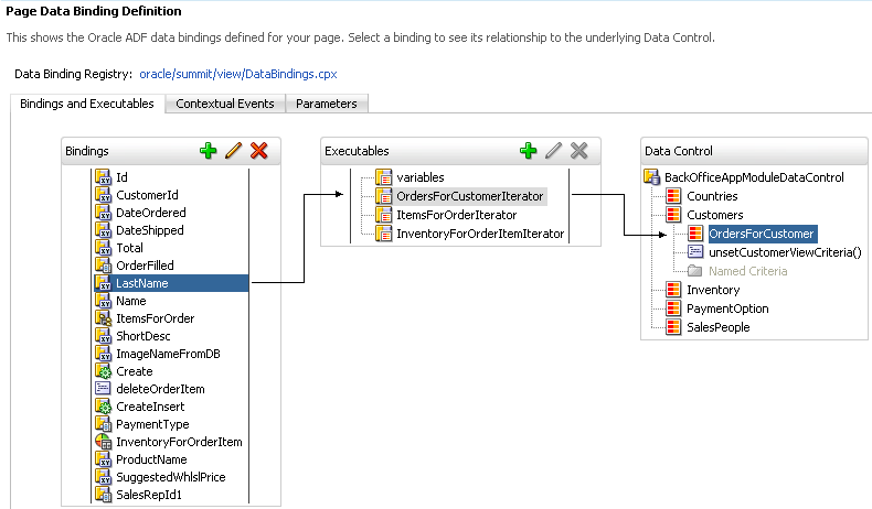
When JDeveloper creates a page definition file, it is displayed in the overview editor. Figure 18-16 shows the page definition file in the overview editor that was created for the Orders.jsff page fragment in the Summit ADF sample application.
Figure 18-16 Page Definition File in the Overview Editor
Description of "Figure 18-16 Page Definition File in the Overview Editor"
The overview editor contains the following tabs, which allow you to view and configure bindings, contextual events, and parameters for a page:
-
Bindings and Executables: The Bindings and Executables tab of the page definition overview editor shows three different types of objects: bindings, executables, and the associated data controls. (The data controls do not display unless you select a binding or executable.) For example, in Figure 18-16, you can see that the binding for the
LastNameattribute uses theOrdersForCustomerIteratoriterator to get its value. The iterator accesses theOrdersForCustomercollection on theBackOfficeAppModuleDataControldata control. See Executable Binding Objects Defined in the Page Definition File.By default, the model binding objects are named after the data control object that was used to create them. If a data control object is used more than once on a page, JDeveloper adds a number to the default binding object names to keep them unique. In Creating ADF Data Binding EL Expressions, you will see how the ADF data binding EL expressions reference the binding object names.
Table 18-2 shows the icons for each of the binding objects, as displayed in the overview editor (note that while parameter objects are shown in the Parameter section of the editor, they are also considered binding objects).
Table 18-2 Binding Object Icons
Binding Object Type Icon Description Parameter

Represents a parameter binding object.
Bindings

Represents an attribute value binding object.

Represents a list value binding object.

Represents a tree value binding object.

Represents a method action binding object
Bindings/ Executables

Represents an action binding object.
Executables

Represents an iterator binding object.

Represents a task flow executable binding object.

Represents a search region binding object, which is used when named criteria objects are added to a page.
-
Contextual Events: You can create contextual events that artifacts in an application can subscribe to. For example, you can use contextual events in a customer registration page to display the appropriate informational topic. One region in the page might contain a customer registration task flow, and the other an informational topic task flow. A contextual event can be passed from the customer registration region to the informational topic region so that the informational topic task flow can display the correct information topic. At design time, the event name, producer region, consumer region, consumer handler, and other information is stored in the event map section of the page definition file. See Using Contextual Events.
-
Parameters: Parameter binding objects declare the parameters that the page evaluates at the beginning of a request. For more information about the ADF lifecycle, see Understanding the Fusion Page Lifecycle . Such parameters can also be passed through task flows, as described in Using Parameters in Task Flows.
You can define the value of a parameter in the page definition file using static values, or EL expressions that assign a static value. The following example shows a parameter binding object that uses an EL expression to assign its value.
<parameters>
<parameter name="productId" value="${payLoad}"/>
</parameters>
Tip:
The EL expression for the parameter values uses the dollar sign ($) because these expressions need to be resolved eagerly, so that the result is returned immediately, as the page is rendered. Most EL expressions in a JSF application use the hash sign (#), which defers the expression evaluation so that the model is prepared before the values are accessed.
When you click an item in the overview editor (or the associated node in the Structure window), you can use the Properties window to view and edit the attribute values for the item, or you can edit the XML source directly by clicking the Source tab. The following example shows XML code excerpts for the page definition file shown in Figure 18-16.
<?xml version="1.0" encoding="UTF-8" ?>
<pageDefinition xmlns="http://xmlns.oracle.com/adfm/uimodel"
                version="11.1.1.59.23" id="OrdersPageDef"
                Package="oracle.summit.view.pageDefs">
  <parameters/>
  <executables>
    <variableIterator id="variables"/>
    <iterator Binds="OrdersForCustomer" RangeSize="25"
              DataControl="BackOfficeAppModuleDataControl"
              id="OrdersForCustomerIterator" ChangeEventPolicy="ppr"/>
    <iterator Binds="ItemsForOrder" RangeSize="25"
              DataControl="BackOfficeAppModuleDataControl"
              id="ItemsForOrderIterator" ChangeEventPolicy="ppr"/>
    <iterator Binds="InventoryForOrderItem" RangeSize="-1"
              DataControl="BackOfficeAppModuleDataControl"
              id="InventoryForOrderItemIterator" ChangeEventPolicy="ppr"/>
  </executables>
  <bindings>
    <attributeValues IterBinding="OrdersForCustomerIterator" id="Id">
      <AttrNames>
        <Item Value="Id"/>
      </AttrNames>
    </attributeValues>
.
.
.
    <list IterBinding="OrdersForCustomerIterator" StaticList="false"
          Uses="LOV_OrderFilled" id="OrderFilled" DTSupportsMRU="false"/>
    <attributeValues IterBinding="OrdersForCustomerIterator" id="LastName">
      <AttrNames>
        <Item Value="LastName"/>
      </AttrNames>
    </attributeValues>
    <attributeValues IterBinding="OrdersForCustomerIterator" id="Name">
      <AttrNames>
        <Item Value="Name"/>
      </AttrNames>
    </attributeValues>
    <tree IterBinding="ItemsForOrderIterator" id="ItemsForOrder">
      <nodeDefinition DefName="oracle.summit.model.views.ItemVO"
                      Name="ItemsForOrder0">
        <AttrNames>
          <Item Value="ProductId"/>
          <Item Value="Name"/>
          <Item Value="Price"/>
          <Item Value="Quantity"/>
          <Item Value="ItemTotal"/>
        </AttrNames>
      </nodeDefinition>
    </tree>
.
.
.
  </bindings>
</pageDefinition>
In later chapters, you will see how the page definition file is used to define and edit the bindings for specific UI components. For a description of all the possible elements and attributes in the page definition file, see pageNamePageDef.xml.
18.6.2.1 Control Binding Objects Defined in the Page Definition File
There are three types of binding objects used to bind UI components to objects on the data control:
-
Value: Displays data in UI components by referencing an iterator binding. Each discrete UI component on a page that will display data from the data control is bound to a value binding object. Types of value binding objects include:
-
Attribute Value: Binds text fields to a specific attribute in an object (also referred to as an attribute binding object.)
-
List: Binds the list items to all values of an attribute in a data collection.
-
Tree: Binds an entire table to a data collection and can also bind the root node of a tree to a data collection.
-
Button (boolean): Binds a checkbox to a boolean value for an attribute.
-
Graph: Binds a graph directly to the source data.
-
-
Method Action: Binds command components, such as buttons or links, to custom methods on the data control. A method action binding object encapsulates the details about how to invoke a method and what parameters (if any) the method expects.
-
Action: Binds command components, such as buttons or links, to built-in data control operations (such as, Commit or Rollback) or to built-in collection-level operations (such as, Create, Delete, Next, or Previous).
The following example shows an excerpt from a sample bindings element. Among other things, the element defines a tree binding for a table, several attribute bindings for text fields, an action binding for the CreateInsert built-in operation, and a list binding for a selectOneChoice component.
<bindings>
.
.
.
  <tree IterBinding="ItemsForOrderIterator" id="ItemsForOrder">
    <nodeDefinition DefName="oracle.summit.model.views.ItemVO"
                    Name="ItemsForOrder0">
      <AttrNames>
        <Item Value="ProductId"/>
        <Item Value="Name"/>
        <Item Value="Price"/>
        <Item Value="Quantity"/>
        <Item Value="ItemTotal"/>
      </AttrNames>
    </nodeDefinition>
  </tree>
  <attributeValues IterBinding="ItemsForOrderIterator" id="ShortDesc">
    <AttrNames>
      <Item Value="ShortDesc"/>
    </AttrNames>
  </attributeValues>
  <attributeValues IterBinding="ItemsForOrderIterator" id="ImageNameFromDB"
                   ChangeEventPolicy="ppr">
    <AttrNames>
      <Item Value="ImageNameFromDB"/>
    </AttrNames>
  </attributeValues>
.
.
.
  <action IterBinding="ItemsForOrderIterator" id="CreateInsert"
          RequiresUpdateModel="true" Action="createInsertRow"/>
  <list IterBinding="OrdersForCustomerIterator" StaticList="false"
        Uses="LOV_PaymentTypeId" id="PaymentType" DTSupportsMRU="true"/>
</bindings>
In the example, the tree element defines the bindings for the ItemsForOrder table. The AttrNames element is used to define the columns for which values will be displayed. The IterBinding attribute references the iterator binding that manages the data to be displayed in the table. For more information, see Executable Binding Objects Defined in the Page Definition File and Iterator and Value Bindings for Tables.
The attributeValues elements define the value bindings for text fields on the page. In the example, the ShortDesc attribute binding will display the value of ShortDesc, which is defined in the AttrNames element. The IterBinding attribute references the iterator binding that manages the data to be displayed in the text field. For more information, see What Happens When You Create a Text Field .
The binding object defined in the action element encapsulates the information needed to invoke the built-in CreateInsert operation on the ItemsForOrder collection. The value of true in the RequiresUpdateModel attribute specifies that the model layer needs to be updated before the operation is executed. For more information, see What Happens When You Create Command Components Using Operations.
If this operation also raised a contextual event, an event definition would also appear. If the page contained bindings that consumed an event, the event mapping would appear. For more information, see Using Contextual Events.
The PaymentType element defines the list binding used to display the list of payment type codes by using the LOV_PaymentTypeId LOV. For more information about creating lists using LOVs on view objects, see Creating Databound Selection Lists and Shuttles .
18.6.2.2 Executable Binding Objects Defined in the Page Definition File
There are the following types of executable binding objects:
-
Iterator: Binds to an iterator that iterates over view object collections. There is one iterator binding for each collection used on the page. All of the value bindings on the page must refer to an iterator binding in order for the component values to be populated with data at runtime.
When you drop a collection or an attribute of a collection on the page, an iterator binding is automatically added as an executable. Iterator binding objects bind to an underlying ADF
RowSetIteratorobject, which manages the current object and current range information. The iterator binding exposes the current object and range state to the other binding objects used by the page.By default, iterator bindings are configured so that any submitted data changes are cached until the data is committed back to the data source. When a data change is submitted, any components on the page whose bindings are associated with the iterator are refreshed to show the changed data. For more information, see What You May Need to Know About Partial Page Rendering and Iterator Bindings.
The iterator range represents the current set of objects to be displayed on the page. The maximum number of objects in the current range is defined in the
rangeSizeattribute of the iterator. For example, if a collection in the data control contains products and the iterator range size is 25, the first 25 products in the collection are displayed on the page. If the user scrolls down, the next set of 25 is displayed, and so on. If the user scrolls up, the previous set of 25 is displayed. If your view object uses range paging, then you can configure the iterator binding to return a set of ranges at one time. For more information, see Using Range Paging to Efficiently Scroll Through Large Result Sets.Note:
If you have two pages each with an iterator binding bound to the iterator on the same view object (which you will if you drop the same collection, for example, on two different pages), then you should ensure that the
rangeSizeattribute is the same for both pages' iterator bindings. If not, the page with a smaller range size may cause the iterator to reexecute, causing unexpected results on the other page. -
Method Iterator: Binds to an iterator that iterates over the collections returned by custom methods in the data control.
A method iterator binding is always related to a method action binding object. The method action binding encapsulates the details about how to invoke the method and what parameters (if any) the method is expecting. The method action binding is itself bound to the method iterator, which provides the data.
You will see method iterator executable binding objects only if you drop a method return collection or an attribute of a method return collection from a custom method on the data control. If you are using only application module data controls, you will see only iterator binding objects.
-
Variable Iterator: Binds to an iterator that exposes all the variables in the binding container to the other bindings. While there is an iterator binding for each collection, there is only one variable iterator binding for all variables used on the page. (The variable iterator is like an iterator pointing to a collection that contains only one data object whose attributes are the binding container variables.)
Page variables are local to the binding container and exist only while the binding container object exists. When you use a data control method (or an operation) that requires a parameter that is to be collected from the page, JDeveloper automatically defines a variable for the parameter in the page definition file. Attribute bindings can reference the page variables.
A variable iterator can contain one of two types of variables:
variableandvariableUsage. Avariabletype variable is a simple value holder, while avariableUsagetype variable is a value holder that is related to a view object's named bind parameter. Defining a variable as avariableUsagetype allows it to inherit the default value and UI control hints from the view object named bind variable to which it is bound. -
Page: Binds to the template's page definition file (if a template is used). For more information about how this works with templates, see Using Page Templates.
Note:
You can also use the
pageelement to bind to another page definition file. However, at runtime, only the current incoming page's (or if the rendered page is different from the incoming, the rendered page's) binding container is automatically prepared by the framework during the current request. Therefore, to successfully access a bound value in another page from the current page, you must programmatically prepare that page's binding container in the current request (for example, using a backing bean). Otherwise, the bound values in that page may not be available or valid in the current request. -
Search Region: Binds named criteria to the iterator, so that the search can be executed.
-
Task Flow: Instantiates the binding container for a region's task flow.
-
Multi Task Flow: Instantiates the binding container for a region's task flow from an array of task flows. This is useful when you have a page that contains an unknown number of regions, such as a
panelTabbedcomponent where each tab is a region, and users can add and delete tabs at runtime. For more information, see Configuring a Page To Render an Unknown Number of Regions.
At runtime, executable bindings are refreshed based on the value of their Refresh attribute. Refreshing an iterator binding reconnects it with its underlying RowSetIterator object. Before refreshing any bindings, the ADF runtime evaluates any Refresh and RefreshCondition attributes specified in the executables. The Refresh attribute specifies the ADF lifecycle phase within which the executable should be invoked. The RefreshCondition attribute specifies the conditions under which the executable should be invoked. You can specify the RefreshCondition value using a boolean EL expression. If you leave the RefreshCondition attribute blank, it evaluates to true.
By default, the Refresh value is set to deferred. This means the binding will not be executed unless its value is accessed (for example by an EL expression on a JSF page). Once called, it will not reexecute unless any parameter values for the binding have changed, or if the binding itself has changed.
For more information about how bindings are refreshed and how to set the Refresh and RefreshCondition attributes, see About the JSF and ADF Page Lifecycles.
The following example illustrates executable binding objects from the Summit ADF sample application.
<executables>
  <variableIterator id="variables"/>
  <iterator Binds="OrdersForCustomer" RangeSize="25"
            DataControl="BackOfficeAppModuleDataControl"
            id="OrdersForCustomerIterator" ChangeEventPolicy="ppr"/>
  <iterator Binds="ItemsForOrder" RangeSize="25"
            DataControl="BackOfficeAppModuleDataControl"
            id="ItemsForOrderIterator" ChangeEventPolicy="ppr"/>
  <iterator Binds="InventoryForOrderItem" RangeSize="-1"
            DataControl="BackOfficeAppModuleDataControl"
            id="InventoryForOrderItemIterator" ChangeEventPolicy="ppr"/>
</executables>
In the example, the iterator binding named OrdersForCustomerIterator was created by dropping the OrdersForCustomer collection on the page as an ADF form. The iterator binding named ItemsForOrderIterator was created by dropping the ItemsForOrder collection as a table. The InventoryForOrderItemIterator iterator binding was created by dropping the InventoryForOrderItem collection as a graph.
The OrdersForCustomer collection has a master-detail relationship with the ItemsForOrder collection, so the two iterators are automatically synchronized. For more information, see What Happens at Runtime: ADF Iterator for Master-Detail Tables and Forms.
The Binds attribute of the iterator element defines the collection the iterator will iterate over. The RangeSize attribute defines the number of objects the iterator is to display on the page at one time. A RangeSize value of -1 causes the iterator to display all the objects from the collection.
Tip:
Normally, an iterator binding's default range size is 25. However, when an iterator binding is created from the Edit List Binding dialog, the range size defaults to -1 so that all choices display in the list, not just the first 25.
Performance Tip:
When you want to reduce the number of roundtrips the iterator requires to fetch the data objects from the view object in the ADF Business Components layer, you can set the rangeSize attribute to -1, and the objects will be fetched in a single round trip to the server, rather than in multiple trips as the user navigates through the objects.
18.7 Creating ADF Data Binding EL Expressions
To display data from the data model, web page UI components are bound to binding objects using JSF Expression Language (EL) expressions. These EL expressions reference a specific binding object in a binding container. At runtime, the JSF runtime evaluates an EL expression and pulls the value from the binding object to populate the component with data when the page is displayed. If the user updates data in the UI component, the JSF runtime pushes the value back into the corresponding binding object based on the same EL expression.
Tip:
There may be cases when you need to use EL expressions within managed beans. For information on working with EL expressions within managed beans, see the "Creating EL Expressions" section in Developing Web User Interfaces with Oracle ADF Faces.
18.7.1 How to Create an ADF Data Binding EL Expression
When you use the Data Controls panel to create a component, the ADF data binding expressions are created for you. The expressions are added to every component attribute that will either display data from or reference properties of a binding object. Each prebuilt expression references the appropriate binding objects defined in the page definition file. You can edit these binding expressions or create your own, as long as you adhere to the basic ADF binding expression syntax. ADF data binding expressions can be added to any component attribute that you want to populate with data from a binding object.
In JSF pages, a typical ADF data binding EL expression uses the following syntax to reference any of the different types of binding objects in the binding container:
#{bindings.BindingObject.propertyName}
where:
-
bindingsis a variable that identifies that the binding object being referenced by the expression is located in the binding container of the current page. All ADF data binding EL expressions must start with thebindingsvariable. -
BindingObjectis the ID, or for attributes the name, of the binding object as it is defined in the page definition file. The bindingobjectIDor name is unique to that page definition file. An EL expression can reference any binding object in the page definition file, including parameters, executables, or value bindings. -
propertyNameis a variable that determines the default display characteristics of each databound UI component and sets properties for the binding object at runtime. There are different binding properties for each type of binding object. For more information about binding properties, see What You May Need to Know About ADF Binding Properties.
For example, in the following expression that might appear on a JSF page:
#{bindings.ProductName.inputValue}
the bindings variable references a bound value in the current page's binding container. The binding object being referenced is ProductName, which is an attribute binding object. The binding property is inputValue, which returns the value of the first ProductName attribute.
Tip:
While the binding expressions in the page definition file can use either a dollar sign ($) or hash sign (#) prefix, the EL expressions in JSF pages can only use the hash sign (#) prefix.
As stated previously, when you use the Data Controls panel to create UI components, these expressions are built for you. However, you can also manually create them if you need to. The JDeveloper Expression Builder is a dialog that helps you build EL expressions by providing lists of binding objects defined in the page definition files, as well as other valid objects to which a UI component may be bound. It is particularly useful when creating or editing ADF databound expressions because it provides a hierarchical list of ADF binding objects and their most commonly used properties. For information about binding properties, see What You May Need to Know About ADF Binding Properties.
18.7.1.1 Opening the Expression Builder from the Properties Window
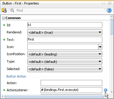
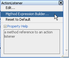
You can select an item in the visual editor, and then create EL expressions for specific attributes using the Properties window.
To open the Expression Builder from the Properties window:
18.7.1.2 Using the Expression Builder
Once the Expression Builder is open, you can use it to create EL expressions.
Before you begin:
It may be helpful to have an understanding of how to create EL expressions when using the ADF Model layer. SeeCreating ADF Data Binding EL Expressions.
To use the Expression Builder:
Table 18-3 Icons Under the ADF Bindings Node of the Expression Builder
| Icon | Description |
|---|---|
|
|
Represents the |
|
|
Represents the |
|
|
Represents an action binding object. Opening a node that uses this icon exposes a list of valid action binding properties. |
|
|
Represents an iterator binding object. Opening a node that uses this icon exposes a list of valid iterator binding properties. |
|
|
Represents an attribute binding object. Opening a node that uses this icon exposes a list of valid attribute binding properties. |
|
|
Represents a list binding object. Opening a node that uses this icon exposes a list of valid list binding properties. |
|
|
Represents a table or tree binding object. Opening a node that uses this icon exposes a list of valid table and tree binding properties. |
|
|
Represents an ADF binding object property. For more information about ADF properties, see What You May Need to Know About ADF Binding Properties. |
|
|
Represents a parameter binding object. |
|
|
Represents a bean class. |
|
|
Represents a method. |
18.7.2 What You May Need to Know About ADF Binding Properties
When you create a databound component using the Expression Builder, the EL expression might reference specific ADF binding properties. At runtime, these binding properties can define such things as the default display characteristics of a databound UI component or specific parameters for iterator bindings. The ADF binding properties are defined by Oracle APIs. For a full list of the available properties for each binding type, see Oracle ADF Binding Properties.
Values assigned to certain properties are defined in the page definition file. For example, iterator bindings have a property called RangeSize, which specifies the number of rows the iterator should display at one time. The value assigned to RangeSize is specified in the page definition file, as shown in the following example.
<iterator Binds="ItemsForOrder" RangeSize="25"
              DataControl="BackOfficeAppModuleDataControl"
              id="ItemsForOrderIterator" ChangeEventPolicy="ppr"/>
18.8 Using Simple UI First Development
While the Data Controls panel enables you to design and create bound components in a single drag-and-drop action, in some cases, it may be preferable to create the basic UI components first and add the bindings later. For example, if your page will use declarative components, you will first need to drop the declarative component, and then bind it to the correct ADF control. Declarative components are reusable, composite UI components that are made up of other ADF Faces components. Once imported into a project, declarative components can be dropped onto a page from the Components window, similar to standard ADF Faces components. While the entire declarative component cannot use ADF data binding, you can use ADF data binding on the individual components that make up the declarative component, once the declarative component is dropped on the page. For more information about declarative components, see the "Using Declarative Components" section of Developing Web User Interfaces with Oracle ADF Faces.
Note:
If you know the UI components on your page will eventually use ADF data binding, but you need to develop the pages before the data controls are ready, then you should consider using placeholder data controls, rather than manually binding the components. Using placeholder data controls will provide the same declarative development experience as using developed data controls. For more information, see Designing a Page Using Placeholder Data Controls .
When designing web pages, keep in mind that ADF bindings can be added only to certain ADF Faces tags or their equivalent JSF HTML tags. Table 18-4 lists the ADF Faces and JSF tags to which you can later add ADF bindings.
Tip:
To enable the use of JSF Reference Implementation UI component tags with ADF bindings, you must choose the Include JSF HTML Widgets for JSF Databinding option in the ADF View Settings of the project properties. However, using ADF Faces tags, especially with ADF bindings, provides greater functionality than does using the reference implementation JSF tags.
Table 18-4 Tags That Can Be Used for ADF Bindings
| ADF Faces Tags Used in ADF Bindings | Equivalent JSF HTML Tags |
|---|---|
|
Text Fields |
|
|
|
|
|
|
|
|
|
|
|
|
n/a |
|
Tables |
|
|
|
|
|
Actions |
|
|
|
|
|
|
|
|
|
n/a |
|
Selection Lists |
|
|
|
n/a |
|
|
|
|
|
|
|
|
|
|
|
h:selectBooleanCheckbox |
|
Queries |
|
|
|
n/a |
|
|
n/a |
|
Trees |
|
|
|
n/a |
|
|
n/a |
Before adding binding to the UI components, ensure that you follow these guidelines:
-
When creating the JSF page using the Create JSF JSP wizard, choose the Do not Automatically Expose UI Components in a Managed Bean option on the Managed Bean tab.
This option turns off JDeveloper's auto-binding feature, which automatically associates every UI component in the page to a corresponding property in the backing bean for eventual programmatic manipulation. If you use the auto-binding feature, you will have to remove the managed bean bindings later, after you have added the ADF bindings. The managed bean UI component property bindings do not affect the ADF bindings, but their presence may be confusing in the JSF code. For information about managed beans, see Using a Managed Bean in a Fusion Web Application.
-
Add the ADF Faces tag libraries.
While you can add ADF bindings to JSF components, the ADF Faces components provide greater functionality, especially when combined with ADF bindings.
18.8.1 How to Apply ADF Model Data Binding to Existing UI Components
You apply ADF model binding to components using the Structure window.
Before you begin:
It may be helpful to have an understanding of UI first development. For more information, see Using Simple UI First Development.
You will need to complete these tasks:
-
Create an application module that contains instances of the view objects that you want in your data model, as described in Creating and Modifying an Application Module. Alternatively, if you are using another type of business service, create a data control for that business service as described in "Exposing Business Services with Data Controls" in Developing Applications with Oracle ADF Data Controls.
-
Create a JSF page as described in Creating a Web Page, and add any components to the page.
To apply ADF Model data binding:
18.8.2 What Happens When You Apply ADF Model Data Binding to UI Components
When you use the Data Controls panel all of the required ADF objects are automatically created for you, as described in What Happens When You Use the Data Controls Panel.
