10g (9.0.4)
Part Number B10268-01
Contents |
Home | Solution Area | Index |
| Oracle Application Server Discoverer Plus User's Guide 10g (9.0.4) Part Number B10268-01 |
|
This chapter explains how to create graphs in Discoverer to answer typical business questions, and contains the following topics:
A Discoverer graph is a pictorial representation of worksheet data. For example, you might create a graph to enable you to easily analyze trends in your data.
Discoverer provides a wide range of graphs to help you analyze data visually (e.g. area, bar, line, and scatter graph). For a complete list of graph types available in Discoverer, see "About graph types available in Discoverer".
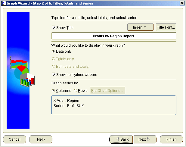
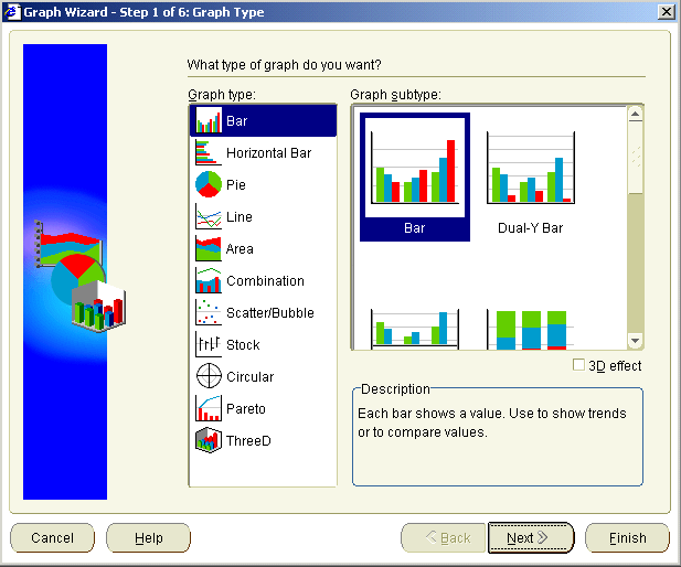
Discoverer provides the Graph Wizard to help you create and edit graphs (see figure below).

The Graph Wizard helps you:
If you change the data displayed in a worksheet, the graph automatically updates to show the new data.
Once you have created a graph, you can also edit areas of a graph using the Graph toolbar and drop down menus (for more information, see "How to edit a graph").
In Discoverer, you create a graph for the items currently displayed on a worksheet. Before you create a graph, make sure that you display the numeric worksheet values that you want to plot on the graph.
Each Discoverer worksheet can have one graph. If you already have a graph in a worksheet and want to create a completely new graph, delete the existing graph (see "How to delete a graph"), then create a new graph (see "How to create a graph").
Alternatively, you can also existing edit graphs (see "How to edit a graph").
When you save a workbook, Discoverer saves graphs automatically for you as part of the worksheets in the workbook. In other words, you do not have to explicitly save graphs. Any changes you make to the graph are also saved automatically when you save the workbook.
Each page of the Graph Wizard enables you to change the default font options for various graph components. For example, the X-axis title, the X-axis label, and the legend font. You use the "Graph Wizard dialog: Font dialog tab" to set the font style.
The figure below shows how the Title Font button on the "Graph Wizard dialog: Titles, Totals, and Series tab" is used to display the "Graph Wizard dialog: Font dialog tab".
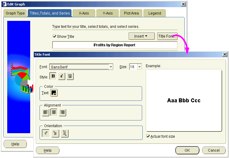
The "Graph Wizard dialog: Font dialog tab" enables you to change the default font styles (e.g. font, font size, font color).
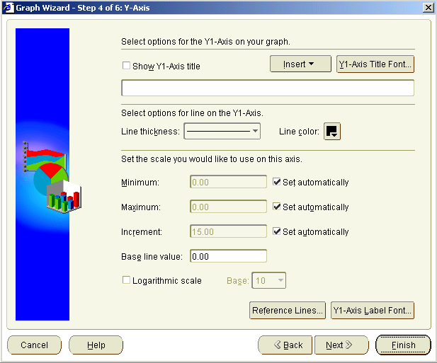
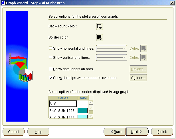
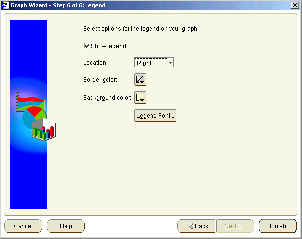
Discoverer gives you great flexibility when producing graphs, enabling you to configure every component of a graph. The figure below shows the typical components of a Discoverer graph.
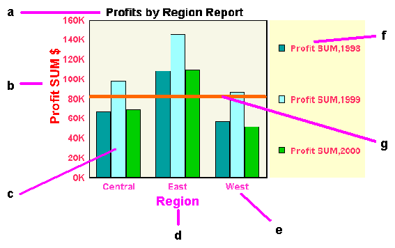
Key to figure:
To present your worksheet data visually in Discoverer, you can choose from a wide range of graph types. For example:
Each graph type has one or more variations, or sub-types. For example, the sub-types for the Bar graph type include the following:
Most graph sub-types have a three-dimensional effect that you can switch on and off as required (using the 3D-Effect check box).
Note: 3D-Effect should not be confused with three-dimensional graphs, such as 3D-Cube and Surface, which are used to represent multi-dimensional data.
Some graphs also have dual-Y sub-types, which have two Y-axes. Dual-Y graphs are useful for showing the following types of data:
The table below shows the graph types that are available in Discoverer.
| Graph icon | Graph name and description |
|---|---|
|
Area graph - shows trends or changes in data using filled-in areas. |
|
|
Bar graph - compares values using vertical bars. Each value is represented by a single bar. Bar graphs shows variation over a period of time or illustrates comparisons between values. The stacked sub-type shows each value's relationship to a whole. Bar graphs can have two Y axes (for more information, see "Notes about creating dual-Y charts"). |
|
|
Circular graph - shows directional data and cyclical patterns in data. |
|
|
Combination graph - combines bars, lines, and areas. |
|
|
Horizontal Bar graph - compares values using horizontal bars. This graph type is identical to a bar graph except that the bars lie horizontally, rather than standing vertically. The stacked sub-type shows each value's relationship to a whole. Bar graphs can have two Y axes (for more information, see "Notes about creating dual-Y charts"). |
|
|
Line graph - shows trends or changes in data at even intervals. Data is represented as a line that connects a series of data points. |
|
|
Pareto graph - shows trends across groups periodically and cumulatively. Each group is displayed as a column. A plotted line also shows the cumulative value across groups. |
|
|
Pie graph - shows data as sections of a circle, similar to slices of a pie. A pie graph shows the proportion of parts to the whole. It is useful for emphasizing a significant element, such as the highest value. Note that a pie graph displays only one row or one column of data at a time (for more information, see "Notes about creating pie graphs"). |
|
|
Scatter graph - displays data as points scattered over the plot area. Each point is a value whose coordinates are specified by two numeric measures. A scatter graph is useful for showing relationships between two measures, for example Sales and Cost. All points are the same size, regardless of their value. Bubble graph - shows data in a similar way to a scatter graph, but with an extra dimension that uses the size of the bubbles. Each bubble is a value whose coordinates are specified by three numeric measures. A bubble graph is useful for comparing data that has three measures (for more information, see "Notes about creating bubble graphs"). |
|
|
Stock graph - shows highest stock price, lowest stock price, and closing stock price as bands on a time axis. Stock graphs are useful for comparing the prices of different stocks or the stock price of an individual stock over time (for more information, see "Notes about creating high-low-close stock graphs"). |
|
|
ThreeD graph - shows three-dimensional (ThreeD) data in a true three-dimensional graph, where you have an X axis, a Y axis, and a Z axis. 3D graphs have a floor, a wall, and a background. There are four 3D graph sub-types: 3D Bar, 3D Cube, 3D Area, and 3D Surface. 3D graphs are useful for showing trends or to compare values along two dimensions. Note: This graph type is not the same as a two dimensional graph with the 3D Effect turned on. The 3D Effect simply adds depth to any graph type. |
To create meaningful graphs in Discoverer, you need to have the correct worksheet configuration for the style of graph that you want to use.
When you create bubble graphs, follow these guidelines:
The figure below shows an example Discoverer worksheet and the worksheet data plotted on a bubble graph.
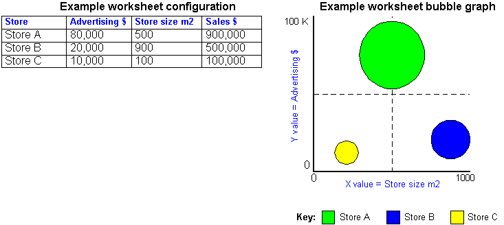
For example, you might have the following items on a bubble graph (see figure above):
You could then see whether the largest stores with the most advertising generated the highest sales revenue.
The figure above shows how worksheet data is represented on a bubble graph. The bubbles represent Sales. A large bubble represents large sales revenue. A small bubble represents small sales revenue.
When you create high-low-close stock graphs (sometimes known as stock charts), follow these guidelines:
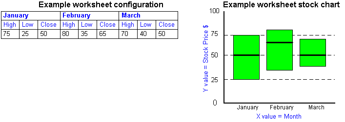
For example, the figure above shows a worksheet configuration for charting a stock price over time (January, February and March). The worksheet data is arranged 'Series by row'.
When you create dual-Y graphs, follow these guidelines:
The figure below shows an example dual-Y bar graph with a Y axis for sales and a second Y axis for costs.
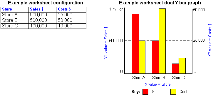
In the figure above, the Y1 axis represents sales on the scale 0 to 1 million. The Y2 axis represents costs on the scale 0 to 50,000. You can therefore analyze sales and costs side by side even though they use different scales.
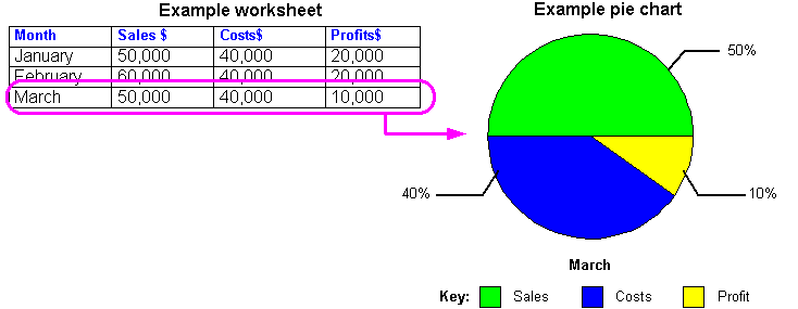
When you create a Pie graph (sometimes called a Pie chart), you choose which row or column you want to represent. The figure below shows how a row of data is represented on a pie graph.
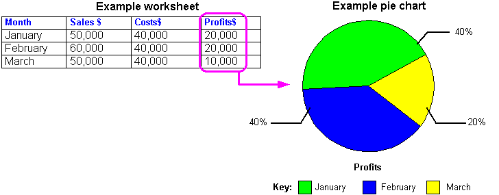
The figure below shows how a column of data is represented on a pie graph.
You create a new graph for a worksheet when you want to display data and trends visually. Discoverer provides the Graph Wizard to help you create a graph of your worksheet data. If at any time you want to use default settings for the remaining steps in the Graph Wizard, simply click the Finish button.
Hint: Before you start, make sure that the worksheet displays the data that you want to plot on the graph.
To create a graph:
Text description of the illustration graph_1.gif
Note: If the Graph | New Graph option is not available, the worksheet already has a graph (which might be hidden). If you want to create a new graph, do one of the following:
For more information about choosing a graph type, see "About graph types available in Discoverer".
If you are creating a pie graph, the Pie Chart Options button is active.
Note: When you click Next, you go straight to the "Graph Wizard dialog: Plot Area tab". This is because you do not define X or Y axes for pie graphs.
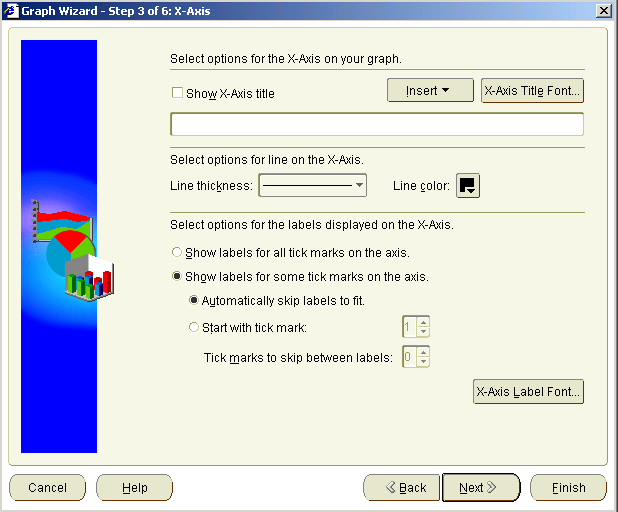
Text description of the illustration grphxaxs.gif
For more information about creating dual-Y graphs, see "Notes about creating dual-Y charts".
Discoverer displays the graph on the worksheet.
You edit a graph to change how it is displayed on a worksheet. For example, you might want to change the graph type, change the axis labels, or change the color of plotted items.
Note: If you want to change which items are displayed on a graph, you need to change which items are displayed on the worksheet. To do this, click Sheet | Edit Sheet to display the "Edit Worksheet dialog", then display the "Edit Worksheet dialog: Select Items tab".
To edit a graph:
Hint: To automatically arrange the graph components, right-click to display graph menu options, then choose Auto Layout.
Discoverer updates the graph as specified.
You change a graph's position on screen when you want to change where it is displayed in relation to the worksheet data. For example, you might want to display a graph below worksheet data, or display a graph in a separate window.
To position a graph:
Note: If you close the separate window, choose Graph | Display Graph and choose a display option to re-display the graph.
Discoverer displays the graph in the position that you specified.
You delete a graph when you no longer want to use it, and will not require the graph later. For example, you might want to delete a temporary graph that you created to produce a printed report.
To delete a graph:
A warning message appears.
The graph is removed from the worksheet.
|
|
 Copyright © 1999, 2003 Oracle Corporation. All Rights Reserved. |
|