| Bookshelf Home | Contents | Index | PDF | |
|
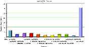
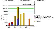
Configuring Siebel eBusiness Applications > Configuring Special Purpose Applets > About Chart AppletsA chart applet graphically displays data from a business component in various formats for analysis of trends, category comparison, and other data relationships. Any data in a business component can be included in a chart. The data in a chart applet reflects the current query for the business component. The user can update the chart with changes to the query by clicking inside the chart. Figure 96 shows a chart applet in a view. This view, titled Opportunity Size Analysis (Oppty Chart View - Opportunity Size Analysis in Siebel Tools), lists opportunities in the upper (list) applet and aggregates them by size in the lower (chart) applet. By default, the chart applet in this view (Oppty Chart Applet - Competitor Frequency Analysis) displays the data in bar chart format, in a specific type of bar chart called 3dBar. The user can select different chart types from the Type picklist at upper right in the chart applet. Chart types are discussed in About Types of Charts. NOTE: To change the size of the legend for a chart applet, right-click on the legend and select one of the options. Axis TerminologySpecialized terminology is used for axes in Siebel Tools and Siebel applications. Each axis has a special name, as shown in Table 57. An example of a chart with all three axes is the Project Revenue Analysis chart shown in Figure 97. In this chart, the amount of revenue is plotted on the Y (data values) axis, quarters appear on the X (category) axis, and each bar color (Z, or series, axis) identifies a a different project. NOTE: In charts with two Y axes, the first Y axis refers to the vertical axis on the left side, while the second Y axis refers to the one on the right side. |
 |
|
| Configuring Siebel eBusiness Applications |