|
Configuring Siebel eBusiness Applications > Configuring Special Purpose Applets > About Types of Charts >
Bar Charts
Bar charts are typically used to compare the absolute difference in data from one category to another.
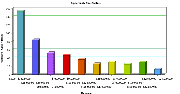
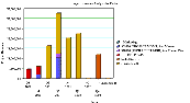
- 3dBar. The 3dBar type divides data from the source records into categories, and displays the total for each category as a vertical bar. This is shown in Figure 98.
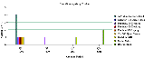
If the chart is configured with a Z (series) axis, a cluster of bars appears for categories rather than a single bar. This is shown in Figure 99.
Figure 99. 3dBar Chart with Series Axis
|
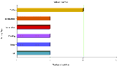
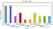
- 3dHorizBar. A 3dHorizBar chart is functionally equivalent to a 3dBar chart, but has the X and Y axes switched, with the result that the bars are horizontal. A 3dHorizBar chart appears in Figure 100.
Figure 100. 3dHorizBar Chart
|
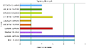
The individual horizontal bars are replaced by clusters of horizontal bars if a series axis is present, as shown in Figure 101.
Figure 101. 3dHorizBar Chart with Series Axis
|
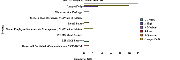
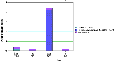
- 3dStackedBar. A 3dStackedBar chart normally has a series axis. The chart displays a single stack of bars for each category, within which appears a bar of a different color for each series. Stacked bar charts are useful for seeing the individual value for each series within the category as well as their total for the category. An example of a 3dStackedBar chart appears in Figure 102.
Figure 102. 3dStackedBar Chart
|
This figure displays a Project Revenue Analysis chart. The data values axis corresponds to project revenue, the category axis corresponds to a quarter, and the series axis corresponds to the project name. So for each quarter along the X axis, there is a stack of bars. Each bar in the stack indicates the revenue reached in a particular quarter. The stacks within each bar indicate the individual projects.
- 2dBar. A 2dBar chart is functionally equivalent to a 3dBar chart, but is displayed without the illusion of depth. Two-dimensional charts are generally easier to read accurately, but may seem less visually attractive than their three-dimensional counterparts. A 2dBar chart appears in Figure 103.
Like the 3dBar chart, a 2dBar chart displays bars in clusters if a series axis is present.
- 2dHorizBar. The 2dHorizBar chart type is functionally equivalent to the 3dHorizBar type, but is displayed without the illusion of depth. A sample 2dHorizBar chart appears in Figure 104.
Figure 104. 2dHorizBar Chart
|
- 2dStackedBar. The 2dStackedBar chart type is functionally equivalent to the 3dStackedBar type, but is displayed without the illusion of depth. A sample 2dStackedBar chart appears in Figure 105.
Figure 105. 2dStackedBar Chart
|
|