|
Configuring Siebel eBusiness Applications > Configuring Special Purpose Applets > About Types of Charts >
Pie Charts
Pie Charts are used to compare the relative difference across categories by dividing a circle into segments that represent each category's percentage of the whole.
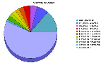
- 3dPie. The 3dPie chart type aggregates data point data in the records by category, and displays each category as a separate segment in the pie. The category (X) axis is the set of pie slices and corresponding labels. The data points (Y) axis determines the relative size of each pie slice as a percentage of the total. You cannot specify a series axis for pie charts. The 3dPie chart type gives the illusion of depth, for visual attractiveness. A sample 3dPie chart appears in Figure 111.
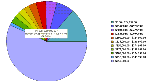
- 2dPie. The 2dPie chart type is functionally the same as the 3dPie type, but without the illusion of depth. A sample 2dPie chart appears in Figure 112.
|