| Bookshelf Home | Contents | Index | PDF | |
|
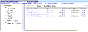
Configuring Siebel eBusiness Applications > Overview of Web Templates and Siebel Tags > About Siebel Templates > About Tree Applets TemplatesThe explorer-style (or tree) applet presents hierarchically structured information in an expandable tree control. The tree control is displayed in a frame on the left side of the applet content area. Detailed information for a selected tree node is displayed in the details applet in a frame to the right. The separate vertical frames allow the contents of the tree applet to be scrolled independently from the details applet. This is important because trees' structures can typically grow very large in length and width. A tree applet in an explorer view is similar in operation to the Object Explorer and Object List Editor in Siebel Tools. The user may expand and collapse folders in the tree applet, and view the records in that folder in the list applet. The hierarchy displayed in the tree applet represents master-detail relationships between records of different business components. A tree applet in an explorer view uses the set of master-detail relationships implemented in the business object assigned to the view. The Opportunities Explorer View is illustrated in Figure 128. For example, when the user expands an opportunity by double-clicking, a set of folders appears hierarchically beneath it including Opportunities, Contacts, Partners, Quotes, Activities, Notes, and so on. When the user expands one of these child folders, a list of records appears of the corresponding business component. If the user expands the opportunity and then expands the Activities folder beneath it, the list of records displayed is the set of activity records for that opportunity. In the master-detail relationship between opportunities and activities, these activity records are detail records of the master opportunity record that was expanded. The user can also add or associate detail records of various kinds to particular master records. This section describes the configuration of the templates for the explorer applet. Here is a sample view template for a view containing an explorer applet: <!--View with tree applet on the left and list applet on the right--> <table border="0" cellspacing="0" cellpadding="1" width="100%"> <swe:applet id="1" hintText="Tree Applet"/> The Here is a sample applet template for an explorer applet. It displays the tree in a single-column table: <TABLE BORDER=0 CELLPADDING=0 CELLSPACING=0> <swe:this property="FormattedHtml"/> <swe:this property="FormattedHtml"/> A tree control can have repository tree nodes and field values as elements in the tree. The term tree item is used for a tree element regardless of whether it is a "root," "branch," or a "leaf" in the tree. A repository tree node is called a tree node. The In order to display a tree, the logic iterates over each item of the tree in a top-down, depth-first fashion, and displays one item at a time. This is specified in the template using the Each tree item is indented to place the text in the correct indent level relative to the root using the Details about the various tags used in Tree Applet Templates are described below:
Configuration File ParametersA tree control consists of reusable graphic elements and text obtained from a business component record, as shown in Figure 128. The text is obtained from business components, as defined in the Tree and Tree Node object types in the repository. The graphic elements (expansion and contraction boxes, elbows, folder symbols and so on) are defined in the configuration file in the [SWE] section. Configuration file parameters are specified to customize the appearance of the folder and document symbols, expand and collapse marks, elbows, spacers, and so on. The syntax of a configuration file parameter line for defining a graphic is as follows: parameter_name = <img param1 param2 etc.> TreeNodeCollapseCaption = "<img src='images/tree_collapse.gif' alt='-' border=0 align=left vspace=0 hspace=0>" A text replacement for an image, for use by text-only browsers, is specified using the Four parameters are also available for configuring the display of text obtained from field values. These are the TreeNodeFontStyle, TreeNodeFontSize, TreeNodeSelectBgColor, and TreeNodeSelectFgColor parameters. The syntax for these is: The term caption as used in the parameter names actually means icon or graphic. The caption (image) precedes the text that is generated from field values, or precedes another caption. The supported caption graphic and text style parameters are listed below by category. Elbows and Trees
Root, Leaf, and Open/Closed Folder Icons
Indentation GraphicsText Style Parameters |
 |
|
| Configuring Siebel eBusiness Applications |