| Oracle® Retail Warehouse Management System UI User Guide Release 15.0 E66766-01 |
|


 Previous |
 Next |
| Oracle® Retail Warehouse Management System UI User Guide Release 15.0 E66766-01 |
|
Previous |
Next |
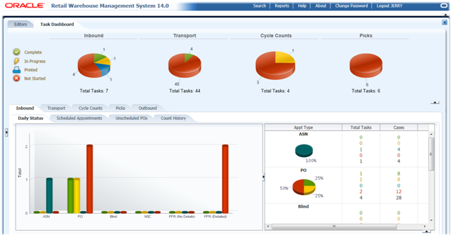
The Activity Monitor dashboard provides at-a-glance views of Key Performance Indicators (KPIs) relevant to a specific warehouse process (Receiving, Transport, Cycle count, Replenishment, Picking, and Shipping). They graphically present the current status (snapshot) and historical trends of the KPIs, so Warehouse Management can make informed decisions quickly. The dashboards provide an easy-to-read, real-time interface into tasks that are Not Started, In Progress, or Completed.
This chapter contains the following topics:
The following functionality is described:
Navigation to the Activity Monitor
To navigate to the WMS Activity Monitor:
Log in to the RWMS system. The Main Menu appears.
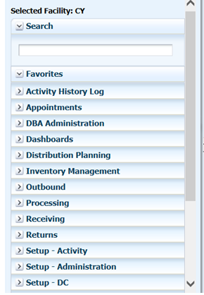
On the Main Menu, select Dashboards.
Select Activity Monitor. The dashboard appears.
Window Expansion and Compression
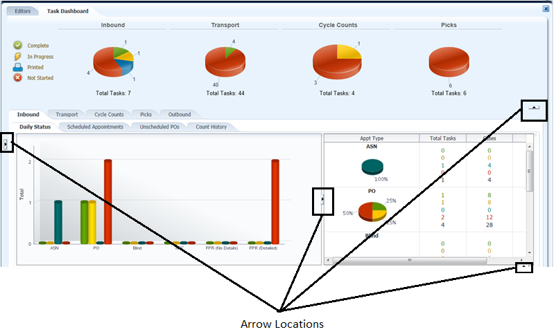
There are four arrows on the window that enable you to expand or compress the view based on your current need. The views dynamically resize based on which arrow is selected. Figure 16-3 shows the location of each arrow.
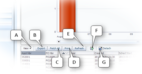
Export Panel Controls
This section describes the buttons available when exporting data to Excel.
The following list describes each button illustrated in Figure 16-4:
The View (A) drop-down enables you to: Add, remove, and order the columns displayed by the enclosed table. The Columns option shows a child menu that lists each column with a tick that represents the visibility of the column.
|
Note: Sort ascending and descending options under View for the Activity Monitor are unavailable based on ADF framework restrictions. |
The Export (B) button performs an export operation of the displayed results to an Excel file. A Save As window opens that allows you to save the Excel file to your desired location.
|
Note: If you use Internet Explorer, the security setting must be modified to export the files. To modify the security setting, go to Tools -> Internet Options. On the Security tab and click Custom Level. To turn off the Information bar for file downloads, scroll to the Downloads section of the list, and then, under Automatic prompting for file downloads, click Enable. |
The Fetch All (C) button executes the underlying query and fetches all the data that is associated with the drill down table. This means that all the summary data in this example is populated into the drill down which can then be exported by clicking the Export function. This feature allows all the rows of the specific grouped category to be presented in the table because the graph or table selections only provide a subset of this data.
The Print (D) button pops up the entire table as a separate printer friendly HTML window.
The Refresh (E) button refreshes the details for the last selected item in the graph (or Fetch All selection) with data updates from the last poll event.
The Query By Example (F) button displays a blank record with a space for each field. You can then enter conditions for each field that you want to be included in the query.
The Detach (G) button detaches the entire component and presents it in a new modal window that fills the entire Dashboard portion of the application window.
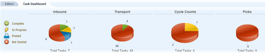
The pie charts summarize the different tasks within each operational area by status.
The pie charts provide the RWMS Supervisors with a summary of all the daily tasks in the four operational areas (Inbound, Transport, Cycle Count, and Picks/Replenishments). They enable the Supervisors to see how many tasks are Not Started, Printed, In Progress, or Completed at any specific time of the day.
Dashboard Statuses
Following are the statuses that are used:
Not Started means that a user has not started the task yet. The one exception to this rule is the Inbound Dashboards where Not Started equals Scheduled.
Printed means that you have printed labels for the Inbound Appointment. This status is only used on the Inbound Daily Status Tab and only for PO and ASN appointment types.
In Progress means that a user has started the task but has not finished the task. The one exception to this rule is the Inbound Dashboards where In Progress equals Open.
Completed means that a user has started and finished the task. The one exception to this rule is the Inbound Dashboards where Completed equals Received. The Completed status only reports tasks completed from now minus 24 hours
Inbound Pie Chart
The Inbound pie chart shows the total number of appointments across all appointment types (PO, ASN, NSC, FPR with Details, FPR without Details, and Blind) in the four statuses (Not Started, Printed, In Progress, and Completed) for that current day. The current day for this Pie Chart includes any past or current day Not Started, Printed, and In Progress appointments and any Completed appointments in last 24 hours (now minus 24 hours).
Transport Pie Chart
The Transport pie chart shows the total number of transports for putaways and moves in the three statuses (Not Started, In Progress, and Completed) for that current day. The current day for this Pie Chart includes any past or current day Not Started, Printed, and In Progress transports and any Completed transports in last 24 hours (now minus 24 hours).
Cycle Count Pie Chart
The Cycle Count pie chart shows the total number of cycle counts for system generated, manual marked, and audit count in the three statuses (Not Started, In Progress, and Completed) for that current day. The current day for this Pie Chart includes any past or current day Not Started, Printed, and In Progress cycle counts and any Completed cycle counts in last 24 hours (now minus 24 hours).
Pick Pie Chart
The Pick (includes Replenishments) pie chart shows the total number of Picks and Replenishments (Bulk Picks, Case Picks, Forward Case Picks, Unit Picks) in the three statuses (Not Started, In Progress, and Completed) for that current day. The current day for this Pie Chart includes any past or current day Not Started, Printed, and In Progress picks and any Completed picks in last 24 hours (now minus 24 hours).
This tab provides the following views:
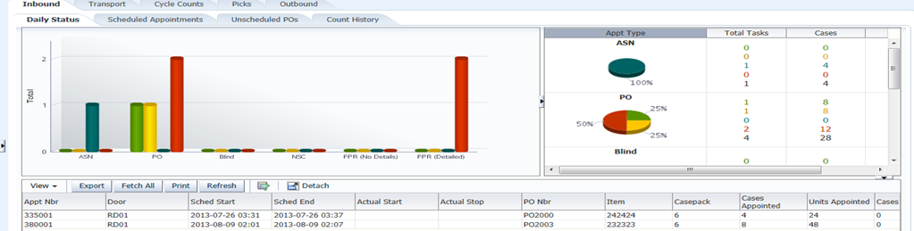
Daily Status View
The Daily Status view enables Supervisors to see how many appointments across appointment types are in the different statuses for the current day, so they can gauge the flow of the receiving operation.
The Daily Status view shows all appointment types (ASN, PO, Blind, NSC, FPR with Details, and FPR without details) and all statuses in both a Bar Chart and Pie Chart view for the current day plus any in the past that have not been Completed.
The Bar Chart shows the number of appointments in each status. The Printed status only applies to PO and ASN appointment types.
The Pie Chart shows the percentage in each status for each appointment type with case and unit totals. The case and unit totals for Not Started, Printed, and In Progress are based on appointed quantities while the Completed totals are based on actual received quantities.
The Not Started status includes appointments not started in past plus any scheduled for next 24 hours (now plus 24 hours).
The Completed status includes any appointments received in last 24 hours (now minus 24 hours).
If you select any bar within the chart, RWMS displays the data contained in the bar and provides the ability to export that to an Excel spreadsheet. To refresh the export data, you must reselect a bar.
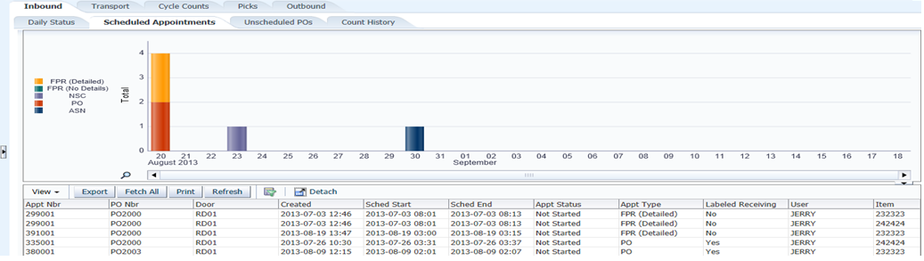
Scheduled Appointment View
The Scheduled Appointment view enables the Supervisor to see the number of appointments scheduled by day and appointment type, so the number of resources needed to get the job done can be determined
The Scheduled Appointment view shows how many appointments by appointment type are in Scheduled (Not Started) status in the past and for the next 30 days into the future.
Each Appointment Type is a unique color and displayed in a Stacked Bar Chart.
If you select any bar within the chart, RWMS displays the data contained in the bar and provides the ability to export that to an Excel spreadsheet. Note that the export data is designed to export at the item level, so the appointment number repeats for each item in the Purchase Order. To refresh the export data, you must reselect a bar.
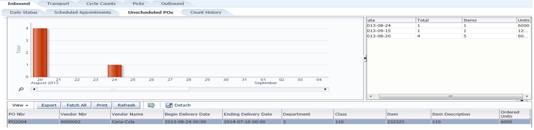
Unscheduled Purchase Orders View
The Unscheduled Purchase Order view shows purchase orders due in the near future that still do not have any scheduled appointments created. The Receiving Team can call the Vendors for these purchase orders to determine the current status of these inbound shipments.
The Unscheduled Purchase Order tab shows any unscheduled purchase orders for the next four weeks into the future. If any line item in the PO is scheduled, the PO does not appear in this tab.
The Unscheduled Purchase Orders are displayed in the bar chart based on their Deliver Not Before date. If a purchase order has not been scheduled and its delivery is not before a date in the past, that purchase order displays in the first date (bar) in the bar chart. This means the first bar includes unscheduled POs in the past and any with a delivery date not before the current date.
The right-hand view displays, for each date, the number of Purchase Orders unscheduled with the actual number of items and units ordered in those POs.
If you select any bar within the chart, RWMS displays the data contained in the bar and provides the ability to export that to an Excel spreadsheet. Note that the export data is designed to export at the item level, so the purchase order number repeats for each item. To refresh the export data, you must reselect a bar.
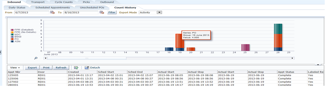
Count History View
The Count History view enables the Warehouse Management team to see the volume of appointment types being received and arrange their resources in the future accordingly.
The Count History view shows how many appointments by appointment type are in Received (Completed) status from the current date/time back to the purge date.
Each Appointment Type is a unique color and displayed in a Stacked Bar Chart.
You can specify a From and To date range to populate the Bar Chart.
If you select any bar within the chart, RWMS displays the data contained in the bar and provides the ability to export that to an Excel spreadsheet. The following export capabilities are supported:
Date Range–When you select any bar, you get all the data across the entire date range.
Date–When you select any bar, you get only the data related to that bar.
Activity–When you select a section of a bar, you get only the data related to that section of the bar.
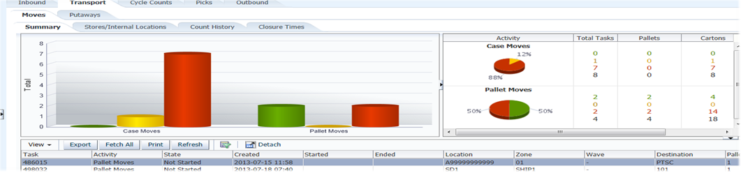
The Transport tab enables the Transport Supervisor, often called Putaway Supervisor, to track the progress of all move and putaway tasks to determine if more or less resources need to be deployed. The Transport tab has two sub-tabs enabling the separate tracking of Moves and Putaways. The views for both Moves and Putaway are named the same, with exactly the same functionality, and both track at the case and pallet levels.
This tab provides the following views:
Summary View
The Summary views shows case and pallet tasks separately and reports how many of each type is in each status (Not Started, In Progress, and Completed).
The Summary view shows any Not Started and In Progress moves from the past and current day plus completed tasks for the last 24 hours (now minus 24 hours).
The Pie Chart shows the percentage in each status with pallet and carton totals. The pallet and carton totals for all statuses are based on actual receipts.
When the RF Build Container option is used, individual case tasks are reduced and pallet tasks are increased.
If you select any bar within the chart, RWMS displays the data contained in the bar and provides the ability to export that to an Excel spreadsheet. To refresh the export data, you must reselect a bar.
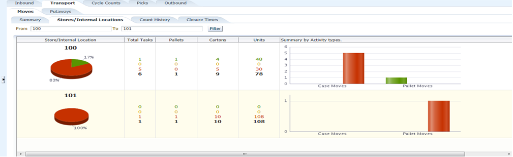
Store/Internal Location/Zone View
The Transport Location view enables the Supervisor to see the volume of tasks assigned to specific internal locations or storage zones. Based on the volume to specific areas, the supervisor may choose to reallocate resources from one area of the warehouse to another area.
The Store/Internal/Zone view shows the number of case or pallet tasks destined for a store (Crossdock), an internal destination (flowthrough or internal pick systems), or a storage zone.
The Move Store/Internal Location and Putaway Zone view shows the actual number of pallets, cartons, and units in Not Started and In Progress status from the past and the current day plus Completed status for last 24 hours (now minus 24 hours).
The Putaway Zone view determines the Not Started and In Progress zone by looking at the first zone defined in the Putaway Plan Editor. The Completed zone is the actual zone for the putaway location.
If you select any bar within the chart, RWMS displays the data contained in the bar and provides the ability to export that to an Excel spreadsheet. To refresh the export data, you must reselect a bar.
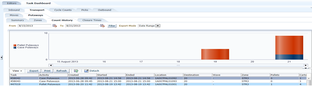
Count History View
The Transport Count History view enables the Warehouse Management team to see the volume of transport tasks (move and putaway) being completed by day and determine if resources are deployed correctly.
The Count History view shows the Completed Moves and Putaways from the current day/time back to the purge date.
The Stacked Bar Chart displays the number of pallet tasks versus the number of case tasks completed by day.
You can specify a From and To date range to populate the Bar Chart.
If you select any bar within the chart, RWMS displays the data contained in the bar and provides the ability to export that to an Excel spreadsheet. The following export capabilities are supported:
Date Range–When you select any bar, you get all the data across the entire date range.
Date–When you select any bar, you get only the data related to that bar.
Activity–When you select a section of a bar, you get only the data related to that section of the bar.
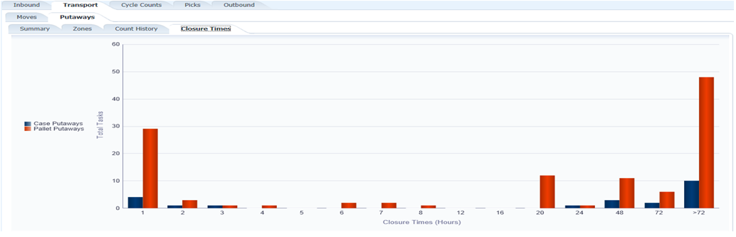
Closure Time View
The Transport Closure Time view enables the Supervisor to see how long it has taken to complete a transport and if the amount of time taken is under or equal to established standards.
The Closure Time view shows how long it took to complete a move or putaway by type (case or pallet) from the time it was received on the dock until the task was actually confirmed in its final location.
This view displays all completed moves and putaways from the current day/time back to the purge date and summarizes how many were completed in specific time (hours) buckets.
For example, the view would show that over the last 60 days (purge setting) that 500 moves were done in under 1 hour, 400 done between 1 hour and 2 hours, 800 done between 2 hours and 3 hours, and 200 done in over one day.
This tab provides the following views:
Summary View
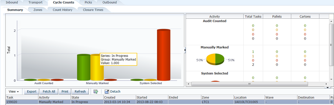
The Cycle Count Summary view enables the Inventory Supervisor to track the progress of all cycle count tasks to determine if more or less resources need to be deployed.
The Cycle Count Summary view shows the three cycle count types (System, Manually Marked, and Audit) and reports how many of each type is in each status (Not Started, In Progress, and Completed).
The Summary view shows any Not Started and In Progress cycle counts that are from the past and current day plus completed cycle counts for the last 24 hours (now minus 24 hours).
The Pie Chart shows the percentage in each status with pallet and carton totals. The pallet and carton totals for all statuses are based on actual cycle counts.
If you select any bar within the chart, RWMS displays the data contained in the bar and provides the ability to export that to an Excel spreadsheet. To refresh the export data, you must reselect a bar.
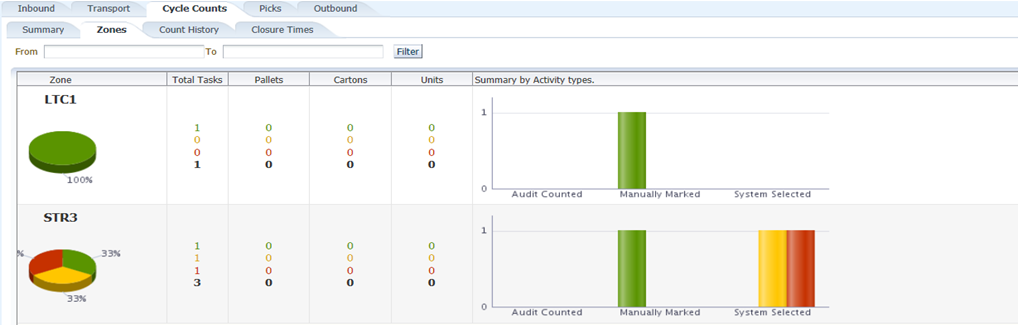
Zone View
The Cycle Count Zone view enables the Supervisor to see the volume of cycle counts assigned to specific zones. Based on the volume in specific zones, the supervisor may choose to reallocate resources from one area of the warehouse to another area.
The Cycle Count Zone tab shows the number of cycle counts by zone by status (Not Started, In Progress, and Completed).
The Cycle Count Zone tab shows the actual number of pallets, cartons, and units in Not Started and In Progress status from the past and the current day plus Completed status for last 24 hours (now minus 24 hours).
If you select any bar within the chart, RWMS displays the data contained in the bar and provides the ability to export that to an Excel spreadsheet. To refresh the export data, you must reselect a bar.
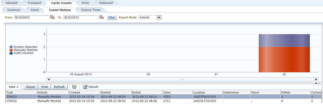
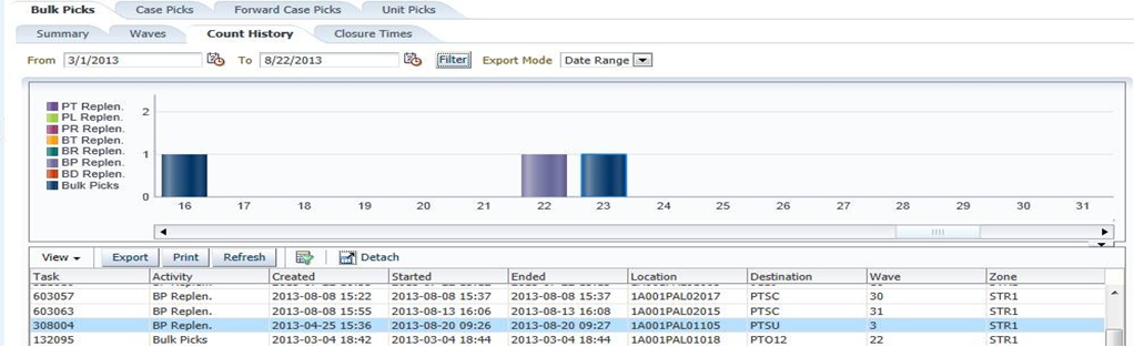
Count History View
The Cycle Count History view enables the Warehouse Management team to see the volume of cycle count tasks being completed by day and determine if resources are deployed correctly.
The Count History view shows the Completed Cycle Counts from the current day/time back to the purge date.
The Stacked Bar Chart displays the number of cycle counts completed by day.
You can specify a From and To date range to populate the Bar Chart.
If you select any bar within the chart, RWMS displays the data contained in the bar and provides the ability to export that to an Excel spreadsheet. The following export capabilities are supported:
Date Range–When you select any bar, you get all the data across the entire date range.
Date– When you select any bar, you get only the data related to that bar.
Activity–When you select a section of a bar, you get only the data related to that section of the bar.
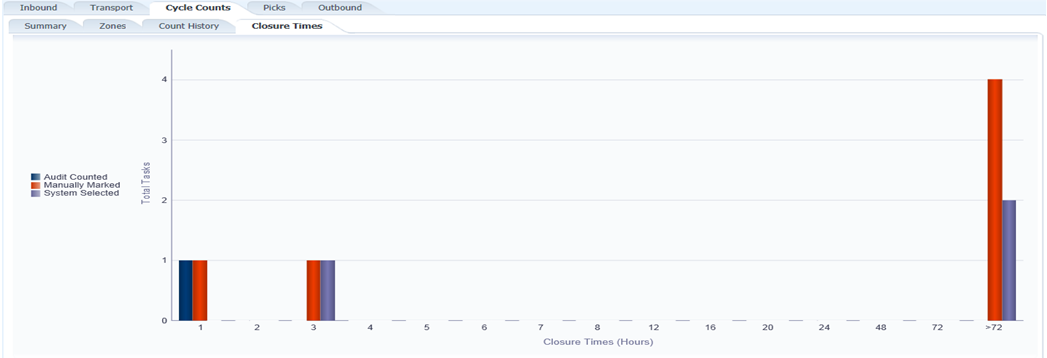
Closure Time View
The Cycle Count Closure Time view enables the Supervisor to see how long it has taken to complete a cycle count and if the amount of time taken is under or equal to established standards.
The Closure Time view shows how long it took to complete a cycle count from the time it was created until the count was actually completed.
This view displays all completed cycle counts from the current day/time back to the purge date and summarizes how many were completed in specific time (hours) buckets.
For example, the view would show that over the last 60 days (purge setting) that 500 cycle count were done in under 1 hour, 400 done between 1 hour and 2 hours, 800 done between 2 hours and 3 hours, and 200 done in over one day.
The Picking Tab enables the Picking/Replenishment Supervisor to track the progress of all bulk pick and replenishment tasks to determine if more or less resources need to be deployed. This tab provides the following views:
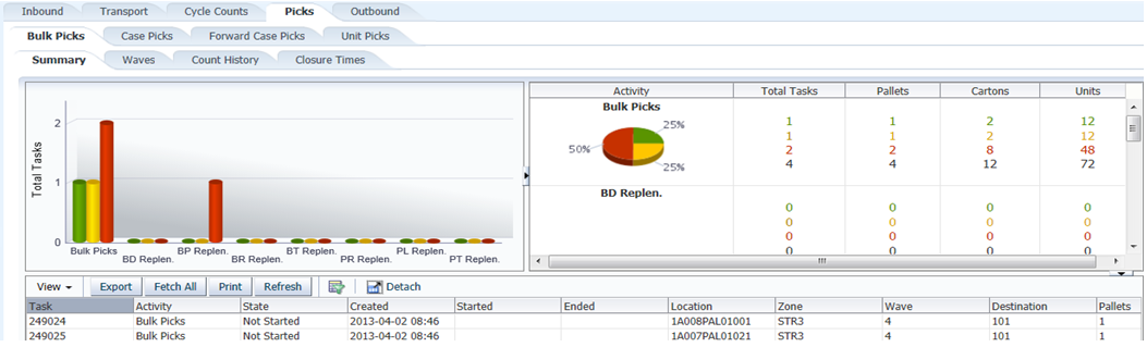
Bulk (Pallet) Summary View
The Bulk Pick Summary view shows the eight types of bulk picks/replenishments (B, BD, BP, BR, BT, PR, PL, PT) and reports how many of each type is in each status (Not Started, In Progress, and Completed).
The Summary view shows any Not Started and In Progress bulk picks/replenishments that are from the past and current day plus Completed for the last 24 hours (now minus 24 hours).
The Pie Chart shows the percentage in each status with pallet, carton, and unit totals. The pallet and carton totals for all statuses are based on actual bulk picks.
If you select any bar within the chart, RWMS displays the data contained in the bar and provides the ability to export that to an Excel spreadsheet. To refresh the export data, you must reselect a bar.
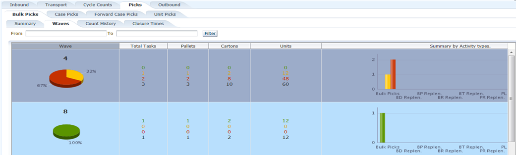
Bulk Wave View
The Bulk Wave view enables the Supervisor to see the volume of pallet picks and pallet replenishments assigned to specific waves and zones. Based on the volume in specific zones, the supervisor may choose to reallocate resources from one area of the warehouse to another area.
The Bulk Wave view shows the number of bulk picks/replenishments by wave number by status (Not Started, In Progress, and Completed).
The Bulk Wave tab shows the actual number of pallets, cartons, and units in Not Started and In Progress status from the past and the current day plus Completed status for last 24 hours (now minus 24 hours).
If you select any bar within the chart, RWMS displays the data contained in the bar and provides the ability to export that to an Excel spreadsheet. To refresh the export data, you must reselect a bar.
Bulk Count History View
The Bulk Count History view enables the Warehouse Management team to see the volume of Bulk Pick and Replenishment tasks being completed by day and determine if resources are deployed correctly.
The Bulk Count History view shows the Completed bulk picks/replenishments from the current day/time back to the purge date.
The Stacked Bar Chart displays the number of bulk picks/replenishments completed by day.
You can specify a From and To date range to populate the Bar Chart.
If you select any bar within the chart, RWMS displays the data contained in the bar and provides the ability to export that to an Excel spreadsheet. The following export capabilities are supported:
Date Range–When you select any bar, you get all the data across the entire date range.
Date–When you select any bar, you get only the data related to that bar.
Activity–When you select a section of a bar, you get only the data related to that section of the bar.
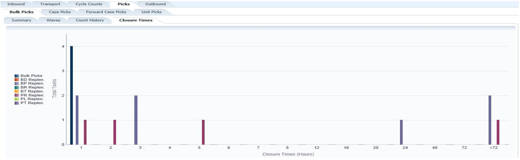
Bulk Closure Time View
The Bulk Closure Time view enables the Supervisor to see how long it has taken to complete a Bulk Picks and Replenishments and to see if the amount of time taken is under or equal to established standards.
The Bulk Closure Time view shows how long it took to complete a bulk pick/replenishment from the time it was created until it was actually completed.
This view displays all completed bulk picks/replenishments from the current day/time back to the purge date and summarizes how many were completed in specific time (hours) buckets.
For example, the view would show that over the last 60 days (purge setting) that 500 bulk picks were done in under 1 hour, 400 done between 1 hour and 2 hours, 800 done between 2 hours and 3 hours, and 200 done in over one day.
Case Pick, Forward Case Pick, and Unit Pick Views
These views have the same exact views with the same functionality as the Bulk Pick tab.
The Case Pick view displays data related to the following case pick/replenishment types: Case Picks, CD Replen, CP Replen, CR Replen, CT Replen, and Case PTS.
The Forward Case Pick view displays data related to the following pick/replenishment types: CF Picks, CB Picks, CE Replen, CL Replen, CO Replen, CS Replen, CT Replen, and C3 Replen.
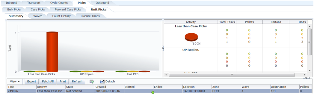
The Unit Pick view displays data related to the following unit pick/replenishment types: Less Than Case, UP Replen, and Unit PTS.
This tab provides the following views:
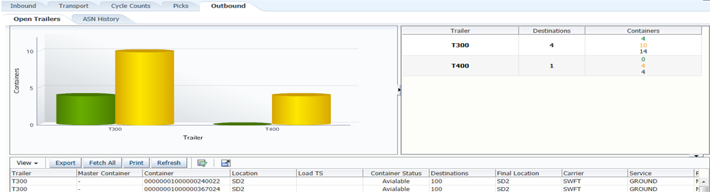
Open Trailer View
The Open Trailer view shows the Available Containers to load and the Loaded Containers for each trailer currently in Open status.
A trailer can be opened for a specific destination (store) or by Carrier/Service/Route (multiple destinations).
The Available Containers include crossdock cartons, bulk outbound picks, case outbound picks, less than case cartons in the In-transit location, unit put to store cartons with a close date, and case put to store cartons with a close date.
The Available Containers is a list of containers that can be loaded on the trailer but it does not mean they have to be loaded. Any unloaded Available Containers will be available for the next open trailer to that destination.
If you select any bar within the chart, RWMS displays the data contained in the bar and provides the ability to export that to an Excel spreadsheet. To refresh the export data, you must reselect a bar.
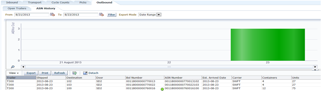
ASN History View
The ASN History view shows the number of Outbound ASNs created each day.
Outbound ASNs are generated for each specific store that ships so one outbound trailer can create multiple Outbound ASNs if the trailer was opened using carrier/service/route.
You can specify a From and To date range to populate the Bar Chart.
If you select any bar within the chart, RWMS displays the data contained in the bar and provides the ability to export that to an Excel spreadsheet. The following export capabilities are supported:
Date Range–When you select any bar, you get all the data across the entire date range.
Date–When you select any bar, you get only the data related to that bar.
Activity–When you select a section of a bar, you get only the data related to that section of the bar.
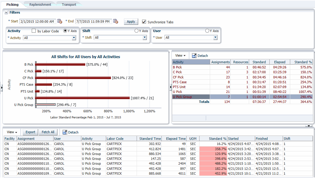
The Labor Management Dashboard provides an at-a-glance view into how well Warehouse Staff are performing against the Engineered Labor Standard. This means the actual time to complete an activity (task) is compared to the engineered labor standard and reported on the dashboard as a percent of standard. If the dashboard bar is green (under 100%) this means the actual time to complete the activity was less than the engineered labor standard. If the dashboard bar is red (over 100%) this means the actual time to complete the activity was more than the engineered labor standard.
The dashboard provides three distinct tabs (picking, replenishment, and transport) so management can measure performance in each processing area. Each tab provides three filters used in unison to customize the results of the dashboard.
To access the Labor Management Dashboard, navigate to Dashboards then select Labor Management. The Labor Management Dashboard window opens.
The Labor Management Dashboard option only appears in the Dashboard Module when the Enable Labor MGMT SCP is set to Yes and the Task Log SCP is set to 2.
The default view of the Labor Management Dashboard displays:
The current date with a 24 hour time range
The Picking tab
Each filter (Activity, Shift, and User) set to All
Customized Display Using Filters
To customize the information displayed within the dashboard, you can modify the date range and filters as desired within the tab.When the date range and filters are set, you can select the Synchronize Tabs check box to use the same date range and filters for the other two tabs.
Each tab provides these three filters:
Activity — The activity filter allows you to select all activities, multiple activities, or a single activity to display labor standard results. You can also check the Labor Code box to break an activity level down to defined Labor Codes.
Shift — The shift filter allows you to select all shifts, multiple shifts, or a single shift to display labor standard results.
User — The user filter allows you to select all users, multiple users, or a single user to display labor standard results.
These filters may be used in unison to customize the results of the dashboard.
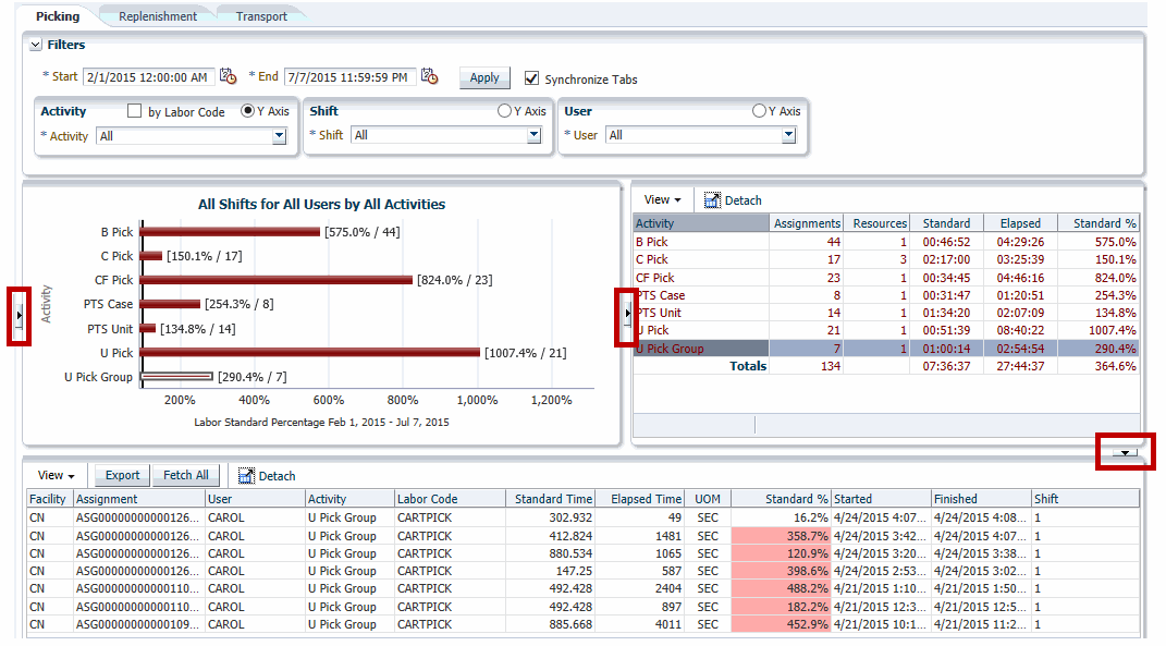
Window Expansion and Compression
There are three arrows on the window that enable you to expand or compress the view based on your current need. The views dynamically resize based on which arrow is selected.Figure 16-26 shows the location of each arrow.
Graph Display
When dashboard results are displayed, the X axis (horizontal) always shows the Percent of Standard. The Y axis can be modified by selecting one of the Y Axis option buttons in the filter control blocks. You can choose to display the Y axis as Activity, Shift, or User. Only one Y axis choice is allowed.
The bars on the graph appear as either green if the actual time to complete the activity was less than the standard time allotted or red if the actual time to complete the activity was more than the standard time allotted.
To the right of each bar displayed on the graph is the percent of standard achieved and the number of aggregated assignments (tasks) compiled based on the search criteria.
The block to the right of the graph is a spreadsheet of the graphical data provided in written form.
To populate the spreadsheet at the bottom of the window, you can select any bar within the graph and RWMS then imports the data related to that specific bar.
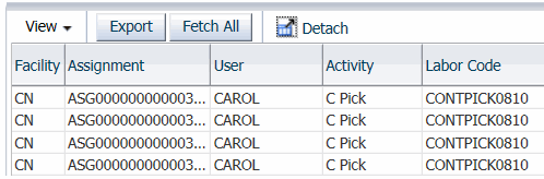
Export Panel Controls
The data in the bottom panel spreadsheet can be exported to an Excel spreadsheet.
The View drop-down menu allows you to add, remove, and order the columns displayed in the table. The Columns option lists each column with a check box that if selected displays the column and if clear, hides the column.
|
Note: Sort ascending and descending options under View for the Labor Management Dashboard are unavailable based on ADF framework restrictions. |
Click Export to open the displayed results in an Excel file.
Click Fetch All to obtain all the data that is associated with the drill down table. This means that all the summary data in this example is populated into the drill down which can then be exported by clicking the Export function. This feature allows all the rows of the specific grouped category to be presented in the table because the graph or table selections only provide a subset of this data.
Click Detach to detach the table and open it in a new full-sized window.
Exit
Click Exit to close the window.