| Oracle® Retail Warehouse Management System UI User Guide Release 15.0 E66766-01 |
|


 Previous |
 Next |
| Oracle® Retail Warehouse Management System UI User Guide Release 15.0 E66766-01 |
|
Previous |
Next |
Tablet-optimized versions of the following desktop workflows allow warehouse personnel, especially supervisors, the convenience and flexibility of monitoring warehouse operations without being tethered to a desktop computer:
The functionality of the tablet workflows is exactly the same as the functionality provided in the desktop version of the windows, but navigation differs.
The following sections describe navigation functions for the mobile version.
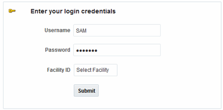
The login is similar to what is used on the desktop version.
When you access the tablet application, the User Login opens.
Logging In
In the Username field, enter the user ID.
In the Password field, enter the password.
In the Facility ID field, enter the facility ID or select an ID from the list.
Tap Submit to access the Home screen.
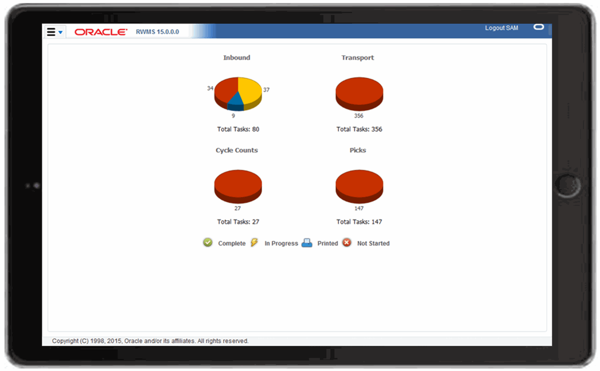
About the Home Screen
The Home screen displays the same information that is at the top of the Activity Monitor Dashboard and provides an overview of warehouse work progress. The pie charts are color coded:
Red indicates Not Started
Green indicates Completed
Yellow indicates In Progress
Blue indicates Printed and applies to Inbound only, but not yet opened appointments.
Logging Out
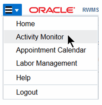
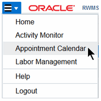
The Home screen includes a menu icon in the top left corner that, when tapped, displays the menu where you can access other mobile screens.
Before you begin using the mobile Oracle RWMS, familiarize yourself with basic mobile navigation, including:
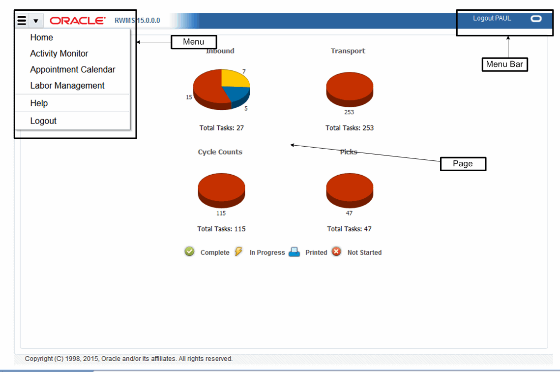
Figure 17-3 shows the mobile RWMS, including its basic components and layout.
Menu Bar
The Menu bar is the horizontal bar at the top of the screen. Tap Logout to exit.
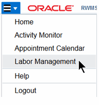
Menu
The icon in the top left corner is the menu. The drop-down menu displays the mobile menu options:
Home
Activity Monitor Dashboard
Appointment Calendar View
Labor Management Dashboard
These options use a responsive design of what is seen on the desktop in order to make the best use of the screen size available on the mobile device. These options are functionally equivalent to their desktop UI counterparts, but appear differently as sections are collapsed in favor of other sections.
Page
The page area is similar to the tabbed panels on the desktop, except that it only allows one tab. When a new page item is selected from the drop-down menu, it closes the current tab within the page area and opens the new tab.
Typically, the pages collapse the filters, but can also display differently based on portrait or landscape view.
|
Note: Always use landscape view for best results. |
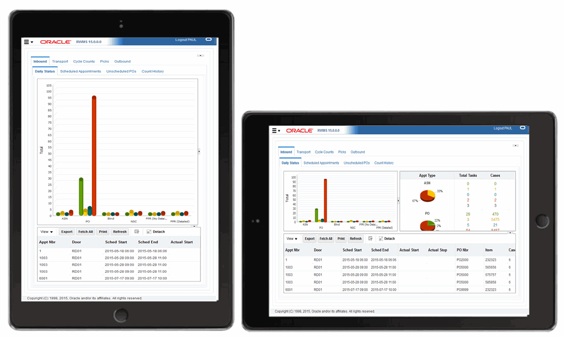
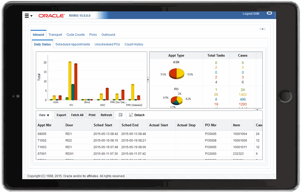
The mobile Activity Monitor dashboard displays warehouse work progress for Inbound, Transport (put-away and move operations), Cycle Counting, Picking, and Outbound. By navigating the various tabs and sub-tabs, you can access 34 different views of warehouse activity.
Tasks are color coded according to progress:
Red indicates Not Started
Green indicates Completed
Yellow indicates In Progress
Blue indicates Printed and applies to Inbound only, but not yet opened appointments.
The default view displays data by activity for the past 24 hours.
|
Note: Screens and data on the mobile Activity Monitor dashboard are similar to the desktop version of the Activity Monitor Dashboard. |
Access
To access the dashboard, tap Activity Monitor from the menu icon.
Figure 17-6 shows the mobile Activity Monitor dashboard.
The following sections describe specific navigation for the mobile Activity Monitor dashboard.
Tabs
Tap any of the tabs to navigate among the many views of warehouse activity. Tapping a tab displays the corresponding details in the data pane at the bottom of the screen.
Pie Chart Display
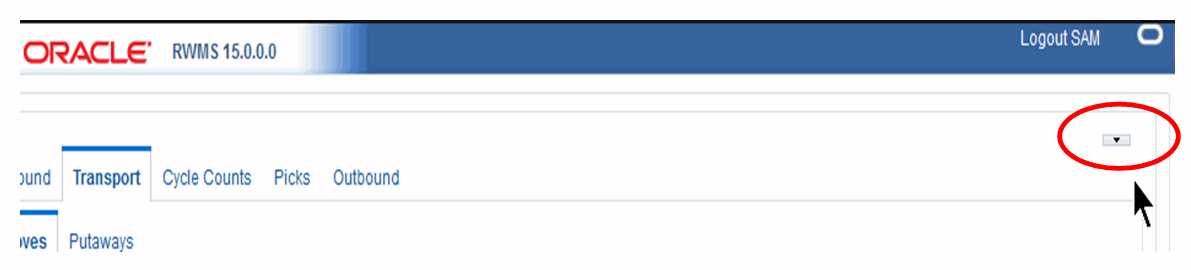
The pie charts display the overall status and are collapsed in the default view to provide maximum space for the tab-specific data shown in Figure 17-6. The pie charts can be displayed or hidden by tapping the expansion arrow as shown in Figure 17-8.
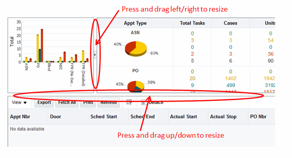
Pane Resizing
The screen panes can be resized and collapsed by dragging or tapping the expansion and collapse arrows. Dividers allow you to drag and resize the panes as shown in Figure 17-9.
Data Details
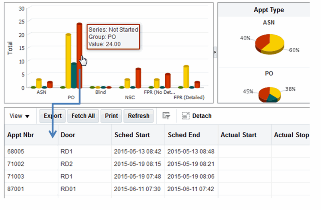
As shown in Figure 17-10, tap any bar in the vertical bar graph to display detailed data in the pane located below the graph.
Similar to the functions in the desktop version, you can detach, sort, and move columns in the data table.
|
Note: Currently, you cannot export the data table to Microsoft Excel in the mobile Activity Monitor dashboard. |
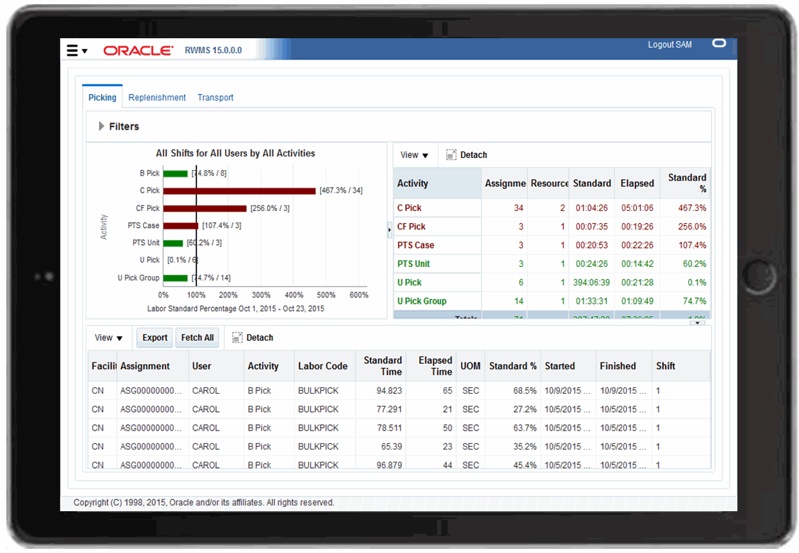
The Labor Management Dashboard displays productivity levels compared to expected standards. Data can be viewed by Activity or Labor Code, by Shift, or by User. There are filters available for each. A date range can also be specified.
The default view displays data by activity for the past 24 hours.
|
Note: Screens and data on the mobile Labor Management dashboard are similar to the desktop version of the Labor Management Dashboard. |
Access
To access the dashboard, tap Labor Management from the menu icon.
Figure 17-12 shows the mobile Labor Management dashboard.
The following sections describe specific navigation for the mobile Labor Management dashboard.
Tabs
Tapping a tab, displays the corresponding details in the data pane at the bottom of the screen
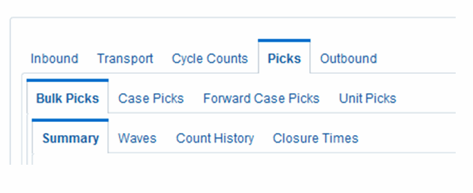
Similar to the desktop version, labor management data is divided into three tabs:
Picking
Replenishment
Transport
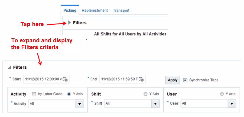
Filters
Use Filters to specify the criteria for the data displayed on the screen. As shown in Figure 17-13, to change the criteria, tap the Filters expansion arrow to display the criteria fields in the Filters pane.
Enter the desired criteria and tap Apply to display the data. Once the data is retrieved, the Filters pane collapses to provide the maximum view of the data.
Pane Resizing
The screen panes can be resized and collapsed by dragging or tapping the expansion and collapse arrows Dividers allow you to drag and resize the panes as shown in Figure 17-9.
Data Details
As shown in Figure 17-10, tap any bar in the vertical bar graph to display detailed data in the pane located below the graph.
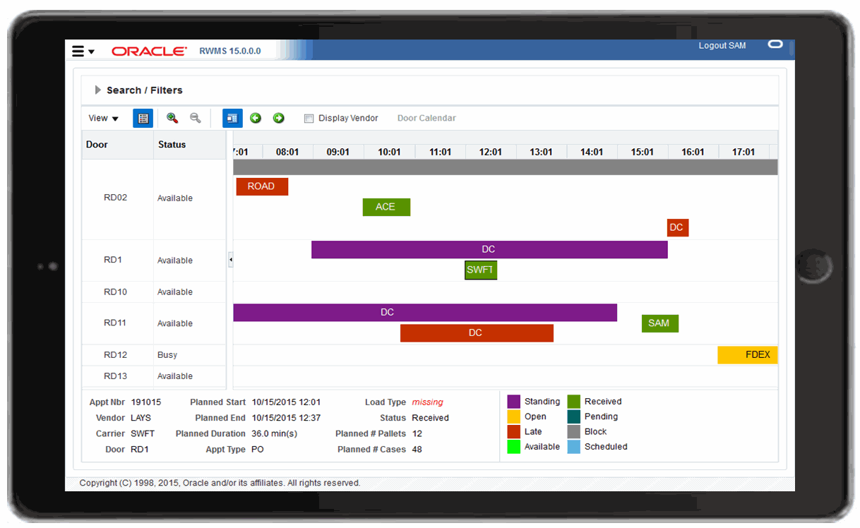
The mobile Appointment Calendar provides a graphical view of receiving door usage. It displays all scheduled appointments along with their color-coded status in a horizontal Gantt chart format. It also provides various detail views for a specific receiving door in a variety of formats.
The default view displays data by activity for the past 24 hours.
|
Note: Screens and data on the mobile Appointment Calendar dashboard are similar to the desktop version of the Appointment Calendar. |
Access
To access the appointment calendar, tap Appointment Calendar from the menu icon.
Figure 17-12 shows the mobile Appointment Calendar.
The following sections describe specific navigation for the mobile Appointment Calendar.
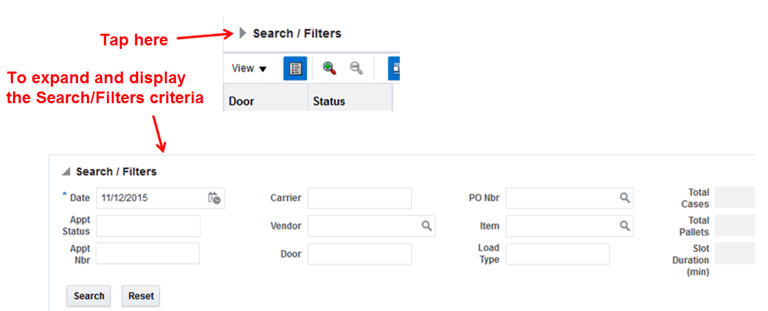
Search/Filters
Use Search/Filters to specify the criteria for the data displayed on the screen. As shown in Figure 17-13, to change the criteria, tap the Search/Filters expansion arrow to display the criteria fields in the Search/Filters pane.
Enter the desired criteria and tap Search to display the data. Once the data is retrieved, the Filters pane collapses to provide the maximum view of the data.
Pane Resizing
As with the mobile dashboards, the Door list and Calendar panes can be resized and collapsed by dragging or tapping the expansion and collapse arrows Dividers allow you to drag and resize the panes as shown in Figure 17-9.
Dragging the horizontal bar for the Calendar displays different time frames for the selected day. Dragging the Calendar pane either vertically or horizontally, allows you to scroll the doors.
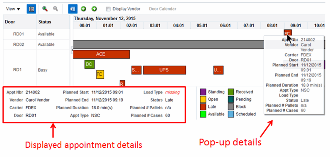
Appointment Details
As shown in Figure 17-17, tap any bar in the calendar to display detailed data in the pane located below the graph. By taping, holding, and then releasing an appointment, the details are shown in a pop-up display.
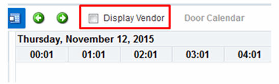
Tap to select or clear the Display Vendor check box and toggle the display to show either the vendor or carrier information as shown in Figure 17-18.
Door details display on a tablet the same as on the desktop version. For more information of functionality, see the section, Appointment Calendar.
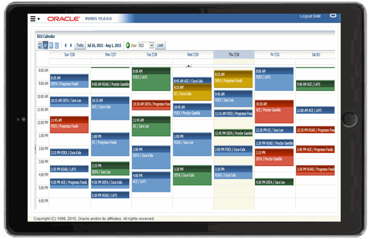
Tap on a door and then tap Door Calendar, to display the details view as shown in Figure 17-19. The display defaults to the weekly view.
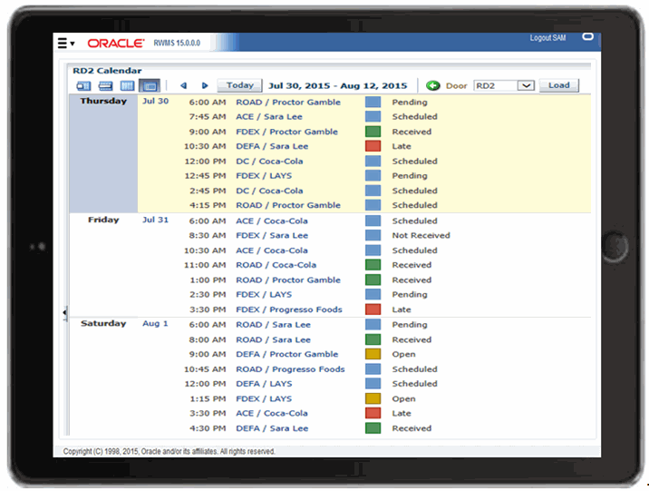
Tap the calendar icon to display different views including daily, monthly, and detail. Figure 17-20 shows the detail view.