| Oracle® Retail Predictive Application Server User Guide for the Fusion Client Release 14.1 E59121-01 |
|

 Previous |
 Next |
| Oracle® Retail Predictive Application Server User Guide for the Fusion Client Release 14.1 E59121-01 |
|
Previous |
Next |
You can use the charting feature to generate a visual representation of the data in the form of charts. This section describes the available chart types and provides instructions on the various tasks you can perform with charts. It includes the following sections:
|
Note: Due to some limitations of Flash, chart axes and labels may not be visible at times and chart sizes may not adjust as expected. |
You can view charts using the following views:
Chart View – In this view, the chart displays in the complete view area.
Split View – In this view, the chart and data display together in two vertical panels.
To view a chart:
Select the data you want for the chart.
From the View toolbar, click the Select Chart Type icon, and then select the chart type.
After you select the chart type, click one of the following icons:
Switch to Chart View – Select this icon to switch the view to charts.
Switch to Split View – Select this icon to see the pivot table and chart split in two vertical panels.
To switch back to the pivot table, click the Switch to Pivot Table View icon.
Cell Selection Considerations
When you choose to view a chart, only the cells that you select are represented in a chart. Each available graph type requires that a specific amount of data or number of cells are selected for a graph to appear. Although you may select a subset, the cells must contain enough data to support the desired graph for the graph to be displayed. For more information on the information required for each graph type, see Available Chart Types.
Squaring the Selection
When the chart is rendered on screen, the cell selections in the view are automatically squared. In this operation, additional cells are added to your selection to represent a squared selection area. This ensures that the data is analyzed in a consistent manner.
For example, if you choose to select some cells before viewing a chart, as shown in Figure 12-5:
After the chart appears, your selection in the view is squared, as shown in Figure 12-6:
The following sections describe the charting functions.
When you switch to the Chart View or Split View, the View toolbar appears with icons relevant to charts.
In the Chart View, the following charting icons appear:
Table 12-1 Charting Icons in the View Toolbar
| Legend | Icon Name | Description |
|---|---|---|
|
A |
Chart Formatting |
Use to customize the format of the charts. For more information, see Customizing a Chart. |
|
B |
Save Chart to Image |
Use to save the chart as an image (PNG format) file. |
|
C |
Flip Chart Axis |
Click to swap the contents represented on the X and Y axes without manually performing a pivot operation. |
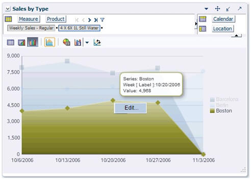
After the chart appears on screen, you can update the value of a specific series.
If no drilling operations have been carried out, data can be edited simply by clicking the series in the chart. To edit a chart:
In the chart, select the value for the specific series represented in the chart using the following steps:
Mouse over the series or the legend. The specific series is highlighted automatically, and the other series are dimmed. See Figure 12-8.
|
Note: This is a configurable setting and can be toggled on or off in the properties file. For more information, refer to the Oracle Retail Predictive Application Server Administration Guide for the Fusion Client. |
After the series is highlighted, locate the value you want to edit on the chart and select the relevant area based on the following:
| Chart Type | Area to Select |
|---|---|
| Area Chart | Right-click on the specific point and select Edit... in the context menu. The point is indicated by a tool tip pop-up when you point at it. |
| Bar Chart | Right-click the bar area and select Edit... |
| Bubble Chart | Right-click the bubble. and select Edit... |
| Column Chart | Right-click the column area and select Edit... |
| Combination Chart | Right-click on the relevant area based on chart type. Refer to the area for Area, Column, and Line Charts. |
| Line Chart | Right-click the specific point on the line and select Edit... (indicated by line marker). |
| Pareto Chart | Right-click on the column or the pareto line marker and select Edit... |
| Pie Chart | Right-click the slice and select Edit... |
| Radar Chart | Right-click the line marker point and select Edit... |
| Ring Chart | Right-click the slice and select Edit... |
| Scatter Chart | Right-click on the scatter marker (shape) and select Edit... |
| Treemap Chart | Right-click the node and select Edit... |
The Chart Editor window appears.
Enter the new value or values and click OK. The chart and the view data are updated with the new values entered.
|
Note: The cell-editing and protection processing rules also apply to the editing of chart values. Read-only values are not editable. |
In Chart View, the View toolbar includes the Chart Formatting icon that you can use to format and customize the chart.
|
Note: The Chart Formatting Window for the Treemap Chart is described separately in Understanding the Treemap Chart Formatting Window. |
To customize the chart:
In the Chart View, click the Chart Formatting icon in the View toolbar.
The Chart Formatting window appears.
In the Chart Formatting window, make the relevant changes. For more information on the Chart Formatting window, see Understanding the Chart Formatting Window.
Click the Apply icon to apply the changes and continue customizing your chart. When you click the Apply icon, the changes take effect immediately in the background.
After you have completed making changes, click OK. The changes are applied to the chart and the Chart Formatting window closes.
|
Note: The Chart Formatting Window for the Treemap Chart is described separately in Understanding the Treemap Chart Formatting Window. |
The Chart Formatting window can include the following tabs. Some tabs are only displayed for certain chart types.
General Tab
Use the General tab to customize the general settings for the chart.
The General tab includes the following fields:
Table 12-2 Fields on the General Tab
| Field | Description |
|---|---|
|
Title |
Use to set a title to the chart. |
|
Subtype and Layouts |
Subtype Selection includes the following options:
Layout Selection includes the following options
|
|
Show Legend |
Select this check box to display a legend on the chart. |
|
3D Effect |
Select this check box to display the chart in 3-D. |
|
Background Color |
Use to select a background color for the chart. |
Axis Tab
Use the Axis tab to customize the axes settings.
The Axis tab includes the following fields:
Table 12-3 Fields on the Axis Tab
| Field | Description |
|---|---|
|
Select Axis |
Based on the type of chart, displays the axes for the chart. You can select each axes and set the parameters in the Axis Settings section. |
|
Title |
Use to set a title for the axis. |
|
Axis Type |
These options are available only for bubble and scatter charts. Use to set the data type for the axis. You can choose from the following options:
|
|
Axis Tick |
Use to show or hide grid lines within the chart. Select from the following options:
|
|
Is Logarithmic |
Changes the axis to use a logarithmic scale when plotting data. This is useful to display data with large range differences. For example, you may have the values 99999, 5002, and 250. Normally, the value 250 does not appear, due to its small value. If the Is Logarithmic box is checked, that value will be displayed properly in the bar chart. |
Series Tab
Use the Series tab to set the series color and Y-Axis assignment.
The Series tab includes the following fields:
Table 12-4 Fields on the Series Tab
| Field | Description |
|---|---|
|
Select Series |
Displays the series that appear in the chart. |
|
Series Color |
Use to set a color for the series selected in the Select Series section. |
|
Series Y-Axis Assignment |
Use to Move/Move All/Remove/Remove All icons and assign series to the Y1 and Y2 axes. |
Quadrants Tab
Use the Quadrant tab to configure quadrants in the bubble charts. The tab only appears if the chart type is set to bubble. It does not appear for other chart types.
You can configure the chart to have more than four quadrants or sections. You can configure the chart to have up to 16 sections.
As you enter the desired number of X and Y axes divisions, the graph icon in the Quadrant Labels section refreshes to show a new representation of the chart. If you enter quadrant labels for the sections, you can adjust the placement of these labels with the Alignment feature.
The Quadrant tab includes the following fields:
Table 12-5 Fields on the Quadrant Tab
| Field | Description |
|---|---|
|
Display quadrants |
Select this check box if you want to display the quadrant lines. |
|
X-axis divisions |
Use this drop-down box to select the number of quadrants or sections you want along the X axis. As you adjust this number, the graph icon refreshes to display your selection. |
|
Y-axis divisions |
Use this drop-down box to select the number of quadrants or sections you want along the Y axis. As you adjust this number, the graph icon refreshes to display your selection. |
|
Alignment |
Use this drop-down box to adjust the placement of quadrant labels within the quadrant. Options are Center, Top, and Bottom. |
|
Quadrant Labels |
Use these fields to enter names for each quadrant. This is optional. |
The Treemap chart formatting window is similar to the General Tab of other charts, but with the addition of Subtypes that are used to configure how node color is displayed. Once you have made updates, you can click OK to refresh the display of the Treemap chart.
Table 12-6 Fields for Treemap Chart Formatting
| Field | Description |
|---|---|
|
Title |
Use to set a title to the chart. |
|
Subtype |
Subtype Selection includes the following options:
|
|
Show Legend |
Select this check box to display a legend on the chart. |
|
Background Color |
Use to select a background color for the chart. |
Continuous Subtype
When you select the continuous subtype, you must manage the options for Auto Fill, Minimum Value, Maximum Value, and Color. The Number of groups value is disabled here as it only applies to the grouped subtype. See Treemap Chart Formatting Window.
Table 12-7 Continuous Subtype Options
| Option | Description |
|---|---|
|
Auto Fill |
Select this check box if you want Values or On drill to be auto-calculated. These two options are both selected by default. Values. Select this option if you want the minimum and maximum values to be auto-calculated based on the chart data. The minimum value is set to the lowest chart data value, and the maximum value is set to the highest chart data value. You can override these auto-calculated values by entering a number for either value yourself. In this case, the Value check box becomes de-selected. On drill. Select this option so that after drilling down, the minimum and maximum values are re-calculated based on the new highest and lowest values instead of on the existing parent-level values. You may not need the On drill option when the data that drives color is aggregated as average, mean, median, or percent. This option is more relevant when color data aggregates as total, min, max, and so on. |
|
Minimum Value/Maximum Value |
Define the starting and ending values for the color transition. Treemap chart nodes that have values less than or equal to the minimum are shaded with the color associated with the minimum value, and nodes with values greater than or equal to the maximum are shaded with that associated color. Nodes with values in between are reflected by color shades according to their specific values. These values are auto-calculated if you select the Auto Fill check box. |
|
Color |
Associates a specific color with the minimum value and a specific color with the maximum value. The default values are derived from PivotTableStyles.properties. |
Grouped Subtype
When you select the grouped subtype, you must manage the options for Number of groups, Auto Fill, Labels, Range cut-off values, and Color.
Table 12-8 Grouped Subtype Options
| Option | Description |
|---|---|
|
Number of groups |
Defines the number of discrete groups that the nodes are grouped into. Each group is associated with a label. range cut-off value, and color. The default is 2. |
|
Auto Fill |
Values. Select this option if you want the range of cutoff values to be auto-calculated based on Number of groups and chart data. You can override these auto-calculated values by entering a range cutoff value yourself. In this case, the Value check box becomes de-selected. On drill. Select this option so that after drilling down, you want the range cutoff values to be proportional. The new cutoffs are based on the new color data and proportioned using the parent-level cutoffs. You may not need the On drill option when the data that drives color is aggregated as average, mean, median, or percent. This option is more relevant when color data aggregates as total, min, max, and so on. |
|
Label |
The name for each group. The default names are Group 1 and Group 2. You can change these names as appropriate. If you add a group (by changing the value in Number of groups), the new group will initially be assigned a default name, regardless of any changes you may have made. |
|
Range cut-off value |
Defines the cut-off value for the range associated with the group. All the nodes that have a color data value greater than the lower cutoff and lower than or equal to the upper cutoff are shaded with the associated color. |
|
Color |
Defines the color associated with each group. A node is assigned a color based on the range into which the value falls. |
In Chart View, the View toolbar includes the Save Chart to Image icon that you use to save the chart as an image (in PNG format).
To save the chart as an image:
In the Chart View, click the drop-down arrow on the Save Chart to Image icon and select the image resolution.
Click the Save Chart to Image icon to save the image.
The File Download dialog box appears. Click Open or Save, as shown in Figure 12-21.
Clicking Open opens the chart as a PNG file. Clicking Save allows you to select a location to save the file.
Line Charts and Area Charts can be displayed with a line that represents the division between elapsed time and unelapsed time.
This line is displayed if, for a given chart for a selection of data cells, the calendar dimension is selected and the time period selected includes the elapsed time. The line will only be displayed if the calendar dimension is on the X-axis and the calendar's positions are in sorted order. If the X-axis contains multiple dimensions that include the calendar dimension, then the line will not be displayed.
You can format this line using the General tab of the Chart Formatting window in order to select the color for the line or to hide/un-hide the line.
To configure the color for the line, select the color you want from the drop-down list and click Apply.
To hide a line that is currently displayed, un-check the Show Today check box and click Apply. To display the line, check the Show today check box and click Apply.
Line charts can be configured to display a Boolean flag.
To display a Boolean flag:
Select a group of measures that include Boolean measures.
Select Line Chart.
The Line Chart display a graph with the Y2-axis as the Boolean axis.
The Y axis is the default axis for the Boolean flag. You can change the default using the Edit Chart dialog box.
The default scale for the Boolean axis is 1. You can change this using the Formatting dialog box.
If you select more than one Boolean measure, all the measures you select will be displayed on the chart.
The following chart types are available with the charting feature:
In a Area chart, the data is represented as a filled-in area. An area chart can be used to show trends over time, such as sales for the past 12 months. Area charts require at least two groups of data along an axis.
Area charts are available in the following types:
Absolute Area Chart – Each area marker connects two data values. This type of chart has the following variations:
Absolute Area Chart with a Single Y-Axis
Absolute Area Chart with a Split Dual Y-Axis
Stacked Area Chart – Area markers are stacked, and the values of each set of data are added to the values of previous sets. The size of the stack represents a cumulative total. This type of chart has the following variations:
Stacked Area Chart with a Single Y-Axis
Stacked Area Chart with a Split Dual Y-Axis
Percentage Area Chart – Area markers show the percentage of the cumulative total of all sets of data.
A Bar Chart is similar to the Column Chart, except that the data is represented as series of horizontal columns.
In a Bubble Chart the data is represented by the location and size of round data markers (bubbles). Bubble charts show correlations among three types of values. They can be used when there are a number of data items present and you want see the general relationships. Bubble Charts require at least two data values. If two data values are used, the size of the bubbles will be the same.
Data is represented by the location and size of round data markers (bubbles). Each data marker in a bubble graph represents three group values:
The first data value is the X value. It determines the marker's location along the X-axis.
The second data value is the Y value. It determines the marker's location along the Y-axis.
The third data value is the Z value. It determines the size of the marker. A negative values in Z coordinate is treated as an absolute (meaning that it has the equivalent size of a positive number in that position) in respect to the visual size. Once the bubble graph is plotted with two measures, you cannot edit the z-value (bubble volume), which is a constant for all the plotted bubbles.
For more than one group of data, bubble graphs require that the data must be in multiples of three. For example, in a specific bubble graph, you might need three values for Paris, three for Tokyo, and so on. An example of these three values might be: X value is average life expectancy, Y value is average income, and Z value is population.
For the X and Y axes in bubble charts, only the minimum and maximum values are programmatically set to correspond to the minimum and maximum values of the data set on each axis. Otherwise, ADF auto scaling would start the axes at 0, and if all the values were relatively high, the bubbles would all be in the upper left area. Therefore, if you were using quadrants, the quadrants would not be meaningful. For more about quadrants, see Quadrants Tab.
Bubble Charts are available in the following types:
Bubble Chart with a Single Y-Axis
Bubble Chart with a Dual Y-Axis
In a Column Chart, the data is represented as a series of vertical bars. A Column Chart can be used to examine trends over time or compare items at the same time (for example, sales for different product divisions in several groups).
Column Charts are available in the following types:
Clustered Column Chart – Each cluster of columns represent a group of data. This type of chart has the following variations:
Clustered Column Chart with Single Y-Axis
Clustered Column Chart with Dual Y-Axis
Clustered Column Chart with Split Dual Y-Axis
Stacked Column Chart – Bars of each set of data are appended to the previous sets of data. The size of the stack represents a cumulative data total. This type of chart has the following variations:
Stacked Column Chart with a Single Y-Axis
Stacked Column Chart with a Dual Y-Axis
Stacked Column Chart with a Split Y-Axis
Percentage Column Chart – Bars are stacked and display the percentage of a given set of data relative to the cumulative total of all sets of data. Percentage Column Charts are arranged only with a single Y-Axis.
The Combination Chart uses three different types of data markers to display different kinds of data items. The Combination Chart can be used to compare bars and lines, bars and areas, lines and areas, or all three combinations. Combination charts require at least two groups of data for the chart to render an area marker or a line marker.
Combination Charts are available in the following types:
Combination Chart with Single Y-Axis
Combination Chart with Dual Y-Axis
In a Line Chart, the data is represented as a line, series of data points, or data points connected by a line. Line Charts require data for at least two points for each member in a group.
Line Charts are available in the following types:
Absolute Line Chart – Each line segment connects two data points. This type of chart has the following variations:
Absolute Line Chart Single Y-Axis
Absolute Line Chart Dual Y-Axis
Absolute Line Chart Split Y-Axis
Stacked Line Chart – Each set of data is appended to previous sets of data. The size of the stack represents a cumulative data total. This type of chart has the following variations:
Stacked Line Chart Single Y-Axis
Stacked Line Chart Dual Y-Axis
Stacked Line Chart Split Y-Axis
Percentage Line Chart – The lines are stacked, and each line shows the percentage of the given set of data relative to the cumulative total of all sets of data. Percentage Line Charts are arranged only with a single Y-Axis.
In a Pareto Chart, the data is represented by bars and a percentage line that indicates the cumulative percentage of bars. Bars are arranged by value from left to right, from the largest to the lowest. A Pareto Chart is always a Dual Y-Axis chart. The first Y-Axis corresponds to values that the bars represent and the second Y-Axis runs from 0-100 percent and represents the cumulative percentage values.
In a Pie Chart, the data is represented as sections of a circle. Pie charts can be used to show the relationship of parts to a whole.
Ring Charts are similar to the Pie Chart, except that the center of each circle displays the total pie value.
In a Radar Chart, the data is represented in a polygon layout. Radar Charts are used to show patterns that occur in cycles, such as monthly sales for last three years.
The data structure of a Radar Chart is:
Number of sides on the polygon is equal to the number of groups of data. Each corner of the polygon represents a group.
A series or set of data is represented by a line, markers of the same color, or both (labeled by legend text).
In a Scatter Chart, the data is represented by the location of data markers. Scatter Charts can be used to show the correlation between two different kinds of data values.
Scatter Charts are available in the following types:
Scatter Chart with a Single Y-Axis
Scatter Chart with a Dual Y-Axis
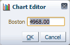
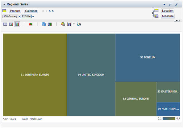
In a Treemap chart, the data is represented by the size and color of the rectangular area markers (nodes). A Treemap chart shows correlations between two types of data values and is used to examine relative performance between a number of data items.
The first data value determines the area size. A zero or negative value will be ignored and no node will be shown on the chart. The second data value determines the area color. You can reverse this via the Flip size/color option that is available on the right-click context menu. Selecting it refreshes the chart so that it displays the new orientation of the data.
For example, a Treemap chart can be used to show the correlation between yearly sales vs. average percent markdown for different regions. The sales data for each region determines the node size, and the average percent markdown determines its color. See Figure 12-51.
Treemap charts are available in the following types:
Treemap chart with continuous colors. The node colors in this Treemap chart transition between a range of shades between two colors. The color shade is determined based on the node data value that determines color.
You can pick the two colors on the chart formatting dialog. See Understanding the Treemap Chart Formatting Window.
Treemap chart with grouped colors. The nodes in this Treemap chart use discrete colors based on the pre-defined range that the node data value falls into. Each range is associated with a group label and a color.
You can define the groups with a start value and a cutoff value with the chart formatting dialog. See Grouped Subtype.
Drilling Down
You can double click on any node with visible children in order to drill down in a Treemap Chart. It is recommended that you do not select the On drill option when drilling down in cases where the data is aggregated (for example, mean, median, percent). Minimum and maximum color values are adjust to reflect new data when you select Auto fill and On drill prior to drilling down. You can de-select the Auto fill option after you have drilled down if you decide you want to use the original parent values instead of the adjusted values.
Showing Images
Show images functionality is supported with Treemap Charts. A single primary image representing the item associated with a node is displayed. If the pivot table you make your data selection from displays images, then the Treemap Chart you render will display those images as well. You can also select the Show images context menu option in order display images (if they are available). For more information about showing images, see Chapter 13, "Images".
This section describes how to drill into graphs to get more detail.
|
Note: With Treemap Charts, unlike other charts, you must double-click in order to drill down. |
When taking decisions or reviewing data, you may find it useful to see the information presented graphically. RPAS lets you drill down into the child positions in the graph to see a greater level of detail. You can also return to the original graph. In the example below, the first pie chart shows data at quarterly level.
Figure 12-53 shows the data for the 1st Quarter segment of the pie chart at a monthly level.
You can return to the previous level in the drill down by clicking on the provided link in the legend. If you drill down more than one level, you can select any prior level from a drop-down list. [Not shown in above screen shot].
You can drill down to the lowest level in the hierarchy and then drill back (go back) to the original chart. To see data at a higher level than that originally selected for the chart, you must make a fresh selection in the pivot table view.
Unless you make a fresh selection, the data selected in the pivot table remains unaffected by the drilling operation.
The drilling functionality has some restrictions:
Types of Chart
The following chart types cannot be drilled into:
Pareto Chart
Radar Chart
Drilling into Groups is not supported for the following types of charts:
Bubble Chart
Scatter Chart
Disabling Chart Legend
When configuring charts, you can hide the legend. If the legend is not visible, you cannot use it for drilling down nor for returning to the previous level. You can still drill down by clicking any chart segment or return by selecting previous levels in the drop-down list.
Dimensions
You can drill into any dimension other than measures. This is because a measure consists of a fact (numerical value of some item of information) plus a formula used to manipulate that information. Since this formula may vary at different points along a dimension, drilling down into a measure is not meaningful.
When you select data for the pivot table, you can select a subset of dimensions from those available. Only dimensions selected for the pivot table can be drilled into. In the example below, data has been selected for March and April.
To drill into Y axis positions (Row edge in the pivot table), you can either click on chart area or the legend. To drill into the X axis (Column edge in pivot table) positions, click on labels displayed on the X axis of chart.
Saving and Reopening
If you save the workbook and reopen it while a chart is open and drilled into, the state of the chart will not be saved. Instead, when you reopen the workbook, the chart that is displayed will be based on the data that was selected in the pivot table view.
Drilling down lets you see more detail associated with a specific part of a chart. Drilling down is only possible if the selected dimension has one or more levels selected below the level at which data has been selected for the chart. For example, if you starts to drill into the product dimension at Class level, you must have previously selected other dimensions like Sub-Class and SKU to drill into.
Plotting the Chart
You create charts by selecting the required data in the pivot view window and then selecting Select Chart Type from the View toolbar. Once you select the chart type,you can display it by choosing the Switch to Chart View or Switch to Split View options. Once the chart is available, you can drill down into the chart.
|
Note: Some restrictions exist on the drill-down functionality. For example, you cannot drill into specific chart types. Nor can you drill into specific levels of a particular dimension if those levels have not been selected when creating the pivot table view. |
Methods for Drilling Down
One way to drill down is to click on the required part of the legend. Another is to click in the appropriate section of the chart. If no further levels are available, the chart legend is no longer clickable.
To drill into Y axis positions (row edge in the pivot table), you can either click on chart area or the legend. To drill into the X axis (Column edge in pivot table) positions, you must click on labels displayed on the X axis of chart.
Once you click the legend or chart section, the chart is redrawn to show the information at the lower level.
Reaching Lowest Level
When you reach the lowest available level for drilling down, clicking on the legend or chart area will have no further effect.
Once you drill down at least one level into the chart, you can revert to previous levels. Two options are available:
Clicking on the link in the legend
The link you use to drill down is highlighted in the legend. This link shows the immediate parent position level. Click this to go back one level. If you have drilled through multiple levels, each click on the legend will take you back one level.
Using the drop-down list
You can also got back to previous levels using the drop-down list. If you have drilled down through multiple levels, you can select any previous level.
You can select alternative positions on the page edge.
If you select another position, for example, another product or another location, the chart will be refreshed with the information at the currently selected level. For example, if you select another store and you have drilled down two levels from the information selected in the pivot table, the chart will refresh and show information for the new store two levels down from the one you selected in the pivot table.
The standard chart formatting options work in the drilled state:
Refreshing Chart
The chart can be refreshed with pivot table selections while in the drilled state.
Changing Chart Type
Chart types can be changed while in the drilled state. The new chart type is drawn with the same positions and data values as the one it is replacing.
Toggling Between Views
Toggling between pivot table view to graph view or toggling between graph view to pivot table view retains the same positions and data values as the current drilled state.
Copying Views
Using the Copy View option when the chart is in the drilled state also copies the state of the drilled graph.
Drilling into Split Levels
If you have drilled into split levels:
The drilled state of the charts is preserved when the workbook is recalculated.
The drilled state of the chart is preserved when the workbook is saved and refreshed. However, the drilled state will be lost if you close and reopen the workbook.
Flipping Charts
If the axes of the chart are reversed, the drilled state of the chart will be preserved and it will remain at the current drilled level.
Pivot Swap from Row or Column to Axis
If a pivot swap from row to column axis (or vice versa) is carried out, either by using tiles or directly in the pivot table, the chart will revert to its original, un-drilled state. This initial state is determined by the selected data in the pivot table.
Pivot Swap between Page Edge to Column or Row
If a pivot swap occurs between column edge to column or row (or vice versa), then the chart revert back to its original state.
In both normal and drilled chart view, data can be edited by right clicking in the chart area and opening the Right Click menu.
If you select the Edit option, a pop-up window opens that you can use to edit the data.
Use the refresh button to update the chart with the current data in pivot view.
If the data selected in the pivot table is unchanged, the chart will be restored to its undrilled state.
If the data selected in the pivot table changes, the chart will be redrawn to an undrilled state and display the new data.