3 Creating a WebCenter Application with a Customizable Page
In this lesson, you will create a basic custom WebCenter application, then create a page within the application where you will later add services, content, and portlets. You will also add layout components and Oracle Composer to the page, so that you (and your users) can customize the page at runtime. At the end of the lesson, we will experiment with customizing our page at runtime using Oracle Composer.
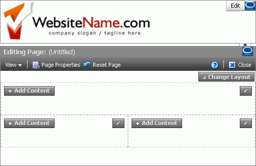
Figure 3-1 shows how your page will look at the end of this lesson.
Figure 3-1 MyPage.jspx at the End of this Lesson

Description of "Figure 3-1 MyPage.jspx at the End of this Lesson"
Introduction
This lesson contains the following steps:
Before you begin the steps in this lesson, ensure you have followed the steps up to this point in the tutorial.
Step 1: Create a Custom WebCenter Application
Let's begin by building a simple custom WebCenter application. WebCenter Framework includes a template that you can use to quickly get started.
To create a custom WebCenter application:
-
In Oracle JDeveloper, choose File > New from the menu.
-
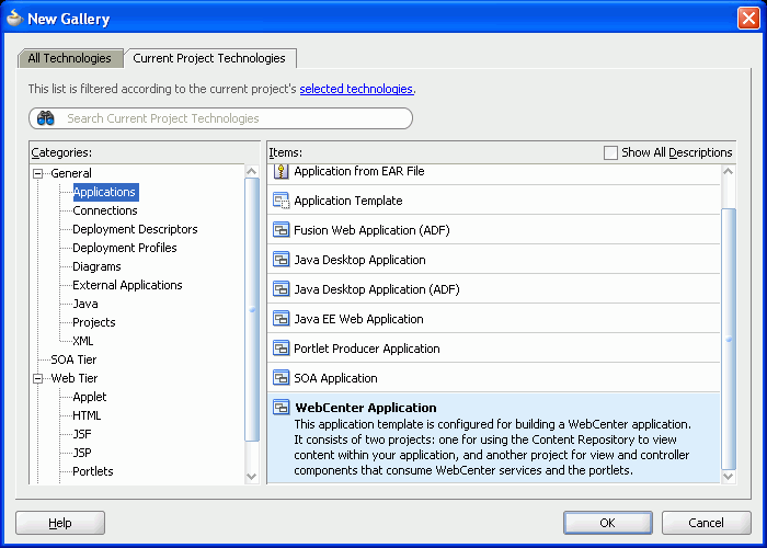
In the New Gallery, on the Current Project Technologies tab, you should see the General category highlighted. Under General, click Applications.
-
In the Items list, scroll down and select WebCenter Application, then click OK (Figure 3-2).
Figure 3-2 Create New WebCenter Application
Description of "Figure 3-2 Create New WebCenter Application"
-
On the Application Name tab, in the Application Name field, enter
MyTutorialApplication. -
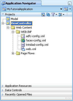
Click Finish. Oracle JDeveloper generates the base files, including two projects, for your application, which you can see in the Application Navigator (Figure 3-3):
-
Model, in which you define the JavaBeans and other data controls you need if the application is to perform any back-end logic.
-
ViewController, in which you'll create the JavaServer Faces (JSF) page that will consume WebCenter services and portlets.
Figure 3-3 Generated Application Project Files in the Application Navigator
Description of "Figure 3-3 Generated Application Project Files in the Application Navigator"
-
-
Let's make a few adjustments for the purposes of testing our application. Right-click the ViewController project, then choose Project Properties (Figure 3-4).
Figure 3-4 Editing the Project Properties
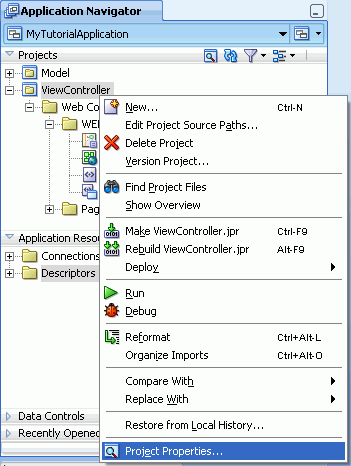
Description of "Figure 3-4 Editing the Project Properties"
-
In the Project Properties dialog box, in the left column, choose Java EE Application (Figure 3-5).
Figure 3-5 Project Properties: Java EE Application
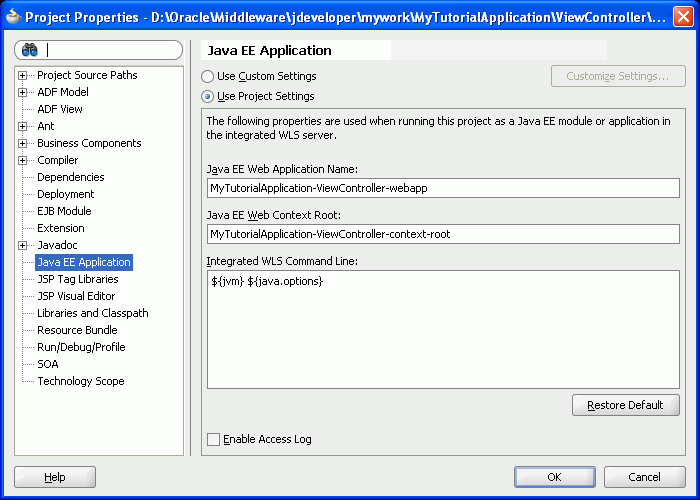
Description of "Figure 3-5 Project Properties: Java EE Application"
-
Here, we'll change the context root of the application to make it easier for us to reference the application resources that we'll use throughout this tutorial. In the Java EE Web Application Name field, enter:
MyTutorialApplication
-
In the Java EE Web Context Root field, enter the same value:
MyTutorialApplication
The Project Properties dialog box should now look like Figure 3-6:
Figure 3-6 Project Properties with the Modified Context Root Values
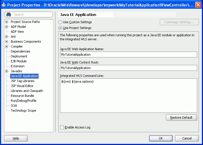
Description of "Figure 3-6 Project Properties with the Modified Context Root Values"
-
Click OK to accept your changes.
-
Save your application by clicking the Save All icon in the toolbar.
Now that you have created a basic custom WebCenter application, you can now create a page. Before we create the page, though, let's add the image files to our application so that we can use them with our page.
Step 2: Add the Images Files to the Application
Now that we've created our application, let's quickly add the image files we want to use, including a logo for our page. Ensure that you've followed the steps in Chapter 2, "Preparing for the Tutorial," which includes a step for obtaining the images files you will add.
To add the image files to our application:
-
In your file system directory (for example, Windows Explorer), navigate to the location where you installed Oracle JDeveloper (
JDev_Home) and locate the following directory:JDEV_USER_HOME\mywork\MyTutorialApplication\ViewController\public_html
JDEV_USER_HOMErefers to the default directory where JDeveloper stores your projects, and depends on how theJDEV_USER_HOMEenvironment variable is set. This could be, for example, your C:\ drive, or it could beD:\Oracle\Middleware\, and so on. You should examine your file system to find out where this directory is set.The
MyTutorialApplicationsubdirectory was automatically generated when you created the application. -
In the
public_htmldirectory, create a directory calledimages. -
Locate the tutorial sample files you downloaded and extracted in Chapter 2, "Preparing for the Tutorial," and copy the contents of the
C:\TutorialContent\imagesfolder into the newimagesdirectory. -
Return to Oracle JDeveloper and click the Refresh icon next to the Projects list in the Application Navigator. You should now see the
imagesfolder in the Application Navigator (Figure 3-7).Figure 3-7 Images in the Application Navigator
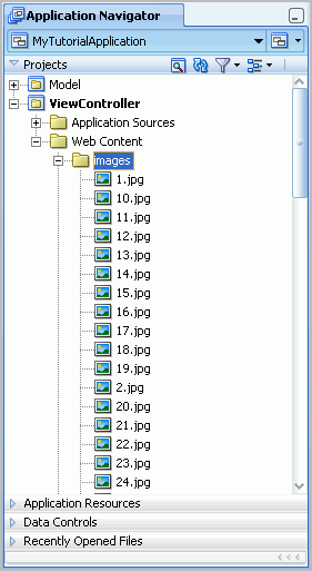
Description of "Figure 3-7 Images in the Application Navigator"
Note:
You'll notice that the image names are enumerated:1.jpg,2.jpg, and so on. These image names match the product ID of the items we will retrieve when we create our portlets in Chapter 5, "Building Portlets and Wiring Them in Your Application." If you change the names of these image files, the statement may not return the correct results.You can now use these images with your application.
Step 3: Create a Page
In this step, you will learn how to create a simple JSF page for your application, which will contain the services and portlets that you'll configure and add in the subsequent steps of this tutorial.
-
In the Application Navigator for
MyTutorialApplication, right-click the ViewController project, then choose New. -
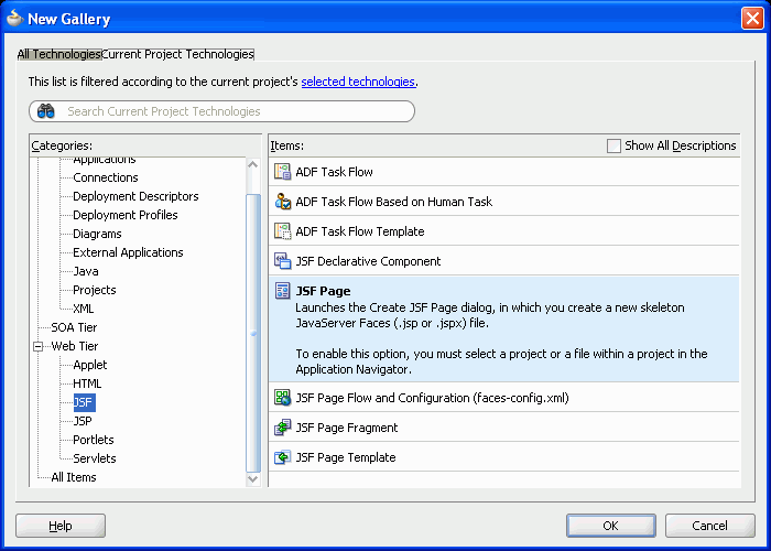
In the New Gallery, under Web Tier, choose JSF.
-
Under Items, choose JSF Page, then click OK (Figure 3-8).
Figure 3-8 Choosing JSF Page from the New Gallery
Description of "Figure 3-8 Choosing JSF Page from the New Gallery"
-
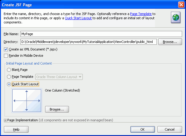
In the Create JSF Page dialog box, in the Name field, enter
MyPage. -
Ensure the Create as XML Document (*.jspx) box is selected.
-
Let's set up an initial layout for our page. WebCenter Framework includes a few “quick start” layouts that help you get started with creating a page layout. You can use these layouts when you begin creating your own applications, or create your own layout from the beginning. In this tutorial, let's use a quick start layout.
Under Initial Page Layout and Content, select Quick Start Layout, then click Browse (Figure 3-9).
-
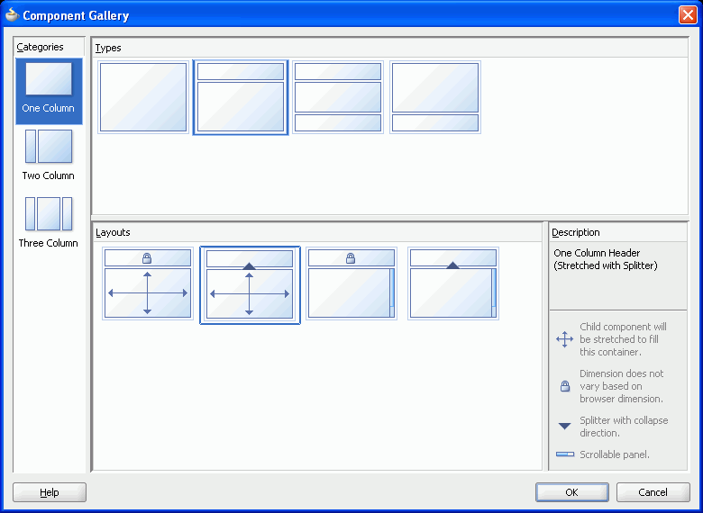
Under Categories, select One Column.
-
Under Types, select the second type.
-
Under Layouts, select the second layout. The Component Gallery should look like Figure 3-10.
-
Click OK, then click OK again.
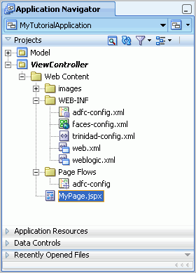
JDeveloper finishes the wizard and displays your page in the Application Navigator (Figure 3-11).
Figure 3-11 MyPage in the Application Navigator
Description of "Figure 3-11 MyPage in the Application Navigator"
-
To the right of the Application Navigator, you'll notice your page displays in the Design view (notice the Design tab is highlighted at the bottom of the view), as shown in Figure 3-12.
-
Below the Application Navigator, notice the Structure window for your page. This view shows all the elements of your page in a hierarchical view. Just below that Structure tab, you'll see a pushpin icon (Figure 3-13).
Figure 3-13 Pushpin in the Structure Window

Description of "Figure 3-13 Pushpin in the Structure Window "
Clicking this icon toggles the behavior of the Structure window -- if it is pressed, then the Structure window displays the current view no matter where you click in Oracle JDeveloper. If it is not pressed, the Structure window updates according to where you click in JDeveloper.
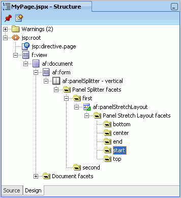
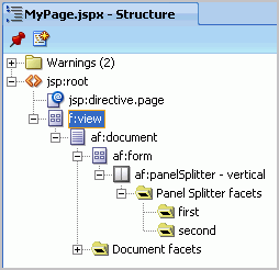
You can expand the nodes in this view to see the various components that were automatically added to your page, since you chose to use the Quick Start Layout. Notice the Panel Splitter and Panel Splitter facets under
f:view, for example (Figure 3-14).Figure 3-14 Structure Window for MyPage.jspx
Description of "Figure 3-14 Structure Window for MyPage.jspx"
Note:
You can alternatively change to the Source view of the page. For the purposes of the tutorial, using the Structure window enables you to see clearly where you've added a new component.Now that we've created our application and a JSF page, let's adjust the layout of our page and add Oracle Composer to our page to enable users to customize the page at runtime.
Step 4: Add Layout Components to the Page
Selecting the Quick Start Layout when we created the page gave us a few “starter” layout components, specifically the Panel Splitter, which gives us the basic framework of our page. Now, let's add a few layout components to the page and structure the header section so that we can begin to add content, such as a logo image.
To add layout component to the page:
-
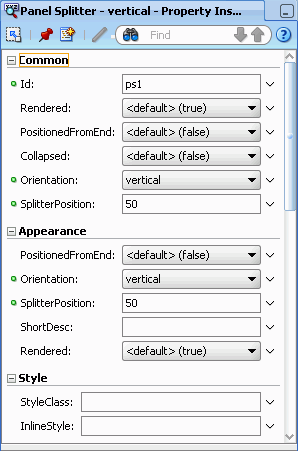
In the Structure window, select the Panel Splitter, which is listed as
af:panelSplitter - vertical. You'll notice that the Property Inspector for this component displays to the right and below the Component Palette (Figure 3-15). The contents of the Property Inspector update depending on your focus in Oracle JDeveloper. Similar to the Structure window, you can use the pushpin icon in the Property Inspector to freeze the view according to the currently selected component.Note:
You can always view the Property Inspector for a component by right-clicking the component, then choosing Go To Properties from the context menu.Figure 3-15 Property Inspector for the Panel Splitter
Description of "Figure 3-15 Property Inspector for the Panel Splitter"
-
In the Property Inspector, under Common, locate the SplitterPosition property, and change the value from
50to85(Figure 3-16). Once you click elsewhere in JDeveloper, the property is saved.Figure 3-16 Setting the SplitterPosition Property
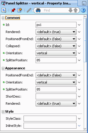
Description of "Figure 3-16 Setting the SplitterPosition Property"
-
In the Structure window, expand the Panel Splitter. You'll notice it contains two facets. In the next step, we'll drop an ADF Faces component onto the
firstfacet. -
Add an ADF Faces layout component to our page to control how the content will display.
In the Component Palette, choose ADF Faces from the list. If the Component Palette is not currently displaying, you can show it by choosing View > Component Palette.
Note:
The Component Palette is context sensitive. That is, the contents of the Component Palette update according to the focus of your view in Oracle JDeveloper. As you're going through this tutorial, if you suddenly “lose” components in the Component Palette or do not see the components described, try ensuring that you have the correct page or panel selected. -
Under Layout, scroll down to Panel Stretch Layout, select it (Figure 3-17), and drag and drop it onto the
firstfacet in the Structure window.Figure 3-17 Panel Stretch Layout in the Component Palette
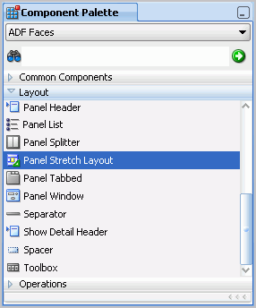
Description of "Figure 3-17 Panel Stretch Layout in the Component Palette"
Figure 3-18 shows the Panel Stretch Layout in the Structure window.
Figure 3-18 Panel Stretch Layout in the Structure Window
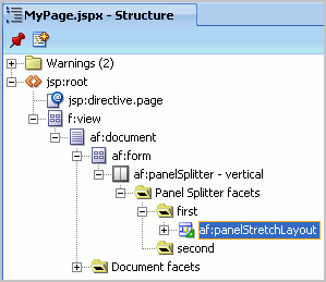
Description of "Figure 3-18 Panel Stretch Layout in the Structure Window"
-
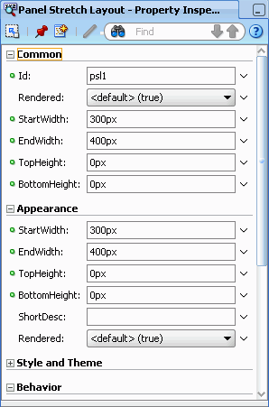
When you drop the Panel Stretch Layout component, you'll notice that the Property Inspector now displays the properties for this component(Figure 3-19).
Figure 3-19 Properties of the Panel Stretch Layout
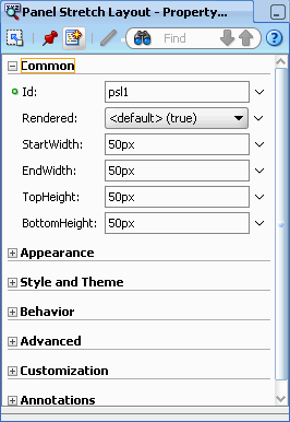
Description of "Figure 3-19 Properties of the Panel Stretch Layout"
-
Set the following properties in the Property Inspector, as shown in Figure 3-20:
-
StartWidth:
300px -
EndWidth:
400px -
TopHeight:
0px -
Bottomheight:
0px
Figure 3-20 Property Inspector for the Panel Stretch Layout with Updated Values
Description of "Figure 3-20 Property Inspector for the Panel Stretch Layout with Updated Values"
-
-
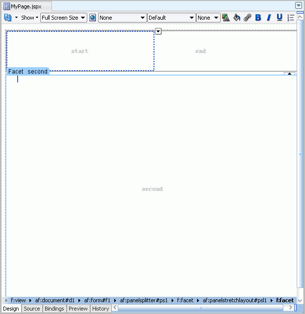
Next, let's add a logo to the header of the page, in the
startfacet of the Panel Stretch Layout. In the Structure window, expand the Panel Stretch Layout you just added so that you can see the different facets (Figure 3-21), then select the start facet.Notice how the corresponding facet is highlighted in the Design view (Figure 3-22). This is where we'll add the logo image.
Figure 3-22 Start Facet in the Design View
Description of "Figure 3-22 Start Facet in the Design View"
-
The logo we'll add is an image file we added to our application in Step 2: Add the Images Files to the Application. In the Application Navigator, under ViewController > Web Content, open the images folder.
-
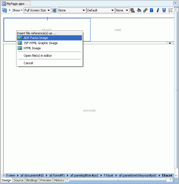
Drag and drop logo.png onto the start facet in the Design view of your page. When you drop the image, choose ADF Faces Image from the context menu (Figure 3-23).
Figure 3-23 Choosing ADF Faces Image from the Context Menu
Description of "Figure 3-23 Choosing ADF Faces Image from the Context Menu"
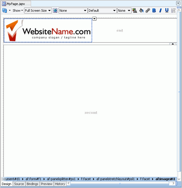
The logo displays on your page, as shown in Figure 3-24.
Figure 3-24 Logo Image on Page in the Start Facet
Description of "Figure 3-24 Logo Image on Page in the Start Facet"
Also notice that the image now displays in the Structure window, as shown in Figure 3-25.
Figure 3-25 Logo Image in the Structure Window
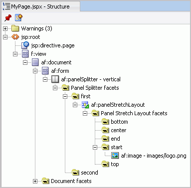
Description of "Figure 3-25 Logo Image in the Structure Window"
-
Let's finish the layout of the header. In the Design view, notice the
endfacet (Figure 3-26).From the Component Palette, drag and drop the Panel Group Layout ADF Faces component onto this facet. You can see this now either in the Design view or, more easily in the Structure window (Figure 3-27).
Figure 3-27 Panel Group Layout in the End Facet
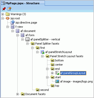
Description of "Figure 3-27 Panel Group Layout in the End Facet"
-
While the Panel Group Layout is selected, in the Property Inspector, under Appearance, change the Halign property to end. This changes the alignment of the components you will add to this layout component.
-
Change the Layout property to horizontal (Figure 3-28).
Figure 3-28 Changing the Properties of the Panel Group Layout
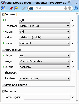
Description of "Figure 3-28 Changing the Properties of the Panel Group Layout"
-
For the purposes of this tutorial, let's add a Status Indicator. The Status Indicator keeps us informed of the application's activity during runtime. For example, if you click a link, the Status Indicator will let you know the application is accessing the target of that link.
Ensure that the MyPage.jspx tab is displaying in the Design view.
-
In the Component Palette, choose ADF Faces from the list to display the ADF Faces components.
-
Under Common Components, scroll down the list and locate Status Indicator, then select it (Figure 3-29).
Figure 3-29 Status Indicator in the Component Palette
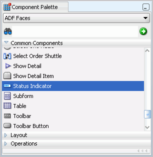
Description of "Figure 3-29 Status Indicator in the Component Palette"
-
Drag and drop the Status Indicator onto the Panel Group Layout in the end facet, as shown in Figure 3-30.
Figure 3-30 Status Indicator on the Panel Group Layout
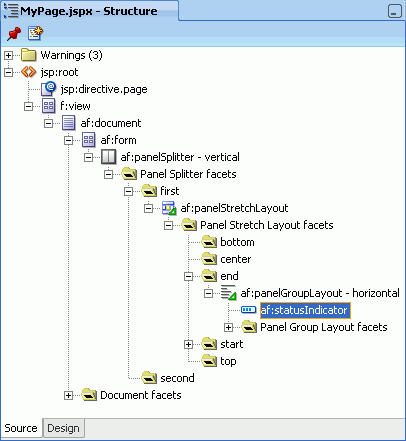
Description of "Figure 3-30 Status Indicator on the Panel Group Layout"
-
Let's examine how the page looks at runtime. Right-click the page in the Design view, then choose Run. The page containing the logo and status indicator displays in your browser, as you can see in Figure 3-31.
Figure 3-31 MyPage with Logo and Status Indicator at Runtime

Description of "Figure 3-31 MyPage with Logo and Status Indicator at Runtime"
-
Return to JDeveloper.
Now that we've set up the initial header for our page, let's add Oracle Composer so that we can customize our page at runtime.
Step 5: Add Oracle Composer to the Page to Enable Customization
In traditional Java EE applications, if you wanted to edit pages (for example, add content, edit security definitions, and so on), you had to make these changes in Oracle JDeveloper, which is the application design time, and then redeploy the updated application to the production environment. With Oracle Composer, you and your application users can now edit your pages at runtime and see the results of your modifications immediately.
Using Oracle Composer, you can give users the ability to move objects around on their page, hide or show content, as well add new content to the page. Let's add Oracle Composer to our page.
To add Oracle Composer to our page:
-
First, let's add the Change Mode Button to the page. This button will enable runtime users of your application to switch between viewing the page and editing it using Oracle Composer.
In the Component Palette, choose Oracle Composer from the list at the top.
-
Under Common Components, drag and drop the Change Mode Button component onto the Panel Group Layout in the Structure window. Adding this component will let you switch back and forth between the Edit mode and the View mode of your page at runtime. Figure 3-32 shows the Change Mode Button in the Component Palette.
Note:
You can adjust the display of the Component Palette to see all of the options. You can do so by clicking and dragging the bars (such as the Layout bar) up and down to view the component names.Figure 3-32 Change Mode Button in the Component Palette
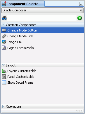
Description of "Figure 3-32 Change Mode Button in the Component Palette"
-
If necessary, you can move the button above the Status Indicator by dragging it in the Structure window (Figure 3-33).
Figure 3-33 Change Mode Button in the Structure Window
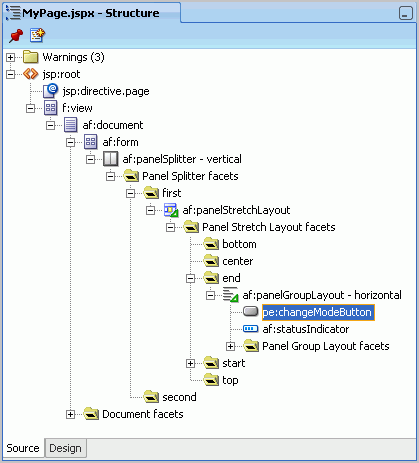
Description of "Figure 3-33 Change Mode Button in the Structure Window"
-
Add a Page Customizable component to the layout. The Page Customizable, which is an Oracle Composer component, adds the runtime customization capabilities to the page.
In the Component Palette, ensure that Oracle Composer is still selected.
-
Under Common Components, drag and drop Page Customizable (Figure 3-34) onto the
secondfacet in the Structure window (Figure 3-35).Figure 3-34 Page Customizable in the Component Palette
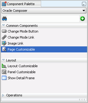
Description of "Figure 3-34 Page Customizable in the Component Palette"
Figure 3-35 Page Customizable in the Second Facet
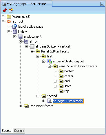
Description of "Figure 3-35 Page Customizable in the Second Facet"
-
In the Structure window, expand the Page Customizable, then delete the Panel Customizable since we do not need it (Figure 3-36). You can delete it by selecting it, then pressing your Delete key.
Figure 3-36 Deleting the Panel Customizable

Description of "Figure 3-36 Deleting the Panel Customizable"
-
Now, we'll add a Layout Customizable to our page to create a layout for this region. In the subsequent chapters, we will add services and portlets to this area. From the Component Palette, drag and drop Layout Customizable onto the Page Customizable in the Structure window (Figure 3-37).
Figure 3-37 Layout Customizable in the Page Customizable

Description of "Figure 3-37 Layout Customizable in the Page Customizable"
-
While the Layout Customizable is selected, in the Property Inspector, under Common, set the Type property to twoColumnBottom (Figure 3-38).
Figure 3-38 Setting the Layout Customizable Properties
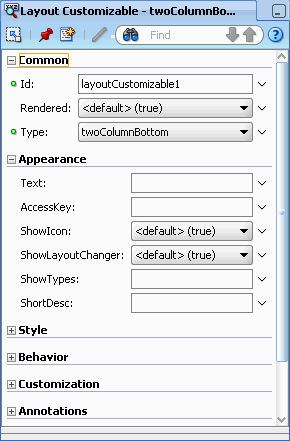
Description of "Figure 3-38 Setting the Layout Customizable Properties"
-
Now that we've added a few Oracle Composer components to our page, let's run the page and check out some of its features at runtime.
Right-click MyPage in the Design view, then choose Run from the context menu to view your page at runtime (Figure 3-39).
Figure 3-39 MyPage at Runtime with the Change Mode (Edit) Button

Description of "Figure 3-39 MyPage at Runtime with the Change Mode (Edit) Button"
We'll explore Oracle Composer at runtime in the next step.
Step 6: Customize the Page at Runtime Using Oracle Composer
After you add Oracle Composer to a page at design time (in JDeveloper), you can run your page and customize the page at runtime (in a web browser). Your application users can also customize their pages at runtime -- this way, you do not have to go back to JDeveloper every time you want to modify the appearance of your application.
In this step, we'll test a few features that Oracle Composer offers. But, for a more in-depth description of using Oracle Composer, refer to the Oracle Fusion Middleware User's Guide for Oracle WebCenter.
-
While MyPage displays in your browser, you'll notice an Edit button next to the Status Indicator. Click the Edit button to see how the page looks in Edit mode (Figure 3-40).
-
Let's take a quick tour of what you can do in Edit mode.
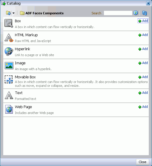
In the top horizontal region, click Add Content to view the runtime catalog. Here, you can click Open to see the different ADF Faces Components you can add at runtime (Figure 3-41).
-
Let's add a Text object to see how it looks. In the Catalog, next to Text, click Add, then click Close. A text box now displays in the region, as shown in Figure 3-42.
Figure 3-42 Text Box in the Edit Mode at Runtime
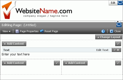
Description of "Figure 3-42 Text Box in the Edit Mode at Runtime"
-
In the upper right corner of the region, click Edit Text to switch to the Rich Text Editor.
-
Place your cursor in the text box and enter some sample text. You can play around with the different functions in the toolbar, as well, such as changing the text to bold or switching the font, as shown in Figure 3-43.
Figure 3-43 Entering and Modifying Text in the Rich Text Editor at Runtime
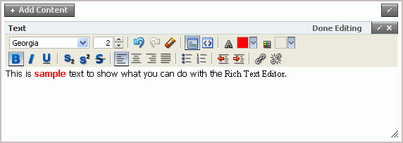
Description of "Figure 3-43 Entering and Modifying Text in the Rich Text Editor at Runtime"
-
When you're finished, click Done Editing.
-
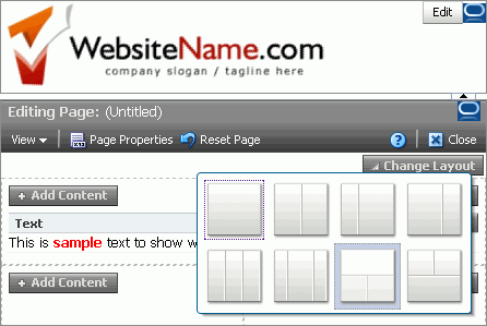
You can change the overall layout of your page by clicking Change Layout, then choosing a layout option (Figure 3-44).
Figure 3-44 Changing the Layout at Runtime
Description of "Figure 3-44 Changing the Layout at Runtime"
-
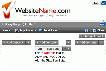
Try selecting a layout option, such as the three column layout. The page automatically refreshes with your changes, as you can see in Figure 3-45.
Figure 3-45 MyPage in a Three Column Layout at Runtime
Description of "Figure 3-45 MyPage in a Three Column Layout at Runtime"
-
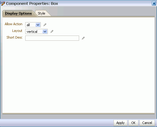
You can also change the layout of each of the component boxes by clicking the pencil icon in the upper right corner of the box (Figure 3-46).
In the Component Properties for the layout box, you can change the layout of the box, the background color, and so on. Click Cancel to exit the Properties pane.
-
You can perform several other tasks at runtime, as well. For example:
-
Drag and drop components from one region to another. Hover your mouse over the text box, and while you see the crosshairs, click and drag the text box from one region to another on the page.
-
Delete components. In the upper right corner of the box, click the X to delete the component.
-
-
Return to Oracle JDeveloper.
Notice that the changes you made, for example the sample text, does not display in your Design view. Modifications that you or your application users make at runtime in Oracle Composer are stored behind the scenes, which means that the changes you make do not affect the source of your application.
-
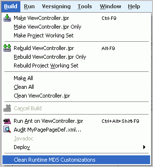
Although your application view is not affected by runtime modifications, the customizations made at runtime are stored in the MDS (Metadata Services). So, while you are developing an application, it is good practice to clear out these changes.
From the Build menu, choose Clean Runtime MDS Customizations (Figure 3-47). If a confirmation dialog box displays, click Yes.
Figure 3-47 Clean Runtime MDS Customizations Menu Option
Description of "Figure 3-47 Clean Runtime MDS Customizations Menu Option"
You can learn more about Oracle Composer and Oracle Metadata Services in the Oracle Fusion Middleware Developer's Guide for Oracle WebCenter.
Now that we've created a custom WebCenter application and customizable JSF page, and taken a quick tour of Oracle Composer at runtime, let's start adding services and components to our page in the next chapter, Chapter 4, "Adding WebCenter Web 2.0 Services to Your Application."
