Result Views Locate
In this section will we explain result views of the Business Service Console.
Selecting Multiple Views Locate
As shown in Figure 14, the selectResultView component is responsible for rendering a menu of available views, rendering selected view and for switching views on user request. It accepts two required parameters - views and titles. If the rendered view needs any parameters, pass them to selectResultView and they will be automatically available in the selected view component. Typically you must pass the data to be rendered and a unique prefix.
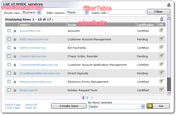
The views parameter holds the names of components that can render the data. Every name must correspond to a component registered in web.xml.
The titles parameter holds titles for these components as they will be rendered in the menu.
<syswf:component prefix="providers" name="selectResultView">
    <syswf:param name="views"
        value="providersCommonResults,providersBizResults"/>
    <syswf:param name="titles" value="Common,Business"/>
    <syswf:param name="prefix" value="providers"/&>
    <syswf:param name="sortedBy" value="${sortedBy}"/>
    <syswf:param name="contentId" value="${contentId}"/>
    <syswf:param name="resultList"
        value="${availableProviders.businessEntityArrayList}"/>
</syswf:component>
Displaying Result View Locate
The result view requires data to be displayed. To provide this data, the bsc:table tag is used to create an instance of com.systinet.uddi.bui.framework.view.Table. This object holds all data that will be displayed. It is instantiated when the result view component is rendered for the first time or when the view has been changed. The table is stored in session, so it is reused on subsequent user actions (such as when the user unfolds a row, changes a sorting column, or changes a filter) as follows:
The table name is defined. Because of possible collisions in the session, the table name incorporates a component prefix into the tableName.
The bsc:table tag is used to create a new Table object in the session under the desired name. If the variable exists in the session already (and the view has not been changed), the body of the bsc:table tag is not evaluated.
Columns are defined using the bsc:column tag. These tags instantiate com.systinet.uddi.bui.framework.view.Column objects that are used for storing display properties of each column and search/filter behavior. The next step is to fill the table with data. In the following example we iterate over org.systinet.uddi.client.v3.struct.BusinessEntityArrayList, extract interesting data and put it into rows and cells of the table object. Once completed we set a table request variable as a shortcut to the session variable with a dynamic name. Detailed information about all tags used in the example is available in the tag reference.
<c:set var="tableName" value="${prefix}TABLE"/>
<bsc:table var="${tableName}" scope="session">
    <bsc:column caption="Provider name" filterCaption="Provider name" name="providerName"
        sortable="true" filterable="true"/>
    <bsc:column caption="UNSPSC" filterCaption="UNSPSC" name="unspsc" sortable="true"
        filterable="true"/>
    <bsc:column caption="Contact name" filterCaption="Contact name" name="contactName"
        sortable="true" filterable="true"/>
    <bsc:column caption="Contact phone" filterCaption="Contact phone" name="contactPhone"
        sortable="true" filterable="true"/>
    <bsc:column caption="Contact email" filterCaption="Contact email" name="contactEmail"
        sortable="true" filterable="true"/>
    <bsc:column caption="Description" filterCaption="Description" name="description"
        sortable="true" filterable="true"/>
    <c:forEach items="${resultList}" var="row" varStatus="status">
        <bsc:row>
           <bsc:attribute key="businessKey" value="${row.businessKey}"/>
           <bsc:cell trimWhitespace="yes">
                <bsc:setLocalizedNames var="DEFAULT_NAMES" value="${row.nameArrayList}"/>
                <c:out value="${DEFAULT_NAMES[0].value}"/>
           </bsc:cell>
           <bsc:cell trimWhitespace="yes">
                <bsc:setCategories var="unspsc"
                    value="${row.categoryBag.keyedReferenceArrayList}"
                    tModelKey="uddi:uddi.org:ubr:categorization:unspsc"/>
                <c:out value="${unspsc[0].keyName}"/>
           </bsc:cell>
           <bsc:setSelectedContacts var="contact"
                value="${row.contactArrayList}" useType="%"
                findQualifier="approximateMatch"/>
           <bsc:cell caption="${contact[0].personNameArrayList[0].value}"/>
           <bsc:cell caption="${contact[0].phoneArrayList[0].value}"/>
           <bsc:cell caption="${contact[0].emailArrayList[0].value}"/>
           <bsc:cell trimWhitespace="yes">
               <bsc:setLocalizedDescriptions var="descriptions"
                        value="${row.descriptionArrayList}"
                            langCode="${userDefaultLanguage}"/>
               <c:out value="${descriptions[0].value}"/>
           </bsc:cell>
        </bsc:row>
    </c:forEach>
</bsc:table>
<c:set var="table" value="${sessionScope[tableName]}"/>
Usually the name of the sorting column comes in parameters from parent JSPs.
<c:choose>
    <c:when test="${not empty sortedBy}">
        <c:set var="defaultSortColumn" value="${sortedBy}"/>
    </c:when>
    <c:otherwise>
        <c:set var="defaultSortColumn" value="providerName"/>
    </c:otherwise>
</c:choose>
The component called processTable is responsible for table processing. This means that if the user enters a new filter, all rows that do not match the filter value are excluded from the actualRows property of the Table object. If the rows are not sorted yet or the user changes sorting criteria, then the actualRows list is sorted.
![[Important]](../images/important.gif)
Important The prefix of this component is very important. The tableFilter and columnHeader components receive their values from the sortTablePrefix parameter. If the value of this parameter is not exactly the same, neither sorting nor filtering will work because the processTable component will not receive these actions!
<syswf:component prefix="sortTable" name="processTable">
    <syswf:param name="table" value="${table}"/>
    <syswf:param name="defaultSortColumn" value="${defaultSortColumn}"/>
</syswf:component>
Here we call tableFilter, which is responsible for rendering the filter. Only columns with the name parameter set and that are filterable are included in the menu.
<syswf:component prefix="filter" name="tableFilter">
    <syswf:param name="table" value="${table}"/>
    <syswf:param name="sortTablePrefix" value="sortTable"/>
</syswf:component>
The next step is to display all column headers. So we call a columnHeader component for each column. The columnHeader component renders the header. If the column is sortable, it inserts syswf:action around the column caption and a character indicating the sort order for the column that is used for sorting.
<th>
    <syswf:component prefix="providerName" name="columnHeader">
        <syswf:param name="table" value="${table}"/>
        <syswf:param name="column" value="${table.columns[0]}"/>
        <syswf:param name="sortTablePrefix" value="sortTable"/>
    </syswf:component>
</th>
To display every table row that is included in the table and matches the filter criteria. So we iterate over the actualRows property of the Table object. Because of code clarity and the row unfolding feature each row is rendered via the providersCommonRow component. It receives a com.systinet.uddi.bui.framework.view.Row object and boolean indicating whether this row is odd or even (for zebra).
<c:forEach items="${table.actualRows}" var="row" varStatus="status">
    <syswf:component prefix="row${status.index}" name="providersCommonRow">
        <syswf:param name="row" value="${row}"/>
        <syswf:param name="even" value="${status.index%2==1}"/>
    </syswf:component>
</c:forEach>
The providersCommonRow is simple. It just renders one HTML table row, filling values from each cell into its appropriate position. Request variable rowClass is set to the name of the CSS class for odd or even rows.
<tr>
    <td class="<c:out value="${rowClass}"/>">
        <a target="_blank" href="<c:out value="${unsecureUrl}"/>
            /browse/providerDetail?businessKey=
            <c:out value="${row.attributes['businessKey']}${loginParams}"/>">
            <c:out value="${row.cells[0].caption}"/>
        </a>
    </td>
    <td class="<c:out value="${rowClass}"/>">
        <c:out value="${row.cells[1].caption}"/>
    </td>
    <td class="<c:out value="${rowClass}"/>">
        <c:out value="${row.cells[2].caption}"/>
    </td>
    <td class="<c:out value="${rowClass}"/>">
        <c:out value="${row.cells[3].caption}"/>
    </td>
    <td class="<c:out value="${rowClass}"/>">
        <c:out value="${row.cells[4].caption}"/>
    </td>
    <td class="<c:out value="${rowClass}"/>">
        <c:out value="${row.cells[5].caption}"/>
    </td>
</tr>
Result Paging Locate
In order to support large result sets without transferring large HTML pages to a web browser, the Business Service Console supports paging of result views. Result views can be split into separate pages, each containing a certain number of items. The user is provided with controls on the user interface for navigating between pages. The registry administrator can configure the number of items on each page for each result view type.
The Business Service Console framework supports turning paging on and off. This may be useful for printing entire result sets.
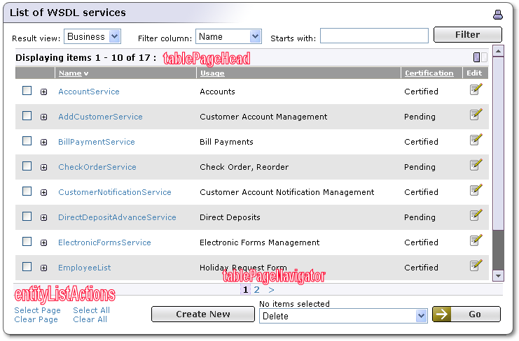
The result view consists of the following parts, as shown in Figure 15:
Result page header - described in tablePageHead component
Result page content - described in Displaying Result View
Page navigator - described in tablePagingNavigator component
The bsc:table object properties define the paging configuration and the current view state. These properties are read and set by the tablePageHead component. The properties are named just as if the bsc:table was a ListDescription object as discussed in the UDDI specification. The tablePageHead component also takes care of UI actions that navigate through the result view content.
In the JSP source code, the tablePageHead component must precede the code that renders the result page content as shown in Example 33. The result page view itself is typically produced in a <forEach> loop, so the JSP has full control of how the table element is rendered. One loop iteration processes a single Row object and produces a single row of the result table.
The Page Navigator displays a list of links that lead to the separate pages of the result view. It generates an output that sends navigational actions to the desired component that takes care of paging and navigation.
Example 33. Example of JSP Page - Paging Result View
This example shows how to split page contents over multiple pages as it is done, for example, in Provider reports.
<!--
1. The table header MUST be used before the table output is produced.
   It configures the table state so that the other components get
   data prepared for rendering of the particular page
  -->
<syswf:component prefix="pager" name="tablePageHead">
    <!--
      The header will configure the table stored in the "table" variable.
      -->
    <syswf:param name="table" value="${table}"/>
    <!--
      The number of rows on a page and the number of pages will be taken
      from the "businessCommonResults" configuration item
    -->
    <syswf:param name="pagingComponent" value="endpointsCommonResults"/>
    <!--
      The number of rows to display on this page will be stored in the
      "rowCount" variable for convenience
    -->
    <syswf:param name="varRowCount" value="rowCount"/>
</syswf:component>

<!--
2. This is the code that renders the table content on the current
   page
-->
<table width="100%" style="margin:0;padding:0">
   <tr>
      <!-- Some column header -->
      <th>
            <syswf:component prefix="service" name="columnHeader">
               <syswf:param name="table" value="${table}"/>
               <syswf:param name="column" value="${table.columns[1]}"/>
               <syswf:param name="sortTablePrefix" value="sortTable" />
            </syswf:component>
      </th>
      <!-- Some more column headers -->
   </tr>

   <!--
      This loop iterates through the rows that should be displayed
      on the page. Note that the "listHead" counts from 1, and that the
      "end" attribute is inclusive!
   -->
   <c:forEach items="${table.actualRows}"
      begin="${table.listHead - 1}"
      end="${table.listHead + rowCount - 2}"
      var="row" varStatus="status">

      <!--
         The body of the loop executes once for each row to be rendered.
      -->
      <tr>
         <!-- Some content here -->
      </tr>
   </c:forEach>
</table>

<!--
3. At the end, the navigation links to individual pages are displayed.
   The configuration and state is taken from the table variable, and the actions
   are sent to the "pager" component (see at the beginning of the example).

   Note the ${prefix} notation, which evaluates to the JSP component's prefix
   itself. This is needed to properly dereference the included component.
-->
<syswf:component prefix="pgNavigator" name="tablePageNavigator">
    <syswf:param name="listDescription" value="${table}"/>
    <syswf:param name="pageSize" value="${table.pageSize}"/>
    <syswf:param name="pageCount" value="${table.pageCount}"/>
    <syswf:param name="targetPrefix" value="${prefix}.pager"/>
</syswf:component>
Paging Configuration Locate
The number of rows displayed on a single page, set in the pageSize parameter, and the number of page links displayed in the navigation bar, set in the pageCount, for individual report types are stored in the Business Service Console configuration file, conf/bsc.xml. If limits for the component name are not found in the configuration, limits for the default component are used to render results.
If you define a different report type, you may want to add an additional pageLimits section into the configuration file with some default values. The user can also configure paging limits under the Configuration main menu tab.
The tablePageHead Component Locate
This component controls the result view division into pages. From the desired start row index and the desired number of items per page, it computes the number of rows to be displayed, or shifts the displayed window so at least some rows are displayed.
The tablePageHead component will configure the table object from the Business Service Console configuration item. The name of the item (the name of the report type) should be provided to the component. If those properties are already set up, the component will not alter them. This is useful for either fixed or customized paging configuration.
Table 93. tablePageHeadParameters
| Param | Description | Required |
|---|---|---|
| table | An instance of com.systinet.uddi.bui.framework.view.Table, the content of which content should be paged. This component sets the listHead, includeCount and actualCount properties of the table object according to the paging status. | yes |
| pagingComponent | The name of the PagingLimits configuration item that determines the desired number of rows per page and the number of page links displayed. If unspecified, or the configuration item does not exist, the pagingComponent will use the default values. | no |
| pageSize | Number of rows per page to be used. If you do not set this value, the value is taken from pagingComponent. | no |
| pageCount | Number of page links to be displayed. If you do not set this value, the value is taken from the pagingComponent. | no |
| varRowCount | An output variable containing the computed number of rows to display on the page. This value can then be used in a loop that generates the result rows on the page. | no |
Component processes actions specific to paging:
Table 94. Actions processed by the tablePageHead component
| Action | Description |
|---|---|
| navigate | Navigates to the specified item index. The index is passed in the pagingListHead action parameter. |
| showAll | Disables paging. This action sets the pageSize property of the table to -1, indicating no limits are imposed. It also sets the listHead property of the table to 1 and the output varRowCount to the size of the table. |
| showPages | Activates paging. The action sets the pageSize property of the table to the value specified in the Business Service Console configuration for the particular report type (or to the default value). It fills the varRowCount output variable properly. |
The tablePageNavigator Component Locate
The tablePageNavigator component displays a set of links to the pages preceding and following the current page content, according to the passed parameters. Links generate actions targeted at a specified component which should process them and switch the current result page.
Table 95. tablePageHead parameters
| Action | Description | Required |
|---|---|---|
| listDescription | An object that describes the state of the paged table. This object must provide the same properties as the UDDI listDescription structure. | yes |
| targetPrefix | The prefix of the component on which the navigation actions will be executed. Note that if the action target component is included in the same JSP as the tablePageNavigator, you will need to use the ${prefix}. prefix to properly reference the embedded component, as shown in Example 33. | yes |
| pageSize | Specifies the number of rows per page. This number is used to compute the start row index for navigational actions produced by the component. The default value is 10. | no |
| pageCount | Number of page links to be displayed. Default value is 20 | no |
Result Tables and Actions Locate
The Business Service Console typically displays lists of entities, based on some search criteria. Depending on the context, the UI contains controls to manipulate with list contents. The framework supports several standard actions, and provides standard components that incorporate them into the UI.
There are two components that assist with handling actions:
The standardRowActions decorates each row of the result table and adds controls that operate on a single result item.
The entityListActions component provides controls for bulk selection, an action selector, and a Go button, which executes the selected action.
The standardRowActions component is used as a wrapper: It gets the name of the component that produces the real row content as a parameter, and generates table cells before or after that content. It also handles the actions for the UI such as folding and selection.
Table 96, “Supported Actions” contains a brief overview of actions that are directly supported by the Business Service Console framework.
Table 96. Supported Actions
| Name | Description |
|---|---|
| Row Folding | The control makes a row in a result table to expand into several lines, or collapses it to a single line. The control appears as a little + icon at the beginning of a row |
| Row Selection | The control allows a row to be added to or removed from a set of selected rows. The group actions operate on selected items in the result set. |
| Row Actions | Each row can have actions associated with it. Such actions typically operate on the single row and they are represented as buttons or clickable icons in the last table column. An example of such action is the Edit action. |
| Multiple-Select Actions | Actions, which select or unselect all items displayed in the table. In the case the table spans multiple pages and only a single page is visible in the browser, the framework provides actions to select or unselect all items on the current page. |
| Create New Action | In some lists, new items can be created. The framework provides a convenience button for the Create New action that launches a Task which ultimately handles the creation. |
| Bulk actions | The framework supports actions, that affect the selected entities from the result set. The user can select the entities and then apply an action on it, for example Delete them. The framework allows the addition of custom actions, which may use the current selection or other parameters gathered by the UI. |
Actions in Table Rows Locate
The framework provides a special wrapper component, standardRowActions, which provides the container for a single logical row of a tabular result. The wrapper supports the following functions:
Adds + action to unfold or fold row content.
Adds a checkbox or a radio button, and handles the row selection and deselection.
After the row content itself, the wrapper appends custom actions, specified as a value of a parameter.
Paints the first line of a row when it is folded
Paints the rest of the row data if a row is unfolded. In this case, the actions provided by the wrapper will span the entire unfolded row.
Individual parts can be turned on or off.
To support result rows with folding, the standardRowActions component generates a clickable sign (+) into a leading table column (<td). The + action will flip the row's unfolded state property, which can be accessed from JSPs. The folding action is generated when the foldingEnabled parameter is not empty. If the row selection action is also present, they share the same table cell.
With folding, you need to make your row component a little more sophisticated. The row component is called in several modes to generate the heading row that is displayed even in the folded state and the content rows, which display only if the result item is unfolded. The row component will get the mode in its mode parameter. The contentRows parameter of standardRowActions must contain the number of table rows occupied by the component, including the header row. The container will generate the correct rowspace attributes using that value.
if you enable folding, your table header should contain one extra column at the beginning. It is advised to put two spaces ( s) inside the <th> header element.
Rows can be selected or unselected. This part of the UI is enabled by passing a non-empty selectableRows, or editableMode parameter. In both cases, the parameter selectionMode controls whether a radio button should be displayed (for value 'one'), or a checkbox ('many' or empty).
The selection is made client-side and is posted to the server when some action is posted by the browser.
![[Tip]](../images/tip.gif) | Tip |
|---|---|
It is not advised that JSP rendering code check the selected flag, since when the user checks an item, the server-side renderer will not know about it immediately, so the behavior would have to be duplicated using javascript for the browser. The entityListActions component will provide controls to select multiple items as well as inform about the number of selected items. | |
Table 98. standardRowAction parameter - Row Selection
| Parameter | Description | Required |
|---|---|---|
| selectableRows | If not empty, enables row selection | no |
| editableMode | If not empty, enables row selection | no |
| selectionMode |
| no |
A line can have actions specific to it, such as Edit or Delete. The standardRowActions will produce a new table cell, and insert verbatim the contents of the rowActions parameter into it.
The selection check boxes (radio buttons) support multiple tables per page. To distinguish the sets of selectable rows, a selectorId must be provided if there are several tables on a page.
Actions that operate on the whole table are provided in the standard way by the entityListActions component. Parameters provided to the component control what parts will be displayed and what actions will be shown.
The component is designed to be rendered under the table that displays the result set. This component provides three groups of controls:
Selection command links - Select All and Unselect all, Select Page and Unselect Page. These buttons operate on the table associated with the entityListActions.
Creation and navigation buttons - These are passed as parameters; the component inlines them in the layout.
An action selector with the Go! button - When the user selects an action and presses the Go! button, the component will transfer control to the task associated with the selected action.
Table 100. standardRowAction Parameters For Whole Table
| Parameter | Description | Required |
|---|---|---|
| table | The com.systinet.uddi.bui.framework.view.Table instance that the UI will work with; the UI uses the SelectionModel, paging properties, and contents of the table object. | yes |
| selectionActions | An instance of com.systinet.uddi.bui.framework.view.TableActions, that should be rendered on the page. | yes |
| buttons | If not empty, the content is put into its own layout cell. The caller may render the content (command buttons) into the parameter, using the syswf:control tags, for example. | no |
| backButton | If not empty, the entityListActions component will display the Back button, which returns the task's parent. | no |
| disableListControls | If not empty, select/unselect buttons are hidden. This is useful when it is not desirable to have bulk operations available. | no |
Action Dispatch Helper Locate
This is a helper component, which can be used as a black-box. Because of limitations of the Systinet Web Framework, it is not really possible to redirect to a task from deep in the component hierarchy. It is only possible from a task's root component. Therefore, a special task, /common/tableActionsDispatch exists, which redirects to the real desired task, passing on the parameters of the selected action.
Table 101. standardRowAction Parameter - Dispatch Helper
| Parameter | Description | Required |
|---|---|---|
| execute | An instance of com.systinet.uddi.bui.framework.view.TableActions. This component will take the selected action, and will redirect to its task. | no |