|
|
BEA provides a set of specialized portlets that you can use in your portal. This chapter explains how to use these portlets. In addition, this chapter discusses special-purpose portlets that are provided by WebLogic Portal partner companies that you can easily incorporate into your portal.
This chapter includes these sections:
| Tip: | To see a sample web application built with the Content Presenter portlet, download a demo at http://wlp.bea.com. |
The Content Presenter portlet ships with WebLogic Portal 10.0. The portlet allows Portal System Administrators to retrieve and display different kinds of content in a portal in real time, without assistance from your IT Department or software developers. For example, you might want to display a list of the most recent Press Releases so users can browse them and click one to read the entire Press Release. You can place images (a photograph or a chart, for example) or add textual content on a portal page. You can also segregate content by subject matter to target different audiences.
The Content Presenter portlet uses a portlet framework that is based on Content Management, metadata, and templates that let business users step through a wizard to quickly retrieve and display content that is appropriate to the audience. The framework allows WebLogic Portal customers to easily publish content in a variety of ways to almost any site.
The Content Presenter portlet can read content from any configured content provider. Content providers can be any repository that implements the WebLogic Portal Content Management Service Provider Interface, including third-party Content Management vendor products, file systems, or other database systems.
When you plan your Content Presenter portlet, determine who will view your content and if you plan to re-use the portlet later for a different audience. Plan entitlements to determine who can choose content to display in the Content Presenter portlet.
You must be a member of the Portal System Administrators role to configure the Content Presenter portlet. The Portal System Administrator role has edit and delete capabilities on the Content Presenter portlet itself, and edit capabilities on any page where the portlet is placed.
If you plan to have a group of users (a subset of the Portal System Administrators role) edit the Content Presenter portlet, this subgroup must have edit and delete capabilities for the Content Presenter portlet itself and edit capabilities for the page that contains the portlet. If the group does not have edit and delete capabilities to the portlet, the group’s members will not be able to see the Edit icon in the portlet.
See the Security Guide for more information on setting entitlements and creating roles and groups. Portal System Administrators can also turn a portlet off by disabling the activation flag in the portlet’s preferences in the Administration Console.
The Content Presenter portlet ships with WebLogic Portal. You must add the Content Presenter facet in Workshop for WebLogic when you set up your portal web project. By default, your portal administrator has the ability to administer the Content Presenter portlet (to move portlets, turn a portlet off, and so on) in the Administration Console.
In a desktop, use the Content Presenter's Configuration Wizard to determine the content you want to display, and how to display it (through templates and template views). The Content Presenter portlet stores those choices as portlet preferences for each portlet instance.
Perform the following steps to configure the Content Presenter portlet:
| Tip: | When you create your Portal Web Project, you must select the Content Presenter Framework facet in the WebLogic Portal (Optional) directory in order to view and use the Content Presenter portlet. |
.portal file) according to the instructions in
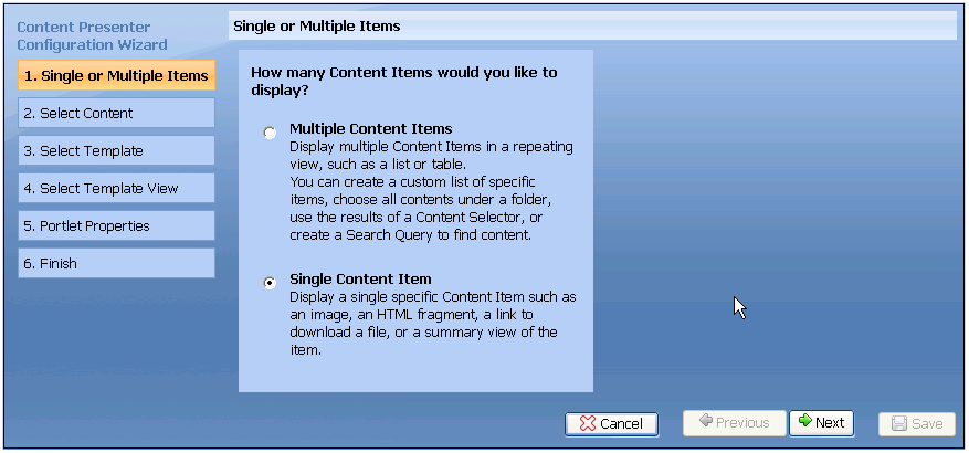
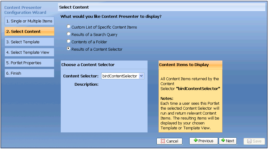
Getting Started With WebLogic Portal tutorial.Library/Pages directory (or wherever you saved it). Add the Content Presenter portlet to the page by clicking Add Page Contents. Click Add Contents in the appropriate column, select the check boxes next to the Content Presenter portlet and a login portlet (if that is the method you are using to authenticate users), and click Save. (If you do not see a list of portlets in the Add Books and Portlets to Placeholder page, click the drop-down box and select Portlets, and click Show all.)See Figure 8-1. Click Next after you select an option.
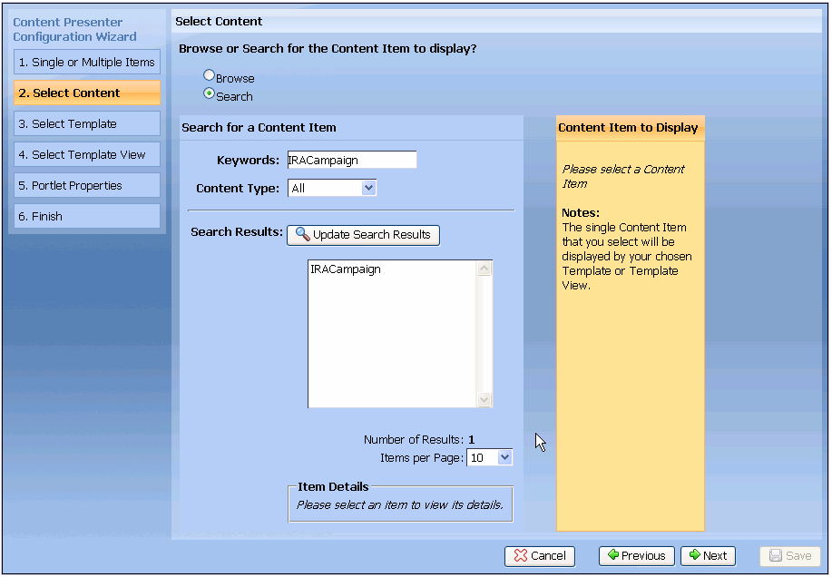
You can click Search to find content by keyword or content type. (If you have multiple content repositories configured, you can also search by repository.) In order to see an object class listed in the Content Type field, you must be specifically entitled to View that object class. See the Security Guide for instructions on setting up users and roles in the Administration Console, and adding View capabilities so users can see the object classes in the Content Type field. Click Update Search Results to view the results. Adjust the Items per Page field to determine how many search results to display in the wizard. See Figure 8-2. Select an item and click Next.
You can also click Search for Content Items, enter a keyword, and click Update Search Results to retrieve content by keyword. If you have multiple content repositories configured, you can also search within a specific repository. To search your repository, you must configure it and make it searchable. The repository that ships with a WebLogic Portal for a new domain is not automatically indexed for searching. See the Content Management Guide for instructions on indexing your repository.
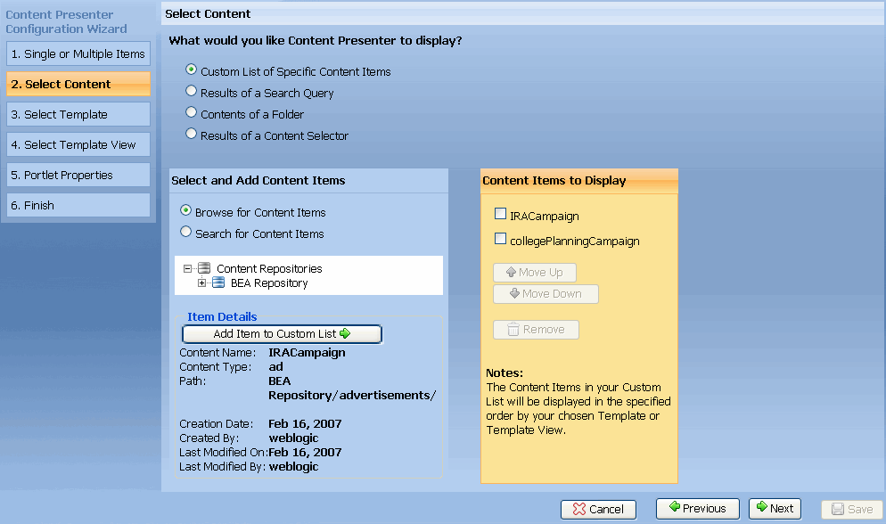
Figure 8-3 shows that after you search and retrieve multiple items, you can select an item and click Add Item to Custom List. The custom list lets you control the order in which the content displays by selecting the check box next to the item and clicking Move Up or Move Down. Moving content to the top of the list ensures that a certain content item displays first. See Figure 8-3. After you determine the order of the content, click Next.
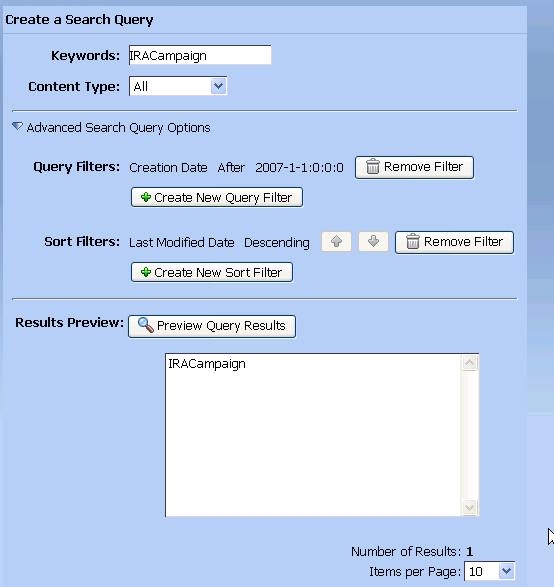
Click Advanced Search Query Options to create a query filter or a sort filter. You can click Create New Query Filter and apply a filter to your query, such as property name, an operator, and a value to narrow down your search results. For example, you can search for content created after1/1/07 by selecting the Creation Date property, selecting After, and then entering a date. Click Add Filter and the new filter appears in the Query Filters section, as shown in Figure 8-4.
| Tip: | The SoundsLike operator retrieves results that contain the keyword and phonetically similar keywords. The Similar operator retrieves results that contain words that are similar to the keyword (for example, the word might be misspelled). |
Click Create New Sort Filter to determine how to display the search results. For example, you can display the most recently-modified content by selecting the Last Modified Date property, selecting Descending, and clicking Add Sort Filter. The new sort filter appears in the Sort Filters section. See Figure 8-4 to see how you can display the most recently-modified content first (descending order). You can change the order in which the results are sorted by clicking the up or down arrow to move the items in the sort filter up or down in the list (from ascending to descending, for example.)
Click Preview Query Results to view the results of the search query. The search query searches both property values and binary content. Adjust the Items per page field to determine how many search results to display in the wizard (it does not affect the final display). Each time someone visits the Content Presenter portlet, the search is re-run. Since content in the repository can change, the results might be different the next time the portlet renders. Click Next.
| Tip: | Running a search query is more resource intensive than retrieving content from a specific node or retrieving the contents of a specific folder. When possible, try to retrieve specific content, rather than running a search. |
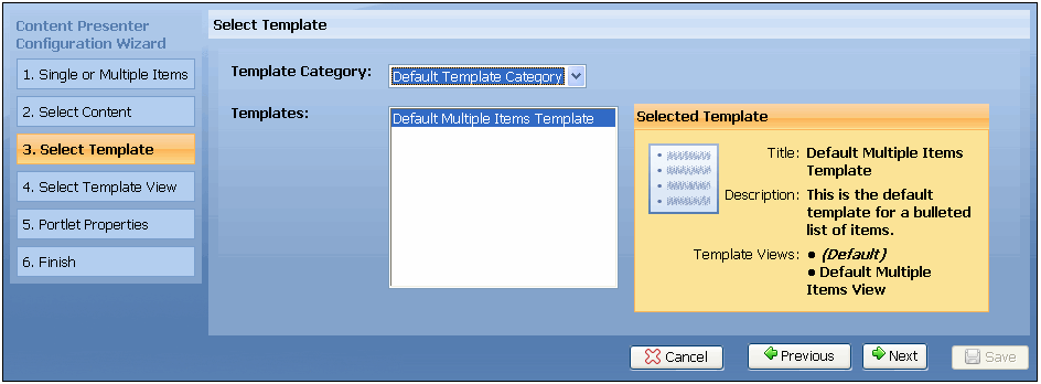
WebLogic Portal ships with the following two default templates:
You should create your own custom template based on the content you want to display. When you create your custom template as described in Creating Custom Templates and Template Views, that template also appears here.
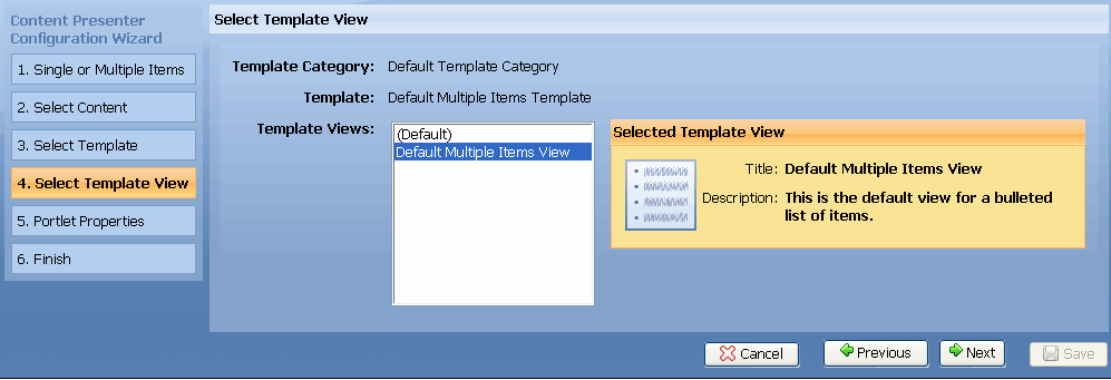
If you chose the Default Single Item Template in step 10 in this section (which displays a single piece of content), or a custom template that you created that does not contain views, select Default Single Item View for the template view. If you chose the Default Multiple Items Template in step 10 in this section, select Default Multiple Items View for the template view
If you created a custom template view as described in Creating Custom Templates and Template Views, that template view also appears here.
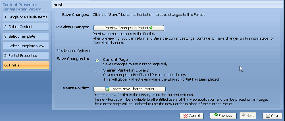
You can also click Advanced Options and select Current Page (to save your changes to the current page only) or select Shared Portlet in Library, to save changes to this shared portlet in the library. Saving changes at the library level globally affects everywhere the shared portlet was placed. You only see this option enabled if you clicked Create New Shared Portlet. When you click Create New Shared Portlet, you use these settings to create a new portlet in the library. The new portlet is available to all entitled users of this web application and can be placed on any page. The current page is updated to use this new portlet, rather than the current portlet. The new portlet also appears in the Administration Console in the \Library\Portlets\ directory. Inheritance rules apply to shared portlets in the library. See the
Portal Development Guide for more information on inheritance. See Figure 8-9.
| Note: | Content Presenter portlets that are configured on pages in the library will remain on the page in the library, even if the page has been customized on the desktop. The only way to make Content Presenter configurations local to a desktop is to add a configured or nonconfigured Content Presenter portlet directly to the desktop, or customize the portlet on the desktop by changing or adding localizations to the portlet on the desktop using the Administration Console. |
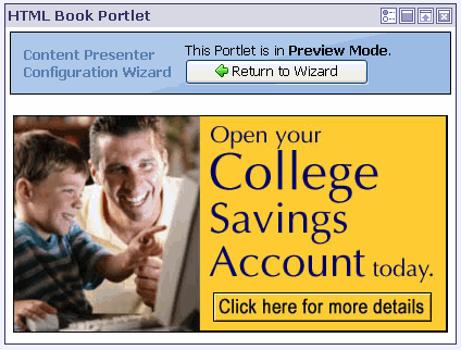
When you finish previewing the portlet, click Return to Wizard or click the Edit icon to return to this step in the wizard and make any additional changes. If you want to save your changes, click Save.
The new content displays in the Content Presenter portlet. Figure 8-10 shows an example of content that is an advertisement for a college savings account.
| WARNING: | If you add or modify your Content Presenter portlet using the Visitor Tools (rather than the Administration Console), the portlet is no longer configurable in your desktop. You should add or modify your Content Presenter portlet in the Administration Console. |
| Tip: | The Content Presenter portlet uses error logging to catch exceptions and will display an error message in the portlet if you have rights to configure the portlet. For example, you might receive an error message if content your portlet is referencing was deleted, or a template or view the portlet is using was removed. The error message instructs you to reconfigure the Content Presenter portlet to fix the errors. You must have edit and delete capabilities in order to configure the portlet. |
Custom templates and template views help you display content precisely as you want. Use the following three concepts to plan your template strategy:
<template-group> elements in the wlp-template-config.xml file, located in the /WEB-INF directory. See Creating Template Categories that Appear in the Configuration Wizard for more information.For example, you can create one template to control how an individual press release displays, and you can create another template to control how multiple press releases display. You might use a template to make your company’s press releases appear in a bulleted list. You can then use template views to display a summary of the press release, the press release’s title only, or an internal view of the press release.
The Content Presenter portlets use WebLogic Portal’s Content Management Display Templates technology, which can display almost any kind of resource. The <template-name-space> element also allows you to create Display Templates specifically for the Content Presenter portlet, and allows the Content Presenter portlet to ignore Display Templates that were created for other purposes. Content Management’s CM Display Templates are optional and can also be used to display content.
For instructions on creating a Display Template or a CM Display Template, see the Content Management Guide. For code samples of Display Templates used in Content Presenter templates and template views, see Using Display Templates to Create Templates and Views and Using CM Display Templates to Create Templates and Views.
The following general steps describe how to create a custom template and template view using the Display Templates and CM Display Templates:
cm:getNode tag. You can also use the cm:getProperty tag within the templates to retrieve a specific property from the content item. See the
Content Management Guide for more information on CM Display Templates, and the getProperty and getNode tags.| Tip: | If you are displaying content only once and do not need to use inheritance to determine how and what content to display, you probably do not need to create a custom template. If you plan to re-use your content template or use inheritance, you should create a custom template. |
Not all <template-group> elements appear in the Template Category field in the Content Presenter’s Configuration Wizard. To appear in the wizard, a <template-group> element must contain a <template-name-space> child element with a <name> child element with one of two name values: wlp-content-presenter-multiple or wlp-content-presenter-single (see Listing 8-1). These two name spaces determine which templates appear in the wizard and more specifically, where they appear in the wizard. Any templates within the wlp-content-presenter-multiple name-space appear when the user selects the option to show multiple content items in the wizard. Therefore, all templates placed under this namespace should be written to handle multiple content items. The wlp-content-presenter-single name-space is designed for templates that handle a single content item.
<template-group>
     <name>My Custom Template Category</name>
     <template-name-space>
          <name>wlp-content-presenter-multiple</name>
          ...
     </template-name-space>
</template-group>
OR
<template-group>
     <name>My Custom Template Category</name>
     <template-name-space>
          <name>wlp-content-presenter-single</name>
          ...
     </template-name-space>
</template-group>
The Content Presenter portlets use WebLogic Portal’s Content Management Display Templates to display content. After you create a custom Display Template, it appears in the Content Presenter portlet’s Configuration Wizard.
Templates are defined by <template> elements in the wlp-template-config.xml file, and can optionally contain template views as defined by child <view> elements. Template views (<view> elements) always have a child <uri> element that references a JSP, which sets up how the content items will be organized. A template can also optionally have a <default-template-uri> element that references a JSP that will be used if a view is not selected. Templates that have an optional <default-template-uri> list a special (Default) Template View in the Configuration Wizard that uses the template's JSP to organize the content items. A template that does not have a <default-template-uri> or child <view> elements (template views) can not display content and therefore will not be available in the Content Presenter’s Configuration Wizard.
You can create templates without template views to display your content, but creating template views can help organize your content and make it easier to use the Configuration Wizard. For example, you create a template called Press Releases that has a <default-template-uri>. You might need several ways to view Press Releases, such as a Press Release Summary, Press Release Title Only, Press Release Public View, and Press Release Internal View. In this case, creating multiple template views under your Press Releases template is a good solution.
You can also choose to reference an icon to aid users in selecting the correct template and template view in the wizard. For templates, add a <default-template-preview-icon-uri> element. For template views, add a <preview-icon-uri> element. See Listing 8-2 for a code sample of a Press Release template with a view and preview icons that will help users select templates and views in the wizard.
<template-group>
     <name>Custom Template Category</name>
     <template-name-space>
          <name>wlp-content-presenter-single</name>
          <template>
               <description>This is the default template for a Press
                    Release.</description>
               <name>Press Release Template</name>
               <default-template-uri>/templates/pressRelease.jsp
                    </default-template-uri>
               <default-template-preview-icon-uri>/templates/
                    images/pressRelease.gif</default-template-preview-
                    icon-uri>
               <view>
                    <name>Press Release Summary</name>
                    <description>This view shows the bare essentials of a
                         Press Release.</description>
                    <uri>/templates/pressReleaseSummary.jsp</uri>
                    <preview-icon-uri>/templates/images/
                         pressReleaseSummary.gif</preview-icon-uri>
               </view>
          </template>
     </template-name-space>
</template-group>
Listing 8-3 shows the registration of a Display Template that displays a bulleted list with two views—one view displays a list of Press Release titles next to an HTML bullet and the other view displays the titles next to a bullet image.
<template-group>
     <name>Custom Template Category</name>
     <template-name-space>
          <name>wlp-content-presenter-multiple</name>
          <template>
               <name>Press Release List Template</name>
               <description>This is the default template for listing Press
                    Releases.</description>
               <default-template-uri>/templates/pressReleaseList.jsp
                    </default-template-uri>
               <default-template-preview-icon-uri>/templates/images/
                     pressReleaseList.gif</default-template-preview-icon-uri>
               <view>
                    <name>Press Release Bulleted List - Text</name>
                    <description>This lists Press Releases with text
                         bullets.</description>
                    <uri>/templates/pressReleaseListBulletText.jsp</uri>
                    <preview-icon-uri>/templates/images/
                          pressReleaseListBulletText.gif </preview-icon-uri>
               </view>
               <view>
                    <name>Press Release Bulleted List - Image</name>
                    <description>This lists Press Releases with image
                         bullets.</description>
                    <uri>/templates/pressReleaseListBulletImage.jsp</uri>
                    <preview-icon-uri>/templates/images/
                         pressReleaseListBulletImage.gif</preview-icon-uri>
               </view>
          </template>
     </template-name-space>
</template-group>
The ability to re-use common Display Templates within different Content Presenter templates and template views is a powerful feature that can help minimize template code and enforce common presentation patterns.
For example, you can list Press Releases in two different ways, each with a different type of bullet in front of the Press Release title. You could create two different template views, each with its own JSP, that prepend different bullets in front of the very same CM Display Template.
Listing 8-4 and Listing 8-5 show JSP files that reuse a CM Display Template to retrieve only the title of a Press Release and modify its appearance in a Display Template or template view. The benefit of this method is you avoid duplicating that code everywhere you will display the title.
<%@ page language="java" contentType="text/html;charset=UTF-8"%>
<%@ taglib uri="http://www.bea.com/servers/portal/tags/dt" prefix="dt"%>
<%@ taglib uri="http://java.sun.com/jsp/jstl/core"prefix="c"%>
<%@ taglib tagdir="/WEB-INF/tags/wlpapps/contentui/templates"
prefix="templateTags"%>
<templateTags:getTemplateNodes var="nodes"/>
<c:forEach items="${nodes}" var="node">
•
<dt:displaycmtemplate
resourceName="${node.objectClass.name}"
view="Press Release Title Only"
node="${node}"
nameSpace="wlp-content-presenter-multiple"/>
<br/>
</c:forEach>
<%@ page language="java" contentType="text/html;charset=UTF-8"%>
<%@ taglib uri="http://www.bea.com/servers/portal/tags/dt" prefix="dt"%>
<%@ taglib uri="http://java.sun.com/jsp/jstl/core"prefix="c"%>
<%@ taglib tagdir="/WEB-INF/tags/wlpapps/contentui/templates
"prefix="templateTags"%>
<templateTags:getTemplateNodes var="nodes"/>
<c:forEach items="${nodes}" var="node">
<img src="bullet.gif"/>
<dt:displaycmtemplate
resourceName="${node.objectClass.name}"
view="Press Release Title Only"
node="${node}"
nameSpace="wlp-content-presenter-multiple"/>
<br/>
</c:forEach>
CM Display Templates are optional, but can provide a more specialized kind of Display Template Use CM Display Templates for template and template view JSPs to actually render the property values of content items.
Custom CM Display Templates do not appear in the Content Presenter portlet’s Configuration Wizard. Listing 8-6 shows a JSP file that is used as a lightweight CM Display Template.
<%@ page language="java" contentType="text/html;charset=UTF-8"%>
<%@ taglib uri="http://www.bea.com/servers/portal/tags/content" prefix="cm"%>
<cm:getNode id="node"/>
<cm:getProperty name="title" node="${node}"/>
Just like templates and template views, all CM Display Templates are also defined in the wlp-template-config.xml file. In Listing 8-6, the Press Release Title Only CM Display Template is registered by a <view> element under the <content-resource> element associated with the pressRelease Content Type (ObjectClass) shown in Listing 8-7. A CM Display Template uses content types to determine what to display. The name of the content type should match the <name> element defined within the <content-resource> element for that specific CM Display Template.
You can also use the * wildcard to call a generic template to display a content type that is not specifically defined, which is also shown in Listing 8-7.
<content-repository>
     <name>BEA Repository</name>
     <default-template-uri>/templates/cm/lastResortDefault.jsp
          </default-template-uri>
     <content-name-space>
          <name>wlp-content-presenter-multiple</name>
          <content-resource>
               <name>pressRelease</name>
               <default-template-uri>/templates/cm/pressReleaseDefault.jsp
                    </default-template-uri>
               <view>
                    <name>Press Release Title Only</name>
                      <description>This retrieves only the title property of
                          a pressRelease.</description>
                    <uri>/templates/cm/pressReleaseTitleOnly.jsp</uri>
               </view>
          </content-resource>

          <content-resource>
               <name>*</name>
               <default-template-uri>/templates/cm/contentDefault.jsp
                    </default-template-uri>
               <view>
                    <name>Title Only</name>
                    <description>This retrieves only the title property of
                         a generic peice of content.</description>
                    <uri>/templates/cm/contentTitleOnly.jsp</uri>
               </view>
          </content-resource>
     </content-name-space>
</content-repository>
For more information on creating CM Display Templates, see the Content Management Guide.
A complete wlp-template-config.xml file that incorporates many of the previous examples would be similar to Listing 8-8.
<?xml version="1.0" encoding="UTF-8"?>
<wlp-template-config xmlns="http://www.bea.com/ns/p13n/90/<content-repository>
wlp-template-config">
<!--The following bold section is an example of a CM Display Template-->
<name>BEA Repository</name>
<default-template-uri>/templates/cm/lastResortDefault.jsp
</default-template-uri>
<content-name-space>
<name>wlp-content-presenter-multiple</name>
<content-resource>
<name>pressRelease</name>
<default-template-uri>/templates/cm/
pressReleaseDefault.jsp </default-template-uri>
<view>
<name>Press Release Title Only</name>
<description>This retrieves on the title property
of a pressRelease.</description>
<uri>/templates/cm/pressReleaseTitleOnly.jsp</uri>
</view>
</content-resource>
</content-name-space>
</content-repository>
      <!--The following bold section is an example of a Display Template-->

     <template-group>
          <name>Custom Template Category</name>
          <template-name-space>
               <name>wlp-content-presenter-multiple</name>
               <template>
                    <description>This is the default template for listing
                         Press Releases.</description>
                    <name>Press Release List Template</name>
                    <default-template-uri>/templates/pressReleaseList.jsp
                         </default-template-uri>
                    <default-template-preview-icon-uri>/templates/
                         images/pressReleaseList.gif</default-template
                         -preview-icon-uri>
                    <view>
                         <name>Press Release Bulleted List - Text</name>
                         <description>This lists Press Releases with text
                              bullets.</description>
                         <uri>/templates/pressReleaseListBulletText.jsp
                              </uri>
                         <preview-icon-uri>/templates/images/
                              pressReleaseListBulletText.gif
                         </preview-icon-uri>
                    </view>
                    <view>
                         <name>Press Release Bulleted List - Image</name>
                         <description>This lists Press Releases with image
                              bullets.</description>
                         <uri>/templates/pressReleaseListBulletImage.jsp
                              </uri>
                         <preview-icon-uri>/templates/images/
                              pressReleaseListBulletImage.gif</
                              preview-icon-uri>
                    </view>
               </template>
          </template-name-space>
     </template-group>
</wlp-template-config>
WebLogic Portal provides a set of portlets for adding collaborative features to your portal. You can use these collaboration portlets in any WebLogic Portal desktop.
This section includes these topics:
WebLogic Portal provides the following collaboration portlets that you can use in any WebLogic Portal desktop:
| Note: | User portlets are portlets that store data on a per-user basis. Common area portlets store data in a common location that can be viewed by all users. The Calendar, Address Book, and Tasks portlets are user portlets by default. In some cases, you might want to reconfigure them to be common area portlets. For example, you might want to configure a corporate events calendar where all users see the same data. See Configuring Collaboration Portlets for a Shared View for details. |
| Tip: | The collaboration portlets are also available for use in communities, such as the GroupSpace Community. For detailed information on creating communities, see the WebLogic Portal Communities Guide. A GroupSpace Community is a community created using the WebLogic Workshop GroupSpace Template. For information on the WebLogic Portal GroupSpace Community, see the WebLogic Portal GroupSpace Guide. |
To use the collaboration portlets, you must add them to your portal project. To add them, you must add the appropriate facets to both the portal EAR projects and the portal Web projects in which the collaboration portlets will be used.
After you add the Collaboration Portlets, they are available to add to any portals you create in Workshop for WebLogic. They are also available in the portal Library in the WebLogic Portal Administration Console.
This section explains how to reconfigure user portlets to be common area portlets. User portlets restrict the portlet’s data to individual users, while common area portlets allow entitled users to share a the same view of the portlet’s data.
Collaboration portlets fall into two categories: common area portlets and user portlets: Typically, common area portlets are recommended for use cases where all users need to share the same view of the portlet’s data. For example, you could create a calendar that displays corporate events to all users. In this case, you would need to configure the Calendar portlet (which is a user portlet by default) to be a common area portlet.
This section explains how to reconfigure user portlets to be common area portlets. Note that by default, the Calendar, Address Book, Tasks, and Mail portlets are user portlets.
| Tip: | Because mail is usually intended to be used by specific users rather than shared among many users, it is typically not necessary to reconfigure the Mail portlet to be a common area portlet. |
.portlet file and change the definition label and title. For example:
<netuix:portlet definitionLabel="task" title="My Task"
lafDependenciesUri="/portlets/collaboration/collaboration.dependencies">
<netuix:portlet definitionLabel="task_team" title="Team Task" lafDependenciesUri="/portlets/collaboration/collaboration.dependencies">
<netuix:meta> tag containing the AccountListenerImpl to use the CmAccountListener instead of the PersonalAccountListener. For example:
<netuix:meta name="collaboration.portlet.AccountListenerImpl"
content="portlets.collaboration.common.c11n.PersonalAccountListener"/>
<netuix:meta name="collaboration.portlet.AccountListenerImpl"
content="portlets.collaboration.common.c11n.CmAccountListener"/>
.portlet file.For detailed information on how to use the collaboration portlets, see the “Using the GroupSpace Portlets” chapter of the WebLogic Portal GroupSpace Guide. All of the collaboration portlets listed previously in this section are described in that chapter.
Source code for the collaboration portlets is available to WebLogic Portal developers, as explained in this section.
To use the source code, you must first copy it from a J2EE Shared Library to your workspace.
Source code for the collaboration portlets is located in the J2EE Shared Library wlp-collab-portlets-web-lib. To use this source code, you need to copy it from the shared library to your project workspace. See Portlets in J2EE Shared Libraries for information on the Copy to Project feature.
Java source code for the collaboration portlets is copied to WEB-INF/src/portlets. Javadoc for the collaboration portlet code is copied to WEB-INF/src/javadoc.zip.
If you modify any of the source code for the collaboration portlets, be aware of the following disclaimers:
WebLogic Portal partner companies create special-purpose portlets that you can easily incorporate into your portal; these companies include Autonomy, Documentum, and MobileAware.
The following sections provide more information about third-party portlets:
WebLogic Portal includes an embedded license of Autonomy-based search capabilities. You can use these capabilities to integrate enterprise-class search into your portal; common use cases include integration with content management systems, relational databases, and external web sites. You can expose these sources of information for searches using portlets that some with WebLogic Portal, and developers can use Autonomy APIs as they author new portlets and business logic for integrating search into your portal as well.
In WebLogic Portal 9.2, the BEA proprietary search APIs were deprecated; we recommend that you use Autonomy APIs to implement search capabilities.
For more information about Autonomy, see Integrating Search.
EMC Documentum has partnered with BEA to offer EMC Documentum Content Services for BEA Weblogic Portal. This product provides a packaged set of Documentum functionality exposed through the BEA WebLogic Portal infrastructure, allowing users to access and interact with all types of enterprise content including web pages, documents, and rich media such as audio and video.
From a portlet development perspective, a key feature of this product is the inclusion of Documentum portlets—application components that expose standardized, enhanced content management user functions through the portal interface.
Documentum portlets expose four key applications:
See the Documentum web site for more information on Documentum portlets for WebLogic Portal
BEA WebLogic Mobility Server provides a standards-based, non-proprietary environment that extends BEA WebLogic deployments to offer multichannel mobile services in significantly reduced time frames. Enterprises can broaden the effectiveness of business-critical systems for employees and customers, and mobile carriers can rapidly deploy new, data-centric services, without the need for re-training and re-tooling.
For more information about BEA WebLogic Mobility Server and how to use it with WebLogic Portal, see the product documentation on the e-docs web site.


|