|
|
This chapter describes how to use the portal framework to develop the overall appearance and behavior of the portal you develop in Workshop for WebLogic. You will be able to look at a rendered portal in a browser and understand which pieces of the underlying framework that you need to modify to obtain the results you want. In addition, the Look & Feel editor is discussed. The Look & Feel editor lets you interactively modify the text styles used by a portal.
This chapter includes the following sections:
At the heart of WebLogic Portal’s rendering framework is the Look & Feel framework. Look & Feel determines the appearance of your portal applications, from the placement and behavior of elements on a portal page to the colors used in the portlet title bars.
As part of the dynamic portal rendering framework, the Look & Feel can be modified by portal developers in their application code, portal administrators in the staging and production environments, and even by end users in the production environment with WebLogic Portal’s visitor tools, providing a powerful level of user interface customization.
Following are the key elements involved in the Look & Feel framework:
This section briefly describes each component. The sections that follow describe how to create and work with these components.
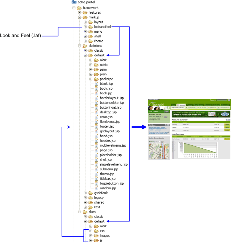
A Look & Feel file (.laf) is an XML block that is inserted into the overall .portal XML file. The Look & Feel file is relatively simple. It references a specific skin and skeleton. The skin provides a set of images, JavaScript functions, and CSS files, which are in turn referenced by the skeleton JSPs that convert the portal XML components to the final HTML output, as shown in Figure 7-1.
When you select a different Look & Feel for a portal, you potentially change the skin and skeleton that is used to render the portal.
Look & Feel files also optionally let you reference skin and skeleton chromosomes, described later.
Skins provide the overall colors, graphics, and styles used by all components in a desktop interface. From the perspective of WebLogic Portal, skins are collections of images, cascading style sheets (CSS), and JavaScript files that allow changes to be made to the Look & Feel of a portal without modifying the portal components directly. References to images and styles are made in the skin rather than being hard coded into the portal definition.
The skeleton JSPs that convert the portal XML to HTML include references to specific image names (portlet titlebar buttons, for example), CSS styles, and JavaScript functions.
The portal rendering framework turns the XML that makes up a portal file into HTML that end users see in a browser. The conversion to HTML happens through JSPs. These JSPs make up a skeleton.
The skeleton provides the physical boundaries of the portal components and provides references to the images, CSS classes, and JavaScript functions from the skin needed to render the portal. A portal web project can have multiple skeletons. When you select a Look & Feel for a desktop, a specific skin and skeleton is used.
Each type of portal component, from a desktop to a portlet’s title bar, has an associated JSP file, called a skeleton file that renders it. Some skeleton files are simple, others are more complex. For example, each desktop uses a skeleton file called shell.jsp that provides the opening and closing <HTML> tags to render the desktop. A portlet title bar, on the other hand, has a skeleton file called titlebar.jsp that is more complex. It references the button graphics to use on the title bar and contains logic to determine the relative placement of title bar elements.
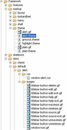
Themes provide a way to override the Look & Feel on books, pages, or portlets, allowing those components to look or behave differently than the rest of the portal desktop Look & Feel. For example, you can set a theme on a portlet that displays a jagged portlet border, turns the portlet title bar red, and displays different portlet title bar buttons.
You can use themes in the skins and/or skeletons. In the previous example, the skeleton theme would control the jagged portlet border, and the skin theme would contain the modified CSS and title bar images.
Skin and skeleton themes are made up of the same types of resources as regular skins and skeletons. The theme skins and skeletons typically provide only the files necessary to override the overall Look & Feel, though full look and feels can also be used as themes. Themes can also be used as Look & Feels. Figure 7-2 shows the types of resources included in a theme:
For example, if the alert theme provides a titlebar.jsp skeleton file, the portal framework uses that skeleton file instead of the parent skeleton’s titlebar.jsp file.
Genes, an optional feature in a Look & Feel, give you an extra level of flexibility, control, and ease of maintenance in working with Look & Feels. A gene defines a particular characteristic of a Look & Feel, such as a CSS color property, that can be referenced as a variable in your Look & Feels.
If, for example, a Look & Feel is defined to have a gene named wlp.portlet.border.color, you can use that gene name in your CSS files rather than a literal color definition. If that gene is defined to be the color value #ff0000, any CSS that uses that gene variable gets that color value. You only have to modify the color value in the gene definition to automatically update all CSS files that use that gene.
Chromosomes are simply the files that contain one or more genes. You can create multiple chromosome files that contain the same gene names, though with different gene values. By simply referencing a different chromosome in your Look & Feel file, you can simulate a completely different Look & Feel without changing any of your core Look & Feel files.
You can also use genes in your JavaScript functions.
Using genes provides the following advantages in your Look & Feels:
Shells define the header and footer regions of a portal. You can include portlets, JSPs, and HTML files in a shell to define the content displayed in the header or footer.
Layouts, used by portal pages, provide structure that determines where you can place portlets and books within a page. Layouts can be implemented, for example, using HTML Tables or CSS-based approaches.
Menus determine the navigation style used for your portal pages. WebLogic Portal provides two types of menus: single-level for single rows of tabs and multi-level for nested, drop-down style page navigation.
WebLogic Portal provides a few default Look & Feels you can use in your applications. You can modify these existing Look & Feels to meet your needs, or you can create your own Look & Feels.
This section describes how to develop custom Look & Feels. However, if you simply want to make small modifications to an existing Look & Feel, you do not need to develop a custom Look & Feel. See Overriding Existing Look & Feels.
For GroupSpace applications, you can find information on modifying the default Look & Feel or creating a new new Look & Feel in the GroupSpace Guide.
You can use Look & Feels created in WebLogic Portal 8.1 by simply importing them into your 9.2 portal web project (into the proper directories). You do not need to upgrade your legacy Look & Feels unless you want to use new features such as genes.
To upgrade a legacy Look & Feel, open the .laf file in Workshop for WebLogic Platform 9.2 from your portal web project. You are prompted to create the skin.xml and skeleton.xml files used in 9.2. After creating these new files, you are ready to use the new WebLogic Portal Look & Feel features.
| Note: | In WebLogic Portal 8.1, skin.properties files could also contain settings for themes. In WebLogic Portal 9.2, themes are stand-alone Look & Feels that use their own skin.xml files. If your WebLogic 8.1 skin.properties files contain theme details that you want to reuse in your WebLogic 9.2 Look & Feels, you must manually add those theme settings to your theme skin.xml files. |
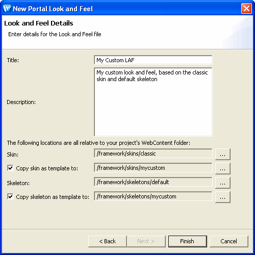
When you create a new Look & Feel, you use an existing Look & Feel as the basis for your new Look & Feel. Using an existing Look & Feel—especially one of WebLogic Portal’s predefined Look & Feels—ensures that you always have the necessary Look & Feel files necessary for properly rendering your portals.
Before you create a Look & Feel file, decide which existing skin and skeleton provides the best basis for your new Look & Feel.
In this window, you can select an existing Look & Feel to use as the basis for your new Look & Feel. Use the following instructions for guidance:
If you want to make a large number of skin and/or skeleton overrides:
You can use this option for just the skin, just the skeleton, or both.
If you want to make relatively few overrides to the selected skin and/or skeleton:
For example, if you use the “classic” skin as the basis of your new Look & Feel, and you create only a <your_skin>/images/titlebar-button-edit.gif file, that graphic overrides the graphic in the classic skin. All other classic skin resources are used for your Look & Feel.
Each Look & Feel must have a skin.xml and skeleton.xml file.
The following sections provide guidance on working with your new Look & Feel, including the Look & Feel editor.
Skins are the graphics, cascading style sheets (CSS), and JavaScript behaviors that define button graphics, text styles, colors, mouseover actions, and other elements in the way a portal looks and behaves. Skins, combined with skeletons, make up a portal desktop's Look & Feel.
Each skin has its own /images, /css, and /js (JavaScript) subdirectories that contain its skin resources. Create and store your Look & Feel images, CSS files, and JavaScript files in these directories. You can also store global Look & Feel resources in a common location outside of a skin’s root directory. A skin knows which resources to use based on its skin.xml file, stored in the skin’s root directory. The skin.xml tells the skin which paths to look in to find image, CSS, and JavaScript files that the Look & Feel uses.
Use the following guidelines when configuring a skin.xml file:
<skin>
<images>
    <search-path>
        <path-element>images</path-element>
        <path-element>../default/images</path-element>
    </search-path>
</images>
</skin>
This block tells the skin to look in the skin’s images subdirectory, and for any files it cannot find in that directory to look for in the default skin’s images directory.
Search paths are relative to the skin directory.
<html>
<scripts>
    <script src=”my.js” type="text/javascript" />
    <search-path>
        <path-element>js</path-element>
        <path-element>../default/js</path-element>
    </search-path>
</scripts>
</html>
If you want to inline JavaScript functions in the HTML output (for example, if you are using genes), use the following types of entries:
<html>
<scripts>
    <script content-uri=”my.js” type="text/javascript" />
</scripts>
</html>
<html>
<scripts>
    <script type="text/javascript">
     alert("Hello World!");
    </script>
</scripts>
</html>
<html>
<styles>
    <style content-uri=”my.css” type="text/css" />
    <search-path>
        <path-element>css</path-element>
        <path-element>../default/css</path-element>
    </search-path>
</styles>
</html>
<html>
<styles>
    <style type="text/css">
        .bea-portal-body
        {
            margin: 0px;
            padding: 0px;
            background-color: #ffffff;
            font-family: Verdana, Arial, Helvetica, sans-serif;
            color: #000000;
        }
    </style>
    <search-path>
        <path-element>css</path-element>
        <path-element>../default/css</path-element>
    </search-path>
</styles>
</html>
Following is a sample structure.xml file:
<?xml version="1.0" encoding="UTF-8"?>
<structure xmlns="http://www.bea.com/servers/portal/framework/laf/1.0.0" xmlns:xsi="http://www.w3.org/2001/XMLSchema-instance" xsi:schemaLocation="http://www.bea.com/servers/portal/framework/laf/1.0.0 laf-structure-1_0_0.xsd">
    <specializations>
        <localizations>
            <localization locale="ja"/>
        </localizations>
        <classifications path="classifications">
            <classification name="nokia"/>
            <classification name="mozilla"/>
        </classifications>
    </specializations>
    <themes>
        <theme name="red_theme" path="../../redtheme"/>
        <theme name="holiday" path="holiday"/>
    </themes>
</structure>
| Note: | Skeletons hard code the names of Look & Feel resources, such as CSS style names, JavaScript functions, and image names. If you rename resources from their default names, you must also modify those names throughout your skeleton JSPs. |
The icon graphics used in portlet title bars are stored in a skin /images directory. The names of these graphics are declared in the portal web project's WEB-INF/netuix-config.xml file to determine which of these graphics to use for the portlet's different states and modes (minimize, maximize, help, edit). If you want to change the name of the graphics used for the portlet title bar icons, change the filenames and the corresponding entries for those graphics in netuix-config.xml.
A portal desktop is a collection of portal components, such as books, pages, and portlets, that have a hierarchical relationship to each another. (Books contain pages, pages contain portlets, and so on.) Since portal components are largely XML files, rendering them in a browser requires a conversion to HTML. That rendering is the function of skeletons.
Each portal component has one or more corresponding skeleton JSP files, located in the <web_project>/framework/skeletons directories. For example, a portlet title bar has a corresponding skeleton JSP file that renders it. When a portal desktop is rendered, the skeleton JSPs for each portal component (in conjunction with any related classes) perform their logic and insert the resulting HTML into the correct hierarchical locations of the HTML file.
Skeletons, combined with skins, make up a portal desktop's Look & Feel. When you select a Look & Feel for a portal desktop, the Look & Feel points to the skeletons and skins to use.
If you open a skeleton JSP, you will notice that it contains <render:beginRender> and <render:endRender> sections. During the rendering process, each skeleton is called twice. This allows the HTML hierarchy to be properly built. For example, a portlet title bar’s own beginRender section is output, followed by the beginRender of the title bar’s children, the buttons. Since buttons do not have children, their endRender sections are then output. Finally, after all buttons have fully rendered, the title bar’s own endRender section is output.
Skeletons also use the WebLogic Portal API to get specific types of information, such as presentation context and style overrides that developers may enter in the Properties view for a selected component.
In summary, skeleton JSPs combine API calls, JSP tags, and HTML snippets to ultimately render a portal desktop in HTML.
WebLogic Portal provides a set of skeletons in the Look & Feels it provides. This section provides guidance on developing your own skeletons for your own Look & Feels. One example of when you might want to create your own skeleton is if you want to provide appropriate rendering on a particular mobile device.
Each skeleton you create must have its own skeleton.xml file in the your skeleton’s root directory.
Use the following guidelines when developing your own skeletons:
<skeleton>
<render-format>
    <preset>HTML_4_01_TRANSITIONAL</preset>
</render-format>
</skeleton>
The <preset> elements allows values for XHTML_1_0_STRICT, XHTML_1_0_TRANSITIONAL, HTML_4_01_STRICT, HTML_4_01_TRANSITIONAL, HTML_4_01_STRICT_NO_SYSTEM_ID, HTML_4_01_TRANSITIONAL_NO_SYSTEM_ID, HTML_3_2, and NONE.
<content-type-overrides>
    <override classification=”nokia” content-type=”application/xhtml+xml” />
</content-type-overrides>
where classification is the name of a device type defined in WEB-INF/client-classifications.xml; and content-type can also use the value “text/html”.
Themes let you override a portal desktop’s overall Look & Feel on individual books, pages, and portlets, allowing a “themed” component to appear or behave differently than the other components in a portal desktop. Also use themes to develop Look & Feels for specific devices, such as mobile devices, to be used in conjunction with WebLogic Portal’s multichannel framework.
Themes are made up of the following resources:
You can also use a Look & Feel as a theme, as long as you create a .theme file for it, described in the following steps.
You can also create a structure.xml in the theme directory if you also plan to use the theme as a full Look & Feel.
If you do not use the structure.xml file in your Look & Feel /skin and /skeleton directories, store your themes as subdirectories of those skins and skeletons.
| Note: | If you create any unique resources, be sure to reference them either in the parent skin or skeleton, or in the theme skin or skeleton. |
After you create a theme, you can select it in the Properties view for any selected book, page, or portlet.
Genes are implemented as simple text strings that are inserted into CSS styles or JavaScript files as variables. You define genes in an XML .chromosome file.
Important: In order to use genes, you must configure the CSS and JavaScript entries in your skin.xml or skeleton.xml to be inlined in the HTML rather than referenced, as described in Working with Skins.
Following is an example that highlights one of the primary benefits of genes.
In a .chromosome file, you could define a gene called “bodyColor” and assign it a value of “red,” like this:
<gene name=”bodyColor”>
    <value>#FF0000</value>
</gene>
In your CSS file, you could use bodyColor as a variable:
body {
     border:1px solid ${bodyColor}
     };
When the page is rendered in a browser, the inlined style definition becomes:
body {
     border:1px solid #FF0000
     };
When you use this gene in your CSS files, you only need to modify the gene value itself to cascade the change throughout all configured CSS files rather than changing the value manually in each CSS file.
You can also use the same gene names in multiple Look & Feels, and provide different gene values in each Look & Feel.
Each skin, skeleton, and theme that uses genes must have its own chromosomes, even if they are simply duplicates of each other. Chromosome files are stored in the same directory as skin.xml and skeleton.xml.
| Note: | Gene values can be defined by references to other genes. |
<netuix:lookAndFeel
    skinChromosome=”holiday”
    skeletonChromosome=”holiday”
By creating a master default.chromosome file, you can keep all your genes in one place and provide gene overrides in other .chromosome file. If the Look & Feel framework does not find a gene in the chromosome you specify in the .laf file, it looks for it in the default.chromosome file.
The Look & Feel framework does not check to see if a gene you reference is defined in a chromosome. If the framework cannot find a gene, it simply prints the gene variable in the HTML output.
Rather than creating new Look & Feels, consider the following possibilities for overriding existing Look & Feels.
Themes let you override the Look & Feel for individual books, pages, and portlets.
Genes let you define different values for variables used in CSS and JavaScript files, which can simulate different Look & Feels with relatively little development effort.
Copy skin, skeleton, or theme files from the WebLogic Portal shared J2EE libraries (copy to the file system from the Merged Projects view). The file-based, modified copies of the files are used at run time instead of the library resources.
In the Properties view for a selected portal component, you can enter presentation property overrides (such as CSS values).
To troubleshoot or fine tune a Look & Feel, use the following guidance:
The Look & Feel editor lets you interactively edit the text styles used by portal text elements. Technically, the editor modifies Cascading Style Sheet (CSS) files that are referenced by a portal’s skin.xml file. For example, using the Look & Feel editor, you can change the size of a heading, the color of a list element, or the padding around a table cell for a portal.
The Look & Feel editor also lets you change the properties of a portal’s Look & Feel file (.laf file), such as the skin and skeleton files that it references.
In addition, the editor shows you, at a glance:
With the Look & Feel editor, you can easily experiment with a portal’s Look & Feel and see the results immediately. The Look & Feel editor lets you interactively edit the text styles used by a portal. Using the Look & Feel editor, you can select text in a portal and modify the text’s characteristics, such as font size, color, padding, and so on. The changes you make are immediately reflected in the editor’s view area.
Remember that a portal’s skin helps to define the overall Look & Feel of a portal. The portal’s skin.xml file specifies one or more CSS files used by the skin. A portal’s HTML text can reference these CSS files and use their style definitions. If you modify the font size for a particular text style, the Look & Feel editor changes the style’s definition inside a CSS file. The change is then immediately reflected in the HTML displayed in the editor’s view area.
The following figure shows the parts of the Look & Feel editor. This section discusses each of these parts in detail.
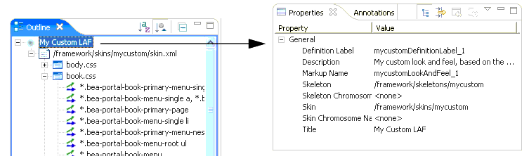
The Navigator panel displays the file structure of a portal project. Use this panel to locate and select the Look & Feel file for the portal that you wish to edit.
The Look & Feel (.laf) file contains references to the skins and skeletons that define a portal’s Look & Feel. To use the Look & Feel editor, you must use the Navigator view to locate the .laf file for the portal you wish to edit. Then, double-click the filename to open the Look & Feel editor. The .laf files for a portal are located in the portal web project framework/markup/lookandfeel folder. For example, the mycustom.laf file is shown selected in the Navigator view in Figure 7-5.
The Style Hierarchy view shows the CSS cascade for the selected style. The cascade is a hierarchy of CSS styles, defined by the HTML document structure. It is useful to see the cascade, because it can help you to locate and appropriately handle inherited style properties. In Figure 7-6, the portlet-section-header style is selected. Note that the style portlet-section-header is below bea-portal-window-content in the hierarchy.
This means that portlet-section-header can inherit properties from portal-window-content, and, potentially, from all other style classes higher up the hierarchy. For more information on inheritance, see CSS Inheritance. When you select a style in the Style Hierarchy view, its style definitions and inherited style properties appear in the Style Description window, described in the next section.
The Style Description window lets you see at a glance the selected style’s properties and its inherited style properties. The Style Info section, shown in Figure 7-7, comes directly from the CSS file in which the style is defined. The Inherited Styles list, also shown, is constructed directly from the document structure of the HTML text that is currently opened in the Look & Feel editor. The Inherited Styles list shows the style properties and their values that are inherited from styles higher up in the document hierarchy. For instance, you can see that portlet-section-header inherits the font-family property from the bea-portal-body style.
To understand the value of the Inherited Styles list, it helps to have a basic understanding of HTML and CSS.
| Tip: | This section is a very brief overview of CSS inheritance. Many books and web sites are devoted to CSS and cover this important subject in greater depth. |
HTML documents are hierarchically organized. In other words, each element of an HTML document can have one or more child elements, one parent element and possibly many ancestor elements. A central feature of CSS is that styles are inherited down the HTML document hierarchy. For example, Figure 7-8 depicts a simple HTML document hierarchy:
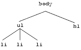
If you would like all the text in this document to be blue, you could define the body tag to be blue. Because of CSS inheritance, all of the elements below body (specifically, li and h1) will also be blue. If, on the other hand, you would like everything to be blue except list elements, you could define the ul tag to be another color, such as red. Then, all of the li elements inherit the color red from their parent, ul. At the same time, the h1 tags will be blue (h1 tags still inherit their color from body).
The Look & Feel editor shows you all styles that a selected style inherits. Therefore, if you want to change the font size of a style, but font size is not defined in that style, you can see at a glance from which style font size is inherited. Then, you can easily edit the property, as explained in the next section.
| Tip: | Without this convenient feature, it would be difficult to decide which styles a given style inherited. Typically, you would have to open and examine the CSS files in the hierarchy to find where a specific style property is defined or possibly overridden. |
As mentioned in the previous section, in some cases, the property you wish to modify is not defined in the specific CSS style class associated with the text you have selected. It is possible, for instance, to select a heading in the Look & Feel editor, but find that font size is not a property of that heading's style. In this case, the property you wish to change might be an inherited property.
The Look & Feel editor displays and lets you edit any inherited property for a given style. For example, suppose you wish to change the font size of some text. After selecting the style you wish to edit (for example, by clicking the text in the View Area), you then notice that font-size is not a property of that text's CSS style. Next you look at the Inherited Styles list, and you discover a style higher up in the cascade in which font-size is defined.
At this point, you must decide whether you want to edit the font-size property where it is currently defined (higher up in the cascade) or add the property directly to the style of the text you wish to modify. Of course, if you modify a property up the cascade, you might inadvertently change the properties of other text that inherits the same property. It is up to you to make this decision. If you change it directly in the selected style, then the inherited property is overridden, and only that style (and any styles down the hierarchy) receive the new property value (unless it is once again overridden).
| Tip: | To add or modify a property in an inherited style, double-click the style name in the Inherited Styles list. Then, use the CSS Style Wizard to make your changes. |
HTML documents are hierarchically organized. In other words, each element of an HTML document can have one or more child elements, one parent element and possibly many ancestor elements. A central feature of CSS is that styles are inherited down the HTML document hierarchy. For example, the following tree diagram depicts a simple HTML document hierarchy:
If you would like all the text in this document to be blue, you could define the body tag to be blue. Because of CSS inheritance, all of the elements below body (specifically, li and h1) will also be blue. If, on the other hand, you would like everything to be blue except list elements, you could define the ul tag to be another color, such as red. Then, all of the li elements will inherit the color red from their parent, ul. At the same time, the h1 tags will be blue (h1 tags still inherit their color from body).
The Look & Feel editor shows you all styles that a selected style inherits. Therefore, if you want to change the font size of a style, but font size is not defined in that style, you can see at a glance from which style font size is inherited. Then, you can easily edit the property, as explained in the next section.
The View Area displays the HTML that uses the CSS styles you wish to edit. When you start the Look & Feel editor, a default HTML page is displayed, showing a representative sample of text elements.
| Note: | Remember that you start the Look & Feel editor by opening a Look & Feel (.laf) file. The HTML file that is shown in the View Area must reference the same CSS files that the .laf file references in its skin. If you load the default HTML page into the editor, this connection is automatically established. However, if you load HTML from a portal into the editor, you must be sure the portal references the same .laf file as the editor. |
The Outline view shows a representation of the files that are referenced by the portal’s skin.xml file. In this panel you can edit properties of:
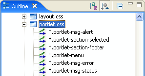
Figure 7-9 shows a portion of the Document Structure panel. In this figure, the css/portlet.css file is expanded to reveal the styles defined in it. You can double-click a style to add or modify its properties. You can also single-click a .css file, style name, or style property to display and edit values in the Properties view.
In addition to using this panel to access CSS styles, you can also access and edit the properties of the Look & Feel file associated with a portal, as shown in Figure 7-10. You can change any of these properties, including picking new skin and skeleton files. Note that the Look & Feel file node occurs at the top of the document structure.
The Properties view lets you interactively modify values of the selected CSS style or Look & Feel file. To display properties in the Properties view, you can do one of the following:
The following packages, documented in Javadoc, let you perform many programmatic operations on Look & Feels:
A shell represents the rendered area surrounding a portal desktop's main content area (books, pages, and portlets). Most importantly, a shell controls the content that appears in a desktop's header and footer regions.
You can configure a shell to use specific JSPs, page flows, HTML files, and portlets to display content in a header or footer.
For each set of different header/footer combinations, create a new shell.
framework/markup/shells directory to your file system.If GroupSpace is enabled in your portal web project, you can also copy communityFiles/shell/communityHeaderFooter.shell.
<netuix:jspContent contentUri="/my_jsps/campaign_header.jsp"/>
Make sure the JSP or HTML file does not contain <html>, <head>, <title>, or <body> HTML tags, because the file is inserted into a single HTML file that already has these tags. You can format the file simply with <div>, <table>, <p>, or any other nested HTML tags.
In the <netuix:jspContent> tag you can also point to an error JSP and a backing file to use for the header or footer JSP, using the following attributes:
errorUri - Enter the path (relative to the project) to an error JSP to be used if there are problems with the contentUri JSP.
backingFile - If you want to class for any preprocessing prior to the rendering of the header or footer JSP (for example, authentication), enter the fully qualified name of that class. That class implements the interface com.bea.netuix.servlets.controls.content.backing.JspBacking or extend com.bea.netuix.servlets.controls.content.backing.AbstractJspBacking.
<netuix:pageflowContent action="showHeader" backingFile=""
contentUri="/communityFiles/shell/CommunityShellController.jpf"
refreshAction="showHeader"/>
<netuix:portletInstance
    title="Visitor Tools Menu"
    markupType="Portlet"
    markupName="portlet"
    instanceLabel="instLblVisitorToolsMenu"
    contentUri="/visitorTools/visitorMenu.portlet"/>
| Note: | Do not use functionality designed to work inside a portlet in the shell. For example, content controls are designed to be used inside portlets rather than directly in a shell. If you want to use portlet-based functionality in a shell, include a portlet in the shell. |
Layouts are the areas of a portal page where you can place books or portlets, letting you arrange these resources in different ways. WebLogic Portal provides a set of predefined layouts you can use in your portals, available for selection in the Properties view when you select a page in the portal editor.
In addition to the predefined layout files WebLogic Portal provides, you can create custom layouts in the following ways:
For the purposes of creating layouts, a layout includes the following files:
WebLogic Portal provides the following three standard layout possibilities for creating your own layouts: border layout, flow layout, and grid layout, as shown in Figure 7-11.
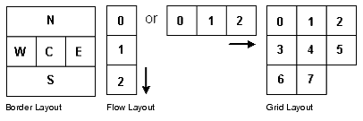
You create each type of layout by configuring the .layout file to suit your needs. For example, you could create a border layout that uses only North (N), West (W), and East (E) areas.
Each type of standard layout has a corresponding skeleton JSP to render it as HTML: borderlayout.jsp, flowlayout.jsp, and gridlayout.jsp.
If you want to create a layout beyond what the standard layouts provide, you must create a custom layout. See Creating a Custom Layout.
title – Provides the name for selecting the layout in a drop-down menu.
description – Provides a description for the selected layout.
|
If you enter
order, the placeholders are ordered according to the value you put in the <netuix:placeholder> tag (covered in the following steps). For example:
|
|
For example, if you are modifying a copy of the fourcolumn.layout to create a border layout, replace the columns attribute with the layoutStrategy attribute and change its value.
htmlLayoutUri – Provides the path (relative to the project) to the .html.txt file you created. For example, /framework/markup/layout/yourNewLayout.html.txt.
markupName – The markupName must be unique among the other layouts.
If you are creating a border layout, use no more than five placeholders.
title – Enter a title for the placeholder. If you are using a border layout with the layoutStrategy attribute set to title, enter north, south, east, west, or center for the title to determine which position of the placeholder in the border layout.
description – Enter a description for the placeholder.
flow – Optional. If you want to control whether the books and portlets are automatically positioned vertically or horizontally when they are added to a layout, enter true.
usingFlow – Optional. If you set the flow attribute to true, enter vertical or horizontal for this attribute value. This value determines whether books and portlets are positioned on top of each other in the placeholder (vertical) or side by side (horizontal).
width – Optional. Set a width for the placeholder.
markupType – Required. Enter Placeholder.
markupName – Required. Used as an ID for the placeholder. Each placeholder must have a unique markupName across all layouts.
order, enter North, South, East, West, or Center as the content between the opening and closing <netuix:placeholder> tag to determine each placeholder's position in the layout. For example, <netuix:placeholder>North</netuix:placeholder> makes a placeholder the north placeholder.You can now use the layout in your portals, by selecting a page in the portal editor and selecting the layout in the Properties view.
If none of WebLogic Portal’s standard layouts suits your needs, you can create a custom layout. When creating a custom layout you need to create three things:
The layout file for a custom layout is the same type of file used in creating standard layouts. It is a block of XML that defines the layout parameters. A layout file must have a .layout extension and can live anywhere in the web application directory except /WEB-INF.
You must create the .layout files by hand (using a text or XML editor). The best way to get started is by copying an existing layout, located in the shared J2EE library in your portal web project’s /framework/markup/layout directory.
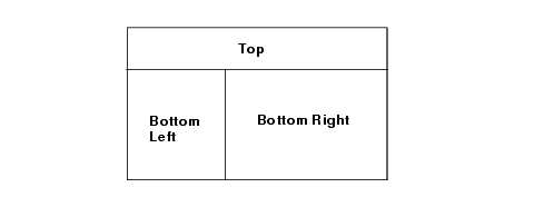
The easiest way to describe how to create a custom layout is to give an example. The following example uses a custom layout with a spanning row at the top with two columns underneath. The two columns split the real estate in a 30%-70% fashion.
Our layout looks something like this:
We will call our layout file spanningtwocolumn.layout, and it looks something like this:
<netuix:layout title="Spanning Two Column" description="One row and two columns."
    type="spanning"
    skeletonUri="/customskeletons/spanningtwocolumnlayout.jsp"
    htmlLayoutUri="/framework/markup/layout/spanningtwocolumn.html.txt"
    iconUri="/framework/markup/layout/spanningtwocolumn.gif"
    markupType="Layout" markupName="spanningTwoColumnLayout">
        <netuix:placeholder title="top" description="The top spanning placeholder."
                            markupType="Placeholder"
                            markupName="spanningTwoColumn_top">
        </netuix:placeholder>
        <netuix:placeholder title="left" description="The bottom left placeholder"
                            markupType="Placeholder"
                            markupName="spanningTwoColumn_left">
        </netuix:placeholder>
        <netuix:placeholder title="right" description="The bottom right placeholder"
                            markupType="Placeholder"
                            markupName="spanningTwoColumn_right">
        </netuix:placeholder>
</netuix:layout>
This example uses the generic <netuix:layout> tag instead of one of the three standard layout tags, such as <netuix:gridLayout>. The example also uses three placeholders, which represent the table cells.
| Note: | The skeletonUri attribute is important for custom layouts, because you will often develop a custom skeleton JSP to render your custom layout. This attribute tells the portal rendering framework which JSP to use. |
The <netuix:markupDefinition>, <netuix:locale/> and <netuix:markup/> elements were left out of the example for the sake of clarity. Do not forget to include these in your .layout file.
This example requires a custom skeleton to do the rendering (as specified by the skeletonUri attribute). You must create this JSP, copying it to any Look & Feels in which the layout is to be used. As with the layout file, the easiest way to create a custom layout JSP is to copy an existing one.
All skeleton files should have the following JSP tags:
The body of the beginRender tag is evaluated during the begin render phase only; the body of the endRender tag is evaluated during the end render phase.
Here is what the custom skeleton JSP (/customskeletons/spanningtwocolumnlayout.jsp) looks like
%@ page import="com.bea.netuix.servlets.util.RenderToolkit,
com.bea.netuix.servlets.controls.layout.LayoutPresentationContext,
java.util.List,
                com.bea.netuix.servlets.controls.layout.PlaceholderPresentationContext"
%>
<%@ taglib uri="render.tld" prefix="render" %>
<%
    RenderToolkit toolkit = RenderToolkit.htmlInstance();
    LayoutPresentationContext layout =
        LayoutPresentationContext.getLayoutPresentationContext(request);
%>

<render:beginRender>
    <table
        <% toolkit.writeId(out, layout.getPresentationId()); %>
        <% toolkit.writeAttribute(out, "class", layout.getPresentationClass(), "layout-custom"); %>
        cellspacing="0"
    >
        <tbody>
    <%
        List children = layout.getChildren("layout:placeholder");

        // Could get optional properties here to help with rendering
        // String property = layout.getProperty("myProperty");

        for (int i = 0; i < children.size(); i++)
        {
            PlaceholderPresentationContext placeholderPresentationContext =
                (PlaceholderPresentationContext)children.get(i);
            if (i == 0)
            {
     %>
                <tr>
                <td colspan="2" width="100%" valign="top" class="layout-placeholder-container">
                    <% toolkit.renderChild(placeholderPresentationContext, request); %>
                </td>
                </tr>
     <%
            }
            else if (i == 1)
            {
     %>
                <tr>
                <td width="30%" valign="top" class="layout-placeholder-container">
                    <% toolkit.renderChild(placeholderPresentationContext, request); %>
                </td>
    <%
            }
            else if (i == 2)
            {
    %>
                <td width="70%" valign="top" class="layout-placeholder-container">
                    <% toolkit.renderChild(placeholderPresentationContext, request); %>
                </td>
                </tr>
    <%
            }
        }
    %>
</render:beginRender>

<render:endRender>
         </tbody>
    </table>
</render:endRender>
| Note: | In this example, the widths are hard coded in the JSP. Instead, these widths should be specified in the layout file as an attribute to the placeholder. Then you can reference the widths in the skeleton as follows: |
<render:writeAttribute name="width" value="<%= placeholderPresentationContext != null ? placeholderpresentationContext.getWidth() : null %>"/>
Also, you can pass other properties like rowspan=2 as name/value pairs on the properties attribute and endtop to create a more generic row/column spanning layout.
The custom layout is now functionally complete. The html.txt file has not yet been created, but you can test the layout. To do this, create a portal file, select a page, and in the Properties view select the custom layout in the Layout field.
| Note: | If you change your .layout file after you have used it in the .portal file, changes are not reflected in the .portal file. This happens because when you use a layout in the .portal it copies the markup from the layout. You must choose another layout and then choose the original one again to see the changes. |
The .html.txt is an HTML snippet strictly used by the tools to give a visual representation of what the layout looks like, so the developer or administrator can place the portlets in the correct placeholders.
In this example, the custom .html.txt file is /framework/markup/layout/spanningtwocolumn.html.txt should look something like this:
<table class="portalLayout" id="thePortalLayout" width="100%" height="100%">
  <tr>
    <td class="placeholderTD" valign="top" width="100%" colspan="2">
      <placeholder number="0"></placeholder>
    </td>
  </tr>
  <tr>
    <td class="placeholderTD" valign="top" width="30%">
      <placeholder number="1"></placeholder>
    </td>
    <td class="placeholderTD" valign="top" width="70%">
      <placeholder number="2"></placeholder>
    </td>
  </tr>
</table>
Navigation Menus provide a way to select different pages in a portal desktop. WebLogic Portal provides a default set of Navigation Menus:
If you want navigation menu behavior other than what is provided with the default menus, modify the singlelevelmenu.jsp or multilevelmenu.jsp skeletons in your Look & Feel /skeletons directory by copying those file from the shared J2EE library to your file system and making the desired modifications. If you are modifying the multi-level menu behavior, you may also need to modify the skin’s menu.js file located in your skin’s /js subdirectory.
To use images on page tabs (Rollover Image, Selected Image, Unselected Image in the Properties view for a selected book), enter a path to the images that is relative to the Look & Feel’s image search paths specific in the skin.xml file.
For example, if you skin.xml image search path is <path-element>images</path-element>, and your menu images are stored in your skin’s /images directory, simply enter the name of the image file in the Properties view. If your menu images are stored in an /images subdirectory of your portal web project, enter a path to the graphic like this: ../../../../images/my_rollover.gif.
This section contains information on the following subjects:
* Accessibility Standards and the Internet
* Government Regulations and Standards
* Accessibility Evaluation and Testing Tools
The Internet provides you with the ability to communicate with a diverse audience from a single point using a portal or web site. Many organizations are required to provide web sites that meet industry or government standards for supporting people with special needs. And even if you do not have specific requirements, it is just good business to design your site to serve the needs of a diverse audience.
WebLogic Portal provides a flexible architecture that supports the design, development, and management of accessible portals and applications, for example, the ability to target specific user interfaces based on user preferences or browser and request attributes.
To learn more about building user interfaces with WebLogic Portal see Creating Look & Feels.
When you develop web sites, you can use the following general guidelines to facilitate accessibility. For a complete list, refer to the industry or government regulation relevant for your implementation.
Text Tags – Provide a text equivalent for every non-text element (for example, using “alt”, “longdesc”, or in element content).
Multimedia Presentations – Synchronize equivalent alternatives for any multimedia presentation.
Color – Design web pages so that all information conveyed with color is also available without color. (for example, from context or markup.)
Readability (style sheets) – Organize documents so they are readable without requiring an associated style sheet.
Server-Side Image Maps – Provide redundant text links for each active region of a server-side image map.
Client-Side Image Maps – Provide client-side image maps instead of server-side image maps except where the regions cannot be defined with an available geometric shape.
Data Table (simple row and column headers) – Identify row and column headers for data tables
Data Tables (multiple levels of row and column headers) – Use markup associate data cells and header cells for data tables that have two or more logical levels of row or column headers.
Frames – Entitle frames with text that facilitates frame identification and navigation.
Flicker Rate – Design pages to avoid causing the screen to flicker with a frequency greater than 2 Hz and lower than 55 Hz.
Text-Only Alternative – Provide a text-only page, with equivalent information or functionality, to make a web site comply with the provisions of this section when compliance cannot be accomplished in any other way. You must remember to update the content of the text-only page whenever the primary page changes.
Scripts – When pages use scripting languages to display content, or to create interface elements, you must identify the information provided by the script with functional text that can be read by assistive technology.
Applets and Plug-ins – When a web page requires that an applet, plug-in or other application be present on the client system to interpret page content, you must provide a link in the page to a plug-in or applet that complies with Section 508 §1194.21(a) through (l).
Electronic Forms – When electronic forms are designed to be completed online, you must create the form to allow people using assistive technology to access the information, field elements, and functionality required for completion and submission of the form, including all directions and cues.
Navigation Links – Provide a method that permits users to skip repetitive navigation links.
Time Delays – When a timed response is required, you must alert users and give them sufficient time to indicate more time is required.
W3C Web Content Accessibility Guidelines
* http://www.w3.org/WAI/w3c.htm - Checklist of Checkpoints for Web Content Accessibility Guidelines 1.0
* http://www.w3.org/TR/WCAG10/full-checklist.html
CLF Accessibility best practices
http://www.cio-dpi.gc.ca/clf-upe/1/1d_e.asp
Adaptive Computer Technology Training Center (Canada)
http://www.cio-dpi.gc.ca/clf-upe/standards/1-1/references/references_e.asp
Guidelines for U.K. Government Web Sites
These tools allow you to validate web page code. They do not repair your code, but they do provide reports on what does and doesn't need to be fixed, as relating to HTML 4.0, W3C, Section 508 and general Accessibility issues.
* W3C Web Accessibility Initiative's Web Tools Page - Evaluation, Repair, and Transformation Tools for Web Content Accessibility
http://www.w3.org/WAI/ER/existingtools.html
* W3C HTML Validator - The W3C HTML Validation Service checks HTML documents for conformance to W3C HTML and XHTML recommendations and other HTML standards.
* CSS Validator - If you are using Cascading Style Sheets (CSS), then use the CSS Validator. http://jigsaw.w3.org/css-validator/
For more information, visit the W3C's Evaluation & Repairs Tools page. http://www.w3.org/TR/2000/WD-AERT-20000426
The Bobby tool identifies W3C accessibility issues by priority level and Section 508 issues. http://bobby.watchfire.com/bobby/html/en/index.jsp
Note: The free version of Bobby allows you to test one page at a time.
The Lynx Viewer generates an HTML page that indicates how much of the content of your page would be available to Lynx, which is a text-only browser. In addition to showing how useful a site would be for a visually-impaired person, it is also a good indicator for anyone with older technology. http://www.delorie.com/web/lynxview.html.


|