A User Interface
This chapter contains information about the user interface for Content Server. The following screens are described in this chapter:
A.1 Getting Started Screens
This section describes the screens used when beginning to use the Content Server.
Note:
If you are using Firefox set to open new tabs instead of windows, help screens launched from an Admin Applet are not accessible until the applet window that launched the help is closed. Therefore, it is preferable to set Firefox to open in new windows instead of tabs.This section covers the following topic:
A.1.1 ExtranetLook Component Logout Option
The optional ExtranetLook component adds the ability to customize the look and feel of Content Server for anonymous users, and adds logout functionality to Content Server.

If the optional ExtranetLook component is installed, then a Logout link is added to the toolbar at the top of a Content Server instance.
A.2 Search Pages
This section describes the screens used when performing Content Server searches.
Note:
If you are using Firefox set to open new tabs instead of windows, help screens launched from an Admin Applet are not accessible until the applet window that launched the help is closed. Therefore, it is preferable to set Firefox to open in new windows instead of tabs.This section covers the following topics:
A.2.1 Expired Content Page
You cannot search for expired content unless you have administrative rights or if your system administrator has granted you specific rights to view and work with expired content.
To display the Expired Content page, click the Content Management tray, and click Expired Content.

| Element | Description |
|---|---|
| Expired Content area | Displays all expired content in the content server repository when the Search button is clicked. |
| Expiring Content area | Displays all expiring content in the content server repository when the Search button is clicked. |
| Find Expired Content area | Used to search the content server repository for content that has already expired.
Before/After choice list: Limits search results to content that expired before or after the specified date. Date field: Specifies the date. Date choice list: Fills in the Date field with a date relative to current date and time. Search button: Displays search results of expired content that meets the date criteria in the Expired Content area above the form. |
| Find Expiring Content area | Used to search the content server repository for content that will expire at a specified time in the future.
From field: Limits search results to content that will expire after the specified date. If this field is blank, the current date and time are used by default. To field: Limits search results to content that will expire before the specified date. Choice lists: Fills in the Date field with a date relative to the current date and time. Search button: Displays search results of expiring content that meets the date criteria in the Expiring Content area above the form. |
A.2.2 Quick Search Field
The quick search field enables you to perform a search regardless of what page is displayed in the content area. The Quick Search field searches the title and content ID metadata, as well as indexed full-text if it is supported on your system.
Note:
If you have changed your layout to the Classic layout, you may need to enable the Quick Search field by selecting the Quick Search check box on your Adding Links to Favorites page.| Item | Description |
|---|---|
| Text entry field | Enter search terms in this field for searching the title and content ID metadata, as well as the full-text index. |
| Quick Search Action icon | Displays the Quick Search Actions menu, which lists the available searches and links to edit them or clear the current selection. Once selected, the search remains persistent until it is cleared or replaced. The name of the selected search is displayed to the left of the icon. If the search is cleared, a quick search reverts to the default behavior of searching content ID, title, and full-text (if enabled.)
Quick Search List: Displays a list of available searches. Selecting a search enables it in the quick search field. Clear Selection: Clears the current quick search and returns the quick search field to the default behavior. Edit: Displays the available searches, from which you can add additional edit existing quick searches. |
| Quick Search button | Displays a search results page that lists the content items that contain the search terms. |
| XML Document Type list | Provides a list of selectable XML document types. By default, the searchxml option is selected. If an XML document type is not selected from the list, the component performs a metadata search in the stored documents and returns all results. In this case, there are no limits on the query.
If you select one or more document types and enter a search term in the text entry field, the component performs a full-text search in the selected document types. To support full-text searches, at least one XML document type must be selected. Any document type included in the list indicates that it has been full-text indexed. |
A.2.3 Home Page Search Fields
The home page search fields enable you to perform a metadata search, full-text search, or a combination of both from the content server Home Page.
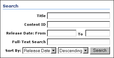
Only the most commonly used search fields are available from the home page.
| Element | Description |
|---|---|
| Title field | A descriptive name for the content item. |
| Content ID field | The unique identifier for the content item. |
| Release Date fields | The date that the item was released to the content server.
From: The search finds items released on or after this date. To: The search finds items released before (but not on) this date. |
| Full-Text Search field | Enter full-text search terms.
If your system administrator has configured the content server to search database metadata only, the Full-Text Search field will not be displayed. |
| Sort By list | Specifies the field that the search results will be sorted on:
Release Date (default): Sorts by the Release Date metadata field. Title: Sorts alphabetically by the Title metadata field. |
| Order list | Specifies the sort order of the search results:
Descending (default): Sorts alphabetical results in Z-A order; numerical results in 9-0 order; and date results in newest to oldest order. Ascending: Sorts alphabetical results in A-Z order; numerical results in 0-9 order; and date results in oldest to newest order. |
| Search button | Displays a list of the content items that match the search criteria on a Search Results Page. |
A.2.4 Search Tray
The Search Tray is used to perform a metadata, full-text, or combination search from the content server's Portal Navigation Bar. Clicking the Search tray expands or collapses the tray.
A.2.4.1 Criteria Tab
The Criteria tab on the Search Tray displays the form in which you enter your search criteria.
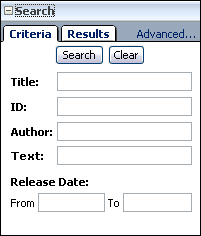
| Element | Description |
|---|---|
| Advanced | Displays the Advanced Search Page. |
| Search button | Submits the search criteria entered to the content server. |
| Clear button | Clears any criteria entered into the search fields. |
| Title field | A descriptive name for the content item. |
| ID field | The unique identifier for the content item. |
| Text field | Enter text search terms.
If your system administrator has configured the content server to search database metadata only, the Text field will not be displayed. |
| Release Date fields | The date that the item was released to the content server.
From: The search finds items released on or after this date. To: The search finds items released before (but not on) this date. |
A.2.4.2 Results Tab
The Results tab in the Search Tray is the area where a listing of search results based on the criteria entered in the criteria tab is displayed.
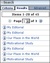
The search results remain in the results tab until a new search is performed or the page is refreshed.
| Element | Description |
|---|---|
| Advanced | Displays the Advanced Search Page. |
| Previous | Returns the search results tab back to the previous results page. |
| Next | Advances the search results tab to the next page of results. |
| Arrow buttons | Forward: Advances to the next search results page in a series.
Back: Returns to the previous search results page in a series. |
| Info icon | Displays the content information of the corresponding content item. |
| ID field | The unique identifier for the content item. |
| Text field | Enter full-text search terms. |
| Release Date fields | The date the item was released to the content server.
From: The search finds items released on or after this date. To: The search finds items released before (but not on) this date. |
A.2.5 Advanced Search Page
The advanced search page enables you to build a search using either the Expanded Form to view all criteria options, or the Query Builder Form to select search criteria from menus as required. The Query Builder Form also allows you to manually edit the query text.
Note:
When using Oracle Text Search with your Content Server instance, you cannot enter complex search queries into the Full-Text Search field on the Expanded Form. Instead, you must use the advanced options on the Query Builder Form.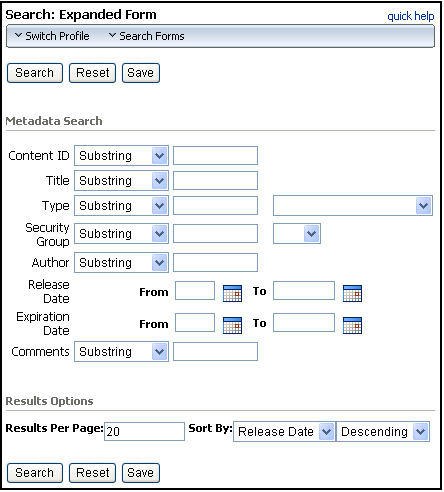
To access this page, click the Advanced link under the Search Tray or the Search link on the toolbar.
A.2.5.1 Expanded Form
The expanded form on the Advanced Search Page displays all search fields available to you on a single page.
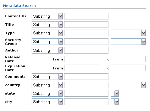
You can alternate between the expanded form and the Advanced Search Page using the Actions menu at the top of the search page.
| Element | Description |
|---|---|
| Search button | Displays a list of the content items that match the search criteria on a Search Results Page. If no search criteria are specified, a list of all content items is displayed. |
| Clear button | Clears the search fields, but does not reset the results options settings. |
| Save button | Saves the search as a saved query link in the Portal Navigation Bar. You are prompted to enter a title for the link. |
| Full-Text Search field (optional) | Enables you to search for words within content items. Also evaluates IdocScript.
If your system administrator has configured the content server to search database metadata only, the Full-Text Search field will not be displayed. |
| Content ID | The unique identifier for the content item. |
| Title | A descriptive name for the content item. |
| Type | The category of the document. You can enter text or select from the list of predefined values. |
| Security Group | An identifier that specifies access permission to the content item. You can enter text or select from the list of predefined values. |
| Account | An identifier that specifies access permission to the content item. This field is displayed only if accounts are enabled on your system. |
| Author | The user who checked in the current content item revision. |
| Release Date | The date that the current revision was released to the content server.
From: The search finds content items released on or after this date. To: The search finds content items released before (but not on) this date. |
| Expiration Date | The date that the content item will no longer be available for searching or viewing in the content server.
From: The search finds content items that will expire on or after this date. To: The search finds content items that will expire before (but not on) this date. |
| Comments | Additional notes about the content item. |
| Results Options | Enables you to specify how search results are displayed. |
| Quick Help button | Displays the help topic specific to the advanced search page. |
Note:
The Search Tray and Advanced Search Page enable you to search on the standard metadata fields. If custom metadata fields have been created for your content server system, they typically will be displayed below the standard metadata fields.A.2.5.2 Query Builder Form
The Query Builder form enables you to easily build and save complex queries by selecting options from a series of lists.
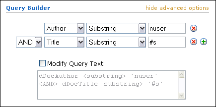
| Element | Description |
|---|---|
| show/hide advanced options | Toggles between displaying and hiding the Modify Query Text check box and Query Text field. |
| Metadata lists | Allows you to choose metadata fields for searching one field at a time. |
| Add/Delete icons | Control the display and use of metadata lists.
Add: Displays an additional metadata field below the current field. Delete: Hides the selected metadata field and removes any query text entered into the field. |
| Operators | Provide easy selection of search options. Available search operators are dependent on the type of search engine being used. |
| Modify Query Text | Controls whether the Query Text field is available for entering text directly into the query.
Enabled: Text can be entered directly into the query text field. Disabled: Query text can be seen as gray text, but cannot be edited directly. |
| Query Text field | Displays the query text as it is being built, or allows user to enter text directly into a query, provided the Modify Query Text check box is enabled. |
A.2.6 Results Options
The Results Options area of the Advanced Search Page is used to control the display of the Search Results page.

| Element | Description |
|---|---|
| Results Per Page field | Specifies the maximum number of content items displayed on each search results page. The default is 25, and the range is from 0 to 100. |
| Sort By list | Specifies the field that the search results will be sorted on:
Release Date (default): Sorts by the Release Date metadata field. Title: Sorts alphabetically by the Title metadata field. Score: Sorts by the number of occurrences of search terms, or the proximity of search terms when a proximity operator such as <NEAR> is used. Applies only to full-text search. |
| Order list | Specifies the sort order of the search results:
Descending (default): Sorts alphabetical results in Z-A order; numerical results in 9-0 order; and date results in newest to oldest order. Ascending: Sorts alphabetical results in A-Z order; numerical results in 0-9 order; and date results in oldest to newest order. |
| Search button | Displays a list of the content items that match the search criteria on a Search Results Page. If no search criteria are specified, a list of all content items is displayed. |
| Clear button | Clears the search fields, but does not reset the results options settings. |
| Save button | Saves the search as a saved query link in the Portal Navigation Bar. You are prompted to enter a title for the link. |
A.2.7 Search Results Page
The search results page displays a list of content items that match the criteria specified during a search.
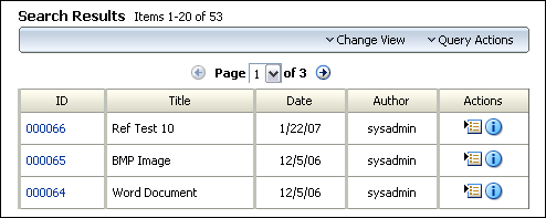
You can control how your search results page looks by choosing a default search template on your User Profile Page. You can also change the template by selecting a different view option from the Action choice list on the search results page.
| Element | Description |
|---|---|
| Found x items matching the query | Shows the number of content items that match the search criteria. |
| Arrow buttons | Forward: Advances to the next search results page in a series.
Back: Returns to the previous search results page in a series. |
| Action Menus | Search Actions:
Allows you to select an action to perform on the search results list. Actions include saving the search to the My Content Server tray, or searching within the listed results. Change View: Allows you to select a different viewing option for the list:
|
| ID column | Displays the content ID of a content item. Clicking the content ID of a selected item either displays a web-viewable version of the content, or prompts you to select to save the file to your local drive or open the document with an associated program. |
| Title column | Displays the title of a content item. |
| Date column | Displays the date that content item was checked in. |
| Author column | Displays the author of the content item. |
| Actions column | Includes the Info icon and the Actions Menu icon.
Info: Displays the Content Information Page for the selected content item. Item Actions Menu: Contains the following options:
|
| Thumbnail
(Thumbnail and Classic views) |
Displays a small image of the content item or an icon indicating the content type of the content item. Clicking the thumbnail of a selected item either displays a web-viewable version of the content, or prompts you to select if you want to save the file to your local drive or open the document with an associated program. |
| Description column
(Classic view) |
Shows the content ID and title of the content item. Clicking the content ID link displays the web-viewable file. |
| Rev. link
(Classic view) |
Shows the latest released revision of the content item. Clicking the link displays the Revision History. |
| Info icon (Classic view) | Displays the Content Information Page for the content item. |
A.2.8 Custom Description Column for Search Result Templates
This area determines what content is displayed in the description column of a Headline View search result template. The Description field must be selected in the Customize Columns section for display on a search results page for this section to have any effect. For information about thumbnail view advanced options, see "Thumbnail View Advanced Options".
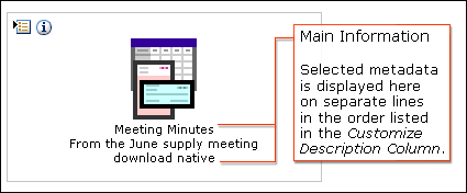
| Item | Description |
|---|---|
| Available Fields | Selecting an item in this box and clicking the right arrow moves the field to the Columns box. Each available field can only be included once in either the Main Information section or Additional Information section, unless the Use Advanced Description Form check box is enabled.
Special: Any special field in the content server. Different components or configurations may add additional special fields. The following fields are available by default.
Standard: The standard Content Server information fields:
Custom: Comments and any custom fields created by your system administrator. |
| Main Information | Controls the display order of the fields in the Description area of a search results page by displaying fields listed in the Text1 box first. Additional display options, such as anchor or formatting tags, may be entered here as either HTML or Idoc Script. |
| Use Advanced Description Form | Enabling this option displays an advanced version of the Main Information field. When enabled, the code for the display of each available field moved to the Main Information section is shown and can be edited directly. Additionally, any item from the Available Fields section can be included in both the Main Information section multiple times. |
A.2.9 Thumbnail View Advanced Options
The following table lists the thumbnail view advanced options. For more information about the description column content, see "Custom Description Column for Search Result Templates".
| Item | Description |
|---|---|
| show/hide additional options | Displays a text field for entering additional Idoc Script options to control the display of a search results page. Idoc Script entered into this field is evaluated and included before the search results page is displayed. |
| Number of Columns | Specifies the number of columns across the result grid. |
A.3 Referenced Links Interface (optional)
This functionality is not available unless the Link Manager component has been added by your system administrator.
Note:
If you are using Firefox set to open new tabs instead of windows, help screens launched from an Admin Applet are not accessible until the applet window that launched the help is closed. Therefore, it is preferable to set Firefox to open in new windows instead of tabs.This section describes the following screens:
A.3.1 Search Links Page
The Search Links page is used to search for links, using criteria stored in the content server repository database.
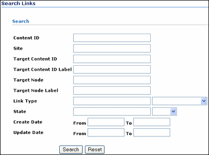
The Search Links page is useful for finding valid or invalid links, to determine where a resource is being used, or to determine how deleting a content item would affect other documents linking to it, etc. If the optional Links Manager component is installed, you can access the Search Links page by clicking the Managed Links Search link in the Content Management tray.
A.3.2 Link Search Results Page
This page displays the results of a link search. Links that are invalid or broken in a Link Search Results Page are listed using bold font.
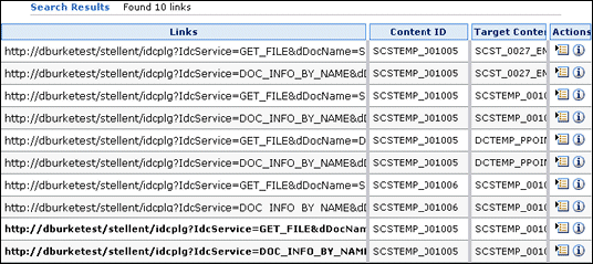
The Link Manager-specific Item Actions Menu and Info icons are available in the Actions column. Clicking the Info icon displays the Content Information page of the document containing the link.
A.3.3 Item Actions Menu
Clicking the Actions icon displays the applicable link management menu.
The menu options include:
-
Content Information: Displays the Content Information page of the document containing the link. This Content Information page contains a References toggle switch that displays (Show option) or hides (Hide option) any related links contained in or links to this content item.
-
Target Content Info: Displays the Content Information page of the document referenced by the link. Again, this Content Information page contains a References toggle switch that displays or hides any related links contained in or links to this content item.
-
Link Info: Displays the Link Info Page for this link.
A.3.4 Link References on Content Information Page
If a content item does not contain any references and no other content items reference it, then the References toggle switch is not displayed on its Content Information page. However, if a content item does contain one or more references and/or has links that reference it, the References toggle switch is displayed.
You can use the Show or Hide References toggle switch to see if the content item references and/or is referenced by other content items.
A.3.4.1 Hide Link References
This is the default display option for the Content Information page when the content item has applicable links associated with it.
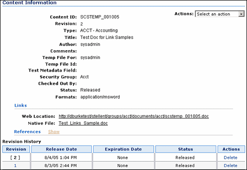
The References toggle switch is included on the page but the individual sections are not displayed. The Show toggle switch option is activated. Clicking Show opens the References sections that list all applicable links associated with the content item.
A.3.4.2 Show Link References
Clicking the Show toggle switch opens the References sections that list all applicable links associated with the content item.
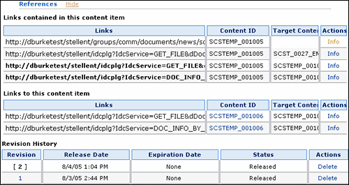
The Links contained in this content item section lists all the links contained in this content item that reference other documents. The Links to this content item section lists all the links in documents that reference this content item. Links that are invalid or broken are listed using bold font. Clicking the Info link in the Actions column displays the Link Info Page for that particular link.
When the References sections are open, the Hide toggle switch option is activated. Clicking Hide closes the References sections and hides the lists of links.
A.3.5 Link Info Page
The Link Info page provides additional information about a link. The Content ID field contains an active link to the content item that contains this link.
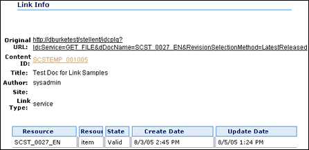
You can access this page from the Search Links Page or from the Content Information page.
A.4 Working With Files
This section describes screens used when you are working with files.
Note:
If you are using Firefox set to open new tabs instead of windows, help screens launched from an Admin Applet are not accessible until the applet window that launched the help is closed. Therefore, it is preferable to set Firefox to open in new windows instead of tabs.This section covers the following topics:
A.4.1 Content Information Page
The content information page is used to view metadata and other information about a specific content item. You can access it from Search Results and Action Item Links.
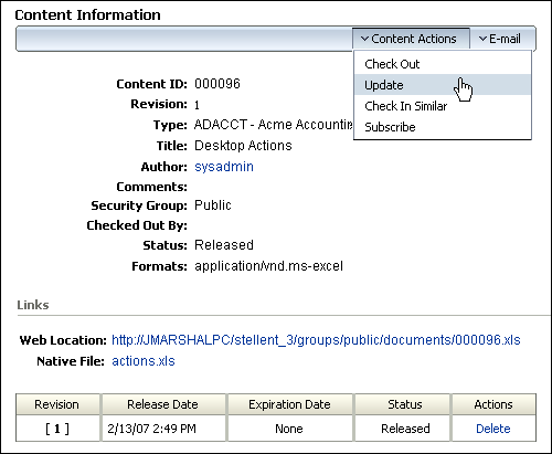
For example, you can use this page to determine when a file was released or to see the content item's revision history.
Note:
Content Profiles may affect what content information is initially displayed on the Content Information page. If content meets a content profile defined by a system administrator, then only information meeting the profile criteria is displayed. If you are an administrator, an additional link for accessing the full content information is displayed in the page heading.| Element | Description |
|---|---|
| Full link | Displays the full content information page.
This link is displayed only if a content item meets criteria defined by the system administrator in a content profile rule and if you have administrator privileges. If this link is displayed, more content information is available than is shown. |
| Content ID field | The unique identifier for the content item.
If your content server uses an Oracle database, all content IDs are converted to uppercase letters automatically. |
| Revision field | The revision number of this revision. |
| Type field | The category of the document. |
| Title field | The descriptive name for the content item. |
| Author link | The user who checked in this revision. Clicking the link opens your e-mail program with a new message addressed to this user. |
| Comments field | Additional notes about the content item. |
| Security Group field | An identifier that specifies access permission to the content item. |
| Account field | An identifier that specifies access permission to the content item. This field is displayed only if accounts are enabled on your system. |
| Checked Out By field | The user who has the content item checked out. |
| Status field | The revision status indicating where the file is in its life cycle. |
| Formats field | The file format of the native file. |
| Web Location link | The unique web address for the web-viewable file. Clicking the link displays the web-viewable file. |
| Native File link | The file name of the native file. Clicking the link enables you to open or save a copy of the native file. |
| Discussion | Allows for the addition of a post to an associated threaded discussion of a content item. Associated discussions are stored as content items in Content Server, and identified by appending a _d to the end of the content ID of the item to which the discussion is associated. For example, an item with content ID 001 would have an associated discussion with content ID 001_d.
If you have a content item that has a document name that is within 1 of the database storage maximum, which is 30 by default, you cannot create a threaded discussion for it. Ask your administrator to increase the length of the field. Create Discussion: Creates a new discussion item in Content Server, associated with the content item. <content_id>_d (x item): Opens an existing discussion associated with the content item so that a new post may be added. The number of posts is listed next to the discussion ID in parenthesis. For example, 001_d (4 items) means that four posts have been made in the discussion associated with content ID 001. |
| Action Menus | Content Actions
Performs the selected action: Check Out: Checks out the content item and displays the Check-Out Confirmation Page. This option is displayed only if the content item is not checked out. Undo Check Out: Cancels the content item check-out. This option is displayed only if the content item is checked out. You can undo check-out only on content items you checked out, or you must have Admin permission for the content item. Update: Displays the Info Update Form, which enables you to change the content item's metadata. Check In Similar: Displays the Content Check-In Form with the current content item's metadata already filled in. Subscribe: Displays the Subscriptions Page, which enables you to be notified of new revisions to the content item. This button is displayed if you have not subscribed to the content item. Unsubscribe: Cancels your subscription to the content item. This option is displayed if you have subscribed to the content item and no criteria subscriptions are enabled on your system. Subscriptions: Displays the Subscriptions Page. This option is displayed if you have subscribed to the content item and criteria subscriptions are enabled on your system. Check Out and Open: Opens the item directly in a WebDAV-compliant native application from Content Server. This option is available only on the current revision, and only if the optional Check Out and Open component is installed and configured. E-Mail: Emails the content item to a recipient. Send link by e-mail: Opens your e-mail program with a new message that contains a link to the URL (web address) of the web-viewable file. |
| Revision History section | Shows the complete revision history of the content item. |
A.4.2 Revision History
The Revision History section of the Content Information Page is used to view and delete revisions of a content item.

| Element | Description |
|---|---|
| Revision column | Clicking a revision number displays the Content Information Page for that revision: |
| Release Date column | The date and time the revision was released. |
| Expiration Date column | The date and time the revision will no longer be available for searching or viewing in the content server, if any. |
| Status column | The revision status indicating where the file is in its life cycle. |
| Actions column | Clicking the Delete option removes the revision from the content server. You must have delete permission for the content item to delete a revision. |
A.4.3 Work In Progress Page

The Work In Progress page displays content items that are in the GenWWW or Done status. To access this page, click Work In Progress on the Content Management Tray.
| Element | Description |
|---|---|
| Content ID link | Clicking the Content ID link displays the web-viewable file. |
| Title column | Displays the title of the content item. Clicking the Content ID link displays the web-viewable file. |
| Status column | Displays the revision status of the content item. |
| Revision Column | Displays the revision number of the content item. |
| Action icon | Displays a contextual menu allowing you to check out the content item, or display the Content Information Page for the content item. |
| Info icon | Displays the Content Information Page for the content item. |
A.4.4 Info Update Form
The Info Update Form is used to change a content item's metadata without creating a new revision.
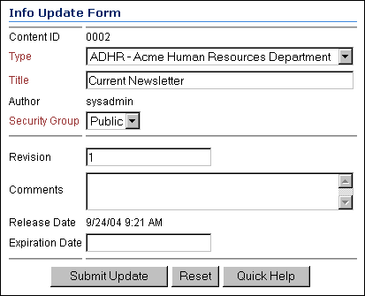
To access this page, select Update from the Actions list on the Content Information Page for a content item.
| Element | Definition |
|---|---|
| Content ID field* | The unique identifier for the content item. This value cannot be changed.
If your content server uses an Oracle database, all content IDs are converted to uppercase letters automatically. |
| Type field* | The category of the file. You must select from a list of predefined values. |
| Title field* | A descriptive name identifying the revision. The maximum length is 80 characters. |
| Author field* | The user who created or revised the content item.
Depending on how your system is set up, you might be able to select from a list of users. This value can be changed only if you have administrative permission. |
| Security Group field* | An identifier that specifies access permission to the content item. You can select from the list of predefined values. |
| Account field | An identifier that specifies access permission to the content item. This field is displayed only if accounts are enabled for your system. |
| Revision field | The revision number. |
| Comments field | Additional notes about the content item. The maximum length is 255 characters. |
| Release Date field | The date that the current revision was released to the content server. This value cannot be changed. |
| Expiration Date field | The date and time that the revision will no longer be available for searching or viewing in the content server.
|
| Submit Update button | Saves the specified metadata. |
| Reset button | Resets all metadata fields to their original values. |
* Required metadata fields
A.4.5 Post Comment Form
The Post Comment Form can be accessed from numerous popup menus and links if the ThreadedDiscussions component is enabled by your system administrator. Use this form to post a comment on a content item, or to post a reply on content that already has a discussion initiated.
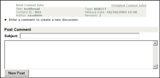
A.4.5.1 Discussion Form Menu
If the ThreadedDiscussions component is enabled by your system administrator, a new discussion form has the Original Content Info menu link only. After a discussion has been initiated, the Print View and Discussion Info menu links become available.

The following table describes the menu options.
| Menu Option | Description |
|---|---|
| [Print View] | Opens a print view of the discussion that you can elect to print. A "printed by user" message is printed at the top of the discussion page for you. |
| [Discussion Info] | Opens the Discussion Info Page for discussion content. |
| [Original Content Info] | Opens the Content Information page for the discussion content. |
A.4.6 Discussion Info Page
If the ThreadedDiscussions component is enabled by your system administrator, the Discussion Info Page is a brief summary page about a discussion.
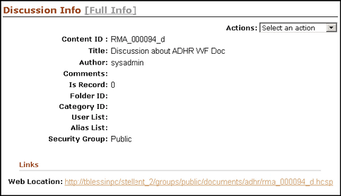
This page is only for content type that is a discussion, as denoted by the "_d" suffix. From this page, you can access the Content Information page by clicking the [Full Info] link.
You can access the Post Comment Form for the discussion thread by clicking the Web Location link, which accesses the Threaded Discussion (hcsp) form.
A.4.7 Content Information Page with Discussion field
If the ThreadedDiscussions component is enabled by your system administrator, the Content Information Page contains the additional Discussion field when the ThreadedDiscussions component is installed and enabled.
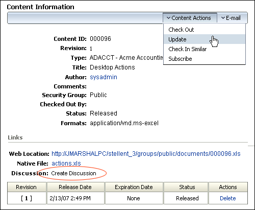
The Content Information Page for content that is a discussion itself does not contain the Discussion link, since it is the discussion.
A.4.8 Subscriptions Page
The Subscriptions page is used to view your current subscriptions.
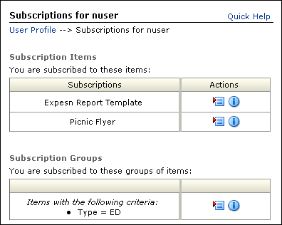
To access this page, click My Subscriptions under the My Content Server tray.
| Field | Description |
|---|---|
| Locator Links | Active links below the page heading that provide a graphical representation of where the page is in the navigation hierarchy. Clicking a link displays the page named by the link. |
| Subscriptions column | Displays the title of the content item. Clicking the title link displays the web-viewable file. |
| Subscription Actions | Actions icon
Info icon: Display the Content Information Page. |
| Subscriptions Groups column | Displays the subscription criteria for the content group. |
| Subscription Groups Actions | Actions icon
Info icon: Displays the Subscription Info Page. |
A.4.9 Subscription Info Page
The Subscription Info page is used to identify when you were subscribed to a file or group of files and when you were last notified about a new revision.
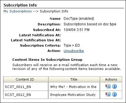
To access this page, select Subscription Info from the Content Actions menu on the Content Information Page.
| Field | Description |
|---|---|
| Locator links | Active links below the page heading that provide a graphical representation of where the page is in the navigation hierarchy. Clicking a link displays the page named by the link. |
| Name field | The name of the subscription. |
| Description field | The description assigned by the system administrator. |
| Subscribed At field | The date and time that you subscribed to the file or your system administrator subscribed you to the file. |
| Latest Notification At field | The most recent date and time that you were sent an e-mail notification from this subscription. |
| Latest Notification Use At field | The most recent date and time that you accessed a content item from an e-mail notification from this subscription. |
| Subscription Criteria | Shows the criteria for the subscription. |
| Action field | Clicking Unsubscribe cancels your subscription. |
| Content ID column | Shows the content IDs of the content items included in the subscription. Clicking a Content ID link displays the web-viewable file. |
| Title | Shows the titles of the content item included in the subscription. |
| Actions column | Actions icon:
Info icon: Displays the Content Information Page. |
A.4.10 Subscribe To "Item" Page
The Subscribe To "item" page is used to specify whether you want a file subscription or a criteria subscription.
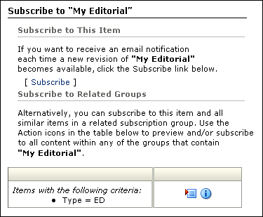
To access this page, select Subscribe from the Content Actions menu on the Content Information Page.
| Element | Description |
|---|---|
| Subscribe link | Subscribes to the content item and not the group. |
| Subscriptions column | Lists the criteria of the group to which the item belongs. |
| Actions column | Actions icon
Info icon: Displays the Subscription Info Page. |
A.4.11 Unsubscribe Page
The Unsubscribe page is used to cancel the subscription to a content item or group.
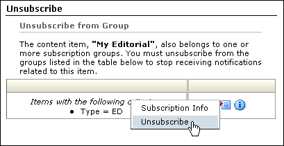
To access this page, select Unsubscribe from the Content Actions menu on the Content Information Page.
| Element | Description |
|---|---|
| Subscriptions column | Lists the criteria of the group to which the item belongs. |
| Actions column | Actions icon
Info icon: Displays the Subscription Info Page. |
A.5 Checkin and Checkout Interface
This section describes the screens used when you check content in and out of the Content Server.
Note:
If you are using Firefox set to open new tabs instead of windows, help screens launched from an Admin Applet are not accessible until the applet window that launched the help is closed. Therefore, it is preferable to set Firefox to open in new windows instead of tabs.This section covers the following topics:
A.5.1 Content Check-In Form
The content check-in form is used by contributors to check files into Content Server.
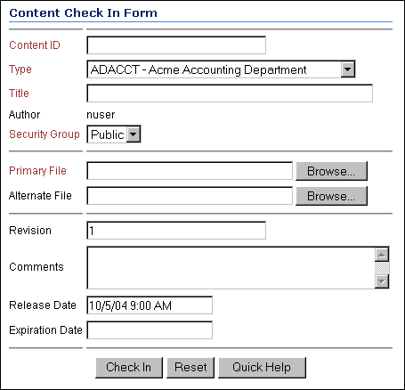
To access this page, click New Check In on the top menu.
Tip:
Using a Content Profiles link under the My Content Server tray to check in or search for content can help you define and display the most critical metadata fields necessary for those tasks. This can help you use Content Server more effectively.| Element | Definition |
|---|---|
| Content ID fieldFoot 1 | The unique identifier for the content item.
If a content ID is already filled in or if this field is not displayed, the system is set up to generate content IDs automatically. If your content server uses an Oracle database, all content IDs are automatically converted to uppercase letters. |
| Type fieldFootref 1 | The category of the file. You must select from a list of predefined values. |
| Title fieldFootref 1 | A descriptive name identifying the revision. Maximum length is 80 characters. |
| Author fieldFootref 1 | The user who created or revised the content item.
Depending on how your system is set up, you might be able to select from a list of users. This value can be changed only if you have administrative permission. |
| Security Group fieldFootref 1 | The security group is a set of files with the same access permission. |
| Account field | An identifier that specifies access permission to the content item. This field is displayed only if accounts are enabled for your system. |
| Primary File fieldFootref 1 | The path and file name of the native file being checked in.
|
| Upload Multiple Files check box | Selected: Clicking the Browse button displays the Upload Files window, which is used to select the files to be included in the zip file that will be created as the primary file.
Clear: Clicking the Browse button displays the standard file selection window. This check box appears only if the system administrator has enabled the upload applet and you have selected the Enable Upload Applet check box in your User Profile page. |
| Format fieldFootref 1 | The application format for the file name entered in the Primary File field.
|
| Alternate File field | The path and file name of an alternate, web-viewable file or a file that can be converted to web-viewable format.
|
| Upload Multiple Files check box | Selected: Clicking the Browse button displays the Upload Files window, which is used to select the files to be included in the zip file that will be created as the alternate file.
Clear: Clicking the Browse button displays the standard file selection window. This check box appears only if the system administrator has enabled the upload applet and you have selected the Enable Upload Applet check box in your User Profile page. |
| Format field | The application format for the file name entered in the Alternate File field.
|
| Revision field | The revision increments automatically with each check-in of the content item, so generally, you should not change this value. |
| Comments field | Additional notes about the file.
|
| Release Date field | The date and time that the revision is available for viewing in Content Server.
|
| Expiration Date field | The date and time that the content item will no longer be available for viewing in the content server.
By default, all revisions of the content item will expire when the current revision expires. |
| Custom fields | Any custom metadata fields for your system will be displayed on this page. |
Footnote 1 Required metadata fields.
A.5.2 Dynamic Converter Check-In Fields
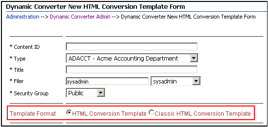
When the Dynamic Converter option is enabled, there are additional metadata fields that are displayed for new and existing content items. For more detailed information about the Dynamic Converter product, refer to the applicable administration and template editor guides.
When you check in a new form, the Template Format metadata field is included on the Content Check-In Form. The available options are:
-
Classic HTML Conversion Template: the template editor from the earlier version of Dynamic Converter.
-
HTML Conversion Template: the current template editor.
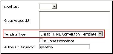
When you check in an existing template, the Template Type field is included. The available options are:
-
Classic HTML Conversion Template
-
Classic HTML Conversion Layout
-
Script Template
A.5.3 Check-In Confirmation Page
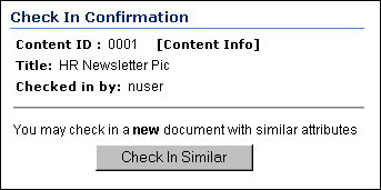
The check-in confirmation page is displayed after you have checked in a content item successfully.
| Element | Description |
|---|---|
| Content ID field | The unique content ID that you entered during check-in or that was generated automatically by the system. |
| [Content Info] link | Displays the Content Information Page for the content item. |
| Title field | The title of the content item that you checked in. |
| Checked in by field | The login you used to check in the file. |
| Check In Similar button | Displays the Content Check-In Form with metadata values similar to the content item you just checked in already filled in. |
A.5.4 Upload Files Window
The Upload Files window is used to create a zip file as the primary or alternate file that will be checked in to the content server.
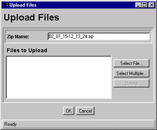
To access this window, select an Upload Multiple Files check box on the Content Check-In Form, and click the corresponding Browse button.
| Element | Description |
|---|---|
| Zip Name field | The name of the zip file that will be checked in to the content server repository. |
| Files to Upload list | Lists the files that will be included in the zip file. |
| Select File button | Displays the Select File Window, which is used to select individual files. |
| Select Multiple button | Displays the Select Files Window, which is used to select multiple files from the same directory. |
| Delete button | Deletes the selected files from the Files to Upload list. |
| OK button | Creates a zip file and enters the file name in the Primary File field or Alternate File field. |
| Cancel button | Closes the Upload Files window without creating a zip file. |
A.5.5 Select File Window
The Select File window is used to select individual files to be included in the uploaded Zip file.
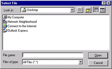
To access this window, click Select File in the Upload Files Window.
| Element | Description |
|---|---|
| Look in field | Select the directory where the file is located. |
| Contents list | Select the file to be included in the zip file. |
| File name field | You can filter the files by typing a wildcard expression, such as doc*.*. |
| Files of type field | You can filter the files in the current directory by selecting a file type. |
| Open button | Places the selected file in the Files to Upload list in the Upload Files window. |
| Cancel button | Closes the Select File window without selecting any files. |
A.5.6 Select Files Window
The Select Files window is used to select multiple files from the same directory to be included in the uploaded zip file.
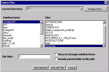
To access this window, click Select Multiple in the Upload Files Window.
| Element | Description |
|---|---|
| Current Directory field | Shows the directory currently selected. |
| Change Drive button | Displays the Change Drive Window. |
| Subdirectories list | Select the subdirectory where the files are located. Double-click the ".." entry in this list to navigate to the parent directory. |
| Files list | Select specific files to be included in the zip file.
|
| File Filter field | All files that meet the criteria in this field will be selected when the Add with Filter button is clicked.
|
| Recurse through subdirectories check box | Selects all files in all subdirectories of the current directory when the Add with Filter button is clicked.
This check box has no effect when the Add Selected button is clicked. |
| Include parent folder in file path check box | Store path information from the parent folder with the files you are adding when the Add with Filter button is clicked.
This check box has no effect when the Add Selected button is clicked. |
| Add Selected button | Places the selected files in the Files to Upload list in the Upload Files Window. |
| Add with Filter button | Places files in the Files to Upload list in the Upload Files Window, based on the File Filter field, Recurse through subdirectories check box, and Include parent folder in file path check box. |
| Cancel button | Closes the Select Files window without selecting any files. |
A.5.7 Change Drive Window
The Change Drive window is used to change the drive where files to be included in the uploaded zip file are located.

To access this window, click Change Drive in the Select Files Window.
| Element | Description |
|---|---|
| Drive list | Select the drive where the files to be selected are located. |
| OK button | Changes the drive displayed in the Current Directory field in the Select Files Window. |
| Cancel button | Closes the Change Drive window without changing the drive. |
A.5.8 Upload Message Screen
The Upload Message screen shows the upload progress when the chunking function is enabled.
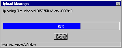
If the chunking function is not enabled on your system, this screen will not appear.
A.5.9 Checked-Out Content for [User] Page
The Checked Out Content for [User] page is used to identify which files are checked out by the current user.

To access this page, click My Checked-Out Content under the My Content Server tray.
| Element | Description |
|---|---|
| Content ID link | Clicking the Content ID link displays the web-viewable file. |
| Title column | Displays the title of the content item. |
| Checked Out By column | Displays the user name of the person who has checked out the content item. |
| Action icon | Displays a contextual menu allowing you to display the Content Information Page, check in the content item, or undo the check-out of the content item, depending on your access rights. |
| Info icon | Displays the Content Information Page for the content item. |
A.5.10 Check-Out Confirmation Page
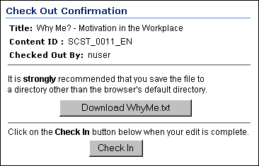
The Check-Out Confirmation page is displayed after you have checked out a single content item successfully.
| Element | Description |
|---|---|
| Title field | The title of the content item that you checked out. |
| Content ID field | The content ID of the file that you checked out. |
| Checked Out By field | The login you used to check out the file. |
| Native File Link | Enables you to open or save a copy of the native file. |
| Check In button | Displays the Checked-Out Content Page. |
A.5.11 Checked-Out Content Page
The checked-out content page is used to identify which files are checked out.
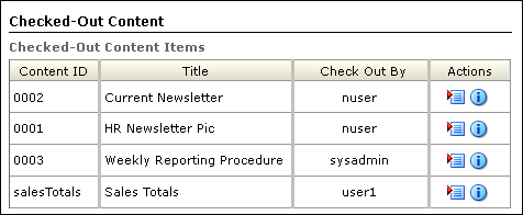
To access this page, click Checked Out Content on the Content Management Tray.
| Element | Description |
|---|---|
| Content ID link | Clicking the Content ID link displays the web-viewable file. |
| Title column | Displays the title of the content item. |
| Checked Out By column | Displays the user name of the person who has checked out the content item. |
| Action icon | Displays a contextual menu allowing you to display the Content Information Page, check in the content item, or undo the check-out of the content item, depending on your access rights. |
| Info icon | Displays the Content Information Page for the content item. |
A.5.12 Download Files Screen
The Download Files screen is used to specify download options and the target directories for files being downloaded from the content server.
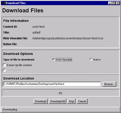
To access this screen, click Download on the Search Results Page.
| Element | Description |
|---|---|
| Content ID field | The content ID of the file. |
| Title field | The descriptive title of the content item. |
| Web Viewable field | The path and file name of the content item's web-viewable file. |
| Native field | The file name of the content item's native file. This field is filled in when the Native option is selected. |
| Type of file to download options | Web Viewable: Specifies that the web-viewable file is to be downloaded.
Native: Specifies that the native file is to be downloaded. |
| Extract zip file contents check box | Selected: Files in zip format will be uncompressed when they are downloaded.
Clear: Files in zip format will be downloaded as is. |
| Check out file check box | Selected: Content items will be checked out as well as downloaded.
Clear: Content items will only be downloaded and will not be checked out. This check box is available only when the Native option is selected. |
| Download Location field | The directory and file name where the current file will be copied. Click the Browse button to navigate to and select the directory. |
| Progress bar | Shows the progress of the download as a percentage. |
| Download button | Downloads the current file to the specified directory. |
| Download All button | Downloads all files that have not been skipped to the specified directory.
This button is not displayed if only one file was selected on the search results page. |
| Skip button | Excludes the current file from the download.
This button is not displayed if only one file was selected on the search results page. |
| Cancel button | Closes the Download Files screen. |
A.6 Workflow Interface
This section describes the screens used when processing workflows.
Note:
If you are using Firefox set to open new tabs instead of windows, help screens launched from an Admin Applet are not accessible until the applet window that launched the help is closed. Therefore, it is preferable to set Firefox to open in new windows instead of tabs.This section covers the following topics:
A.6.1 Workflow Started Notification
A workflow started notification message is e-mailed to you when you are assigned to check in a new file for a basic workflow.
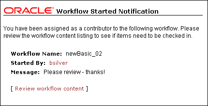
This is an automated message that you can use to identify the file that you need to check in and other workflow information.
| Element | Description |
|---|---|
| Workflow Name field | Identifies the workflow. |
| Started By field | Opens an e-mail to the person who initiated the workflow. |
| Message field | Displays a message from the person who initiated the workflow. |
| Review workflow content link | Opens the Workflow Content Items Page. |
A.6.2 Workflow Review Notification Message
A workflow review notification message is e-mailed to you when you are assigned to review a revision in a workflow.
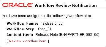
It is an automated message that you can use to identify some workflow characteristics.
| Element | Description |
|---|---|
| Workflow Name field | Identifies the workflow. |
| Workflow Step field | Identifies the current step in the workflow. |
| Content Item field | Identifies the content item or items in the workflow. |
| Review workflow item link | Opens the Workflow Review Page. |
A.6.3 Workflow Content Items Page
The Workflow Content Items page is used to identify which action to perform in the workflow.
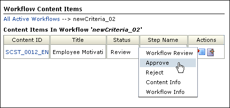
To access this page, click the Review Workflow Content link on a Workflow Started Notification or open the Content Management Tray, click Active Workflows, and then the workflow name on the Active Workflows Page.
| Element | Description |
|---|---|
| Locator links | Displays a hierarchical navigation within content server. Located just below the page title. |
| Content ID column | Click the content ID to display the web-viewable file. |
| Title | The title of the content. |
| Status column | The status of the revision. |
| Step Name column | The name of the current workflow step. |
| Action icon | Displays the actions (if any) that you can take on the content item:
Workflow Review: Displays the Workflow Review Page. Approve: Approves the revision. Reject: Rejects the revision and displays the Reject Content Item Page. Content Info: Displays the Content Information Page for the revision. Workflow Info: Displays the Workflow Info For Item Page for the revision. |
| Info icon | Displays the Workflow Review Page for the content item. |
Note:
Content security can affect what is displayed on the Workflow Content Items page. For example, if 2 content items are included in one workflow to which you are assigned, but one item belongs to a security account to which you do not have access, that item is not displayed on the Workflow Content Items page. It is displayed on the Workflow in Queue Page page, but without providing access to the content or content information. This ensures that a workflow to which you are assigned does not get held up because you are unaware of your responsibility.A.6.4 Reject Content Item Page
The Reject Content Item page is used to explain why you are rejecting a workflow revision.
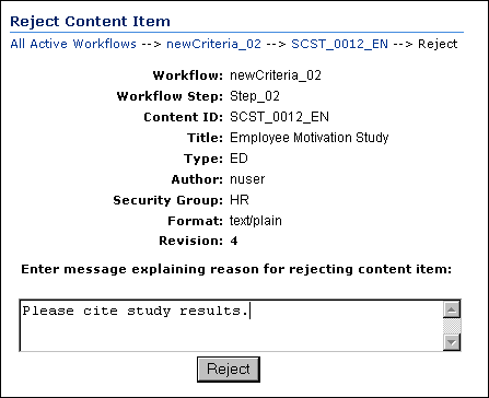
This page is displayed automatically when you reject a workflow item.
| Element | Description |
|---|---|
| Locator links | Displays a hierarchical navigation structure within the content server. Located just below the page heading. |
| Workflow field | The name of the current workflow. |
| Workflow Step field | The name of the current workflow step. |
| Content ID field | The content ID of the content item. |
| Title field | The title of the revision. |
| Type field | The value associated with the Type metadata field. |
| Author field | The login associated with the user who checked in the file. |
| Security Group field | The security group associated with the content item. |
| Format field | The formats corresponding to the file. |
| Revision field | The current revision of the content item. |
| Message field | Enables you to enter an explanation for why you are rejecting the revision. Include what should be done to ensure that the revision is approved in the future. |
| Reject button | Sends a Workflow Content Item Reject Notification to the previous contributor in the workflow. |
A.6.5 Workflow Content Item Reject Notification
When a revision is rejected and the Reject Content Item Page is filled out, this e-mail message is automatically sent to users assigned to the previous contribution step in the workflow.
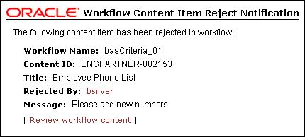
The workflow content item reject notification message identifies who rejected the revision and why it was rejected.
| Element | Description |
|---|---|
| Workflow Name field | The name of the workflow. |
| Content ID field | The content ID of the rejected item. |
| Title field | The title of the rejected item. |
| Rejected By field | The user name of the person rejecting the item. Click to send an e-mail to the person. |
| Message field | The message sent by the person rejecting the item. |
| Review workflow content link | Opens the Workflow Content Items Page. |
A.6.6 Active Workflows Page
The Active Workflows page is used to view a list of all active workflows in the system.
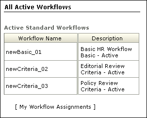
To access this page, click Active Workflows on the Content Management Tray.
| Element | Description |
|---|---|
| Workflow Name column | The names of the active workflows in the corresponding security group. Clicking a link opens the Workflow Content Items Page. |
| Description | A description of the workflow |
| My Workflow Assignments link | Displays the Workflow in Queue Page. |
Note:
Content security can affect what is displayed on the Workflow Content Items page. For example, if 2 content items are included in one workflow to which you are assigned, but one item belongs to a security account to which you do not have access, that item is not displayed on the Workflow Content Items page. It is displayed on the Workflow in Queue page, but without providing access to the content or content information. This ensures that a workflow to which you are assigned does not get held up because you are unaware of your responsibility.A.6.7 Workflow in Queue Page
To access this page, click My Workflow Assignments under the My Content Server tray.
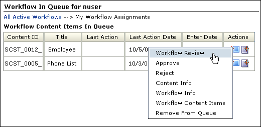
The Workflow in Queue page is used to view a list of all content items that you need to review.
| Element | Description |
|---|---|
| Locator links | Displays a hierarchical navigation structure within the content server. Located just below the page heading. |
| Content ID column | Displays the content ID and the title of each workflow item. Clicking the content ID link displays the web-viewable file. |
| Title | The title of the workflow. |
| Enter Date column | The date and time that the content item entered the current step. |
| Action icon | Displays the actions (if any) that you can take on the content item:
Workflow Review: Displays the Workflow Review Page. Approve: Approves the revision. Reject: Rejects the revision and displays the Reject Content Item Page. Content Info: Displays the Content Information Page for the revision. Workflow Info: Displays the Workflow Info For Item Page for the revision. Workflow Content Items: Displays the Workflow Content Items Page for the revision. Remove from Queue: Removes the content item from the Workflow in Queue page. (The content item is not deleted from the workflow.) |
| Info icon | Displays the Workflow Review Page. |
Note:
Content security can affect access to content displayed on the Workflow in Queue page. For example, if 2 content items are included in one workflow to which you are assigned, but one item belongs to a security account to which you do not have access, that item is displayed on the Workflow in Queue page, but without providing access to the content or content information. This ensures that a workflow to which you are assigned does not get held up because you are unaware of your responsibility.A.6.8 Workflow Info For Item Page
The Workflow Info page is used to identify where a revision is in the current workflow and to view the workflow history.
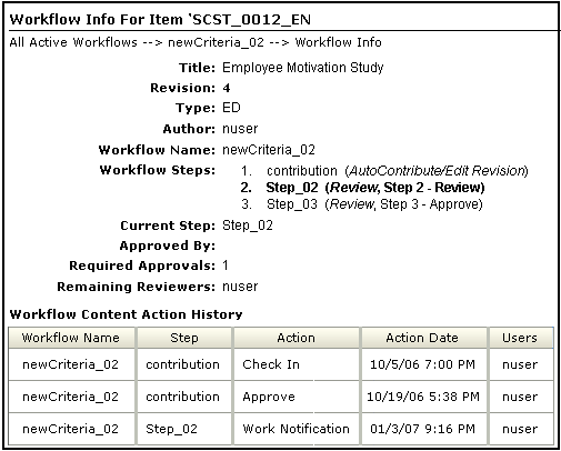
To access this page, select Workflow Info from the contextual menu under the Actions column on the Workflow Content Items Page or the Workflow in Queue Page, or by clicking Workflow Info on the Workflow Review Page.
| Element | Description |
|---|---|
| Locator links | Displays a hierarchical navigation structure within the content server. Located just below the page heading. |
| Title field | The title of the content item. |
| Revision field | The current revision of the content item. |
| Type field | The value associated with the Type metadata field. |
| Author field | The login associated with the user who checked in the file. |
| Locator links | Displays a hierarchical navigation structure within the content server. Located just below the page title. |
| Workflow Name field | The name of the current workflow. |
| Workflow Steps field | Lists all of the workflow steps. The current workflow step is in boldface type. The type of workflow step is shown in parentheses. |
| Current Step field | The current workflow step. |
| Approved by field | Lists the logins of the users who have approved the revision at the current workflow step. |
| Required Approvals field | Shows how many approvals are required at the current workflow step. |
| Remaining Reviewers field | Lists the users who have yet to review the revision for the current step. |
| Current Step's Additional Exit Condition field | Lists additional conditions beyond required approvals that must be met for the workflow step to be completed. |
| Workflow Content Action History field | Lists the actions that have been performed on the revision during the current workflow process. |
| Workflow Name column | The name of the workflow or sub-workflow. |
| Step column | The name of the workflow step. |
| Action column | The action that was performed on the revision. |
| Action Date column | The date and time that the action was performed. |
| Users column | The users that performed the action. |
A.6.9 Workflow Review Page
The Workflow Review page offers several options for viewing and taking action on content in a workflow to which you have a responsibility.
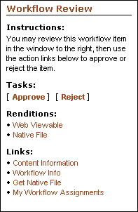
To access this page, click Review Workflow Item on the Workflow Review Notification Message or by selecting Workflow Review from the contextual menus under the Actions column on the Workflow Content Items Page or the Workflow in Queue Page.
| Element | Description |
|---|---|
| Instructions field | Displays instructions on how to proceed with the workflow. |
| Tasks links | Links to specific tasks you can perform in the workflow.
Approve: Approves the revision. Reject: Rejects the revision and displays the Reject Content Item Page. Check Out: Checks out a file and displays the Check-In Confirmation Page. This link is displayed only if the current step is a reviewer/contributor step. |
| Renditions | Links to specific tasks you can perform in the workflow.
Web Viewable: Opens a version of the item in a format viewable in your browser, provided your system administrator has configured the content server to convert the item. Native File: Opens the item in your browser using the native application. |
| Links | Links to information relating to the item or workflow.
Content Info: Displays the Content Information Page for the revision. Workflow Info: Displays the Workflow Info For Item Page for the revision. Get Native File: Prompts for you to open the item in its native application, or save a copy of the item in its native format. My Workflow Assignments: Displays the Workflow in Queue Page. |
A.7 Folders Interface
This section describes the Folders interface screens.
Note:
If you are using Firefox set to open new tabs instead of windows, help screens launched from an Admin Applet are not accessible until the applet window that launched the help is closed. Therefore, it is preferable to set Firefox to open in new windows instead of tabs.This section covers the following topics:
A.7.1 Contribution Folders Link
When the Folders component is enabled, a new Contribution Folders link appears in the Browse Content tray.
Clicking this link displays the top-level Exploring Contribution Folders.
Expanding this link by clicking its plus symbol displays links to the Exploring Contribution Folders for the top-level folders in the hierarchy.
A.7.2 Folder Configuration Link
When the Folders component is enabled in Content Server, a Folder Configuration for [User] link appears in the My Content Server tray. Clicking this link displays the Folder Configuration Page.
Expanding this link by clicking its plus symbol displays links to the Default Information Field Configuration Page and Revision Information Field Configuration Page.
A.7.3 User Profile Page
When the Folders component is enabled in Content Server, a Folder Configuration for [User] button appears on the User Profile page. Clicking this button displays the Folder Configuration Page.

A.7.4 Folder Configuration Page
The Folder Configuration page enables the user to configure their virtual folder interface. To access this page, do one of the following:
-
Click the Folder Configuration Link in the My Content Server tray.
-
Click the Folder Configuration for [User] button on the User Profile Page.
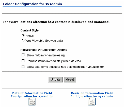
| Element | Description |
|---|---|
| Content Style options | Native = The native file is displayed when the user clicks a content item in a folder.
Web Viewable (Browse only) = The web-viewable file is displayed when the user clicks a content item in a folder. The user cannot perform any folder operations when this option is selected. |
| Hierarchical Virtual Folder Options | Show hidden when browsing = When selected, hidden folders and content items are displayed and identified with a dimmed icon; users can still see and work with hidden items. If not selected, hidden folders and content items do not appear in the folder hierarchy.
Remove items immediately when deleted = When selected, items are deleted immediately (not moved to the Trash folder). If not selected, deleted items are first moved to the Trash folder. Show only items that user has deleted in trash virtual folder = When selected, only items that the current user has deleted are displayed the Trash folder. If not selected, all items in the Trash folder are displayed. |
| Update button | Applies any changes to the system. |
| Reset button | Resets the options to the last saved condition. |
| Default Information Field Configuration for User button | Displays the Default Information Field Configuration Page. |
| Revision Information Field Configuration for [User] button | Displays the Revision Information Field Configuration Page. |
A.7.5 Default Information Field Configuration Page
The Default Information Field Configuration page defines the default metadata values to apply to new content (not subsequent revisions) that the user checks in through a virtual folder.
Important:
These default settings only apply to content that is pasted through the WebDAV interface. They do not apply if new content is added to the folder through the web browser.To access this page, do one of the following:
-
In the My Content Server tray, expand the Folder Configuration for [User] link and click the Default Information Field Configuration for [User] link.
-
Click the Default Information Field Configuration for [User] button on the Folder Configuration Page.
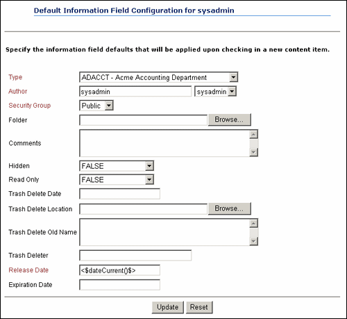
| Element | Description |
|---|---|
| Information fields | Define the metadata values that will be applied to new content (not subsequent revisions) checked in through a virtual folder if values are not already defined for the folder.
These metadata values are applied only on initial check-in; these settings do not affect revisions to existing content.
|
| Update button | Applies changes to the user's profile. |
| Reset button | Resets the fields to the last saved values. |
A.7.6 Revision Information Field Configuration Page
The Revision Information Field Configuration page defines the default metadata values to apply to revisions (not new content items) that the user checks in through a virtual folder.
Important:
These default settings only apply to revisions that are pasted through the WebDAV interface. They do not apply if revisions are added to the folder through the web browser.To access this page, do one of the following:
-
In the My Content Server tray, expand the Folder Configuration for [User] link and click the Revision Information Field Configuration for [User] link.
-
Click the Revision Information Field Configuration for [User] button on the Folder Configuration Page.
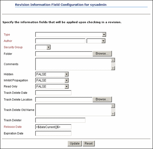
| Element | Description |
|---|---|
| Information fields | Define the metadata values that will be applied to content revisions (not new content items) checked in through a virtual folder if values are not already defined for the folder.
|
| Update button | Applies changes to the user's profile. |
| Reset button | Resets the fields to the last saved values. |
A.7.7 Exploring Contribution Folders
The exploring contribution folders pages are used to work with virtual folders within the hierarchy. To access a folder exploring page, click the folder link under the Contribution Folders Link, or click the folder link on another folder exploring page.
You can customize the look and feel of your exploring pages from your user profile page.
Some of the fields in the My View search results are unavailable or not applicable when browsing through virtual folders. For example, if you enable Vault File Size as a column in your My View, this field will be populated when performing searches, but it will be blank on folder exploring pages.
Depending on how the system administrator set up the system, long display lists may be truncated and spread out over multiple pages. Navigation links are then provided to move between pages.

| Element | Description |
|---|---|
| Folder path | Displays the folder hierarchy for the current folder. Clicking a link displays the exploring page for that folder. |
| Actions list | Classic View: Displays the folder contents in the pre-7.0 format.
Thumbnail View: Displays the folder contents as icons. Headline View: Displays the folder contents in a table. My View: Displays the folder contents in your personalized display style. Customize: Opens a configuration page where you can modify the personalized My View display. Select All: Selects all items in the displayed list (i.e., all Select check boxes are selected at once). Unselect All: Unselects all items in the displayed list (i.e., all Select check boxes are cleared at once). Information: Displays the Hierarchical Folder Information Page. New Folder (for contributors only): Displays the Hierarchy Folder Configuration Page, which is used to create a new folder. This option is not available for guest users. New Content (for contributors only): Displays the content check-in form, with the current folder's default metadata already filled in. This option is not available for guest users. Move: Displays the Browsing Window, which is used to select the target folder for the current folder. This action appears only when the system administrator has enabled the Move function. |
| Actions list | Delete: If the Trash Bin function is enabled, this action moves the folder and its contents to the Trash folder. If the Trash Bin function is not enabled, this action permanently deletes the current folder, its subfolders, and all revisions of all content items in the folders. This action appears only when the system administrator has enabled the Delete function.
Open Web Folder: If the Web Folder feature is enabled, displays the current folder as a WebDAV virtual folder in Windows Explorer. |
| Select check box | Selected = The folder or content item will be moved or deleted.
Clear = The folder or content item is not affected by the move or delete operation. |
| Name column | Folder link: Displays the exploring page for the folder.
File link: Displays the web-viewable file or the File Download dialog, depending on which content style you selected on the Folder Configuration Page. |
| Size column | Displays the size of the content item. |
| Date column | Displays the release date of the content item. |
| Author column | Displays the author of the content item. |
| Actions icon for folders | Folder Information: Displays the Hierarchical Folder Information Page.
Create Shortcut: Displays the Browsing Window, which is used to select the target folder for a shortcut link to the current folder. Move: Displays the Browsing Window, which is used to select the target folder for the current folder. This action appears only when the system administrator has enabled the Move function. Delete: If the Trash Bin function is enabled, this action moves the folder and its contents to the Trash folder. If the Trash Bin function is not enabled, this action permanently deletes the current folder, its subfolders, and all revisions of all content items in the folders. This action appears only when the system administrator has enabled the Delete function. |
| Actions icon for content items | Content Information: Displays the content information page.
Check Out: Checks out content item and displays the check-out confirmation page. Check In Similar: Displays the content check-in form, with a number of metadata field already filled in to match the current content item's metadata. Send link by e-mail: Opens the default mail client and automatically generates the Web-Viewable link and Native File link paths in the message area. Create Shortcut: Displays the Browsing Window, which is used to select the target folder for a shortcut link to the content item. Move: Displays the Browsing Window, which is used to select the target folder for the content item. This action appears only when the system administrator has enabled the Move function. Delete: If the Trash Bin function is enabled, this action moves the content item to the Trash folder. If the Trash Bin function is not enabled, this action permanently deletes all revisions of the content item. This action appears only when the system administrator has enabled the Delete function. |
| Information icon | Displays the Hierarchical Folder Information Page for the virtual folder or the content information page for the content item. |
A.7.8 Trash Exploring Page
The Trash exploring page is used to work with deleted folders and content items. To access this page, click the Trash link under the Contribution Folders Link. You can customize the look and feel of your Trash exploring page from your user profile page. The system administrator must have enabled the Trash Bin function for the Trash exploring page to be available.
With only one exception, the descriptions applicable list options for each of the features on the Trash Exploring page are identical to those for the Exploring Contribution Folders. The Actions icon for both folders and content items includes a Restore option. Selecting the Restore option returns the item to its original parent folder. If the original parent folder has been deleted and is still in the Trash folder, the restored item will be moved to the original folder. If the original folder has been permanently deleted, you will not be able to restore the item.

A.7.9 Browsing Window
The Browsing window is used to select a target folder for moving items, creating shortcuts, and specifying local folders. To access this window, do one of the following:
-
Select one or more items and click the Move icon on the Exploring Contribution Folders.
-
Select the Shortcut action on a Hierarchical Folder Information Page or Content Information page.
-
Click the Browse button on the Local Folders Page (documented in the Folders and WebDAV Administration Guide).
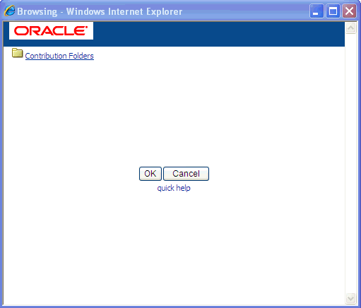
| Element | Description |
|---|---|
| Folder hierarchy | Clicking a folder displays any subfolders. |
| OK button | Selects the open folder as the target folder. (Lower-level folders may be displayed, but only the open folder is active.) |
| Cancel button | Closes the Browsing window without selecting a folder. |
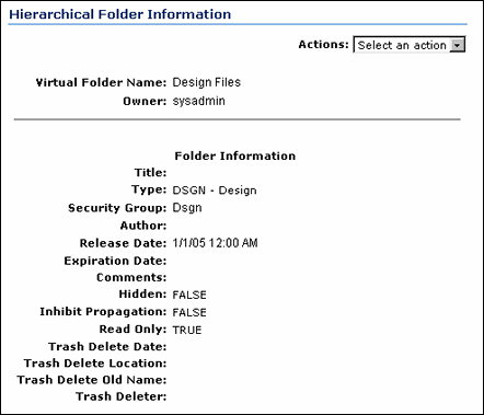
A.7.10 Hierarchical Folder Information Page
The Hierarchical Folder Information page is used to view information on a virtual folder. There are two ways to access this page:
-
By selecting Information from the Actions dropdown menu on any of the Exploring Contribution Folders.
-
By selecting Folder Information from the Actions icon popup menu for a folder on any of the Exploring Contribution Folders.
The page shows the default metadata for the current virtual folder, and, in the case of deleted folders, information about the delete action.
| Element | Description |
|---|---|
| Virtual Folder Name field | The name of the virtual folder. |
| Virtual Folder Owner field | The user name of the folder's owner. This user can change the folder metadata and delete the folder. |
| Folder Information fields | Display the metadata values for the folder and content items that are checked in through this folder.
These metadata values are applied only on initial content check-in; these settings do not affect revisions to existing content. |
| Hidden field | True hides the folder. Users will see a dimmed folder icon if they have permission to the folder's security group and they have selected the "Show hidden when browsing" check box on the Folder Configuration Page. Otherwise, the folder will not be visible in the folder hierarchy.
False makes the folder visible to all users who have permission to the folder's security group. This field appears only when the system administrator has enabled the Hide/Unhide feature. The Hide/Unhide icons are only visible in the Classic layout. Instead, the Trays and Top menus layouts use the metadata fields ReadOnly and Hidden on the folder information page. |
| Inhibit Propagation field | True prevents metadata changes to the folder during metadata propagation from a higher-level folder.
False includes the folder in metadata propagation from a higher-level folder. |
| Read Only field | True prevents renaming, moving, or deleting the folder or content items in that folder. Content can still be checked in and folder metadata can be updated.
False makes all folder operations available. This field appears only when the system administrator has enabled the Read Only feature. |
| Trash Delete Date field | For deleted folders, this field shows when the folder was deleted.
This field appears only when the system administrator has enabled the Trash Bin feature. |
| Trash Delete Location field | For deleted folders, this field shows the location of the folder before it was deleted.
This field appears only when the system administrator has enabled the Trash Bin feature. |
| Trash Delete Old Name field | For deleted folders, this field shows the name of the folder before it was deleted.
This field appears only when the system administrator has enabled the Trash Bin feature. |
| Trash Deleter field | For deleted folders, this field shows the name of the user who deleted the folder.
This field appears only when the system administrator has enabled the Trash Bin feature. |
| Actions list | Update: Displays the Hierarchy Folder Configuration Page.
Create Shortcut: Displays the Browsing Window, which is used to select the target folder for a shortcut link to the current folder. Propagate: Propagates the folder's default metadata values to uninhibited subfolders and content items. |
A.7.11 Hierarchy Folder Configuration Page
The Hierarchy Folder Configuration page is used to define or modify virtual folders.
-
To access the Hierarchy Folder Configuration page to add a folder, select New Folder from the Actions list on any of the Exploring Contribution Folders.
-
To access the Hierarchy Folder Configuration page to edit an existing folder, open the Hierarchical Folder Information Page and select Update from the Actions list.
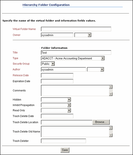
| Element | Description |
|---|---|
| Virtual Folder Name field | The name of the virtual folder. |
| Owner field | The user name of the folder's owner. This user can change the folder metadata and delete the folder. |
| Folder Information fields | Define the metadata values for the folder and any content items that are checked in through this folder.
These metadata values are applied only on initial content check-in; these settings do not affect revisions to existing content. |
| Hidden field | True hides the folder. Users will see a dimmed folder icon if they have permission to the folder's security group and they have selected the "Show hidden when browsing" check box on the Folder Configuration Page.
False makes the folder visible to all users who have permission to the folder's security group. This field appears only when the system administrator has enabled the Hide/Unhide feature. The Hide/Unhide icons are only visible in the Classic layout. Rather than icons, the Trays and Top Menus layouts use the metadata fields ReadOnly and Hidden on the folder information page. |
| Inhibit Propagation field | True prevents metadata changes to the folder during metadata propagation from a higher-level folder.
False includes the folder in metadata propagation from a higher-level folder. |
| Read Only field | True prevents renaming, moving, or deleting the folder or content items in that folder. Content can still be checked in and folder metadata can be updated.
False makes all folder operations available. This field appears only when the system administrator has enabled the Read Only feature. |
| Trash Delete Date field
Trash Delete Location field Trash Delete Old Name field Trash Deleter field |
You can specify values for these fields, but they will be overwritten with their current field values at the moment the virtual folder is actually deleted. It is therefore recommended that you leave these fields empty.
These fields appear only when the system administrator has enabled the Trash Bin feature. |
| Save button | Saves the new virtual folder.
This button appears only when a new folder is being created. |
| Submit Update button | Saves the changes to the virtual folder.
This button appears only when an existing folder is being modified. |
| Reset button | Resets the fields to the last saved definition of the virtual folder.
This button appears only when an existing folder is being modified. |
A.8 WebDAV Interface
This section describes the WebDAV interface screens.
Note:
If you are using Firefox set to open new tabs instead of windows, help screens launched from an Admin Applet are not accessible until the applet window that launched the help is closed. Therefore, it is preferable to set Firefox to open in new windows instead of tabs.This section covers the following topics:
A.8.1 Virtual Folders
The WebDAV interface is based on the hierarchical Folders interface. The interface to a content server repository is set up as "virtual folders." Each folder contains the content items that have the same numerical "Folder" value, which is assigned automatically upon creation of the folder.
You can work with content items and virtual folders in much the same way you would work with files and folders in a file system. However, typical tasks you perform on files in a file system may have a different effect when you perform them on files in a WebDAV virtual folder. For example, opening a file from a WebDAV virtual folder also checks the content item out of the content server.
The user logins and security controls in Content Server and the Folders component also apply to content that is managed using WebDAV clients. For example, if you have Read permission for a content item, you will be able to view the file, but you will not be able to check in a new revision of the file.
Figure A-1 below shows how a typical set of WebDAV virtual folders would look in Windows Explorer:
A.9 Folio User Interface
This section describes the pages and contextual menus added to Content Server when folios is enabled.
Note:
If you are using Firefox set to open new tabs instead of windows, help screens launched from an Admin Applet are not accessible until the applet window that launched the help is closed. Therefore, it is preferable to set Firefox to open in new windows instead of tabs.This section covers the following topics.
A.9.1 My Content Server Tray: My Baskets
Content Baskets are created by you and used as an unstructured place to collect content you want to access quickly. They are similar to Saved Queries, in that they display a search results page listing content associated with the basket. They differ from Saved Queries in that the only defining criteria for the search is whether or not you have specifically added a content item to a basket.
Content baskets are displayed under the My Baskets folder on the My Content Server tray, and also under the Source Items tray of the Edit Folio Page. Clicking My Baskets or Manage baskets displays the Manage Content Baskets Page, where baskets can be added, modified, deleted, or made active.
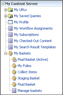
A.9.2 Content Management Tray: New Folio
New folios are created using the New Folio link on the Content Management tray. Clicking New Folio displays the Manage Content Baskets Page.
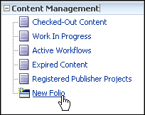
A.9.3 Pick Folio Type Page
The Pick Folio Type page is accessed by clicking New Folio in the Content Management tray. It is used to choose the type of folio to create.

| Form Element | Description |
|---|---|
| Load Folio | Displays the Edit Simple Folio Page or Edit Folio Page for the type of folio selected. |
| Simple Folio | A simple folio is a folio with no structure established. Items in a simple folio are displayed as a table on the Edit Simple Folio Page, and can be reordered in the table, but not nested in a hierarchy unless the simple folio is converted to an advanced folio. If a simple folio is converted to an advanced folio, it cannot be converted back to a simple folio. |
| Advanced Folio | An advanced folio has structure. The structure can be predefined by the system administrator in a template selected by the user. The structure of a template-based folio may or may not be modified later, depending on the template. If no template is selected, then the folio is created with no structure established. When this option is selected, a folio is begun with a root level node only, and the structure can be modified later. An advanced folio cannot be converted to a simple folio. |
| Folio Template | Lists the templates available on which the new folio is based. |
A.9.4 Edit Simple Folio Page
The Edit Simple Folio page displays the element info of content associated with a simple folio in a table. Although a simple folio displays content in a manner similar to a standard Content Server search results page, there is an important difference. A standard search results page displays content information from a content item's metadata. The Edit Simple Folio page displays element information from the XML file stored in Content Server that defines the folio. This element information is unique to the folio, and can be changed in the folio without affecting the content item's metadata.
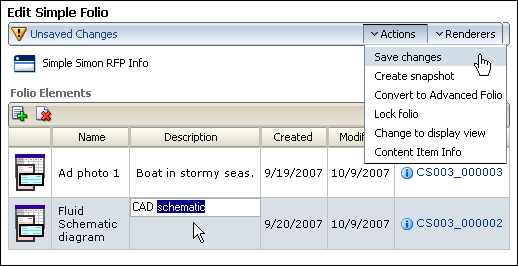
| Item | Description |
|---|---|
| Changes Notification | Displays the status of any changes made to the folio. An icon with an exclamation point indicates unsaved changes. An icon with a check mark indicates changes were saved. |
| Actions menu | See "Actions Menu" |
| Renderers menu | "Renderers Menu" |
| Add icon | Displays a search from for finding items within Content Server to add to the folio. |
| Delete icon | Deletes the selected item from the folio. Items are selected by clicking the item row. |
| Thumbnail column | Displays a small image of the item if your system administrator has set up Content Server to create thumbnails. If thumbnails are not set up, an icon associated with the item type is displayed. Clicking the thumbnail displays the Content Server content information page. |
| Name | Displays the text entered into the name element of the folio XML file. When a content item is first added to a simple folio, the name element is populated with the content item title metadata from Content Server. After it is associated with a folio, the name element information can be edited independently for each folio with which a content item is associated. |
| Description | Displays the text entered into the description element of the folio XML file. When a content item is first added to a simple folio, the description element is blank. After it is associated with a folio, the description element information can be edited independently for each folio with which a content item is associated. |
| Created | Displays the text entered into the creation date element of the folio XML file. When a content item is first added to a simple folio, the creation date element is populated with the creation date from the content item metadata from Content Server. |
| Modified | Displays the text entered into the modification date element of the folio XML file. When a content item is first added to a simple folio, the modification date element is populated with the current date. The modification date is updated each time the element information is updated. For example, if you edit the description text of an item in the simple folio, the modification date for that item changes. The modification date does not change if changes are made to the content item metadata in Content Server. |
| Content Item | Displays the Content ID of the associated item and the information icon. Clicking the Content ID displays the web-viewable of a content item. Clicking the information icon displays the standard Content Server content information page for the item. |
A.9.5 Edit Folio Page
Clicking the content ID or the folio icon in the Actions column of a search result displays the Edit Folio page. From the Edit Folio page, you can add nodes, slots, and items to the folio, find information regarding the folio and its contents, lock or take a snapshot of a folio, and view or render the folio. The left side of the Edit Folio page displays the folio structure. The right side of the Folio is a series of trays, similar to the left area of Content Server. Clicking the heading of a tray expands or collapses the tray. The main areas on the Edit Folio page are:
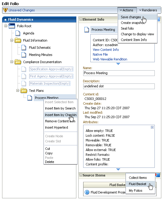
A.9.5.1 Folio Structure Tray
The left side of the Edit Folio page is the folio structure section. It displays the nodes, slots, and items that make up the folio hierarchy. Right-clicking within the folio structure area displays a contextual menu for performing a variety of tasks, such as adding and deleting nodes and slots, or inserting content items.
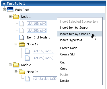
A.9.5.1.1 Folio Structure Contextual Menu
The following options are available in the folio structure section contextual menu.
| Item | Description |
|---|---|
| Insert Selected Source Item | Inserts the item in the folio slot with the selected item from the Source Items Tray. If the slot currently contains a content item, the item is replaced with the source item. |
| Insert Item by Search | Displays a child window with a search form that searches Content Server for a previously checked-in item, and adds it to the folio in the selected node or slot. If the slot currently contains a content item, the item is replaced with the found content. Available in all contexts: Nodes, Slots, and Items. |
| Insert Item by Checkin | Displays a child window with a content check in form that checks a new content item into Content Server and adds it to the folio in the selected node or slot. If the slot currently contains a content item, the content item is replaced with the checked in content. Available in all contexts: Nodes, Slots, and Items |
| Remove Content Item | Removes a content item from a slot. Note that this does not delete the slot, but empties it, leaving the folio structure intact. To delete a slot, you must select Delete from the contextual menu. Available in Item context only. |
| Insert Hypertext | Creates a new item in the folio structure that can establish a hypertext link to the specified URL. Available in all contexts: Nodes, Slots, and Items |
| Create Node | Creates a new node or sub-node in the folio structure. |
| Create Slot | Creates an empty slot in the folio structure. |
| Cut | Cuts an item, node, or slot from the folio structure for placement elsewhere in the same folio. Available in all contexts: Nodes, Slots, and Items |
| Copy | Copies an item, node, or slot from the folio structure for placement elsewhere in the same folio. Available in all contexts: Nodes, Slots, and Items |
| Paste | Pastes an item, node, or slot that was previously cut or copied from the folio structure into another area of the same folio. Available in all contexts: Nodes, Slots, and Items |
| Delete | Deletes an item, node, or slot from the folio structure. Available in all contexts: Nodes, Slots, and Items |
A.9.5.2 Element Info Tray
The first tray on the right side of the page is the element info tray. The element information is what is articulated in the XML file checked into Content Server that defines the folio. When a node, slot, or item is selected in the folio structure section of the page, information about what is selected is displayed in the element info section, where it can be modified. Modified information is written back to the XML file checked into Content Server.
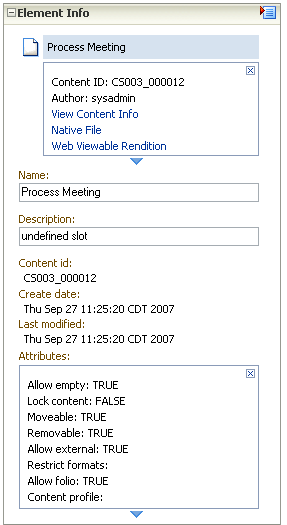
Important:
The element information is unique to the folio, and not to the content item associated with the folio. A single content item may be associated with several different folios, and the element information about that item may be different in each folio. It is important to remember that if you change the element information in one folio, it does not change in another folio.The type of information displayed by default on all elements includes name, description, and attributes. Slots and Content items also display the content ids of the items, as well as their creation date and last modification date. Hyperlinks display the URL of the link.
| Information | Description |
|---|---|
| Title | The title of the item in Content Server. |
| Content ID | The content ID of the item in Content Server. |
| Author | The name of the person who last checked the item into Content Server. |
| View Content Info | Clicking this link opens the content information page for the item in a separate window. |
| Native File | Clicking this link downloads the native file from Content Server. |
| Web Viewable Rendition | Clicking this link opens the web-viewable file for the item in a separate window. |
| Name | The name given the element, as displayed in the folio hierarchy.
Displayed for all elements. |
| Description | A description of the element to help identify its intended use. For example, a slot named Field Report could have a description of Information gathered at the scene by first responders.
Displayed for all elements. |
| Attributes | Allowable uses and limitations of an element. Attributes are identical for slots and items, but differ for nodes.
Default attributes for slots and items:
Default attributes for nodes:
|
| Content ID | The unique identifier of a content item used by Content Server.
Displayed for items and slots. Slots display this attribute as blank. |
| Create Date | The date a content item was created.
Displayed for items and slots. |
| last modified | The date changes were last made to the content item.
Displayed for items and slots. |
| link | The URL of the hyperlink.
Displayed for hyperlinks only. |
A.9.5.3 Source Items Tray
The Source Items tray provides the ability to collect items checked into Content Server for use in the folio. The default allows you to search Content Server and display a listing of search results in the tray, from which you can select items to insert into the folio. This is useful if you have multiple items from a search result that you want included in your folio.

Additionally, the selection menu in the Source Items tray heading allows you to choose a content basket to display in the tray. This is useful if you have previously collected items in a content basket, and now want to add them to a folio.
A.9.5.4 Actions Menu
The Actions menu on the Edit Folio Page allows you to access and control the folio versions checked into Content Server.
| Item | Description |
|---|---|
| Save Changes | Saves the folio and any changes to the folio. When saving a folio for the first time, the Set Folio Profile Page is displayed to initiate checking the folio in to Content Server. When saving subsequent changes, the graphic under the page title changes from Unsaved Changes to Changes Saved.
Saving a folio does not update the revision of the folio in Content Server. The revision of a folio is not updated until a snapshot of a folio is made, or until a locked folio is unlocked for additional editing. |
| Create snapshot | Creates a new revision of the folio in Content Server. When a snapshot is created, the folio hierarchy displayed in the Folio Structure Tray is collapsed, but editing of the folio can continue. |
| Lock folio | Locks a folio at the latest released revision, preventing further updates unless unlocked. When a folio is locked, the display changes to the View Folio Page. |
| Create editable revision | Creates a new, unlocked revision of a locked folio. This option is displayed only on the View Folio Page of a locked folio. |
| Change to display view | Displays the View Folio Page. |
| Content Item Info | Displays the standard Content Server content information page for the folio. |
A.9.5.5 Renderers Menu
The Renderers menu on the Edit Folio Page allows you to download folio content items in a variety of formats.

| Item | Description |
|---|---|
| Download zip rendition | Downloads a compressed (.zip) file of all folio content for distribution. For example, a folio of catalog art, text, and instructions can be compressed and downloaded into a single .zip file to give to the print vendor. |
| Download PDF rendition | Downloads all folio content that has a PDF version available, consolidated into one printable portable document format (PDF). |
| Download XML rendition | Downloads an XML file articulating the folio hierarchy. |
A.9.6 Set Folio Profile Page
The Set Folio Profile page is accessed when you first select Save folio from the Actions menu of either the Edit Simple Folio Page or Edit Folio Page. It allows you to select a Content Server profile for the folio if your system administrator has created any.
A.9.7 Folio Check In Page
The Folio Check In page is accessed by clicking Next on the Set Folio Profile Page. It displays a modified Content Server check in form that allows you to specify metadata for the folio.
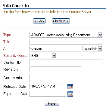
A.9.8 Folio Check In Confirmation Page
The Folio Check In Confirmation page is accessed by clicking Check in on the Folio Check In Page. It confirms the folio has been successfully checked into Content Server, and provides you with the following options of how to proceed when clicking Finish:
| Option | Description |
|---|---|
| Continue editing the folio | Displays the Edit Simple Folio Page or Edit Folio Page of the folio checked in. |
| View content information for the folio | Displays the standard Content Server content information page for the folio. |
| View the folio | Displays the View Folio Page for the folio. |
A.9.9 View Folio Page
By default, the View Folio page is identical to the Edit Folio Page, displaying the folio as a folder hierarchy with nodes, slots, and items. However, because the folio is stored in Content Server as an XML file, your system administrator can create additional folio views to display folio structure in a way more relevant to your business, and may set a new default view. When displayed as a view, the folio cannot be edited.
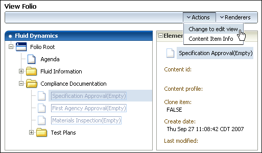
A.9.10 Manage Content Baskets Page
The Manage Content Baskets page is accessed by clicking My Baskets on the My Content Server tray, or by clicking Manage Baskets under the My Baskets folder on the My Content Server tray. The Manage Content Baskets page allows you to append, rename, or delete a content basket, and to set which is the active basket.
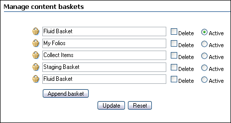
A.9.11 Content Basket Page
The Content Basket page is accessed by clicking a basket under the My Baskets folder on the My Content Server tray. The Content Basket page is a search results listing showing all items you have explicitly placed in this content basket.
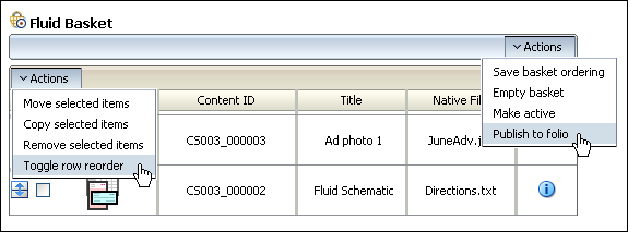
| Item | Description |
|---|---|
| Thumbnail Column | Displays an icon of the item type, or a thumbnail of the content item if your system administrator has set up Content Server to create them. |
| Content ID | Displays the content ID of the content item. |
| Title | Displays the title of the content item. |
| Native File | Displays the name of the native file of the content item. |
| Info | Clicking the info icon displays the content information page of a content item. |
| Table Actions Menu | The table actions menu lists actions that can be applied to any selected item or items in the content basket.
|
| Page Actions Menu | The page actions menu lists actions that can be applied to the entire content basket.
|
A.9.12 Move/Copy Basket Items Page
The Move/Copy Basket Items page is accessed by selecting a content item or items in a content basket from the Content Basket Page, and selecting either Move selected items or Copy selected items from the table Actions menu. Click the basket on the page to which you want to move the item or items.
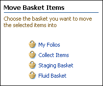
A.9.13 Insert Hypertext Page
The Insert Hypertext page is accessed by selecting Insert Hypertext from the Folio Structure Contextual Menu on the Edit Folio Page. It allows you to add a label and hypertext link as a new item in the folio structure.
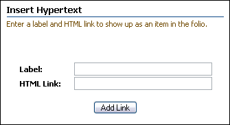
| Item | Description |
|---|---|
| Label | A description or other identifier for the item. |
| HTML Link | The URL of the hypertext link. For example, http://templates.company.com. |
A.9.14 Subscribe to <folio_name> page
The Subscribe to <folio_name> page is accessed by selecting Subscribe from the page Actions menu of a Content Server content information page for a folio. Selecting the desired actions from the list and clicking Subscribe notifies you when the actions have occurred.
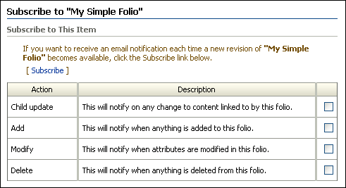
A.10 Content Tracker Interface
When enabled, the Content Tracker component enables users to generate a pre-defined access history report of a content item. To generate this report, select the View Access History Report option from the Content Actions menu on the document's Content Information page.
Note:
If you are using Firefox set to open new tabs instead of windows, help screens launched from an Admin Applet are not accessible until the applet window that launched the help is closed. Therefore, it is preferable to set Firefox to open in new windows instead of tabs.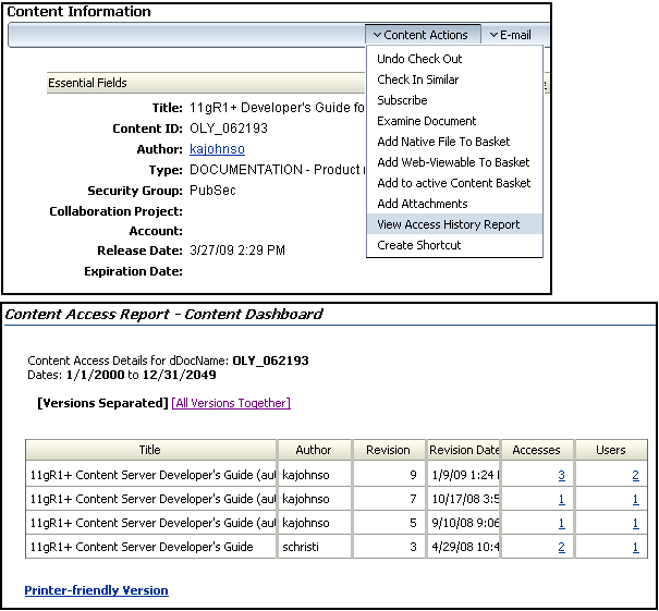
| Field | Description |
|---|---|
| Report Name field | The name of the selected query report. |
| Dates field | The dates entered in the Start Date and End Date fields. If you did not enter specific dates, the default dates are used for the query. |
| Results table columns | Provide the relevant information for the selected report. |
| Printer-friendly Version link | Opens a new browser window and displays the report without the navigation trays. |
