Release 11g (11.1.1)
Part Number E13881-02
Contents
Previous
Next
| Oracle Fusion Middleware Report Designer's Guide for Oracle Business Intelligence Publisher Release 11g (11.1.1) Part Number E13881-02 | Contents | Previous | Next |
| View PDF |
This chapter covers the following topics:
Release 11g of Oracle BI Publisher introduces a new type of layout template. The BI Publisher Layout template enables end users to:
view Dynamic HTML output and perform lightweight interaction with their report data from within a browser
generate high fidelity, pixel perfect reports to PDF, RTF, Excel, PowerPoint, and static HTML
BI Publisher Layout Templates are created using the BI Publisher Layout Editor - a design tool that provides a WYSIWIG, drag and drop interface for creating pixel perfect reports in PDF, RTF, Excel, PowerPoint, and HTML. It also provides dynamic HTML output that supports lightweight interaction through a browser. This interactive output is featured in the figure below:
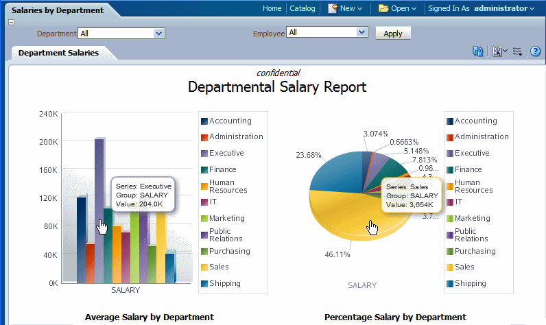
Notice the following features:
Pop-up chart details – pause your cursor over chart items to display details of data.
Group filtering – grouped regions can be filtered by the grouping element.
Scrollable tables – table data can be scrolled while maintaining display of the headers and totals.
Table column sorting – table data can be sorted by different columns from within the viewer.
Table column filtering – table data can be filtered by values in different columns from within the viewer.
Automatic table totaling – table data totals are automatically added to the layout.
Propagated filtering - filter other components by clicking on chart areas or by clicking on pivot table header, column, or elements
Collapse and expand areas of the document
BI Publisher layouts are best suited for reports of simple to medium complexity that do not require custom coding. Because the dynamic HTML view is only available for BI Publisher layouts, BI Publisher layouts must be used when there is a requirement to enable a report consumer to interact with the report (change sorting, apply filters, and so on).
To use the layout editor your account must be granted a role that includes the appropriate permissions for accessing report layout tools.
You must attach sample data to your data model before you create a new layout. For information on adding sample data to the data model, see Testing Data Models and Generating Sample Data, Oracle Fusion Middleware Data Modeling Guide for Oracle Business Intelligence Publisher.
For optimum viewing, set your display resolution to 1024 x 768 or higher.
For enabling interactive sorting and filtering the complete data set that is passed to the layout should be limited to several thousand rows to achieve a responsive report. BI Publisher layouts have a comparable performance to RTF layouts for generating static output such as PDF or RTF documents.
Launch the layout editor in one of the following ways:
After selecting the data model for a new report, the report editor displays the Add Layout page.
From the Create Layout region, click a predefined template to launch the layout editor.
In the Report Editor:
From the Thumbnail view, click Add New Layout.
or
From the List view, click the Create button on the layouts table toolbar.
From the Create Layout region, click a predefined template to use to launch the layout editor.
You can also access the Layout Editor when viewing a report. Click Actions and then click Edit Layout. Note that the layout must have been created in the layout editor.
When you creating a new layout, you are given the option of selecting a predefined layout to help you get started.
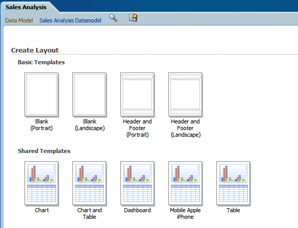
The Basic and Shared Templates offer common layout structures with specific components already added. Choosing one of the predefined layouts is optional, but can facilitate layout design. If your enterprise utilizes a common design that is not available here, you can add predefined layouts for your own use, or your Administrator can add more for all users.
To add predefined layout files to the shared directory for all users to access:
Log in with Administrator privileges and navigate to the Catalog.
In the Shared Folders directory, open the Components folder.
Locate the Boilerplates report and click Edit.
Click Add New Layout.
Design or upload the layout.
To design the layout: Click an existing boilerplate (or blank) to launch the layout editor. Insert the components to the layout. When finished, click Save and give your boilerplate a name. This layout will now display to all users in the Shared Templates region.
To upload a layout: Click Upload to upload a predefined BI Publisher Template (.xpt file).
Save the report.
Any BI Publisher Templates (.xpt) added to this report will be displayed to all users as a Shared Template.
To add predefined layouts that are available to your account user only:
Navigate to My Folders.
Create a new report called "Boilerplates". This report will have not have a data model.
Click Add New Layout.
Design or upload the layout.
To design the layout: Click an existing boilerplate (or blank) to launch the layout editor. Insert the components to the layout. When finished, click Save and give your boilerplate a name.
To upload a layout: Click Upload to upload a predefined BI Publisher Template (.xpt file).
These layouts will be presented in the My Templates region when you create a new layout.
The following figure shows the Layout Editor:
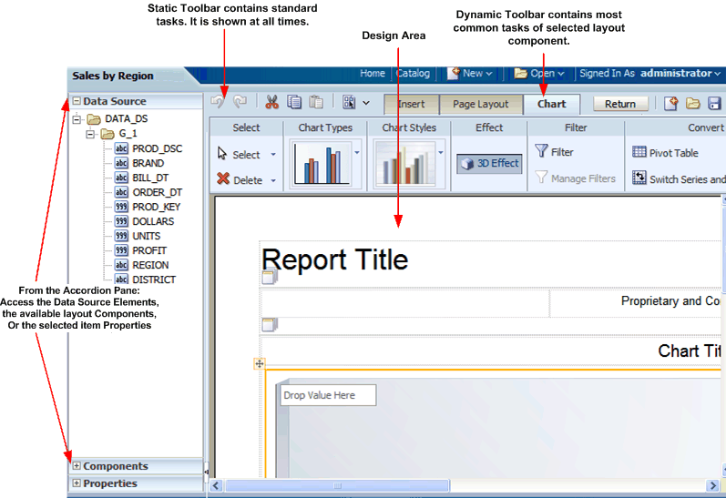
The Layout Editor interface comprises the following:
The top of the Layout Editor contains two toolbars:
The Static toolbar is always available and contains common commands such as save and preview. See About the Static Toolbar.
The Tabbed toolbar includes the Insert tab, the Page Layout tab, and a dynamic tab that shows the most commonly used actions and commands for the selected layout component. You can collapse this toolbar to make more room to view your design area. See About the Tabbed Toolbar.
The accordion pane on the left contains the following:
Use the Data Source pane to select the data fields to drag to the layout components.
Use the Components pane to select layout components and drag them to the design area. You can also use the Insert tab to insert components when this pane is collapsed.
Use the Properties pane to modify properties for the selected layout component.
You can expand and display each control by clicking the title of the control or the plus sign next to the title of the control. You can collapse the entire accordion pane to allow more room to view the layout.
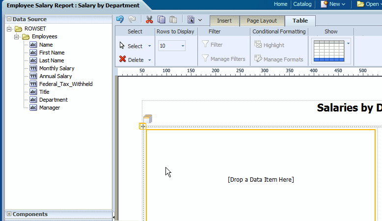
The lower right region is the design area for building your layout.
The Data Source pane displays the structure of your data model and the data elements that are available to insert into your layout.
To insert a data element, select and drag it from the Data Source pane to the component in the layout.
The data type for each field is represented by an appropriate icon: number, date, or text.
The following figure shows the data source pane. Note that the icon beside each element indicates the data type:
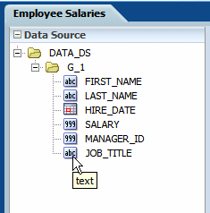
The JOB_TITLE element is shown as text, the SALARY element is shown as a number, and the HIRE_DATE element is shown as a date data type.
Note: When you enter dates in the Layout Editor (such as a data comparison for a filter or for conditional formatting), use one of the following XSL date or time formats: YYYY-MM-DD or YYYY-MM-DDTHH:MM:SS.
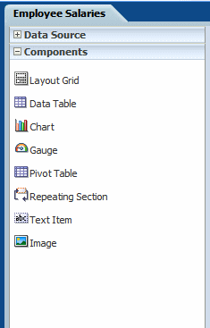
The Components pane contains the layout components that you can insert into a report. These components include charts, pivot tables, and images. To insert a component, simply drag and drop it to the layout.
You can also use the Insert menu to add components to your layout.
The following figure shows the Components pane:
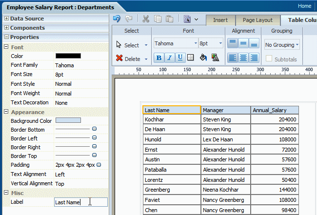
The Properties pane displays the properties for the selected component. The properties displayed are determined by the selected component. Some of the properties available in the Properties pane are also editable in the dynamic tab for the component.
Click a property value to edit it. The change is applied to the component when you move your cursor out of the field. Collapse or expand a property group by clicking the plus or minus signs beside the group name.
The properties available for each component are discussed in detail in the corresponding section for that component in this chapter. Note that if a property field is blank, the default is used.
The following figure shows a sample Properties pane for a table column header:
The Static toolbar extends on either side of the tabbed toolbar and is shown in the following figure:
Use it to perform the following functions:
Undo and redo operations.
Cut, copy and paste items.
Preview as Interactive, HTML, PDF, Microsoft Word (RTF), Microsoft Excel, Microsoft PowerPoint, or Microsoft PowerPoint 2007.
Return to the previous page.
Create a new layout.
Open a layout.
Save the layout.
Save the layout as a new copy under a different name.
The Tabbed toolbar contains the following tabs:
The Insert tab provides the components and page elements that can be placed on a layout. See Inserting Layout Components.
The Page Layout tab provides common page-level tools and commands. See About the Page Layout Menu.
The component-specific tab provides the most commonly used commands and properties for the component that is selected in the layout. For example, when you select a chart, the Chart tab displays. See the section on a specific component for details on the commands.
To set or control more properties for the selected component, open the Properties pane in the accordion pane, as described in About the Properties Pane.
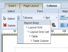
Each of the component-specific tabs include the Select region.
The Select tool enables you to control precisely which component on the layout has focus. This ability is particularly helpful when working with a complex layout where components overlap. For example, to select a table, it is sometimes difficult to click the correct spot to select the table and not a column, or header cell. To avoid unnecessary clicking, use the Select tool to precisely select the Table component from the list.
The Delete tool provides a similar function to the Select tool to enable you to precisely select the component to delete.
Use the Insert tab to insert report components and page elements. The following figure shows the Insert tab:
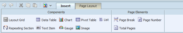
The Components group displays the report components that you can insert into your layout. To insert a component, select and drag the item to the desired location in the design area. For more information about each component, see its corresponding section in this chapter.
The Page Elements group contains page-level elements for your report. To insert a page break, the page number, or the total page number calculation, select and drag the component to the desired position in the layout.
Note: Page elements are intended for paginated output types, such as PDF and RTF. Using them in interactive or HTML output may have unexpected results.
The Page Layout tab is shown in the following figure:
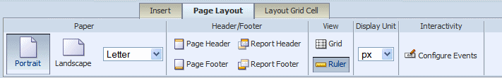
The Page Layout tab contains commands to set up your layout.
| Option | Description |
|---|---|
| Orientation | Choose Portrait or Landscape. |
| Paper Size | Select from the following paper size options: Letter, Legal, A4, A3, Executive, B5, Com-10, Monarch DL, or C5. Note that the paper size will determine the dimensions of the layout area. |
| Option | Description |
|---|---|
| Page Header | Click to insert a page header in your layout. By default, the page header appears on every page of a printed report, but can be configured to skip the first page. To remove the page header, click Page Header again. |
| Page Footer | Click to insert a page footer in your layout. By default, the page footer appears on every page of a printed report, but can be configured to skip the last page. To remove the page footer, click Page Footer again. |
| Report Header | Click to insert a report header to your layout. The report header appears only once at the beginning of the report. To remove the report header, click Report Header again. |
| Report Footer | Click to insert a report footer to your layout. The report footer appears only once at the end of the report. To remove the report footer, click Report Footer again. |
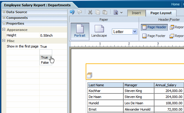
The Properties pane enables you to set the following properties for headers and footers. To access the Properties pane, select the header or footer in the design region, then click Properties from the accordion pane on the left of the page.
For all report and page headers and footers:
Height - set the height of the header region in pixels, points, centimeters, or inches
For headers:
Show in the first page - select True to show the header in the first page. Select False to suppress the header from the first page.
The following figure shows the Properties for a report header:
For footers:
Show in the last page - select True to show the footer in the last page. Select False to suppress the footer from the last page.
| Option | Description |
|---|---|
| Grid | Click to insert gridlines in the layout design area. The grid unit size will depend on the Display Unit selected. To remove the gridlines, click Grid again. |
| Ruler | Click to insert a display ruler across the top of the layout design area. The ruler units will depend on the Display Unit. To remove the ruler, click Ruler again. |
Select the unit of measure to display. This unit is used for the ruler and grid view options, as well as for any other function that displays a measurement, such as setting border widths and sizing grid cells. Options are: inch, px (pixel), cm (centimeter), and point (pt).
The Configure Events feature enables you to configure how components of your layout respond to events triggered by a user when viewing the report in interactive mode.
The two types of events are:
Filter - if you click an element in a list, chart, or pivot table, that element will be used to dynamically filter other components defined as targets in the report. The component being clicked does not change.
Show Selection Only - if you click an element of a list, chart, or pivot table, the chart or pivot table (being clicked) will show the results for the selected element only. This action does not affect other components of the report.
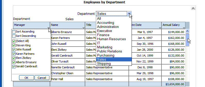
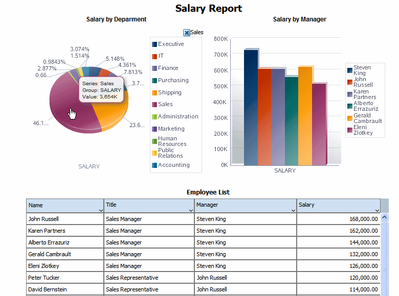
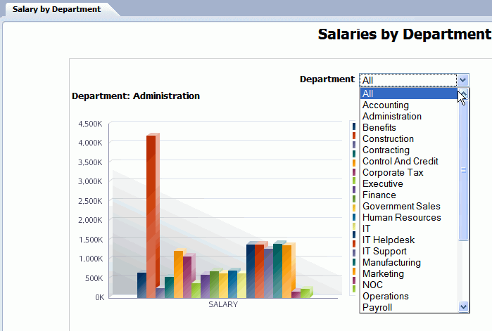
In this example the layout contains two charts and a table. The first chart shows salary totals by department in a pie chart. The second chart shows salary totals by manager in a bar chart. The table displays a list of employees and their salaries. This example is shown in the following figure:
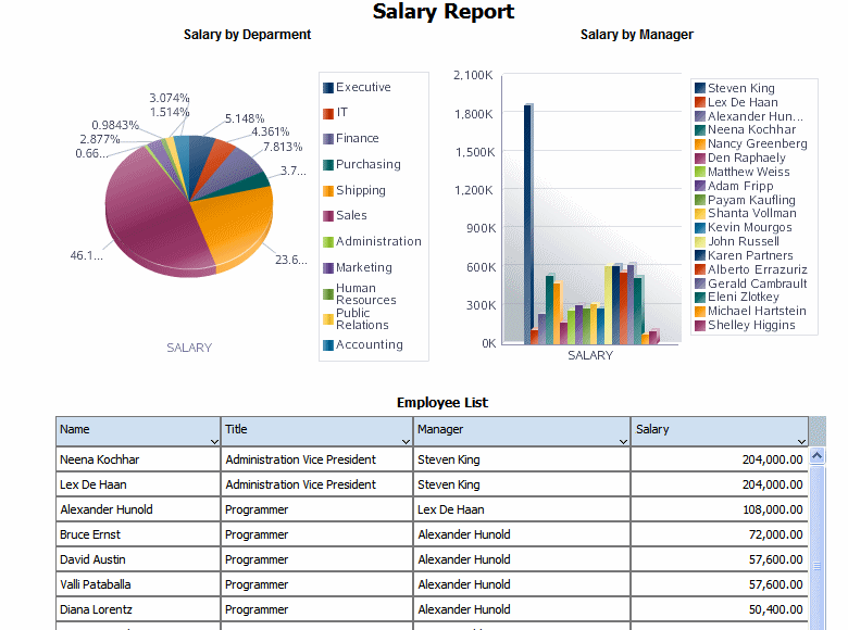
In this report, if a user clicks on a value in the Salary by Department chart, you want the Salary by Manager chart and the Employees table to automatically filter to show only the managers and employees in the selected department.
The following figure shows the automatic filtering that occurs when a user clicks the Sales department section of the Salary by Department pie chart. The Salary by Manager chart automatically filters to display only the managers belonging to the sales department. The Employee table automatically filters to display only the employees in the sales department.
On the Page Layout tab, click Event Configuration to display the Configure Events dialog.
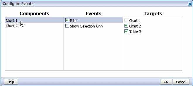
In the Components column, click the layout component (lists, charts, and pivot tables are available to configure).
Select Filter to enable automatic filtering in other report components.
Select the report components in the Targets column to enable the automatic filtering based on interactive events in the selected component. To disable the automatic filtering for a target component, clear the box.
The preceding figure shows that the Filter event is enabled for Chart 1 in the layout. Chart 2 and Table 3 are selected as targets to enable automatic filtering when a selection event occurs in Chart 1.
Note that Show Selection Only is not enabled for Chart 1. That means that Chart 1 will continue to display all values when one its elements is selected.
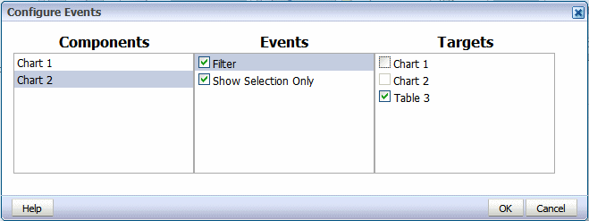
The Show Selection Only event displays only the value of the selected element within the chart or pivot table (being acted on).
In this example, Chart 2 is configured with Show Selection Only enabled and Filter enabled with Table 3 as the Target, as shown:
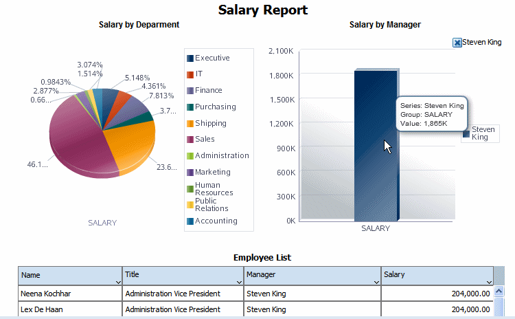
This configuration will result in the output shown below. When the user clicks on Chart 2, only the selected value will be shown in Chart 2. Because the Filter event is enabled for Table 3, the selection is applied as a filter to Table 3.
To set the page margins for your report:
Click anywhere in the design area outside of an inserted component.
Click the Properties pane in the lower left of the Layout Editor. The following figure shows the Properties for the page:
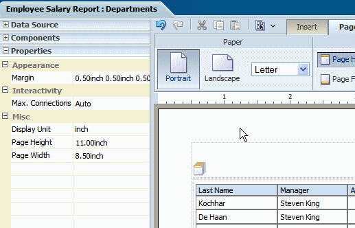
Click the value shown for Margin to launch the Margin dialog. The Margin dialog is shown in the following figure:
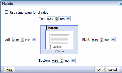
Select the desired size for the margin. Enter the value for the Top, Left, Right, and Bottom margins.
To automatically set the same value for all sides, select the box: Use same value for all sides. This action will disable all but the Top margin entry. Enter the value in the Top to apply to all sides.
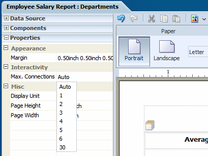
You can limit the connections from the browser to the server for the interactive viewer. More connections are faster but increase server load The default is six connections. Reduce the number to reduce the load on your server for large reports.
To set the maximum connections for this layout:
Click anywhere in the design area outside of an inserted component.
Click the Properties pane in the lower left of the Layout Editor. The following figure shows the Properties for the page:
Click the value shown for Max. Connections and select the desired value from the list.:
The layout editor supports components that are typically used in reports and other business documents. The followings components are described in these sections:
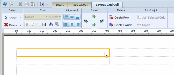
The layout grid provides a way to divide a layout into sections. It functions similarly to a table in HTML or Word documents to create forms or to provide sophisticated layouts. Use a layout grid to control the exact placement of all other components in the layout.
To create a layout grid, select and drag the Layout Grid component to the design area.
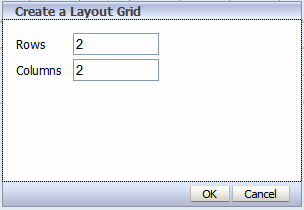
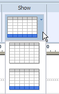
In the dialog, enter the number of rows and columns for the grid and click OK to insert the grid to the design area as shown in the following figure:
Note the following about a layout grid:
The grid is created with equidistant columns, and the row size defaults to a minimum of one row of text.
Although Font properties are not enabled for a layout grid cell (set font properties using the individual component properties), the background color and border properties are enabled.
When you insert a component to a grid cell, it automatically resizes to accommodate the component.
Adjust the column width and height by either positioning the mouse pointer over the border and dragging the blue bar, or by changing the grid column properties in the Properties pane.
The grid supports merging of cells.
You can insert a grid inside a grid.
Similar to Microsoft Word, the grid uses a flow layout that is very convenient for designing business documents. Components that do not occupy a full paragraph or block are positioned top-down and left to right.
By default, the gridlines are displayed in the design area only and are not shown during runtime. If you wish to display the gridlines in your finished report, select the grid cell and click the Set Border command button to launch the Border dialog.
To add a background color to a cell, click the Background Color command button to launch the Color Picker.
Once you have inserted a layout grid, you can add additional rows or columns. Select the layout grid cell that is the focal point, then click the appropriate command button:
Add a Row above
Add a Column to the right
Add a Row below
Add a Column to the left
To join cells horizontally or vertically, select multiple adjacent cells by holding down the Ctrl key and clicking each grid cell. Then click the Join command button.
To unjoin cells that have been joined, select the joined cell and click the Unjoin button.
When viewing a report in interactive mode, expand and collapse of a layout grid are supported. Expand and Collapse are supported at the grid level, (not the cell-level) therefore ensure to insert grids appropriately. For example, if your report contains a chart in the top portion of the layout and a table in the bottom and you want to be able to collapse the chart display, you must insert one layout grid to contain the chart and a second layout grid beneath the first to contain the table. Do not insert one grid with two rows.
To enable the expand and collapse option:
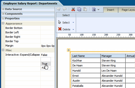
Select the layout grid.
Open the Properties pane.
Set the Interactive: Expand/Collapse property to True. The following figure shows this option on the Properties pane.
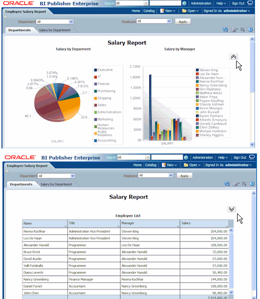
The following figures demonstrate the expand and collapse behavior when the report is viewed in interactive mode. Note the collapse icon in the upper right area of the report. Click the icon to collapse the grid. The second figure shows the report with the region collapsed.
Repeating sections repeat the components within the section of the layout based on the occurrence of an element in the data. Repeating sections are used to create classic banded reports, as well as repeating pages or sections for different data elements (such as Group Above/Outline).
To create a repeating section:
Drag and drop the repeating section component to the layout.
In the Repeating Section dialog, select one of the following:
Element: Specify the element for which the section repeats. For example, if your dataset contains sales information for several countries. If you select COUNTRY as the repeat-by element, then the section of the layout repeats for each unique country occurring in the dataset.
Group Detail: If you have nested sections, then select this option. To continue the previous example, assuming there are unique data rows for each city and grouping by country, then this option creates a section that repeats for each city.
The following example shows a layout that has a repeating section defined for the element Department. Within the repeating section are a chart that shows salaries by manager and a table that shows all employee salaries. So for each occurrence of department in the dataset, the chart and table will be repeated:
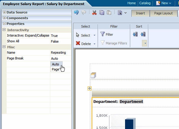
By default, for paginated output types, the page will break automatically according to the amount of content that will fit on a page. It is frequently desirable to have the report break after each occurrence of the repeated content.
Using the preceding example, it would be desirable for the PDF output of this report to break after each department. To create a break in the report after each occurrence of the repeating section:
Select the repeating section component.
Open the Properties pane.
Set the Page Break property to Page.
The following figure displays the Properties for a repeating section:
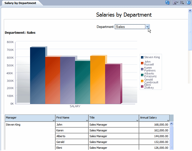
In interactive mode, the values for the repeat by element are displayed as a list of values. This enables the enable the report consumer to dynamically select and view the results.
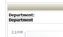
Shown in the example below, the repeat by element Department is displayed in a list of values:
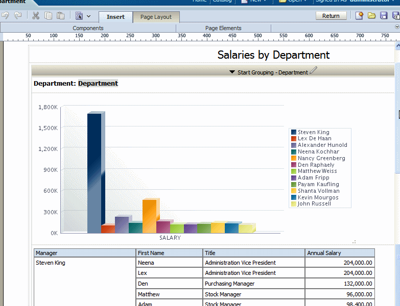
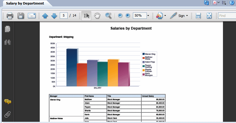
By contrast, note the same layout displayed in PDF. In this example the page break option is set so that each new department begins the repeating section on a new page:
In interactive mode, the values for the repeat by element are displayed as a list of values. By default, this list includes only the values present for the element in the data. Therefore, a report consumer can view results for only one item at a time.
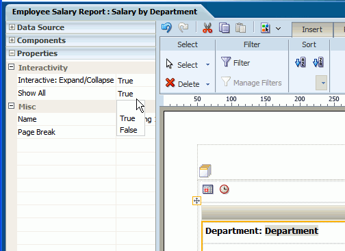
To enable a report consumer to view the results in the repeating section for all values of the element, the Repeating Section component provides the property: Show All. When this property is set to true, the value "All" is added to the list to enable the display of results for all values.
To enable Show All:
Select the repeating section component.
Open the Properties pane.
Set the Show All property to True.
The following figure displays the Show All setting in the Properties pane:
When you view the report, the option All is added to the menu of values:
The data table is a standard table that is shown in many layouts. It contains a header, data columns, and a total row. The table supports "group left" functionality (outlines) that merges fields with the same values as well as subtotals, grand totals, custom calculations, and running totals.
Once inserted, you can edit the table properties using the dynamic tabs or the Properties pane. The following dynamic tabs are available for the table components:
Table
Table Column Header
Column
Total Cell
From the Insert tab, select and drag the Data Table component to the design area.
The following figure shows an inserted, empty data table. Notice that the Table tab is now displayed.
To add data columns to your table, select an element from the Data Source pane and drag it to the table in the layout.
The following figure shows the columns being added to the table. Notice that when you drop a column on the table your sample data is immediately displayed.
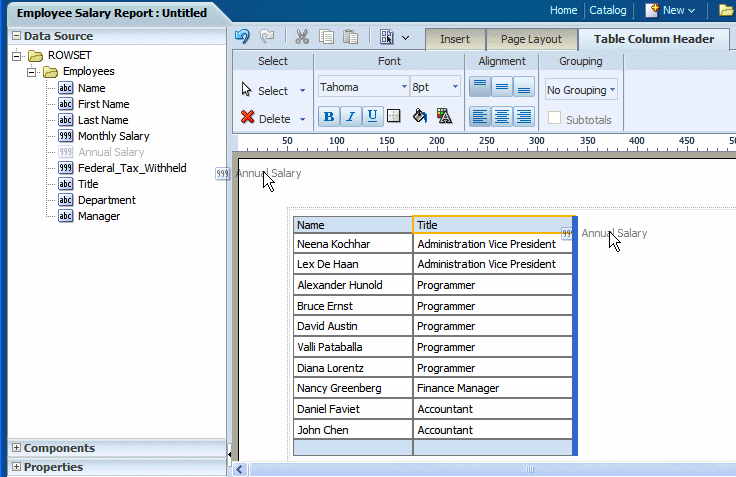
Continue to drag the elements from the Data Source pane to form the columns of your table. If you need to reposition a column that you have already added, select it and drag it to the correct position.
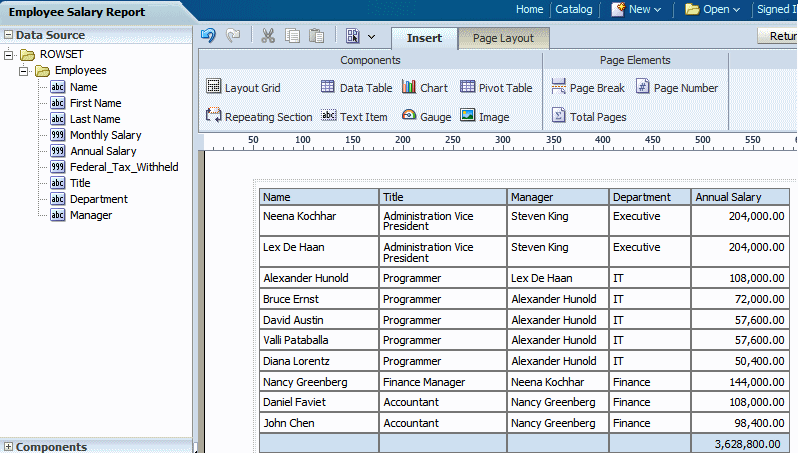
The following figure shows a completed data table.
Notice the following default behavior:
A total row is automatically inserted. By default it calculates the sum of the items in the column. You can remove this row or edit the display and calculation applied. See About the Total Cell Tab.
Default date formatting is applied. To change the default formatting, see About the Column Tab.
Default number formatting and alignment is applied. To change the default formatting, see About the Column Tab.
Some data tables are easier to read when the rows display alternating colors, as shown in the following figure:
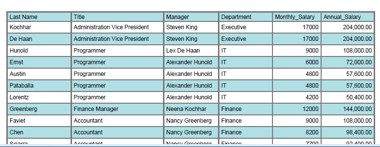
To set an alternating row color:
Select the table.
Open the Properties pane.
Click the value shown for Alternate Row Color to launch the color picker.
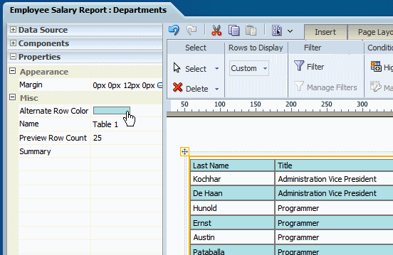
Choose a color and click OK.
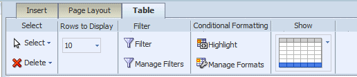
The Table Tab enables you to perform the following:
Set the number of rows displayed
Define filters for the data displayed in the table
Define conditions and formats to apply to rows that meet the conditions
Show or hide the total row for the table
The Rows to Display property controls the number of rows of data displayed as follows:
When designing the layout, this property sets the number of rows that will be displayed for the table within the layout editor.
When viewing this layout in the report viewer in interactive mode, this property sets the size of the scrollable region for the table.
The default is 10 rows of data. You can select 10, 20, 30, 40, or All rows of data to be displayed. To set a custom value, open the Properties pane and enter the custom value for the Rows to Display property.
Note: Displaying more rows of data could impact performance of the Layout Editor.
A filter refines the displayed items by a condition. This is a powerful feature that enables you to display only desired elements in your table without having to perform additional coding. For example, you could add a filter to meet some of the following report conditions:
Display only the top 10 salaries
Display only the bottom 25 store sales
Display only employees in the IT department
Display only sales that are between $10,000 and $20,000 and in the Southern region
You can add multiple filters and manage the order in which they are applied to your table data.
To set a filter:
Click the Filter toolbar button. This launches the Filter dialog, shown in the following figure:
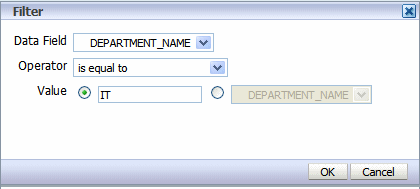
Enter the fields to define a filter:
| Field | Description |
|---|---|
| Data Field | Choose the data field to filter the table data by. All elements are available regardless of whether they are included as table columns. |
| Operator | Select from the following operators: is equal to is not equal to is less than is greater than is less than or equal to is greater than or equal to is between is in top is in bottom |
| Value | Enter the value or values appropriate for the operator selected. The value can be either a text entry, or an element from the data. |
After you have added filters, use the Manage Filters feature to edit, delete, or change the order that the filters are applied.
To manage filters:
Click the Manage Filters toolbar button to launch the Manage Filters dialog shown in the following figure:
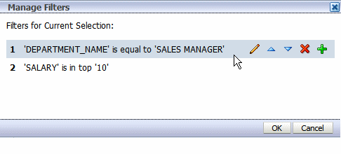
Pause your cursor over the filter to display the actions toolbar. Use the toolbar buttons to edit the filter, move the filter up or down in the order of application, delete, or add another filter.
A conditional format changes the formatting of an element in your table based on a condition. This feature is extremely useful for highlighting target ranges of values in your table. For example, you could create a set of conditional formats for your table that display rows in different colors depending on threshold values.
To apply a conditional format:
Click the Highlight button. This launches the Highlight dialog, shown in the following figure:
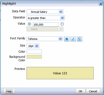
Enter the fields to define a condition and format to apply:
| Field | Description |
|---|---|
| Data Field | Choose the data field to apply the condition to. All elements are available regardless of whether they are included as table columns. For example, you may want to highlight in red all employees with salaries greater than $10,000, but not actually include the salary element in the table. |
| Operator | Select from the following operators: is equal to is not equal to is less than is greater than is less than or equal to is greater than or equal to is between |
| Value | Enter the value or values appropriate for the operator selected. The value can be either a text entry, or an element from the data.
Important: If entering a date value, use on of the following XSL date or time formats: YYYY-MM-DD or YYYY-MM-DDTHH:MM:SS. |
| Font Family | Select the font to apply to the row of data that meets the condition. You can also apply bold, italic, or underline emphasis. |
| Size | Select the size of the font to apply to the row of data that meets the condition. |
| Color | Click the color box to open the Color Picker. Choose one of the predefined colors or click Custom Color to define your own color to apply to the font. |
| Background Color | Click the color box to open the Color Picker. Choose one of the predefined colors or click Custom Color to define the background color to apply to the row. |
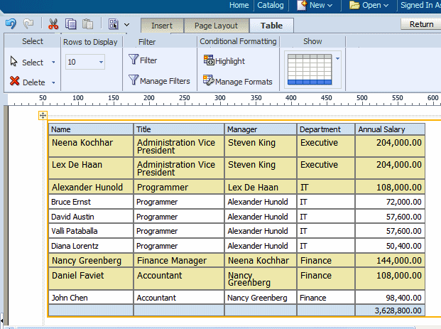
The following figure shows the table in the layout with the condition applied:
After you have added conditional formats, use the Manage Formats command to edit or delete a format.
To manage formats:
Click the Manage Formats button to launch the Manage Conditional Formats dialog shown in the following figure:
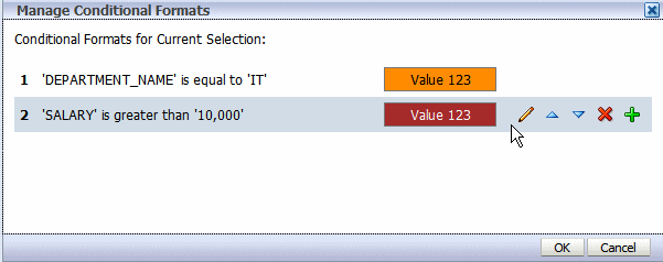
Pause your cursor over an item to display the actions toolbar. Use the toolbar buttons to edit the format, move the format up or down in the order of application, delete, or add another format. Note that the order of the conditions is important because only the first condition met will be applied.
By default, the layout editor inserts a total row in your table that sums numeric columns. To remove the total row, click the Show menu and select the table view without the highlighted total row. The Show menu options are shown in the following figure:
The total row can be further customized using the Total Cell tab and the Properties pane. For more information see About the Total Cell Tab.
The Table Column Header tab is shown in the following figure:
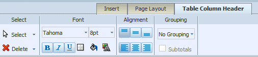
The Table Column Header tab enables you to perform the following:
Edit the font properties of the table header column
Edit the cell properties of the table header including border weight, style, and color and background fill color
Set the vertical and horizontal alignment of the table header
Apply grouping
"Grouping" groups together elements in the data of the same value. In a table, applying grouping can make your table easier to read.
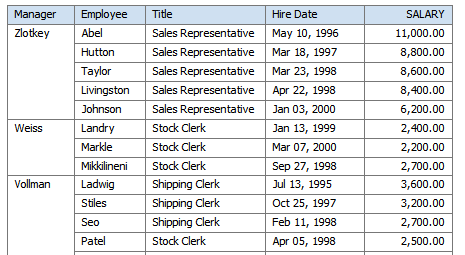
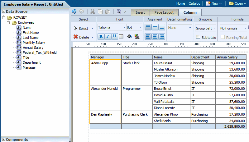
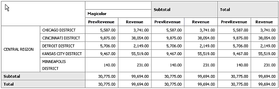
The Grouping option enables you to choose between "Group Left" or "Group Above". Group left maintains the "group by" element within the table. The following figure shows a table that has been grouped by Manager using Group Left:
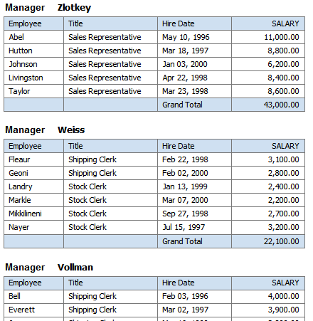
Group above inserts a Repeating Section component, and extracts the grouping element from the table. The grouping element is instead displayed above the table and a separate table is displayed for each occurrence of the grouping element. The following figure shows a table that has been grouped by Manager using Group Above:
In the following example, the table data has been grouped by the elements of the first two columns, Manager and Title. Notice that there is only one entry per manager name and one entry for each job title under that manager name. This organizes the data rows more cleanly in the table.
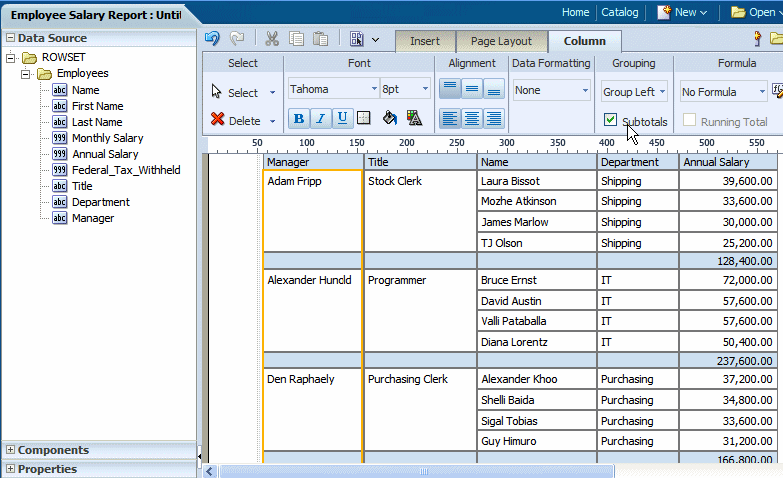
To further enhance your table, you can add a subtotal row to display for each grouped occurrence of the element. The figure below shows the same table with the Subtotals box checked. Notice that for each manager a subtotal row has been inserted.
In the following example, the table data has been grouped by Manager. Notice that in the design pane, the Data Table component has been replaced with a Repeating Element component that contains the data table. The Manager element is inserted above the table with a label.
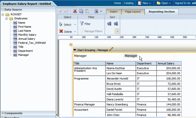
The label is a text item. Edit the text by double-clicking the item to select it, then single-clicking to edit.
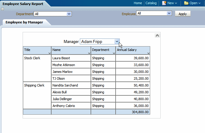
When you run the report, a separate table is created for each occurrence of the grouping element. In Interactive output mode, the grouping element displayed at the top of the table is displayed as a filter. Choose the value you wish to view from the list as shown in the following figure:
The Column tab is enabled when you select a specific column in a table.
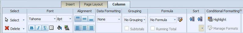
It enables you to perform the following:
Edit the font properties of the column including style, size, and color
Edit the cell properties of the column including border weight, style, and color and background fill color
Set the vertical and horizontal alignment of the column contents
Apply formatting to the column data (options depend on the data type)
Apply grouping
Apply a running total (or other formula) to the data
Apply sorting and sort precedence
Apply conditional formatting to the column
The options available from the Data Formatting region of the tab depend on the data type of the column selected. The tab provides common options to choose from.
If the column contains numeric data, the following formatting options are available:
Format - select one of the common number formats from the list. The format is applied immediately to the table column. The formats are categorized by Number, Percent, and Currency as shown in the following figure.
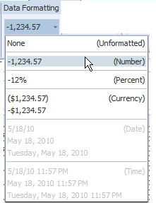
To apply a format not available from this list, see About Custom Formats.
Decimal position - click the Move Left or Move Right to increase or decrease the decimal positions displayed.
Show/Hide Grouping Separator - click this button to hide the grouping separator (for example, 1,234.00 will display as 1234.00). To show the grouping separator, click the button again.
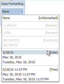
If the column contains dates, the following formatting options are available:
Format - select one of the common date formats from the list. The format is applied immediately to the table column. The formats are categorized by Date and Time as shown in the following figure.
The options available from the Formula region of the column tab depend on the data type of the column.
For more information about applying formulas, see Setting Predefined or Custom Formulas.
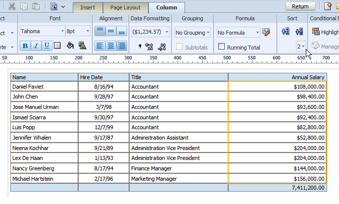
To sort the data in a column, select the column, then under the Sort group click Ascending Order or Descending Order.
To sort by more than one column, select the column, the sort order, and then assign a Priority to each column. The priority list is a list of values beneath the sort order commands.
For example, in the following employee salary table, assume you want to sort ascending first by Title then sort descending by Annual Salary:
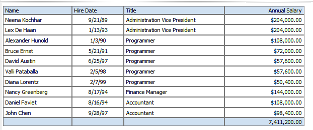
To apply the sort order to this table:
Select the Title column.
On the Column tab, under Sort, click the Ascending Order button.
From the Priority list, select 1.

Next select the Annual Salary column.
On the Column tab, under Sort, click the Descending Order button.
From the Priority list, select 2.
The sorted table is shown in the following figure:
To remove a sort order applied to a column:
Select the column.
From the Sort region on the Column tab, click the appropriate button of the sort order that has been applied. For example, to deselect the ascending order, click the Ascending Order button to undo the sort.
The Layout Editor automatically inserts a grand total row when you insert a data table to your layout. As shown in the section on grouping, you can also insert subtotal rows within your table based on a grouping element. To edit the attributes of the cells in a grand total or subtotal row, select the cell and use the options in the Total Cell tab shown in the following figure:
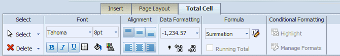
The Total Cell tab enables you to perform the following:
Edit the font properties of the total cell
Edit the cell properties of the total cell including border weight, style, and color and background fill color
Set the vertical and horizontal alignment of the table header
Apply formatting to the cell data
Apply a formula to the cell
Apply conditional formatting to the cell
See About the Data Formatting Options for Columns under the Column tab section.
By default, the formula applied to a Total Cell within a numeric column is a sum of the column items. The Formula option enables you to apply a different formula.
Not all options available from the Formula region of the column tab are applicable to a Total Cell.
For more information about applying formulas, see Setting Predefined or Custom Formulas.
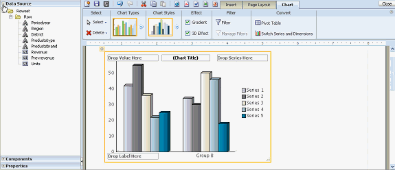
The layout editor supports a variety of chart types and styles to graphically present data in your layout. The following figure shows side-by-side vertical bar and pie charts in the layout editor.
Once inserted, you can edit the chart properties using the dynamic toolbars or the Properties pane. The Properties pane extends the options from the Chart tab and enables you to enter very specific custom settings for the following:
Chart Effect
Chart Legend
Chart Plot Area
Chart Title
Chart Label
Note: The Chart Label properties Title Font, Title Horizontal Align, Title Text, and Title Visible apply to Scatter and Bubble chart types only.
Chart Values
Note: Some font effects such as underline, italic, and bold may not render in PDF output.
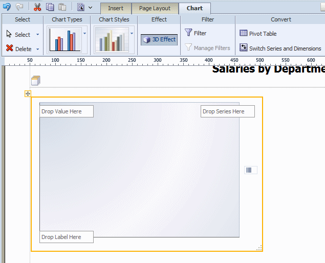
From the Insert menu, select and drag the Chart component to the layout.
By default an empty vertical bar chart is inserted and the Chart dynamic tab is displayed, as shown in the following figure:
To change the chart type, click the Chart Type list to select a different type. In the following figure the chart type is changed to Pie.
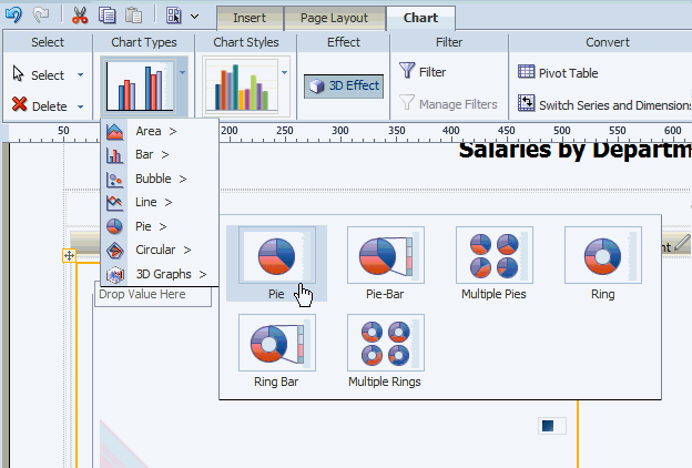
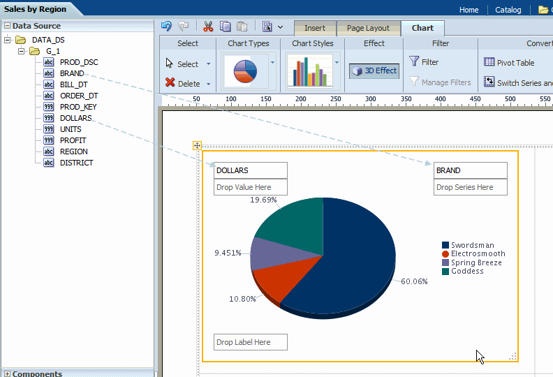
Select and drag the data fields from the Data Source pane to the appropriate areas in the chart. The chart will immediately update with the preview data.
To resize the chart, drag and drop the resize handler on the lower right corner of the chart, as shown in the following figure:
The Chart tab enables you to perform the following:
select a different Chart Type
apply a different Chart Style
enable 3-D effects
filter the data that is displayed in the chart
manage multiple filters
convert the chart to a pivot table or switch the series and dimensions values
See About Filters for information on how to apply and manage filters.
To convert a chart to a pivot table:
Select the chart.
In the Convert group, click Pivot Table.
The layout editor will convert the label, series, and value elements of the chart into the appropriate rows, columns, and data elements of a pivot table.
By default, the chart displays a sum of the values of the chart measure. You can change the formula applied to a chart measure field by selecting an option from the Chart Measure Field tab.
Change the Formula Using the Tab
Select the measure field in the chart. This displays the Chart Measure Field tab as shown in the following figure:
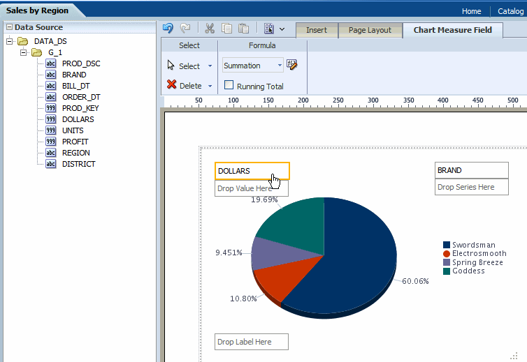
Select from the following options available from the Formula list:
Count
Sum
Running Total
To sort a field in your chart:
Select the field to display the Chart Field tab.
On the Chart Field tab select Sort Ascending or Sort Descending.
To sort by multiple fields, apply a Priority to each sort field to apply the sort in the desired order.
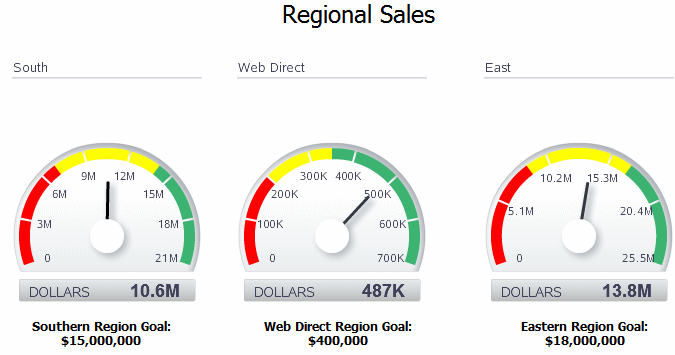
A gauge chart is a useful way to illustrate progress or goals. For example, the following figure shows a report with three gauges to indicate the status of regional sales goals:
To insert a gauge chart in your layout:
From the Insert menu, select and drag the Gauge component to the layout. This inserts an empty gauge chart.
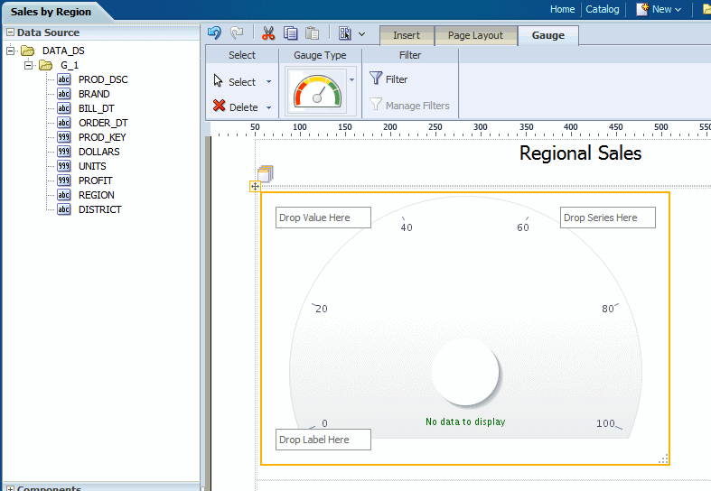
Select and drag the data fields from the Data Source pane to the Label, Value, and Series areas of the chart. The chart will immediately update with the preview data.
In the example figure, drag REGION to the Label area and DOLLARS to the Value area:
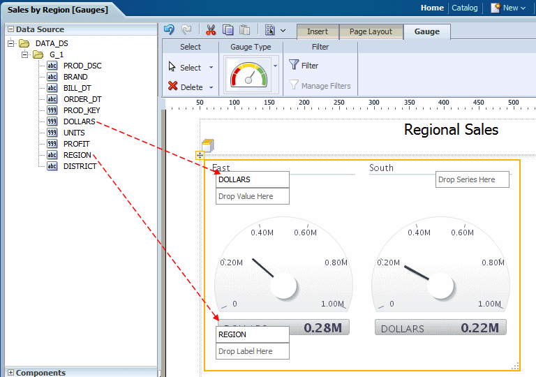
Note the following:
A separate gauge is created for each occurrence of the Label (that is, each REGION). One set of properties will apply to each occurrence. To apply different properties to each gauge, see Creating Filtered Gauges.
By default, the Value field is a sum. You can change the expression applied to the value field. See Changing the Formula Applied to a Chart Measure Field.
You can apply a sort to the other gauge chart fields.
Use the Properties Pane to set detailed options for your gauge chart.
See About Filters for information on how to apply and manage filters.
The pivot table provides views of multidimensional data in tabular form. It supports multiple measures and dimensions and subtotals at all levels. The following figure shows a pivot table:
To insert a pivot table:
From the Insert tab, select and drag the Pivot Table component to the layout. The following figure shows the empty pivot table structure:
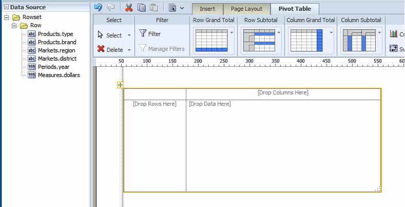
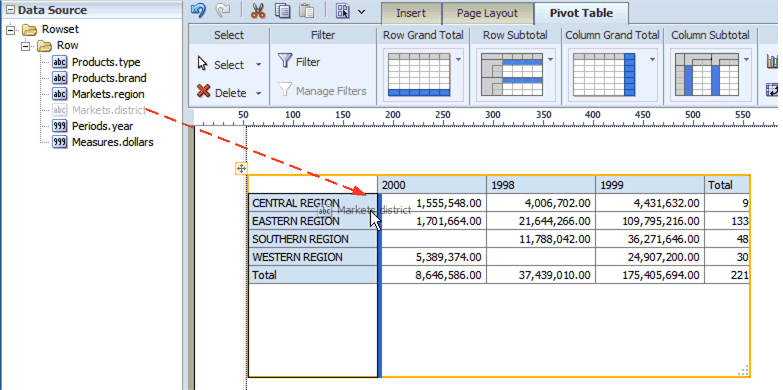
Drag and drop data fields from the Data Source pane to the row, column, and data positions.
Drag multiple fields to the pivot table and place them precisely to structure your pivot table.
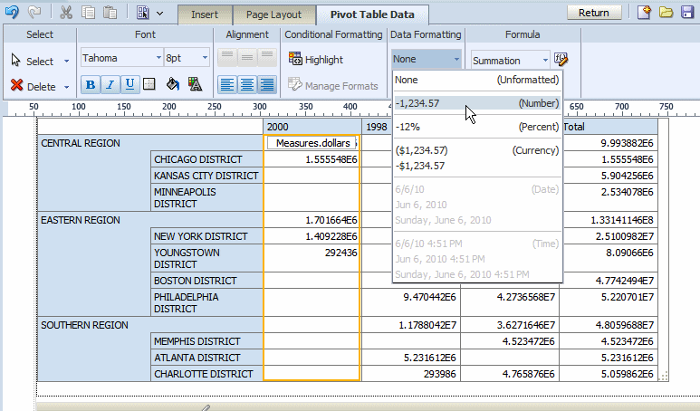
By default the pivot table is inserted with no data formatting applied. To apply a format to your data, click the first column of data to enable the Pivot Table Data toolbar. On the Data Formatting group, select the appropriate format as shown in the following figure:
Optionally resize the pivot table by clicking and dragging the handler in the lower right corner of the pivot table.
After you insert a pivot table customize the appearance and layout using the following dynamic tabs:
Pivot Table tab
Pivot Table Header tab
Pivot Table Data tab
The following figure shows the Pivot Table tab:
See About Filters for a description of he Filter and Manage Filters features.
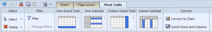
The Pivot Table tab enables you to quickly customize the display of grand total and subtotal rows.
By default, the layout editor inserts the pivot table with the total and subtotal displays as shown in the tab:
Row Grand Total - inserted at bottom of table
Row Subtotal - inserted at top of each subgroup, with no row header
Column Grand Total - inserted at the far right
Column Subtotal - inserted to the left of each column subgrouping, with no header
Change the positioning and display of totals and subtotals by clicking the appropriate group in the tab and selecting the desired layout pattern from the menu.
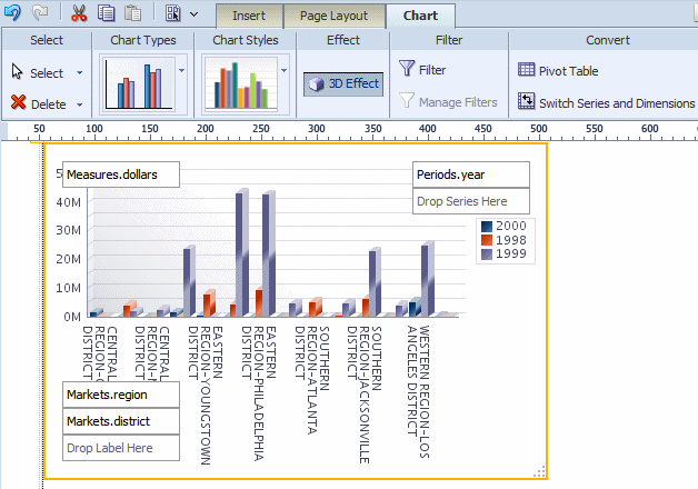
The Convert Pivot Table to a Chart command converts the pivot table to a default vertical bar chart. After conversion, customize the table as described in About Charts.
The following figure shows the pivot table created in the preceding step converted to a vertical bar chart:
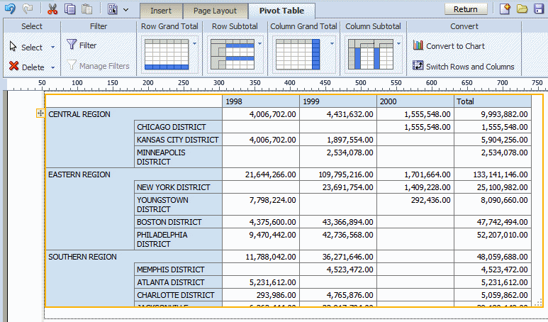
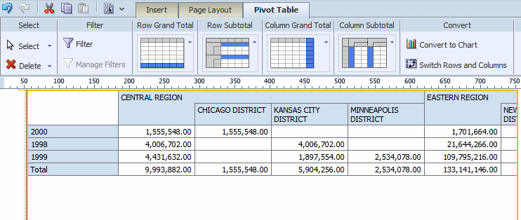
Use the Switch Rows and Columns command to see a different view of the same data. The following figure shows the pivot table created in the previous step with rows and columns switched:
The Pivot Table Header tab is shown in the following figure:
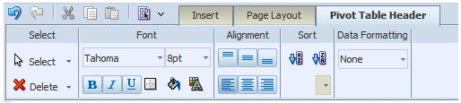
Select the column or row header of the pivot table and use the Pivot Table Header tab to perform the following:
customize the fonts, colors, alignment and other display features of the header
apply a sort order (for more information see About the Sort Option)
apply data formatting (if the data type is number or date)
The Pivot Table Data tab is shown in the following figure:
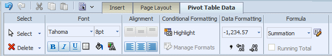
Select the data area of the pivot table and use the Pivot Table Data tab to perform the following:
Note: The commands in the Pivot Table Data tab are the same as the corresponding commands in the table Column tab. See the references for more information on their use.
customize the fonts, colors, alignment and other display features of the data
apply conditional formatting to the data for more information (see About the Conditional Formatting)
apply data formatting (see About the Data Formatting Options for Columns)
apply a formula (see Applying a Formula)
The text item component allows you to enter free-form text in the layout.
To create a text item component:
Drag and drop the text item component to the layout.
Double-click the text to enter text editor mode. Select parts of the text to apply different formatting to different parts.
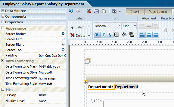
By default, the text item always spawns a complete paragraph. Inserting a data field next to the text field will place the data field beneath the text field as shown in the following figure:
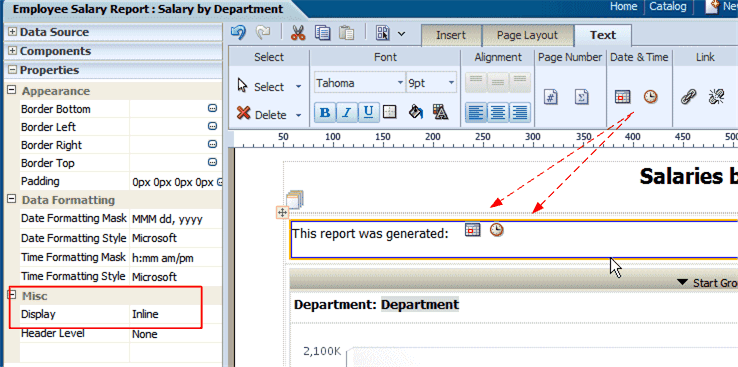
To display the data field inline with the text item, set the Display property to Inline in the Properties pane:
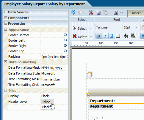
This setting enables the positioning of text items and data fields into a single line as shown in the following figure:
The Text Tab is shown in the following figure:
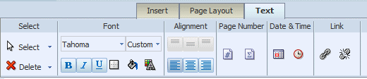
The Text tab enables you to perform the following:
Set the font properties
Set alignment of the text in the grid cell
Insert predefined text items: page number, date, and time
Insert a hyperlink
Use the Font group of commands to set the following:
select a font style
select a font size
apply emphasis (bold, italic, or underline)
insert a border around the text item
apply a background color
apply a font color
Drag and drop the page number component to the design area.
To create the following Page # of N construction
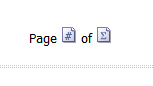
perform the following:
From the Insert tab drag and drop a Text Item to the design area where you want the page numbers to display.
Double-click the inserted text to select the text item for editing. Type "Page ".
From the Text dynamic tab, drag and drop the Page Number component.
Enter a space, and type "of ".
From the Text dynamic tab, drag and drop the Page Total component.
To insert the date and time in your report:
From the Insert tab drag and drop a Text Item to the design area where you want the date and time to display.
Double-click the inserted text to select the text item for editing.
Click the Date icon to insert the date icon in the text item. Click the Time icon to insert the time icon in the text item.
Note: To display the items side-by-side ensure to set the Text Item property to "Inline".
This is shown in the following figure:
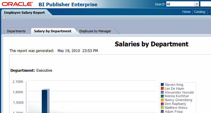
When this report is viewed, the date and time will be displayed according to the server time zone if viewed online, or for scheduled reports, the time zone selected for the schedule job.
To insert a hyperlink in your report:
From the Insert tab drag and drop a Text Item to the design area where you want the date and time to display.
Double-click the inserted text to select the text item for editing. Enter the text which you want to convert to a link.
Select the text, then click the Link button.
In the dialog enter the URL.
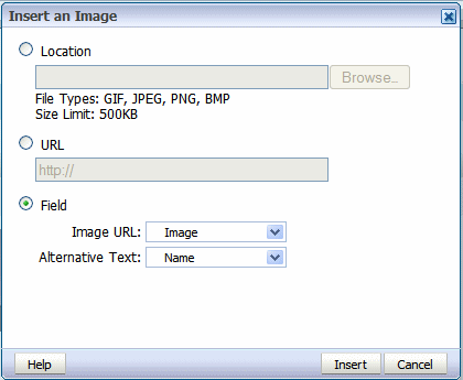
The image component enables you to include a graphic in the layout. BI Publisher supports the following methods for including an image:
Static image: Upload a static image that is saved in the report file. An uploaded image file must be in one of the following graphic file formats: GIF, JPEG, PNG, or BMP. The image file cannot be larger than 500 KB.
Static URL: Specify a static link to a URL where an image is stored.
Dynamic URL: Include the image URL in an element of your data. The value of the element will be evaluated at runtime enabling dynamic insertion of images.
To insert an image:
Drag and drop the image component to the layout.
In the Insert an Image dialog, specify one of the following sources for the image:
Location: Click Browse to specify the file name and directory of the image on a local or mapped drive to upload the image.
URL: Enter the URL where the image is stored.
Field:
Image URL: Select the field from your data that contains a URL to an image.
Alternative Text: If your data includes a field that contains alternative text for the image, select that field to display alternative text when the report is viewed as HTML.
The following figure shows the Insert an Image dialog set up to retrieve an image URL dynamically from the "Image" data element. The value of the "Name" element will be used as alternative text.
Optionally resize the image in one of these ways:
Drag the right bottom corner of the image. To preserve the aspect ratio when resizing an image, press and hold the Shift key before starting to drag the corner.
Modify the width and height in the Properties pane.
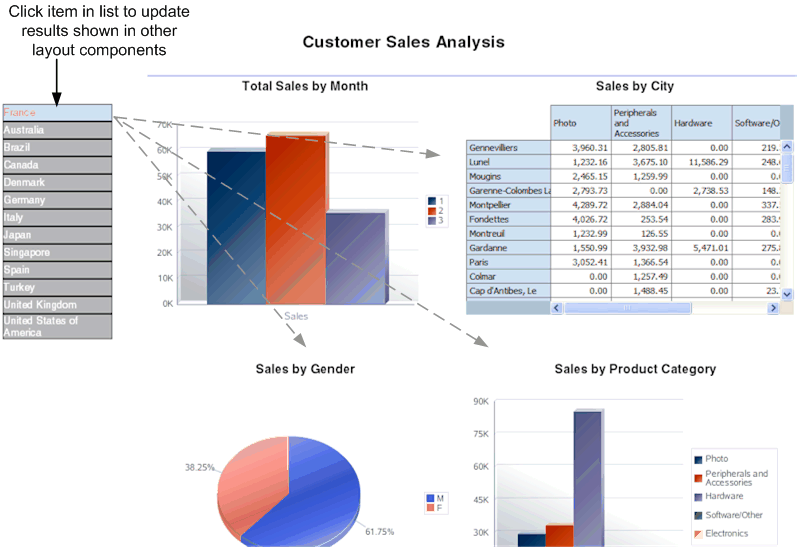
The list component displays all values of a data element in a vertical or horizontal list. When viewed in interactive mode, clicking an item in the list updates the results shown in the linked components of the report. The following example shows a report that displays multiple charts based on sales data. The list component displays each country for which there is sales data. The list enables the report consumer to quickly see results for each country in the list by clicking the entry in the list.
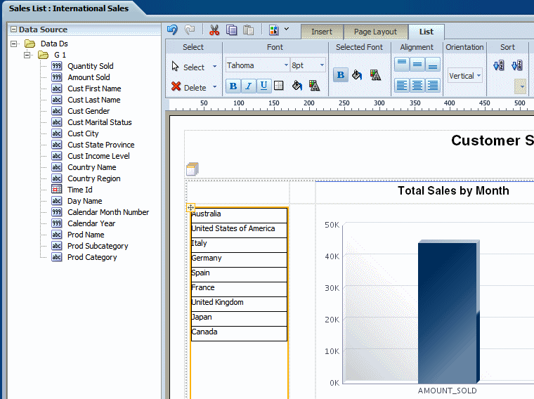
From the Insert tab, select and drag the List component to the design area.
The following figure shows an inserted, empty list.
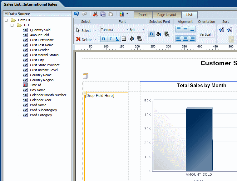
To create the list, select an element from the Data Source pane and drag it to the empty list in the layout.
The following figure shows the list component after dragging the element Country Name to it.
Customize the appearance of the list. See Customizing a List.
Configure linked components using the Configure Events command. By default, all other tables and charts in the layout are configured to filter their results based on the user selections in the list component. To change this default behavior, see Event Configuration.
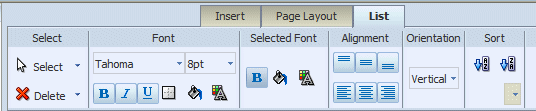
Use the List Tab to:
Edit the font size, style, and color
Define borders for the list
Set the background color
Edit the font color and background color for the display of selected items
Set the orientation of the list
Specify the sort order
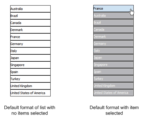
The list on the left shows the default format of the list. The list on the right shows the Selected Font default format:
Edit the font settings by selecting a font family from the list and adjusting the point size.
By default, the list displays with one point black gridlines. Click the Set Border to adjust the default borders of the list. Use the Background Color and Font Color commands to customize the colors.
The Selected Font commands edit the appearance of the item in a list when it is selected. By default, the selected element is moved to the top of the list, and the background is changed to light blue. You can edit the font weight, background color, and font color that are displayed for selected items.
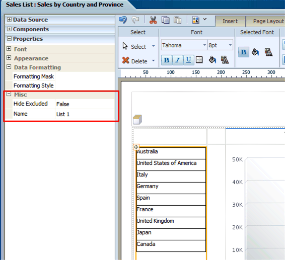
By default, the selected items move to the top of the list and the nonselected items are "hidden" by a gray fill. You also have the option of not applying this behavior by setting the property "Hide Excluded".
This property is available from the Properties pane when the List component is selected. The Hide Excluded property is highlighted in the following figure:
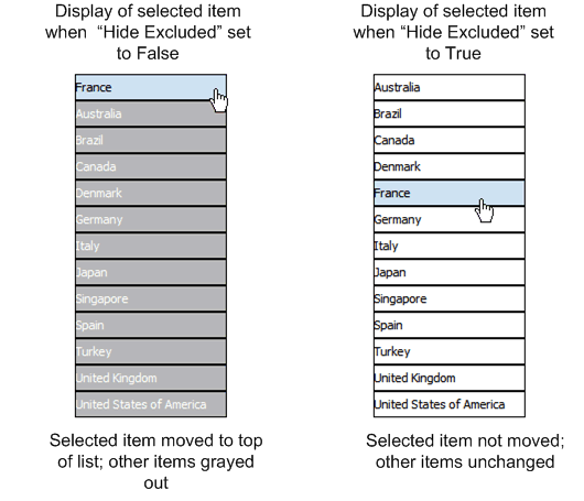
The following figure shows the difference in the display depending on the setting of the property:
The Formula group of commands is available from the following tabs:
Column tab
Total Cell tab
Chart Measure Field tab
Pivot Table Data tab
Note that not all options are applicable to each component type.
The menu provides the following predefined formulas:
| Formula | Description |
|---|---|
| No Formula | Removes any mathematical formula from a numeric column. |
| Blank Text | Removes all data and inserts blank text. |
| Count | Returns the count of the number of occurrences of the element in the current . group. |
| Count Distinct | Returns a count of the distinct values of an element in the current group. |
| Summation | Sums the values of the element in the current group. |
| Average | Displays the average of the values in the current group. |
| Maximum | Displays the highest value of all occurrences in the current group. |
| Minimum | Displays the lowest value of all occurrences in the current group. |
For non-numeric data, only the following formula options are supported:
Blank Text
Count
Count Distinct
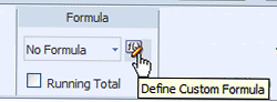
Click Define Custom Formula to define your own formula for a component. The Function dialog enables you to define Basic Math, Context, and Statistical functions in your layout.
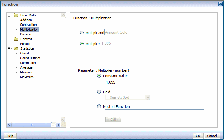
When you click one of the basic math functions you are prompted to define the appropriate parameters for the function. You can enter a constant value, select a field from the data, or create a nested function to supply the value.
In the following example, clicking the Multiplication function displays prompts to enter the multiplicand and the multiplier. The example shows that the multiplicand is the value of the Amount Sold field. The multiplier is the constant value.
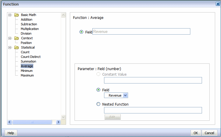
When you click one of the statistical math functions you are prompted to define the appropriate parameter for the function. You can select a field from the data, or create a nested function to supply the values. In the following example, clicking the Average function displays prompts for you to specify the source of the values for which to calculate the average.
Example 1: Subtraction
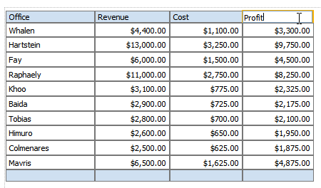
The following table shows data for Revenue and Cost for each Office:
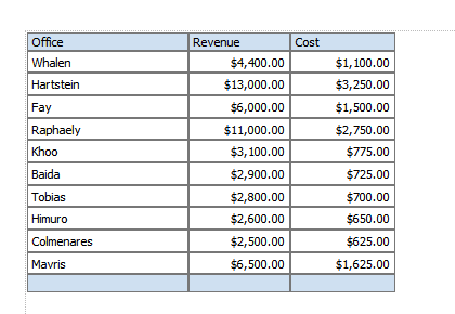
Using a custom formula, you can add a column to this table to calculate Profit (Revenue - Cost).
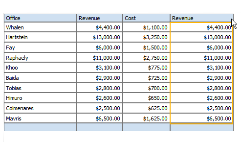
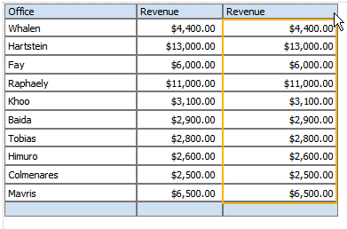
Add another numeric data column to the table. For example, drag another instance of Revenue to the table:
With the table column selected, click Define Custom Formula.
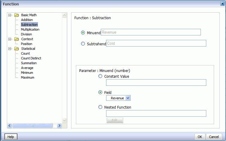
In the Function dialog select Subtraction from the list. Because the source data for the column is Revenue, by default the Minuend and the Subtrahend will both show the Revenue element
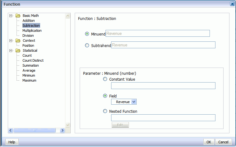
Select Subtrahend, then in the Parameter region, select Field and choose the Cost element.
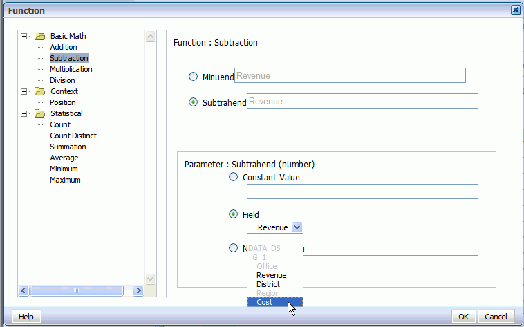
The dialog will update to show that your formula is now Revenue minus Cost.
Click OK to close the dialog.
The table column displays the custom formula. Edit the table column header title, and now your table has a Profit column:
Example 2: Nested Function
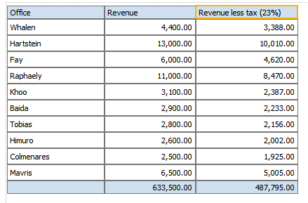
This example will use a nested function to create a column that shows Revenue less taxes.
Add another numeric data column to the table. For example, drag another instance of Revenue to the table:
With the table column selected, click Define Custom Formula.
In the Function dialog select Subtraction from the list. Because the source data for the column is Revenue, by default the Minuend and the Subtrahend will both show the Revenue element
Select Subtrahend, then in the Parameter region, select Nested Function and click Edit.
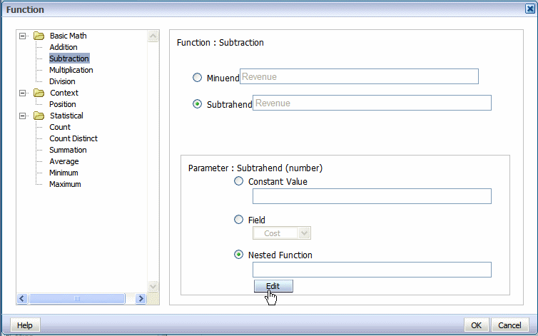
A second Function dialog will launch to enable you to define the nested function. In this case the nested function is Revenue times a constant value (tax rate of .23).
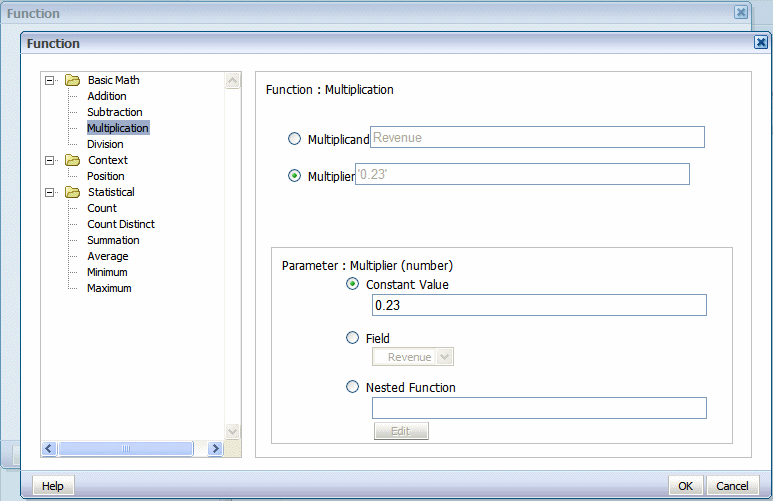
Click OK to close the dialog. The primary Function dialog now shows the nested function as the source of the subtrahend:
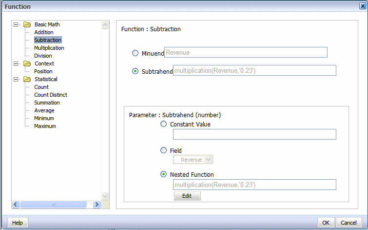
Click OK to close the Function dialog. The table column displays the custom formula. Edit the table column header label, and now your table shows your custom function:
To save your layout to the report definition:
Click the Save or Save As toolbar button
The Save Layout dialog displays the list of layouts defined for the report definition as shown in the following figure:
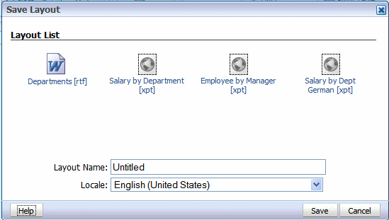
Enter a unique name for this layout.
Select a Locale.
Important: Once you have saved the layout, the Locale cannot be updated.
Copyright © 2010, 2011, Oracle and/or its affiliates. All rights reserved.