17 Designing a Page Using Placeholder Data Controls
This chapter describes how to create and use placeholder data controls. It shows you how to create placeholder data types, including master-detail relationships. It also describes how to create and import sample data.
This chapter includes the following sections:
17.1 About Placeholder Data Controls
Application development is typically divided into two separate processes: technical implementation and user interface design. More often than not, they are undertaken by separate teams with very different skill sets. The two teams can work together either in a data-first approach or a UI-first approach, or with some overlap between the two. With either approach, the teams usually work together iteratively, refining the application with each cycle.
In a data-first approach, the model, or data control is built first. Then the designer creates the layout and page flow by dragging and dropping the data controls onto pages as UI components. The model data is automatically bound to the components. This approach requires the data model to be available before the designer can proceed.
In a UI-first approach, the designer creates the layout using components from the Component Palette. When the data controls do become available, UI components are then bound to them. With this approach, you should be able to see most of the layout and page flows to make a development evaluation. However, until the data controls are available and bound to components, the application may not fully convey the intent of its design. For instance, an application that has a master-detail relationship is best reviewed when there is actual data that dynamically drives that relationship.
Placeholder data controls are easy-to-create, yet fully functional, stand-in data controls that can efficiently speed up the design-development process. UI designers can use placeholder data controls to create page layouts and page flows without the need to have real data controls available. These placeholder controls can be loaded with sample data to realistically simulate application execution for design evaluations. When the real data controls are ready, the UI components can be easily rebound to complete the application.
Creating placeholder data controls is a purely declarative process and does not require coding. It does not require in-depth knowledge of the underlying model, data source technology, actual database schema, or any of the complex relationships in an actual production data control. Placeholder data controls do not require an existing data source or a database connection. You can define multiple data types with multiple attributes. You can also define nested master-detail hierarchies between data types. Placeholder data controls have the same built-in operations such as Execute, Next, and Create. An implicitly created named criteria item allows the user to create search forms as if view objects and view criteria were available.
17.1.1 Placeholder Data Controls Use Cases and Examples
For many complex applications, the UI design may actually drive the development of the model, or data source. In this UI-first scenario, having placeholder data controls with sample data is essential to properly model the behavior of the application. In some cases, even if production data controls are available, UI designers may opt to use placeholder data controls because of their flexibility and ease of use.
Placeholder data controls can be used in many situations. In addition to being used for design review and development, they can be used to develop realistic runtime mock-ups for usability studies, or for proof-of-concept requirements. They can be used to create demos when the data model is not yet ready.
17.1.2 Additional Functionality for Placeholder Data Controls
You may find it helpful to understand some data access features before you start working with placeholder data controls. Following are links to other functionality that may be of interest.
-
After your initial design with placeholder data controls, when the final data controls are available, you can simply rebind the components. For more information about rebinding components, see Chapter 26, "Creating a Basic Databound Page" and Chapter 27, "Creating ADF Databound Tables."
-
A placeholder data type attribute can be configured to be a list of values (LOV). For more information about LOVs, see Section 5.12, "Working with List of Values (LOV) in View Object Attributes."
-
You can create master-detail relationships between placeholder data types, similar to the master-detail data collections in a standard data control. For more information on master-detail forms and tables, see Chapter 29, "Displaying Master-Detail Data."
-
When you define placeholder data types in a master-detail hierarchy, JDeveloper creates view links that define that relationship. For more information about view links, see Section 5.6, "Working with Multiple Tables in a Master-Detail Hierarchy."
-
Placeholder data controls can be used for the development of search forms. For more information about query search forms, see Chapter 31, "Creating ADF Databound Search Forms."
-
You might want to package placeholder data controls into reusable components as ADF Library JARs. For more information about reusable components and the ADF Library, see Chapter 38, "Reusing Application Components."
17.2 Creating Placeholder Data Controls
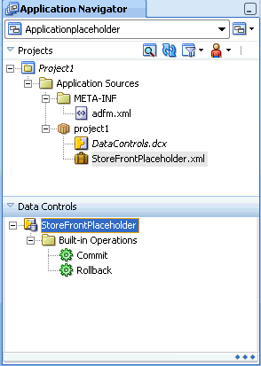
You add placeholder data controls to a project using the New Gallery. After the placeholder data control has been created, it appears as a node in the Data Controls panel. It has a different icon than do standard data controls. Instead of an Operations node, the placeholder data control has a Built-in Operations node. Although the Built-in Operations node contains Commit and Rollback operations, these operations do not perform commits or rollbacks because there is not an actual data source for the data.
When a data control is initially created, it does not have any data types associated with it. You will need to manually create the data types as described in section Section 17.3, "Creating Placeholder Data Types."
17.2.1 How to Create a Placeholder Data Control
Placeholder data controls are defined at the project level in JDeveloper. You must already have created a project before you can create placeholder data controls.
It may be helpful to have an understanding of the options you have for creating placeholder data controls. For more information, see Section 17.2, "Creating Placeholder Data Controls."
You may also find it helpful to understand additional functionality that can be added after using placeholder data controls. For more information, see Section 17.1.2, "Additional Functionality for Placeholder Data Controls."
To create a placeholder data control:
-
In the Application Navigator, right-click the project and choose New.
-
In the New Gallery, expand Business Tier, select Data Controls and then Placeholder Data Control, and click OK.
-
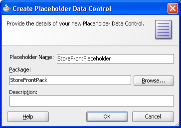
In the Placeholder Data Control dialog, as shown in Figure 17-1, enter:
-
Placeholder Name: The name of the placeholder data control.
-
Directory Name: The package name that will be used to reference the placeholder data control.
-
Description: Optional description of the placeholder data control.
-
-
Click OK.
17.2.2 What Happens When You Create a Placeholder Data Control
When you create a placeholder data control, the package you selected to contain the data control appears under the project node in the Application Navigator. A data control XML file PlaceholderDataControl.xml appears under the package, where PlaceholderDataControl is the name of the placeholder data control. Example 17-1 shows a sample file called StoreFrontPlaceHolder.xml, which was created when the StoreFrontPlaceHolder data control was created.
Example 17-1 Sample placeholderdatacontrol.xml
<?xml version='1.0' encoding='windows-1252' ?>
<AppModule
   xmlns="http://xmlns.oracle.com/placeholder"
   Name="StoreFrontPlaceholder" >
</AppModule>
JDeveloper also creates a DataControls.dcx file if it has not yet been defined, and adds entries for the placeholder data control, as shown in Example 17-2.
Example 17-2 Placeholder Data Control entry in DataControls.dcx
<?xml version="1.0" encoding="UTF-8" ?>
<DataControlConfigs xmlns="http://xmlns.oracle.com/adfm/configuration"
                    version="11.1.1.44.30" id="DataControls"
                    Package="storefront">
  <PlaceholderDataControl SupportsTransactions="true" SupportsFindMode="true"
                          SupportsResetState="true" SupportsRangesize="true"
                          SupportsSortCollection="true"
                          FactoryClass=
                            "oracle.adf.model.placeholder.DataControlFactoryImpl"
                          id="StoreFrontPlaceholder"
                          xmlns="http://xmlns.oracle.com/adfm/datacontrol"
                          Definition="storefront.StoreFrontPlaceholder"
                          Package="storefront"/>
</DataControlConfigs>
In the Data Controls panel, the placeholder data control appears alongside other data controls in the root tree. A placeholder data control that does not yet have data types defined will have only the Commit and Rollback built-in operations available, as shown in Figure 17-2.
17.3 Creating Placeholder Data Types
A standard data control obtains its data collections and attributes from its underlying data source in the model or business service layer. For example, an application module data control obtains its data collections from the view objects and associated database tables.
For a placeholder data control, instead of data collections, it has placeholder data types. A placeholder data type is analogous to a data collection. It can be dropped onto a page to create complex components such as forms, tables, and trees. It also has a set of attributes that can be dropped onto pages as individual components such as input text, output text, and select choice. Some attributes may be defined as LOVs.
When you first create a placeholder data control, it is devoid of any data types because there are no underlying database tables for the placeholder data control to reference. You must declaratively create one or more placeholder data types. For each data type, you specify attribute names, types, default UI components, and other options. You can create multiple data types for a data control, similar to the multiple data collections in an application module.
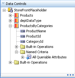
After you have created a placeholder data type, it appears as a child node of the placeholder data control. It also has a Built-in operations node with the standard set of operations. It has a Named Criteria node that contains an All Queriable Attributes item that is analogous to the named view criteria of a view object in a standard data control. You can drag and drop the All Queriable Attributes item onto a page to create a query or quick query search form. In a standard data control, you can create multiple view criteria on a view object. Because there is no real view object in a placeholder data type, only one All Queriable Attributes item is available. For more information about query search forms, see Chapter 31, "Creating ADF Databound Search Forms."
You can create master-detail relationships between placeholder data types, similar to the master-detail data collections in a standard data control. You can drop master-detail data types onto pages to create master-detail forms and tables. For more information on master-detail forms and tables, see Chapter 29, "Displaying Master-Detail Data."
JDeveloper allows you to reuse placeholder data types created for other placeholder data controls in the same project. When you are creating a data type, you can select an option to load existing data types from another placeholder data control. If you select the Copy Data Type option, the attributes from the imported data type will be added to the list of existing attributes.
You can also select an option to copy the sample data associated with the imported data type when the attributes are added.
Note:
Although you do not need sample data until you run the application, you should add sample data to provide a consistent design time rendering of the components.17.3.1 How to Create a Placeholder Data Type
After you have created a placeholder data control, you can proceed to create data types. You define a name for the data type, and define each of its individual attributes. For each attribute, you then define its type, format, default UI component, and whether it should be an LOV.
In order to simplify the process of creating placeholder data types, you can select from a list of four of the most common types: String, Boolean, Date, and Number. Because placeholder attributes are typed, you can create column labels and include UI control hints in the design.
If you have a sample data file in comma-separated value or CSV format, you can automatically create all the attributes and load sample data using the sample data file import function. You do not need to create the attributes. JDeveloper will automatically create them for you from the format of the CSV file, which should be a comma-separated value list of column headings. The attributes default to type String. You can manually reset each attribute to another type as required. For instructions to import sample data, see Section 17.3.6, "How to Add Sample Data."
It may be helpful to have an understanding of the options you have for creating placeholder data types. For more information, see Section 17.3, "Creating Placeholder Data Types."
You may also find it helpful to understand additional functionality that can be added after using placeholder data controls. For more information, see Section 17.1.2, "Additional Functionality for Placeholder Data Controls."
To create a placeholder data type manually:
-
In the Data Controls panel, right-click the placeholder data control and choose Create Placeholder Data Type.
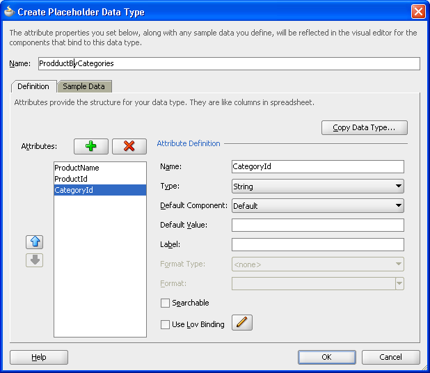
Figure 17-3 shows the Create Placeholder Data Type dialog.
Note:
If you had already added placeholder data types previously and want only to add or edit them, choose Edit Placeholder Data Type from the context menu instead. The dialog that appears will be the Edit Placeholder Data Type dialog. It has the same options as the Create Placeholder Data Type dialog. -
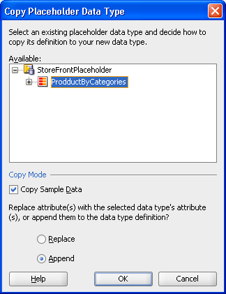
If you already have data types defined for another placeholder data control, and you want to copy or append them, click Copy Data Type.
-
In the Copy Placeholder Data Type dialog, as shown in Figure 17-4, select the placeholder data type you want. Select Replace to replace the current attributes with the attributes from the file, or select Append to add the attributes from the file to the list of current attributes.
-
Select the Copy Sample Data checkbox to load sample data from the file.
-
Click OK.
-
-
In the Create Placeholder Data Type dialog, enter a name for the placeholder data type, and then in the Attributes Definition section, enter:
-
Name: Enter a name for the attribute.
-
Type: Select a type for the attribute from the dropdown list. The supported types are
String,Boolean,Date, andNumber. -
Default Component: Select a default component for the attribute from the dropdown list. For an LOV, select Combo Box List of Values.
-
Default Value: Enter the initial value for the attribute.
-
Label: Enter a label for the attribute. The label will be used when the component is displayed.
-
Format Type: This field is enabled only when the type is
DateorNumber. Select a format type from the dropdown list. -
Format: This field is enabled only when a format mask has been defined for that format type.
-
Searchable: Select this checkbox to make the attribute searchable.
-
Use Lov Binding: Select this checkbox if you want the attribute to be an LOV. To configure the attribute, see Section 17.3.3, "How to Configure a Placeholder Data Type Attribute to Be an LOV."
Click the Add icon to add more attributes.
-
-
To add data, use the Sample Data tab. For that procedure, see Section 17.3.6, "How to Add Sample Data."
You need sample data for runtime and for a consistent design time.
-
Click OK.
17.3.2 What Happens When You Create a Placeholder Data Type
When you create a placeholder data type, JDeveloper creates a PlaceholderDataType.xml file, where PlaceholderDataType is the name of the placeholder data type you had specified.
The PlaceholderDataType.xml file has the same format as a view object XML file. It includes the name of the view object and the name and values of each placeholder attribute that was defined.
Example 17-3 shows a PlaceholderDataType.xml for the Supplier data type. Two attributes were declarative defined: Supplier_Id and Supplier_Name.
Example 17-3 Sample Placeholder Data Type Suppliers.xml file
<?xml version='1.0' encoding='windows-1252' ?>
<ViewObject
   xmlns="http://xmlns.oracle.com/placeholder"
   Name="Suppliers"
   BindingStyle="OracleName"
   CustomQuery="true"
   ComponentClass="oracle.adf.model.placeholder.PlaceholderVOImpl"
   UseGlueCode="false" >
   <ViewAttribute
      Name="Supplier_Id"
      Type="oracle.jbo.domain.Number"
      PrimaryKey="true" >
   </ViewAttribute>
   <ViewAttribute
      Name="Supplier_Name"
      Type="java.lang.String" >
   </ViewAttribute>
   <StaticList
      Name="Suppliers"
      Rows="2"
      Columns="2" >
   </StaticList>
   <ResourceBundle >
      <PropertiesBundle
         xmlns="http://xmlns.oracle.com/bc4j"
         PropertiesFile="storefrontproject.StoreFrontProjectBundle" >
      </PropertiesBundle>
   </ResourceBundle>
</ViewObject>
Since a data type is similar to a data collection and is based on a view object, each data type will have a corresponding PlaceholderDataType.xml file.
JDeveloper also adds entries for each placeholder data type to the PlaceholderDataControl.xml file. For example, after the Suppliers data type has been created, the StoreFrontPlaceholder.xml file includes a new ViewUsage entry for the Suppliers data type, as shown in Example 17-4.
Example 17-4 Sample PlaceholderDataControl.xml File After Addition of Placeholder Data Type
<?xml version='1.0' encoding='windows-1252' ?>
<AppModule
   xmlns="http://xmlns.oracle.com/placeholder"
   Name="StoreFrontPlaceHolder" >
   <ViewUsage
      Name="Suppliers"
      ViewObjectName="storefrontproject.Suppliers" >
   </ViewUsage>
</AppModule>
In the Data Controls panel, a placeholder data type node appears under the placeholder data control. Expanding the node reveals the presence of each of the attributes, the Built-in Operations node, and the Named Criteria node.
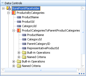
Figure 17-5 shows a placeholder data control as it appears in the Data Controls panel.
17.3.3 How to Configure a Placeholder Data Type Attribute to Be an LOV
A placeholder data type attribute can be configured to be a list of values (LOV). An LOV-formatted attribute binds to UI components that display dropdown lists or list picker dialogs. For more information about LOVs, see Section 5.12, "Working with List of Values (LOV) in View Object Attributes."
When you are creating a placeholder data type, you can select an option to bring up a dialog to configure that attribute to be an LOV.
If you have only one data source, you can only create a fixed LOV. To create a dynamic LOV, there must be more than one placeholder data type available to be the source.
17.3.3.1 Configuring an Attribute to Be a Fixed LOV
Before you begin, you should determine which attribute you want to be a fixed LOV and which values should be in the fixed list.
It may be helpful to have an understanding of the options you have for creating placeholder data types. For more information, see Section 17.3, "Creating Placeholder Data Types."
You may also find it helpful to understand additional functionality that can be added after using placeholder data controls. For more information, see Section 17.1.2, "Additional Functionality for Placeholder Data Controls."
To configure an attribute to be a fixed LOV:
-
In the Data Controls panel, right-click the placeholder data control and choose Create Placeholder Data Type or Edit Placeholder Data Type.
-
In the Create Placeholder Data type or Edit Placeholder Datatype dialog, select the Use Lov Binding checkbox.
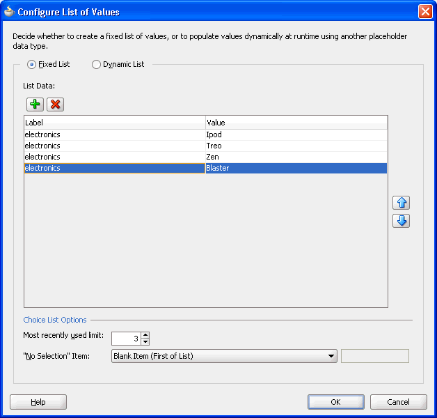
The Configure List of Values dialog appears, as shown in Figure 17-6.
-
In the dialog, select Fixed List.
-
Click the Add icon to enable adding an entry to the list of values.
-
For each entry, enter a label and a value.
When the user selects an item from the list of values, the value entry will be entered into the input field.
-
Select the maximum number of the most recently used items that will be displayed in the dropdown list.
-
From the No Selection Item dropdown list, select an option for how you want the "no selection" item to be displayed.
For instance, selecting Blank Item (First of List) will display the "no selection" item as a blank at the beginning of the list.
-
Click OK.
17.3.3.2 Configuring an Attribute to Be a Dynamic LOV
Using a placeholder data type to serve as the source, you can configure an attribute to be a dynamic LOV.
It may be helpful to have an understanding of the options you have for creating placeholder data types. For more information, see Section 17.3, "Creating Placeholder Data Types."
You may also find it helpful to understand additional functionality that can be added after using placeholder data controls. For more information, see Section 17.1.2, "Additional Functionality for Placeholder Data Controls."
Also, you should have already created another placeholder data type to serve as the source of the dynamic LOV.
To configure an attribute to be a dynamic LOV:
-
In the Data Controls panel, right-click the placeholder data control and choose Create Placeholder Data Type or Edit Placeholder Data Type.
-
In the Create Placeholder Data type or Edit Placeholder Data type dialog, select the Use Lov Binding checkbox.
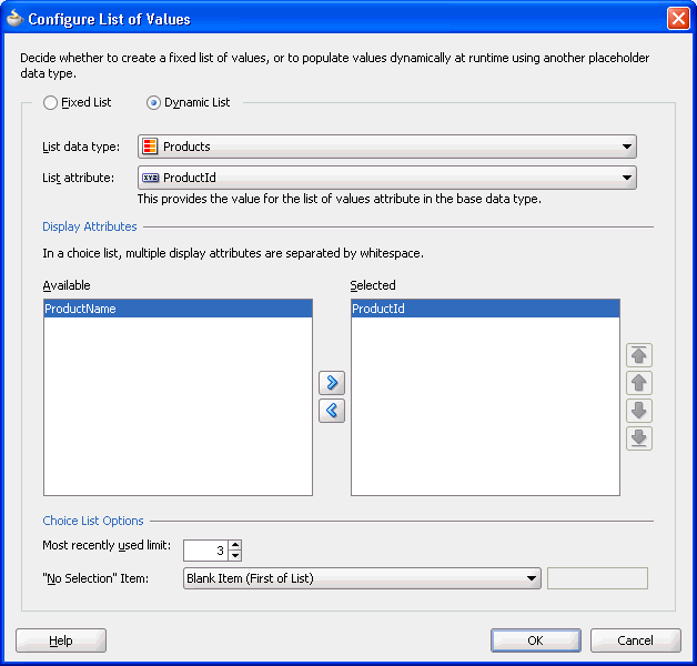
The Configure List of Values dialog appears, as shown in Figure 17-7.
-
In the dialog, select Dynamic List.
-
Select the list data type with the source attribute. You must have a source placeholder data type for this selection to be available.
-
Select the list attribute.
-
Shuttle the attribute from the Available list to the Selected list.
-
Select the maximum number of the most recently used items that will be displayed in the dropdown list.
-
From the No Selection Item dropdown list, select an option for how you want the "no selection" item to be displayed. For instance, selecting Blank Item (First of List) will display the "no selection" item as a blank at the beginning of the list.
-
Click OK.
17.3.4 How to Create Master-Detail Data Types
You create master-detail relationships between data types in the same way you create master-detail hierarchies between tables. In a standard data control, you can use view links to define source and target view objects that would become the master and the detail objects. For more information about master-detail relationships, see Chapter 29, "Displaying Master-Detail Data."
You first create a master data type and its attributes. Then you create a detail data type as a child of the master data type. You define the source attribute in the master data type that defines the relationship to the detail data type.
It may be helpful to have an understanding of the options you have for creating placeholder data types. For more information, see Section 17.3, "Creating Placeholder Data Types."
You may also find it helpful to understand additional functionality that can be added after using placeholder data controls. For more information, see Section 17.1.2, "Additional Functionality for Placeholder Data Controls."
Before you create a master-detail hierarchy, you must determine the data structure of the master data type and the data structure of the detail data type. You must also determine which attribute in the master will be the source for the detail data type.
To create master-detail hierarchical data types:
-
Create a placeholder data type to be the master as described in Section 17.3.1, "How to Create a Placeholder Data Type," or select an existing data type to be the master.
For example, you could use the
ProductsByCategoriesdata type as the master. -
In the Data Controls panel, right-click the master placeholder data type and choose Create Placeholder Data Type.
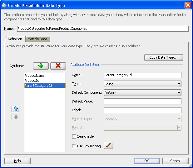
Figure 17-8 shows the Create Placeholder Data Type dialog for entering detail data type attributes.
-
In the Create Placeholder Data Type dialog, enter a name for the detail data type.
-
The first attribute in the master data type appears in the Attributes section. This attribute provides the foreign key relationship.
Add attributes for the detail data type, copy data type attributes from another data type, or create attributes automatically by importing sample data from a CSV file. For the procedure to add attributes, see Section 17.3.1, "How to Create a Placeholder Data Type."
-
Click OK.
The Data Controls panel should display the detail data type as a child of the master data type, as shown in Figure 17-9.
17.3.5 What Happens When You Create a Master-Detail Data Type
A master-detail relationship is implemented in the same way as is a standard master-detail relationship, using view object and view links. When you define placeholder data types in a master-detail hierarchy, JDeveloper creates a DTLink.xml file that contains metadata entries for view links that define that relationship. For more information about view links, see Section 5.6, "Working with Multiple Tables in a Master-Detail Hierarchy." For example, in the relationship between the master data type Video and the detail data type Brand associated with a key dvdplayer, JDeveloper creates a DTLink.xml file in the form of a view link file to define that relationship, as shown in Example 17-5.
Example 17-5 DTLink.xml file for Master-Detail Data Type Relationships
<?xml version='1.0' encoding='windows-1252' ?>
<ViewLink
   xmlns="http://xmlns.oracle.com/placeholder"
   Name="DTLink" >
   <ViewLinkDefEnd
      Name="sourceEnd"
      Cardinality="1"
      Owner="project1.ProductsByCategories"
      Source="true" >
      <AttrArray Name="Attributes">
         <Item Value="project1.ProductsByCategories.ProductName" />
      </AttrArray>
   </ViewLinkDefEnd>
   <ViewLinkDefEnd
      Name="destEnd"
      Cardinality="-1"
      Owner="project1.ProductCategoriesToParentProductCategories" >
      <AttrArray Name="Attributes">
         <Item Value="project1.ProductCategoriesToParentProductCategories.ProductName" />
      </AttrArray>
   </ViewLinkDefEnd>
</ViewLink>
17.3.6 How to Add Sample Data
If you intend to run an application using the placeholder data control, you will need to add sample data for execution. You can add sample data to the placeholder data type attributes manually or by importing the data from a CSV file. Although having sample data is mandatory only at runtime, you should add sample data for a consistent design time rendering of the components.
Before you begin to add sample data to a placeholder data type, you should have already created a placeholder data control and a placeholder data type. If you are entering the data manually, you should have the data ready. If you are loading the data from a CSV file, you need to have the location of the file.
17.3.6.1 Adding Sample Data Manually
You can use the Sample Data page of the Edit Placeholder Data Type dialog to manually enter sample data for your placeholder data control.
It may be helpful to have an understanding of the options you have for creating placeholder data types. For more information, see Section 17.3, "Creating Placeholder Data Types."
You may also find it helpful to understand additional functionality that can be added after using placeholder data controls. For more information, see Section 17.1.2, "Additional Functionality for Placeholder Data Controls."
Also, you should have already prepared the sample data.
To add sample data to placeholder data types manually:
-
In the Data Controls panel, right-click the placeholder data control and choose Create Placeholder Data Type or Edit Placeholder Data Type.
-
In the Create Placeholder Data Type or Edit Placeholder Data Type dialog, click the Sample Data tab.
-
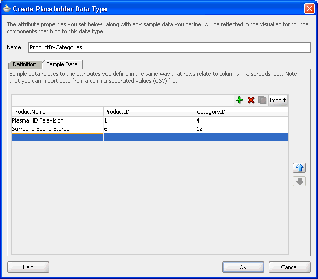
For each row of data, enter a value for each attribute that was defined. Click the Add icon to create each row.
For example, in Figure 17-10, for the first row,
Plasma HD Televisionwas entered for theProductNameattribute,1was entered for theProductIDattribute, and4was entered for theCategoryIDattribute. -
Click OK.
17.3.6.2 Importing Sample Data
You can use the Sample Data page of the Edit Placeholder Data Type dialog to import sample data for your placeholder data control from a file.
It may be helpful to have an understanding of the options you have for creating placeholder data types. For more information, see Section 17.3, "Creating Placeholder Data Types."
You may also find it helpful to understand additional functionality that can be added after using placeholder data controls. For more information, see Section 17.1.2, "Additional Functionality for Placeholder Data Controls."
Additionally, you should have the sample data file available on your file system so it can be found in the Select File dialog.
To import sample data from CSV files into placeholder data types:
-
In the Data Controls panel, right-click the placeholder data control and choose Create Placeholder Data Type or Edit Placeholder Data Type.
-
In the Create Placeholder Datatype or Edit Placeholder Datatype dialog, click the Sample Data tab.
Tip:
If you already have a CSV file for importing, you do not need to manually create the attributes for each column. JDeveloper automatically creates the attributes from the first row of the CSV file. For more information, see Section 17.3.1, "How to Create a Placeholder Data Type." -
If you are also importing attributes, you must delete the default "attribute" in the first row.
This default attribute appears when you first navigate to the Sample Data tab. If you do not remove this default attribute, JDeveloper will assume that this is a declaratively created attribute and will not import any other columns except for the first column.
-
Click Import.
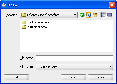
In the Open dialog, navigate to and select the import file, and click Open, as shown in Figure 17-11.
The data from the CSV file, including column heading and values, should appear as sample data.
-
Click OK.
17.3.7 What Happens When You Add Sample Data
Placeholder sample data, whether manually added using the dialog or from an imported CSV file, is stored in message bundle properties files within the placeholder data control packages. JDeveloper creates a text-based file for each data type that has sample data. The properties file name is placeholderdatatypenameMsgBundle.properties. Example 17-6 shows a sample data properties file for the Televisions data type that has three attributes of brand, size, and type.
17.4 Using Placeholder Data Controls
You use placeholder data controls in the same way you would use standard data controls. You can drag data types onto pages and use the context menus to drop the data types as forms, tables, trees, graphs, and other components. You can drop individual attributes onto pages as text, lists of values, single selections, and other components. You can use any of the built-in operations such as Create, Execute, and Next by dropping them as buttons, command links, and menu items.
You can work in several ways to take advantage of placeholder data controls:
-
Build a page using the placeholder data controls and rebind to real data controls later.
-
Build a page using components, bind them to placeholder data controls, and rebind to real data controls later.
-
Build a page using some combination of components from the Component Palette, components from the placeholder data controls, and then bind or rebind to the real data controls later.
17.4.1 Limitations of Placeholder Data Controls
You can use placeholder data controls in your application development in many situations. For most UI design evaluations, placeholder data controls should be able to fully substitute for real data controls.
There are a few limitations:
-
Because data types are not tied to an underlying data source, the Commit and Rollback operations do not perform real transactions, nor do they update the cache.
-
Placeholder data controls can only be created declaratively. You cannot create custom methods like you can with a real application module or data control.
-
Placeholder data controls cannot be used when there is a need either for custom data or for filtering or custom code to fetch data. Placeholder data controls will disable those operations.
17.4.2 Creating Layout
Use the drag-and-drop feature to create the page using the placeholder data controls, any available real data controls, and components from the Component Palette. If you intend to run a page or application that requires real data, enter sample data for your placeholder data types. If you have a large amount of sample data, you may be able to create CSV files from the data source and load them into the data type. You may also use spreadsheets and other tools to create CSV sample data files.
17.4.3 Creating a Search Form
In a standard data control, you can create view criteria on view objects to modify the query. These view criteria are also used for drag-and-drop creation of query and quick query search forms. The named view criteria items appear under the Named Criteria node for a data collection. For more information about query and quick query search forms, see Chapter 31, "Creating ADF Databound Search Forms."
For placeholder data controls, there is also a Named Criteria node under each data type node. An automatically created All Queriable Attributes item appears under this node and can be used to drag and drop onto pages to create the query or quick query search forms.
17.4.4 Binding Components
Instead of building the page using the data controls, for instance, if you are unsure of the shape of your data, you can lay out the page first using the Component Palette and later bind it to the data types, attributes, or operations of the placeholder data controls.
17.4.5 Rebinding Components
After the final data controls are available, you can simply rebind the components. You can select the component in the Structure window and use the context menu to open the relevant rebind dialog. You can also drag and drop the data control item onto the UI component to initiate a rebinding editor. The rebinding procedures are the same whether the component was originally bound to a placeholder data control or a standard data control.
For more information about rebinding components, see Chapter 26, "Creating a Basic Databound Page" and Chapter 27, "Creating ADF Databound Tables."
17.4.6 Packaging Placeholder Data Controls to ADF Library JARs
A useful feature of placeholder data controls is that they allow parallel development and division of labor among developers and designers. You may be able to leverage that further by packaging placeholder data controls into reusable components as ADF Library JARs. ADF Libraries are JARs that have been packaged to contain all the necessary artifacts of an ADF component. For more information about reusable components and the ADF Library, see Chapter 38, "Reusing Application Components." You can create libraries of placeholder data controls and distribute them to multiple designers working on the same UI project. Because they are lightweight, you can even use them in place of available real data controls for the earlier phases of UI design.
