Understanding Quality Equations and Methods
This chapter provides an overview of quality equations and methods and discusses how to:
Use the statistical matrix.
Use distribution analysis.
Use control charts.
Use Pareto charts.
Use bar graphs.
Use box plots.
Use line graphs.
Understanding Quality Equations and Methods
Quality integrates data collection and monitoring functions with comprehensive statistical analysis tools. The tools are a combination of standard industrial statistics and methods that enhance productivity and encourage exploratory analysis.
Text references are provided at the end of this document. As appropriate,
statistics and descriptions are marked with the number that correlates to
the references. Table values can be found with the associated text reference
for those statistics that use table values (Z, t and ![]() ).
).
Using the Statistical Matrix
This section provides an overview of the statistical matrix and discusses how to:
Use basic statistics.
Use quartiles.
Use skewness and kurtosis.
Use process capability.
Test for normality.
Use Pearson Best-Fit criteria.
Use attribute statistics.
 Understanding the Statistical Matrix
The statistical matrix is a spreadsheet view of various statistics that you can customize to include any statistic that Quality calculates. You can display the statistics in various formats.
Some statistics may be altered through the use of non-normal distribution assessment techniques. Quality incorporates the following methods to achieve an appropriate distribution fit. Both methods use the Pearson family of distributions.
A test of normality, using the skewness and kurtosis of the distribution.
If the distribution is normal at a 95 percent confidence, then the data is evaluated based on the normal assumption. If the distribution isn't found to be normal at a 95 percent confidence, then the data is evaluated using the Pearson Best-Fit family of curves. This is the recommended method if you are unsure of the distribution type.
Direct use of the Pearson Best-Fit family of curves.
The routines determine the best-fit and adjust the statistics appropriately.
Using Basic Statistics
The set of basic statistics includes measures of central tendencies, measures of dispersion, and the other descriptive statistics, as shown in the following table:
|
Equation |
Statistic |
Alternate Equation Forms |
|
|
The mean is the arithmetic mean (average) of a sample. |
See References. |
|
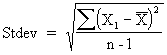
|
The standard deviation is the root-mean-square of a sample. |
See References. |
|
|
The observation is the total number of values in a sample. |
None |
|
|
The summation is the total of all the values in a sample. |
None |
|
|
The minimum is the smallest value in the sample. |
None |
|
|
The maximum is the largest value in the sample. |
None |
|
|
The range is the largest value minus the smallest value in the sample. |
None |
|
|
The variance is the square of the standard deviation. |
See References. |
|
|
The standard error of the mean is the standard deviation of the mean. It measures the extent to which a sample mean can be expected to vary. |
See References. |
|
|
The coefficient of variation is the standard deviation of a sample expressed as a percentage of the mean. It is a measure of relative dispersion. |
See References. |
|
|
The lower Z-score is the number of standard deviations that the lower specification limit (LSL) is from the mean. |
None |
|
|
The upper Z-score is the number of standard deviations that the upper specification limit (USL) is from the mean. |
None |
|
Lwr 3 sigma = deviate at probability 0.00135 |
The lower 3 sigma represents three standard deviations from left of the mean. |
None |
|
Upr 3 sigma = deviate at probability 0.99865 |
The upper 3 sigma represents three standard deviations from right of the mean. |
None |
Using Quartiles
Quality calculates the twenty-fifth, fiftieth, (also referred to as the median), and seventy-fifth quartiles. The quartiles can be displayed as values and are used to graph the Box and Whisker plots.
To compute the quartiles, the system:
Arranges data in ascending order.
Ranks the data accordingly (1 to n).
Multiplies each quartile by n+1.
If the result is an integer, sets the quartile to the value of the calculated rank.
The following table shows quartile equations:
|
Equation |
Statistic |
|
|
The median is the center or middle of a sample. It is the value above which there are as many values as there are below it. It is also the fiftieth percentile of the sample (Quartile 50 percent). See References. |
|
|
The twenty-fifth percent quartile is the point separating the lower 25 percent of the values from the upper 75 percent. See References. |
|
|
The seventy-fifth percent quartile is the point separating the upper 25 percent of the values from the lower 75 percent. |
|
where: p is the percentile, f is the fractional portion of the computed rank, I is the integer portion of the computed rank. |
To resolve calculated values that are not integers (for example, if the percentage lies between two values), the value is interpolated by calculating the weighted average between the two ranks. See References. |
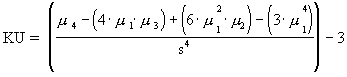
Using Skewness and Kurtosis
The calculations for skewness and kurtosis use the following examples:
|
Equation |
Statistic |
|
|
Skewness measures the degree of asymmetry in a sample. |
|
|
Kurtosis measures the degree of peakedness in a sample. |
|
|
N/A |
|
|
N/A |
|
|
N/A |
|
|
N/A |
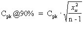
Using Process Capability
Process capability indices are industrial-accepted calculations for
comparing the process output to defined specification limits. For a normal
distribution, the process output is defined as ![]() standard deviations from the mean. For non-normal distributions,
Quality determines the Best-Fit Pearson distribution and calculates equivalent
99.73 percent deviations (at 0.00135 and 0.99865).
standard deviations from the mean. For non-normal distributions,
Quality determines the Best-Fit Pearson distribution and calculates equivalent
99.73 percent deviations (at 0.00135 and 0.99865).
The following table shows equations that relate to process capability:
|
Equation |
Statistic |
|
|
The process potential is the ratio of the process distribution to specification limits. It is the potential capability if the process was perfectly centered. This equation requires both upper and lower specifications. |
|
|
This equation represents the actual process capability. These equations
account for shifts in the process center. The |
|
|
The lower process capability represents the process's ability to perform at the LSL. This equation requires an LSL. |
|
|
The upper process capability represents the process's ability to perform at the USL. This equation requires a USL. |
|
where:
|
The 90 percent confident Cpk is an adjusted Cpk based on a 90 percent confidence. The result is heavily affected by the sample size. The larger the sample size, the closer the computed value is to the actual Cpk. See References. |
|
|
The capability ratio is the percentage that the process distribution consumes of the specification. This equation requires both upper and lower specifications. |
|
where:
|
The percent below specification is the estimated area under the curve to the left of the LSL. This equation requires an LSL. |
|
where:
|
The percent above specification is the estimated area under the curve to the right of the USL. This equation requires a USL. |
|
|
The total percent out of specification is the total estimated area under the curve outside of the specification limits. |
Testing for Normality
Quality offers a test for normality based on the skewness and kurtosis of the distribution. The test compares the skewness and kurtosis to the expected sampling variation of these statistics at a 95 percent confidence interval. The following are the computations:
|
Equation |
Statistic |
|
|
This equation calculates skewness at a 95 percent confidence bound. |
|
|
This equation calculates kurtosis at a 95 percent confidence bound. |
See Also
Using Pearson Best-Fit Criteria
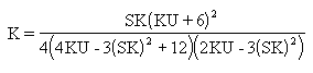
Quality uses Pearson criteria to determine the best-fit distribution for the sample. A K value, computed using the following equation, classifies the distribution as one of the following types.
Pearson Frequency Curves
The following table describes Pearson frequency curvesL
|
Type |
Description |
Criteria |
|
1 |
Beta |
|
|
2 |
Uniform |
|
|
3 |
Gamma |
|
|
4 |
Non Central t |
|
|
5 |
Inverse Gamma |
|
|
6 |
Inverse Beta |
|
|
7 |
Student t |
|
|
8 |
Normal |
|
|
10 |
Exponential |
|
See Also
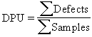
Using Attribute Statistics
Attribute statistics only apply to discrete data types, that is, count data. This type of data is typically associated with defect tallies.
The following table describes equations used with attribute statistics:
|
Equation |
Statistic |
Alternate Equation Forms |
|
|
The sum of defects is the total count of all the defects in a sample. |
None |
|
|
This equation represents the average number of defects per unit. |
|
|
|
This equation represents the number of defects per 100 units. |
None |
|
|
This equation represents the number of defects per 1000 units. |
None |
|
|
This equation represents the number of defects per million units. |
None |
Using Distribution Analysis
Use the Quality application client to view and interact with histograms, box plots, Pearson distribution types, and basic statistics. Quality provides the following single sample statistical confidence tests:
A t-test, to test the mean of the current population versus a target mean supplied by you.
A chi-square test, to test the standard deviation of the current population versus a target standard deviation that you supply.
This section discusses how to:
Use histogram statistics.
Use test statistics.
Using Histogram StatisticsThe following table lists equations that apply to histogram statistics:
|
Equation |
Statistic |
|
|
The number of cells is a calculated value that determines the number of bars to be displayed on a histogram. |
|
|
The cell width represents the size of each cell interval. |
|
|
The cell lower limit is the lower class limit for each cell (i) within the histogram. The first cell (i=1) must be calculated, and then subsequent cell limits can be calculated using the second equation. |
|
|
The cell upper limit is the upper class limit for each cell within the histogram. |
|
|
The cell tally is the total number of individual values in a cell. |
|
|
The cell percentage is the percentage of individual values in a cell. |
Using Test Statistics
The following table lists the two single sample statistical confidence tests: a mean test and a Stdev test (standard deviation test).
|
Equation |
Statistic |
|
|
The mean test is a t-test that tests the mean of the current sample versus a target mean that you supply. Once the t value is calculated, it is compared to the t statistic (table value), which is determined by the confidence level selected for a one-sided test. The test assumes that the samples are normally distributed. See References. |
|
|
The standard deviation test is a chi-square test that tests the standard
deviation of the current sample versus a target standard deviation that you
supply. Once the chi-square value is calculated, it is compared to the chi-square
statistic (table value), which is determined by the confidence level selected
for the test. The standard deviation test has a limitation of
See References. |
Using Control Charts
Control charts display standard and nonstandard statistical process control (SPC) control charts. The default control charts provided with the installation of Quality are the industrial-standard charts that are documented in most Quality references, and are categorized by variable and attribute type.
This section discusses how to:
Use variable data control charts.
Use attribute data control charts.
Using Variable Data-Control ChartsThis table shows the use of variable data-control charts:
|
Equation |
Statistic |
|
where:
|
The |
|
where:
|
The |
|
where:
|
The X/MR chart, or individual and moving range chart, is typically used
when measurements can't easily be formed into subgroups. Measurements may
be expensive or destructive, or time periods between samples may be excessive.
Each point |
Using Attribute Data-Control ChartsThis table shows the use of attribute data-control charts:
|
Equation |
Statistic |
|
where:
|
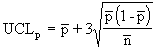
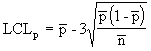
The p chart displays the proportion of nonconforming items in a group of items being inspected. The plotted point (p) is the fraction of defective items found for each sample (n). The sample size (n) need not be constant; however, sample sizes that vary more than 25 percent may provide misleading results (as documented in most SPC references). |
|
where:
|
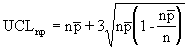
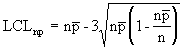
The np chart displays the nonconforming items in a group of items being inspected. It is similar to the p chart, but requires a constant sample size (n). The plotted point (np) is the number of defective items found for each sample (n). |
|
where:
|
The c chart displays the number of defects found in a group of items being inspected. It requires a constant sample size (n). The plotted point (c) is the number of defects found for each sample (n). |
|
where:
|
The u chart displays the number of defects found in a unit. Each unit is equal to the sample size, which may vary from group to group. This chart is similar to the c chart, but doesn't require a constant sample size (n). The plotted point (u) is the number of defects per unit (sometimes denoted as DPU). |
Using Pareto Charts
Use the Pareto chart to view a bar graph of discrete attributes, such as defects, causes, actions, or control test violations. The chart appears with horizontal bars in a descending order. The bars are accompanied with a cumulative percent curve (Lorenz curve) and bar statistics to the right of the chart.
You can remove bars by clicking them and redrawing them or by using filtering options provided under the Modify Graph menu.
|
Equation |
Statistic |
|
|
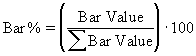
Each bar value is equal to the tally found for each attribute category. |
|
|
The bar percent is the percent that each bar represents for all displayed attribute categories. |
|
|
The cumulative percent represents the cumulative bar percentages. |
Using Bar Graphs
Use bar graphs to quickly compare statistics by subset in a horizontal bar layout. Use options to view the bars in subset and descending or ascending order. The bar value is the chosen subset and statistic that determine each bar length. The mean is the default value for each bar.
See Also
Using Box Plots
Use box plots to display Box and Whisker plots, capability graphs, or
minimum/maximum plots for multisubset comparisons. The system provides a list
of statistics at the bottom of each graphic, or you can select individual
subsets for more detail. Use options, such as the display of statistics, overlay
![]() sigma region, and graphic scaling, to modify the display.
sigma region, and graphic scaling, to modify the display.
See Also
Using Line Graphs
Line graphs display up to six subsets of data (by individual values) on one chart. Interaction with the graph includes point selection.
ReferencesHere are some references related to the contents of this chapter.
Rippstein, Greg L. Data Set Descriptions for Statistical Validation. August 1996.
SAS Institute. JMP version 2.0 Reference Guide for Macintosh.
Ford Motor Company. Continuing Process Control and Process Capability Improvement. December 1987.
VSA, Inc. SQC release 7 for DOS software.
Montgomery, Douglas C. Introduction to Statistical Quality Control, 2nd ed. 1991.
Duncan, Acheson J. Quality Control and Industrial Statistics, 5th ed. 1986.
Rippstein, Greg L. SPC Implementation Guide, 1st ed. 1994.
Freund, John E., and Richard M. Smith. Statistics: A First Course, 4th ed. 1986.
Rippstein, Greg L. Measurement Systems Analysis (seminar guide). 1995.
Crocker, Douglas C. "Regression Analysis in Quality Control." 40th Annual Quality Congress, May 1986, Anaheim, CA. 42-49.
BBN Software Products. RS/1 Statistical Tools Reference Guide. 1992.
Sanders, Murph, and Eng. Statistics: A Fresh Approach, 2d ed. 1980.
Gruska, Mirkhani, and Lamberson. Non Normal Data Analysis.Dearborn Heights, MI: Multiface Publishing Company, 1973.
Biometrika 50 (1968).
Western Electric Co., Inc. Statistical Quality Control Handbook. May 1985.
Hewlett-Packard Corporation. Hewlett-Packard Applications Programs. 1975.