Home
History
Search
Feedback
FAQ
|
Download
Home History |
|
API
Search Feedback FAQ |
Using the HTML Component Tags
The tags defined by the JavaServer Faces standard HTML render kit tag library represent HTML form controls and other basic HTML elements. These controls display data or accept data from the user. This data is collected as part of a form and is submitted to the server, usually when the user clicks a button. This section explains how to use each of the component tags shown in Table 17-2, and is organized according to the
UIComponentclasses from which the tags are derived.The next section explains the more important tag attributes that are common to most component tags. Please refer to the TLD documentation at
http://java.sun.com/j2ee/javaserverfaces/1.1/docs/tlddocs/index.htmlfor a complete list of tags and their attributes.For each of the components discussed in the following sections, Writing Component Properties explains how to write a bean property bound to a particular UI component or its value.
UI Component Tag Attributes
In general, most of the component tags support these attributes:
id: Uniquely identifies the componentimmediate: If set totrue, indicates that any events, validation, and conversion associated with the component should happen in the apply request values phase rather than a later phase.rendered: Specifies a condition in which the component should be rendered. If the condition is not satisfied, the component is not rendered.style: Specifies a Cascading Style Sheet (CSS) style for the tag.styleClass: Specifies a CSS stylesheet class that contains definitions of the styles.value: Identifies an external data source and binds the component's value to it.binding: Identifies a bean property and binds the component instance to it.All of the UI component tag attributes (except id and var) are value-binding-enabled, which means that they accept JavaServer Faces EL expressions. These expressions allow you to use mixed literals and JSP 2.0 expression language syntax and operators. See Expression Language for more information about the JSP 2.0 expression language.
The id Attribute
The
idattribute is not required for a component tag except in these situations:
- Another component or a server-side class must refer to the component.
- The component tag is impacted by a JSTL conditional or iterator tag (for more information, see Flow Control Tags).
If you don't include an
idattribute, the JavaServer Faces implementation automatically generates a component ID.The immediate Attribute
UIInputcomponents and command components (those that implementActionSource, such as buttons and hyperlinks)can set theimmediateattribute totrueto force events, validations, and conversions to be processed during the apply request values phase of the life cycle. Page authors need to carefully consider how the combination of an input component'simmediatevalue and a command component'simmediatevalue determines what happens when the command component is activated.Assume that you have a page with a button and a field for entering the quantity of a book in a shopping cart. If both the button's and the field's
immediateattributes are set totrue, the new value of the field will be available for any processing associated with the event that is generated when the button is clicked. The event associated with the button and the event, validation, and conversion associated with the field are all handled during the apply request values phase.If the button's
immediateattribute is set totruebut the field'simmediateattribute is set tofalse, the event associated with the button is processed without updating the field's local value to the model layer. This is because any events, conversion, or validation associated with the field occurs during its usual phases of the life cycle, which come after the apply request values phase.The
bookshowcart.jsppage of the Duke's Bookstore application has examples of components using theimmediateattribute to control which component's data is updated when certain buttons are clicked. Thequantityfield for each book has itsimmediateattribute set tofalse. (Thequantityfields are generated by theUIDatacomponent. See The UIData Component, for more information.) Theimmediateattribute of the Continue Shopping hyperlink is set totrue. Theimmediateattribute of the Update Quantities hyperlink is set tofalse.If you click the Continue Shopping hyperlink, none of the changes entered into the quantity input fields will be processed. If you click the Update Quantities hyperlink, the values in the quantity fields will be updated in the shopping cart.
The rendered Attribute
A component tag uses a Boolean JavaServer Faces expression language (EL) expression, along with the
renderedattribute, to determine whether or not the component will be rendered. For example, thecheckcommandLinkcomponent on thebookcatalog.jsppage is not rendered if the cart contains no items:<h:commandLink id="check" ... rendered="#{cart.numberOfItems > 0}"> <h:outputText value="#{bundle.CartCheck}"/> </h:commandLink>The style and styleClass Attributes
The
styleandstyleClassattributes allow you to specify Cascading Style Sheets (CSS) styles for the rendered output of your component tags. The UIMessage and UIMessages Components describes an example of using thestyleattribute to specify styles directly in the attribute. A component tag can instead refer to a CSS stylesheet class. ThedataTabletag on thebookcatalog.jsppage of the Duke's Bookstore application references the style classlist-background:The stylesheet that defines this class is
stylesheet.css, which is included in the application. For more information on defining styles, please the see Cascading Style Sheets Specification athttp://www.w3.org/Style/CSS/.The value and binding Attributes
A tag representing a component defined by
UIOutputor a subclass ofUIOutputusesvalueandbindingattributes to bind its component's value or instance respectively to an external data source. Binding Component Values and Instances to External Data Sources explains how to use these attributes.The UIForm Component
A
UIFormcomponent represents an input form that has child components representing data that is either presented to the user or submitted with the form. Theformtag encloses all the controls that display or collect data from the user. Here is an example:The
formtag can also include HTML markup to lay out the controls on the page. Theformtag itself does not perform any layout; its purpose is to collect data and to declare attributes that can be used by other components in the form. A page can include multipleformtags, but only the values from the form that the user submits will be included in the postback.The UIColumn Component
The
UIColumncomponent represents a column of data in aUIDatacomponent. While theUIDatacomponent is iterating over the rows of data, it processes theUIColumncomponent for each row.UIColumnhas no renderer associated with it and is represented on the page with acolumntag. Here is an examplecolumntag from thebookshowcart.jsppage of the Duke's Bookstore example:<h:dataTable id="items" ... value="#{cart.items}" var="item"> ...<h:column><f:facet name="header"> <h:outputText value="#{bundle.ItemQuantity}"/> </f:facet> <h:inputText ... value="#{item.quantity}"> <f:validateLongRange minimum="1"/> </h:inputText></h:column>... </h:dataTable>The
UIDatacomponent in this example iterates through the list of books (cart.items) in the shopping cart and displays their titles, authors, and prices. Thecolumntag shown in the example renders the column that displays text fields that allow customers to change the quantity of each book in the shopping cart. Each timeUIDataiterates through the list of books, it renders one cell in each column.The UICommand Component
The
UICommandcomponent performs an action when it is activated. The most common example of such a component is the button. This release supportsButtonandLinkasUICommandcomponent renderers.In addition to the tag attributes listed in Using the HTML Component Tags, the
commandButtonandcommandLinktags can use these attributes:
action, which is either a logical outcomeStringor a method-binding expression that points to a bean method that returns a logical outcomeString. In either case, the logical outcomeStringis used by the defaultNavigationHandlerinstance to determine what page to access when theUICommandcomponent is activated.actionListener, which is a method-binding expression that points to a bean method that processes an action event fired by theUICommandcomponent.See Referencing a Method That Performs Navigation for more information on using the
actionattribute.See Referencing a Method That Handles an Action Event for details on using the
actionListenerattribute.Using the commandButton Tag
The
bookcashier.jsppage of the Duke's Bookstore application includes acommandButtontag. When a user clicks the button, the data from the current page is processed, and the next page is opened. Here is thecommandButtontag frombookcashier.jsp:Clicking the button will cause the
submitmethod ofCashierBeanto be invoked because theactionattribute references thesubmitmethod of theCashierBeanbacking bean. Thesubmitmethod performs some processing and returns a logical outcome. This is passed to the defaultNavigationHandler, which matches the outcome against a set of navigation rules defined in the application configuration resource file.The
valueattribute of the preceding examplecommandButtontag references the localized message for the button's label. Thebundlepart of the expression refers to theResourceBundlethat contains a set of localized messages. TheSubmitpart of the expression is the key that corresponds to the message that is displayed on the button. For more information on referencing localized messages, see Using Localized Messages. See Referencing a Method That Performs Navigation for information on how to use theactionattribute.Using the commandLink Tag
The
commandLinktag represents an HTML hyperlink and is rendered as an HTML<a>element. ThecommandLinktag is used to submit an action event to the application. See Implementing Action Listeners for more information on action events.A
commandLinktag must include a nestedoutputTexttag, which represents the text the user clicks to generate the event. The following tag is from thechooselocale.jsppage from the Duke's Bookstore application.<h:commandLink id="NAmerica" action="bookstore" actionListener="#{localeBean.chooseLocaleFromLink}"> <h:outputText value="#{bundle.English}" /> </h:commandLink>This tag will render the following HTML:
<a id="_id3:NAmerica" href="#"
  onclick="document.forms['_id3']['_id3:NAmerica'].
  value='_id3:NAmerica';
  document.forms['_id3'].submit();
  return false;">English</a>
Note: Notice that the
commandLinktag will render JavaScript. If you use this tag, make sure your browser is JavaScript-enabled.
The UIData Component
The
UIDatacomponent supports data binding to a collection of data objects. It does the work of iterating over each record in the data source. The standardTablerenderer displays the data as an HTML table. TheUIColumncomponent represents a column of data within the table. Here is a portion of thedataTabletag used by thebookshowcart.jsppage of the Duke's Bookstore example:<h:dataTable id="items" columnClasses="list-column-center, list-column-left, list-column-right, list-column-center" footerClass="list-footer" headerClass="list-header" rowClasses="list-row-even, list-row-odd" styleClass="list-background" value="#{cart.items}" var="item"> <h:column > <f:facet name="header"> <h:outputText value="#{bundle.ItemQuantity}" /> </f:facet> <h:inputText id="quantity" size="4" value="#{item.quantity}" /> ... </h:column> <h:column> <f:facet name="header"> <h:outputText value="#{bundle.ItemTitle}"/> </f:facet> <h:commandLink action="#{showcart.details}"> <h:outputText value="#{item.item.title}"/> </h:commandLink> </h:column> ... <f:facet name="footer" <h:panelGroup> <h:outputText value="#{bundle.Subtotal}"/> <h:outputText value="#{cart.total}" /> <f:convertNumber type="currency" /> </h:outputText> </h:panelGroup> </f:facet> </h:dataTable>Figure 18-1 shows a data grid that this
dataTabletag can display.
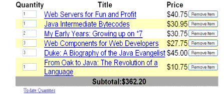
Figure 18-1 Table on the
bookshowcart.jspPageThe example
dataTabletag displays the books in the shopping cart as well as the quantity of each book in the shopping cart, the prices, and a set of buttons, which the user can click to remove books from the shopping cart.The
facettag inside the firstcolumntag renders a header for that column. The other column tags also containfacettags. Facets can have only one child, and so apanelGrouptag is needed if you want to group more than one component within afacet. Because the facet tag representing the footer includes more than one tag, thepanelGroupis needed to group those tags.A
facettag is usually used to represent headers and footers. In general, a facet is used to represent a component that is independent of the parent-child relationship of the page's component tree. In the case of a data grid, header and footer data is not repeated like the other rows in the table, and therefore, the elements representing headers and footers are not updated as are the other components in the tree.This table is a classic use case for a
UIDatacomponent because the number of books might not be known to the application developer or the page author at the time the application is developed. TheUIDatacomponent can dynamically adjust the number of rows of the table to accommodate the underlying data.The
valueattribute of adataTabletag references the data to be included in the table. This data can take the form ofAll data sources for
UIDatacomponents have aDataModelwrapper. Unless you explicitly construct aDataModelwrapper, the JavaServer Faces implementation will create aDataModelwrapper around data of any of the other acceptable types. See Writing Component Properties for more information on how to write properties for use with aUIDatacomponent.The
varattribute specifies a name that is used by the components within thedataTabletag as an alias to the data referenced in thevalueattribute ofdataTable.In the
dataTabletag from thebookshowcart.jsppage, thevalueattribute points to aListof books. Thevarattribute points to a single book in that list. As theUIDatacomponent iterates through the list, each reference toitempoints to the current book in the list.The
UIDatacomponent also has the ability to display only a subset of the underlying data. This is not shown in the preceding example. To display a subset of the data, you use the optionalfirstandrowsattributes.The
firstattribute specifies the first row to be displayed. Therowsattribute specifies the number of rows--starting with the first row--to be displayed. For example, if you wanted to display records 2 through 10 of the underlying data, you would setfirstto 2 androwsto 9. When you display a subset of the data in your pages, you might want to consider including a link or button that causes subsequent rows to display when clicked. By default, bothfirstandrowsare set to zero, and this causes all the rows of the underlying data to display.The
dataTabletag also has a set of optional attributes for adding styles to the table:Each of these attributes can specify more than one style. If
columnClassesorrowClassesspecifies more than one style, the styles are applied to the columns or rows in the order that the styles are listed in the attribute. For example, ifcolumnClassesspecifies styleslist-column-centerandlist-column-rightand if there are two columns in the table, the first column will have stylelist-column-center, and the second column will have stylelist-column-right.If the
styleattribute specifies more styles than there are columns or rows, the remaining styles will be assigned to columns or rows starting from the first column or row. Similarly, if thestyleattribute specifies fewer styles than there are columns or rows, the remaining columns or rows will be assigned styles starting from the first style.The UIGraphic Component
The
UIGraphiccomponent displays an image. The Duke's Bookstore application uses agraphicImagetag to display the map image on thechooselocale.jsppage:<h:graphicImage id="mapImage" url="/template/world.jpg" alt="#{bundle.chooseLocale}" usemap="#worldMap" />The
urlattribute specifies the path to the image. It also corresponds to the local value of theUIGraphiccomponent so that the URL can be retrieved, possibly from a backing bean. The URL of the example tag begins with a /, which adds the relative context path of the Web application to the beginning of the path to the image.The
altattribute specifies the alternative text displayed when the user mouses over the image. In this example, thealtattribute refers to a localized message. See Performing Localization for details on how to localize your JavaServer Faces application.The
usemapattribute refers to the image map defined by the custom component,MapComponent, which is on the same page. See Chapter 20 for more information on the image map.The UIInput and UIOutput Components
The
UIInputcomponent displays a value to the user and allows the user to modify this data. The most common example is a text field. TheUIOutputcomponent displays data that cannot be modified. The most common example is a label.The
UIInputandUIOutputcomponents can each be rendered in four ways. Table 18-3 lists the renderers ofUIInputandUIOutput. Recall from Component Rendering Model that the tags are composed of the component and the renderer. For example, theinputTexttag refers to aUIInputcomponent that is rendered with theTextrenderer.
The
UIInputcomponent supports the following tag attributes in addition to the tag attributes described at the beginning of Using the HTML Component Tags. TheUIOutputcomponent supports the first of the following tag attributes in addition to those listed in Using the HTML Component Tags.
converter: Identifies a converter that will be used to convert the component's local data. See Using the Standard Converters for more information on how to use this attribute.validator: Identifies a method-binding expression pointing to a backing bean method that performs validation on the component's data. See Referencing a Method That Performs Validation for an example of using thevalidatortag.valueChangeListener: Identifies a method-binding expression that points to a backing bean method that handles the event of entering a value in this component. See Referencing a Method That Handles a Value-change Event for an example of usingvalueChangeListener.The rest of this section explains how to use selected tags listed in Table 18-3. The other tags are written in a similar way.
Using the outputText and inputText Tags
The
Textrenderer can render bothUIInputandUIOutputcomponents. TheinputTexttag displays and accepts a single-line string. TheoutputTexttag displays a single-line string. This section shows you how to use theinputTexttag. TheoutputTexttag is written in a similar way.Here is an example of an
inputTexttag from thebookcashier.jsppage:<h:inputText id="name" size="50" value="#{cashier.name}" required="true"> <f:valueChangeListener type="listeners.NameChanged" /> </h:inputText>The
valueattribute refers to thenameproperty ofCashierBean. This property holds the data for thenamecomponent. After the user submits the form, the value of thenameproperty inCashierBeanwill be set to the text entered in the field corresponding to this tag.The
requiredattribute causes the page to reload with errors displayed if the user does not enter a value in thenametext field. See Requiring a Value for more information on requiring input for a component.Using the outputLabel Tag
The
outputLabeltag is used to attach a label to a specified input field for accessibility purposes. Thebookcashier.jsppage uses anoutputLabeltag to render the label of a checkbox:<h:selectBooleanCheckbox id="fanClub" rendered="false" binding="#{cashier.specialOffer}" /> <h:outputLabel for="fanClub" rendered="false" binding="#{cashier.specialOfferText}" > <h:outputText id="fanClubLabel" value="#{bundle.DukeFanClub}" /> </h:outputLabel> ...The
forattribute of theoutputLabeltag maps to theidof the input field to which the label is attached. TheoutputTexttag nested inside theoutputLabeltag represents the actual label component. Thevalueattribute on theoutputTexttag indicates the text that is displayed next to the input field.Instead of using an
outputTexttag for the text displayed as a label, you can simply use theoutputLabeltag'svalueattribute. The following code snippet shows what the previous code snippet would look like if it used thevalueattribute of theoutputLabeltag to specify the text of the label.<h:selectBooleanCheckbox id="fanClub" rendered="false" binding="#{cashier.specialOffer}" /> <h:outputLabel for="fanClub" rendered="false" binding="#{cashier.specialOfferText}" value="#{bundle.DukeFanClub}" /> </h:outputLabel> ...Using the outputLink Tag
The
outputLinktag is used to render a hyperlink that, when clicked, loads another page but does not generate an action event. You should use this tag instead of thecommandLinktag if you always want the URL--specified by theoutputLinktag'svalueattribute--to open and do not have to perform any processing when the user clicks on the link. The Duke's Bookstore application does not utilize this tag, but here is an example of it:<h:outputLink value="javadocs"> <f:verbatim>Documentation for this demo</f:verbatim> </h:outputLink>As shown in this example, the
outputLinktag requires a nestedverbatimtag, which identifies the text the user clicks to get to the next page.You can use the
verbatimtag on its own when you want to simply output some text on the page.Using the outputFormat Tag
The
outputFormattag allows a page author to display concatenated messages as aMessageFormatpattern, as described in the API documentation forjava.text.MessageFormat(seehttp://java.sun.com/j2se/1.4.2/docs/api/java/text/MessageFormat.html). Here is an example of anoutputFormattag from thebookshowcart.jsppage of the Duke's Bookstore application:<h:outputFormat value="#{bundle.CartItemCount}"> <f:param value="#{cart.numberOfItems}"/> </h:outputFormat>The
valueattribute specifies theMessageFormatpattern. Theparamtag specifies the substitution parameters for the message.In the example
outputFormattag, thevaluefor the parameter maps to the number of items in the shopping cart. When the message is displayed in the page, the number of items in the cart replaces the{0}in the message corresponding to theCartItemCountkey in thebundleresource bundle:This message represents three possibilities:
The value of the parameter replaces the
{0}from the message in the sentence in the third bullet. This is an example of a value-binding-enabled tag attribute accepting a complex JSP 2.0 EL expression.An
outputFormattag can include more than oneparamtag for those messages that have more than one parameter that must be concatenated into the message. If you have more than one parameter for one message, make sure that you put theparamtags in the proper order so that the data is inserted in the correct place in the message.A page author can also hardcode the data to be substituted in the message by using a literal value with the
valueattribute on theparamtag.Using the inputSecret Tag
The
inputSecrettag renders an<input type="password">HTML tag. When the user types a string into this field, a row of asterisks is displayed instead of the text the user types. The Duke's Bookstore application does not include this tag, but here is an example of one:In this example, the
redisplayattribute is set tofalse. This will prevent the password from being displayed in a query string or in the source file of the resulting HTML page.The UIPanel Component
The
UIPanelcomponent is used as a layout container for its children. When you use the renderers from the HTML render kit,UIPanelis rendered as an HTML table. This component differs fromUIDatain thatUIDatacan dynamically add or delete rows to accommodate the underlying data source, whereasUIPanelmust have the number of rows predetermined. Table 18-4 lists all the renderers and tags corresponding to theUIPanelcomponent.
The
panelGridtag is used to represent an entire table. ThepanelGrouptag is used to represent rows in a table. Other UI component tags are used to represent individual cells in the rows.The
panelGridtag has a set of attributes that specify CSS stylesheet classes:columnClasses,footerClass,headerClass,panelClass, androwClasses. These stylesheet attributes are not required. It also has acolumnsattribute. Thecolumnsattribute is required if you want your table to have more than one column because thecolumnsattribute tells the renderer how to group the data in the table.If a
headerClassis specified, thepanelGridmust have a header as its first child. Similarly, if afooterClassis specified, thepanelGridmust have a footer as its last child.The Duke's Bookstore application includes three
panelGridtags on thebookcashier.jsppage. Here is a portion of one of them:<h:panelGrid columns="3" headerClass="list-header" rowClasses="list-row-even, list-row-odd" styleClass="list-background" title="#{bundle.Checkout}"> <f:facet name="header"> <h:outputText value="#{bundle.Checkout}"/> </f:facet> <h:outputText value="#{bundle.Name}" /> <h:inputText id="name" size="50" value="#{cashier.name}" required="true"> <f:valueChangeListener type="listeners.NameChanged" /> </h:inputText> <h:message styleClass="validationMessage" for="name"/> <h:outputText value="#{bundle.CCNumber}"/> <h:inputText id="ccno" size="19" converter="CreditCardConverter" required="true"> <bookstore:formatValidator formatPatterns="9999999999999999| 9999 9999 9999 9999|9999-9999-9999-9999"/> </h:inputText> <h:message styleClass="validationMessage" for="ccno"/> ... </h:panelGrid>This
panelGridtag is rendered to a table that contains controls for the customer of the bookstore to input personal information. ThispanelGridtag uses stylesheet classes to format the table. The CSS classes are defined in thestylesheet.cssfile in the <INSTALL>/j2eetutorial14/examples/web/bookstore6/web/directory. Thelist-headerdefinition isBecause the
panelGridtag specifies aheaderClass, thepanelGridmust contain a header. The examplepanelGridtag uses afacettag for the header. Facets can have only one child, and so apanelGrouptag is needed if you want to group more than one component within afacet. Because the examplepanelGridtag has only one cell of data, apanelGrouptag is not needed.A
panelGrouptag can also be used to encapsulate a nested tree of components so that the tree of components appears as a single component to the parent component.The data represented by the nested component tags is grouped into rows according to the value of the columns attribute of the
panelGridtag. Thecolumnsattribute in the example is set to"3", and therefore the table will have three columns. In which column each component is displayed is determined by the order that the component is listed on the page modulo 3. So if a component is the fifth one in the list of components, that component will be in the 5 modulo 3 column, or column 2.The UISelectBoolean Component
The
UISelectBooleanclass defines components that have abooleanvalue. TheselectBooleanCheckboxtag is the only tag that JavaServer Faces technology provides for representingbooleanstate. The Duke's Bookstore application includes aselectBooleanCheckboxtag on thebookcashier.jsppage:<h:selectBooleanCheckbox id="fanClub" rendered="false" binding="#{cashier.specialOffer}" /> <h:outputLabel for="fanClub" rendered="false" binding="#{cashier.specialOfferText}"> <h:outputText id="fanClubLabel" value="#{bundle.DukeFanClub}" /> </h:outputLabel>This example tag displays a checkbox to allow users to indicate whether they want to join the Duke Fan Club. The label for the checkbox is rendered by the
outputLabeltag. The actual text is represented by the nestedoutputTexttag. Binding a Component Instance to a Bean Property discusses this example in more detail.The UISelectMany Component
The
UISelectManyclass defines a component that allows the user to select zero or more values from a set of values. This component can be rendered as a set of checkboxes, a list box, or a menu. This section explains theselectManyCheckboxtag. TheselectManyListboxtag andselectManyMenutag are written in a similar way.A list box differs from a menu in that it displays a subset of items in a box, whereas a menu displays only one item at a time until you select the menu. The
sizeattribute of theselectManyListboxtag determines the number of items displayed at one time. The list box includes a scrollbar for scrolling through any remaining items in the list.Using the selectManyCheckbox Tag
The
selectManyCheckboxtag renders a set of checkboxes, with each checkbox representing one value that can be selected. Duke's Bookstore uses aselectManyCheckboxtag on thebookcashier.jsppage to allow the user to subscribe to one or more newsletters:<h:selectManyCheckbox id="newsletters" layout="pageDirection" value="#{cashier.newsletters}"> <f:selectItems value="#{newsletters}"/> </h:selectManyCheckbox>The
valueattribute of theselectManyCheckboxtag identifies theCashierBeanbacking bean property,newsletters, for the current set of newsletters. This property holds the values of the currently selected items from the set of checkboxes. You are not required to provide a value for the currently selected items. If you don't provide a value, the first item in the list is selected by default.The
layoutattribute indicates how the set of checkboxes are arranged on the page. Because layout is set topageDirection, the checkboxes are arranged vertically. The default islineDirection, which aligns the checkboxes horizontally.The
selectManyCheckboxtag must also contain a tag or set of tags representing the set of checkboxes. To represent a set of items, you use theselectItemstag. To represent each item individually, you use aselectItemtag for each item. The UISelectItem, UISelectItems, and UISelectItemGroup Components explains these two tags in more detail.The UIMessage and UIMessages Components
The
UIMessageandUIMessagescomponents are used to display error messages. Here is an examplemessagetag from theguessNumberapplication, discussed in Steps in the Development Process:<h:inputText id="userNo" value="#{UserNumberBean.userNumber}"> <f:validateLongRange minimum="0" maximum="10" /> ... <h:message style="color: red; font-family: 'New Century Schoolbook', serif; font-style: oblique; text-decoration: overline" id="errors1" for="userNo"/>The
forattribute refers to the ID of the component that generated the error message. Themessagetag will display the error message wherever it appears on the page.The
styleattribute allows you to specify the style of the text of the message. In the example in this section, the text will be red, New Century Schoolbook, serif font family, and oblique style, and a line will appear over the text.If you use the
messagestag instead of themessagetag, all error messages will display.The UISelectOne Component
A
UISelectOnecomponent allows the user to select one value from a set of values. This component can be rendered as a list box, a set of radio buttons, or a menu. This section explains theselectOneMenutag. TheselectOneRadioandselectOneListboxtags are written in a similar way. TheselectOneListboxtag is similar to theselectOneMenutag except thatselectOneListboxdefines asizeattribute that determines how many of the items are displayed at once.Using the selectOneMenu Tag
The
selectOneMenutag represents a component that contains a list of items, from which a user can choose one item. The menu is also commonly known as a drop-down list or a combo box. The following code snippet shows theselectOneMenutag from thebookcashier.jsppage of the Duke's Bookstore application. This tag allows the user to select a shipping method:<h:selectOneMenu id="shippingOption" required="true" value="#{cashier.shippingOption}"> <f:selectItem itemValue="2" itemLabel="#{bundle.QuickShip}"/> <f:selectItem itemValue="5" itemLabel="#{bundle.NormalShip}"/> <f:selectItem itemValue="7" itemLabel="#{bundle.SaverShip}"/> </h:selectOneMenu>The
valueattribute of theselectOneMenutag maps to the property that holds the currently selected item's value. You are not required to provide a value for the currently selected item. If you don't provide a value, the first item in the list is selected by default.Like the
selectOneRadiotag, theselectOneMenutag must contain either aselectItemstag or a set ofselectItemtags for representing the items in the list. The next section explains these two tags.The UISelectItem, UISelectItems, and UISelectItemGroup Components
UISelectItemandUISelectItemsrepresent components that can be nested inside aUISelectOneor aUISelectManycomponent.UISelectItemis associated with aSelectIteminstance, which contains the value, label, and description of a single item in theUISelectOneorUISelectManycomponent.The
UISelectItemsinstance represents either of the following:Figure 18-2 shows an example of a list box constructed with a
SelectItemscomponent representing twoSelectItemGroupinstances, each of which represents two categories of beans. Each category is an array ofSelectIteminstances.
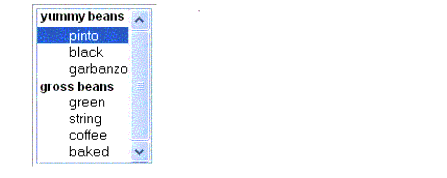
Figure 18-2 An Example List Box Created Using
SelectItemGroupInstancesThe
selectItemtag represents aUISelectItemcomponent. TheselectItemstag represents aUISelectItemscomponent. You can use either a set ofselectItemtags or a singleselectItemstag within yourselectOneorselectManytag.The advantages of using the
selectItemstag are as follows:
- You can represent the items using different data structures, including
Array,MapandCollection. The data structure is composed ofSelectIteminstances orSelectItemGroupinstances.- You can concatenate different lists together into a single
UISelectManyorUISelectOnecomponent and group the lists within the component, as shown in Figure 18-2.- You can dynamically generate values at runtime.
The advantages of using
selectItemare as follows:For more information on writing component properties for the
UISelectItemscomponents, see Writing Component Properties. The rest of this section shows you how to use theselectItemsandselectItemtags.Using the selectItems Tag
Here is the
selectManyCheckboxtag from the section The UISelectMany Component:<h:selectManyCheckbox id="newsletters" layout="pageDirection" value="#{cashier.newsletters}"> <f:selectItems value="#{newsletters}"/> </h:selectManyCheckbox>The
valueattribute of theselectItemstag is bound to thenewslettersmanaged bean, which is configured in the application configuration resource file. Thenewslettersmanaged bean is configured as a list:<managed-bean> <managed-bean-name>newsletters</managed-bean-name> <managed-bean-class> java.util.ArrayList</managed-bean-class> <managed-bean-scope>application</managed-bean-scope> <list-entries> <value-class>javax.faces.model.SelectItem</value-class> <value>#{newsletter0}</value> <value>#{newsletter1}</value> <value>#{newsletter2}</value> <value>#{newsletter3}</value> </list-entries> </managed-bean> <managed-bean> <managed-bean-name>newsletter0</managed-bean-name> <managed-bean-class> javax.faces.model.SelectItem</managed-bean-class> <managed-bean-scope>none</managed-bean-scope> <managed-property> <property-name>label</property-name> <value>Duke's Quarterly</value> </managed-property> <managed-property> <property-name>value</property-name> <value>200</value> </managed-property> </managed-bean> ...As shown in the
managed-beanelement, theUISelectItemscomponent is a collection ofSelectIteminstances. See Initializing Array and List Properties for more information on configuring collections as beans.You can also create the list corresponding to a
UISelectManyorUISelectOnecomponent programmatically in the backing bean. See Writing Component Properties for information on how to write a backing bean property corresponding to aUISelectManyorUISelectOnecomponent.The arguments to the
SelectItemconstructor are:UISelectItems Properties describes in more detail how to write a backing bean property for a
UISelectItemscomponent.Using the selectItem Tag
The
selectItemtag represents a single item in a list of items. Here is the example from Using the selectOneMenu Tag:<h:selectOneMenu id="shippingOption" required="true" value="#{cashier.shippingOption}"> <f:selectItem itemValue="2" itemLabel="#{bundle.QuickShip}"/> <f:selectItem itemValue="5" itemLabel="#{bundle.NormalShip}"/> <f:selectItem itemValue="7" itemLabel="#{bundle.SaverShip}"/> </h:selectOneMenu>The
itemValueattribute represents the default value of theSelectIteminstance. TheitemLabelattribute represents theStringthat appears in the drop-down menu component on the page.The
itemValueanditemLabelattributes are value-binding-enabled, meaning that they can use value-binding expressions to refer to values in external objects. They can also define literal values, as shown in the exampleselectOneMenutag.
|
Download
Home History |
|
API
Search Feedback FAQ |
All of the material in The J2EE(TM) 1.4 Tutorial is copyright-protected and may not be published in other works without express written permission from Sun Microsystems.