Using the Supply Chain Analyst Dashboard
This chapter covers the following topics:
- Understanding the Supply Chain Analyst Dashboard
- Using the Plan Health Summary Page
- Using the Demand and Supply Page
- Using the Resources Page
- Using the Exceptions Page
- Using the Historical Performance Page
- Using the Scenario Analysis Page
- Using the Inventory Analysis Page
- Supply Chain Analyst Secondary Drill-Down Reports
Understanding the Supply Chain Analyst Dashboard
The Supply Chain Analyst role has access to a predefined dashboard with a selection of different seeded reports. These reports enable the supply chain analyst to perform tasks related to supply chain analysis. The report pages leverage the flexibility of the Oracle Business Intelligence – Enterprise Edition (OBI-EE), which enables the layout and content of the delivered reports to be changed by the user
The reports are organized in logical groupings as pages, or tabs, within the Supply Chain Analyst Dashboard.
For details on how to use the OBI-EE features, see Oracle Business Intelligence Answers, Delivers, and Interactive Dashboards User Guide.
These pages are available for the supply chain analyst:
-
Plan Health Summary
-
Demand and Supply
-
Resources
-
Exceptions.
-
Historical Performance
-
Scenario Analysis
-
Glossary
The Glossary page provides:
-
Definitions of all measures that are presented in the Supply Chain Analyst Dashboard.
-
Information about the logic used to calculate each measure.
Integration of Oracle Advanced Planning Command Center and Oracle Rapid Planning
APCC supports Rapid Planning reports in the same manner that it supports drilldown to the ASCP workbench. Listed below are the Supply Chain Analyst Dashboard pages that you can use to view Oracle Rapid Planning information:
-
Plan Healthy Summary, includes a report to highlight cost parameters (revenue, manufacturing cost, purchasing cost, transportation cost, carrying cost, total cost and gross margin
-
Demand and Supply
-
Resource
-
Exceptions, includes Oracle Rapid Planing exception messages and a report to compare orders via a drilldown
-
Historical Performance
-
Scenario Analysis, includes a report to highlight cost parameters (revenue, manufacturing cost, purchasing cost, transportation cost, carrying cost, total cost and gross margin
Drilldowns from APCC to Rapid Planning are available from Item, Organization or Resource column only.
When you are accessing the Rapid Planning reports as a drill down from APCC, the Plan being passed must either be loaded or loaded into memory and the relevant report in Rapid Planning displayed with the passed context. The data from the last saved report is displayed. This may be different from what is displayed in APCC if the archive workflow was not run after the changes were made in Rapid Planning.
Note: If there is an instance of Rapid Planning already open by the user, then it will be refreshed when opening a drill down report from APCC. It will not be opened in a new browser. If, on the other hand, there is no instance of Rapid Planning already open the Rapid Planning report is displayed in a new browser.
Using the Plan Health Summary Page
This section provides an overview of the Plan Health Summary page and discusses:
-
Page-Level filters
-
Shipments and Production Trends
-
Demand and Supply Summary
-
Resource Summary
-
Exception Summary
Understanding the Plan Health Summary Page
The Plan Health Summary page provides a high-level summary of the health of the supply chain plan. It displays primary measures for supply and demand, resources, and exceptions. It also enables the supply chain analyst to compare an archived version of a plan against a current version, or compare two or more plans.
To access the Plan Health Summary page:
-
Select the Supply Chain Analyst responsibility.
-
Select Supply Chain Analyst Dashboard.
Page-Level Filters
Page-level filters are provided at the top of the Plan Health Summary page. Page-Level filters are used to filter the results of the work areas.
This table lists the page-level filters for the Plan Health Summary page:
| Filter | Description |
|---|---|
| Archived Plans | Select from a list of plans from which an archived plan can be selected. Multiple plans can be selected. This is a required field. |
| Baseline Plan | Select from a list of plans that are to be used as the baseline. Only one plan can be selected. This is a required field. |
| Category | Select from a list of categories. Multiple categories can be selected. This is an optional field. |
| Resource Group | Select from a list of resource groups. Multiple resource groups can be selected. This is an optional field. |
| Organization | Select from a list of organizations. Multiple organizations can be selected. This is an optional field. |
| Period Start | Select from a list of date and time selections. A range of date and time can be selected. This is an optional field. |
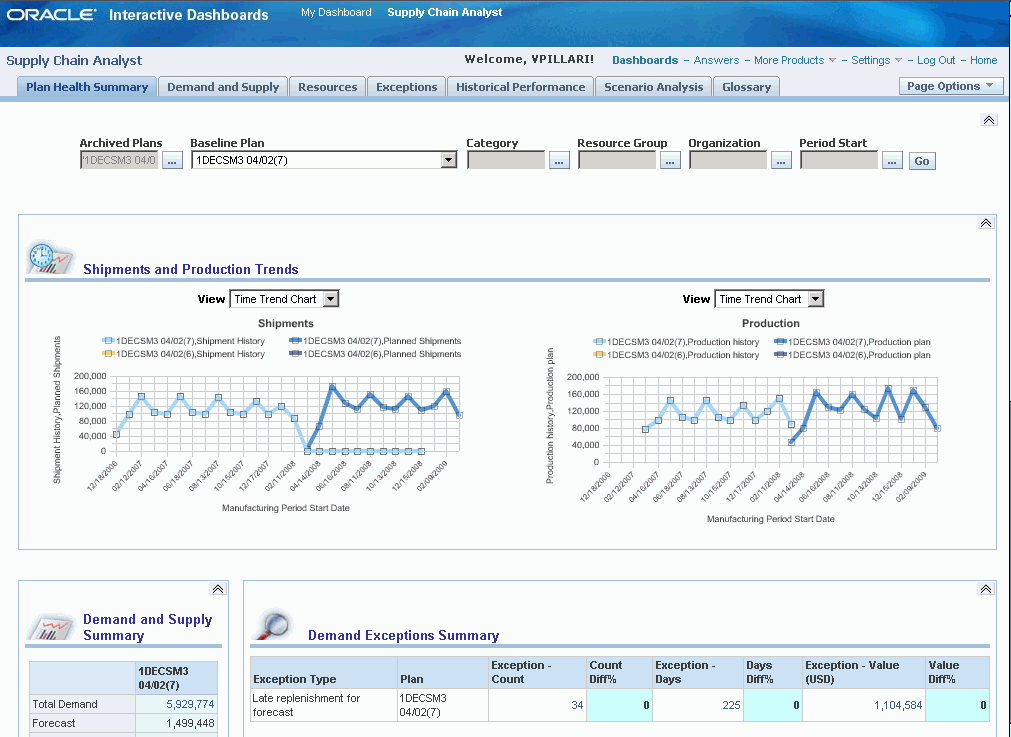
Shipments and Production Trends
The Shipment and Production Trends report enables the user to evaluate:
-
How the key supply chain metrics of the plan and actuals compare to past periods?
-
What plan trends are projected to be in the future
To view an example of the Shipments and Production Trends report, see Understanding the Plan Health Summary Page
In addition to the page-level filters at the top of the page, users can specify this filter for the report:
| Field | Description |
|---|---|
| View | Select how you want to view the report. Options include Time Trend Chart and Time Trend Table. The Time Trend Chart view plots the shipment history and planned shipments over time using a line graph. The Time Trend Table view provides the values that correspond to the Time Trend Chart view. |
Additional reports that you can be access from the Shipment and Production Trends report are (listed in alphabetical order):
-
Days of Cover by Items.
-
Days of Cover by Organizations.
-
Exception Summary.
-
Total Demand by Customers.
-
Total Supply by Categories.
-
Work In Progress (WIP) Start by Organizations.
Demand and Supply Summary
The Demand and Supply Summary report enables the user to determine how demand and supply differ between a baseline plan and archived plans.
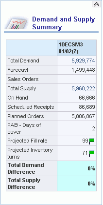
For a list of the additional reports that you can access from the Demand and Supply Summary report, see Demand and Supply Summary
Resource Summary
The Resource Summary report enables the user to determine how resource utilization varies between baseline and archived plans.
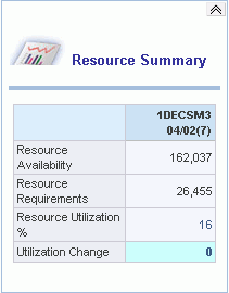
Additional reports that you can access from the Resource Summary report are (listed in alphabetical order):
-
Exception Summary.
-
Least Utilized Resources.
-
Most Utilized Resources.
-
Resource Utilization by Resource Groups.
-
Resource Utilization by Organizations.
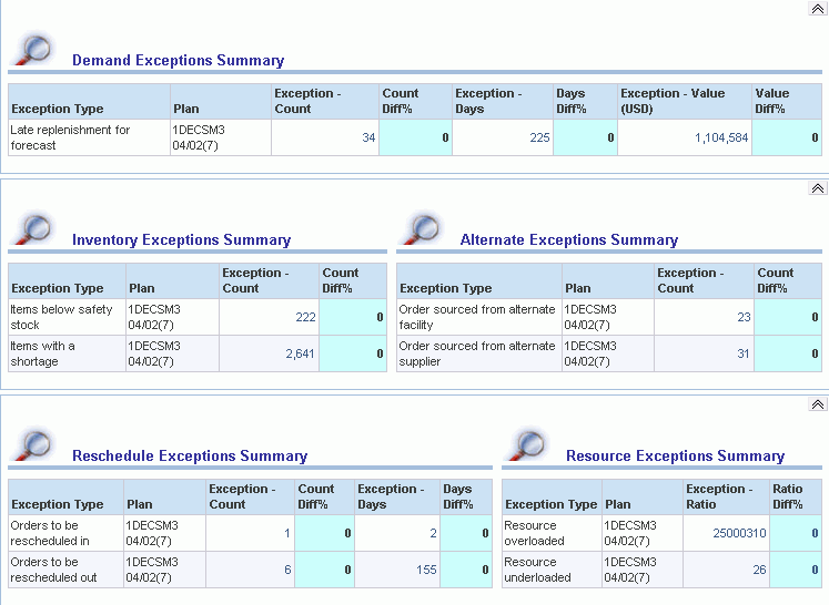
Exception Summary Report
The Exception Summary report enables the user to:
-
View a summary of exceptions in the baseline plan.
-
Compare exceptions between baseline and archived plans.
The Exceptions Summary report is detailed into six subreports:
-
Item Exceptions Summary
-
Resource Exceptions Summary
-
Demand Exceptions Summary
-
Inventory Exceptions Summary
-
Alternate Exceptions Summary.
-
Reschedule Exceptions Summary
The Item Exception report is a new report that enables users to analyze an exception severity based on a specified measure aggregated by specific seeded dimensions such as Organization, Category, and Organization-Category in the Baseline plan. You can use the page level filters to create this report for specific organizations, categories, and periods and view the results as a bar graph or table..
The Item Exception report provides the following facts:
-
Exception Count
-
Exception Days
-
Exception Value
-
Exception Quantity
-
Exception Ratio
You can group your results by:
-
Organization
-
Category
-
Item
-
Org/Category
-
Category/Item
-
Customer
-
Supplier
-
Customer/Item
-
Supplier/Item
-
Demand Class
-
Project
Below is an example of an Item Exception Summary Report
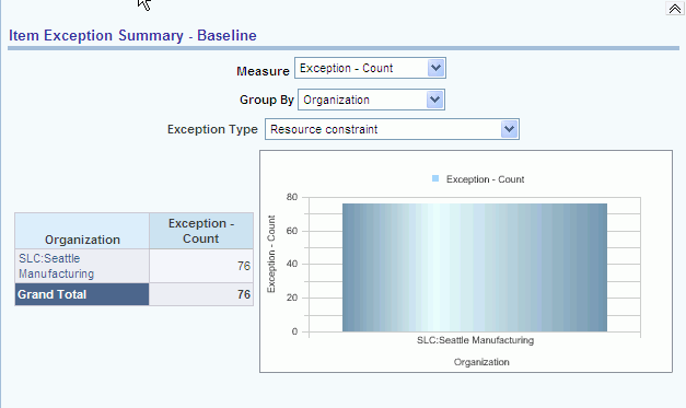
By double clicking on an entity cell, you can drill down to the underlying applications. The contexts that are passed down are the plan and the entities associated with each cell. In the resulting window, all items with the Items with a Shortage exception in the organization and category are displayed. Drilldown to applications is not supported from this report. However, drilldown along the dimensional model is supported, for example, Category to Item.
The drilldown from this report is available for all values specified in the Group By field.
Note: The Resource value in the Group By field is disabled for DRP and CP plans. You can drill down to Service Parts Planning (SPP) only if the report is grouped by Item, Category / Item, Customer / Item, or Supplier / Item. This report may be displayed with the following Plans ASCP, DRP, SPP, SNO and CP.
The formatting of the Exception columns is based on the selected measure:
-
Exception Count – Integer
-
Exception Quantity – Integer
-
Exception Value – Integer with $ sign
-
Exception Days – Number with one decimal
-
Exception Ratio - Number with two decimals
-
Use a comma (“,”) for 1000 separator
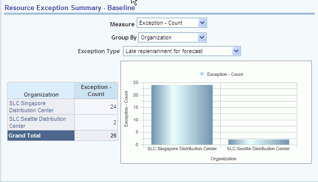
Resource Exceptions Summary Report
The Resource Exception Summary report enables users to analyze a Resource related exception severity based on a specified measure aggregated by specific seeded dimensions such as Organization, Category, and Org / Category in the Baseline plan. User can also use the page level filters to create this report for specific organizations, categories, and periods.
You view this report by plan in table or bar graph format. If you view the report in table format, you can filter your results in two more parameters in addition to the page level filters:
-
Exception Type is the ability to select an exception type using the combo box containing the list of exception types. Note that only Resource related exceptions are available in this selection.
-
Measure is the ability to select one of the exceptions facts as the measure to be displayed in the table. The measures include: Exception Count, Exception Value, Exception Days, Exception Quantity, and Exception Ratio.
The Resource Exception Summary report provides the following facts:
-
Exception Count
-
Exception Days
-
Exception Value
-
Exception Quantity
-
Exception Ratio
You can group your results by:
-
Organization
-
Category
-
Item
-
Org/Category
-
Category/Item
-
Customer
-
Supplier
-
Customer/Item
-
Supplier/Item
-
Demand Class
-
Project
Below is an example of a Resource Exception Summary report:
Drill downs to applications is not supported from this report. However, drilldown along the dimensional model is supported, for example, Category to Item.
Note: The Resource value in the Group By field is disabled for DRP and CP plans.
Note: You can drill down to Service Parts Planning (SPP) only if the report is grouped by Item, Category / Item, Customer / Item, or Supplier / Item. This report can be displayed with the following Plans ASCP, DRP, SPP, SNO and CP.
The following windows of the underlying applications are displayed as a result of drilling down from the above report:
-
ASCP – Exception Details window, all detail level exceptions for the selected entities are displayed.
-
DRP – Exception Details window, all detail level exceptions for the selected entities are displayed.
-
SPP – Exception Details, all detail level exception for the selected entities are displayed.
-
SNO – Alerts, only the plan context is passed down.
-
CP – Exception Details window, all detail level exceptions for the selected entities are displayed.
The formatting of the Exception columns is based on the selected measure:
-
Exception Count
-
Integer Exception Quantity
-
Integer Exception Value
-
Integer with $ sign Exception Days
-
Number with one decimal Exception Ratio - Number with two decimals
-
Use comma (“,”) for 1000 separator.
Additional reports that can be accessed from the Exception Summary report are (listed in alphabetical order):
-
Days of Cover by Items.
-
Exceptions Trend Over Time.
-
Exceptions Type by Category.
-
Exceptions Type by Customer.
-
Exceptions Type by Items.
-
Exceptions Type by Organization.
-
Exceptions Type by Supplier.
-
Least Utilized Resources.
-
Most Utilized Resources.
-
Resource Utilization by Organization.
Using the Demand and Supply Page
This section provides an overview of the Demand and Supply page and discusses:
-
Page-level filters
-
Demand and Supply Summary
-
Demand Change by Customers
-
Supply Change by Categories
-
Demand and Supply Trend Across Plans
-
Demand and Supply Trend (Baseline Plan)
-
Total Demand by Customers (Baseline Plan)
-
Total Supply by Categories (Baseline Plan)
-
Excess and Obsolescence
-
Oracle Rapid Planning Supply Demand Plan Drill-downs
Understanding the Demand and Supply Page
The Demand and Supply page enables the supply chain analyst to evaluate how demand and supply are balanced over time and how they vary from one plan to another.
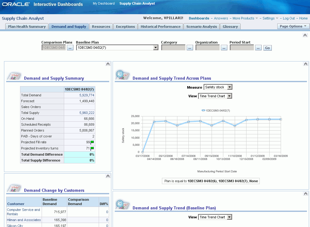
Page-Level Filters
Page-level filters are provided at the top of the page to filter the results of all reports.
This table lists the page-level filters for the Demand and Supply page:
| Filter | Description |
| Comparison Plans | Select from a list of comparison plans. Multiple plans can be selected. This is a required field. |
| Baseline Plan | Select from a list of plans to use as a baseline. Only one plan can be selected. This is a required field. |
| Category | Select from a list of categories. Multiple categories can be selected. This is an optional field. |
| Organization | Select from a list of organizations. Multiple organizations can be selected. This is an optional field. |
| Period Start | Select from a list of date and time selections. A range of date and time can be selected. This is an optional field. |
Demand and Supply Summary
The Demand and Supply Summary report enables the user to determine how demand and supply is different between a baseline plan and comparison plans.
To view the Demand and Supply Summary report, see Understanding the Demand and Supply Page
Additional reports that can be accessed from the Demand and Supply Summary report are (listed in alphabetical order):
-
Aggregate Horizontal Plan.
-
Days of Cover by Organizations.
-
Demand and Supply Totals by Category.
-
Demand and Supply Totals by Organization.
-
Detailed Horizontal Plan.
-
Exceptions Summary.
-
Total Demand by Customers.
-
Total Supply by Categories.
-
WIP (work in progress) Start by Organizations.
Demand Change by Customers
The Demand Change by Customers report enables the user to compare demand from the baseline plan to demand from the comparison plan for multiple customers.
The difference in total demand for each customer between the two plans is computed as a percentage and the percentage is sorted in descending order. By default the report displays the top ten customers. Using the MSC: Value of N for all top/bottom-N reports in Dashboards profile, the user can adjust the number of top customers displayed.
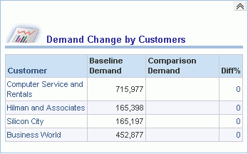
The customer name is a link, which can be used to display all customer sites for that customer. Use the Return or Back button to return to the report that lists all customers.
Additional reports that can be accessed from the Demand Change by Customers report are (listed in alphabetical order):
-
ASCP Workbench – Supply and Demand Detail.
-
Demand and Supply Trend (Baseline Plan).
Supply Change by Categories
The Supply Change by Categories report enables the user to compare supply from the baseline plan to supply from the comparison plan for multiple categories.
The difference in total supply for each category between the two plans is computed as a percentage and the percentage is sorted in descending order. By default the report displays the top ten categories. Using the MSC: Value of N for all top/bottom-N reports in Dashboards profile, the user can adjust the number of top categories displayed.
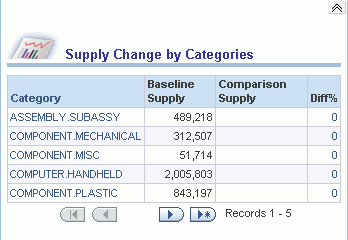
The category name is a link, which can be used to display all items for that category. Use the Return button to return to the report that lists all categories.
An additional report that can be accessed from the Supply Change by Categories report is the Demand and Supply Trend (Baseline Plan). The ASCP Workbench – Items link takes the user directly to the Advanced Supply Chain Planner Workbench.
Demand and Supply Trend Across Plans
The Demand and Supply Trend Across Plans report enables the user to evaluate the trends of demand and supply over time and if the trends change between the baseline and comparison plans.
To view the Demand and Supply Trend Across Plans report, see Understanding the Demand and Supply Page
In addition to the page- level filters at the top of the page, users can specify these filters for the report:
| Filter | Description |
|---|---|
| Measure | Select a measure to evaluate, which appears on the vertical axis. Options include Total Supply, PAB – units (Projected Available Balance), Safety Stock, and Total Demand. |
| View | Select how you would like to view the report. Options include: Time Trend Chart and Time Trend Table. The Time Trend Chart view plots the measure option over the manufacturing period start date using a line graph. The Time Trend Table view provides the values that correspond to the Time Trend Chart view. |
Additional reports that can be accessed from the Demand and Supply Trend Across Plans report are (listed in alphabetical order):
-
Exceptions Summary
-
Days of Cover by Organization.
-
Total Demand by Customers
-
Total Supply by Categories
-
WIP Start by Organizations
The ASCP Workbench – Items link takes the user directly to the Advanced Supply Chain Planner Workbench.
Demand and Supply Trend (Baseline Plan)
The Demand and Supply Trend (Baseline Plan) report enables the user to compare measures within a single plan. This report plots line graphs for safety stock and PAB units, and bar charts for total demand and total supply.
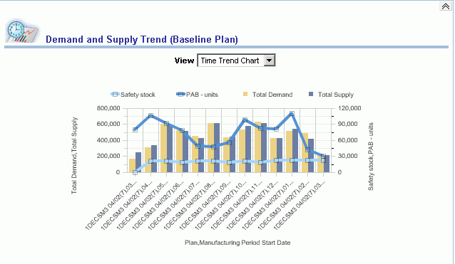
In addition to the page-level filters at the top of the page, users can specify this filter for the report:
| Field | Description |
|---|---|
| View | Select how you would like to view the report. Options include: Time Trend Chart and Time Trend Table. The Time Trend Chart view plots the measures over plans using a line graph and bar chart. The Time Trend Table view provides the values that correspond to the Time Trend Chart view. |
Additional reports that can be accessed from the Demand and Supply Trend (Baseline Plan) report are (listed in alphabetical order):
-
Exceptions Summary.
-
Days of Cover by Organizations.
-
Total Demand by Customers.
-
Total Supply by Categories.
-
WIP Start by Organizations.
The ASCP Workbench - Items link takes the user directly to the Advanced Supply Chain Planner Workbench.
Total Demand by Customers (Baseline Plan)
The Total Demand by Customers (Baseline Plan) report displays total demand by customer in a bar chart or table format.
This report shows data for the plan selected as the baseline plan in the page filters. By default, the report displays the top 10 customers. Using the MSC: Value of N for all top/bottom-N reports in Dashboards profile, the user can adjust the number of top customers displayed.
You can access this report from multiple locations.
To access this report from the Plan Health Summary page:
-
Select the Supply Chain Analyst responsibility.
-
Select the Supply Chain Analyst Dashboard.
-
Select the Total Demand value link from the Demand and Supply Summary report.
To access this report from the Demand and Supply page:
-
Select the Supply Chain Analyst responsibility.
-
Select the Supply Chain Analyst Dashboard.
-
Select Demand and Supply tab.
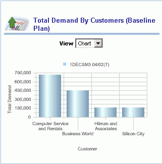
In addition to the page-level filters at the top of the page, users can specify this filter for the report:
| Field | Description |
|---|---|
| View | Select how you want to view the report. Options include Chart and Table. The Chart view plots total demand for each customer using a bar graph. The Table view provides the values that correspond to the Chart view. |
An additional report that you can access from the Total Demand by Customers (Baseline Plan) report is the Demand and Supply Trend within a Plan report. The ASCP Workbench - Supply and Demand Detail link takes the user directly to the Advanced Supply Chain Planner Workbench.
Total Supply by Categories (Baseline Plan)
The Total Supply by Categories (Baseline Plan) displays total supply by item category in a bar chart or table format.
This report shows data for the plan selected as the baseline plan in the page filters. By default the report displays the top ten categories. Using the MSC: Value of N for all top/bottom-N reports in Dashboards profile, the user can adjust the number of top categories displayed.
You can access this report from multiple locations.
To access this report from the Plan Health Summary page:
-
Select the Supply Chain Analyst responsibility.
-
Select the Supply Chain Analyst Dashboard.
-
Select the Total Supply value link from the Demand and Supply Summary report.
To access this report from the Demand and Supply page:
-
Select the Supply Chain Analyst responsibility.
-
Select the Supply Chain Analyst Dashboard.
-
Select the Demand and Supply tab.
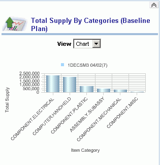
In addition to the page-level filters at the top of the page, users can specify this filter for the report:
| Field | Description |
|---|---|
| View | Select how you want to view the report. Options include Chart and Table. The Chart view plots total supply for each category using a bar graph. The Table view provides the values that correspond to the Chart view. |
An additional report that you can access from the Total Supply by Categories report is the Demand and Supply Trend within a Plan report. The ASCP Workbench - Supply and Demand Detail link takes the user directly to the Advanced Supply Chain Planner Workbench.
Excess and Obsolescence
This section describes the excess and obsolescence analyses that are available through the Supply and Demand page of the SCA Dashboard. It discusses the following reports:
-
Excess and Obsolescence Summary
-
Excess Details
-
Obsolescence Details
-
Excess Details Across Plans
-
Obsolescence Details Across Plans
In addition to the Excess and Obsolescence reports, two fields in the Item Attributes Mass Maintenance window, Excess Horizon Days and Obsolescence Date, help capture the excess and obsolescence horizons. These fields indicate the horizon that is used in the computation of Excess and Obsolescence. Excess Horizon Days is a number field while Obsolescence Date is a date field with the format DDMONYY. For example, 12JUN10 is June 12th, 2010.
The selection of a plan option triggers the summarization of Excess Horizon Days and Obsolescence Date from the Item Attributes Mass Maintenance to APCC schema as part of the archive workflow. It also triggers the computation of Excess and Obsolescence. The plan type and the corresponding plan option are shown in the table below:
| S. No | Plan Type | Plan Option |
| 1 | Advanced Supply Chain Planning | Calculate Key Performance Indicators |
| 2 | Service Parts Planning | Calculate Key Performance Indicators |
| 3 | Distributed Replenishment Planning | Calculate Key Performance Indicators |
| 4 | Rapid Planning | Expose in Planning Analytics |
Excess and Obsolescence Reports
This section describes the Excess and Obsolescence Reports. The diagram below shows the reports and their associated drill-downs from the Total Excess or Total Obsolescent reports:
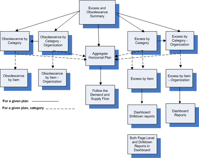
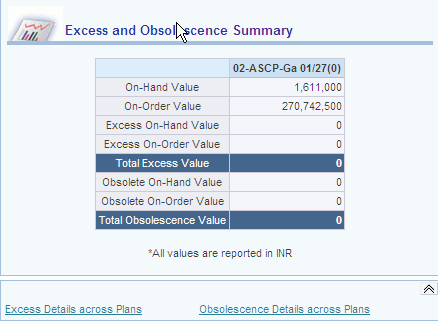
Excess and Obsolescence Summary Report
The Excess and Obsolescence Summary report compares the excess and obsolescence measures across plans. It is viewed by plan in table format. The following measures provide this information:
-
On Hand
-
On Order
-
Excess On Hand
-
Excess On Order
-
Total Excess
-
Obsolete On Hand
-
Obsolete On Order
-
Total Obsolescence
Note: All the facts in the Excess and Obsolescence Summary report are shown in equivalent dollars. You may want to render the report in the selected reporting currency.
The Excess and Obsolescence Summary report has drill downs to the following reports:
-
Excess Details
-
Obsolescence Details
-
Excess Details Across Plans
-
Obsolescence Details Across Plans
-
Total Excess (value)
An example of the layout of the Excess and Obsolescence Summary report is shown below:
Excess and Obsolescence Summary Report Drill Downs
This section explains the drilldown reports that are available from the Excess and Obsolescence Summary Report.
The Excess Details report provides details about the excess measures by Category, Organization and Category-Organization for the baseline or compare plan. The report is a TopN report and is viewed in table format. The information is provided in the following measures:
-
On Hand
-
On Order
-
Demand within Excess Horizon
-
Excess On Hand
-
Excess On Order
-
Total Excess
-
Excess On Order (value)
-
Total Excess (value)
Note: The report on the main page is a Top-N report for the Baseline Plan. If it is a drilldown report, then it is not a Top-N report.
The definition and computation details of key facts are given below:
On Order is the sum of scheduled receipts within the plan horizon. Scheduled receipts include: in receiving, in transit, purchase orders, purchase requisitions, internal requisitions, and work orders.
Demand within Excess Horizon is the cumulative demand in the supply chain over the excess horizon. The demand includes: Forecasts, Sales Orders, Dependent Demand, and Other Demands. The excess horizon is defined as the period between Plan Current and Plan Current plus Excess Horizon Days.
Excess Horizon = Plan Current, Plan Current + Excess Horizon Days
where:
Dependent Demand is the sum of all demands at intermediate level in the supply chain and Other Demand is any residual demand that may exist in the chain that is not of Order type FORECAST or SALES ORDER.
Excess On Hand is the difference between On Hand Inventory and Demand within Excess Horizon as given below:
Max{On Hand – Demand within Excess Horizon, 0}
Excess On Hand (value): It is computed as:
Excess On Hand * Item Standard Cost
Excess On Order is the difference between On Order Inventory and Demand within Excess Horizon as given below:
Max{On Order– Demand within Excess Horizon, 0}
Excess On Order (value) is computed as: Excess On Order * Item Standard Cost
Excess On Order * Item Standard Cost
Total Excess is sum of excess computed from On Hand and On Order
Total Excess (value): is the excess quantity computed in equivalent currency as given below:
Total Excess * Item Standard Cost
Some thoughts to keep in mind when using the Excess Details report are:
-
The report is sorted by Total Excess in descending order of Category, Organization, or Category-Organization.
-
You can display the report in currency of choice (reporting currency).
-
Excess at the category-organization level is equal to the sum of excess for all item-organizations within that category-organization.
-
You can select the choice of viewing by Category, Organization or Category-Organization.
-
This is a report by Total Excess based on the view type. It is a Top-N report on the main tab for the Baseline Plan and, as a drilldown report, it is sorted by Total Excess.
The Obsolescence Details report provides details about the obsolescence measures by Category, Organization or Category-Organization for the baseline or compare plan. The information is provided by the following measures:
-
On Hand
-
On Order
-
Demand within Obsolescence Horizon
-
Obsolete On Hand
-
Obsolete On Order
-
Total Obsolescence
-
Obsolete On Order (value)
-
Total Obsolescence (value)
The drilldown reports supported include:
| S. No | Drill Down Report | Click From: | Context |
| 1 | Aggregate Horizontal Plan | Total Obsolescence | Plan, Category, Organization |
| 2 | Item Attribute Mass Maintenance window | Item | Plan, Item, Organization |
Note: The report on the main page is a Top-N report for the Baseline Plan. If it is a drilldown report, then it is not a Top-N report.
The definition and computation details of key facts are given below:
On Order is the sum of scheduled receipts within the plan horizon. Scheduled receipts include: in receiving, in transit, purchase orders, purchase requisitions, internal requisitions, and work orders.
Demand within Obsolescence Horizon is the cumulative demand in the supply chain over the obsolescence horizon. The demand includes: Forecasts, Sales Orders, Dependent Demand, and Other Demands. The obsolescence horizon is defined as the period between Plan Current and End of Obsolescence Date.
Obsolescence Horizon = Plan Current, Obsolescence Date
where:
Dependent Demand is the sum of all demands at intermediate level in the supply chain and Other Demand is any residual demand that may exist in the chain that is not of Order type FORECAST or SALES ORDER .
Obsolete On Hand: It is the difference between On Hand and Demand within Obsolescence Horizon as given below:
Max{On Hand – Demand within Obsolescence Horizon, 0}
Obsolete On Hand (value) is computed as:
Obsolete On Hand * Item Standard Cost
Obsolete On Order is the difference between On Order and Demand within Obsolescence Horizon as given below:
Max{On Order – Demand within Obsolescence Horizon, 0}
Obsolete On Order (value) is computed as
Obsolete On Order * Item Standard Cost
Total Obsolescence is sum of obsolescence computed from On Hand and On Order.
Total Obsolescence (value is the obsolescence quantity computed in equivalent currency as given below:
Total Obsolescence * Item Standard Cost
Some thoughts to keep in mind when using the Obsolescence Details report are:
-
The report is sorted by Total Obsolescence in descending order of Category, Organization or Category-Organization.
-
You can display the report in currency of choice (reporting currency).
-
Obsolescence at the category-organization level is equal to the sum of Obsolescence for all item-organizations within that category-organization.
-
You can select the choice of viewing by Category, Organization or Category-Organization.
-
This is a report by Total Obsolescence based on the view type. This is a Top-N report on the main tab for the Baseline Plan and as a drilldown report it is sorted by Total Obsolescence.
Excess Details Across Plans Report
The Excess Details Across Plans report provides details about the excess measures by Category, Organization, and Category-Organization across plans. This lets you compare the excess quantity by category across plans. The report is in table format. The report includes the following measures:
-
On Hand
-
On Order
-
Demand Within Excess Horizon
-
Excess On Hand
-
Excess On Order
-
Total Excess
-
Excess On Order (value)
-
Total Excess (value
The drilldown reports supported include:
| S. No | Drill Down Report | Click From: | Context |
| 1 | Aggregate Horizontal Plan | Total Excess | Plan, Category, Organization |
| 2 | Item Attribute Mass Maintenance window | Item | Plan, Item, Organization |
Some thoughts to keep in mind when using the Excess Details Across Plans report are:
-
The report should be sorted by Total Excess in descending order of Category, Organization or Category-Organization.
-
Ability to display the report in currency of choice (reporting currency).
-
Excess at the category-organization level is equal to the sum of excess for all item-organizations within that category-organization.
-
Ability to select the choice of viewing by Category, Organization or Category-Organization.
Obsolescence Details Across Plans
The Obsolescence Details Across Plans report provides details about the obsolescence measures by Category, Organization or Category-Organization across plan. This lets you compare the obsolescence quantity by category across plans. The report is in table format. The report includes the following measures:
-
On Hand
-
On Order
-
Demand Within Obsolescence Horizon
-
Obsolete On Hand
-
Obsolete On Order, Total Obsolescence
-
Obsolete On Order (value)
-
Total Obsolescence (value)
The drilldown reports supported include:
| S. No | Drill Down Report | Click From: | Context |
| 1 | Aggregate Horizontal Plan | Total Obsolescence | Plan, Category, Organization |
| 2 | Item Attribute Mass Maintenance window | Item | Plan, Item, Organization |
Some thoughts to keep in mind when using the Obsolescence Details Across Plans report are:
-
The report is sorted by Total Obsolescence in descending order of Category, Organization or Category-Organization.
-
You can display the report in currency of choice (reporting currency).
-
Obsolescence at the category-organization level is equal to the sum of Obsolescence for all item-organizations within that category-organization.
-
You can select the choice of viewing by Category, Organization or Category-Organization.
-
This is a report by Total Obsolescence based on the view type. This is a Top-N report on the main tab for the Baseline Plan and as a drilldown report it is sorted by Total Obsolescence.
The Excess by Item report shows the amount of excess available at an Item level in the supply chain. This helps you make better decisions on buying and also making effective substitution strategies. The report is in table format. The information is provided in the following measures:
-
On Hand
-
On Order
-
Demand within Excess Horizon
-
Excess On Hand
-
Excess On Order
-
Total Excess
-
Excess On Order (value)
-
Total Excess (value)
The definition and computation details of key facts are given below:
On Order is the sum of scheduled receipts within the plan horizon. Scheduled receipts include: in receiving, in transit, purchase orders, purchase requisitions, internal requisitions, and work orders.
Demand within Excess Horizon is the cumulative demand in the supply chain over the excess horizon. The demand includes: Forecasts, Sales Orders, Dependent Demand, and Other Demands. The excess horizon is defined as the period between Plan Current and Plan Current plus Excess Horizon Days.
Excess Horizon = Plan Current, Plan Current + Excess Horizon Days
Excess On Hand (value) is computed as:
Excess On Hand * Item Standard Cost
Excess On Hand is the difference between On Hand Inventory and Demand within Excess Horizon as given below:
Max{On Hand – Demand within Excess Horizon, 0}
Excess On Order is the difference between On Order Inventory and Demand within Excess Horizon as given below:
Max{On Order– Demand within Excess Horizon, 0}
Excess On Order (value) is computed as:
Excess On Order * Item Standard Cost
Total Excess is sum of excess computed from On Hand and On Order.
Total Excess (value): It is the excess quantity computed in equivalent currency as given below:
Total Excess * Item Standard Cost
In generating the Excess by Item report, you can:
-
Generate the report for certain items only.
-
Generate reports respecting the user security model
-
Display the report in currency of choice (reporting currency).
-
4. Sort the report in descending order of Total Excess.
This report details the amount of obsolescence available at an Item level in the supply chain. Obsolescence is a special flavor of excess in that the horizon date at which difference in Inventory and Demand is taken is not dictated by business policy, but rather by the obsolescence date of item. The information is provided by the following measures:
-
On Hand
-
On Order
-
Demand Within Obsolescence Horizon
-
Obsolete On Hand
-
Obsolete On Order
-
Total Obsolescence
-
Obsolete on Hand (value
-
Obsolete on Order (value)
-
Total Obsolescence (value)
The definition and computation details of key facts are given below:
On Order is the sum of scheduled receipts within the plan horizon. Scheduled receipts include: in receiving, in transit, purchase orders, purchase requisitions, internal requisitions, and work orders.
Demand within Obsolescence Horizon is the cumulative demand in the supply chain over the obsolescence horizon. The demand includes: Forecasts, Sales Orders, Dependent Demand, and Other Demands. The obsolescence horizon is defined as the period between Plan Current and End of Obsolescence Date.
Obsolete On Hand is the difference between On Hand and Demand within Obsolescence Horizon as given below:
Max{On Hand – Demand within Obsolescence Horizon, 0}
Obsolete On Hand (value) is computed as:
Obsolete On Hand * Item Standard Cost
Obsolete On Order is the difference between On Order and Demand within Obsolescence Horizon as given below:
Max{On Order – Demand within Obsolescence Horizon, 0}
Obsolete On Order (value): It is computed as:
Obsolete On Order * Item Standard Cost
Total Obsolescence is sum of obsolescence computed from On Hand and On Order
Total Obsolescence (value) is the obsolescence quantity computed in equivalent currency as given below:
Total Obsolescence * Item Standard Cost
In generating the Obsolescence by Item report, you can:
-
Generate the report only for selected items.
-
Generate reports respecting the user security model.
-
Display the report in currency of choice (reporting currency).
-
Sort the report in descending order of Total Obsolescence.
Rapid Planning Supply Demand Plan Drilldowns
The Supply Demand Plan in Rapid Planning is accessible from the following APCC reports:
-
Demand and Supply Totals by Category
-
Demand and Supply Totals by Organization
-
Total Demand by Organization
-
Total Demand by Customers
-
Total Supply by Category
-
Days of Cover by Organization
-
WIP Start Trend
-
Aggregate Horizontal Plan
-
Detailed Horizontal Plan
-
Change in Demand by Customers
The context that must be passed to Rapid Planning is one of the following:
-
Plan, Item
-
Plan, Item, Organization
-
Plan, Organization
An example of the supply demand plan is shown below:
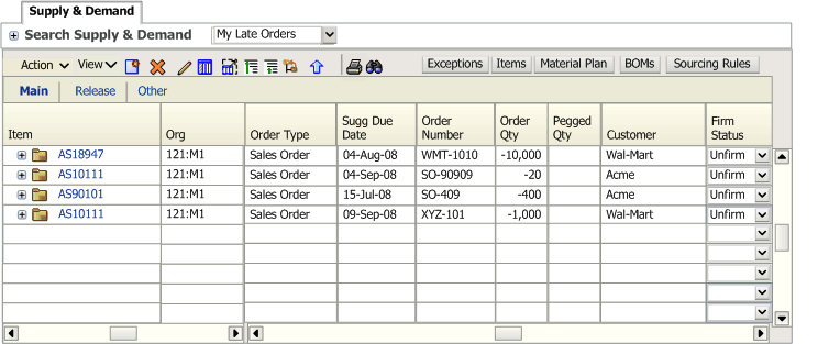
The exceptions and resource plan views are similar to the Supply & Demand report. When you click on the exceptions tab, you go to the Exceptions view; the Resource Plan is similar to the Supply Demand view.
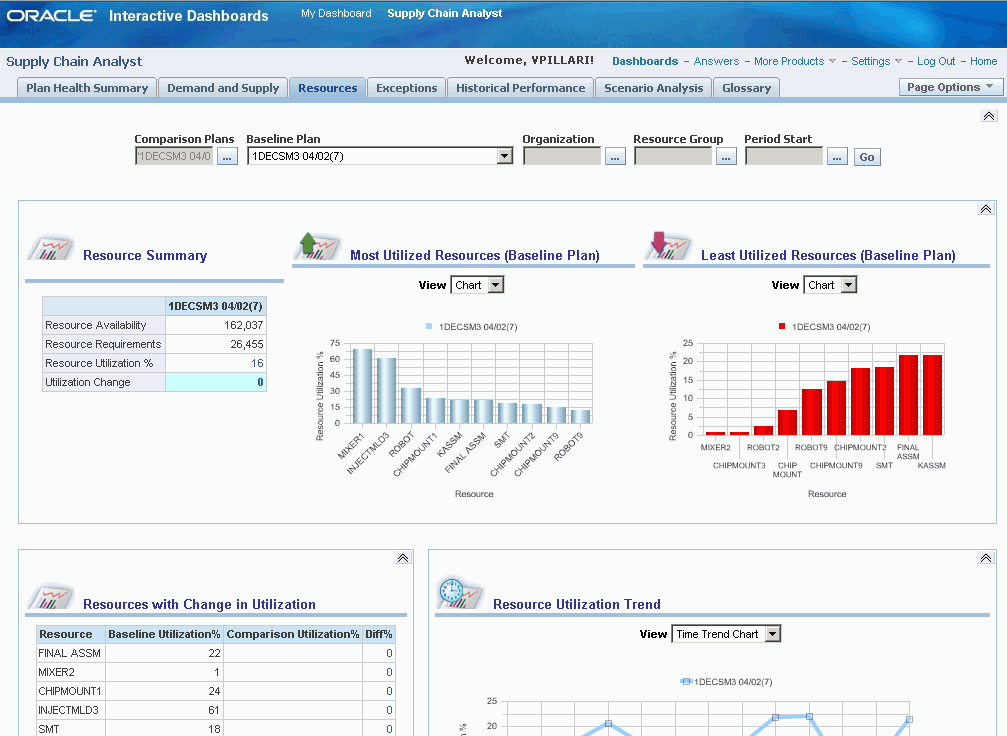
Using the Resources Page
This section provides an overview of the Resources page and discusses:
-
Page-Level filters.
-
Resource Summary.
-
Most Utilized Resources (baseline plan).
-
Least Utilized Resources (baseline plan).
-
Resources with Change in Utilization.
-
Resource Utilization Trend.
-
Rapid Planning Resource Plan drill-downs
Understanding the Resources Page
The Resources page enables the supply chain analyst to evaluate how resource utilization has changed from one plan to another.
Page-Level Filters
Page-level filters are provided at the top of the page to filter the results of all reports.
This table lists the page-level filters for the Resources page:
| Filter | Description |
|---|---|
| Comparison Plans | Select from a list of comparison plans. Multiple plans can be selected. This is a required field. |
| Baseline Plan | Select from a list of plans to use as a baseline. Only one plan can be selected. This is a required field. |
| Organization | Select from a list of organizations. Multiple organizations can be selected. This is an optional field. |
| Resource Group | Select from a list of resource groups. Multiple resource groups can be selected. This is an optional field. |
| Period Start | Select from a list of date and time selections. A range of date and time can be selected. This is an optional field. |
Resource Summary
The Resource Summary report enables the user to determine how resource utilization varies between baseline and comparison plans.
To view the Resource Summary report, see Understanding the Resources Page
Additional reports that you can access from the Resource Summary report are (listed in alphabetical order):
-
Least Utilized Resources.
-
Most Utilized Resources.
Click Resource Utilization % to access these reports:
-
Exception Summary.
-
Resource Utilization by Organizations.
-
Resource Utilization by Resource Groups.
Most Utilized Resource (Baseline Plan)
The Most Utilized Resource (Baseline Plan) report enables the user to view the resources that are used the most for the baseline plan.
This report shows data for the plan selected as the baseline plan in the page filters. By default, the report displays the top 10 resources. Using the MSC: Value of N for all top/bottom-N reports in Dashboards profile, the user can adjust the number of top resources displayed.
To view the Most Utilized Resource Baseline Plan report, see Understanding the Resources Page
In addition to the page leve-filters at the top of the page, users can specify this filter for the report:
| Field | Description |
|---|---|
| View | Select how you want to view the report. Options include Chart and Table. The Chart view plots resource utilization for each resource using a bar graph. The Table view provides the values that correspond to the Chart view. |
An additional report that you can access from the Most Utilized Resources (Baseline Plan) report is the Resource Utilization Trend report. The ASCP Workbench – Resources link takes the user directly to the Advanced Supply Chain Planner Workbench.
Least Utilized Resources (Baseline Plan)
The Least Utilized Resource (Baseline Plan) report enables the user to view the resources that are used the least for the baseline plan.
This report shows data for the plan selected as the baseline plan in the page filters. By default, the report displays the bottom 10 resources. Using the MSC: Value of N for all top/bottom-N reports in Dashboards profile, the user can adjust the number of resources displayed.
To view the Least Utilized Resource Baseline Plan report, see Understanding the Resources Page
In addition to the page-level filters at the top of the page, users can specify this filter for the report:
| Field | Description |
|---|---|
| View | Select how you want to view the report. Options include Chart and Table. The Chart view plots resource utilization for each resource using a bar graph. The Table view provides the values that correspond to the Chart view. |
An additional report that you can access from the Least Utilized Resources (Baseline Plan) report is the Resource Utilization Trend report. The ASCP Workbench – Resources link takes the user directly to the Advanced Supply Chain Planner Workbench.
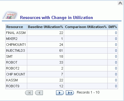
Resources with Change in Utilization
Utilization varies, for each resource, between baseline and comparison plans.
The difference in utilization percent for each resource between the two plans is computed as a percentage and the percentage is sorted in descending order. By default the report displays the top 10 resources with the most change. Using the MSC: Value of N for all top/bottom-N reports in Dashboards profile, the user can adjust the number of top resources displayed.
Resource Utilization Trend
The Resources Utilization Trend report enables the user to determine how resources are used over time and whether the trend has changed between the baseline and comparison plans.
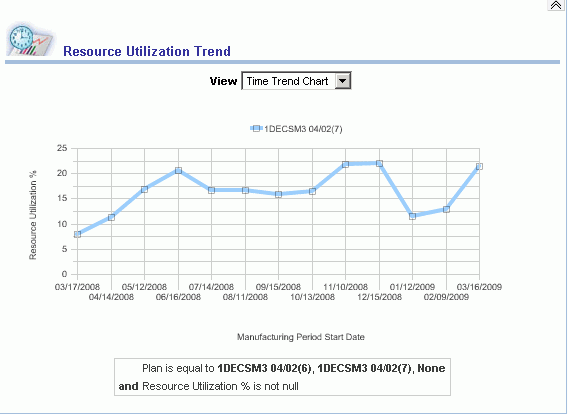
In addition to the page-level filters at the top of the page, users can specify this filter for the report:
| Field | Description |
|---|---|
| View | Select how you want to view the report. Options include Time Trend Chart and Time Trend Table. The Chart view plots resource utilization over manufacturing period start dates using a line graph. The Table view provides the values that correspond to the Chart view. |
Additional reports that you can access from the Resource Utilization Trend report are (listed in alphabetical order):
-
Exception Summary.
-
Least Utilized Resources.
-
Most Utilized Resources.
-
Resource Utilization by Organizations.
-
Resource Utilization by Resource Groups.
Rapid Planning Resource Plan Drilldowns
The Resource Plan in Rapid Planning is accessible from the following APCC reports:
-
Resource Utilization by Resource Groups
-
Resource Utilization by Organization
-
Resource Utilization by Department
-
Most Utilized Resources
-
Least Utilized Resources
-
Resources with Change in Utilization
The context that needs to be passed to Rapid Planning is one of the following:
-
Plan, Resource
-
Plan, Department, Resource
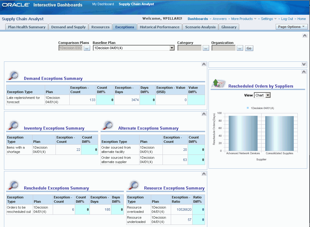
Using the Exceptions Page
This section provides an overview of the Exceptions page and discusses:
-
Page-Level Filters.
-
Exceptions Summary.
-
Exceptions Summary by Category.
-
Exceptions Summary by Organization.
-
Rescheduled Orders by Suppliers.
-
Rapid Planning Exceptions Report drill-downs.
Understanding the Exceptions Page
The Exceptions page enables the supply chain analyst to analyze exceptions in a current plan and compare those exceptions against a comparison plan.
Page-Level Filters
Page-level filters are provided at the top of the page to filter the results of all reports.
This table lists the page-level filters for the Exceptions page:
| Filter | Description |
|---|---|
| Comparison Plans | Select from a list of comparison plans. Multiple plans can be selected. This is a required field. |
| Baseline Plan | Select from a list of plans to use as a baseline. Only one plan can be selected. This is a required field. |
| Category | Select from a list of categories. Multiple organizations can be selected. This is an optional field. |
| Organization | Select from a list of organizations. Multiple organizations can be selected. This is an optional field. |
| Period Start | Select from a list of date and time selections. Select from a range of dates and times. This is an optional field. |
Exceptions Summary
The Exceptions Summary reports enable the user to analyze exceptions in the baseline plan and compare exceptions between the baseline and comparison plans. The Exceptions Summary report consists of seven subreports:
-
Item Exceptions Summary.
-
Resource Exceptions Summary.
-
Demand Exceptions Summary.
-
Inventory Exceptions Summary.
-
Alternate Exceptions Summary.
-
Reschedule Exceptions Summary.
-
Resource Exceptions Summary.
To view the Exceptions Summary reports, see Understanding the Exceptions Page.
Additional reports that you can access from the Exceptions Summary reports are (listed in alphabetical order):
-
Exceptions by Categories.
-
Exceptions by Customers.
-
Exceptions by Items.
-
Exceptions by Organizations.
-
Exceptions by Suppliers.
-
Exceptions Trend.
-
Resource Utilization by Organization.
Exceptions Summary by Category
The Exceptions Summary by Category report enables the user to analyze exceptions based on an item category in the baseline plan and also compare exceptions between the baseline and comparison plans for an item category.
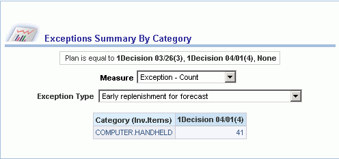
In addition to the page-level filters at the top of the page, users can specify these filters for the report:
| Field | Description |
|---|---|
| Measure | Select how you want to view the exception measure. Options include Exception – Days, Exception – Quantity, Exception – Ratio, Exception – Value, Exception – Count. |
| Exception Type | Select an exception type. Options include Early replenishment for forecast, Items with a shortage, and so on. |
Additional reports that you can access from the Exceptions Summary by Category report are (listed in alphabetical order):
-
Aggregate Horizontal Plan.
-
Detailed Horizontal Plan.
-
Exceptions Trend.
Exceptions Summary by Organization
The Exceptions Summary by Organization report enables the user to analyze exceptions based on an organization in the baseline plan and also compare exceptions between the baseline and comparison plans.
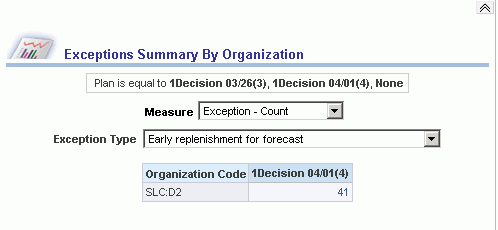
In addition to the page level-filters at the top of the page, users can specify these filters for the report:
| Field | Description |
|---|---|
| Measure | Select how you want to view the exception measure. Options include Exception – Days, Exception – Quantity, Exception – Ratio, Exception – Value, Exception – Count. |
| Exception Type | Select an exception type. Options include Early replenishment for forecast, Items with a shortage, and so on. |
Additional reports that you can access from the Exceptions Summary by Organization report are (listed in alphabetical order):
-
Aggregate Horizontal Plan.
-
Detailed Horizontal Plan.
-
Exceptions Trend.
Rescheduled Orders by Suppliers
The Rescheduled Orders by Suppliers report enables the user to analyze the number of rescheduled orders by days for suppliers.
By default the report displays the top 10 suppliers. Using the MSC: Value of N for all top/bottom-N reports in Dashboards profile, users can adjust the number of top suppliers displayed.
To view the Rescheduled Orders by Suppliers report, see Understanding the Exceptions Page.
In addition to the page-level filters at the top of the page, users can specify this filter for the report:
| Field | Description |
|---|---|
| View | Select how you want to view the report. Options include Chart and Table. The Chart view plots rescheduled orders in days for suppliers using a bar graph. The Table view provides the values that correspond to the Chart view. |
An additional report that you can access from the Rescheduled Orders by Suppliers report is the Exceptions Trend report.
Rapid Planning Exception Report Drill Downs
The Exceptions Report in Rapid Planning is accessible from the following APCC reports:
-
Exceptions Trend
-
Exceptions Type by Category
-
Exceptions Type by Supplier
-
Exceptions Type by Customer
-
Exceptions Type by Organization
-
Exceptions Type by Item
-
Exceptions Summary by Category
-
Exceptions Summary by Organization
-
Shipments to Plan by Category
-
Shipments to Plan by Organization
-
Production to Plan by Category
-
Production to Plan by Organization
-
Inventory Value by Category
-
Inventory Value by Organization
The context that needs to be passed to Rapid Planning is one of the following:
-
Plan, Exception Type
-
Plan, Exception Type, Resource
-
Plan, Exception Type, Item
-
Plan, Exception Type, Organization
-
Plan, Exception Type, Organization, Item
For details on each report, refer to the Supply Chain Analyst Dashboard section of this document
Note: Thesel downs are also applicable to ASCP Plans in the SCA dashboard in which case it the drilldown is to the ASCP workbench.
Using the Historical Performance Page
This section provides an overview of the Historical Performance page and discusses:
-
Page-Level Filters.
-
Overall Supply Chain Performance Metrics.
-
Supply Chain Metrics Trend.
-
Inventory Value by Categories.
-
Days of Cover by Categories.
-
Production to Plan by Categories.
-
Shipments to Plan by Categories.
-
Resource Utilization by Resource Groups.
Understanding the Historical Performance Page
The Historical Performance page enables the supply chain analyst to analyze the performance of the supply chain from one period to another. The user can compare the historical performance of a baseline plan to plans from previous periods.
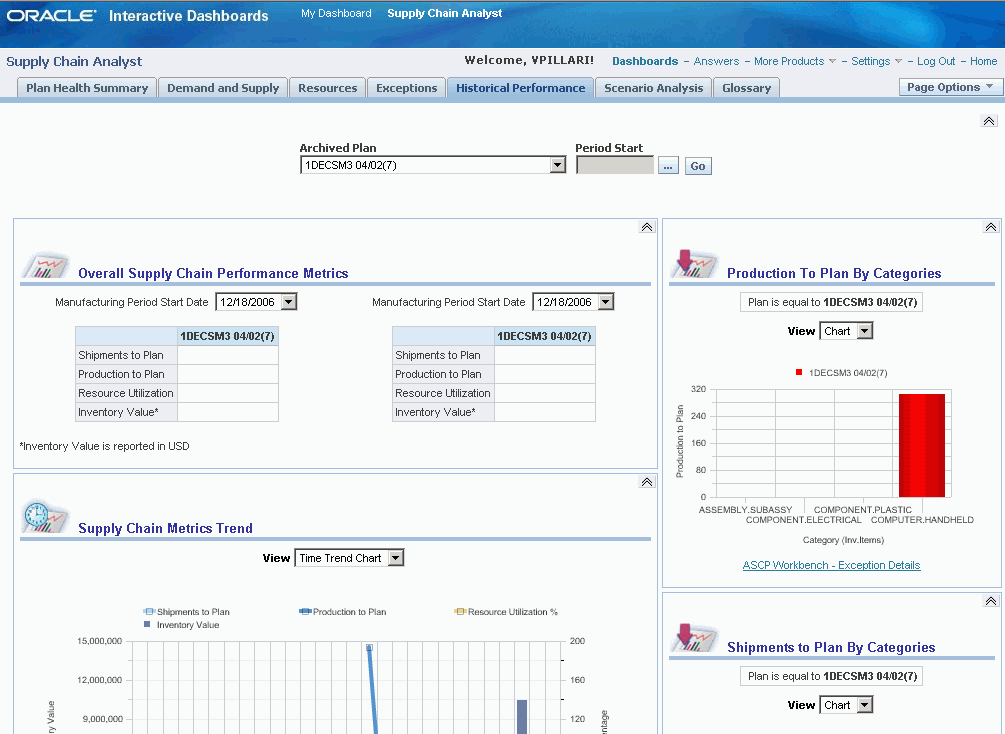
Page-Level Filters
Page-level filters are provided at the top of the page to filter the results of all reports.
This table lists the page-level filters for the Historical Performance page:
| Filter | Description |
|---|---|
| Archived Plan | Select from a list of archived plans. Only one plan can be selected. |
| Period Start | Select from a list of date and time selections. A range of date and time can be selected. |
Overall Supply Chain Performance Metrics
The Overall Supply Chain Performance Metrics report enables users to analyze performance metrics in one manufacturing period or two manufacturing periods.
To view the Overall Supply chain Performance Metrics report, see Understanding the Historical Performance Page
In addition to the page-level filters at the top of the page, users can specify this filter for the report:
| Field | Description |
|---|---|
| Manufacturing Period Start Date | Select a date to analyze or compare. |
Additional reports that you can access from the Overall Supply Chain Performance Metrics report are (in alphabetical order):
-
Exceptions Summary.
-
Inventory Value by Category.
-
Inventory Value by Organization.
-
Least Utilized Resources.
-
Most Utilized Resources.
-
Production to Plan by Category.
-
Production to Plan by Organization.
-
Resource Utilization by Resource Group.
-
Shipments to Plan by Category.
-
Shipments to Plan by Organization.
-
Total Demand by Customers.
Supply Chain Metrics Trend
The Supply Chain Metrics Trend report enables users to analyze the trends of key supply chain metrics and how these metrics are expected to perform in the future given a specific plan.
The report indicates how each supply chain metric has been performing against a plan value in the past and in the future. The report displays any metric that has a significant deviation between periods.
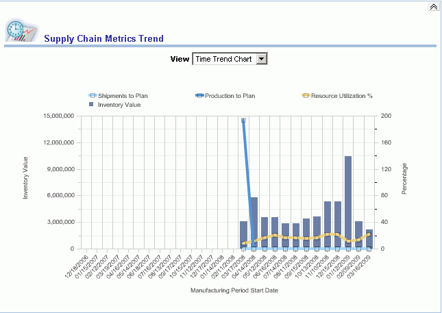
In addition to the page-level filters at the top of the page, users can specify this filter for the report:
| Field | Description |
|---|---|
| View | Select how you want to view the report. Options include Time Trend Chart and Time Trend Table. The Chart view plots inventory value, resource utilization, planned shipments, and planned production in a combination of line graphs and bar charts over time. The Table view provides the values that correspond to the Chart view. |
Additional reports that you can access from the Supply Chain Metrics Trend report are (in alphabetical order):
-
Days of Cover by Items.
-
Exception Summary.
-
Resource Utilization by Organizations.
-
Resource Utilization by Resource Groups.
-
Total Demand by Customers.
-
Total Supply by Categories.
Inventory Value by Categories
The Inventory Value by Categories report enables users to analyze inventory performance in the baseline plan. Inventory performance is displayed in terms of projected available balance at the end of a period as a monetary value.
By default, the report displays the top 10 categories with the most inventory. Using the MSC: Value of N for all top/bottom-N reports in Dashboards profile, the user can adjust the number of top categories displayed.
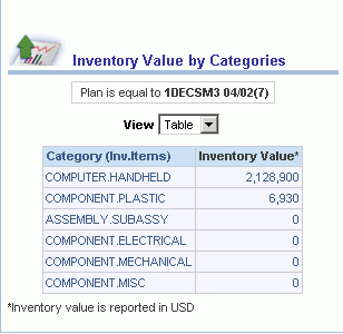
In addition to the page-level filters at the top of the page, users can specify this filter for the report:
| Field | Description |
|---|---|
| View | Select how you want to view the report. Options include Chart and Table. The Chart view plots inventory value for each category using a bar graph. The Table view provides the values that correspond to the Chart view. |
Additional reports that you can access from the Inventory Value by Categories report are (in alphabetical order):
-
Exceptions Summary by Categories.
-
Total Demand by Customers.
-
Total Supply by Category.
Days of Cover by Categories
The Days of Cover by Categories report enables users to analyze inventory performance in the baseline plan. Inventory performance is displayed in terms of projected available balance at the end of a period as days of cover.
By default, the report displays the top 10 categories. Using the MSC: Value of N for all top/bottom-N reports in Dashboards profile, the user can adjust the number of top categories displayed.
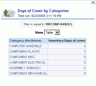
In addition to the page-level filters at the top of the page, users can specify this filter for the report:
| Field | Description |
|---|---|
| View | Select how you want to view the report. Options include Chart and Table. The Chart view plots inventory days of cover for each category using a bar graph. The Table view provides the values that correspond to the Chart view. |
Additional reports that you can access from the Days of Cover by Categories report are (in alphabetical order):
-
Top Categories by Exceptions.
-
Top Items with Most Days of Cover.
-
Top Organizations by Most Days of Cover.
Production to Plan by Categories
The Production to Plan by Categories report enables users to analyze the planned production for each category for a specific plan.
By default, the report displays the bottom 10 categories with lowest production to plan. Using the MSC: Value of N for all top/bottom-N reports in Dashboards profile, the user can adjust the number of categories displayed.
To view the Production to Plan by Categories report, see Understanding the Historical Performance Page
In addition to the page-level filters at the top of the page, users can specify this filter for the report:
| Field | Description |
|---|---|
| View | Select how you want to view the report. Options include Chart and Table. The Chart view plots planned production for each category using a bar graph. The Table view provides the values that correspond to the Chart view. |
An additional report that you can access from the Production to Plan by Categories report is the ASCP Workbench – Exception Details report.
Shipments to Plan by Categories
The Shipments to Plan by Categories report enables users to analyze the planned shipments for each category for a specific plan.
By default the report displays the bottom 10 categories with lowest shipments to plan. Using the MSC: Value of N for all top/bottom-N reports in Dashboards profile, the user can adjust the number of categories displayed.
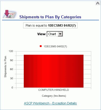
In addition to the page-level filters at the top of the page, users can specify this filter for the report:
| Field | Description |
|---|---|
| View | Select how you want to view the report. Options include: Chart and Table. The Chart view plots planned shipments for each category using a bar graph. The Table view provides the values that correspond to the Chart view. |
An additional report that you can access from the Shipments to Plan by Categories report is the ASCP Workbench – Exception Details report.
Resource Utilization by Resource Groups
The Resource Utilization by Resource Groups report enables users to analyze resource utilization for the resource groups within a plan.
By default, the report displays the top 10 resource groups. Using the MSC: Value of N for all top/bottom-N reports in Dashboards profile, the user can adjust the number of resource groups displayed.
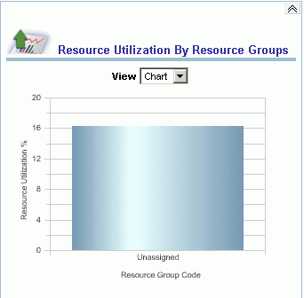
In addition to the page-level filters at the top of the page, users can specify this filter for the report:
| Field | Description |
|---|---|
| View | Select how you want to view the report. Options include Chart and Table. The Chart view plots resource utilization for each resource group using a bar graph. The Table view provides the values that correspond to the Chart view. |
An additional report that you can access from the Resource Utilization by Resource Groups report is the Resource Utilization Trend report.
Using the Scenario Analysis Page
This section provides an overview of the Scenario Analysis page and discusses:
-
Page-Level Filters.
-
Scenario Summary Report
-
Demand Pegging - Baseline Plan Report
-
Left to Book by Quarter Report
-
Plans Report
-
Demand and Supply Summary Report
-
Demand and Supply Trend Across Scenarios Report
-
Resource Summary Report
-
Resource Utilization Trend Report
-
Exception Summary Report
Understanding the Scenario Analysis Page
The Scenario Analysis page enables the supply chain analyst to analyze key metrics in the supply chain over time and how they vary from one scenario to another. The key metrics that are displayed are:
-
Demand and Supply.
-
Resources.
-
Exceptions.
Page-Level Filters
Page-level filters are provided at the top of the page to filter the results of all reports.
This table lists the page-level filters for the Scenario Analysis page:
| Filter | Description |
| Comparison Scenario | Select from a list of plans that are to be used to compare to the baseline plan. Multiple plans can be selected. This is a required field. |
| Baseline Plan | Select from a list of plans that are to be used as the baseline plan. Only one plan can be selected. This is a required field. |
| Category | Select from a list of categories. Multiple categories can be selected. This is an optional field. |
| Resource Group | Select from a list of resource groups. Multiple resource groups can be selected. This filter applies only to the resource- related reports on the page such as Resource Measures, Resource Trend Over Time, and Resource Exceptions Summary. This is an optional field. |
| Organization | Select from a list of organizations. Multiple organizations can be selected. This is an optional field |
| Period Start | Select from a list of date and time selections. A range of dates and times can be selected. This is an optional field. |
Scenario Summary Report
The Scenario Summary report is similar to the Executive Summary report on the SOP Dashboard. It contains a summary of the demand and supply metrics for the scenario, including:
-
Scenario Summary
-
Manufacturing Period Start Date
-
Measures
-
Shipment History (units)
-
Consensus Forecast (units)
-
Sales Orders (qty)
-
Constrained Forecast (units)
-
Constrained Forecast Value in Reporting Currency
-
Consensus Forecast Value in Reporting Currency
-
Shipment History Value in Reporting Currency
-
Actual Backlog Value in Reporting Currency
-
Current Shipment Plan – Derived – Formula to add Shipment History Value and Sales Order Value
-
Difference – Consensus Forecast and Shipment Plan – Derived – Formula to subtract Current Shipment Plan from Consensus Forecast Value
-
Projected Demand Fill %
-
Operating Plan Value in Reporting Currency
-
Financial Forecast Value in Reporting Currency
-
Difference % - Operating Plan and Financial Forecast – Derived – Formula to ratio Financial Plan minus Financial Forecast
Filters
Filter set for prompts for Scenario Analysis page include both the prompted comparison Scenarios and the Baseline Scenario Presentation variable SCABScenarioPV.
From the Scenario Summary Report, you can drill down to the numerous reports using the default filtering from the analysis dashboard page level prompts. At the same time, you can enable interactive changing of the prompts to further filter down the selection or expand the selection.
The table below shows the drilldown reports you can access from the Scenario Summary report and the field values from which you drill down.
| From Field Value | Drilldown Report |
| Constrained Forecast Value | Demand Pegging - Units Demand Pegging - Value |
| Shipment History Value | Bookings Performance - Units Bookings Performance - Value Shipment Performance - Units Shipment Performance - Value |
| Actual Backlog Value | Backlog Analysis – Units Backlog Analysis – Value |
| Sales Order Value | Sales Order Analysis - Units Sales Order Analysis - Value |
| Current Shipment Plan | Current Shipment Plan |
Demand Pegging - Units Report
The Demand Pegging - Units report is viewed by drilling down from the Constrained Forecast Value field in the Scenario Summary Report. It provides information about the following:
-
Scenario
-
Organization
-
Category description
-
Manufacturing week start
The following measures are available from the Demand Pegging – Units report:
-
Demand Pegged to Onhand (qty)
-
Demand Pegged to Scheduled Receipts (qty)
-
Demand Pegged to Planned Orders (qty)
Filters
The filters are the Supply Chain Analyst (SCA) Scenario prompts.
Views
The views are:
-
Title
-
Chart - Stacked bar of metrics by week
-
Pivot table
You can view the Pivot table by the following criteria:
-
Organization, Category, Measure Labels as Rows
-
Week as column
-
Demand Pegged to Onhand, Demand Pegged to Scheduled Receipts, Demand Pegged to Planned Orders as measures
Demand Pegging - Value Report
The Demand Pegging - Value report is viewed by drilling down from Constrained Forecast Value field in the Scenario Summary Report. It provides information about the following:
-
Scenario
-
Organization
-
Category description
-
Manufacturing week start
The following measure are available from the Demand Pegging - Value report:
-
Demand Pegged to Onhand – Value in Reporting Currency
-
Demand Pegged to Scheduled Receipts – Value in Reporting Currency
-
Demand Pegged to Planned Orders – Value in Reporting Currency
Filters
The filters are the SCA Scenario prompts.
Views
-
Title
-
Chart – Stacked bar of metrics by week
-
Pivot table
The Pivot table is viewed by the following criteria:
-
Organization, Category, Measure Labels as Rows
-
Week as column with totals
-
Demand Pegged to Onhand – Value in Reporting Currency, Demand Pegged to Scheduled Receipts – Value in Reporting Currency, Demand Pegged to Planned Orders – Value in Reporting Currency as measures.
Bookings Performance – Units Report
The Bookings Performance – Units report is view by drilling down from the Shipment History – Value field of the Scenario Summary report. It provides information about the following:
-
Scenario
-
Manufacturing Week Start Date
-
Category Description
The following measures are available from the Booking Performance - Units report:
-
Bookings Forecast (units)
-
Bookings History (units)
-
Filters
Filters
The filter is set from the SCA dashboard, Scenario Analysis.
Views
The views are:
-
Title
-
Column Selector – Choose View By from Category, Organization, Customer, Zone
-
Chart – Line Bar Combo – Bookings Forecast as Line and Bookings History by week as Bar
-
Pivot Table
The Pivot table is viewed by the following criteria:
-
Category and Measure Labels as Rows
-
Week as Column with Totals
-
Bookings Forecast (units) and Bookings History (units) as measures
Bookings Performance – Value Report
The Bookings Performance – Value report is view by drilling down from the Shipment History – Value field of the Scenario Summary report. It provides information about the following:
-
Scenario
-
Manufacturing week start date
-
Category description
The following measures are available from the Booking Performance - Units report:
-
Bookings Forecast – Value Reporting Currency
-
Bookings History Value Reporting Currency Filters
Filters
The filter is set from the SCA dashboard, Scenario Analysis.
Views
The views are:
-
Title
-
Column Selector – Choose View By from Category, Organization, Customer, Zone
-
Chart-Line Bar Combo. Bookings Forecast as Line and Bookings History by week as a bar. The bar and line Axis are synchronized.
-
Pivot table
The Pivot table is viewed by the following criteria:
-
Category and Measure Labels as Rows
-
Week as Column with Totals
-
Bookings Forecast (units) and Bookings History (units) as measures
Shipment Performance - Units Report
The Shipment Performance - Units report is viewed by drilling down from the Shipment History Value field in the Scenario Summary Report. It provides information about the following:
-
Scenario
-
Category description
-
Manufacturing week start
The following measures are available from the Shipment Performance – Units report:
-
Shipment Forecast (units)
-
Shipment History (units)
Filters
The filters are set from the SCA dashboard, Scenario Analysis.
Views
The views are:
-
Title
-
Column Selector – Choose View By from Category, Organization, Customer, Zone
-
Chart – Line Bar Combo – Shipment Forecast as Line and Shipment History by week as Bar. The Bar and Line axis are synchronized.
-
Pivot table
The Pivot table is viewed by the following criteria:
-
Category and Measure Labels as Rows
-
Week as Column with Totals
-
Shipment Forecast (units) and Shipment History (units) as measures
Shipment Performance – Value Report
The Shipment Performance - Value report is viewed by drilling down from the Shipment History Value field in the Scenario Summary Report. It provides information about the following:
-
Scenario
-
Category description
-
Manufacturing week start
The following measures are available from the Shipment Performance – Value report:
-
Shipment Forecast Value in Reporting Currency
-
Shipment History Value in Reporting Currency
Filters
Filters are set from the SCA dashboard, Scenario Analysis.
Views
The views are:
-
Title
-
Column Selector – Choose View By from Category, Organization, Customer, Zone
-
Chart – Line Bar Combo – Shipment Forecast Value in Reporting Currency as Line and Shipment History Value in Reporting Currency by week as Bar. The Bar and Line axis are synchronized.
-
Pivot table
The Pivot table is viewed by the following criteria:
-
Category and Measure Labels as Rows
-
Week as Column with Totals
-
Shipment Forecast Value in Reporting Currency and Shipment History Value in Reporting Currency as measures
Backlog Analysis - Units Report
The Backlog Analysis - Units report is viewed by drilling down from the Backlog Value field in the Scenario Summary Report. . It provides information about the following
-
Scenario
-
Category description
-
Manufacturing week start
The Actual Backlog measure is available from the Shipment Performance – Value report.
Filters
The filters are set from the SCA dashboard, Scenario Analysis.
Views
The views are:
-
Title
-
Column Selector – choose View By from Category, Organization, Customer, Zone
-
Chart – Stacked Bar Chart - Actual Backlog by Category by Week
-
Pivot table
The Pivot table is viewed by the following criteria:
-
Category and Measure Labels as Rows
-
Week as Column with Totals
-
Actual Backlog (units) as Measure
Backlog Analysis – Value Report
The Backlog Analysis – Value report is viewed by drilling down from the Backlog Value field in the Scenario Summary Report. It provides information about the following:
-
Scenario
-
Category description
-
Manufacturing week start
The Actual Backlog - Value Reporting Currency measure is available from the Shipment Performance – Value report.
Filters
Filter are set from the SCA dashboard, Scenario Analysis.
Views
The views are:
-
Title
-
Column Selector – choose View By from Category, Organization, Customer, Zone
-
Chart – Stacked Bar – Backlog by Category by Week
-
Pivot table
The Pivot table is viewed by the following criteria:
-
Category and Measure Labels as Rows
-
Week as Column with Totals
-
Actual Backlog – Value Reporting Currency as measure
Sales Order Analysis – Units
The Sales Order Analysis – Units report is viewed by drilling down from Sales Order Value field in the Scenario Summary Report. It provides information about the following:
-
Scenario
-
Category description
-
Manufacturing week start
The following measures are available from the Sales Order Analysis - Units report:
-
Sales Order – Scheduled Date (qty)
-
Sales Order – Requested Date (qty)
-
Sales Order – Promised Date (qty)
Filters
The filters are set from the SCA dashboard, Scenario Analysis.
Views
The views are:
-
Title
-
Sales Order – Scheduled Date (qty) Sales Order – Requested Date (qty) Sales Order – Promised Date (qty)
-
Chart – Stacked Bar – Sales Orders by Category by week as Bar
-
Pivot table
The Pivot table is viewed by the following criteria:
-
Category and Measure Labels as Rows
-
Week as Column with Totals
-
Sales Orders – Scheduled Date (qty), Sales Orders, Request Date, Sales Orders – Promise Date as measures
Sales Order Analysis – Value Report
The Sales Order Analysis – Value report is viewed by drilling down from Sales Order Value field in the Scenario Summary Report. It provides information about the following:
-
Scenario
-
Category description
-
Manufacturing week start
The following measures are available from the Sales Order Analysis - Units report:
-
Sales Order – Scheduled Date - Value in reporting currency
-
Sales Order – Requested Date - Value in reporting currency
-
Sales Order – Promised Date - Value in reporting currency
Filters
Filters are set from the SCA dashboard, Scenario Analysis.
Views
The views are:
-
Title
-
Column Selector – Choose View By from Category, Organization, Customer, Zone
-
Chart – Stacked Bar – Sales Order Value by Category by week as Bar
-
Pivot table
The Pivot table is viewed by the following criteria:
-
Category and Measure Labels as Rows
-
Week as Column with Totals
-
Sales Orders - Scheduled Date - Value in Reporting Currency, Sales Orders - Request Date - Value in Reporting Currency, Sales Orders - Promise Date - Value in Reporting Currency as measures
Current Shipment Plan Report
The current shipment plan measure combines period to date shipment history and sales orders (backlog) scheduled to ship in the period. It expresses how much of the forecast or revenue target is already covered by booked orders that may or may not have yet shipped. A comparison of this measure to the forecast becomes how much is “left to book” to meet the forecast.
The Current Shipment Plan report is viewed by drilling down from the Current Shipment Plan in the Scenario Summary Report. It provides information about the following:
-
Scenario
-
Organization
-
Category Description
-
Manufacturing Week Start date
The following measures are available from the Current Shipment Plan report:
-
Shipment History – value in Reporting Currency
-
Sales Orders – Value in Reporting Currency
-
Consensus Forecast – value in Reporting Currency
-
Derived Measure – Current Shipment Plan – sum of Shipment History and Sales Orders
-
Derived Measure – Difference – Forecast and Shipment Plan. Consensus forecast minus current shipment plan
Filters
The filters are the SCA Scenario Analysis prompts.
Views
The views are:
-
Title
-
Pivot table
-
Organization, Category, Measure Labels as Rows
-
Week as Column with Totals
-
Shipment History Value, Sales Order Value, Current Shipment Plan, Consensus Forecast value, Difference Forecast and Shipment Plan, Cumulative Difference Forecast and Current Shipment Plan as measures
Demand Pegging – Baseline Plan Report
The Demand Pegging - Baseline Plan report provides information about the scenario.
-
Demand Pegged to On Hand – Value in Reporting Currency
-
Demand Pegged to Scheduled Receipts – Value in Reporting Currency
-
Demand Pegged to Planned Orders – Value in Reporting Currency
An example of the Demand Pegging - Baseline Plan report is shown below:
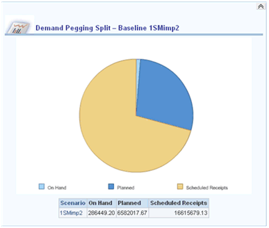
Filters
The filters are the SCA Scenario prompts that are adjusted to select the Baseline Scenario.
Views
The views are:
-
Title: Custome title with Presentation Variable for Baseline Scenario and Demand Utilization Split – Baseline @{SCABScenarioPV}
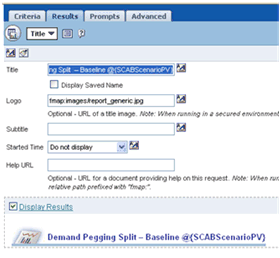
-
Chart, pie chart of measures
-
Table
Left to Book by Quarter Report
The Left to Book by Quarter report provides information about the following:
-
Scenario Name - Baseline Scenario
-
Fiscal Quarter Start Date
The following measures are available from the Left to Book by Quarter Report:
-
Consensus by Forecast – Value in Reporting Currency
-
Sales Orders – Value in Reporting Currency
-
Shipment History – Value in Reporting Currency
Filters
The filters are SCA Scenario prompts, adjusted to prompted Baseline Scenario.
Views
The views are:
-
Title: Custom title to insert presentation variable for baseline scenario
-
Chart: combined line/bar chart
-
Quarter as Axis
-
Sales Order Value and Shipment History Value as stacked bar
-
Consensus Forecast Value as Line
-
Line and Bar axis synchronized
Plans Report
The Plans report provides information about:
-
Scenario
-
Plan
-
Formula on column to provide link to ASCP or Rapid Planning
Filters
The filters capture prompted comparison scenarios and prompted baseline scenario.
Views
The views are:
-
Title
-
Table: a simple table of scenario and plan
Demand and Supply Summary Report
The Demand and Supply Summary report on the Scenario Analysis page is exactly like the Demand and Supply Summary report on the Demand and Supply page with one exception. The former enables the user to determine how demand and supply is different between a baseline and comparison scenario.
Demand and Supply Trend Across Scenarios Report
The Demand and Supply Trend Across Scenarios report on the Scenario Analysis page is similar to the Demand and Supply Trend Across Plans report on the Demand and Supply page with one exception. The former report enables the user to evaluate the trends of demand and supply over time and whether the trends change between the baseline and comparison scenarios.
See Demand and Supply Trend Across Plans
Navigations:
From Total Demand:
-
Demand Pegging – Units
-
Demand Pegging – Value
From Total Supply
-
Supply Utilization – Units
-
Supply Utilization – Value
Supply Utilization – Units Report
The Supply Utilization – Units report provides information about:
-
Scenario
-
Organization
-
Category Description
-
Manufacturing Week Start
The following measures are available from the Supply Utilization – Units report:
-
Supply End Pegged to Sales Orders (qty)
-
Supply End Pegged to Forecasts (qty)
-
Supply End Pegged to Safety Stocks (qty)
-
Supply End Pegged to Excess (qty)
Filters
The filters are the SCA Scenario prompts expressed as filters.
Views
The views are:
-
Title
-
Chart – stacked bar of metrics by week
-
Pivot table
You can view the Pivot table by the following criteria:
-
Organization, Category, Measure Labels as Rows
-
Week as column with totals
-
Supplies End Pegged to Sales Orders, Supplies End Pegged to Forecasts, Supplies End Pegged to Safety Stocks, Supplies End Pegged to Excess as measures
Supply Utilization – Value Report
The Supply Utilization – Value report provides information about the following:
-
Scenario
-
Organization
-
Category Description
-
Manufacturing week start
The following measures are available from the Supply Utilization – Value report:
-
Supplies End Pegged to Sales orders – value in reporting currency
-
Supplies End Pegged to Forecasts – value in reporting currency
-
Supplies End Pegged to Safety Stocks – value in reporting currency
-
Supplies End Pegged to Excess – value in reporting currency
Filters
The filters are the SCA Scenario prompts.
Views
The views are:
-
Title
-
Chart, stacked bar of metrics by week
-
Pivot table
The Pivot table can be viewed by the following criteria:
-
Organization, Category, Measure Labels as Rows
-
Week as column with totals
-
Supplies End Pegged to Forecasts – Value in Reporting Currency, Supplies End Pegged to Forecasts, Value in Reporting Currency, Supplies End Pegged to Safety Stocks – Value in Reporting Currency, Supplies End Pegged to Excess – Value in Reporting Currency as measures
Resource Summary Report
The Resource Summary report on the Scenario Analysis page is exactly like the Resource Summary report on the Resources page with one exception. The former enables the user to determine how resource utilization varies between baseline and comparison scenarios.
See Resource Summary
Resource Utilization Trend Report
The Resource Utilization Trend report on the Scenario Analysis page is exactly like the Resource Utilization Trend report on the Resources page with one exception. The former enables the user to determine how resources are used over time and whether the trend has changed between baseline and comparison scenarios.
See Resource Utilization Trend
Exception Summary
The Exception Summary report on the Scenario Analysis page is exactly like the Exception Summary report on the Exceptions page with one exception. The former enables the user to analyze exceptions in the baseline scenario and compare exceptions between the baseline and comparison scenarios.
Using the Inventory Analysis Page
The Inventory Analysis page allows supply chain analysts to efficiently evaluate how inventory attributes and parameters vary from plan to plan and within a plan. You can make inventory decisions using APCC. All reports are provided in the reporting currency.
All reports are provided in the reporting currency.
An example of the top portion of the Inventory Analysis page is shown below. Addition reports are available by scrolling down the page.
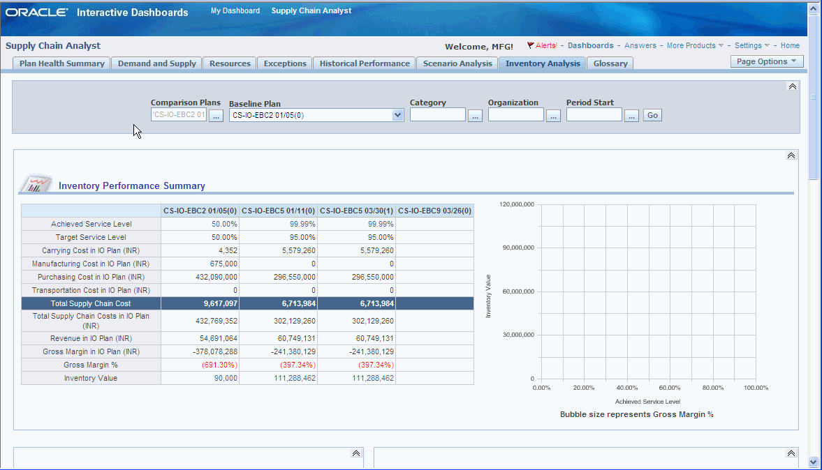
Page-Level Filters
Page level filters are provided at the top of the page to filter the results of all reports.
This table lists the page-level filters for the Inventory Analysis page.
| Filter | Description |
| Baseline Plan | Select from a list of plans that are to be used as the baseline plan. Only one plan can be selected. This is a required field. |
| Comparison Plan | Select from a list of plans that are to be used to compare to the baseline plan. You can select multiple plans from this list. |
| Category | Select from a list of categories. Multiple categories can be selected. This is an optional field. |
| Organization | Select for a list of organizations. Multiple organizations an be selected. This is an optional field. |
| Week Start | Select from the date range of choice over which the reports are displayed. |
Inventory Analysis Page Reports
The following diagram shows the reports available in the Inventory Analysis Page and their relationship to each other.
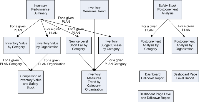
Inventory Performance Summary Report
The inventory performance summary page helps users understand the investment required to achieve a given service level and the profit that is derived from it. The following measures provide this information:
-
Achieved service level
-
Target service level
-
Carrying costs
-
Manufacturing cost
-
Purchasing cost
-
Transportation cost
-
Total supply chain cost
-
Revenue
-
Gross margin
-
Gross margin as a percentage
-
Inventory value
You can view the Inventory Performance Summary report as a table, bubble graph, or chart.
From the Inventory Summary Report, you can drill down to the following reports:
-
Inventory Value by Category
-
Inventory Value by Organization
-
Service Level Short Fall by Category
-
Inventory Budget Excess by Category
Drilldown reports are sorted by Service level shortfall, but display all categories. The Difference in service levels is given as a percentage and calculated as:
{Target Service Level – Achieved Service Level}
The graph on the Inventory Analysis page is for the Baseline Plan and the report on the dashboard page is Top-N.
Inventory Measures Trend Report
This report help analyze inventory performance using key measures of Safety Stock and Service Level. This helps users understand if achieved service level is tracking to target service level and if projected available balance is tracking to safety stock.
The report can be viewed as a table or a chart.
In generating the Inventory Measure Trend report, note the following:
-
The report is generated for the Baseline Plan
-
A link to the Inventory measures Trend by Category-Organization is available at the bottom of the report
-
The report is available in Reporting currency
-
Data is displayed in Manufacturing Periods.
An example of the Inventory measures Trend report is shown below:
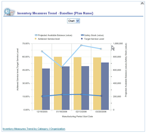
Inventory Quantity (Value) by Category Report and Inventory Quantity (Value) by Organization Report
These two reports are drill downs from the Inventory Performance Summary report and provide inventory information for a given plan. From either one of these plans, you can drill down to the Comparison of Inventory Quantity (Value) and Safety Stock.
If the drill down is from Inventory Quantity (Value) by Category report, then the resulting report is the Inventory Quantity and Safety Stock Comparison for the specific category across organizations.
If the drill down is from Inventory Quantity (Value) by Organization report, then the resulting report is the Inventory Quantity and Safety Stock Comparison for all categories in the specific organization.
Inventory Quantity (Value) as a drilldown report brings up both the Inventory Quantity (Value) by Category and Inventory Quantity (Value) by Organization reports. These are not Top-N reports.
Service Level Short Fall by Category Report
The Service Level Short Fall by Category report details the Top N categories that have the greatest difference between Achieved Service Level and Target Service Level for a given plan.
This report is a drill down from the Inventory Performance Summary report. It applies to a given plan. From this report, you can drill down to the Inventory Measures Trend by Category-Organization report, which displays information for a given plan or organization.
Some points to note when using this report are:
-
The graph on the Inventory Analysis page is for the Baseline Plan.
-
Only the report on the dashboard page is a Top-N report, if it a drilldown report, sort by Service Level Shortfall but display all categories.
-
The Difference in Service Level as a percentage is computed as:
{Target Service Level – Achieved Service Level}
An example of a Service Level Shortfall by Category report is shown below:
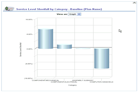
Inventory Budget Excess by Category Report
This report details the Top-N categories with the most difference between Budget and Inventory Value (Average Projected Available Balance (reporting currency) over the desired period). It helps business users understand which categories have either exceeded their budget or are way below their assigned budget values.
This report is a drill down from the Inventory Performance Summary report. An example of the report is shown below:
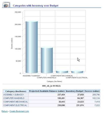
Comparison of Inventory Quantity (Reporting Currency) and Safety Stock
This report, generated for selected categories and organizations, helps you compare inventory to safety stock in value, days of cover and quantity. The report also displays a Ratio, which is useful in determining if there is adequate inventory available to meet Safety Stock. The Ratio is sorted in ascending order.
Note: Safety Stock that is used in this table is the value of the first bucket.
This report is a drill down from the Inventory Quantity (Value) by Category and the Inventory Quantity (Value) by Organization reports. You can drill down from this report to the Item-Organization level by using the inherent hierarchy of the model.
Safety Stock Postponement Analysis Report
This report details material positioning for across plans. It helps business users understand how much organizations have saved in terms of carrying cost and cost of inventory in using postponement.
From this report, you can drill down to Safety Stock Postponement Analysis by Category report and the Safety Stock Postponement Analysis by Organization report.
An example of the Safety Stock Postponement Analysis report is shown below:
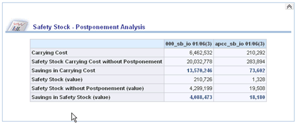
Safety Stock Postponement Analysis by Organization Report
This report details material positioning for a given plan across organizations. It helps users understand how much organizations have saved in terms of carrying cost and cost of inventory in using postponement.
Savings is calculated as:
Measure without Postponement – Measure with Postponement
This report is a drill down from the Safety Stock Postponement Analysis report. There are no drill downs from this report.
Supply Chain Analyst Secondary Drill-Down Reports
Primary reports are located on the six tabs in the Supply Chain Analyst Dashboard: Plan Health Summary, Demand and Supply, Resources, Exceptions, Historical Performance, and Scenario Analysis.
Secondary drill-down reports are reports that are accessed from the primary reports. They are often displayed in the context of where the user is drilling down from in the primary report. That is, if the user drills down from a data point in the primary report that displays the value for a product category, then the secondary report is displayed for that product category.
This table lists secondary reports for the Supply Chain Analyst Dashboard in alphabetical order:
| Report Name | Measures or Facts | Dimension or View by |
|---|---|---|
| Aggregate Horizontal Plan | Total demand, total supply, safety stock, and projected available balance (PAB) – units | Plan |
| Days of Cover by Items | Exception count (use alternate sources or use alternate suppliers) and safety stock violations | Plan or Period |
| Days of Cover by Organizations | Days of cover | Organization |
| Demand and Supply Totals by Category | Total demand, forecast sales orders, past-due backlog quantity, total supply, on hand, days of cover, and scheduled receipts | Category |
| Demand and Supply Totals by Organization | Total demand, forecast sales orders, past-due backlog quantity, total supply, on hand, days of cover, and scheduled receipts | Organization |
| Detailed Horizontal Plan | Total demand, forecast, sales order, total supply, on hand, scheduled receipts, planned orders, safety stock, PAB – units | Plan |
| Exceptions by Categories | Based on the exception type that the user selects to drill down to the trend report, which is one of: Exception Count (stock outs, use alternate sources, or use alternate suppliers), Exception Days (late sales orders, rescheduled orders), Exception Value (late sales orders), Exception Quantity (late forecast), or Safety Stock Violations | Category |
| Exceptions by Customers | Based on the exception type that the user selects to drill down to the trend report, which is one of: Exception Days (late sales orders, rescheduled orders), Exception Value (late sales orders), or Exception Quantity (late forecast) | Customer |
| Exceptions by Items | Based on the exception type that the user selects to drill down to the trend report, which is one of: Exception Count (stock outs, use alternate sources, use alternate suppliers), Exception Days (late sales orders, rescheduled orders), Exception Value (late sales orders), Exception Quantity (late forecast), or Safety Stock Violations | Item |
| Exceptions by Organizations | Based on the exception type that the user selects to drill down to the trend report, which is one of: Exception Count (stock outs), Exception Days (late sales orders, rescheduled orders), Exception Value (late sales orders), Exception Quantity (late forecast), or Safety Stock Violations | Organization |
| Exceptions by Suppliers | Based on the exception type that the user selects to drill down to the trend report, which is one of: Exception Count (use alternate sources and use alternate suppliers), or Exception Days (rescheduled orders) | Supplier |
| Exceptions Trend | Based on the exception type that the user selects to drill down to the trend report, which is one of: Exception Count (stock outs, user alternate sources, or use alternate suppliers), Exception Days (late sales orders or rescheduled orders), Exception Value (late sales orders), Exception Quantity (late forecast or resource overload), or Safety Stock Violations | Exception type |
| Least Utilized Resources | Resource availability, resource requirement, or resource utilization | Resources |
| Most Utilized Resources | Resource availability, resource requirement, or resource utilization | Resources |
| Production to Plan by Organization | Production to plan | Organization |
| Resource Utilization Trend | Resource availability, resource requirement, or resource utilization | Plan |
| Resource Utilization by Department | Resource availability, resource requirement, or resource utilization | Department |
| Resource Utilization by Organizations | Resource availability, resource requirement, or resource utilization | Organization |
| Resource Utilization by Resource Groups | Resource availability, resource requirement, or resource utilization | Resource Group |
| Shipments to Plan by Organization | Shipments to plan | Organization |
| WIP (work in progress) Start by Organizations | WIP start quantity | Organization |
The following forms in the ASCP application are accessible from the supply chain analyst dashboard:
-
Supply and Demand Detail.
-
Resources.
-
Exception Details.
-
Items.
My Open Activities
When you are logged on, the two seeded dashboards, the Supply Chain Analyst dashboard and the Sales & Operations Planning Analyst dashboard, display an alert in the top right of the page whenever overdue open activities exist. This is based on a seeded iBot that is tied to a report called My Open Activities. When you click the alert icon, the My Open Activities table displays a complete list of all open activities for which you are the primary or secondary owner.
When you click an activity name in the My Open Activities table, the activities table in the Scenario management user interface opens and displays all the details of the activity. In this location, you can update the status, owner, and other details of the activity.
See Working with Activities Working with Activities in Chapter 2 for an understanding of planning activities.