Widgets
Overview
This section describes the standard properties for the various types of objects that a user interacts with. For details on implementing these widgets, see the Oracle E-Business Suite Developer's Guide.
The topics covered in this chapter are:
General Properties
-
Each object should be displayed consistently with the same widget, prompt, and general properties everywhere the user will encounter it. Specific exceptions are noted in this chapter.
-
In forms that are designed for high speed heads-down data entry, avoid any widget which cannot be operated from the keyboard and without looking at the screen. For example, a check box can be operated from the keyboard, but the user must look at the screen to see the current value because they cannot explicitly set it to checked or unchecked.
-
Items are always sequenced left-to-right, top-to-bottom, within a region, block, or window (OMS-71005).
-
For accessibility requirements, all functionality must be available from the keyboard.
-
The colors of objects are usually controlled automatically by the Oracle look and feel. Only in exceptional cases should these be overridden.
For more information on general properties of widgets, see the Oracle E-Business Suite Developer's Guide.
Text Items
The following rules apply to text items.
Usage
-
When any text is valid.
-
When data is validated from a list that may contain more than 15 entries.
-
When a field displays textual data that the user cannot alter, but the field must support querying or scrolling.
Recommended Alignment Rules
-
Textual values should be Start aligned.
-
Date values should be Start aligned.
-
Numbers that do not display consistent precision, such as identification or phone numbers, should be Start aligned.
-
Numbers with consistent precision, such as quantities and prices, should be Right aligned.
Note: When displaying values "Right Aligned" you must ensure that the field is large enough to display the largest possible value. Right-aligned fields do not allow scrolling and numbers that are not fully visible will not display the most significant digits of the number.
Rules
-
A text item numeric field should be wide enough to display the largest possible value for the field. This ensures that the value is not truncated when displayed which could cause the value to be misread by the user. If the field is right-aligned then it must be wide enough to fully display the value. (OMS-70011)
-
A text item date field must be 1.2" wide. This allows 11 characters to be displayed plus one cell to display the bevel. (OMS-74001)
-
A text item time field must be 0.8" wide. The field can be 0.6" wide if seconds are not important. (OMS-74002)
-
A text item used as a datetime field must be 1.7" wide. (OMS-74003)
Note: For date, time, and datetime fields, masks will be read from environment variables. Never supply a format mask for these field types.
-
A text item used as a percent field may display percents with a fixed decimal point with a precision of two (preferred). (OMS-74005)
A text item used as a percent field may display percents with a floating decimal point, if extended precision is required. (OMS-74004)
-
Text items should allow mixed-case entry, unless there is a business need to enforce either upper or lower case. (OMS-74006)
-
If a text item must show multiple lines, then always enable the scroll bar and set the wrap style to "Word." (OMS-74007)
-
A text item that must fully show between 1 and 10 characters should be sized one average character wider than the maximum contents to guarantee that the contents will be fully visible. (OMS-74008)
Example: Suppose a text item must fully show three letters. The text item should then be sized to display four characters (0.4"). If the text item is sized to display only three characters, a word such as "WOW" that contains wide characters will not be fully displayed. Adding the extra character width to the field will also allow for the additional space used by the field bevels.
Cosmetics
-
All text items are displayed as follows (OMS-74009):
Height = 0.25"
Inter-row Spacing = 0.0"
Bevel = Lowered
-
[Translation] To support bidirectional languages such as Arabic which read right to left, you must use "Start" instead of "Left" when setting the alignment property. The alignment properties "Center" and "Right" can be used where appropriate. (OMS-74011)
Behaviors
-
Text items with an LOV associated with them almost always employ "Validate from List." This allows a user to type a partial value into the field, and it will autoreduce against the list of valid values.
-
A text item with an LOV associated with it automatically renders the LOV icon next to it upon taking focus.
-
Text item colors are as follows:
If editable and required, then with a yellow background.
The yellow color only appears when the item is in the current record; otherwise it has a white background.
If editable and not required, then with a white background.
If not editable, then with a gray background.
-
Text item date and datetime fields must enable the List lamp. Invoking LOV or Edit Field on these fields opens the Calendar window. (OMS-74012)
-
A multiple line text item should ideally be sequenced last in a block because of the behavior of [Tab], [Return], [Up Arrow] and [Down Arrow] within the field. (OMS-74013)
-
A text item that cannot currently be validated due to a dependency on another field, or cannot be currently entered for any other reason, must have its insert, update, and navigable properties turned off. (OMS-74014)
-
When disabling a text item, make sure that any related fields (such as a field that holds a description) are also disabled. (OMS-74015)
-
Text items that hold free-form text such as descriptions and allow querying use "Case Insensitive Query" to allow users to access data without regard to case unless performance would be unacceptable. (OMS-74016)
-
In general, only fields that allow input should be included in the [Tab] sequence. However, for a display-only item (such as a description field) that a user may need to scroll, make the field navigable and skip over it in the forward [Tab] sequence but allow [Shift] [Tab] to navigate to it. That way if a user using only the keyboard needs to get into the field to scroll it, they can back tab to it. If a field which the user may need to scroll comes after all enterable fields, it must be made navigable. (OMS-76006)
-
On inquiry forms, where all fields are display-only, all fields should be navigable. (OMS-74017)
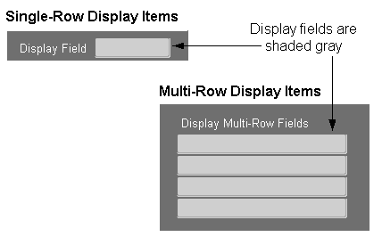
Display Items
Usage
-
Only use display items for fields that never require the user to interact with them in any way, including scrolling or querying. (OMS-74018). This will generally restrict their use to:
-
context fields
-
fields that are sized such that scrolling would be unnecessary (such as total fields)
-
fields that may display truncated information, but some other mechanism (such as overflow fields) exists for the user to see the entire contents of the field
-
dynamic boilerplate
-
Rules
-
Display items may be used to simulate dynamic boilerplate when the Prompt attribute is not adequate.
-
[Translation] The width of a display item must be set to display its contents fully and to accomodate translation expansion; or, the item width may be sized for the current text length at runtime. (OMS-74019)
Cosmetics
-
(OMS-74020) When Display items hold data, they are displayed similarly to text items. See: Text Items.
-
Height: 0.25"
-
Inter-row Spacing: 0.0"
-
Color: gray background
-
Bevel: Inset
-
-
When Display items are used as boilerplate, they are displayed as follows (OMS-74022):
-
Height: 0.2"
-
Inter-row Spacing: 0.0"
-
Color: background matches the current canvas color
-
Bevel: None
-
Y Position: 0.05" below the nearest gridline
-
-
[Translation] To support bidirectional languages which read right to left, use the following rules to set alignment properties (OMS-74021):
-
Use "Start," "Center," or "Right" for display items that show data.
-
Use "Start," "Center," or "End" for display items that act as boilerplate.
For information on implementing Display Items, see the Oracle E-Business Suite Developer's Guide.
-
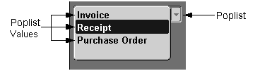
Poplists
Usage
-
Use poplists when only one value is applicable, and the list of choices is never expected to grow beyond 15. (OMS-74023)
-
In exceptional cases, poplists may be used as field prompts in single-record blocks.
-
A poplist may act as a Query Control Poplist.
-
Do not use a dynamic poplist when possible values may become inactive. If a value is validated by an effective date or by an active flag and becomes inactive in a dynamic poplist, the user will not be able to retrieve records with that value until the value becomes active again. Use a Text Item field instead. (OMS-74523)
Rules
-
An attribute modeled with a poplist in an entry form may be modeled with a text item in an inquiry-only form. (OMS-74524)
-
In a Find window, include a blank row in the poplist to allow the user to specify that any value returned for the poplist during a search should be accepted. This blank row appears automatically if the poplist is made optional. (OMS-74024)
-
In a Find window, include "(No Value)" in the list of valid choices if the poplist was optional when it was used for entering values on the form. If "(No Value)" is a choice, it should be placed last in the list of choices and will then appear immediately before the blank "any value" choice (which automatically shows up at the bottom of the list). This allows the user to search for a "null-valued" row. (OMS-74025)
-
[Translation] A poplist requires a width of 0.5" just to support the cosmetics of the widget. To adhere to translation requirements, the actual minimum width of a poplist is therefore 1.5." An exception to this is a "Yes/No" poplist which can be 1" wide. (OMS-74026)
-
[Translation] A poplist is restricted to displaying 30 characters. To adhere to translation requirements, English text should not exceed 23 characters. (OMS-74027)
Cosmetics
-
Poplists that hold data are displayed as follows (OMS-74028):
-
Height: 0.25"
-
-
Poplists that are used as field prompts in single-record blocks are displayed as follows (OMS-74030):
-
Height: 0.25"
-
Font Weight: Medium
-
Behaviors
-
A poplist that cannot currently be validated due to a dependency on another field, or cannot be currently entered for any other reason, must have its insert, update, and navigable properties turned off. (OMS-74130)
-
Poplist colors are as follows:
-
editable and required: yellow background
The yellow background only appears when the item is in the current record
-
all other cases: gray background
-
-
A Query Control Poplist must either be navigable, or its values must be presented in an LOV invoked from the Block Menu function.
For information on implementing Poplists, see the Oracle E-Business Suite Developer's Guide.
T-Lists
Usage
-
Use T-lists when only one value is applicable, the list of choices is never expected to grow beyond 100, and no entry is expected to exceed 30 characters when translated. (OMS-74131)
Rules
-
Always show at least five rows of data. (OMS-74132)
-
T-lists should only be used in low-volume forms with extensive screen space available. (OMS-74133)
-
An attribute modeled with a T-list in an entry form may be modeled with a text item in an inquiry-only form. (OMS-74134)
-
T-list colors are the same as Text Items.
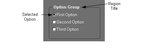
Option Groups
Usage
-
Used when only one value is applicable, there are only two to four possible values, and the list will be static throughout the life of the product. (OMS-74031)
For example, selecting sex or gender (with three choices: Male, Female, Unknown) is an appropriate use of an option group because it is a limited selection that would never change.
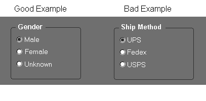
An inappropriate use of an option group would be as a Ship Method selection (with choices UPS, Fedex, USPS). This example is a bad use of an option group because it is inappropriate for customer-defined lookups (different customers will use different shipping methods).
Rules
-
Avoid using option groups for items that may ever appear in multi-record blocks.
-
An option group must always have a default value. (OMS-74032)
-
Use in place of a check box when the two states are not accurately modeled as yes/no.
-
An option group must always specify its title in the Hint Text property. This text must replicate any title drawn on the screen, and must exist even if no title is drawn.
-
Each single-row option button must specify a Label.
-
Each multi-row option button must specify a Prompt.
-
An option group can be used to set a "mode" of a form, such as what type of information should be displayed.
-
An option group can also be used to indicate progression of data through various states, such as a Sales Order moving from "Booked" to "Shipped" to "Billed" to "Paid."
-
An option button should have an access key. (OMS-74232)
-
[Translation] The minimum width of an option group button is 0.3," which displays just the button with no label. However, in a single-row display, the minimum width is the larger of 1.3" or 30% longer than the label to allow for translation. Always allow as much space as possible for expansion. (OMS-74033)
Cosmetics
-
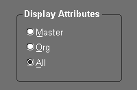
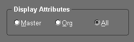
Draw the buttons of an option group in their own region, where the name of the item is the title, and the individual buttons are labeled elements within the region. (OMS-74034)
EXCEPTION: If the title of an option group is obvious, then the region title and boundary may be omitted. This should only be done if necessary, however, because the boundary helps to indicate that the options are mutually exclusive and visually different from check boxes.
-
Option buttons may be laid out vertically or horizontally. (OMS-74234)
Vertical layout allows more space for translation and is easier to read.
Horizontal layout requires less space and the keyboard access method is more intuitive (the left and right arrow keys are used).
Querying a row with "invalid" option group data
For attributes modeled as option groups, there may be situations where a queried row will contain data that is not a valid choice of options. If such a situation may occur, create an additional option group button labeled "Other," and set it to be disabled. This allows the record to be queried, but prevents a user from setting the value to anything but a valid value. (OMS-74235)
For information on implementing Option Groups, see the Oracle E-Business Suite Developer's Guide.
Check Boxes
Usage
-
Used when only one value is applicable in a yes/no situation, and the yes/no statement is not contrived or obscure.
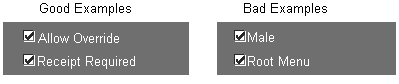
Examples of good uses of check boxes include Allow Override and Receipt Required, where the yes/no response is clear.
For example, the use of a check box with the label Male is contrived to represent the Male/Female choice as a question with a yes/no response, so this is an inappropriate use of a check box (it should be an option group). A second example, with the check box labeled Root Menu, demonstrates inappropriate usage of a check box because the opposite of Root Menu is not obvious.
In each of these bad examples, an option group or poplist item would present a more intuitive set of choices to the user.
Rules
-
A check box item is mandatory, and must always have a value (including a default value). (OMS-74035)
-
In a Find window, an attribute normally modeled with a check box is modeled with a poplist. The list must include values for the checked and unchecked states and should not be required so that a null entry appears as well. (OMS-74036)
-
[Translation] The recommended minimum width of a check box is 0.2," which displays just the check box with no label. In a single-row display, the minimum width is the larger of 1.3" or 30% wider than the label, to allow for translation. Always allow as much space as possible for expansion. (OMS-74037)
Cosmetics
-
The check box itself is normally positioned as a text item would be.
-
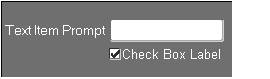
When the label of a check box is very long, the check box may be positioned starting at the left end of the prompt of the field above.
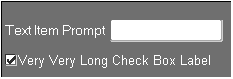
In the above example, the check box and prompt are aligned along their left sides. This alignment may of course not hold after translation to other languages.
-
Check boxes in multi-record blocks are 0.2" wide. (OMS-74038)
-
For a single-row check box, the Label must be used. For a multi-row check box, the Prompt must be used.
Entering at least one selection
In certain cases, the user has a choice of options to choose from and may select more than one, but must select one at a minimum. If only two check boxes are available and the user deselects the only selected item, the other item should be selected automatically. A confirmation point may also be used later in the form to ensure that at least one item is selected. (OMS-74238)
For information on implementing check boxes, see the Oracle E-Business Suite Developer's Guide.
Coordination Check Boxes
Coordination check boxes are used to control master-detail relations between blocks. See Master-Detail Characteristics
Buttons
Usage
-
Used to initiate an action, such as a product-specific function, or block-to-block navigation.
-
Only use buttons for the most commonly needed functions in a form. Put other functions in the Special menus.
Rules
-
Try to use only one row of buttons per window. (OMS-74239)
-
Provide one default button per window, where that function is the most likely for the user to perform. Always provide a default button in a modal window (typically "OK"). (OMS-74039)
-
Sequence buttons within a window as follows:

-
Place the default button to the left of all other buttons.
-
Place the Cancel button immediately to the right of the default button to form a group.
-
Place all other buttons in a group to the right.
-
EXCEPTIONS:
If the Cancel button is the default button, do not reposition it within its group.
In cases where there are other actions which are logically related to the default button, place those buttons immediately to the right of the default button. Place the Cancel button in the rightmost position of the group.
-
Follow the same button sequence rules for modal windows except when the modal window includes a Help button. Place the Help button in the leftmost position.

-
-
Buttons within a window should be sized similarly and spaced consistently, except when using gaps to group related buttons. If a window contains one button with a particularly long label, but all the other buttons have short labels, only size the short-labeled buttons the same.
-
Buttons may be placed on tab regions if they only apply to the contents of that specific region.
-
The default button should never be placed in a tab region where it can be accessed by keystroke when not visible.
-
The right edge of the rightmost button must be 0.1" from the right edge of the window. In general, leave 0.1" between buttons. If there are logical groupings of buttons, leave 0.5" between the groups (and still place 0.1" between the buttons in each group). If horizontal space does not allow 0.5" between groups of buttons, then leave as much separation as is possible. (OMS-74041)
-
[Translation] A button has a minimum width of 0.2" just to support the cosmetics of the widget. To adhere to translation requirements, the actual minimum width of a button is therefore 1.2." See the section on Text for more information on expansion requirements for button labels. (OMS-74042)
See: Text
-
In general, buttons are navigable except for the following: (OMS-76013):
-
Buttons below a multi-record block
-
Buttons that only apply when the cursor is in a particular field
-
The "Clear" button in a Find window
-
-
All buttons have an access key except "OK" and "Cancel" within dialog windows. "OK" must have an access key if it is not the default button, and "Cancel" must have an access key if it does not perform the same function as "Close Window."(OMS-74043)
-
All but the simplest modal windows should have a Help button in the lower left corner.
-
All iconic buttons must provide Tooltip text.
Cosmetics
-
Textual Buttons are displayed as follows (OMS-74044):
-
Height: 0.3"
-
Rounding: Buttons that have the same Y-coordinate, and are spaced within 30 pixels of each other, have only their outermost edge rounded. A button with no other button near to it has both edges rounded.
-
-
Iconic buttons within a screen are either 0.25" by 0.25" or 0.3" by 0.3."
For information on implementing Buttons, see the Oracle E-Business Suite Developer's Guide.
Lists of Values (LOV)
Usage
LOVs are used when the user must select from a list of valid values in a text field.
Rules
-
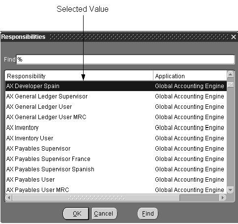
All LOVs open near the item they are associated with, or if there is no specific item, they open centered in the MDI window. (OMS-74045)
-
LOV columns are set to use Autosize, which ensures that the column width can fully display its title.
-
Width: Maximum: 7.8" Minimum: 3" Any width between these is allowed. (OMS-74046) However, the following guidelines are recommended:
-
[Translation] The column width in the LOV should match the length of the field in the window.
-
The LOV window should be smaller than the window from which it was invoked so the LOV does not totally obscure it.
-
-
The title is the name of the object in the LOV, and is plural, for example, "Customers." For a "Row LOV," where the user chooses a particular record, the title is "Find" plus the name of the entity (with the name of the entity in singular). For example, a Row LOV to find Purchase Order Lines would have a title of "Find Purchase Order Line." (OMS-74047)
-
The prompt of the first column is related to, or matches identically, the prompt of the item that invoked it. (OMS-74247)
-
[Translation] In an LOV, display the value of a true/false value as "*" for true and <blank> (no value shown) for false. This is easier for a user to read quickly than words like "True" or "Yes," and simplifies translation. (OMS-74248)
Cosmetics
All LOVs use the default visual attributes. (OMS-74249)
Behaviors
-
LOVs do not display automatically upon navigating to a field. (OMS-74250)
-
LOVs automatically select a row when the list of valid choices is reduced to one. However, an LOV that is not associated with a text item (such as one that is invoked by pressing a specific button), should not automatically select a row. (OMS-74451)
-
(OMS-74452) After selecting from an LOV, the cursor automatically moves to the next field except when:
-
the next field is in a region not currently displayed.
-
the field is a mirror item of a field in Folders, like in Combination Blocks.
-
the field is the last navigable field in a multi-row block with horizontal scrolling.
-
-
If an LOV may show more than 100 records, then the user must be prompted to reduce the list of valid values first. (OMS-74048)
-
In normal (entry) mode, an LOV shows only values that currently can be selected.
EXCEPTION: Validation can be performed after-the-fact if any of the following apply:
-
The validation clause cannot be written in a single SQL statement.
-
The validation clause is too costly to evaluate in a single SQL statement.
-
The reason for exclusion from the list is obscure to the user.
In such cases, after the value is selected show an error message indicating exactly why the value could not be selected.
-
-
Do not provide LOVs in QBE.
For information on implementing Lists of Values, see the Oracle E-Business Suite Developer's Guide.
Editors
The Editor is invoked by pressing the Edit Field toolbar button, or by selecting Edit Field from the pull-down Edit menu. In response to these actions, Oracle E-Business Suite shows the default Forms editor window, or a user-specified editor (see the Oracle Forms Installation Manual for more information on specifying an editor).
On a Date field, the Edit Field action opens the Calendar. (OMS-74350)
On a Flexfield, Edit Field opens the Flexfield window (OMS-74058).
Descriptive Flexfields
Usage
All entities should provide a descriptive flexfield to allow customization. (OMS-74049)
Cosmetics
-
Code a descriptive flexfield as a text item, displaying two characters (width of 0.2"). (OMS-74050)
-
The prompt associated with the descriptive flexfield is "[ ]".
-
In a single row block, the "[" is the prompt, and is drawn .05" to the left of the item and centered vertically. The "]" is boilerplate placed .05" to the right of the item, also centered vertically. (OMS-74051)
-
In a multi-row block, the prompt is "[ ]" drawn .05" above the item and centered horizontally.
-
The descriptive flexfield is located as the last item in each block on the content canvas. When regions exist, the descriptive flexfield is located after the region (not as an item within a particular region). (OMS-74052)
In exceptional cases, where the aesthetics of the single-row block are compromised by locating the descriptive flexfield last, it may be located elsewhere, but should always appear at the "end" of a group of fields (for example, as the last field of the context canvas fields before an alternative region). Regardless of its location, it is always the last sequenced item of the block.
Behaviors
-
The descriptive flexfield Forms field should be navigable, but should not allow input. It adheres to all text item standards. (OMS-74053)
-
Flexfield code will automatically show the concatenated values in the descriptive flexfield Forms field.
-
Descriptive flexfield uses a user-level profile that determines whether the flex window should pop open upon the user navigating into the field. (OMS-74054)
EXCEPTION: In folder blocks, the flexfield window must not automatically open because this would prevent the user from resizing the field.
-
At form startup, the descriptive flexfield is disabled if the customer has not activated the flexfield by defining and enabling segments.
-
If the user invokes the descriptive flexfield before the independent fields of context-sensitive segments are populated, then the following will occur:
-
If there are global segments, the window will open, and text will display indicating that other context-sensitive fields cannot currently be populated.
-
If there are no global segments, then no window will open and a message will indicate that the context-sensitive fields cannot currently be populated.
-
-
Behavior of the descriptive flexfield window itself :
-
Any successful navigation out of the window moves the cursor to the next field.
-
Canceling the window moves the cursor to the previous field.
-
During validation, if mandatory segments are missing, then flex will issue a message. In the cases where it can be done, the flex window will open automatically upon the user acknowledging this message; in those that it cannot, the user will have to invoke the window.
For information on implementing descriptive flexfields, see the Oracle E-Business Suite Developer's Guide.
-
Key Flexfields
Usage
For all attributes that can be modeled as a multi-segment key, such as Item Number or Account.
Behaviors
-
All key flexfields use the direct-entry method. (OMS-74055)
-
Only key flexfields with Validation set to Full should enable the List lamp. (OMS-74056)
-
Invoking a List of Values in a flexfield allows for entry of a combination-level List of Values. (OMS-74057)
-
Invoking Edit Field in a flexfield expands the field to allow entry of values in individual segments. (OMS-74058)
EXCEPTION: For a flexfield that allows dynamic inserts, Edit Field and List invoke the same window because it is irrelevant to the user whether a particular combination has ever been entered before.
Cosmetics
-
Do not code any special visual indicator or activation button for key flexfields. The field should look like any other text item. (OMS-74059)
For information on implementing Key Flexfields, see the Oracle E-Business Suite Developer's Guide.